2.1. Visual experience
The first is the visual experience. A good visual design can make the interactive programs underground and be used more accurately by the users; thus, the information could be sent better. It is aimed not only at the transmission of cultural information and aesthetic information but also at a high degree of emotional identification of users when visual design is up to the high level of user experiment. (
Xiao & Tian, 2011)
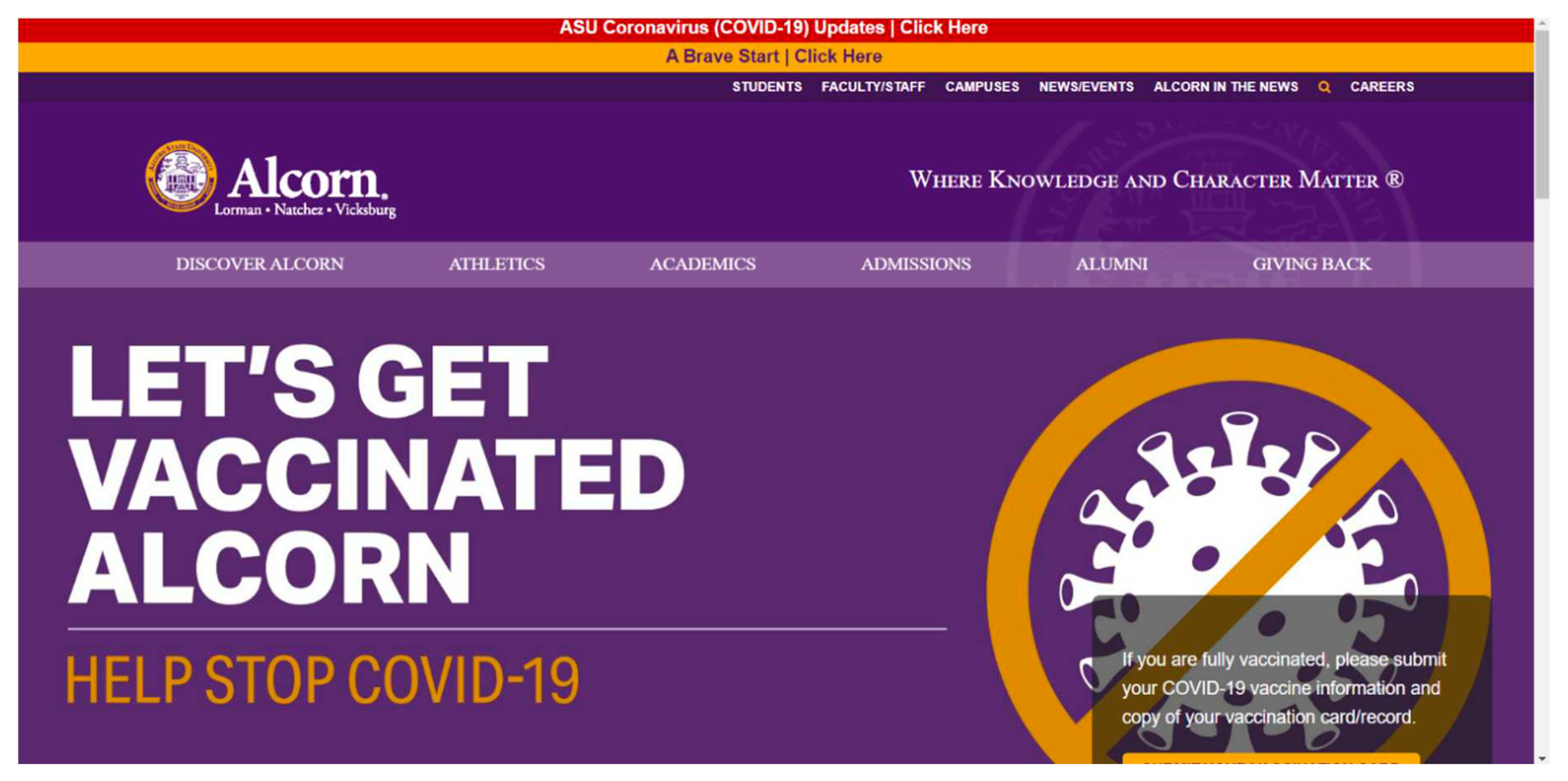
Therefore, the first thing is the visual experience. Alcorn State University (ASU) was founded in 1877 near Loman, Mississippi, USA. When it was first founded, ASU was the first university in the United States supported by the state government to recruit African-American students, and it was also a member school of the Thurgood Marshall Scholarship Foundation. Therefore, as shown in the figure,
Figure 1.
The portal website of Alcorn State University.
Figure 1.
The portal website of Alcorn State University.
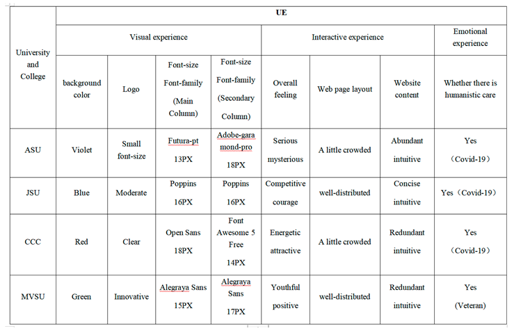
We can see that the three words "service", "scholarship" and "dignity" appear on the homepage Logo. However, we find that compared with the name and address of the university next to the logo, the font size of the words in the logo may be too small, so users may not be able to directly and clearly see the three words on the standard web page scale. For the main column "STUDENTS, FACULTY/STAFF, CAMPUSES, NEWS/EVENTS, ALCORN IN THE NEWS, CAREER ", the author checked through the Inspector that the font of the main column is "futura-pt" and the font size is 13PX. The subcolumn "DISCOVER ALCORN, ATHLETICS. ALUMNI, GIVING BACK", with a font size of 18PX and the font of "adobe-garamond-pro". That is, the font size of the main column is much smaller than that of the subcolumn, and the fonts of the two columns are inconsistent. In my opinion, if the column font and font size of this website can be adjusted, the column font size will be much better. However, from the background color, ASU’s website background color mostly uses "purple". According to color psychology, orange, yellow, blue, and violet contributed significantly to post popularity based on different photographic typologies (
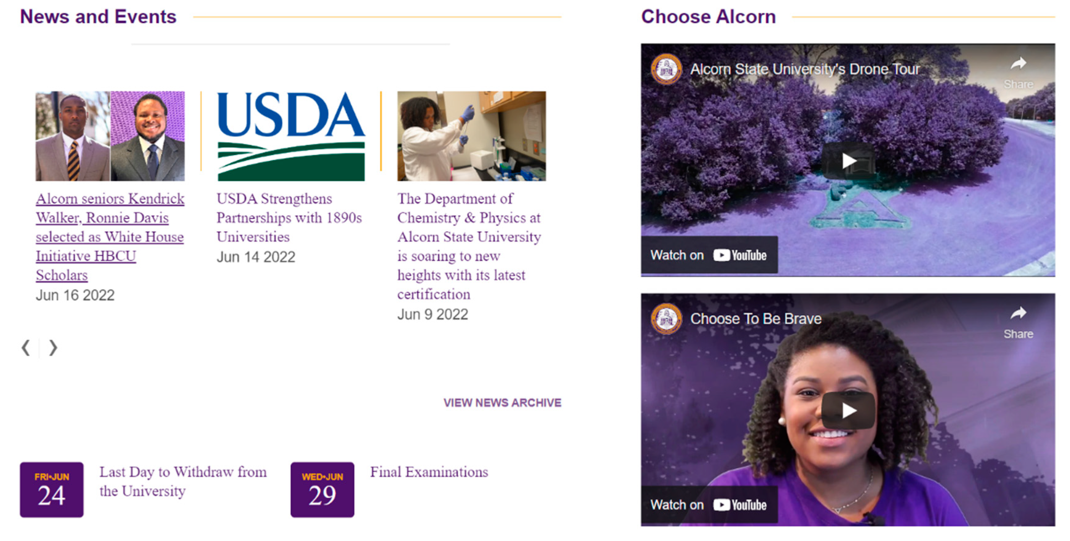
Chung-en Yu, 2020). "Purple" represents nobility, and it also reflects the meaning of the school’s slogan. "Where knowledge and Character matter", excellent "character" should be noble. In addition, there is a very famous plant in Africa, "Violet". Therefore, the author believes that this color background may also imply ASU tolerance for races, such as "African Americans". After that, at the bottom of the main and sub columns is the latest news module of the school with a large space, which consists of scrolling pictures and titles, and then the static news module below is shown in the figure.
Figure 2.
The middle part of the portal website of Alcorn State University.
Figure 2.
The middle part of the portal website of Alcorn State University.
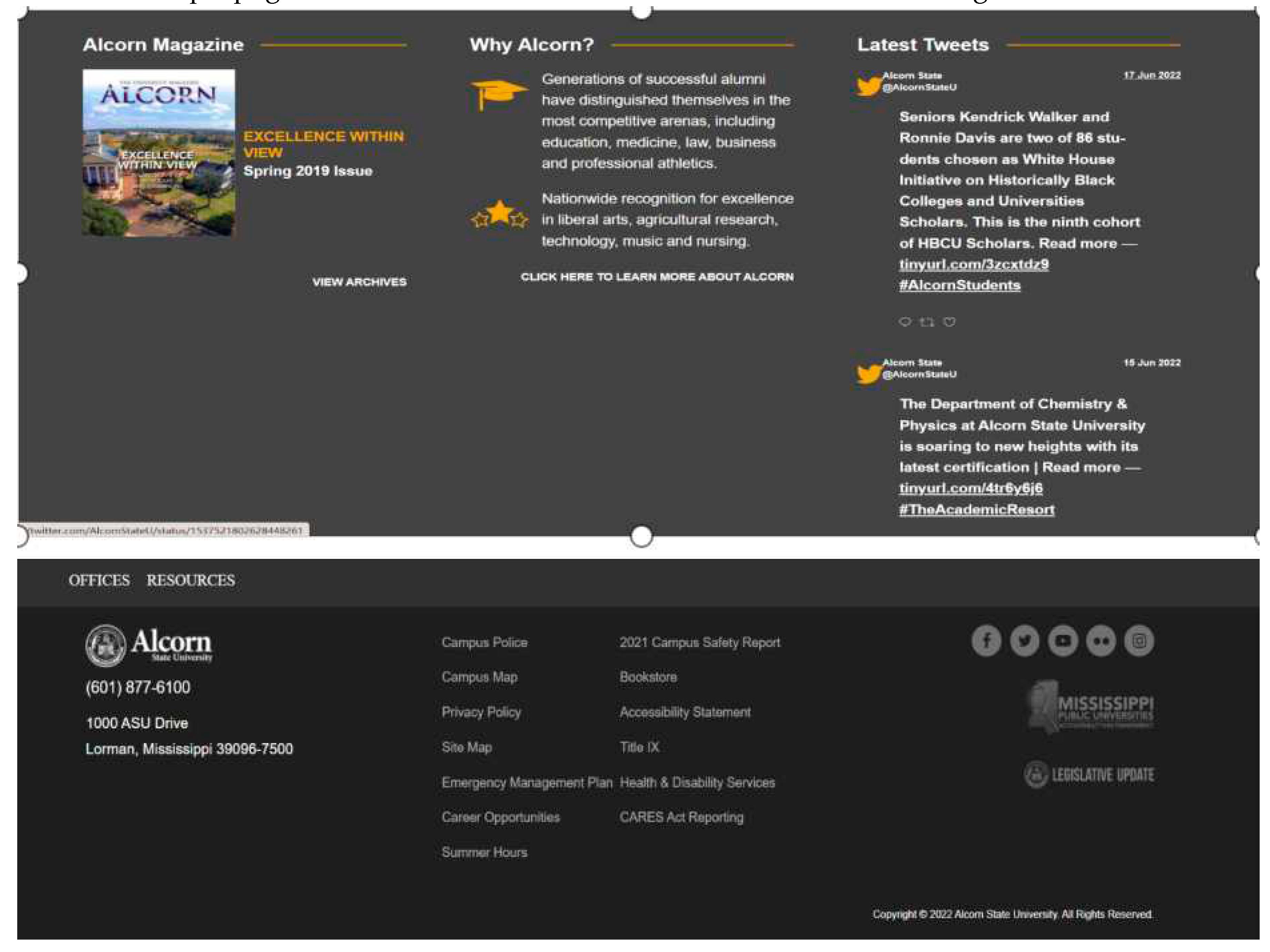
This module is composed of static pictures and links to web pages, while the right half is a video of the school’s propaganda film. The bottom of the website is shown in the figure.
Figure 3.
The bottom part of the portal website of Alcorn State University.
Figure 3.
The bottom part of the portal website of Alcorn State University.
It is composed of two different shades of gray, with some friendship links at the top and contact addresses and information at the bottom. The overall color is "purple, white, gray". The author believes that the purple color can give people a sense of "mystery" and "nobility", and the background color of the school is very innovative. However, the fly in the ointment may be that the background color of the second plate, white, is too small, and compared with the large purple of the first plate, it may appear "top-heavy", which does not look particularly uniform. The dark gray background at the bottom of the site is close to black, which may distract users from the important information on the module, which shows the university’s address and phone number.
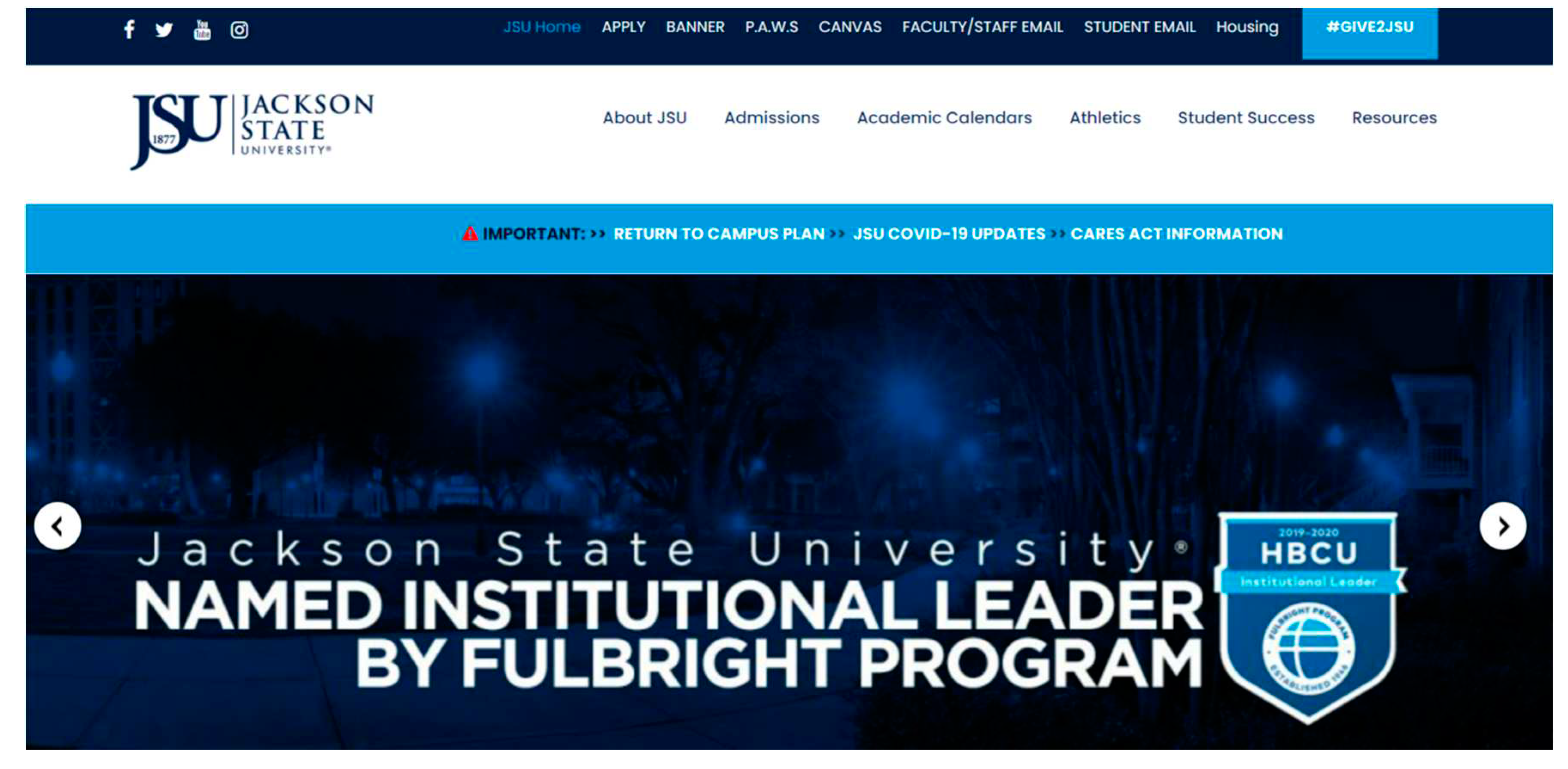
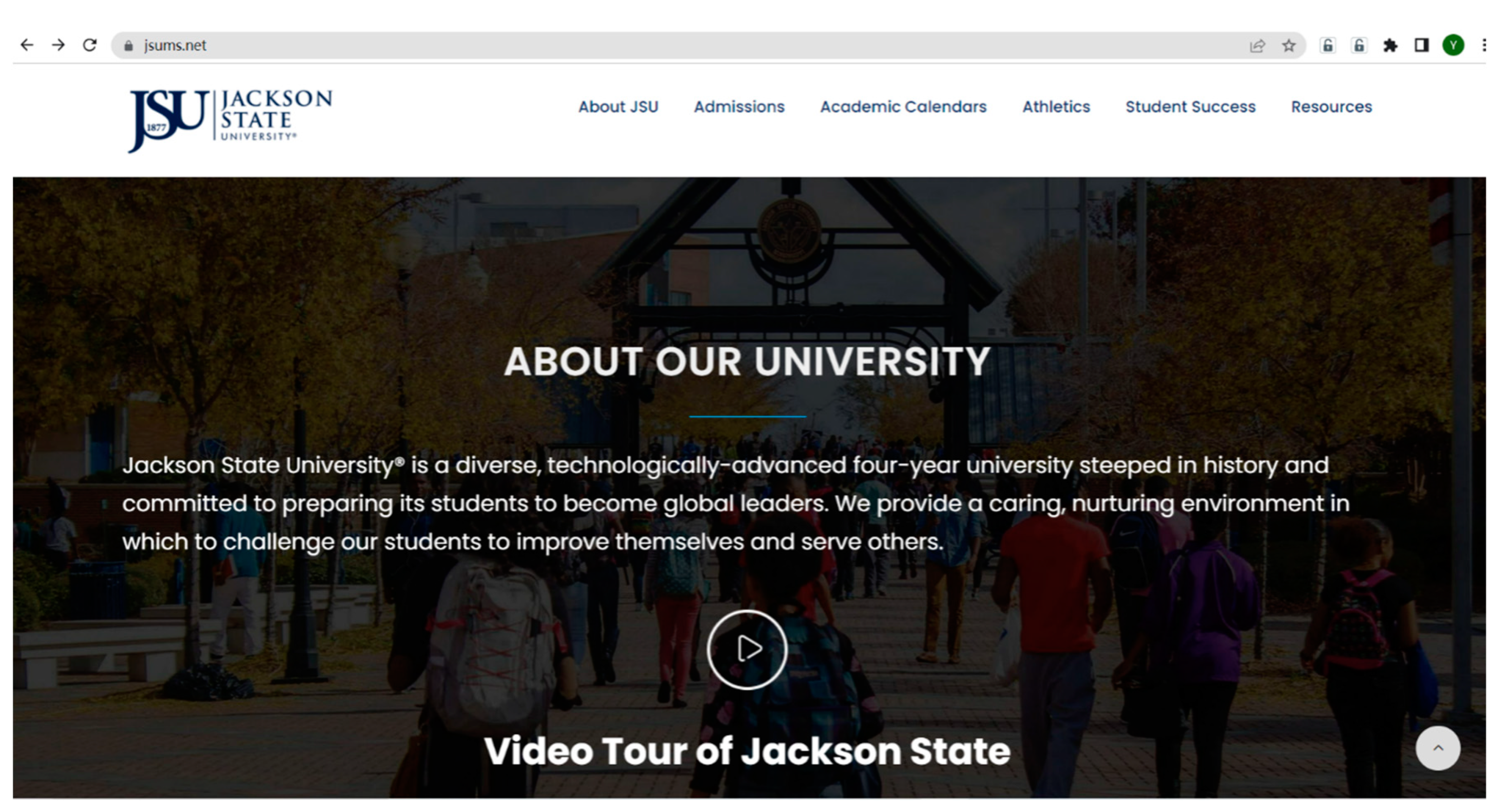
Jackson State University (JSU), founded on October 23rd, 1877, was once a black university in history. JSU has an outstanding history and a rich tradition in cultivating the leadership of young men and women. Therefore, the mascot of JSU is “Tiger”, which is a decisive organizer with high dominance among animals and strong competitiveness. This is also in line with JSU’s mission, providing high-quality teaching, research and services for students and using different models to ensure that they are technologically advanced and ethical global leaders who can think critically about solving social problems and competing effectively. Therefore, in the main column of JSU’s portal, the title of the front-end module of students’ related information inquiry system shows "P.A.W. S", which means "Tiger’s Pawn". First, from the visual experience, as shown in the figure,
Figure 4.
The top part of the portal website of Jackson State University.
Figure 4.
The top part of the portal website of Jackson State University.
The portal website of JSU is generally dark blue. In many countries, police uniforms are blue, and the lights of police cars and ambulances are generally blue because "blue" means "courage". Blue is also in line with the culture of the school. The vision of the school is recognized as a challenging, but nurturing, knowledge community instilled with the most advanced technology. Second, the logo size of JSU’s portal website is very standard, so there is no repetition. The subcolumn" ABOUT JSU, ADMISSIONS, ACADEMIC CALENDERS, ATHELETICS, STUDENT, SUCCESS RESOURCES” uses 16PX font size and "Poppins" font, while the main column “APPLY, BANNER, PAWS, CANVAS, FACULTY/STAFF EMAIL, STUDENTMAIL, HOUSING” also uses 16PX font size and "Poppins" font. The main column and the sub column use the same font and font size. The author believes that this layout design will make the website layout look more regular. At the bottom of the subcolumn is the rolling news section. At the bottom of the rolling news section is the publicity section of the school. The designer of the website put a video in this section, as shown in the figure,
Figure 5.
The middle part of the portal website of Jackson State University.
Figure 5.
The middle part of the portal website of Jackson State University.
Below the publicity section is a static news section, as shown in the figure.
Figure 6.
The news section of the portal website of Jackson State University.
Figure 6.
The news section of the portal website of Jackson State University.
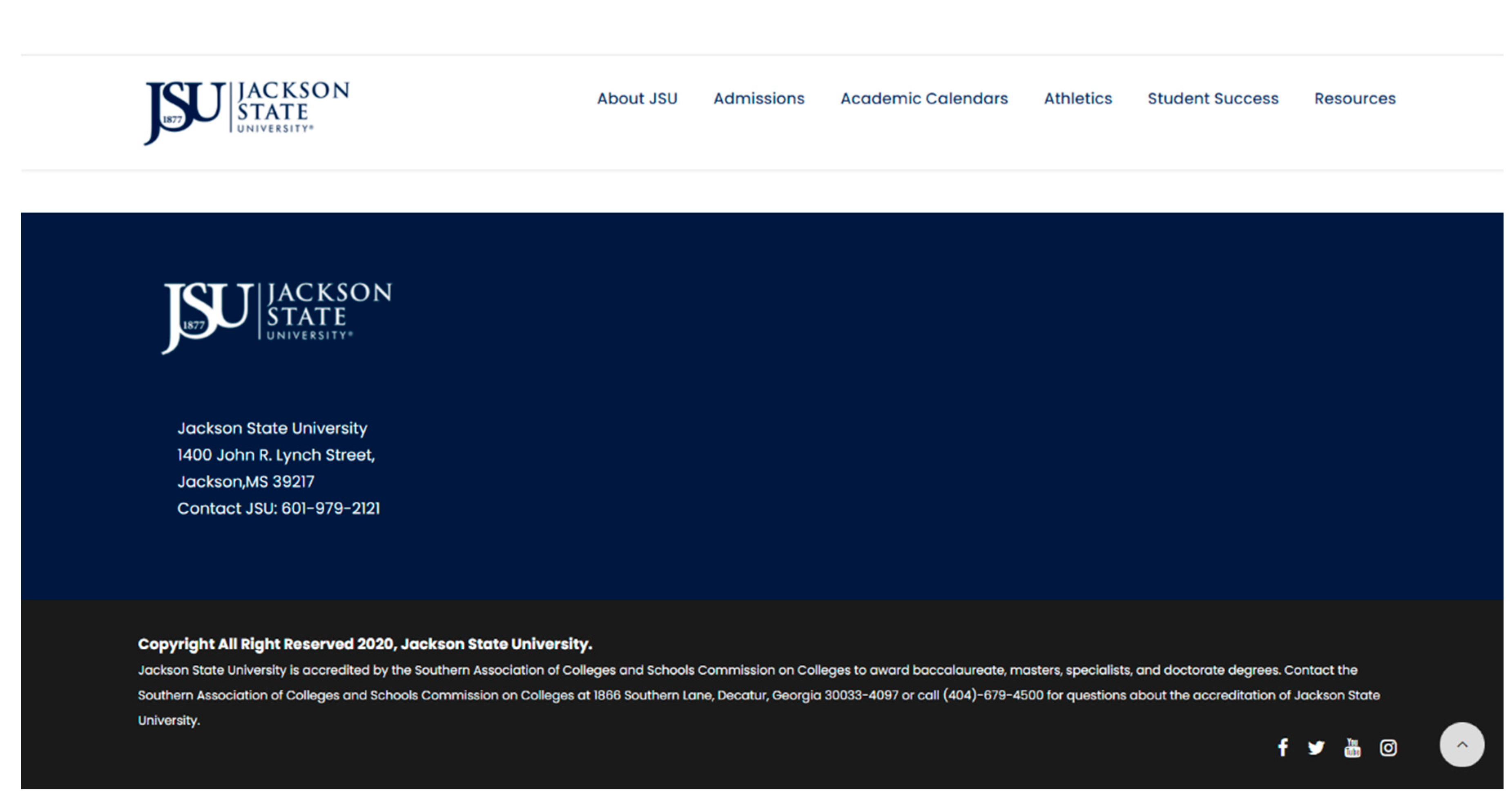
The left part is a still picture, while the right part is a webpage link of some related news. The author thinks that if the position of the propaganda section and the static news section are interchanged, because the content structure of the current website is "dynamic news module-propaganda module-static news module", if it is converted into "dynamic news module-static news module-propaganda module", the content of the website will look clearer and more regular. The bottom background of the portal website is still dark blue, showing the contact address and telephone number of the school very concisely, as shown in the figure.
Figure 7.
The bottom part of the portal website of Jackson State University.
Figure 7.
The bottom part of the portal website of Jackson State University.
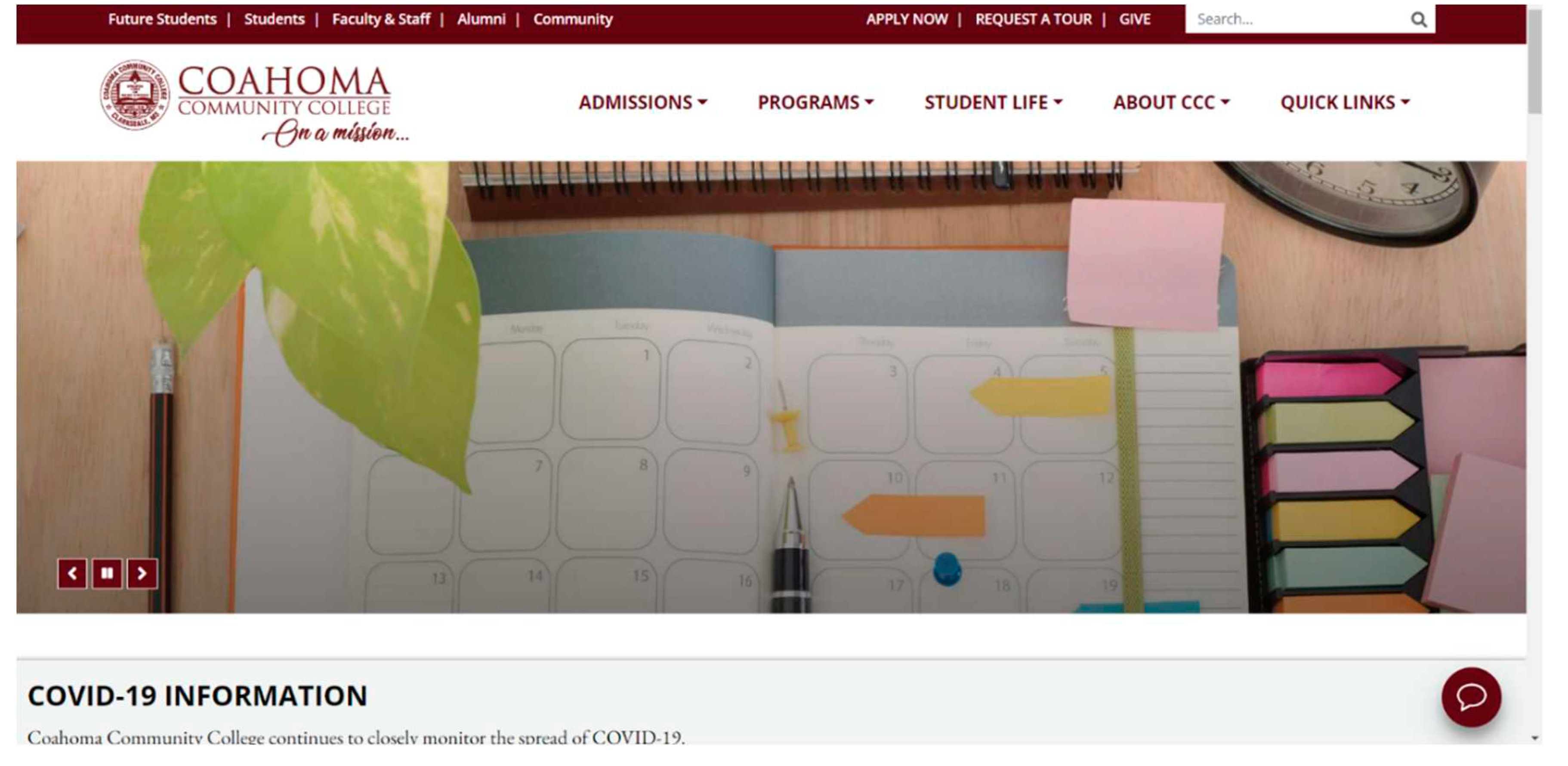
Coahoma Community College (CCC) is located in Clarkes Dale, Mississippi, USA. Founded in 1924, the school is a comprehensive college. In 1950, CCC became the first educational institution for blacks in the Mississippi public college system. In 1965, CCC opened its doors to all students, regardless of race, color, sex, nationality or disability. CCC’s portal website is shown in the figure.
Figure 8.
The top part of the portal website of Coahoma Community College.
Figure 8.
The top part of the portal website of Coahoma Community College.
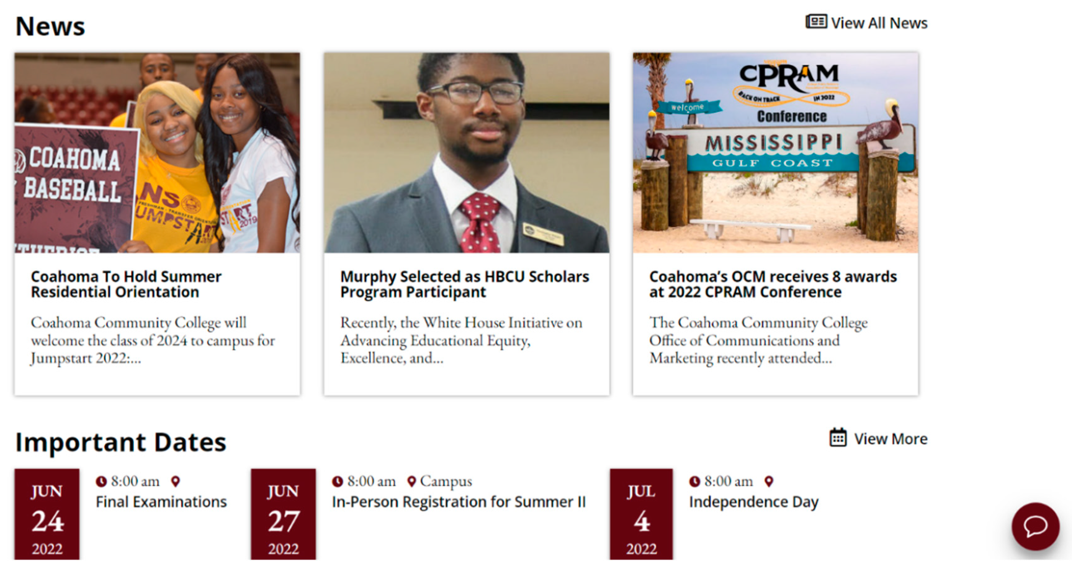
The website is generally red. In color psychology, red has the longest light wave in the spectrum, and it is a color that can truly attract users’ attention. Red is the main brand color of many success stories, including Coca-Cola and Ferrari F1. Red is positive and full of vitality, and it is also in line with one of the school’s goals, that is, promote and support a culture of health and wellness on campus that extends to the surrounding communities and schools. CCC, located by the Mississippi River, has a very rich agricultural culture. Although the font size in the logo of the school’s portal website is small, fortunately, users can see with the naked eye that the words in the logo are the location where the school is located. The main column “ADMISSIONS, PROGRAMS, STUDENT LIFE, ABOUT CCC, QUICK LINKS” of the school’s portal website uses the font size of 18PX with the font of "Open Sans", while the subcolumn "FUTURE STUDENT, STUDENTS, FACULTY&STAFF, ALUMNI, COUMMNITY” uses the font of "Font Awesome 5 Free" with the font of 14PX. The author thinks that the font size of the main column and the subcolumn is very reasonable, but author also thinks that in order to make the website look more regular, the two columns can be set to the same font. Below the main column and the dynamic news module is the static news module, as shown in the figure.
Figure 9.
The news section of the portal website of Coahoma Community College.
Figure 9.
The news section of the portal website of Coahoma Community College.
Under the static news module, as shown in the figure,
Figure 10.
The academic section of the portal website of Coahoma Community College.
Figure 10.
The academic section of the portal website of Coahoma Community College.
It is the Academic module, the Career & Technical Education module, the Health & Sciences module, the Workforce Development module and the Titter module in turn. The author thinks that from the overall module layout, although the academic module and other modules can show the elegance and characteristics of the school, too many modules are presented on the homepage, which will make the homepage look like it has no focus. However, the following plate is shown in the figure:
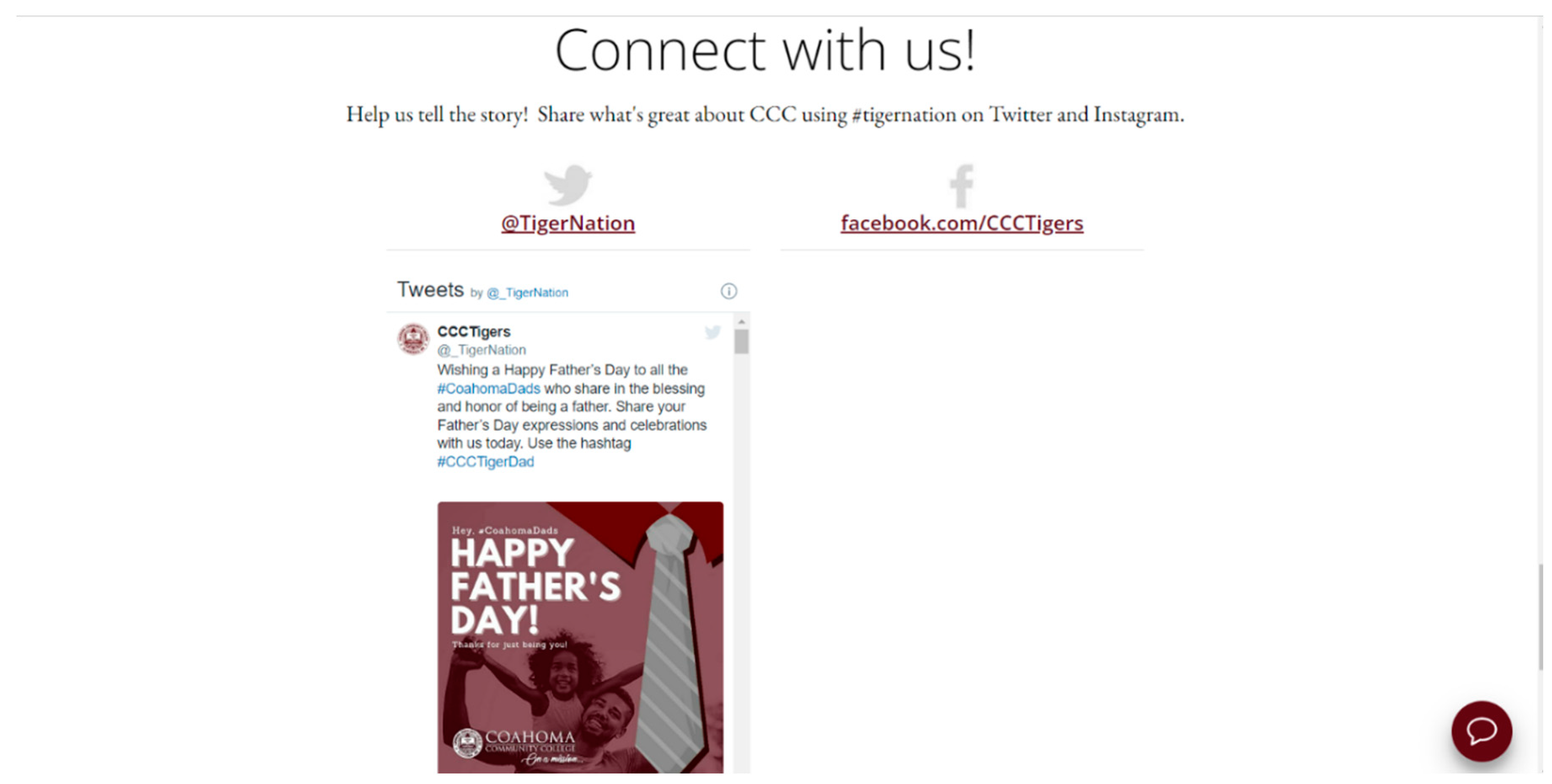
Figure 11.
The contact section of the portal website of Coahoma Community College.
Figure 11.
The contact section of the portal website of Coahoma Community College.
The author thinks that the most distinctive feature of this website is the Tweets page in this section and the intelligent dialog box in the lower right corner. The dynamic Tweets page makes the new things happening in the school unobstructed, while the intelligent dialog box reflects the very humanized webpage design, which enhances the impression of students and parents on the university. At the bottom of the website is the contact number, address and some links of the school, as shown in the figure.
Figure 12.
The bottom part of the portal website of Coahoma Community College.
Figure 12.
The bottom part of the portal website of Coahoma Community College.
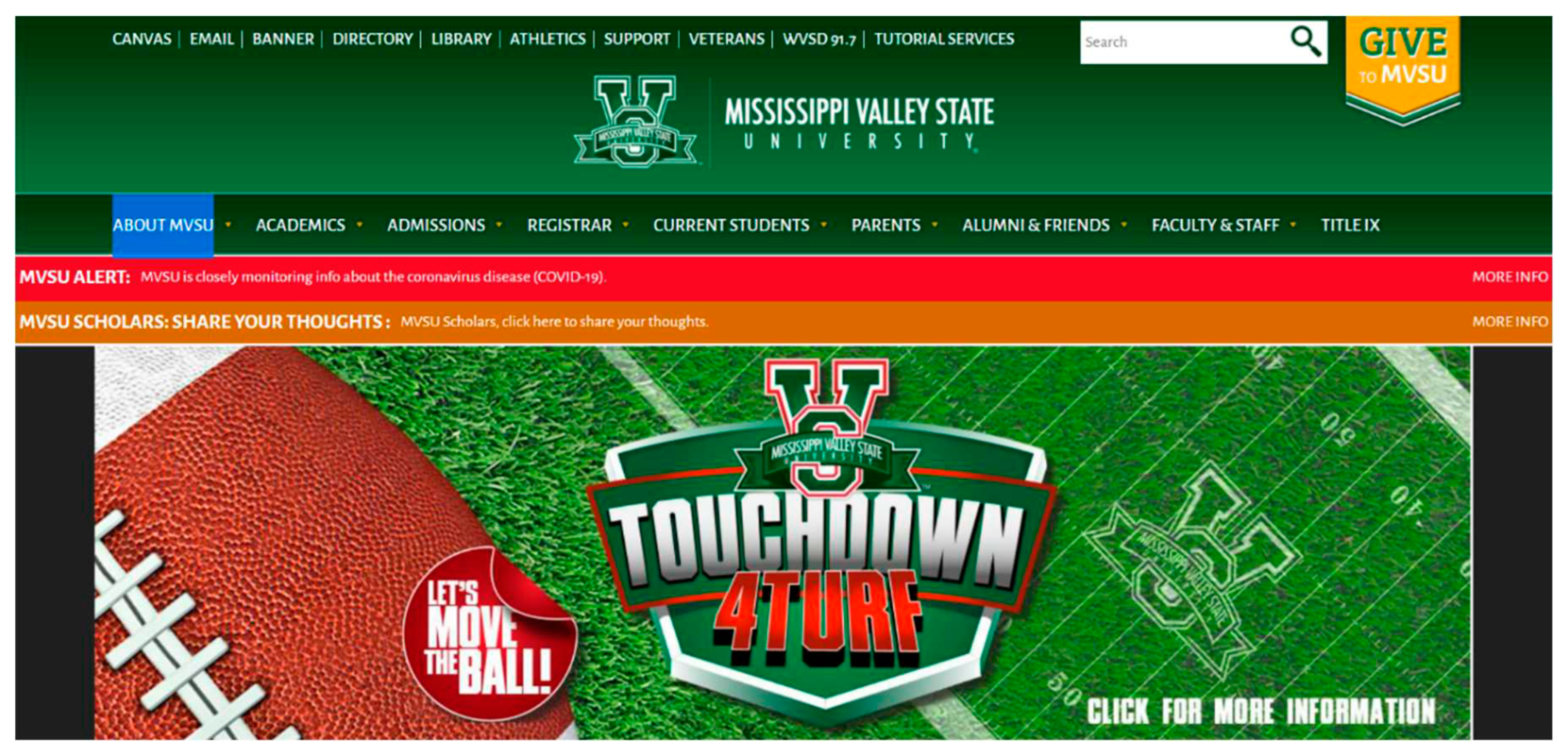
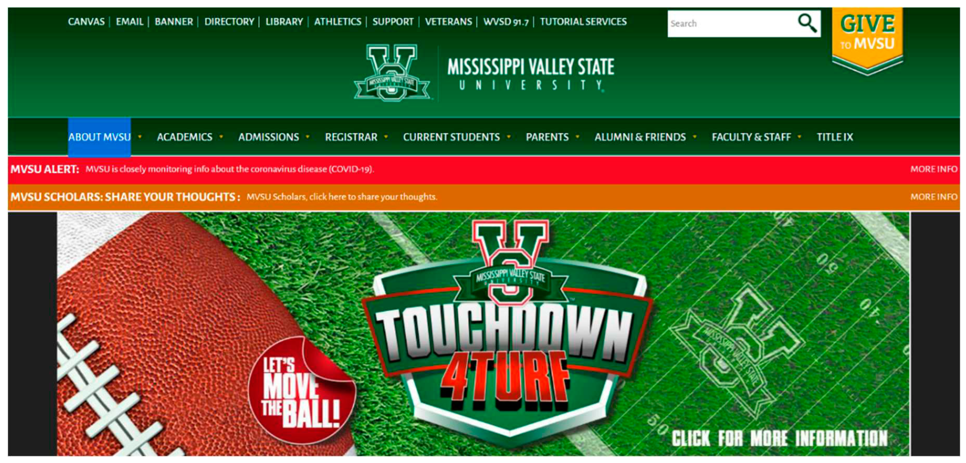
Mississippi Valley State University, a public university, was founded in 1950 and named Mississippi Vocational College. It is a traditional black university. According to the ranking of the Best Colleges in the Southern United States in 2011, MVSU ranks second and is a member of the Marshall University Foundation in Thurgood, USA. The school is proud of the diversity of its students and teachers. They come from American states, Canada and all over the world. The homepage of the portal website is shown in the figure.
Figure 13.
The top part of the portal website of Mississippi Valley State University.
Figure 13.
The top part of the portal website of Mississippi Valley State University.
The background color of MVSU’s portal website is green. According to color psychology, green is the color of growth, health and nature. Spotify and Starbucks use green in their logos to convey youth and freshness. For many people, green is the "prevailing" color because it represents the meaning of road signs in Europe and North America and is an excellent color for receiving successful news. This color, which can represent a positive attitude toward life, also conforms to MVSU’s mission, that is, MVSU is fundamentally committed to positively impacting the quality of life and creating extraordinary educational opportunities for the Mississippi Delta and beyond.
Sub column of website “CANVAS, EAMIL, BANNER, DIRECTORY, LIBRARY, ATHLETICS, SUPPORT, VETERAN, TUTORIAL SERVICES” uses the font size of 17PX and the font of" Alegraya Sans ", while the main column “MVSU, ACADEMICS, ADMISSIONS, REGISTRAR, CURRENT STUDENTS, PARENTS, ALUMNI & FRIENDS, FACULTY&STAFF, TITLE IX” uses 15PX font size and the font of "Alegraya San ". The fonts of the main column and the sub column are the same. In terms of font size, the font size of the main column is slightly larger than that of the subcolumn. The author thinks that this layout makes the columns of this website look very regular, as shown in the figure.
Figure 14.
The news section of the portal website of Mississippi Valley State University.
Figure 14.
The news section of the portal website of Mississippi Valley State University.
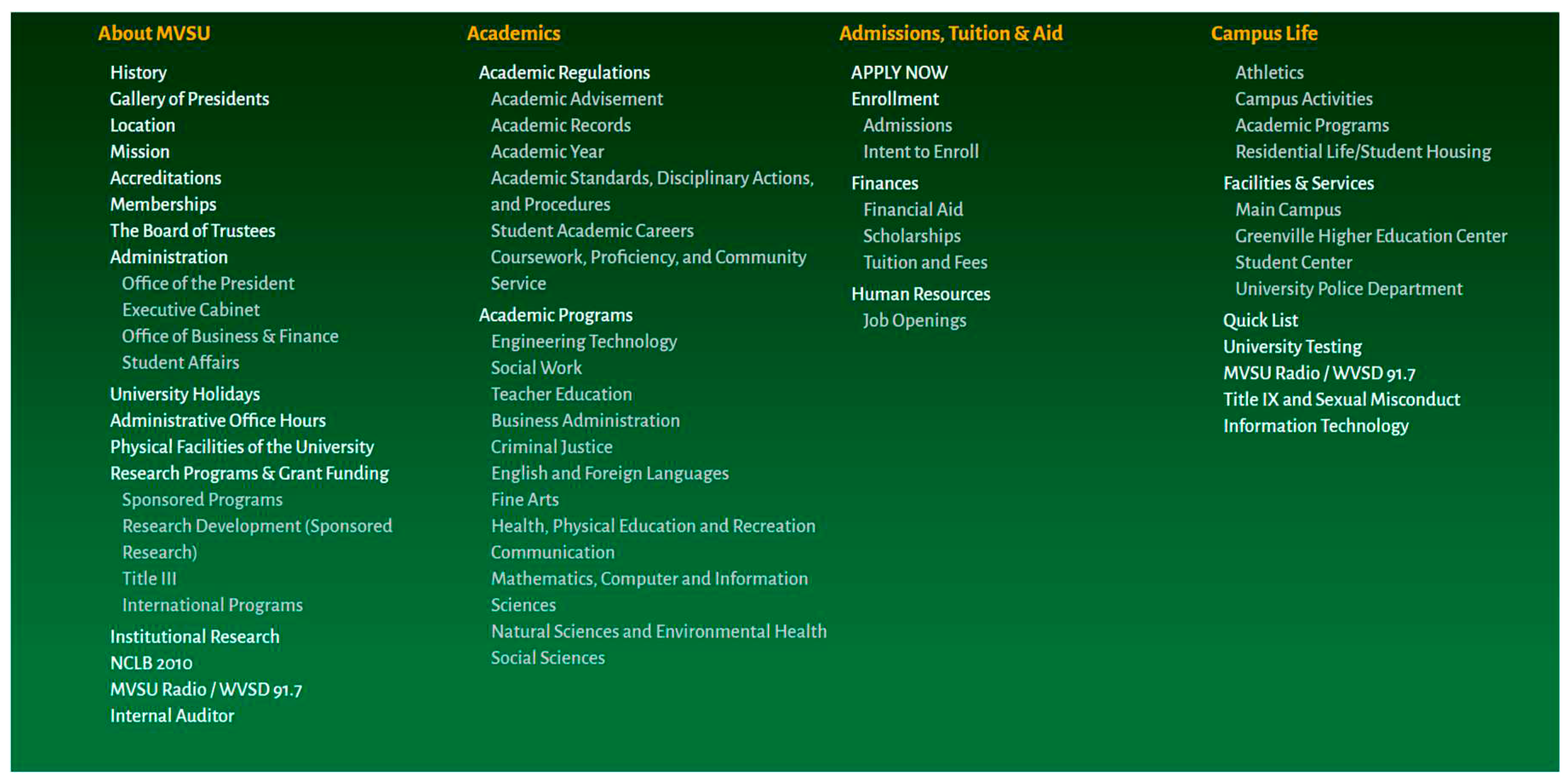
Below the main column and the dynamic news module is the static news module, which is divided into two parts: the left part is the detailed news content, while the right part has many news links, followed by relevant school links. As shown in the figure,
Figure 15.
The contact section of the portal website of Mississippi Valley State University.
Figure 15.
The contact section of the portal website of Mississippi Valley State University.
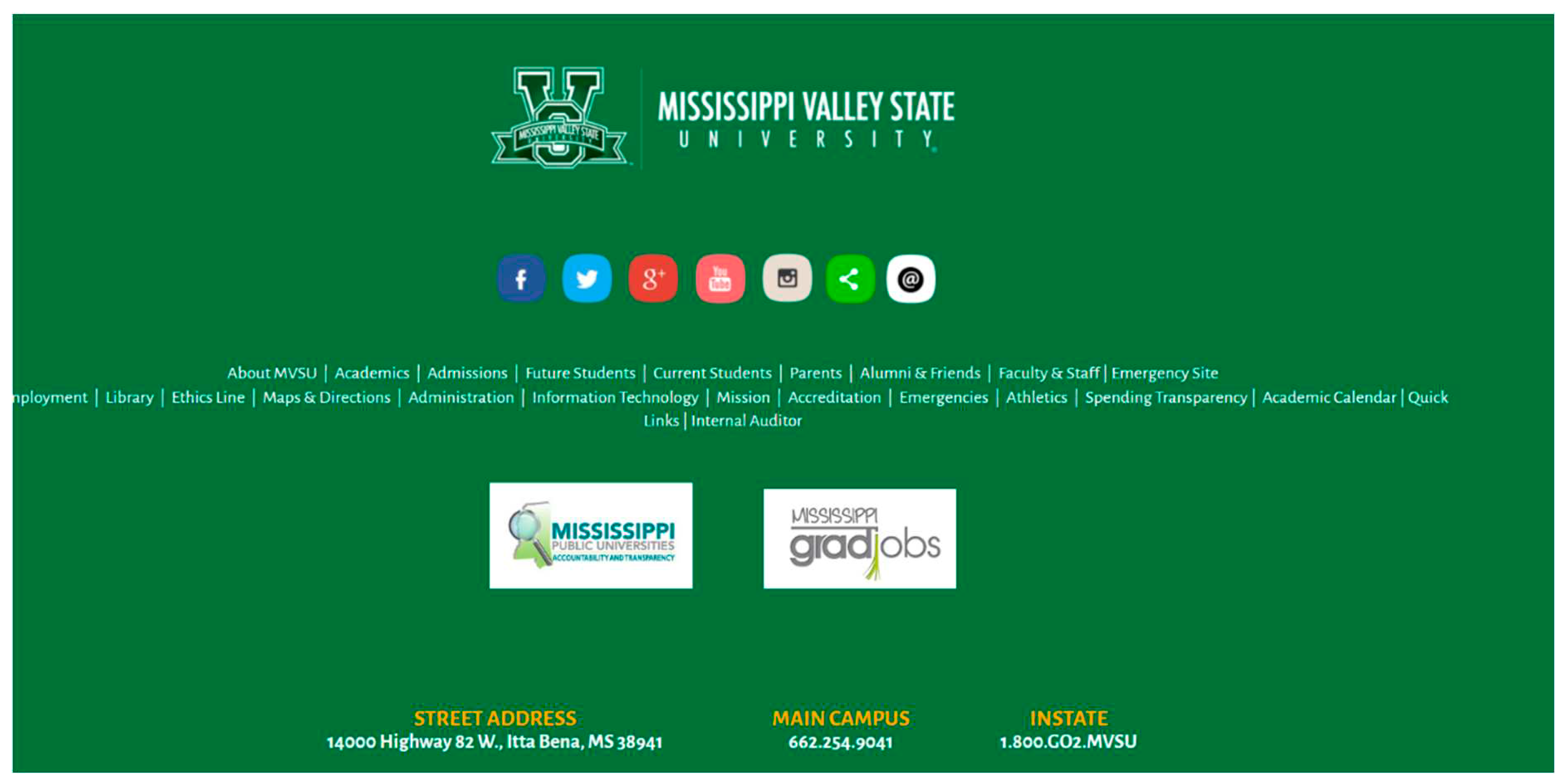
The author thinks that there are too many school links in this module, which will bring confusion to users, and they may not know which link is more useful information. If designers can streamline these links and leave the most useful information, this module will look more concise. At the bottom of the website is a graphic module that can be linked to the school’s Facebook account and Youtobe accounts, as well as the school address and contact number. As shown in the figure,
Figure 16.
The bottom part of the portal website of Mississippi Valley State University.
Figure 16.
The bottom part of the portal website of Mississippi Valley State University.
