Submitted:
17 February 2024
Posted:
19 February 2024
You are already at the latest version
Abstract
Keywords:
1. Introduction
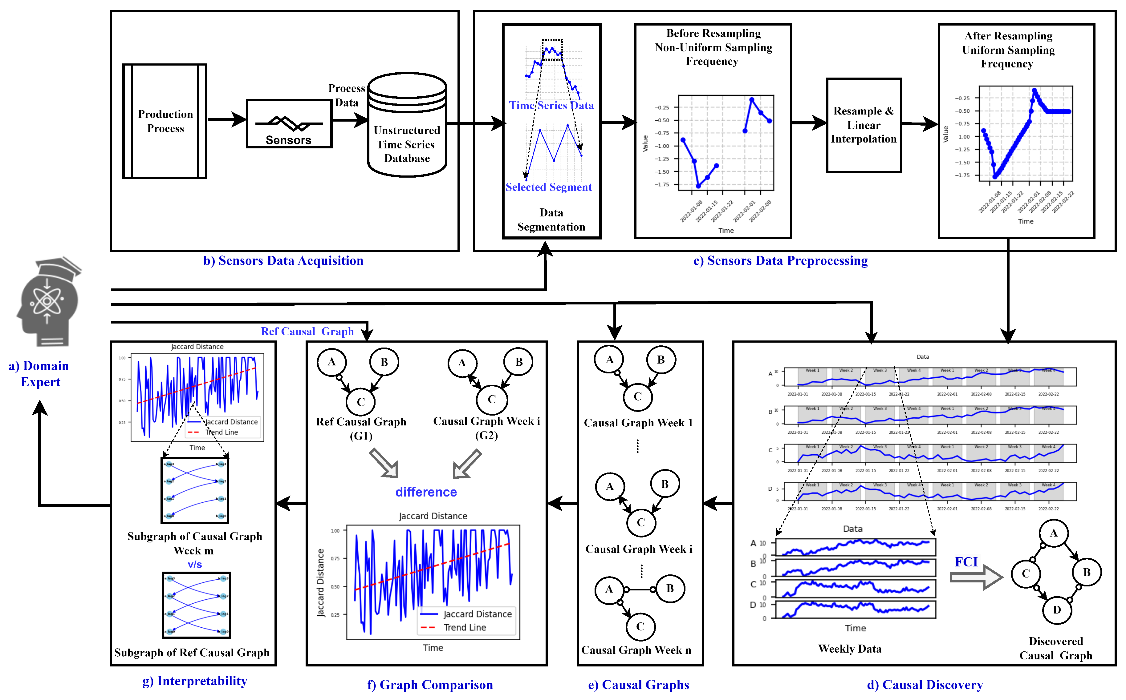
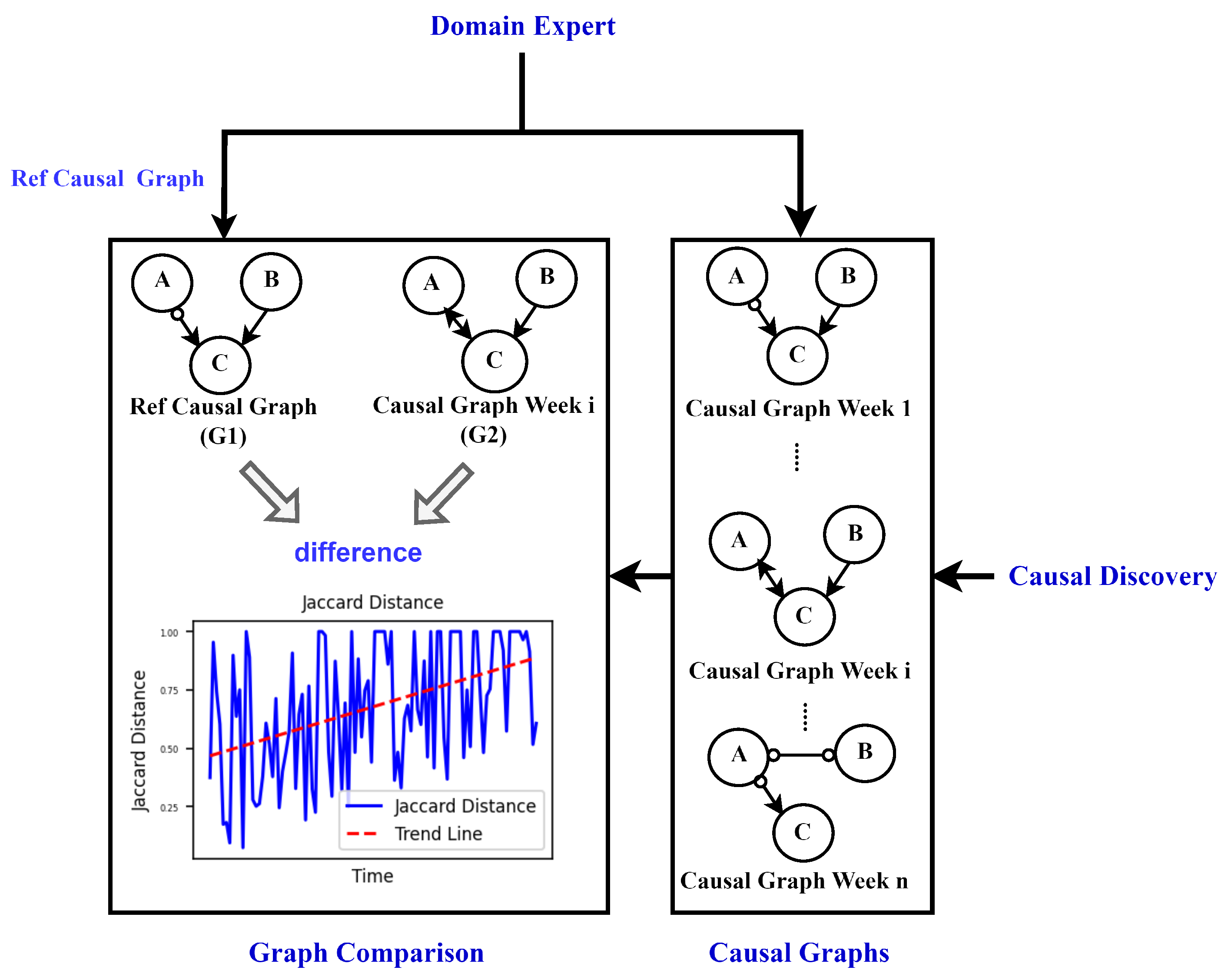
- Propose a novel approach making use of causal discovery, and adapting the FCI algorithm to time series data for tracking degradation processes together with proposed distance measures to quantify these changes
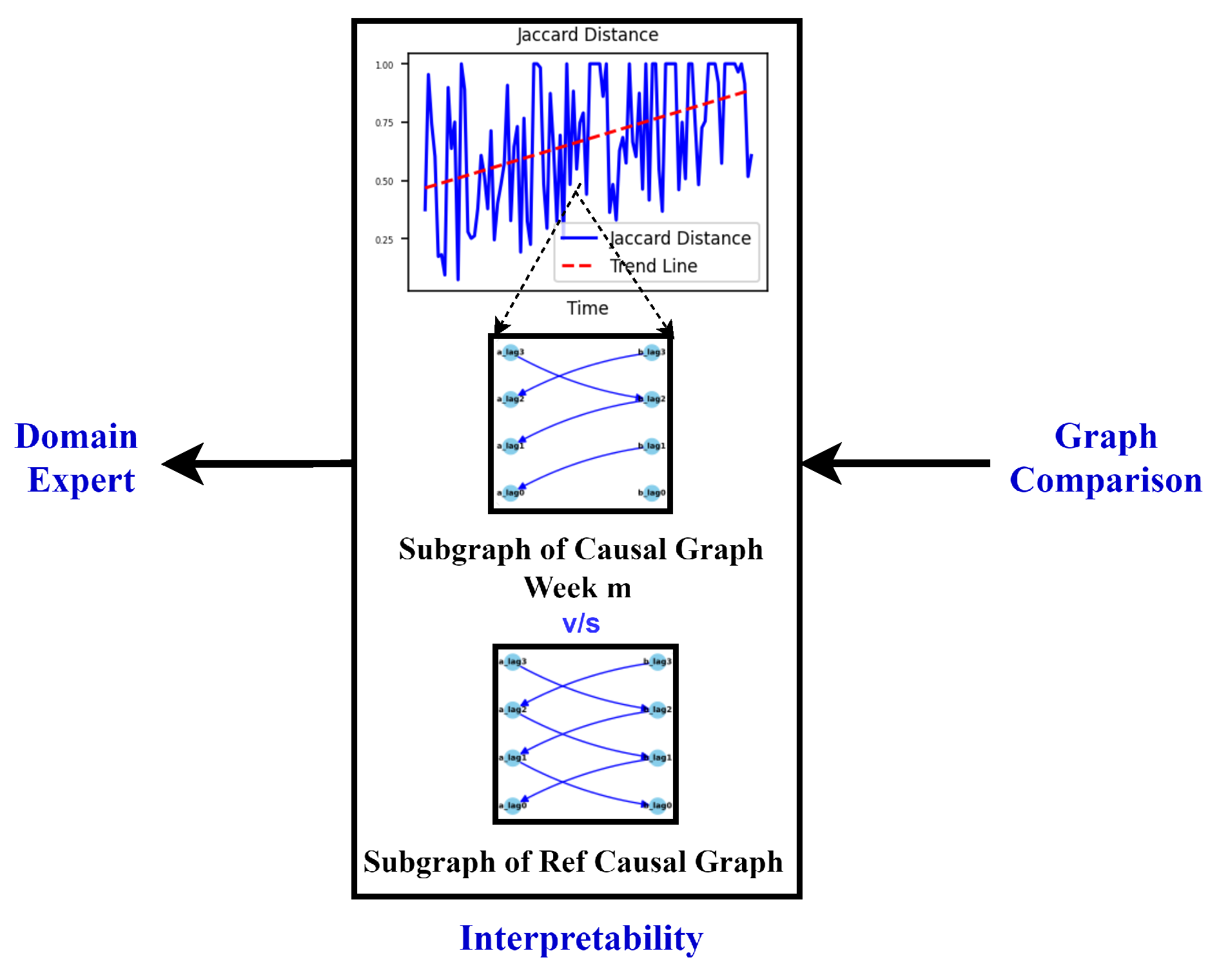
- Developing visualizations to illustrate dynamic changes as a tool for communication with domain experts achieving the goal of interpretable results
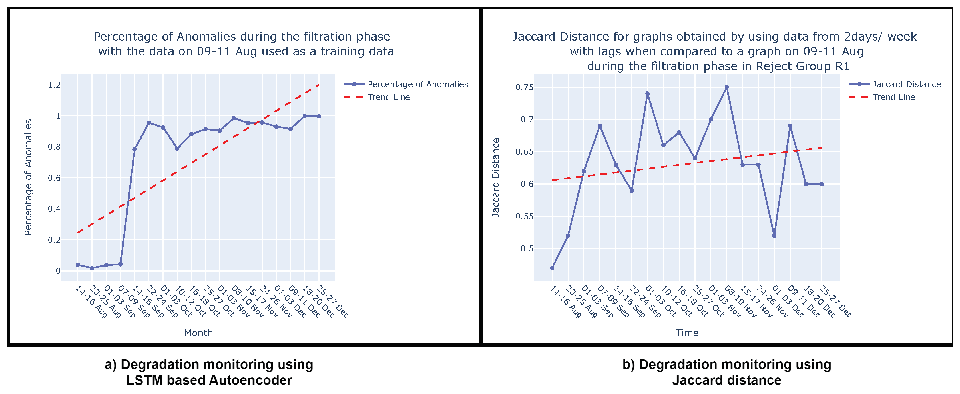
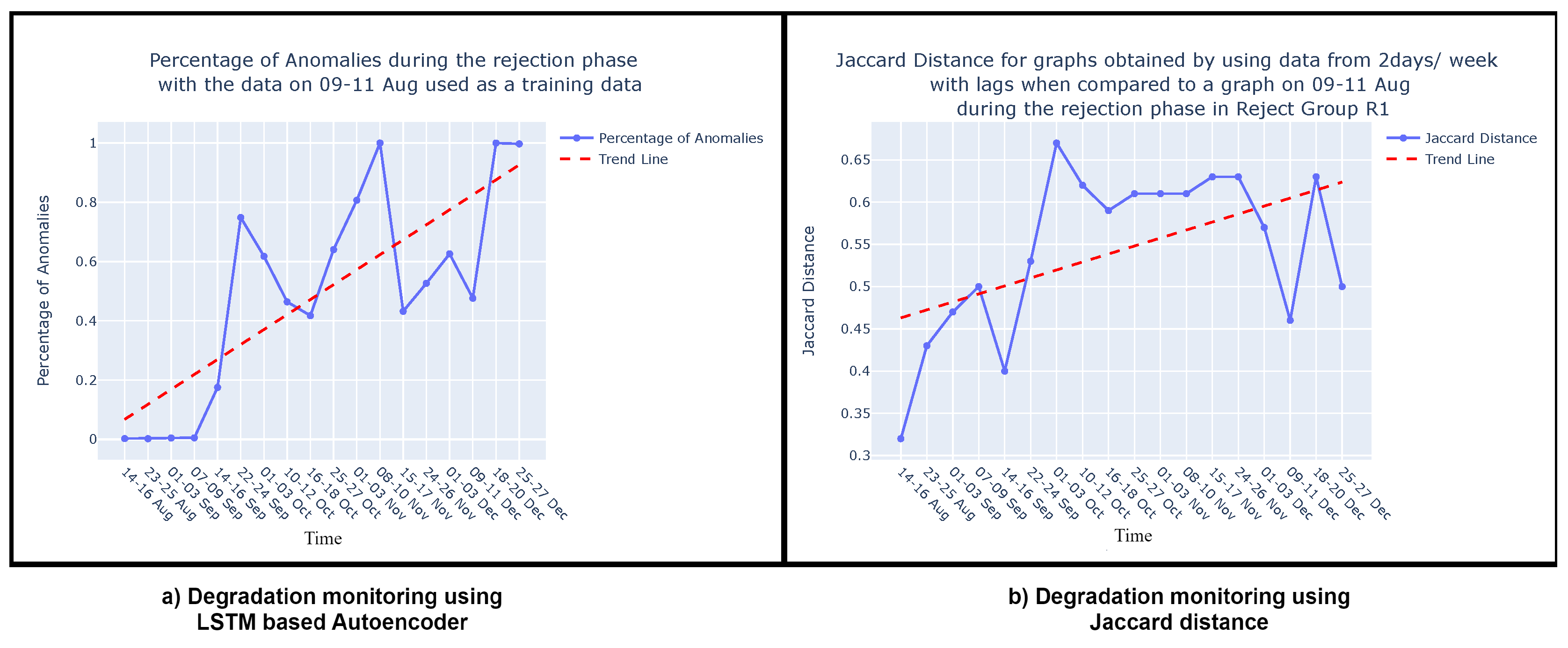
- Comparing our degradation monitoring results with those obtained using the state-of-the-art LSTM-based autoencoder method, which is not considered to be interpretable
2. Related Work
2.1. Approaches to Unsupervised Degradation Monitoring
2.2. Causal Discovery in Manufacturing Industry
2.3. Causal Interpretability
3. Approach
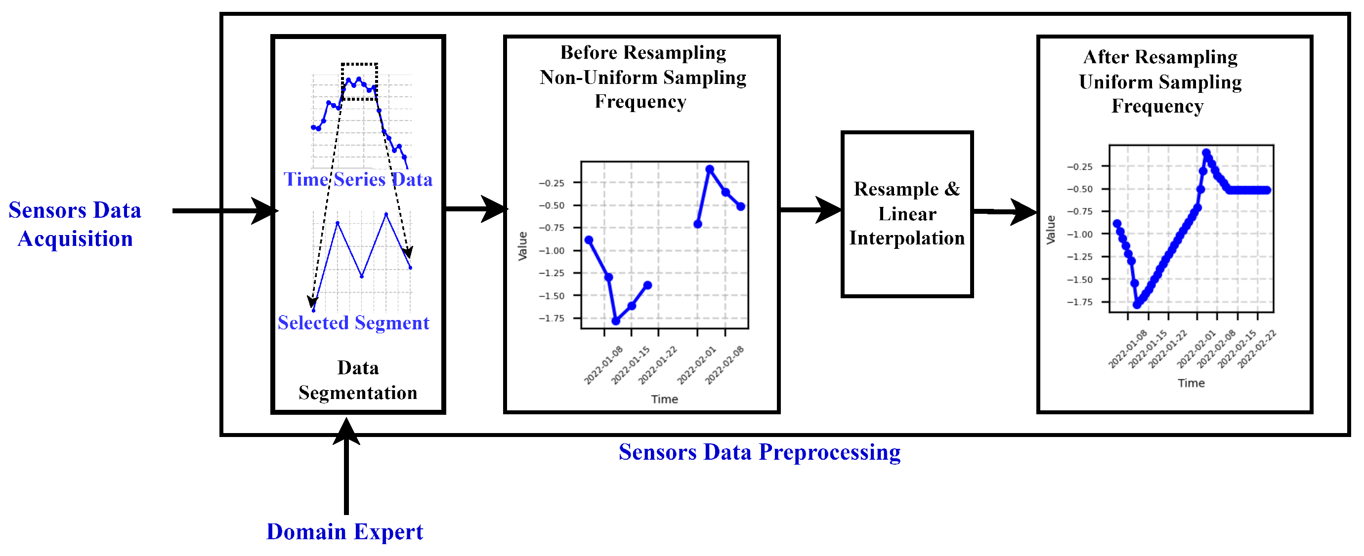
3.1. Data Preprocessing
3.2. Preliminary: Causal discovery
- CD algorithms for independent and and identically distributed (i.i.d.) data i.e. non-time series data
- CD algorithms for time series data
- Independent: Each observation is not influenced by or dependent on any other observation. The occurrence or value of one data point does not affect the occurrence or value of another.
- Identically Distributed: All observations come from the same probability distribution. This implies that underlying statistical properties, such as mean, variance, and other distributional characteristics, do not change.
- Skeleton Construction: PC algorithm begins by constructing an undirected graph, called the skeleton, based on conditional independence tests.
- Conditional Independence Tests: It tests for conditional independence between variables to identify potential causal relationships.
- V-Structure Identification: It identifies V-structures, indicative of potential causal relationships, in the undirected graph.
- Edge Orientation: PC algorithm orients edges in the graph to form a partially directed acyclic graph (PDAG) by exploiting the identified V-structures.
- Initial Setup: Begin with a set of variables or characteristics. This is given as , where X, Y, Z, A, and B are the column vectors representing the variables or features in the data.
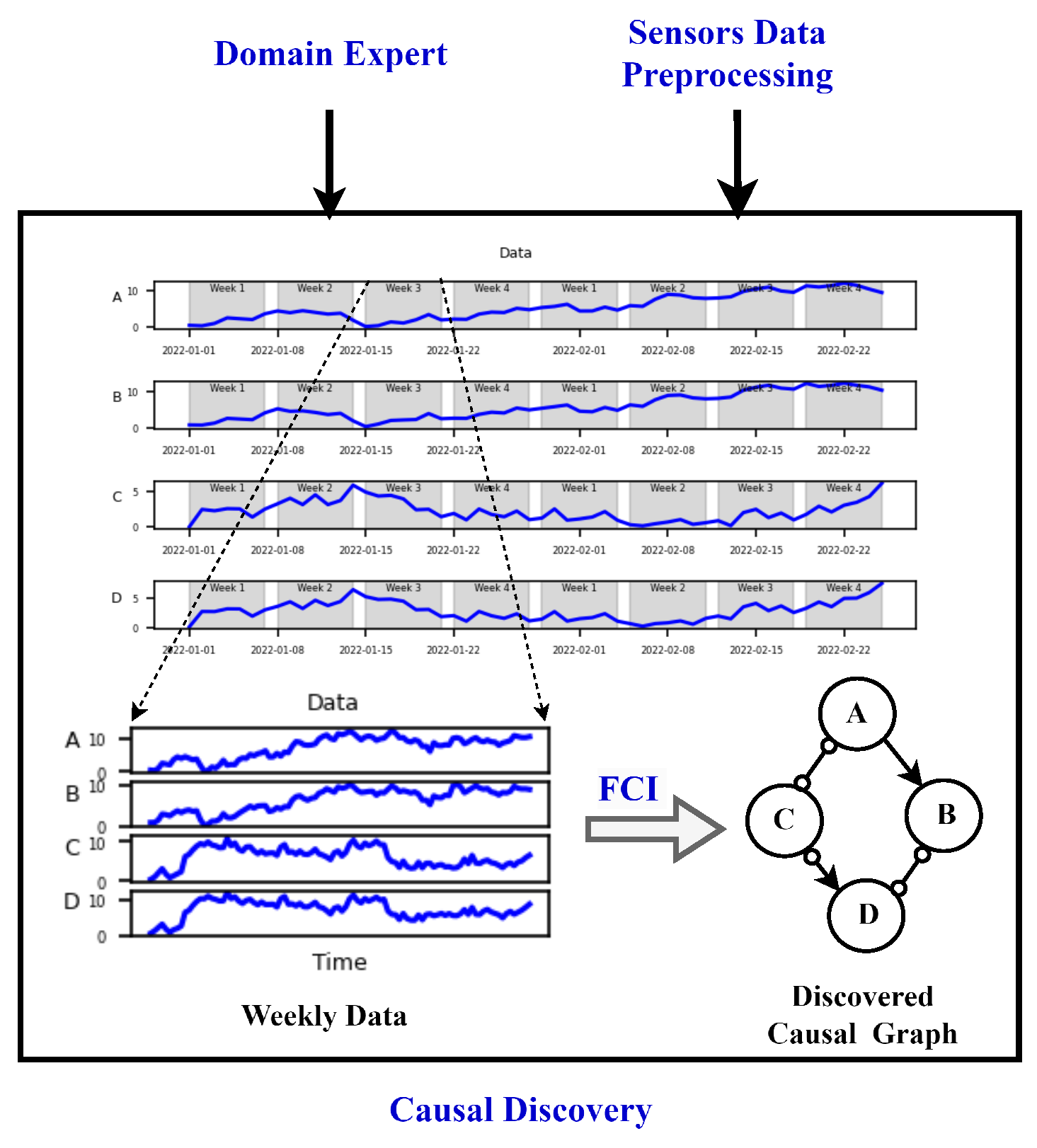
- Data Modification: Modify the data to include lagged versions of the features to capture temporal dependencies. This is given as , representing data with lagged versions of the original features up to 40 lags as additional features.
- Graph Formation: Create a complete undirected graph using the variables as vertices.
- Iterative Process: Test pairs of variables for conditional independence given subsets of other variables. Remove edges between variables that are conditionally independent.
- Graph Orientation: Orient edges based on certain criteria, such as the absence of direct causal influence between certain pairs of variables.
- Edge Removal: Further refine the graph by removing edges between pairs of variables that are d-separated given subsets of other variables.
3.3. Similarity measures
| Algorithm 1 Jaccard similarity and Jaccard distance Calculation [47] |
|
4. Case Study
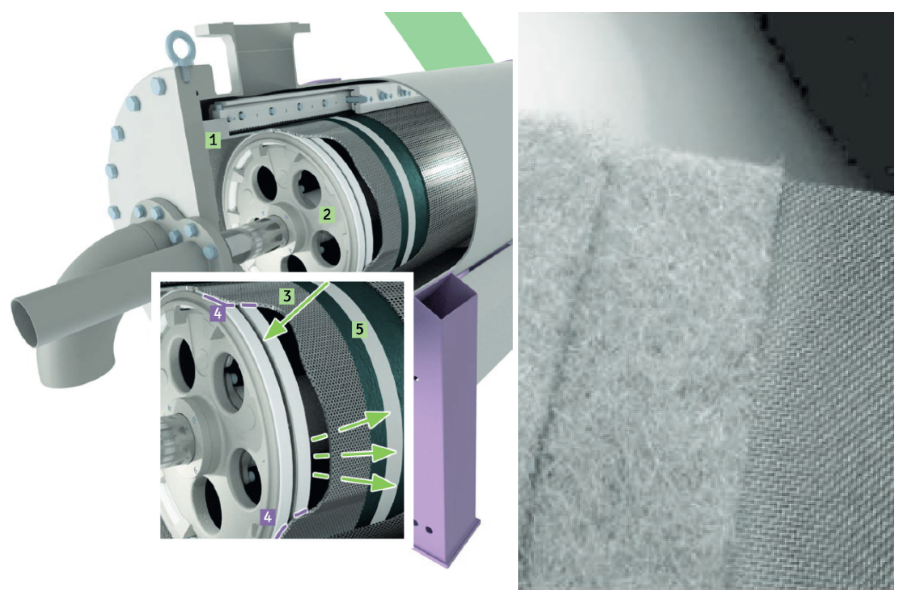
4.1. Process Description
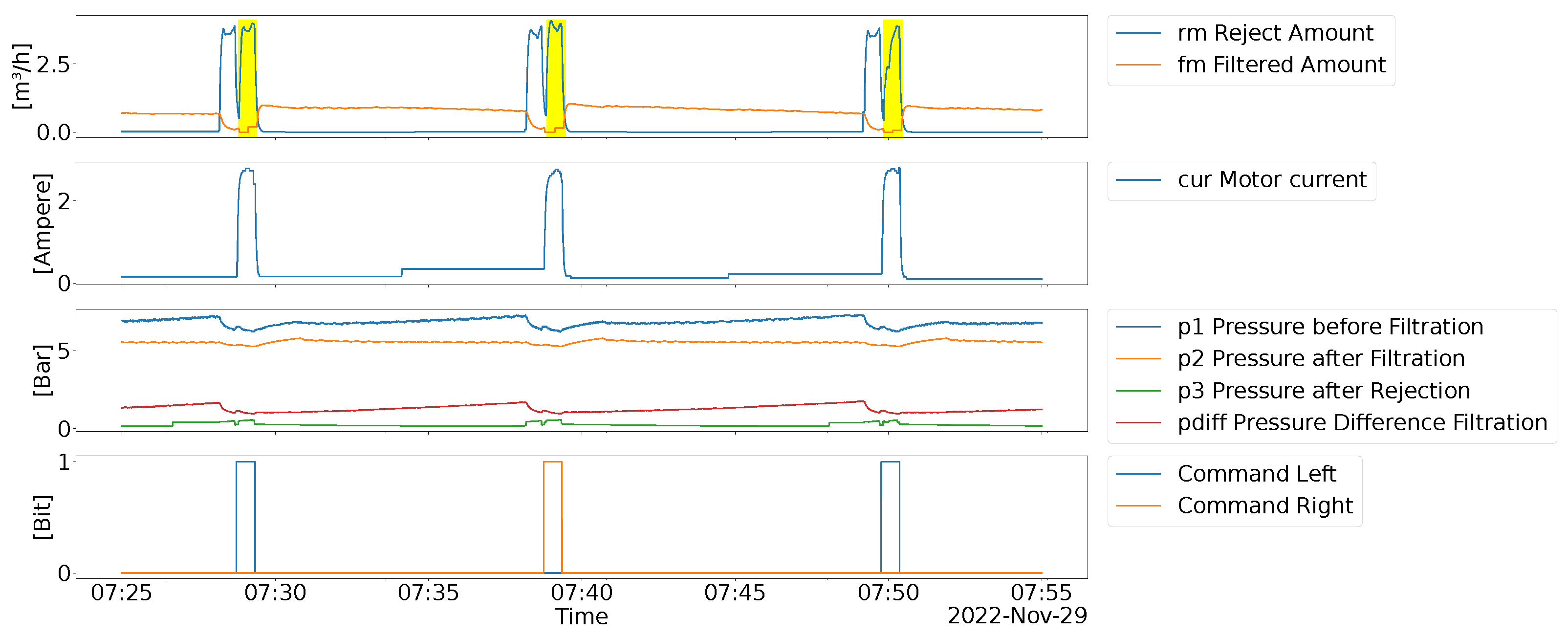
4.2. Data description
4.3. Degradation Monitoring
5. Evaluation
5.1. Procedure and Results
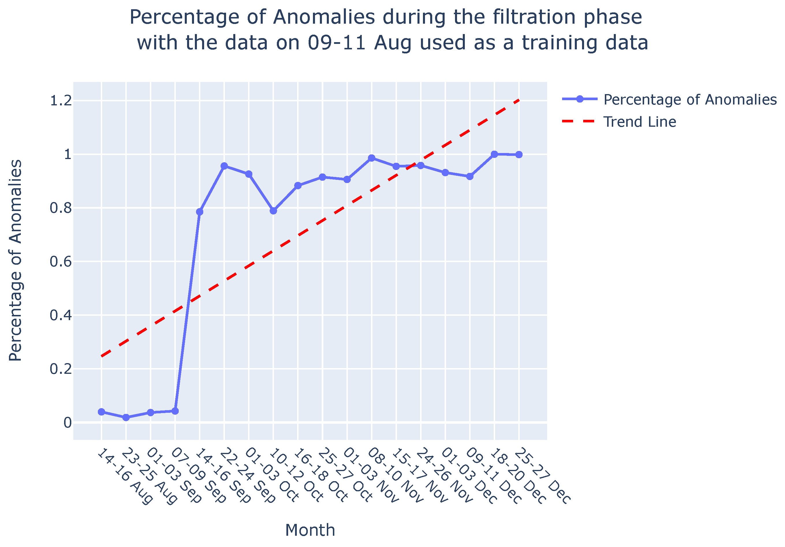
5.2. Discussion
6. Conclusion and Future Scope
Author Contributions
Funding
Acknowledgments
Conflicts of Interest
Appendix A. Degradation Monitoring- Filtration phase
Appendix A.1. Causal Graphs and Reference Causal Graph for filtration phase
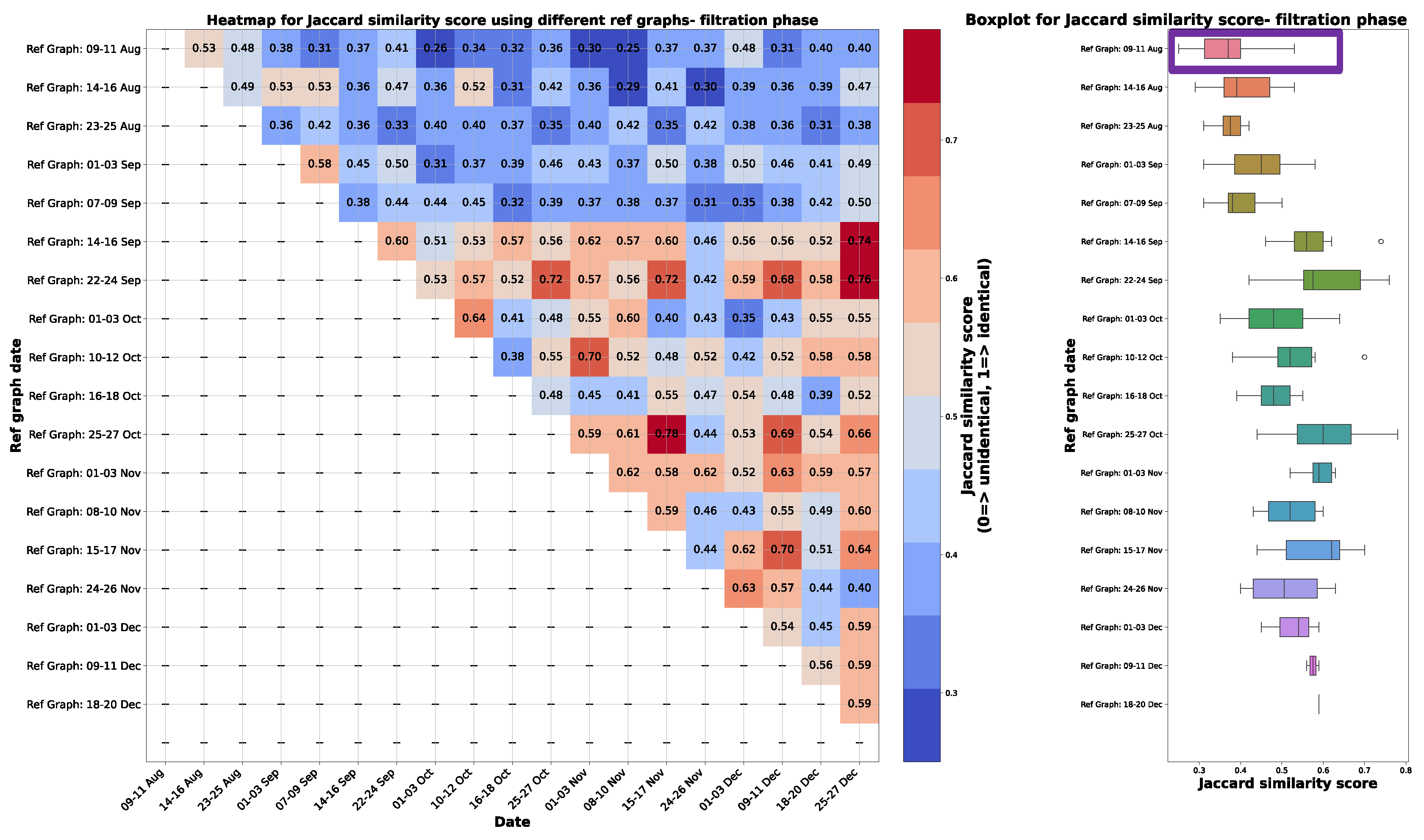
Appendix A.2. Graph comparison
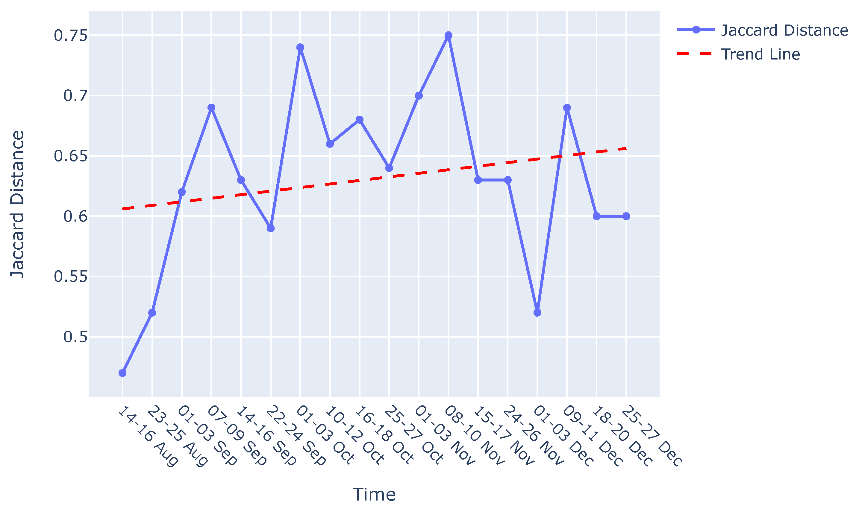
Appendix B. Evaluation- Filtration phase
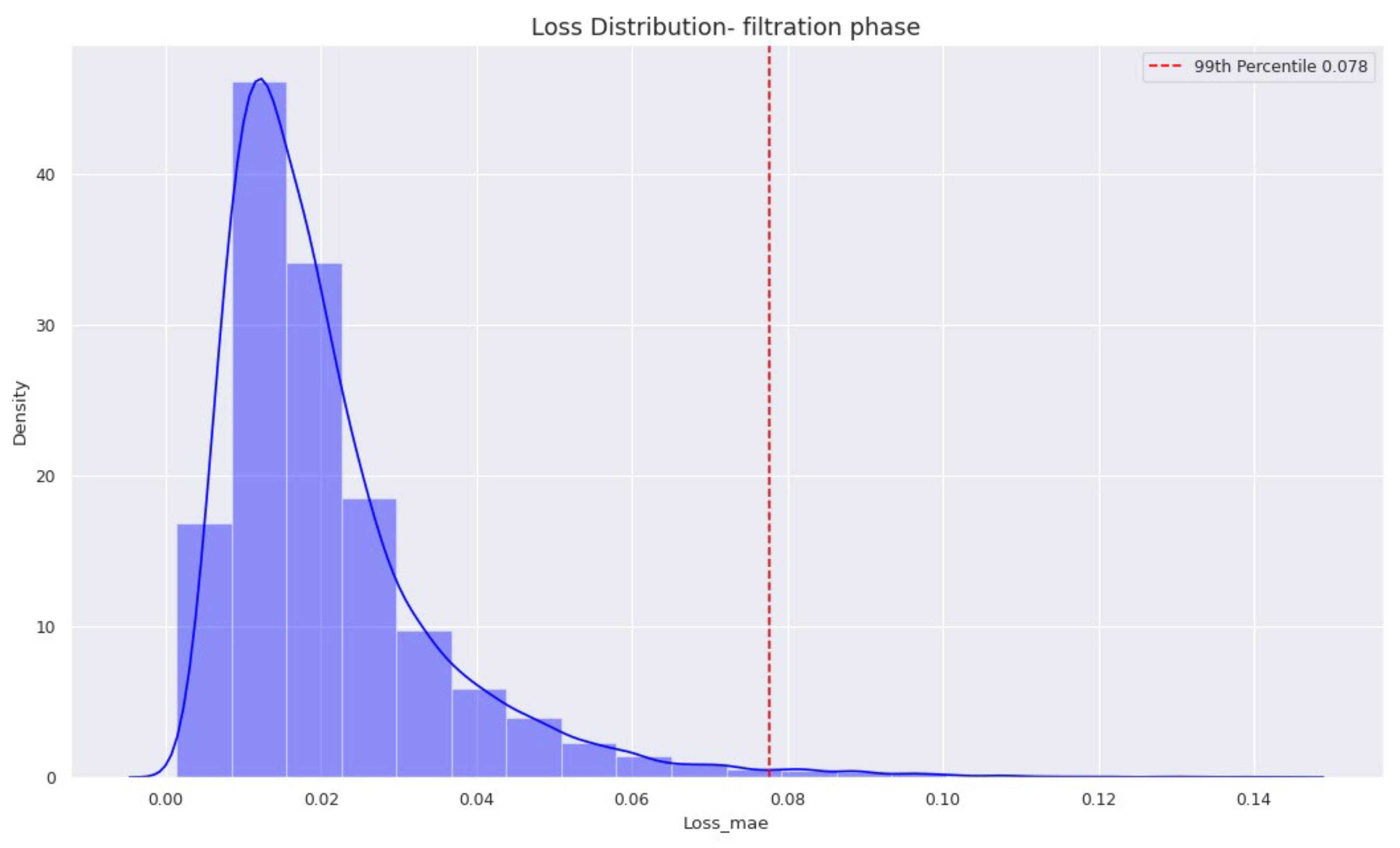
References
- Surucu, O.; Gadsden, S.A.; Yawney, J. Condition Monitoring using Machine Learning: A Review of Theory, Applications, and Recent Advances. Expert Systems with Applications 2023, 221, 119738. [Google Scholar] [CrossRef]
- Glymour, C.; Zhang, K.; Spirtes, P. Review of Causal Discovery Methods Based on Graphical Models. Frontiers in Genetics 2019, 10. [Google Scholar] [CrossRef] [PubMed]
- Amer, M.; Goldstein, M.; Abdennadher, S. Enhancing one-class Support Vector Machines for unsupervised anomaly detection. 2013, pp. 8–15. [CrossRef]
- Diez-Olivan, A.; Pagan Rubio, J.; Nguyen, K.; Sanz, R.; Sierra, B. Kernel-based support vector machines for automated health status assessment in monitoring sensor data. The International Journal of Advanced Manufacturing Technology 2018, 95. [Google Scholar] [CrossRef]
- Li, Z.; Li, X. Fault Detection in the Closed-loop System Using One-Class Support Vector Machine. 2018 IEEE 7th Data Driven Control and Learning Systems Conference (DDCLS) 2018, pp. 251–255.
- Ma, J.; Perkins, S. Time-series novelty detection using one-class support vector machines. Proceedings of the International Joint Conference on Neural Networks, 2003., 2003, Vol. 3, pp. 1741–1745 vol.3. [CrossRef]
- Shawe-Taylor, J.; Žličar, B. Novelty Detection with One-Class Support Vector Machines; 2015; pp. 231–257. [CrossRef]
- Chevrot, A.; Vernotte, A.; Legeard, B. CAE : Contextual Auto-Encoder for multivariate time-series anomaly detection in air transportation. Computers & Security 2022, 116, 102652. [Google Scholar] [CrossRef]
- Tziolas, T.; Papageorgiou, K.; Theodosiou, T.; Papageorgiou, E.; Mastos, T.; Papadopoulos, A. Autoencoders for Anomaly Detection in an Industrial Multivariate Time Series Dataset. Engineering Proceedings 2022, 18. [Google Scholar] [CrossRef]
- Li, G.; Jung, J.J. Deep learning for anomaly detection in multivariate time series: Approaches, applications, and challenges. Inf. Fusion 2023, 91, 93–102. [Google Scholar] [CrossRef]
- González-Muñiz, A.; Díaz, I.; Cuadrado, A.A.; García-Pérez, D. Health indicator for machine condition monitoring built in the latent space of a deep autoencoder. Reliability Engineering & System Safety 2022, 224, 108482. [Google Scholar] [CrossRef]
- Hasani, R.; Wang, G.; Grosu, R. A Machine Learning Suite for Machine Components’ Health-Monitoring. Proceedings of the AAAI Conference on Artificial Intelligence 2019, 33, 9472–9477. [Google Scholar] [CrossRef]
- Choi, K.; Yi, J.; Park, C.; Yoon, S. Deep Learning for Anomaly Detection in Time-Series Data: Review, Analysis, and Guidelines. IEEE Access 2021, PP, 1–1. [Google Scholar] [CrossRef]
- Tran, K.P.; Nguyen, H.D.; Thomassey, S. Anomaly detection using Long Short Term Memory Networks and its applications in Supply Chain Management. IFAC-PapersOnLine 2019, 52, 2408–2412, 9th IFAC Conference on Manufacturing Modelling, Management and Control MIM 2019. [Google Scholar] [CrossRef]
- Hsieh, R.J.; Chou, J.; Ho, C.H. Unsupervised Online Anomaly Detection on Multivariate Sensing Time Series Data for Smart Manufacturing. 2019 IEEE 12th Conference on Service-Oriented Computing and Applications (SOCA), 2019, pp. 90–97. [CrossRef]
- Abbracciavento, F.; Formentin, S.; Balocco, J.; Rota, A.; Manzoni, V.; Savaresi, S.M. Anomaly detection via distributed sensing: a VAR modeling approach. IFAC-PapersOnLine 2021, 54, 85–90, 19th IFAC Symposium on System Identification SYSID 2021. [Google Scholar] [CrossRef]
- Diao, W.; Naqvi, I.H.; Pecht, M. Early detection of anomalous degradation behavior in lithium-ion batteries. Journal of Energy Storage 2020, 32, 101710. [Google Scholar] [CrossRef]
- Mejri, N.; Lopez-Fuentes, L.; Roy, K.; Chernakov, P.; Ghorbel, E.; Aouada, D. Unsupervised Anomaly Detection in Time-series: An Extensive Evaluation and Analysis of State-of-the-art Methods, 2023, [arXiv:cs.LG/2212.03637].
- Bi, X.; Wu, D.; Xie, D.; Ye, H.; Zhao, J. Large-scale chemical process causal discovery from big data with transformer-based deep learning. Process Safety and Environmental Protection 2023, 173, 163–177. [Google Scholar] [CrossRef]
- Mehling, C.W.; Pieper, S.; Ihlenfeldt, S. Concept of a causality-driven fault diagnosis system for cyber-physical production systems. 2023 IEEE 21st International Conference on Industrial Informatics (INDIN), 2023, pp. 1–8. [CrossRef]
- Xu, Z.; Dang, Y. Data-driven causal knowledge graph construction for root cause analysis in quality problem solving. International Journal of Production Research 2023, 61, 3227–3245. [Google Scholar] [CrossRef]
- Wang, H.; Xu, Y.; Peng, T.; Agbozo, R.S.K.; Xu, K.; Liu, W.; Tang, R. Two-stage approach to causality analysis-based quality problem solving for discrete manufacturing systems. Journal of Engineering Design 2023, 0, 1–25. [Google Scholar] [CrossRef]
- Vuković, M.; Thalmann, S. Causal discovery in manufacturing: A structured literature review. Journal of Manufacturing and Materials Processing 2022, 6, 10. [Google Scholar] [CrossRef]
- Ahang, M.; Charter, T.; Ogunfowora, O.; Khadivi, M.; Abbasi, M.; Najjaran, H. Intelligent Condition Monitoring of Industrial Plants: An Overview of Methodologies and Uncertainty Management Strategies. arXiv preprint arXiv:2401.10266 2024. [Google Scholar]
- Wuest, T.; Weimer, D.; Irgens, C.; Thoben, K.D. Machine learning in manufacturing: advantages, challenges, and applications. Production & Manufacturing Research 2016, 4, 23–45. [Google Scholar]
- Moraffah, R.; Karami, M.; Guo, R.; Raglin, A.; Liu, H. Causal interpretability for machine learning-problems, methods and evaluation. ACM SIGKDD Explorations Newsletter 2020, 22, 18–33. [Google Scholar] [CrossRef]
- Saeed, W.; Omlin, C. Explainable AI (XAI): A systematic meta-survey of current challenges and future opportunities. Knowledge-Based Systems 2023, 263, 110273. [Google Scholar] [CrossRef]
- Galhotra, S.; Pradhan, R.; Salimi, B. Explaining black-box algorithms using probabilistic contrastive counterfactuals. Proceedings of the 2021 International Conference on Management of Data, 2021, pp. 577–590.
- Chattopadhyay, A.; Manupriya, P.; Sarkar, A.; Balasubramanian, V.N. Neural Network Attributions: A Causal Perspective. Proceedings of the 36th International Conference on Machine Learning; Chaudhuri, K.; Salakhutdinov, R., Eds. PMLR, 2019, Vol. 97, Proceedings of Machine Learning Research, pp. 981–990.
- Harradon, M.; Druce, J.; Ruttenberg, B.E. Causal Learning and Explanation of Deep Neural Networks via Autoencoded Activations. CoRR 2018, abs/1802.00541, [1802.00541].
- Parafita, Á.; Vitrià, J. Explaining visual models by causal attribution. 2019 IEEE/CVF International Conference on Computer Vision Workshop (ICCVW). IEEE, 2019, pp. 4167–4175.
- Narendra, T.; Sankaran, A.; Vijaykeerthy, D.; Mani, S. Explaining Deep Learning Models using Causal Inference. CoRR 2018, abs/1811.04376, [1811.04376].
- Wachter, S.; Mittelstadt, B.; Russell, C. Counterfactual explanations without opening the black box: Automated decisions and the GDPR. Harv. JL & Tech. 2017, 31, 841. [Google Scholar]
- Grath, R.M.; Costabello, L.; Van, C.L.; Sweeney, P.; Kamiab, F.; Shen, Z.; Lecue, F. Interpretable Credit Application Predictions With Counterfactual Explanations, 2018, [arXiv:cs.AI/1811.05245].
- Mothilal, R.K.; Sharma, A.; Tan, C. Explaining machine learning classifiers through diverse counterfactual explanations. Proceedings of the 2020 Conference on Fairness, Accountability, and Transparency. ACM, 2020, FAT* ’20. [CrossRef]
- Moore, J.; Hammerla, N.; Watkins, C. Explaining Deep Learning Models with Constrained Adversarial Examples, 2019, [arXiv:cs.LG/1906.10671].
- Xu, G.; Duong, T.D.; Li, Q.; Liu, S.; Wang, X. Causality learning: A new perspective for interpretable machine learning. arXiv preprint arXiv:2006.16789 2020. [Google Scholar]
- Zanga, A.; Stella, F. A Survey on Causal Discovery: Theory and Practice, 2023, [arXiv:cs.AI/2305.10032].
- Assaad, C.K.; Devijver, E.; Gaussier, E. Survey and Evaluation of Causal Discovery Methods for Time Series. J. Artif. Int. Res. 2022, 73. [Google Scholar] [CrossRef]
- Hasan, U.; Hossain, E.; Gani, M.O. A Survey on Causal Discovery Methods for I.I.D. and Time Series Data, 2023, [arXiv:cs.AI/2303.15027].
- Arafeh, M.; Hammoud, A.; Otrok, H.; Mourad, A.; Talhi, C.; Dziong, Z. Independent and Identically Distributed (IID) Data Assessment in Federated Learning. GLOBECOM 2022 - 2022 IEEE Global Communications Conference, 2022, pp. 293–298. [CrossRef]
- Dafoe, A.; Zhang, B.; Caughey, D. Confounding in survey experiments. Annual Meeting of The Society for Political Methodology, University of Rochester, Rochester, NY, July, 2015, Vol. 23.
- Wang, J.; Dong, Y. Measurement of Text Similarity: A Survey. Information 2020, 11. [Google Scholar] [CrossRef]
- Varma, S.; Shivam, S.; Thumu, A.; Bhushanam, A.; Sarkar, D. Jaccard Based Similarity Index in Graphs: A Multi-Hop Approach. 2022 IEEE Delhi Section Conference (DELCON), 2022, pp. 1–4. [CrossRef]
- Cheng, L.; Guo, R.; Moraffah, R.; Sheth, P.; Candan, K.S.; Liu, H. Evaluation Methods and Measures for Causal Learning Algorithms, 2022, [arXiv:cs.LG/2202.02896].
- Shen, X.; Ma, S.; Vemuri, P.; Simon, G.; Alzheimer’s Disease Neuroimaging Initiative. Challenges and opportunities with causal discovery algorithms: Application to Alzheimer’s pathophysiology. Sci. Rep. 2020, 10, 2975. [Google Scholar] [CrossRef]
- Niwattanakul, S.; Singthongchai, J.; Naenudorn, E.; Wanapu, S. Using of Jaccard Coefficient for Keywords Similarity. 2013.


Disclaimer/Publisher’s Note: The statements, opinions and data contained in all publications are solely those of the individual author(s) and contributor(s) and not of MDPI and/or the editor(s). MDPI and/or the editor(s) disclaim responsibility for any injury to people or property resulting from any ideas, methods, instructions or products referred to in the content. |
© 2024 by the authors. Licensee MDPI, Basel, Switzerland. This article is an open access article distributed under the terms and conditions of the Creative Commons Attribution (CC BY) license (http://creativecommons.org/licenses/by/4.0/).


