1. Introduction
This article is based on prior research[
1] that focuses on the visualization of atmospheric environments within the innovative Environmental Impact Assessment (EIA) visualize tools developed by Gaia3D Inc., a South Korean corporation. This article extends upon the visualization of air flow data covered in previous research by additionally presenting the processing aspect of atmospheric dispersion data.
EIA is a decision-making process designed to help evaluate the potential environmental impacts of a proposed project or development[
2]. EIA process is designed to review, predict, and evaluate potential environmental impacts before the final confirmation of a project plan, enabling the development of strategies to prevent or minimize potential negative impacts on the environment. The legal and institutional processes of EIA may vary by country, but it is equally important to verify whether the predicted impacts have occurred and whether the proposed mitigation measures have been implemented.
During the initial stages of the EIA, it is imperative to undergo a decision-making process facilitated by community participation, aimed at achieving a sustainable environment[
3]. This involves gathering diverse opinions through public hearings and proposal processes between developers and relevant organizations associated with the development site. However, within this process, there are several limitations that could hinder communication between stakeholders. Which is in EIA, experts often present results of environmental impacts prediction to the stakeholders using text along with numerical tables or static pictures with full of technical terms. Many stakeholders, such as the public, developers, administrators, and engineers, are involved in the decision-making process, and the role and participation of the public are particularly important in EIA[
4]. However, the public may find it difficult to fully understand the details of the project under consideration due to a lack of expertise in the environment and engineering involved. This lack of understanding can lead to serious miscommunication among stakeholders, inefficient decision-making, and unintended project outcomes. To address this, tools are needed that make predictive results related to EIA easily understandable by the public[
4]. When these tools are used in the public review stage of a project, citizens can better understand the potential environmental impacts of the development project. In this respect, the use of appropriate data visualization methods, such as maps, charts, and simulations, can enhance the delivery of information on environmental topics[
5], which is beneficial. Particularly for environmental impact elements that are hard to verify with the naked eye, such as noise, wind flow, ground vibration, and air quality, this kind of visualization technique is even more critical because it can provide prediction results in a way that is easy to understand even for non-experts.
In this context, Digital Twin technologies offer numerous benefits to stakeholders by simulating and visualizing development projects before and after their implementation in a virtual environment[
6,
7]. In this paper, we focus on the impact assessment of the atmospheric sector, one of the six areas evaluated in South Korea’s EIA system, which include the natural ecological environment, atmospheric environment, water environment, land environment, living environment, and socio-economic environment[
8]. Specifically, we aim to present methods for the visualization of air flow analysis using 3D digital twin technology to make the invisible air flow visible through programming, along with the data processing techniques employed. This approach seeks to enhance the understanding and management of atmospheric impacts within the framework of environmental impact assessments.
The structure of this paper is divided into three main sections: the background of the research, the presentation of the solution, and the results constructed through the digital twin system. In
Section 2, Background of the Research, we examine the existing technologies for representing air flow as a web service and their limitations. Issues related to the volume of data collected during the EIA process and the challenges encountered during the visualization process are addressed.
Section 3, Solution Method, presents solutions to overcome the constraints of representing air flow identified in
Section 2. This section elucidates the approach devised to address the highlighted issues effectively. In
Section 4, Results and Conclusion, the outcomes concerning the visualization of air flow are presented and discussed. This section summarizes the findings of the study and discusses the implications of the digital twin system’s application in enhancing the understanding and representation of air flow within the context of Environmental Impact Assessments.
2. Background of the Research
In the field of EIA for air quality, visualization encompasses areas such as mapping of pollution sources, air quality data visualization, air quality modeling, visualization of wind speed and direction, and charting for reports[
8]. In digital twin-based data visualization, modeling air quality data and its flow in a three-dimensional space requires efficiently handling a large volume of data and adapting it for easy user comprehension.
2.1. Air Quality/Odor Flow Model Data
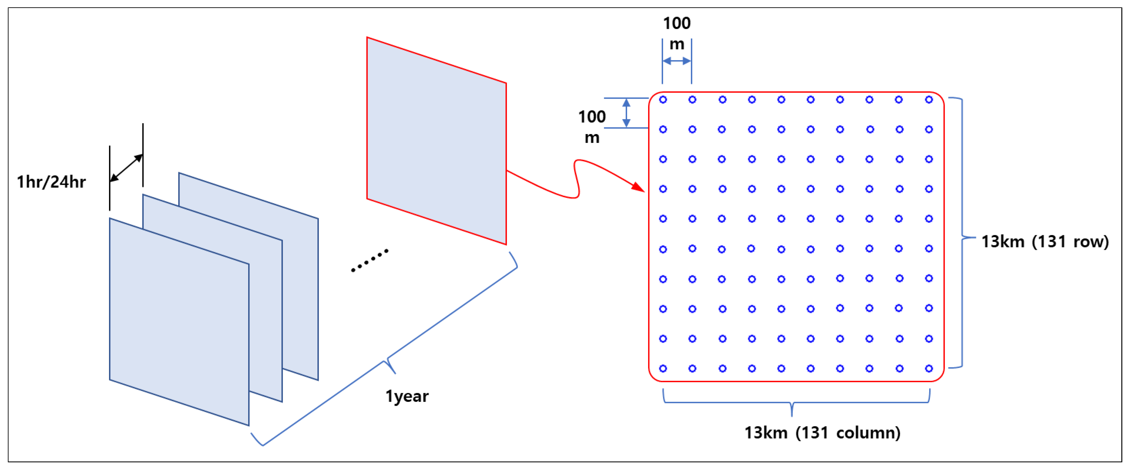
The sample data for this research was obtained from a company named NineEco, involving records from an area undergoing an Environmental Impact Assessment (EIA). The spatial extent of the data covers an area of 13km x 13km, and the temporal range spans one year, utilizing atmospheric environmental observation modeling data produced on an hourly basis throughout the year. The quality of the air was recorded at grid points spaced 100m apart, totaling 17,161 data points, collected in a time series on an hourly basis (
Figure 1). The amount of data for one substance at one site for one hour is approximately 100 bytes. Such planar layers were constructed for seven height segments (ground surface-0m, 10m, 20m, 30m, 60m, 100m, 200m) to facilitate the analysis of 3D spatial data.
The volume of data constructed in this manner is quite large, necessitating the transmission and processing of 4.45GB of data to visualize a year's worth of data in three-dimensional space through animation. When operating over a web service, server and data communication mean that users attempting to view this via a web browser would face a waiting time of nearly 15 minutes, posing a significant issue. Addressing this problem is crucial for facilitating smooth evaluation and information sharing within the EIA process.
2.2. Visualizing a Particle Floating
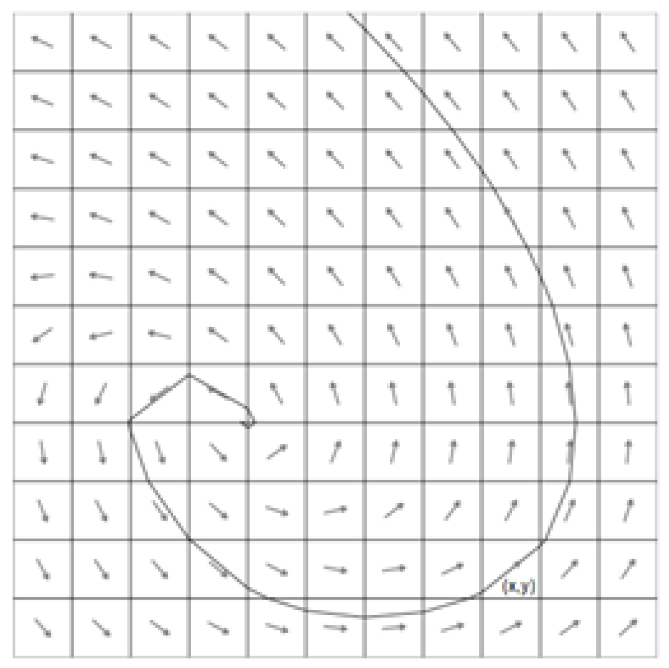
Visualizing a particle floating in a particular wind field means that the particle is moving along the vector field's streamline. The schematic representation of a vector field of wind data and its streamline is shown in
Figure 2.
The method to visualize wind field on 2D map in a web browser is already an existing technique. The key to the existing method on 2D map is to create animation frames by separately generating images for spatial information and images for the trajectory of wind flow marker and then mixing them.
The advantage of the existing 2D technology is that the process of mixing memory that composes the image at an array level is quick, making it a suitable approach for web services with performance limitations. However, it is quite difficult to apply this technology to 3D digital twins. This is because the third dimension introduces an additional height axis (z-axis), making it difficult to easily produce images for wind flow markers[
9]. Even if we were to produce images for wind flow markers, because it is an image fusion method, whenever screen manipulation (screen movement, zooming in, zooming out, changing camera direction, etc.) occurs, we would need to reset the existing screen, create new images for the wind flow markers, and redraw the screen. In other words, every time screen manipulation occurs, the continuity of the wind flow marker's animation effect is not guaranteed.
To animate the flow of wind on 3D spatial information, the existing 2D visualization technology cannot be utilized. Instead, it must be implemented by directly drawing symbols into each animation frame[
9]. However, the task of calculating and updating new positions for the N number of wind symbols that will be visualized on the screen for each animation frame requires significant computational power. Hence, it is typically impossible to implement this in web services with resource constraints using conventional methods. Therefore, we devised a method for executing wind flow symbol animation by leveraging the high-speed computational capabilities of graphic cards.
3. Solution Method
3.1. Air Quality/Odor Prediction Model Data Optimize Using PNG Encoding
As mentioned in
Section 2.1, due to the issues with the size of air quality/odor data, a method was devised to optimize the data for service delivery.
The exploration culminated in the decision to employ the Portable Network Graphics (PNG) format for the web-based visualization of air quality and odor data, predicated on the following 4 rationales:
Air quality and odor data, structured as grid data with concentration values assigned to regular grid points, logically parallels the data structure in image files where each pixel represents RGBA (Red, Green, Blue, Alpha for transparency) values. This structural congruency suggests a seamless transformation of air quality data into an image-based format[
10].
A single pixel in a PNG image file, described by a 4-byte unsigned integer, can encapsulate an 8-byte floating number through value coding, enabling the storage of concentration values within each pixel's data structure.
Given the lossless compression supported by PNG[
10], converting air quality and odor data into this image format facilitates further data compression, significantly reducing the overall data size while preserving the integrity of the original data.
The widespread adoption of the PNG format in web services, combined with its direct compatibility with graphics processing units (GPUs) without the need for additional encoding or decoding processes, enhances the efficiency of data binding—defined as the uploading of data from the CPU/RAM to the GPU/VRAM spaces—and simplifies its integration into existing web infrastructure.
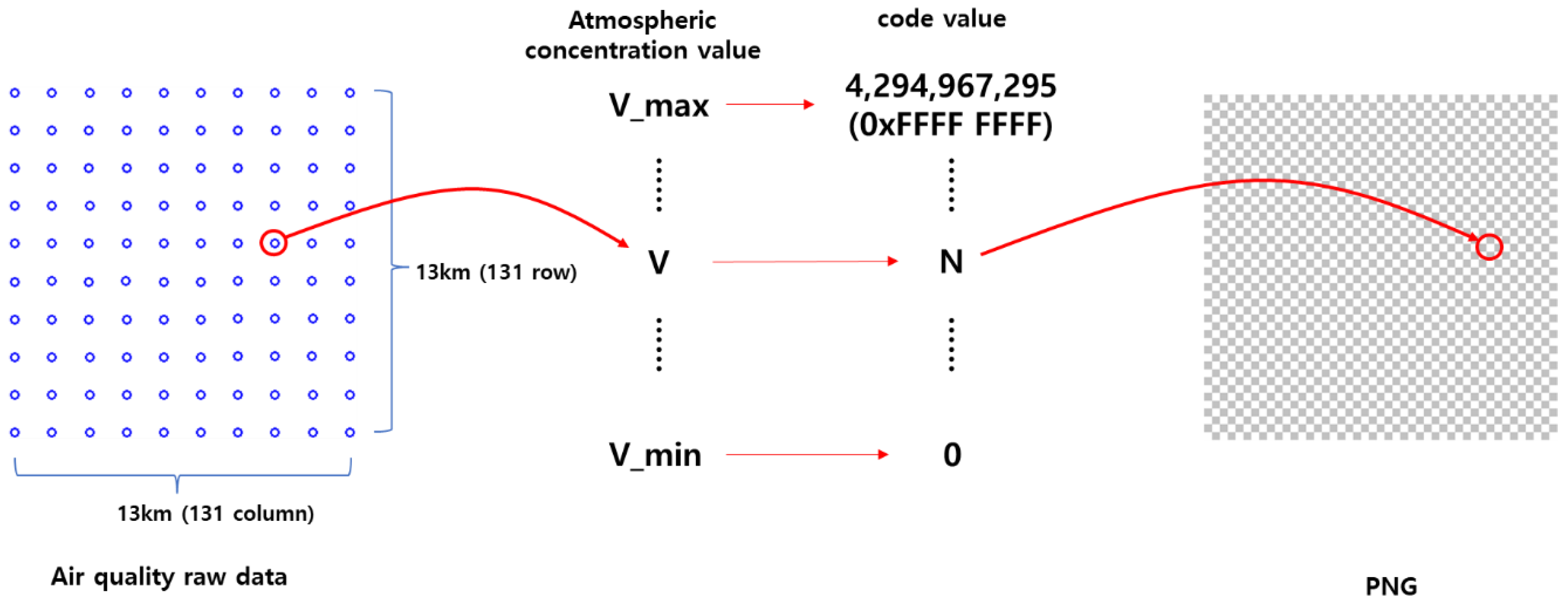
The execution of code value mapping, through which the data's minimum and maximum concentration values are mapped to the integer range between 0 and 0xFFFFFFFF (decimal 4,294,967,295) and interpolated to the nearest integer for intermediate values, enabled the production of a PNG file representing a single time slice of seven layers of data (
Figure 4). This process resulted in a drastic reduction of the original data size from 4.45GB to 65.5MB (0.0655GB), amounting to a mere 1.5% of the original volume.
3.2. Wind Flow Marker Animation
The method explained here refers to a visualization technique that represents moving particle animation based on wind field data to depict the flow of wind on a 3D digital twin, utilizing the computational capabilities of the graphics card to simulate particles floating in the air which mentioned in
Section 2.2. A wind flow symbol is a type of symbol that visualizes air particles floating in the wind to represent the wind's flow in animation. By attaching a tail to the particles, the afterimage effect is enhanced.
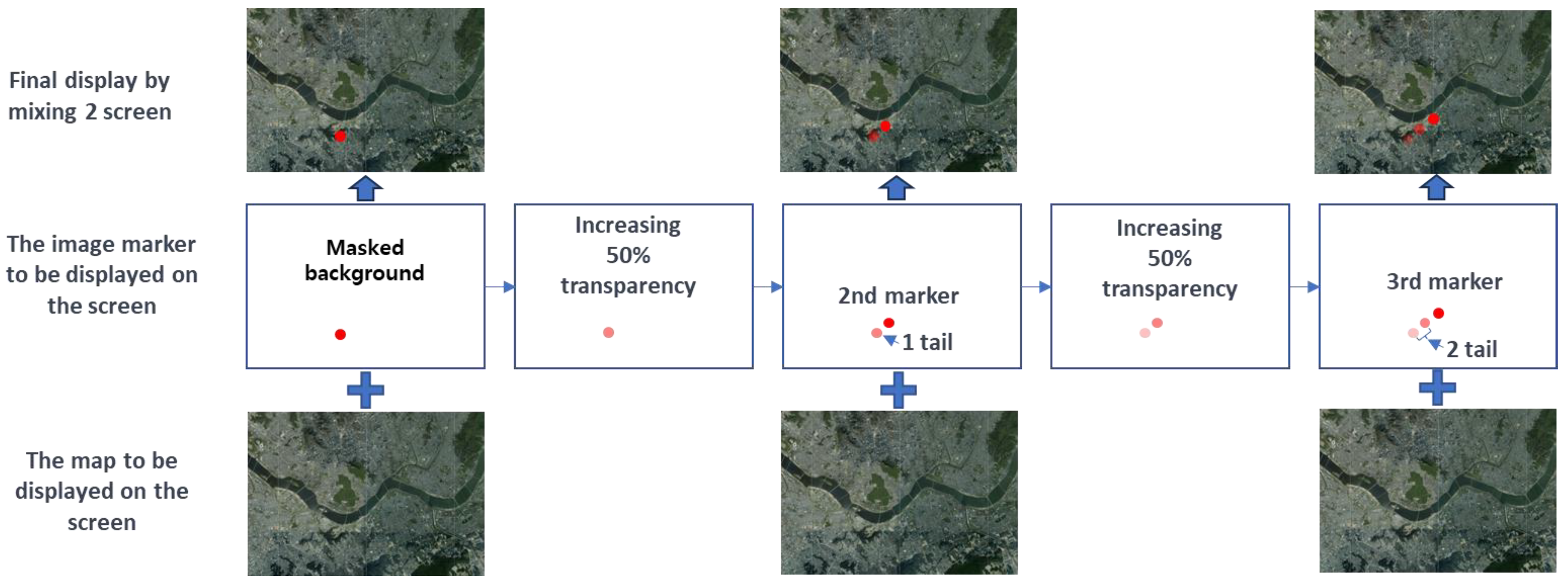
Both the head and tail are visualizations of a point shape, differing only in size. Animation is the process of making static images appear to move by rapidly showing them in a sequence at a speed that human eyes cannot distinguish. Therefore, by updating and rendering the position of the wind symbols for each frame, we can make the wind symbols appear to flow like particles (
Figure 5).
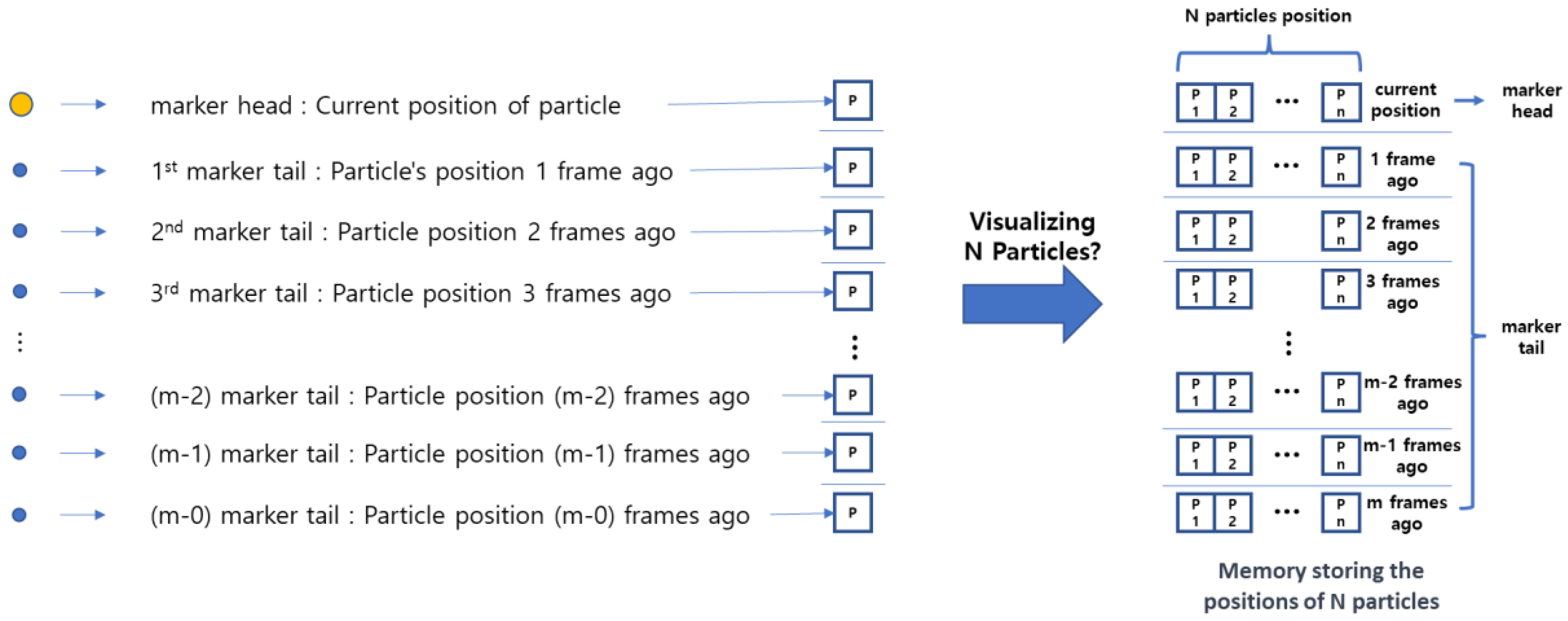
Wind flow markers symbolize the particles in the wind; therefore, the positions of the points making up the head/tail are the actual spatial positions of the particles recorded for each frame. The head represents the current position of the particle, and the farther the tail from the head, the more it corresponds to the particle's position in the more distant past frames. Thus, by remembering the particle's position for each animation frame, we can draw a wind flow marker. When visualizing N particles simultaneously, it is possible by preparing N sets of such memory (
Figure 6).
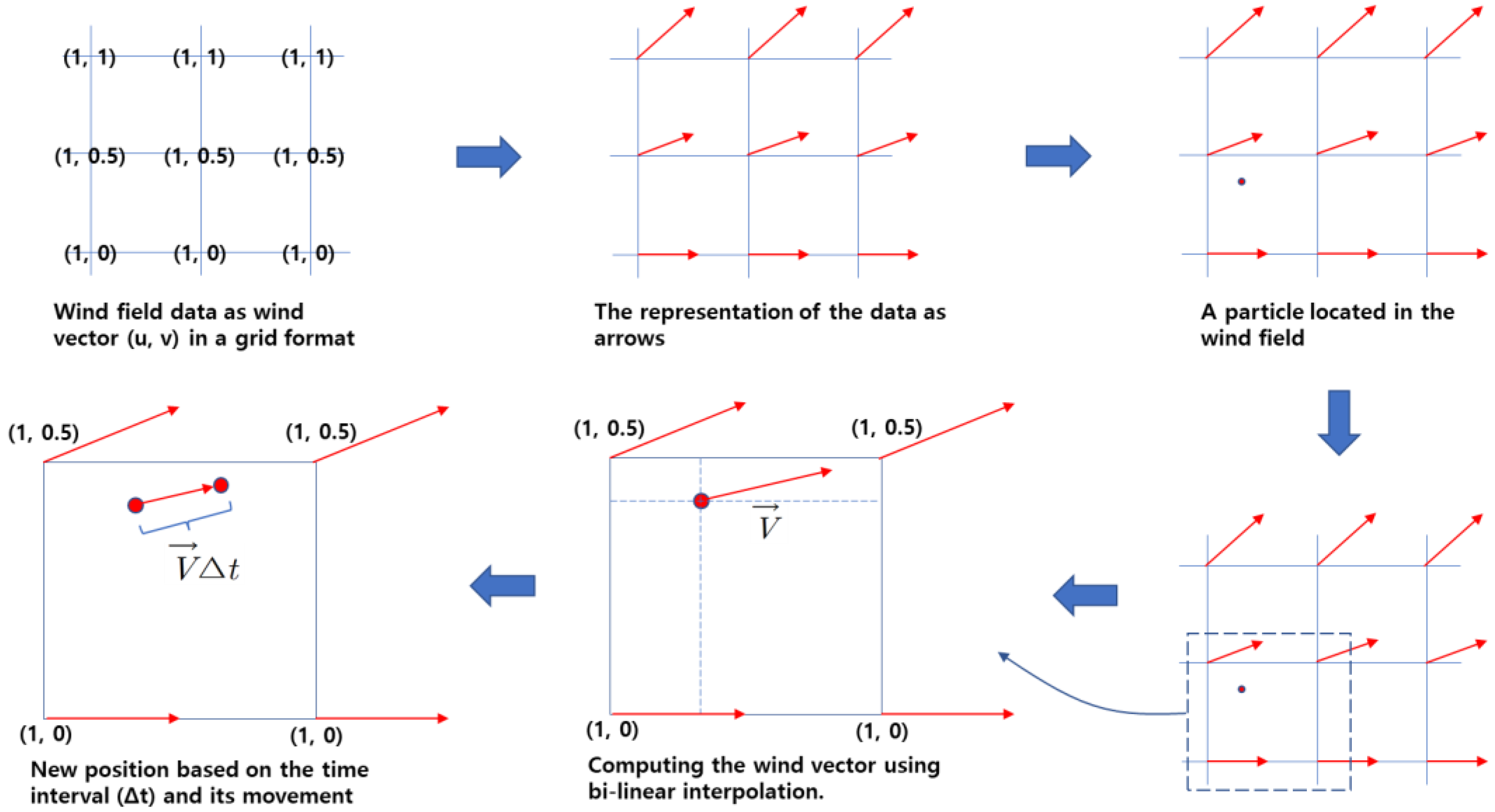
The method of finding the particles' positions in the next frame involves using the wind field (u, v) grid data (
Figure 7).
The wind vector applied to the current position of the particle is calculated using bi-linear interpolation. Then, by using the time interval between animation frames, the position is determined through vector Equation (1):
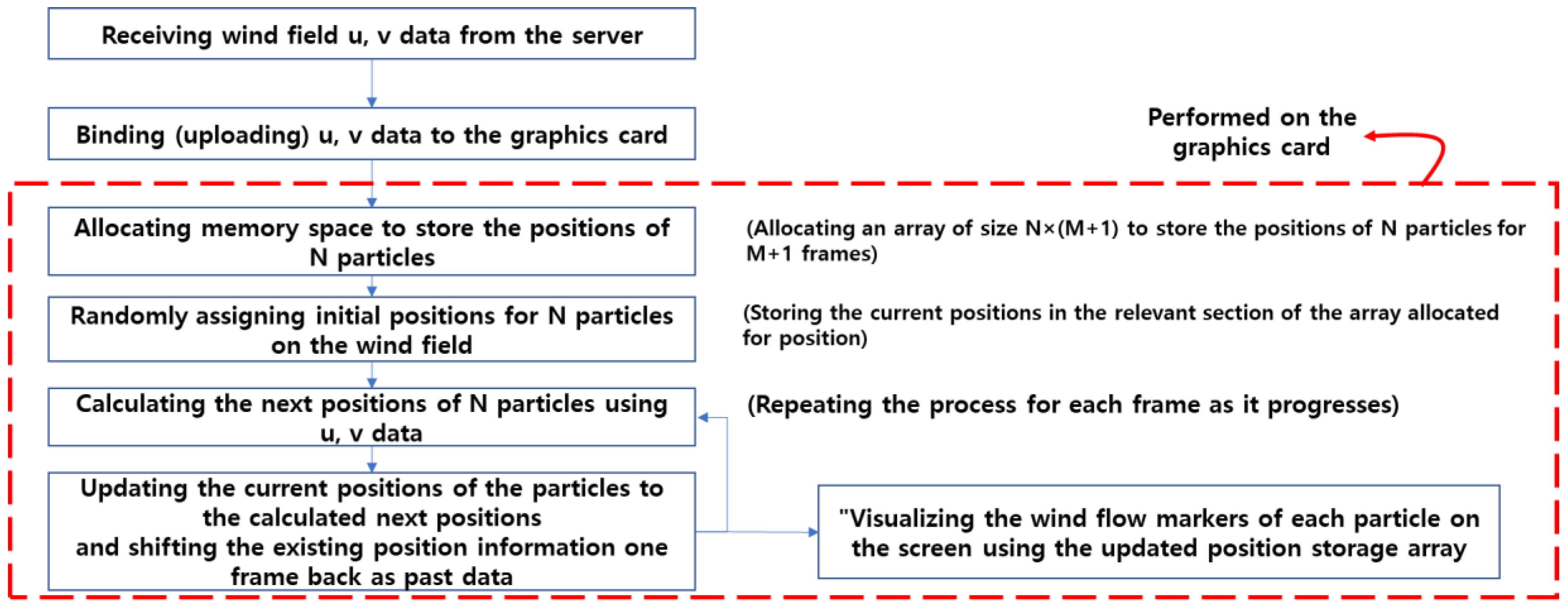
The schematic representation of these techniques can be expressed in the following flowchart (
Figure 8).
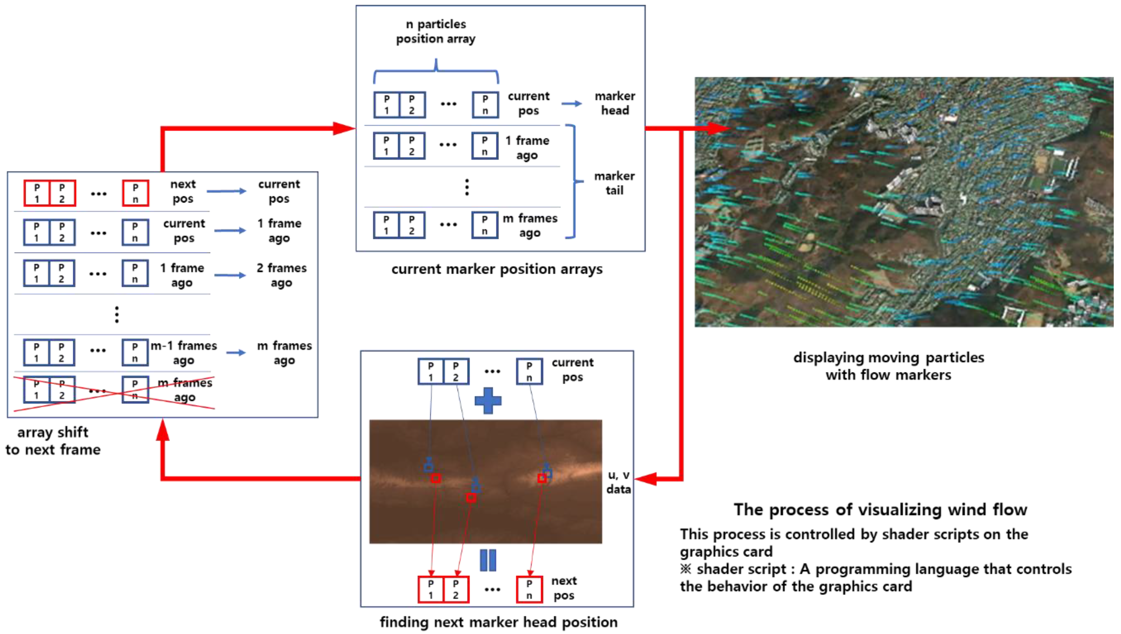
The technique applied involves processing the vector information of the wind field received from the server and the particle's position information in a time-parallel manner on the graphics card to display them on the screen. The following diagram (
Figure 9) illustrates the rendering process according to the aforementioned flowchart.
4. Result and Conclusion
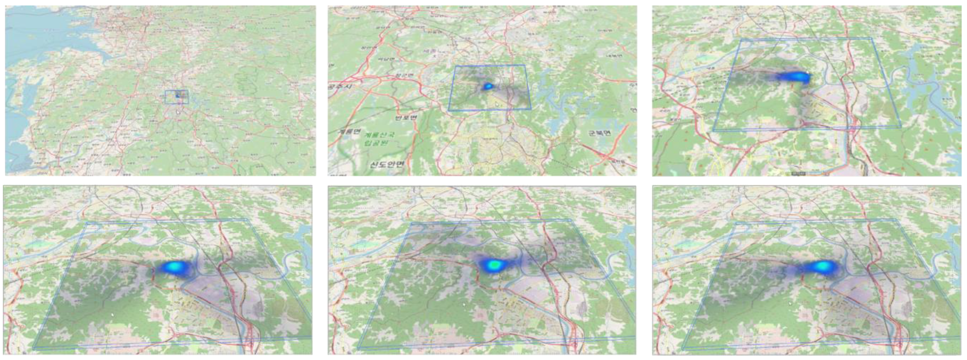
In this study, to visualize the air quality/odor modeling data by transmitting a large amount of data to a web browser, we presented a method to encode the data in the form of PNG graphics to efficiently realize the phenomenon of the spread of pollutants in the digital twin space without loss of information. The figure below is the result of visualizing the atmospheric modeling results in the digital twin area of 13km x 13km x 200m for one year (
Figure 10).
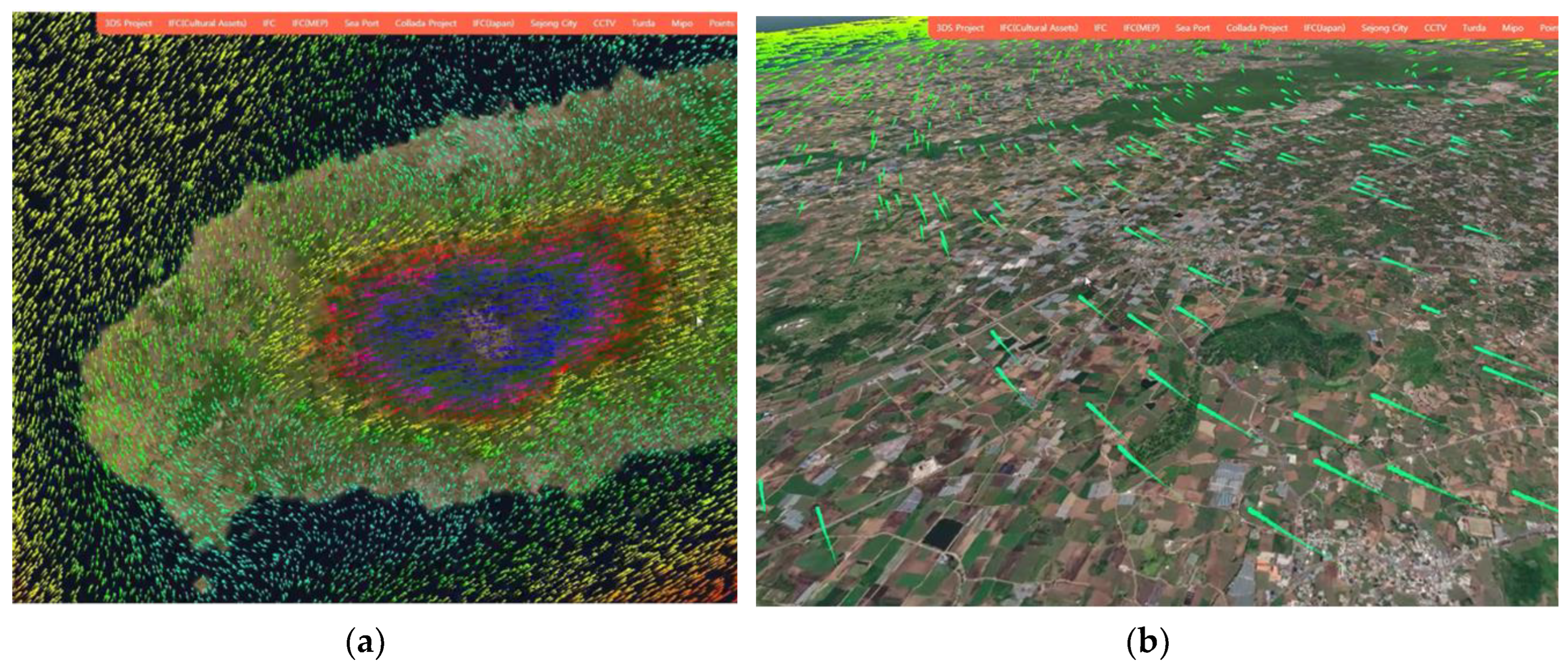
Next is the result of visualization technology through graphics card computational processing that enables wind marker animation in 3D space (
Figure 11). This technique involves directly drawing and updating wind symbols on the screen in each frame, allowing for continuous visualization even in vertical visualization scenarios where the height of the horizontal intersection plane can be controlled. It is applicable not only when 3D spatial information is visualized on a web browser's screen but also when the wind field data is available at different altitudes.
In this paper, we introduced a technology for visualizing the non-visible element of wind flow in environmental impact assessments in a 3D web environment. The wind data on the digital twin platform has the spatiotemporal characteristics of time and 3D space, which cannot be visualized using traditional 2D-based wind data visualization techniques. To overcome this limitation, our research utilized a method of memorizing particle positions frame by frame and rapidly drawing wind symbols to visualize the wind data. This approach enables easy visualization of temporal wind data on the web and provides the flexibility to explore and visualize wind data along vertical planes.
The development of these visualization techniques is expected to ultimately enhance the understanding of environmental impacts among key stakeholders, particularly the public, and facilitate communication among stakeholders. By visualizing the non-visible elements of environmental impact assessments, such as wind flow, in an accessible and interactive manner, these techniques can contribute to raising awareness and improving understanding of environmental impacts. This, in turn, can promote meaningful engagement and communication between different stakeholders involved in the environmental assessment process.
Author Contributions
Conceptualization, S.S., D.K. and H.K.; methodology, H.K.; software, H.K.; validation, S.Son, D.K. and S.S.; formal analysis, S.S.; investigation, S.S.; resources, S.S.; data curation, S.Son; writing—original draft preparation, S.S.; writing—review and editing, D.K.; visualization, H.K.; supervision, S.S.; project administration, S.S.; funding acquisition, S.S. All authors have read and agreed to the published version of the manuscript.
Funding
This work was supported by Korea Environment Industry & Technology Institute (KEITI) through 'The Decision Support System Development Project for Environmental Impact Assessment' Program, funded by Korea Ministry of Environment (MOE) (grant number: 2020002990005).
Conflicts of Interest
The authors declare no conflicts of interest.
References
- S. Shin, "Visualizing the Invisible – Wind Flow Animation in Digital Twin Based Environmental Impact Assessments," in The 2023 IEEE International Conference on Digital Twin, Portsmouth, UK, 28–31 August 2023, in Digital Twin 2023. [CrossRef]
- L. W. Canter and C. Wood, Environmental impact assessment. 1996.
- D. Komínková, "Environmental Impact Assessment and Application – Part 1," in Encyclopedia of Ecology, S. E. Jørgensen and B. D. Fath Eds. Oxford: Academic Press, 2008, pp. 1321–1329.
- C. O'Faircheallaigh, "Public participation and environmental impact assessment: Purposes, implications, and lessons for public policy making," in Environmental Impact Assessment Review vol. 30, ed: Elsevier, 2010, pp. 19–27. [CrossRef]
- Lee, S.-y; Shin, S.; Kim, H.; Kim, M.-K.; Yoon, S.-Y.; Lee, S. Assessing the Visualization-Based Decision Support System for Environmental Impact Assessments. International Journal of Environmental Research and Public Health 2022, 19, 1345. [Google Scholar] [CrossRef]
- Julin, A.; et al. Characterizing 3D city modeling projects: towards a harmonized interoperable system. ISPRS International Journal of Geo-Information 2018, 7, 55. [Google Scholar] [CrossRef]
- Murshed, S.M.; Al-Hyari, A.M.; Wendel, J.; Ansart, L. Design and implementation of a 4D web application for analytical visualization of smart city applications. ISPRS International Journal of Geo-Information 2018, 7, 276. [Google Scholar] [CrossRef]
- Morgan, R.K. Environmental impact assessment: the state of the art. Impact assessment and project appraisal 2012, 30, 5–14. [Google Scholar] [CrossRef]
- Chu, L.; Ai, B.; Ma, H.; Feng, W. A Spatio-Temporal Dynamic Visualization Method of Time-Varying Wind Fields Based on Particle System. ISPRS International Journal of Geo-Information 2023, 12, 146. [Google Scholar] [CrossRef]
- Horák, J.; Růžička, J.; Novák, J.; Ardielli, J.; Szturcová, D. Influence of the Number and Pattern of Geometrical Entities in the Image upon PNG Format Image Size; Springer: Berlin/Heidelberg, Germany, 2012; pp. 448–457. [Google Scholar]
|
Disclaimer/Publisher’s Note: The statements, opinions and data contained in all publications are solely those of the individual author(s) and contributor(s) and not of MDPI and/or the editor(s). MDPI and/or the editor(s) disclaim responsibility for any injury to people or property resulting from any ideas, methods, instructions or products referred to in the content. |
© 2024 by the authors. Licensee MDPI, Basel, Switzerland. This article is an open access article distributed under the terms and conditions of the Creative Commons Attribution (CC BY) license (http://creativecommons.org/licenses/by/4.0/).
