Introduction
Sample size calculations using formulae have been the fundamental basis of research methodologies. The set precision standards and the Z-value are used with the known prevalence of the known disease is one of the simplest ways to calculate the size of the sample required in studying that disease at any given point in time [
1] Prevalence is considered from the previous literature and is used in the formula. The formula of sample size using prevalence is simple yet has multiple unknown entities that need to be set by the researcher. It depends on the Z value which is determined by the level of confidence the author wants in the study and the precision of the study required [
2] Using the formulae, yields a minimum number of patients required to give a result that at the level of confidence and p-value would have a corresponding probability of being by chance [
3,
4]
SS = Sample Size
Z = Z statistic for a level of confidence
p = Expected prevalence or proportion
a = Margin of Error (MOE) (Precision)
The Formula has multiple variables which can be set by the author and it’s often difficult to comprehend the influence they carry and what changes would occur in the calculation when they are changed. It becomes important to understand the interrelationship between these variables and the effect they have [
3,
5].
Graphical representation of these variables is also impossible as for a 3D Graph, only 2 variables can be used and for a 3D surface plot, only 3 variables can be used. Using 4 variables would require a 4D plot or one of the variables needs to be determined. These 4 variables have a lower limit and upper limit and that can be used to determine different values and then they can be placed on the graph.
Z values are set mathematically for different levels of confidence. The usual value taken is 1.96 at a 95% level of confidence. Precision corresponds to the level of allowable false positive error. Prevalence is used from the literature and is used in the “out of 100 individuals” format in the formulae [
6,
7]
Table 1.
For Z statistic or Z- value (z).
Table 1.
For Z statistic or Z- value (z).
| Level of confidence |
Corresponding Z Statistic Value |
| 50% |
0.674 |
| 70% |
1.036 |
| 75% |
1.15 |
| 80% |
1.282 |
| 85% |
1.44 |
| 90% |
1.645 |
| 95% |
1.96 |
| 98% |
2.326 |
| 99% |
2.576 |
| 99.50% |
2.807 |
| 99.73% |
3.000 |
| 99.90% |
3.291 |
| 99.99% |
3.891 |
| 99.999% |
4.417 |
For MOE (a) the value ranges from
% to 20% of the prevalence its corresponding values are used in the formulae making the below expression represent the limits.
For prevalence (p), the highest prevalence can be just [
] less than half of the population. Hence, the lower limit of prevalence can be explained by stating that it reaches up to 0 but is never 0. As the upper limit cannot be more than half, the below limit correctly represents the prevalence.
A disease prevalence higher than half of the population can be seen from the other side as less than half population is normal. Hence, the highest prevalence for anything stated is just less than half.
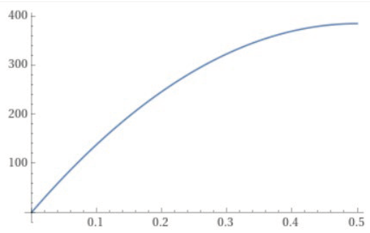
Firstly, the sample size can be calculated by taking Z at 1.96 (95% confidence) and MOE at 0.05 to demonstrate the most widely used status. Changing prevalence from 0.0001 to 0.49999, the following graph can be seen in 2D
Figure 1.
2D Parabola graph of Sample Size at constant Z= 1.96 and MOE = 0.05.
Figure 1.
2D Parabola graph of Sample Size at constant Z= 1.96 and MOE = 0.05.
It is evident here from the formula that the highest value of the sample size will not be more than 385. At any given prevalence due to the “(p)(1-p)” part in the formulae, the highest achievable value of the part is 0.25. Any other value of p higher or lower will result in a value lesser than 0.25
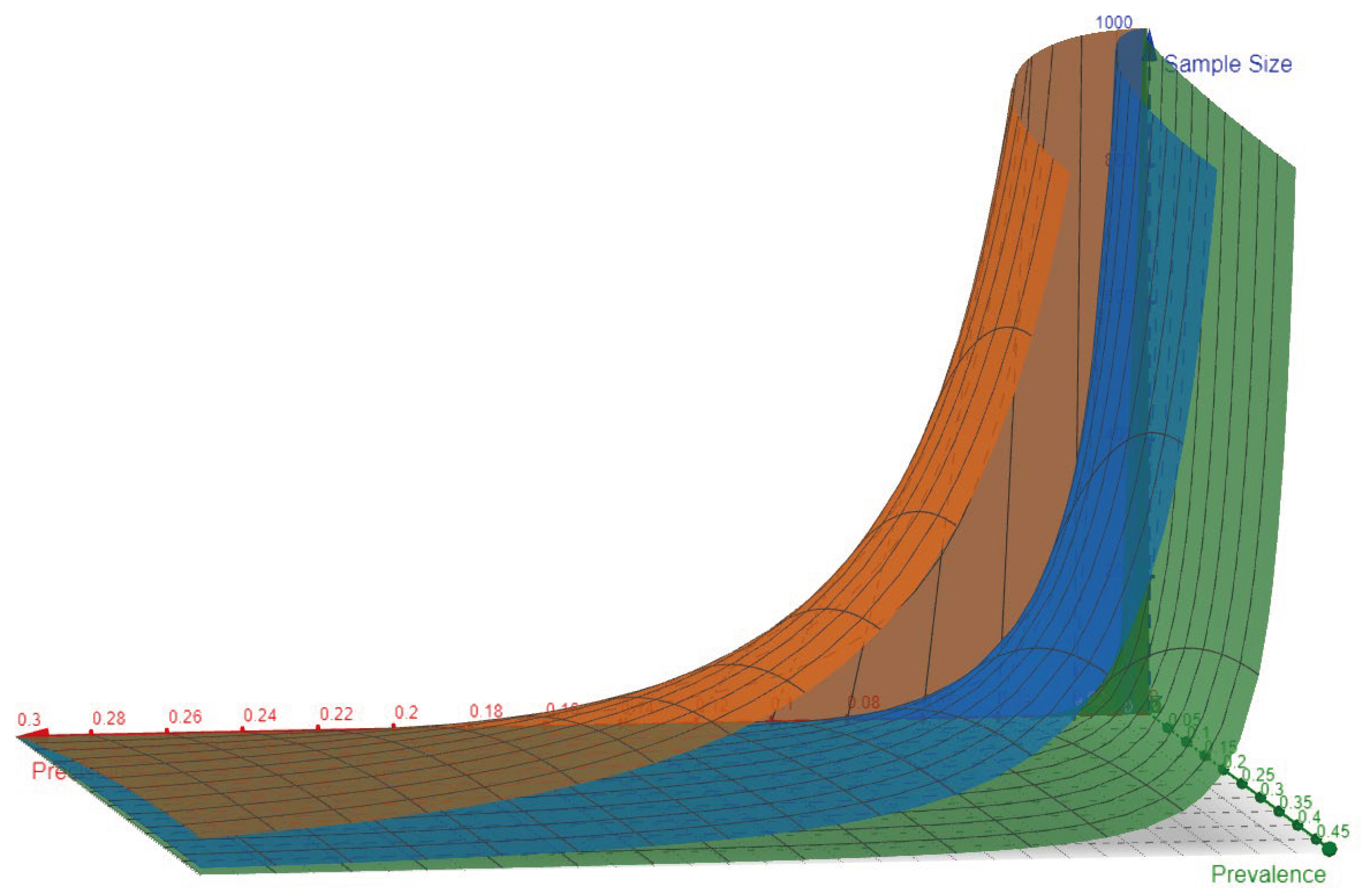
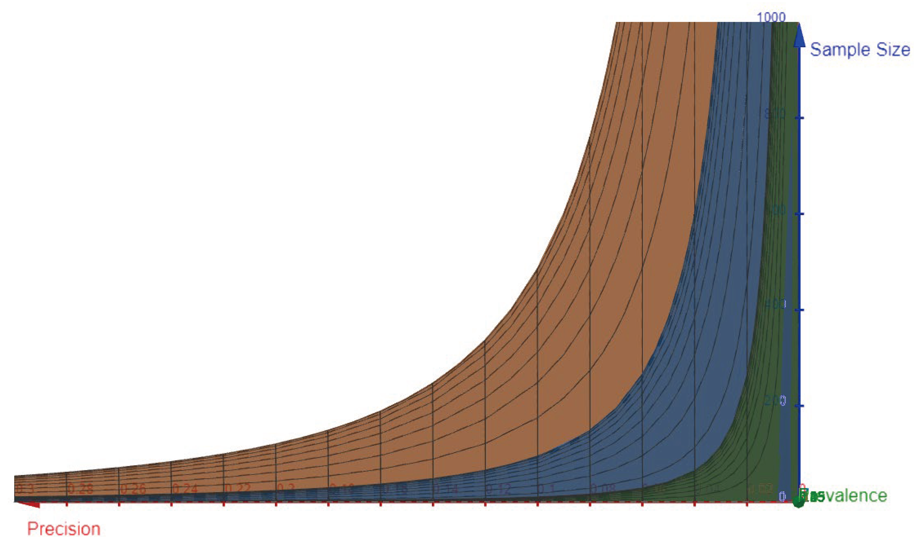
Using three values of Z, the lower and upper limit of Z, and the most commonly used value, Topological 3D surface plots can be created to represent the formula for changing prevalence and precision and how it changes the sample size.
The below images and link to the 3D graph are created using “GeoGebra 3D surface plotter”
On the Z axis – Sample Size
On the X axis - Precision ranging from 0. a 0.2
On the Y axis - Prevalence ranging from 1 p 0.4
The value of Z was used as a constant to create different surfaces
Z at 50% Confidence = 0.674 - Green Surface
Z at 95% Confidence = 1.96 - Blue Surface
Z at 99.999% Confidence = 4.417 - Orange Surface
Variable value from 0.647 Z 4.417 - Pink Surface
Figure 2.
- XYZ view of the topological surfaces represents the curvature when precision on the X-axis moves from 0.0001 towards 0.3 and higher. The higher the value of Z, the further the surface from the XY plane suggests that a higher sample size is needed for a better level of confidence.
Figure 2.
- XYZ view of the topological surfaces represents the curvature when precision on the X-axis moves from 0.0001 towards 0.3 and higher. The higher the value of Z, the further the surface from the XY plane suggests that a higher sample size is needed for a better level of confidence.
Figure 3.
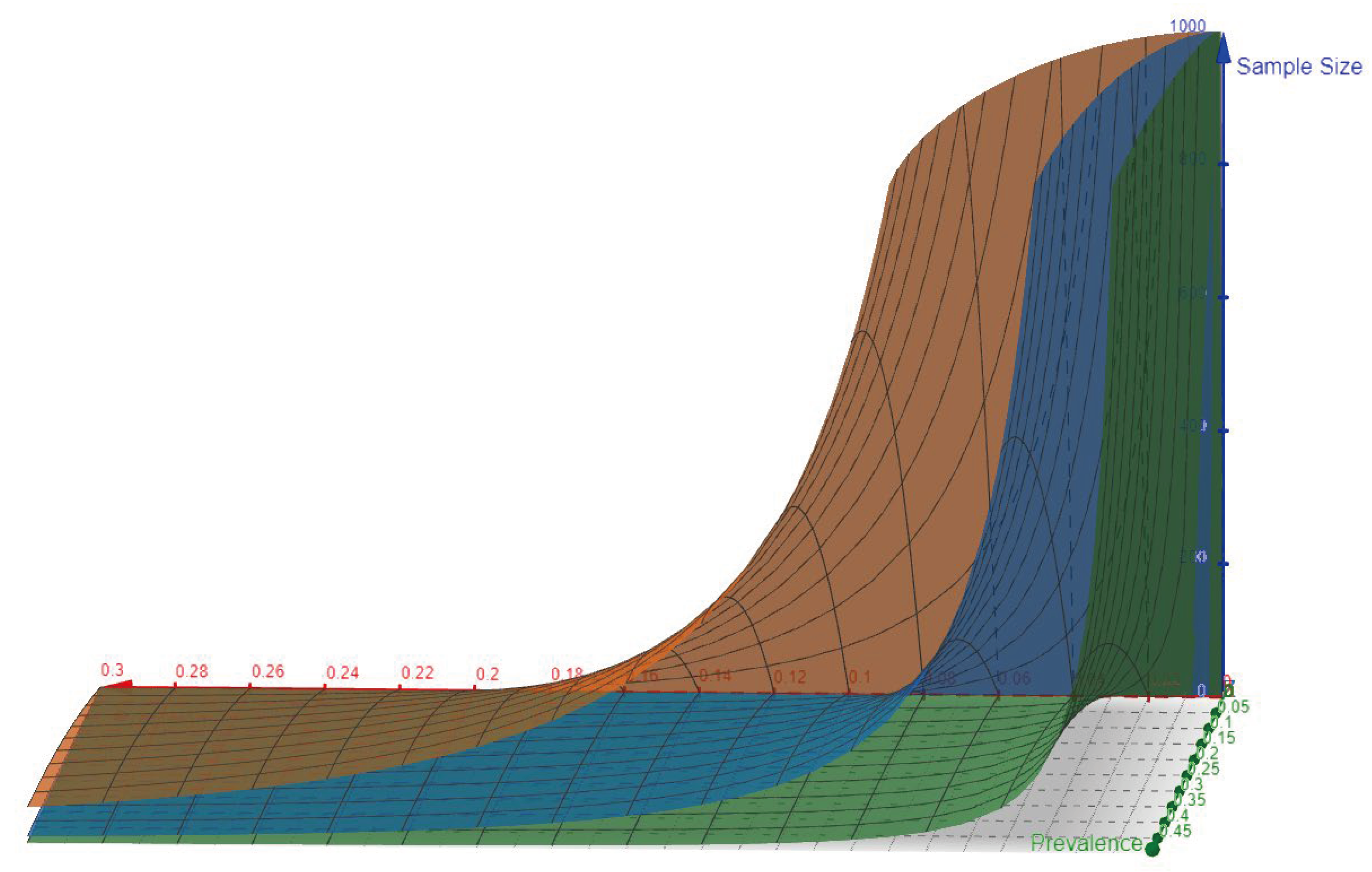
XYZ view of the topological surface showing the separation from the YZ plane created between Sample size and prevalence. It represents the end of the Z axis trying to show the curve is very near and adjacent to the YZ plane but it never touches that as it would mean that the precision value is so high that the error is 0 making the result of the formula at Sample size of ∞. Hence, these surfaces will go along the YZ plane towards the Z axis but will never touch the plane.
Figure 4.
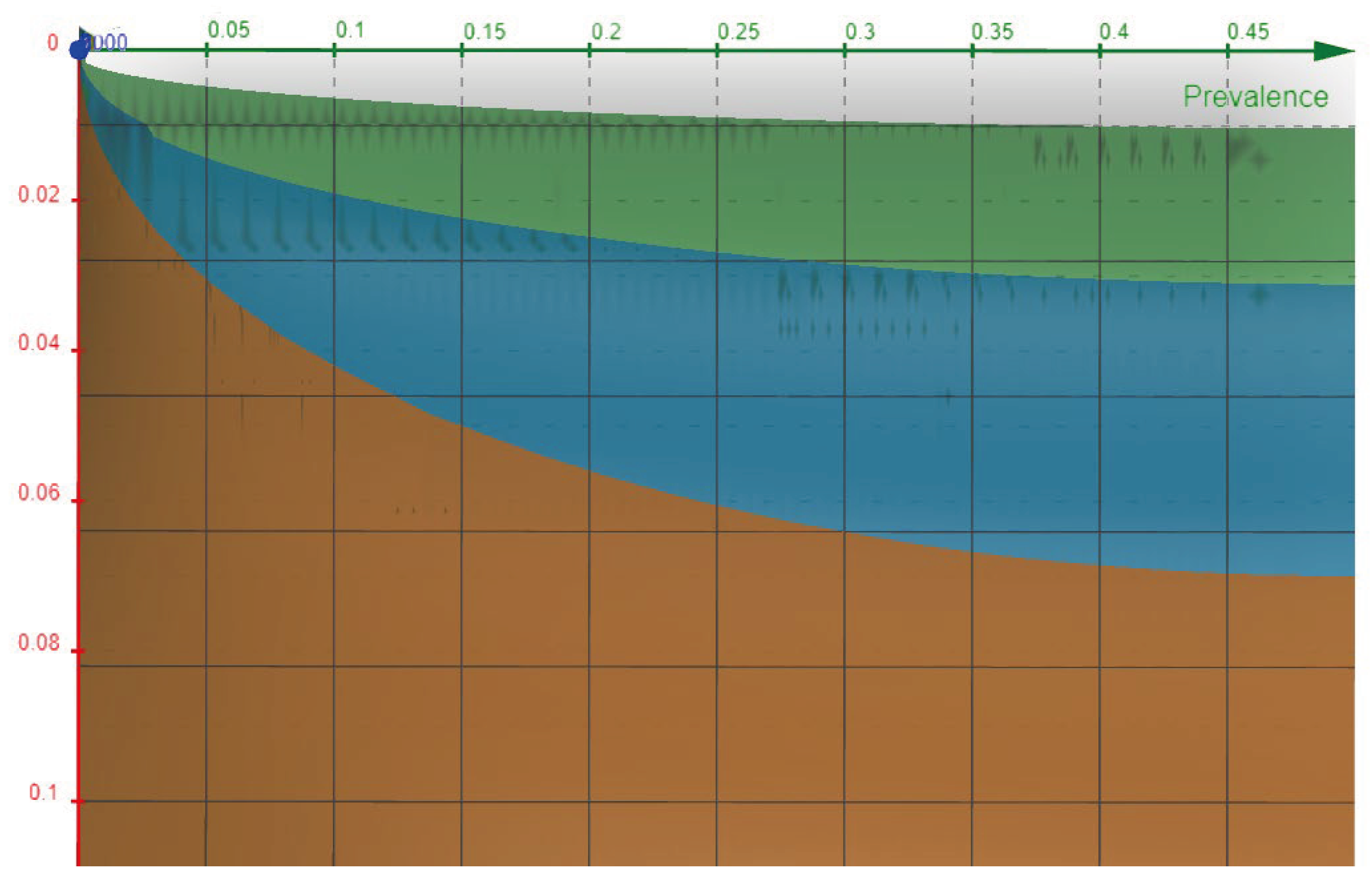
Contour plot of XY plane showing the top view. As the surfaces can be seen as solid areas under different curves, the relationship between precision and precision and prevalence can be seen corresponding to the respective Z value.
Figure 4.
Contour plot of XY plane showing the top view. As the surfaces can be seen as solid areas under different curves, the relationship between precision and precision and prevalence can be seen corresponding to the respective Z value.
Figure 5.
Contour plot of XZ plane showing the side view the curvature can be visualized in 2D here and the area under the surface can be visualized.
Figure 5.
Contour plot of XZ plane showing the side view the curvature can be visualized in 2D here and the area under the surface can be visualized.
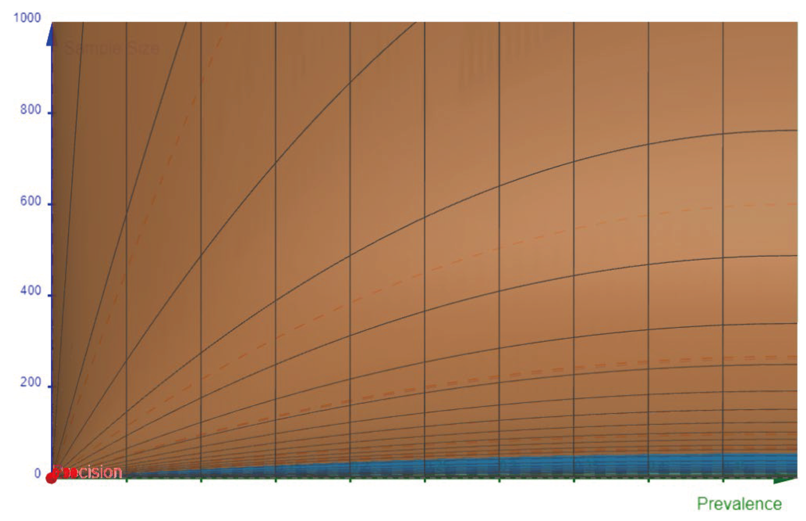
Figure 4.
Contour plot of YZ plane showing the Front view. The Blue color (Z=1.96) at the bottom of the chart represents a minimal sample that will be required despite any precision value just because the Z value is very high and the prevalence is increasing. The grid lines can be visualized here showing the parabola nature of the formula evident in
Figure 1.
Video 1:- Demonstrating the variable Z statistic value
These graphs represent the interrelationship between the variables such as Z value, Precision, and Prevalence and how it affects the sample size calculations.
More complex forms of sample size calculation formulae can be used similarly to understand how the parts of the formulae are related to each other and how a small change might affect the behavior and calculations and subsequently the research methodology and research process entirely.
