1. Introduction
The design and usability of digital products, such as websites, mobile applications, and software interfaces, frequently serve as the basis for customers’ first significant interactions with these things. The User Interface (UI) and User Experience (UX) are essential components that direct the user journey and have a significant impact on user satisfaction and engagement.[
1] While UI design is more concerned with the aesthetics and visual components that improve the user experience overall, UX design makes sure that the digital experience is both useful and pleasurable. The foundation of a successful digital product is the mutually beneficial link between UI and UX.[
2]
A well-considered UX/UI design has an influence that extends beyond usability and aesthetics. It can increase sales, improve a company’s standing in the market, and help to gain loyal customers.[
1] But attaining this balance between UI and UX design is more than just a matter of intuition; it calls for a thorough comprehension of user needs, preferences, and behavior. It requires a design methodology that goes beyond best practices and design principles. This is where the technique known as data-driven UI design shows up, offering a way to connect the dots between user-centered design and design intuition.
Data-driven user interface design is an organized methodology that makes use of data gathering and analysis to guide design choices.[
3] Designers may produce digital products that better reflect consumer expectations and preferences by implementing data-driven concepts. During my research endeavors, I actively engaged in the data-driven UI design process. This involved the systematic collection of relevant data, employing diverse research techniques to gain insight into user needs and preferences. Subsequently, a thorough analysis of the data was performed to extract meaningful patterns and trends.[
4]
An educational institution’s academic activities are managed and coordinated using the MyAlatoo educational process management system. In order to determine the issues students confront, this study has analyzed data processing techniques and done user interface research. Additionally, the MyAlatoo system has been evaluated concerning user experience and current recommendations for the management of similar platforms.
2. Research Problem
By using data analysis techniques and performing surveys and interviews, it has become clear what needs to be optimized in the MyAlatoo system and what issues users are most likely to encounter. The study’s findings show how ineffective the current system is at satisfying students’ expectations and how out of step it is with the demands of the contemporary information technology industry.
The primary objective is to optimize students’ educational management system according to the conducted research, which is based on the analysis of the user experience of students and modern methods of organizing the educational process.
3. Literature review
In the context of digital products, User Experience (UX) and User Interface (UI) design are two closely connected fields.
User Experience design is the process by which users communicate with the company and its digital products through interfaces and interactions. UX design experience includes researching and analyzing the needs, objectives, and behavior of users. In addition to designing the information architecture, they also make wireframes, prototypes, and usability tests. Ensuring the product is user-friendly, efficient, and fulfills user expectations is their main objective.[
2]
User Interface design is the process of constructing a user’s visual experience. It focuses on easy and intuitive visual interaction and fast navigation through digital products. Interface design is based on looks, such as color scheme, typography and various elements.[
2]
Usability Testing The process of assessing an application’s user experience and user interface in close collaboration with users is known as usability testing. Users are required to do standard tasks that mimic how the program would be used in real life throughout the usability testing process. Users may be asked to use the program freely without being assigned any specified duties in various situations. The time needed to complete tasks or activities, the completion rate, and user mistakes throughout the test are all noted by the observer.
Sujito et al.[
5] studied Lumbung Media’s online media storage system and user interface, which is part of Universitas Negeri Semarang. The System Usability Scale (SUS) was used as a questionnaire tool to collect data. The study’s findings showed that Lumbung Media’s website had significantly improved both before and after it was created.
Dharmayanti et al. [
6] examined the Comrades application’s user interface and user experience to determine the user’s goal through design. Goal-directed design was employed during the interface’s development phase. User flows were then used to examine the user experience and characterize the issues that users were having. A better user experience was achieved with a demonstrated value usability testing task better in the interface developed utilizing the Goal Directed Design technique, which also had a higher testing level than the prior design.
Agarina et al. [
7] examined the Department of Informatics System’s website’s user interface design. The primary purpose of the website is to provide departmental students with an information gateway. The analysis that follows is based on the user-centered design (UCD) approach. The Department of Informatics System’s website examination reveals that, despite a few issues that require quality improvement and additional development, the interface design and usability have usually been good.
4. Methodology
4.1. Data Collection
This study will be based on the Ala-Too International University website. The total number of bachelor’s degree AIU students is 2326. As shown [
5] using the Solvin formula sample size was found:
Note:
n : Sample size
N : Total number of populations
a : Significant level
Then we had our calculation, which showed that respondents were enough for UX analysis:
Using a proportional allocation formula, proportional random sampling is used to determine the number of stratified samples[
5]:
Note:
: Number of sample members by stratum
n : Sample size
: Number of population members by stratum
N : Total of population members
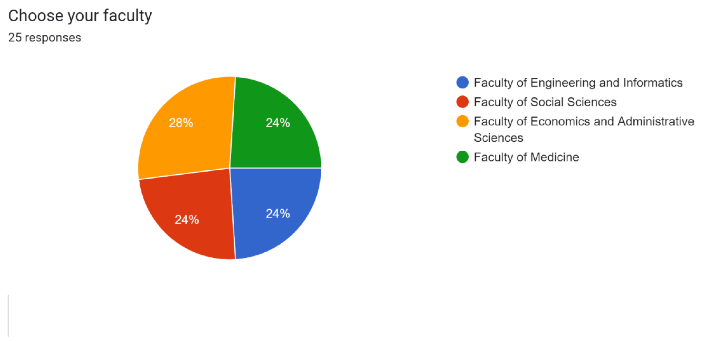
Based on the formula, the number of responding students from each faculty is calculated in
Figure 1.
4.2. Data Analysis
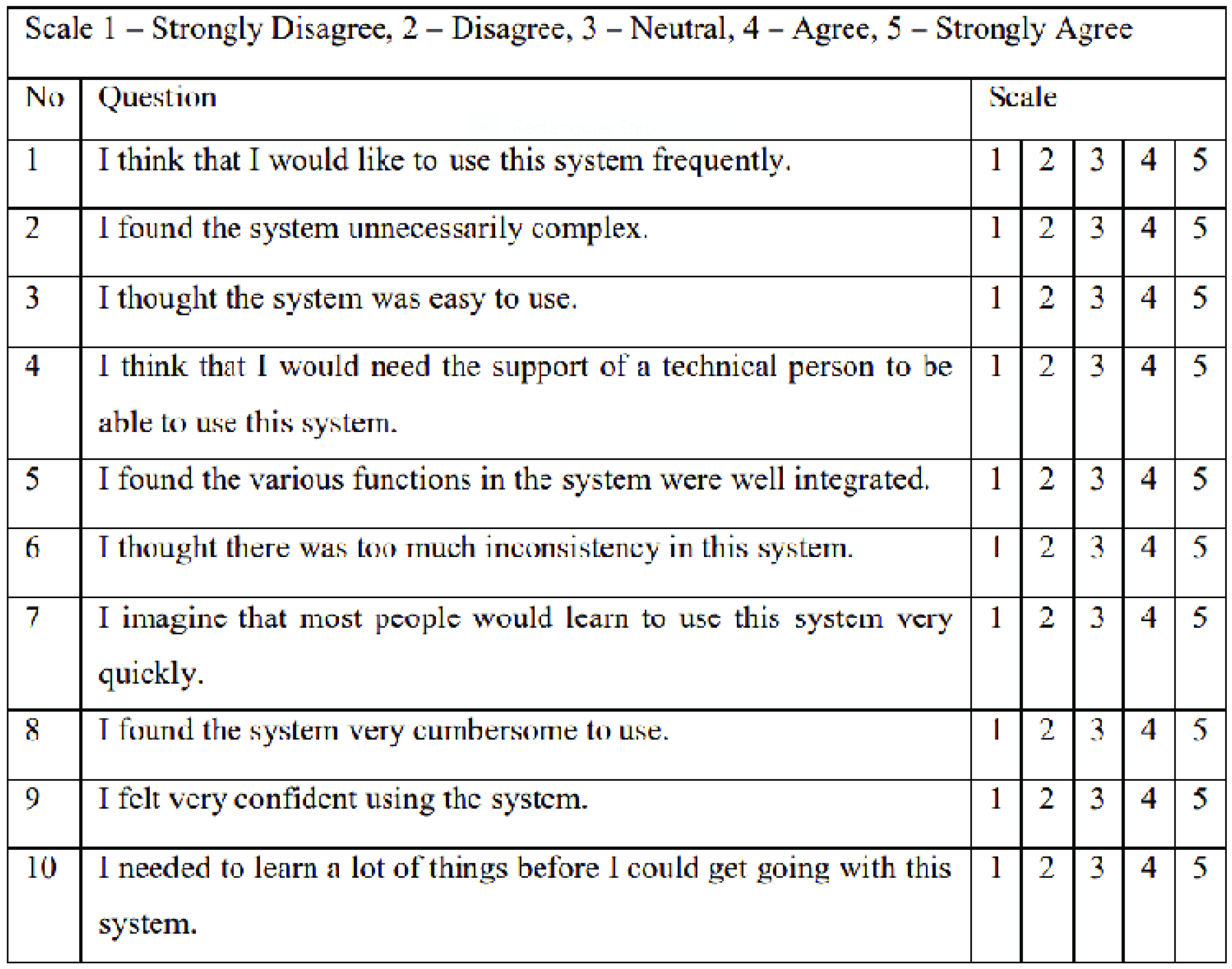
For the analysis of data, we used a System Usability Scale (
Figure 2). Which is a questionnaire-based technique that uses a set of standard questions to evaluate a system’s or product’s usability.[
8]
Study of [
5] showcased the efficiency of the sus method for evaluation of users’ views. As this method has proved its practicality, we will adopt it in our study to analyze users’ thoughts and develop a proper website.
Each sentence in the questionnaire has a Likert scale with scores ranging from 1 to 5, with strongly disagree to strongly agree. SUS was calculated by adding the points assigned to each sentence. The user’s judgment for each of the odd statements—1, 3, 5, 7, and 9—was deducted by one to determine the statement score. The statement score for statements 2, 4, 6, 8, and 10 (even statements) was 5 (five) minus the user value for the statement. After multiplying the sum of the scores for the ten assertions by 2.5, the final score fell between 0 and 100.[
8]
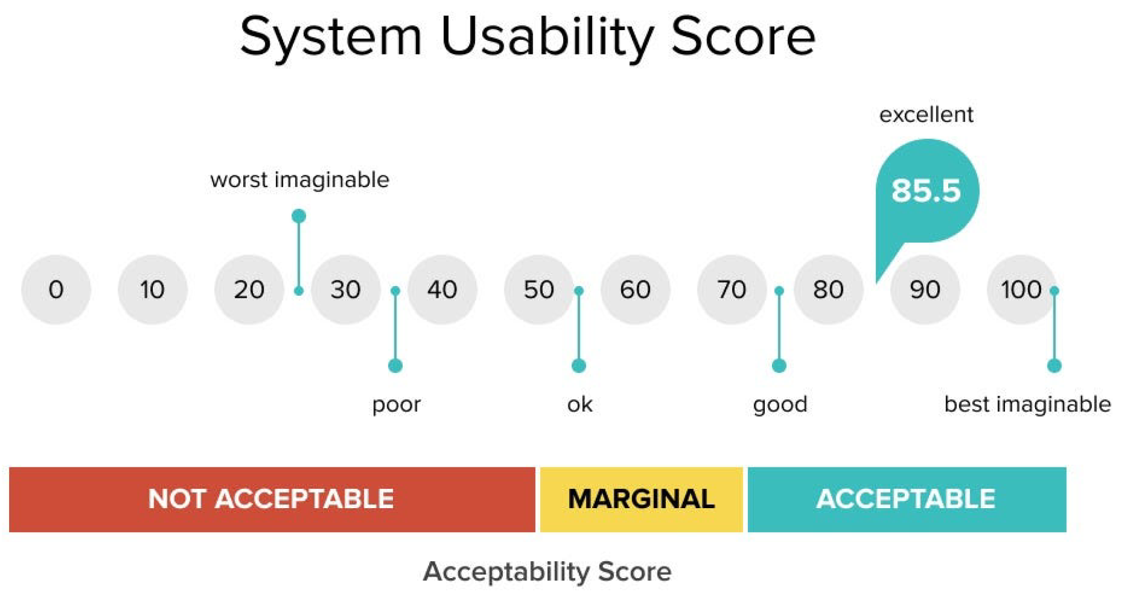
The average SUS score is then calculated and compared to the value range.
Figure 3 shows the interpretation of the SUS score.
4.3. Prototyping and Implementation
Figma was used for the first design and prototype of the user interface because of its strong design tools and collaboration features.
To describe the interface’s composition and organization, a sitemap was built. This concentrated on how things were arranged and how information flowed between displays. Then Figma’s interactive components were used to create interactive prototypes, which were guided by the sitemap. An early assessment of the user experience was made possible by these prototypes, which mimicked user interactions.
Afterward, conducted usability testing of the interactive prototypes. Before proceeding to the final prototype, these tests helped detect possible usability issues and make the required revisions by providing crucial insights into user interactions.
Vue.js with a stack including HTML and CSS was used for the implementation of the front-end development. Vue.js, CSS, and pre-made Vue UI kits were used in the development and styling of UI components. Functionality and usability were guaranteed via continuous testing, which included manual testing. The completed application was examined and improved to satisfy design requirements and user experience objectives.
5. Results
A total of 25 students with bachelor’s degrees at Ala-Too International University participated in questionnaires and interviews.
Figure 4 shows how the participants were distributed.
5.1. SUS Results
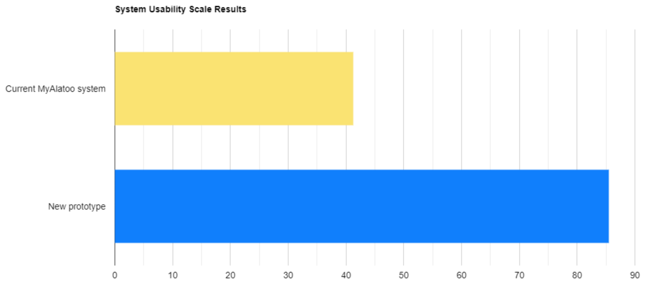
25 students were given the questionnaires, and every one of them has returned it. The completed surveys qualified for processing. The SUS approach was employed to analyze the survey data. The average SUS value, according to the results of the SUS testing, is 41.3 for the current MyAlatoo system. It could be seen as not acceptable. Additionally, the respondents’ average SUS score for the new prototype of the MyAlatoo system was 85.5. It is seen as acceptable.
The SUS test results are summarized in
Figure 5.
5.2. Interviews
Interviews with the participants were done to acquire a better understanding of how they used the present MyAlatoo educational process management system. The student’s primary concerns were as follows: difficult navigation, old-fashioned appearance and poor responsive design.
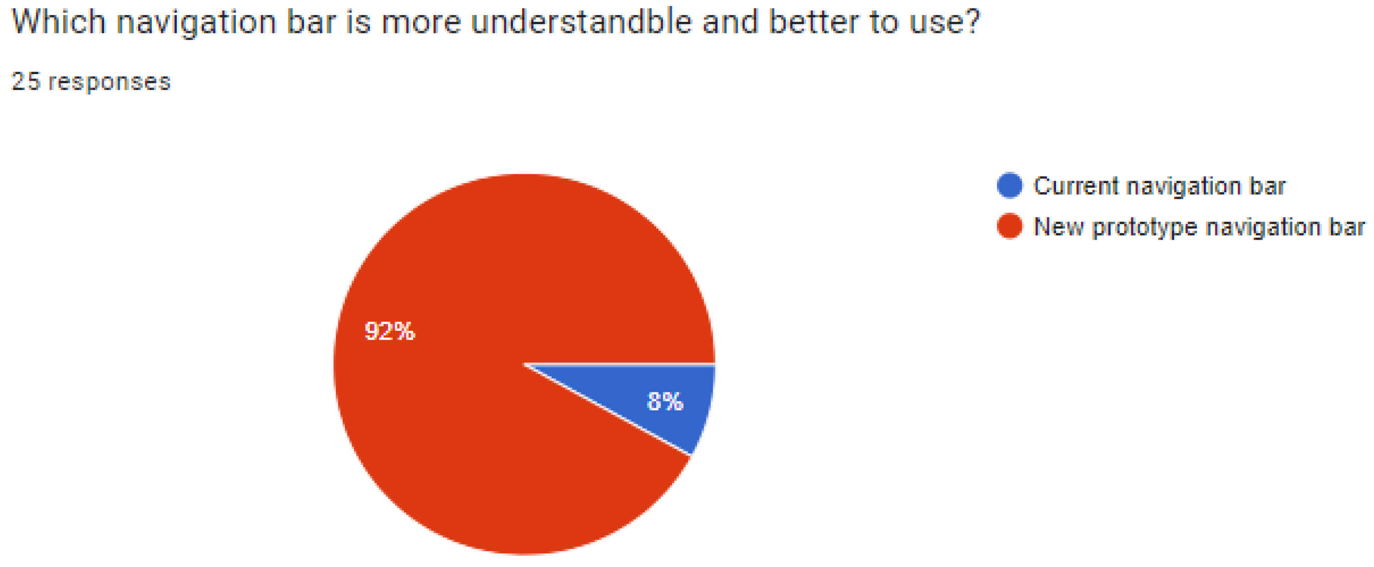
After development, more interviews were made about the new myAlatoo system. The interviews contained comparison questions about new and old systems, which showed the success of the new optimized system.(
Figure 6)
5.3. Prototyping and Implemantation
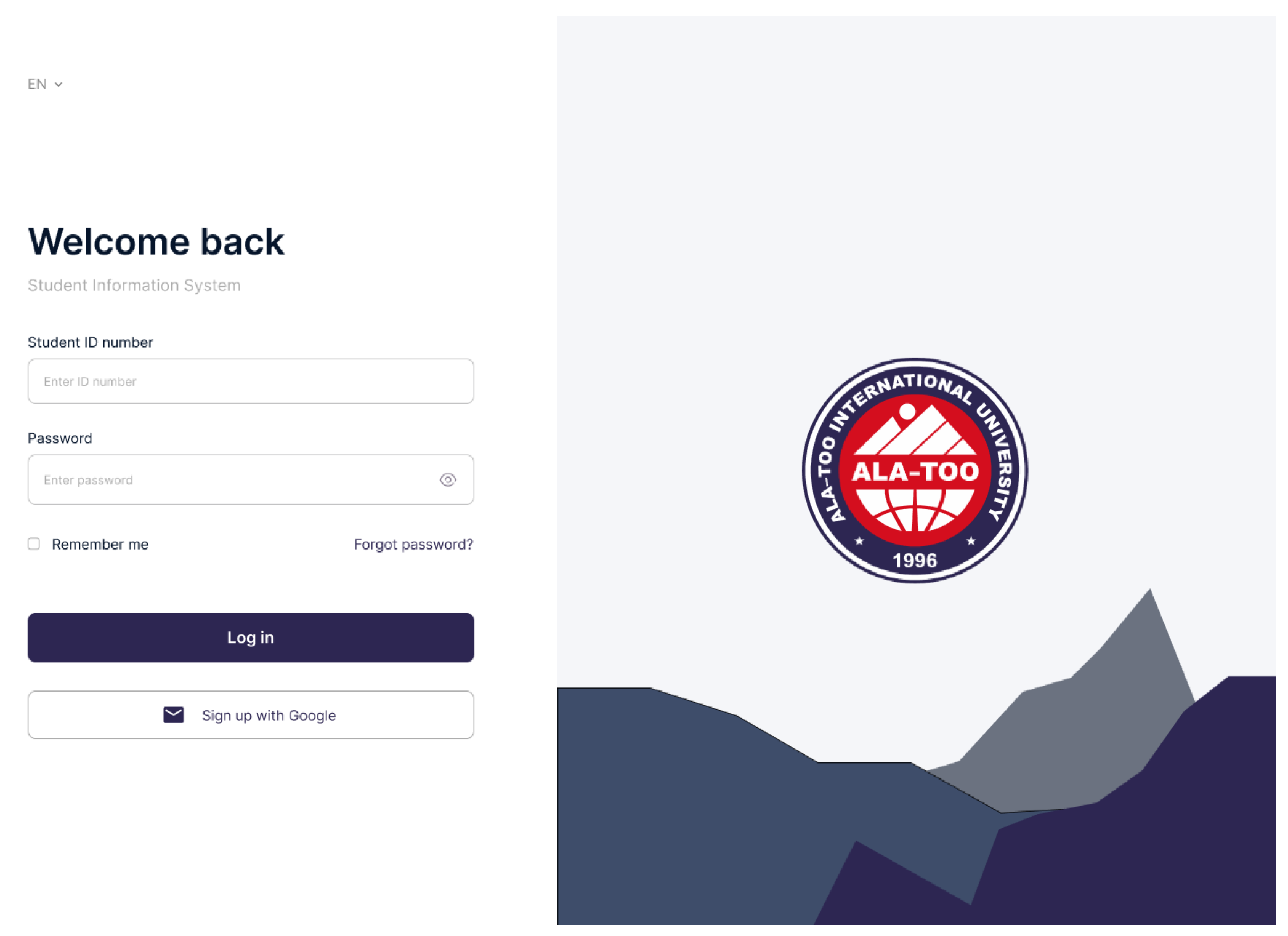
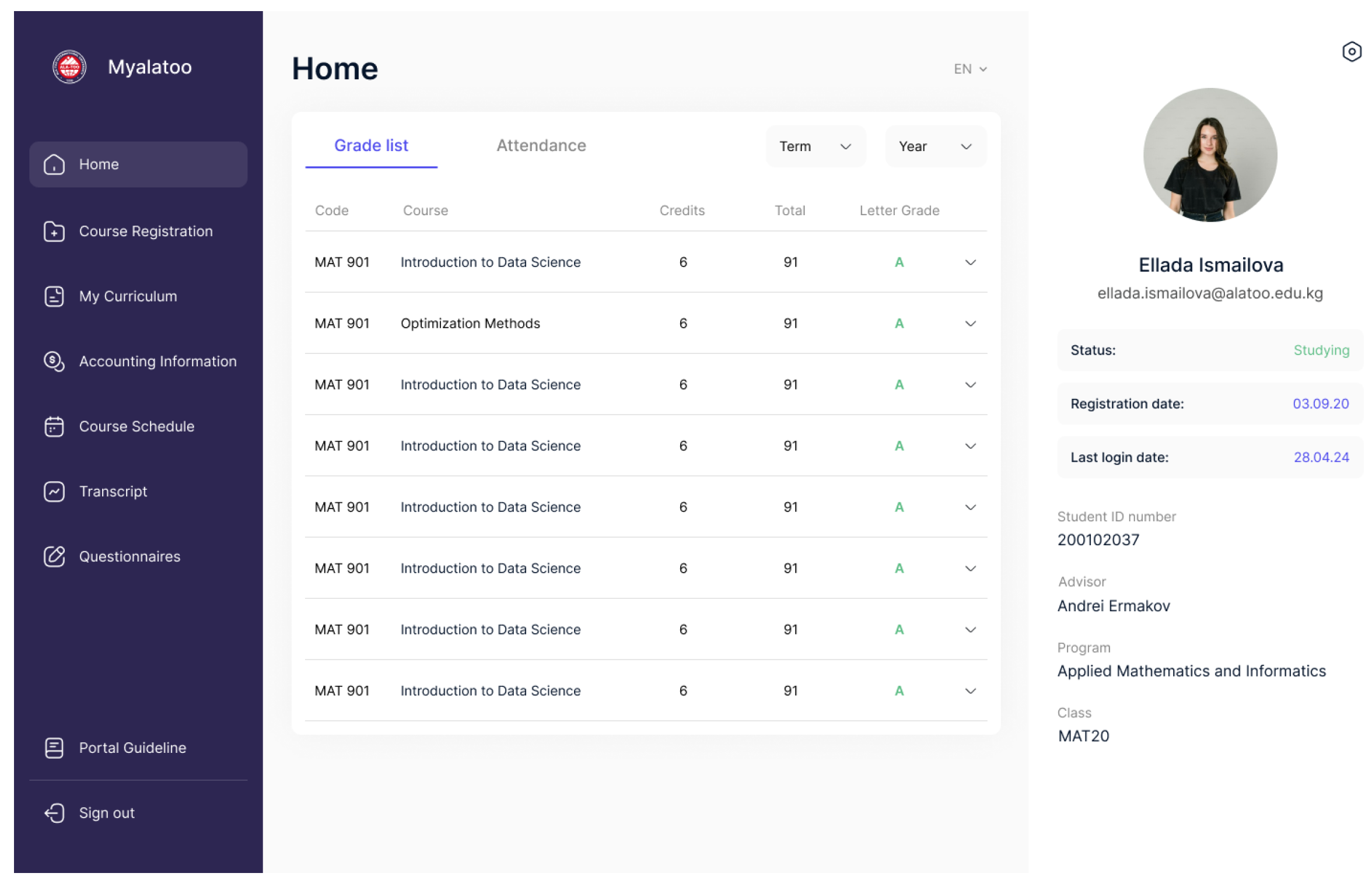
A new prototype was created using Figma in light of the information obtained from the interviews and the SUS findings. Prototype improvements that were noteworthy included: responsive design, cleaner interface and simplified navigation.
Figure 7.
New prototype "Sign In" page
Figure 7.
New prototype "Sign In" page
Figure 8.
New prototype "Home" page
Figure 8.
New prototype "Home" page
After conducting usability testing and fixing errors, the prototype design was implemented into a functional frontend using Vue.js.
Figure 9.
New prototype "Home" page
Figure 9.
New prototype "Home" page
6. Conclusion and Future Works
The notable increase in user satisfaction indicates that the MyAlatoo educational process management system optimization was successful. The current system’s low average SUS score of 41.3 in the early tests indicated serious usability problems. Through iterative design modifications and user input, the new prototype was able to obtain an average SUS score of 85.5.
Data analysis verified that the improvements successfully resolved the problems found, creating a system that is more user-friendly, aesthetically pleasing, and efficient. Students’ reports of a far improved user experience speak to the effectiveness of our approach to user-centered design. This project emphasizes the value of iterative creation and constant feedback in producing education resources that satisfy user requirements and expectations.
The Ala-Too International university may integrate the frontend code optimization into their current backend system for future development. The educational process management system will benefit from this integration, which will improve its overall functionality and user experience and turn it into a useful asset for the university.
References
- Pratama, M.; Cahyadi, A. Effect of user interface and user experience on application sales. IOP Conference Series: Materials Science and Engineering. IOP Publishing, 2020, Vol. 879, p. 012133.
- Sharma, V.; Tiwari, A.K. A study on user interface and user experience designs and its tools. World Journal of Research and Review (WJRR) 2021, 12, 41–45. [Google Scholar]
- Pimenov, D.; Solovyov, A.; Askarbekuly, N.; Mazzara, M. Data-Driven Approaches to User Interface Design: A Case Study. Journal of Physics: Conference Series 2021, 2134, 012020. [Google Scholar] [CrossRef]
- Alqahtani, F.; Orji, R. Insights from user reviews to improve mental health apps. Health informatics journal 2020, 26, 2042–2066. [Google Scholar] [CrossRef] [PubMed]
- Sujito, F.; Arifudin, R.; Arini, F.Y. An Analysis of User Interface and User Experience Using System Usability Scale and GOMS Method. Journal of Advances in Information Systems and Technology 2019, 1, 65–73. [Google Scholar]
- Dharmayanti, D.; Bachtiar, A.; Wibawa, A. Analysis of user interface and user experience on Comrades application. IOP Conference Series: Materials Science and Engineering. IOP Publishing, 2018, Vol. 407, p. 012127.
- Agarina, M.; Karim, A.S.; Sutedi, S. User-centered design method in the analysis of user interface design of the department of informatics system’s website. Proceeding International Conference on Information Technology and Business, 2019, pp. 218–230.
- Brooke, J. SUS: a retrospective. Journal of usability studies 2013, 8, 29–40. [Google Scholar]
|
Disclaimer/Publisher’s Note: The statements, opinions and data contained in all publications are solely those of the individual author(s) and contributor(s) and not of MDPI and/or the editor(s). MDPI and/or the editor(s) disclaim responsibility for any injury to people or property resulting from any ideas, methods, instructions or products referred to in the content. |
© 2024 by the authors. Licensee MDPI, Basel, Switzerland. This article is an open access article distributed under the terms and conditions of the Creative Commons Attribution (CC BY) license (http://creativecommons.org/licenses/by/4.0/).
