Submitted:
14 August 2024
Posted:
15 August 2024
You are already at the latest version
Abstract
This research paper is divided into two aspects: first part describes the modelling techniques which are referred for handling infectious diseases in public health domain, second part describes the modelling techniques which are referred for building epidemiology cases in public health domain. To illustrate further, first part helps in understanding various modeling ordinary differential equations have been defined to develop the definition, described to know the terminologies involved in developing the equations and henceforth established to understand the end-to-end process. Second part helps in understanding various aspects of epidemiology in public health domain and how they help in addressing the public health domain policy-making.
Keywords:
modelling of infectious diseases
; data analysis and epidemiology
; data science and public health
; ordinary differential equations
| Term | Abbreviations or symbols | Definition |
| Basic reproduction number (in epidemiology) | The expected * number of secondary cases produced by a single infected case in an otherwise susceptible population *expected in statistical sense is mean here |
|
| Calibration | Any process by which a model parameters are adjusted, to bring a model’s outputs into agreement with data | |
| Case fatality rate | The proportion of infected cases who die from a given disease. Note this is more properly thought of as a proportion, and is not a per-capita rate as described above | |
| Closed population | A population with no immigration or emigration | |
| Cluster | An aggregation of cases grouped in place and time that are suspected to be greater than the number expected, even though the expected number may not be known. | |
| Compartmental model | A modelling approach where the population is divided into different ‘compartments’, representing their status of disease, demographics and other factors, and where mathematical equations are used to model transitions between different compartments. Contrast with ‘individual-based’ models, where each individual in the population is modelled explicitly | |
| Competing hazards | Different hazards acting on a single compartment in a model; for example, infected people may be subject to hazards of recovery and death. Population outcomes depend on the relative sizes of each hazard | |
| Deterministic model | A model that has only one possible output when all of its parameters are fully specified. Called as deterministic because the model behaviour is predictable in this way | |
| Effective Reproduction number (in epidemiology) | The expected* number of secondary cases arising from an infected case, with a given immunity in the population. *expected in the statistical sense, i.e. mean |
|
| Endemic | Refers to the constant presence, and/or usual prevalence of a disease of infectious agent in a population within a geographic area. The amount of a particular disease that is usually present in a community is referred to as the baseline or endemic level of the disease. | |
| Epidemic | The occurrence of disease cases in excess of normal expectancy, usually referring to a larger geographical area than “outbreak” | |
| Epidemiology | The study of how often diseases occur in different groups of people, and why. | |
| Exposed | ||
| Extinction (in epidemiology) | When prevalence of an infection in the population becomes zero | |
| Force of infection | λ (lambda) | Risk of infection of an individual, per unit time. Think of this as a force that is acting susceptible people in the population and is working to turn them into infected people. |
| Generation time | The mean duration between the onset of symptoms in an infected case, and the onset of symptoms in their secondary infections | |
| Homogenous population | Refers to a population which all faces the same hazard | |
| Incidence | The number of new infections during a given interval of time (for example, weekly incidence) | |
| Incubation period | Period between exposure and onset of clinical symptoms | |
| Infectious period | The length of time for which an infected individual is infectious to others | |
| Latent period | Period between exposure and onset of clinical symptoms | |
| Mortality rate (mu) | µ (mu) | Rate at which death of individual occurs, per unit time |
| Outbreak | The occurrence of disease cases in excess of normal expectancy, usually referring to a smaller geographical area than “epidemic”. | |
| Pandemic | An epidemic that has spread over several countries of continents, usually affecting a large number of individuals | |
| Parameter | Any quantity governing rates of changes of different compartments, and is thus used to specify a model. Examples include the per-capita rate of recovery, and the proportion of infections that are symptomatic | |
| Pathogen | A micro-organism which can cause, or causes disease or damage to a host. | |
| Per-capita rate (or hazard) | A rate of transition between two different states in a compartmental model, that is assumed to apply equally to every individual in the source compartment | |
| Population turn-over | Change over time in the individuals making up a population, as a result of birth or death | |
| Prevalence | The number of infected people in population at a given point in time | |
| SIR model | Foundational model of infectious disease epidemiology, used for perfectly immunising infections such as measles | |
| State variable | Describes the state of population at a given point in time: for example, the number of susceptible people. Each compartment has an associated state variable representing the number of people in that compartment has an associated state variable representing the number of people in that compartment. | |
| Stochastic model | A model that may produce a range of outputs despite having fully specified parameters, as a result of incorporating probabilistic processes | |
| Vaccination | Use of a biological formulation to raise immunity without disease | |
| Vectorial capacity | The number of secondary cases arising per day from a single infective case in a totally susceptible human population |
Solving ordinary differential equations:
To model processes such as population growth, or the spread of infection in a population for example, we often consider how the relevant variables change over time. This means we need to look at differential equations.
1. Population growth: exponential
The variable of interest in this case, is the size of the population: call this N.
We want to model as N it changes over time: dN/dt
For a very simple population, growth (especially initially) can be modelled as exponential.
Imagine a very simple population of bacteria growing in a large flask with good food supply (and removal of waste). As long as each bacterium divides at least once (so one cell becomes two viable daughter cells), the population will grow. In fact the population's growth is proportional to the population size, which we can write down in mathematical terms as:
This is Ordinary Differential Equation or ODE.
We refer to N as a state-variable; its value represents the state of the system at a given time. is a parameter. We are ignoring some of the realistic constraints on population size: for example, the size of the flask, and the amount of food available. For now, we are only looking at the initial population growth, we would be including other constraints as well. The tool we are using has definition of ODE as:
ode(y= state_vars, times= times, func= exp_pop_fn, parms = parms)
y must contain the initial state values. In our simple example, we only have N. We start with 1 bacterium so our initial N = 1
times contains the sequence of times for which we want to know the output – the first time-point is the initial time-point, corresponding to our initial state values.
func is our differential equation, defined as R function.
parms are the parameters for the function func.
| We initialize state_vars (y) |
| We initialize times from 0 to 40 years with 0.5 days intervals (assuming that shorter the timesteps, the more accurate a solution) |
| We generate an exp_pop_fn with time, state and parameters as input parameters N = state[‘N’] = state variables dN = parameters[‘alpha’] * N = alpha is extracted from the parameters argument where this argument gets fed in the ode() function |
| Points to remember while implementing exp_pop_fn: if we have more than one state variable to calculate tell the function to return derivatives in the same order as we entered them (in the ‘state’ argument) The above function is an argument into another function; it doesn’t do a lot by itself, the inputs come from running the ode() function, the output goes back into the ode() function |
| Initializing parms : alpha = log(2) = alpha has been chosen so the population doubles each timestep |
| parms[‘alpha’] = we can see ‘parms’ is a vector with one named element (alpha), this argument “parms” gets fed, by ode(), into the function that we specify to use as a function, so it needs to contain whatever variables that function is expecting. |
| Final parameters going into ode(): state_vars = contains initial N times = the vector of timepoints exp_pop_fn = the exponential equation, written as a function parms = parameters for the exponential equation : here its just alpha |
First we start with plotting the population growth with respect to time.
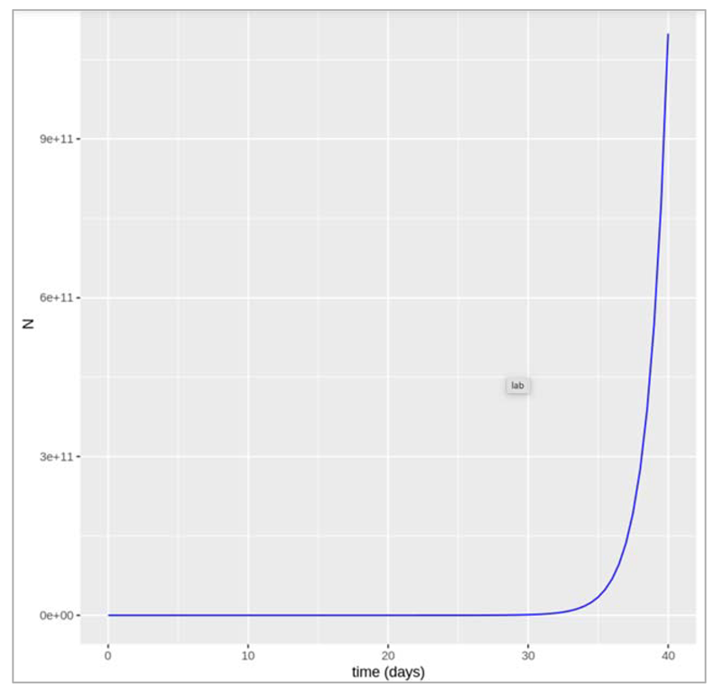
Figure []. Plot shows the growth in population with size N over a time period (in days).
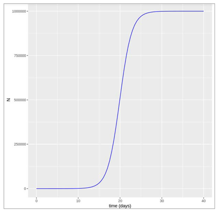
Logistic growth in population:
As mentioned in the above graph, we don’t see the growth in population as smooth exponential curve, hence we need to count in realistic perspective and take into account the fact that populations cannot increase forever in a limited space with limited resources. In ecology, we model this using what is known as ‘carrying capacity’, called K. As the population size comes close to K, then the rate of growth slows down. The population equation we want to solve for dN/dt with a carrying capacity K is the logistic growth equation.
Figure[]:
Modelling an infected cohort:
We start a simple model (not a transmission model yet). However, the concepts built in this model are important like rates, and transitions, and delays. So we imagine a cohort of the people with an infectious disease. So we are going to be assuming that ultimately, everyone recovers from the infection after a certain infectious period. We can then organise a cohort into two compartments. One is the number of people still infected with the disease and the other is the number of people who have recovered. We start with everyone in the infected compartment and end up with everyone in the recovered compartment. But how long does it take for people to move from one compartment to another? If we knew the infectious period, then we could predict how many people would be infected and recovered after one week, after a month or a year? To model this, we are going to introduce the rate of transition between I and R. So first, we can model the dynamics of this cohort using just two differential equations: dl by dt equals Gamma times I and dR by dt equals Gamma times I. We would recognise these as simple differential equations, where dI by dt denotes the rate of change of I with respect to time. We just seen the rate of flow out of I compartment is proportional to the number of people in the I compartment, and the constant of proportionality is Gamma (recovery rate). So the larger the value of Gamma, the more quickly people go from I to R, the more quickly they recover. Perhaps most important is that at any given point in time, every individual in the I compartment is just as likely to experience a recovery. This is why we're able to attach this rate Gamma to everyone in the I compartment. Next, we're starting with a cohort of 1,000 people and simulating how they recover over time. Note that Gamma is a rate per unit time. So it has units of per day or day to the minus one. This graph has time in days along the x-axis. You can see that when we choose a value of Gamma that is 0.1 per day, some people in the cohort recover quickly, others recover slowly, but on average, it takes people 10 days to recover. Let's take another example. When we have a higher value of Gamma, say 0.5 per day, on average, it takes people two days to recover. So what's going on here is the behaviour of the exponential distribution. It turns out that for any population governed by this assumption, the time spent in the I compartment is distributed according to an exponential distribution with exponential parameter Gamma. The mean of that distribution or the mean infectious period is just one over Gamma. It makes sense, right? The shorter the infectious period, the shorter the duration, and therefore, the larger the value of Gamma. So to recap, we have just written down a simple model to describe the dynamics of an infected cohort. As long as you know the value of Gamma, you'll be able to say how many people are still infected and how many people are recovered at any given point of time. Here we've talked about the infectious period and recovery times. But now imagine more complex models that involve additional compartments and rates to describe other types of transitions like mortality. In all of these models, two important things to remember about rates like Gamma are that they are in units of inverse time, so they could be days to the minus one or even years to the minus one, and secondly, the inverse of the rate is the average duration that people spend in a given compartment.
Steps that we coded in the tool:
| Initialise the respective libraries to perform modelling on infect cohort |
| We initialise values like Initial_number_infected (upto 100000), initial_number_recovered (0 since no one has recovered in the beginning), recovery_rate (1/10 : since at the beginning of the simulation the average duration spent in the I compartment is 10 days), followup_duration (4*7 : 4 week period) |
| Combine the model input vectors (as explained above) |
| Initialise model function as cohort_model with time, state and parameters as input parameters |
| We get the output for I and R values for the timeframe period (28 days) : Ratio = (we observe the number of people who recovered after 4 weeks)/(number of people who got infected + number of recovered people) |
| Plotting the output (please refer the figure below) – we check at what point in time were the infected and recovered individuals equal in number |
| Then we try to check the plots by varying values of γ : average duration of infection = 2 days so the recovery rate = 0.5 days |
| Then we graph by changing average duration of infection = 20 days so the recovery rate = 0.05 days |
| We note down the changes that we observe in the transition to the recovered compartment if γ is higher or lower? Like how long does it take for everyone to recover in both cases? If the rate is higher (γ = 0.5) we can see that infected people recover more quickly: it takes less than 2 days for half of the infected cohort to recover, and by around 8 days, nearly everyone has recovered. A lower rate (γ = .05) on the other hand corresponds to a slower transition: it takes around 14 days for half of the infected people to move into the R compartment and by the end of our 4 week follow-up around a quarter of people still not have recovered. |
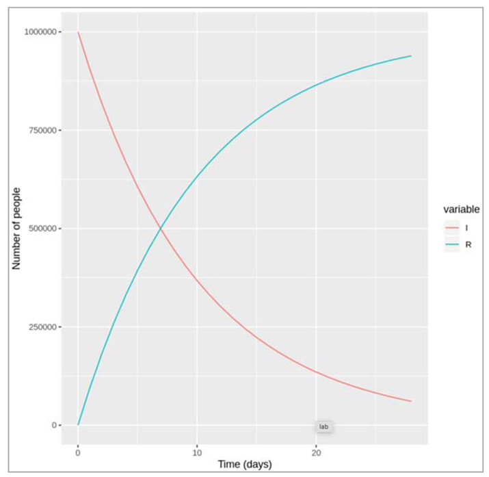
Figure []. Number of infected and recovered over time when gamma = 1/0.1 days.
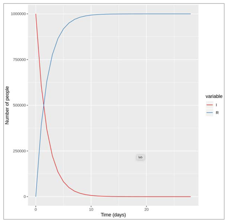
Figure []: Number of infected and recovered over time when gamma = 0.5 days^-1
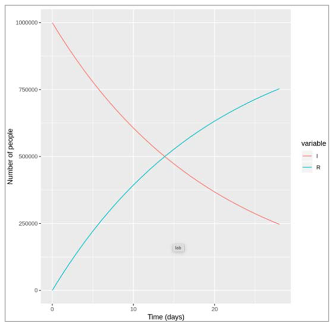
Figure []: Number of infected and recovered over time when gamma = 0.05 days^-1
Simulating competing hazards:
The model we want to specify in this has 3 compartments: I (infected), R (recovered), M (dead).
The infected people can recover at rate of γ and now they die at rate μ
The differential equations for this model would like:
dI/dt = -γI - μI
dR/dt = γI
dM/dt = μI
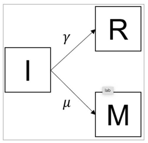
Figure [] : The equation describing the rate of change in the recovered (R) compartment (second line) is not affected by this addition. However, we need a new equation describing the rate of change in the deceased (M) compartment (third line). People move into this compartment from the infected compartment (I) at a rate μ - this transition also needs to be added in the rate of change in the infected compartment I (first line).
Steps that we coded in the tool:
| We initialise model function that takes as input arguments : time, state and parameters and then pass that as arguments in cohort_model which returns the number of people in each compartment at each time-step (in the same order as the input state variables) |
| We define model input and timesteps: initial_state_values (I=10000000, M= 0, R=0), parameters (gamma = 0.1, mu= 0.2) , times (28 days) |
| After 4 weeks, we would want to gauge more people have recovered or more people have died? : We expect more people to die than to recover because the mortality rate (0.2) is higher than the recovery rate (0.1), so people move more quickly from I to M than from I to R. |
| We load the necessary libraries to solve the differential equations |
| We plot the graphs as mentioned |
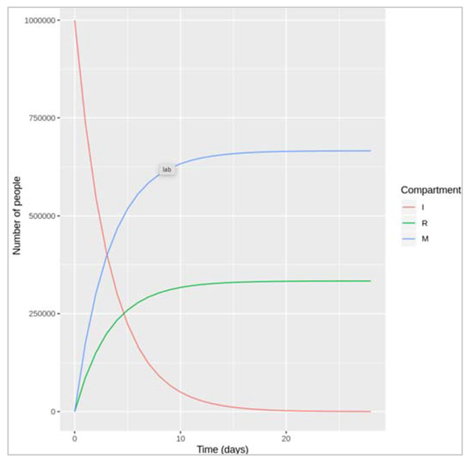
Figure [] : This figure shows the graphs of how I, M and R changes with respect to increasing days.We would want to check what proportion of the initially infected cohort died before recovering over the 4 week period? - (number of people who died over the 4-week period)/(number of people initially infected).
We check the case fatality rate (CFR) = μ/( μ+ γ )
If we assume CFR = 50%, γ = 0.1 then μ = 0.1 : if μ and γ are equal, then they represent two competing hazards that are also equal, half of the people die and half recover, so CFR = 50%.
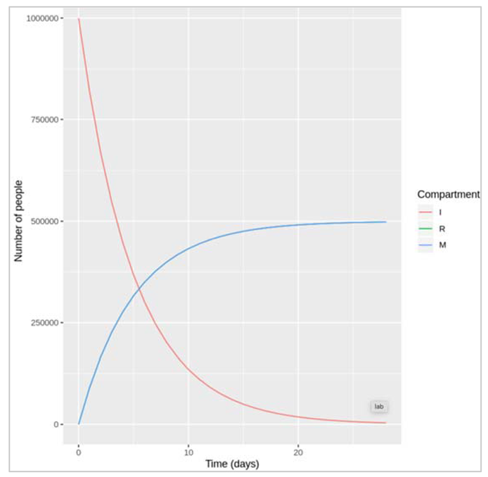
Figure []: We only see red and blue lines here representing the number of people in the I and M compartment, despite having plotted all 3 compartments. This is just because, with μ = γ and R(0) = M(0) (the initial number recovered and deceased), the number of recovered and deceased people is identical at each time-step so the lines completely overlap
SIR model with a constant force of infection
The differential equations for the simple SIR model with a constant force of infection are:
dS/dt = -λS
dI/dt = λS - γI
dR/dt = γI
The input data:
Initial number of people in each compartment
S= 10^6 – 1
I = 1
R = 0
Parameters:
λ = 0.2 days^-1 (this represents a force of infection that’s constant of 0.2)
γ = 0.2 days^-1 (corresponding to an average duration of infection of 10 days)
| We load the library packages |
| We provide model inputs with the initial number of people in each compartment |
| We provide the parameters describing the transition rates in units of days^-1 : lambda = the force of infection, which acts on susceptibles and gamma = the rate of recovery, which acts on those infected |
| We store the sequence of time-steps to solve the model at 0 to 60 days in daily intervals |
| SIR model function: input parameters = time, state and parameters where dS = -lambda*S = people move out of (-) the S compartment at a rate lambda (force of infection) dI = lambda*S – gamma*I = people move into (+) the I compartment from S at a rate lambda, and move out of (-) the I compartment at a rate gamma (recovery) dR = gamma * I = people move into (+) the R compartment from I at a rate gamma |
| We plot the graph as shown below |
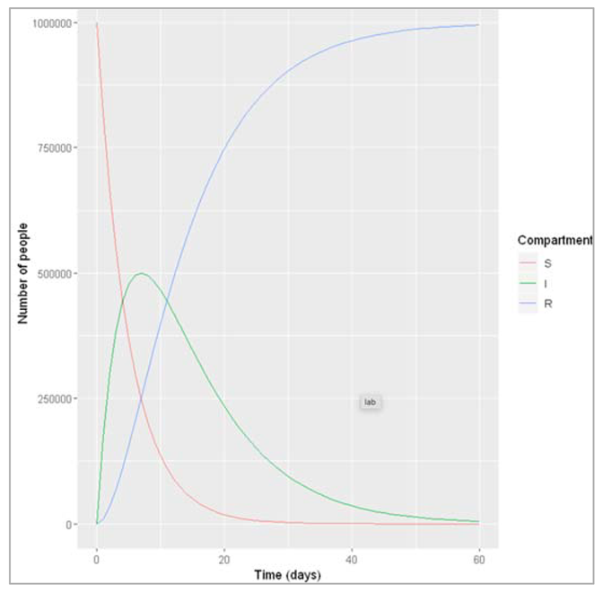
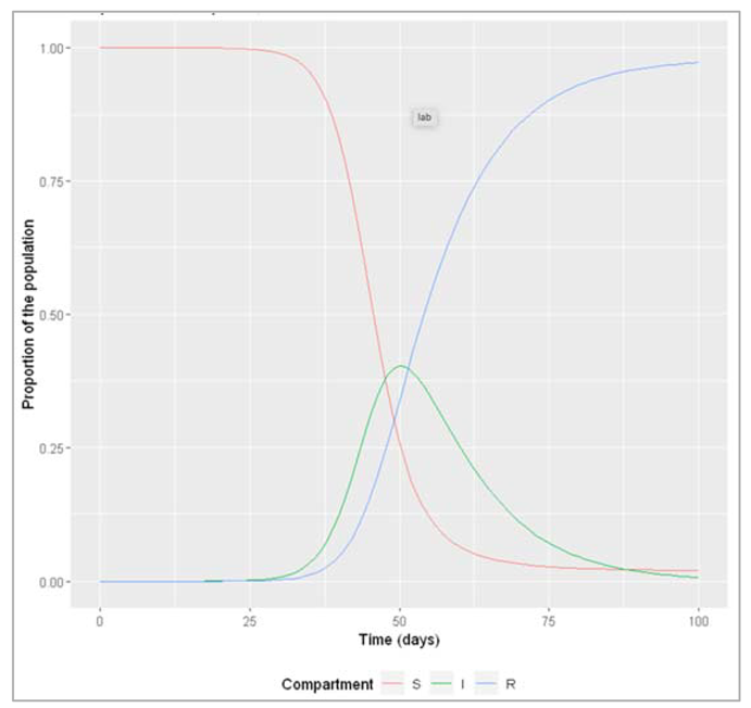
Figure []: Based on this graph, describe the pattern of the epidemic over the 2 month period. How does the number of people in the susceptible, infected and recovered compartment change over time? After how many days does the epidemic reach its peak? And how many days does it end?
The number of infected people quickly increases, reaching a peak of 5000000 infected people after around 7 days, before steadily decreasing again. The number of recovered people starts to rise shortly after the first people become infected. It increases steadily (but less sharply than the curve of infected people) until the whole population has become immune – by day 53, 99% are in the R compartment, and nearly no susceptible people remain after 60 days.
SIR model with a dynamic force of infection
The differential equations for an SIR model with a dynamic force of infection are:
dS/dt = -β(I/N)S
dI/dt = β(I/N)S - γI
dR/dt = γI
Some assumptions inherent in this model structure are:
- a homogenous population – everyone in the same compartment is subject to the same hazards
- a well-mixed population – all susceptible people have the same risk as getting infected, dependent on the number of infected people
- a closed population – there are no births or deaths, so the population size stays constant
| We initialize the libraries |
| We initialize state values for S, I, R, parameters(beta, gamma), sequence of timestamps from 0 to 60 days with 1 day interval |
| We initialize SIR model function with time, state and parameterswhere N = S+I+R (sum of number of people in each compartment)lambda = beta*(I/N)dS = -lambda*S = people move out of (-) the S compartment at a rate lambda (force of infection)dI = lambda*S – gamma*I = people move into (+) the I compartment from S at a rate of lambda, and move out of (-) the I compartmentdR = gamma * I = people move into (+) the R compartment from I at a rate gamma |
| We eventually plot the graph |
The figures below are going to explain some details on how tuning different configurations/parameters have helped us to establish the occasional behaviour of how epidemic spreads and what are the measures we tend to achieve to get the results. The explanations for the figures have also been mentioned alongside (as can be seen below).
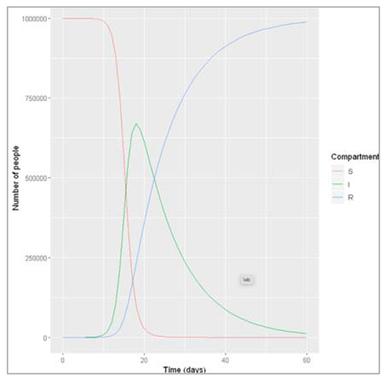
Figure []: After how many days does the epidemic peak? What is the peak relevance? The peak of the epidemic occurs after 19 days, at which point around 6700000 people are infected.
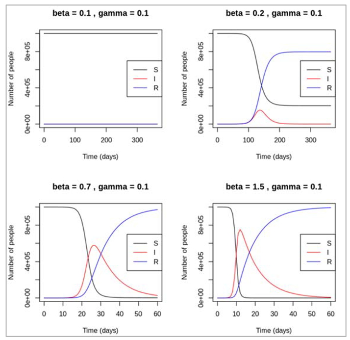
How does the pattern of the epidemic change under different assumptions for β and γ e.g. in terms of of the peak of the epidemic, the number infected at the peak, and when the epidemic ends?
Figure[] : As can be seen, different recovery rates affects the epidemic just as much as different forces of infection. With β held constant at 1, an increasing rate value for γ tends to lead to a later and lower peak of infected people, and an earlier rise in the recovered curve. If people can stay infected for a long time before recovering (γ = 0.025, corresponding to an average duration of infection of 40 days), the number of infected people stays high over a longer period and declines slowly – the epidemic flattens out. In contrast, if recovery happens very quickly after injection (γ= 0.5), there is only small speak in the prevalence of infection and the epidemic dies out quickly. If γ are as large as 1, no epidemic takes place after the introduction of 1 infected case.
SIR dynamics with varying parameters
We are modelling a disease where every infectious person infects 1 person on average, every 2 days and is infectious for 4 days with β = 1 person/2 days = 0.5 days^-1 and γ = 0.25 days^-1
| We load necessary libraries |
| We initialize the initial number of people in each compartment (S,I,R values), transition rates in units of days^-1, the sequence of timesteps to solve the model at 0 to 100 days in daily intervals |
| We write SIR model function with time, state and parameters where N = S + I + R = total population size N (sum of number of people in each compartment) lambda = beta * I/N dS = -lambda * S = people move out of (-) the S compartment at a rate lambda (force of infection) dI = lambda * S – gamma*I = people move into (+) the I compartment from S at a rate lambda, and move out of (-) the I compartment at a rate gamma (recovery) dR = gamma * I = people move into (+) the R compartment from I at a rate gamma |
| We refer to ode function with the values initialized above |
| We create proportion of the population in each compartment at each timestep = number in each compartment/total initial population size |
| We plot the graph |
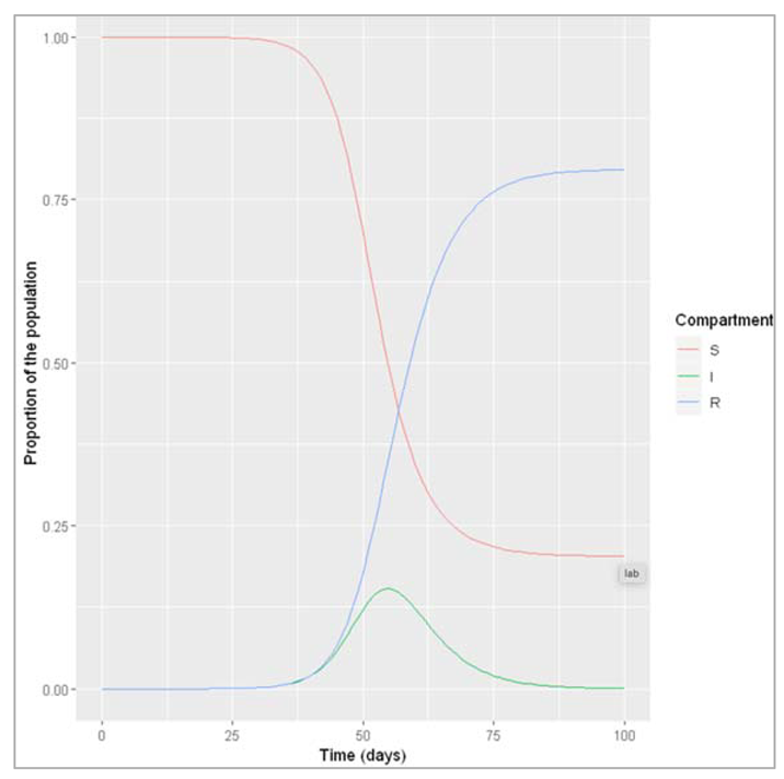
Figure []: What do we observe when β = 0.5 and γ = 0.25? An epidemic occurs, reaching a peak 56 days after introduction of the first infectious case, at which point about 15% of the population are infected. By the end of the epidemic, about 80% of the population have been infected and recovered.
Modelling a scenario where beta drops to 0.1 because an infection control measure is introduced:
| We intialize parameters beta(infection rate) and gamma (rate of recovery, which acts on those infected) |
| Solving ODE with the parameters defined above |
| Calculating proportion in each compartment = output_value/initial_state_values |
| Plotting the graph to understand better |
Figure []: What do we observe when β is reduced to 0.1 instead, with γ remaining at 0.25? Under this set of conditions, no epidemic occurs – the number of infected people does not increase following the introduction of a first infectious disease.
Assuming β = 0.1, what value of γ do we need in order to get an epidemic?
In real life, what could give rise to this change in γ?
With γ around 0.09 or lower, we start to see a small epidemic if we run the model for each long enough (like 1000 days). Different mechanisms can lead to such a decrease in the recovery rate, corresponding to an increase of the average infectious period, for example strain evolution of the infectious agent or changes in social behaviour.
Based on your answers to the previous question, can you think of a condition involving β and γ that is necessary for an epidemic? Test this condition using your code above.
For an epidemic to happen, the ratio β/γ has to be greater than 1. In other words, to give rise to an epidemic, infectious people have to be infectious enough (β has to be high enough) for long enough (γ as to be low enough) to pass on the pathogen -β as to be higher than γ. Because of the relationship between these two parameters, a low infection rate can still lead an epidemic if infected people are infectious for long enough, as you modelled in the previous question.
|
Simulating the effective reproduction number Reff We have chosen a daily infection rate of 0.4 and a daily recovery rate of 0.1 to get an R0 of 4. We are modelling this epidemic over the course of about 3 months We load necessary libraries for analysis |
| We initialize the initial number of people in each compartment (at timestep 0) with values S = 1000000 -1 (the whole population we are modelling is susceptible to infection), I = 1 (the epidemic starts with a single infected person), R = 0 (there is no prior immunity in the population) |
| We store the parameters describing the transition rates in units of days^-1 where beta = 0.4 (infection rate, which acts on susceptibles), gamma = 0.1 (the rate of recovery, which acts on those infected) |
| We initialize sequence of timesteps to solve the model at 0 to 100 days in daily intervals |
| We write SIR model function with inputs, state and parameters N = S+I+R lambda = beta*I/N dS = -lambda * S = people move out of (-) the S compartment at a rate lambda (force of infection) dI = lambda * S – gamma*I = people move into (+) the I compartment from S at a rate lambda, and move out of (-) the I compartment at a rate gamma (recovery) dR = gamma * I = people move into (+) the R compartment from I at a rate gamma |
| We refer to ode function with the values initialized above |
| We create proportion of the population in each compartment at each timestep = number in each compartment/total initial population size |
| We plot the graph |
| We calculate effective reproduction number in new column Reff = R0 * proportion susceptible at each timestep for each row = (beta/gamma)*(output/(output*S + output*I + output*R)) |
Figure[]: Proportion susceptible, infected and recovered over time
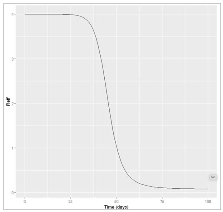
Figure[]: Effective reproduction number over time
How does Reff vary over the course of the epidemic? What do you notice about the connection between the change in Reff and the epidemic curve over time? In particular, in relation to Reff, when does the epidemic peak and start to decline?
The effective reproduction number is highest when everyone is susceptible: at the beginning, Reff = R0. At this point in our example, every infected cases causes an average of 4 secondary infections. Over the course of the epidemic, Reff declines in proportion to susceptibility. The peak of the epidemic happens when Reff goes down to 1 (in the example here, after 50 days). As Reff decreases further below 1, the epidemic prevalence goes into decline. This is exactly what you would expect, given your understanding of the meaning of Reff: once the epidemic reaches the point where every infected case cannot cause at least one more infected case (that is, when Reff < 1), the epidemic cannot sustain itself and comes to an end.
Calculating more complex forms of R0:
To derive R0 for more complex models, it is useful to remember: it is the average number of secondary infections caused by a single infected case (index case) in a totally susceptible population and the principle of competing hazards.
Example 1: symptomatic and asymptomatic infection
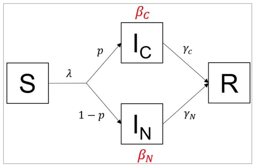
Figure []:
In this variation of the SIR model, infected people are stratified into 2 compartments: people in the IC
compartment are coughing, whereas people in the IN compartment show no symptoms. The
proportion of infected people with a cough is p, which means the proportion of asymptomatic
infected people is 1-p. Coughing people transmit infection at a rate βC and recover at a rate γC,
whereas asymptomatic people transmit infection at a rate rate βN and recover at a rate γN.
With 2 compartments being a source of infection, we can approach the problem by first calculating
separately the average number of secondary infections caused by a single coughing case IC, and the
average number of secondary infections caused by a single asymptomatic case IN.
For this, we only need to apply the general principle introduced in the lecture: For any infected
compartment, β is (by definition) the average number of secondary infections caused per unit time,
and 1/γ is the average duration of infection.
Take a simple example: if someone infectious is infecting 2 people per day on average, and they are
infectious for 5 days on average, this means they cause 10 secondary infections overall, over their
whole infectious period.
More generally, we can write:
Totalnumberofsecondaryinfections = Secondary infections per unit time × average infectious period
which in terms model parameters, is the same as: β * (1/γ)
This is the same as the logic covered in the lectures. Now – thinking about the model above, we
concentrate first on a coughing index case (in the compartment). The average number of
secondary infections caused by such a case equals:
Similarly, the average number of secondary infections caused by an asymptomatic index case (in the
IN compartment) equals:
Now, remember that R0 is an average over the population, meaning that we need to take an average
over coughing and non-coughing individuals. We know that a proportion p of infected people are
coughing. So a population average of the terms above is simply:
R0 = p*βC/γC + (1 − p)*βN/γN
Of course, if there is an equal number of people in both compartments, this simplifies to a normal mean:
R0 = 0.5 βC/γC + 0.5 βN/γN
Example 2: progressive infection
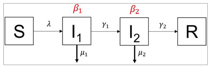
Figure []:
In the second example, we again have 2 compartments transmitting the infection, but this time they
represent consecutive stages of an infection. People in the first stage of the infection I1 transmit
infection at a rate β1, die at a rate µ1, and leave the first stage of infection at a rate γ1. They progress
into the second stage of infection, I2. People in the stage I2 transmit infection at a rate β2, die at a
rate µ2, and recover at a rate γ2. This kind of structure could apply, for example, to a disease that has
an initial asymptomatic stage (I1), where infected people are infectious without symptoms, and a
more advanced diseased stage (I2), where they develop symptoms, and potentially higher
infectiousness.
The approach to calculating R0 is similar to before: first, we calculate the average number of
secondary infections caused by an index case from each compartment separately. This time, when
calculating the average duration in any compartment, we have to take account of the fact that there
are now 2 competing rates involved, γ and µ.
The average number of secondary infections caused by an index case in I1 is:
β1/(γ1 + μ1)
And the average number of secondary infections caused by an index case in I2 is:
β2/(γ2 + μ2)
Again, we need to take a population average of both. Of course, we know that every infected person
(100%) passes through the first stage of infection, but what proportion of infected people reaches
the second stage? Because of the rate μ1, some individuals may die before progressing to I2.
Here, you just need to apply the same principle you learnt in the lecture on competing hazards to
calculate the case fatality ratio. The proportion who progresses to the second stage before dying is:
γ1/(γ1 + μ1)
Bringing all this together into a population average of secondary infections gives, for R0:
R0 = β1/(γ1 + μ1) + γ1/(γ1 + μ1) × β2/(γ2 + μ2)
Modelling population turnover
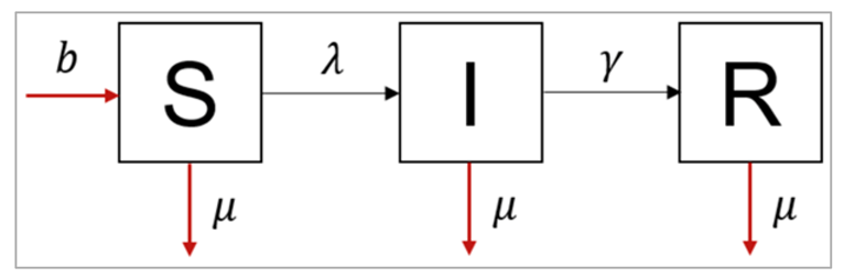
Figure []:
The differential equations for an SIR model with population turnover look like this:
dS/dt = -β I/N S - μ S + bN
dI/dt = β I/N S - γI - μI
dR/dt = γI - μR
This structure assumes that every individual in each compartment experiences the same background mortality μ (there is no additional mortality from the infection for example, and we make no distinction by age). Those who have died no longer contribute to infection (a sensible assumption for many diseases). Babies are all born at a rate b into the susceptible compartment.
Note that, as always, we calculate the people dying in each of the compartments by multiplying the number in that compartment by the rate μ. Even though babies are all born into the same compartment, the birth rate still depends on the population in all of the compartments, hence why we need to multiply b* by the total population size *N. We choose a value of b to allow a constant population size, so that all deaths are balanced by births.
Modeling an acute disease epidemic in a fully susceptible human population
Parameters:
β = 0.4 days−1 = 0.4 * 365 years−1
γ = 0.2 days−1 = 0.2 * 365 years−1
μ = 1/70 years−1
b = 1/70 years−1
In this part, we are running the model for the 400 years period, the first only plotting the number of infected people only over the course of 1 year.
| We load the necessary libraries |
| We initial number of people in each compartment (at time-step 0) with S, I, R values where S = 1000000 – 1 (whole population we are modelling is susceptible to infection) I = 1 (the epidemic starts with a single infected person) R = 0 (there is no prior immunity in the population) |
| We store parameters describing the transition rates in units of years^-1 beta = 0.4*365 = the infection rate, which acts on susceptibles gamma = 0.2*365 = the rate of recovery, which acts on those infected mu = 1/70 = the background mortality rate, which acts on every compartment b = 1/70 = the birth rate |
| We are storing the sequence of time-steps to solve the model from 0 to 400 years in the interval of every 2 days |
| The model function takes input parameters (time, state, parameters) N = S + I + R lambda = beta * I/N dS = -lambda * S – mu * S + b * N dI = lambda * S – gamma * I – mu * I dR = gamma * I – mu * R |
| Plotting the graph as it is |
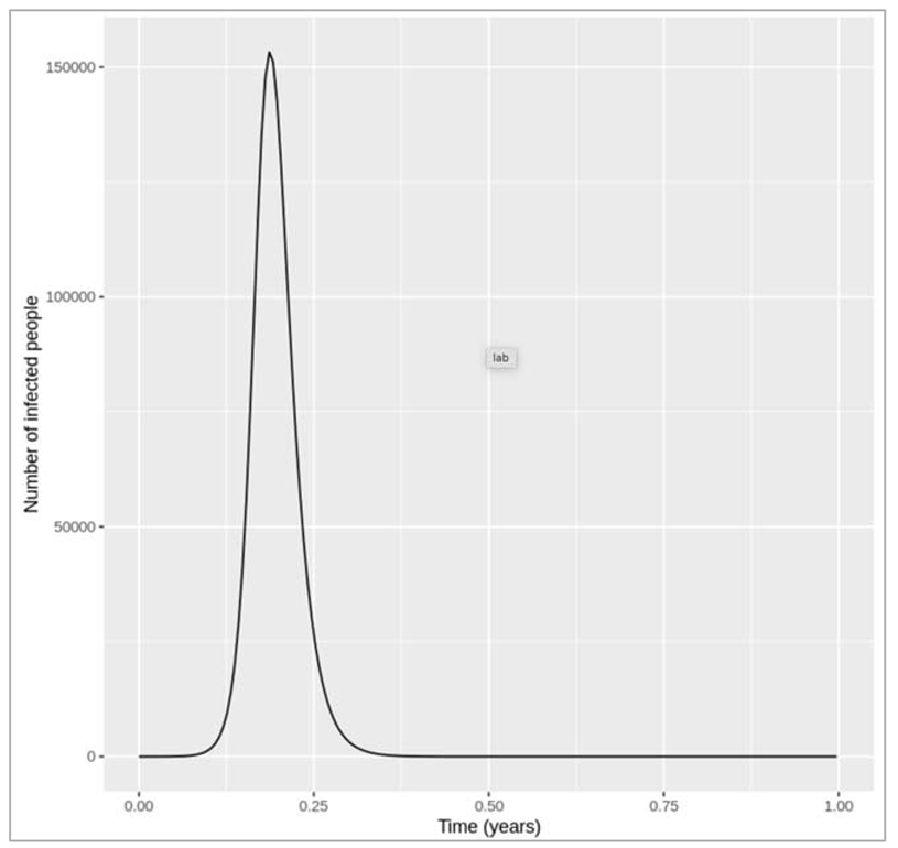
FIGURE {} :
Figure [] : Epidemic curve in the first year
introduction of an infected case
How does changing the interval of the time-steps to solve the model at influence the output? Does the plot look correct in each case? If not, at what resolution of time-steps do you get erroneous results, and why?
Changing the time-step vector from seq(from = 0, to = 400, by = 2/365) to: by = 1/365, by = 3/365 and by = 4/365 gives a very similar result in each case. However, if we only solve the equations every 5 days (by = 5/365), we get a nonsensical plot with the y axis showing negative values. deSolve also gives us warning messages that the integration was not successful. This is because, although we are looking at a long timescale, the disease we are modelling still spreads and resolves quickly! The average infectious period is 1/0.2 = 5 days, and the model code needs to have a sufficiently short time-step to capture these dynamics. In this example, a time-step of 5 days is too long, and causes an error where the number of new recoveries at each time-step is larger than the number of infected people. Since the newly recovered individuals (γ∗I) are subtracted from the number currently infected, this eventually leads to negative values in I.
Something to keep in mind is that, while time-steps of 1, 2, 3 and 4 days all give sensible and very similar results based on the plot, if you print the output you can see that the numbers are actually slightly different. A lower time-step always gives a better resolution, but especially if we work with more complex models, there is a trade-off between the resolution and the computational speed. The choice of time-step therefore also depends on the modeller's priorities, and in practice we are most concerned with which resolution is good enough to get reliable predictions.
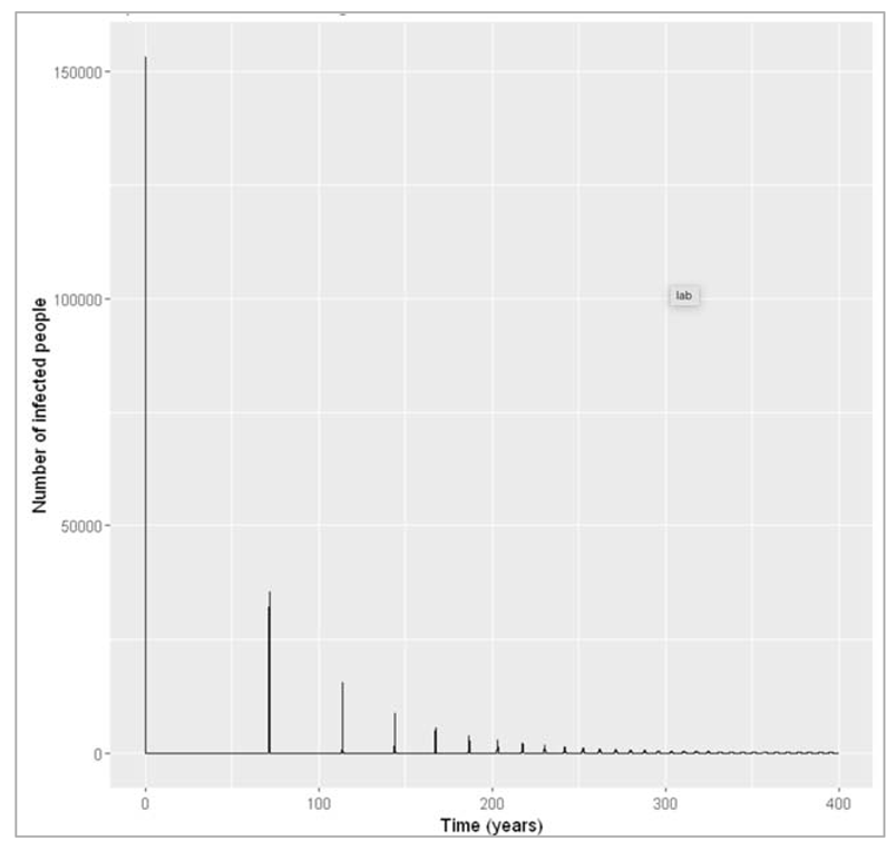
Figure [] : Plotting the long-term epidemic curve over 4 generations
What do you observe about the long-term disease dynamics under these assumptions? Can you explain why this pattern occurs based on what you have learnt in the last weeks?
Over several generations, we see that the number of infected people oscillates over time. These are sharp epidemic cycles: epidemics reoccur repeatedly over time, although the peaks become progressively smaller and eventually disappear. The first peak is the one we looked at above.
This pattern occurs because the disease has a much shorter duration than the human population turnover. Once an epidemic has spread through the population and depleted the susceptible pool, it takes a long time for the susceptibles to replenish through births. This is why we see these deep and long troughs (around 70 years until the second epidemic) between epidemics.
We can confirm this by adding susceptible and recovered people to the plot below. As you can see, there are consecutive peaks and troughs in the number of susceptible and immune people as well, with the number in the immune compartment being at its lowest when the number of susceptibles peaks. Once the proportion of susceptibles is sufficiently high for infection to spread, the number of infected people starts rising. Just before the peak of the epidemic, more susceptibles are removed through infection than are added through births, so the susceptible proportion starts going into decline again. As you should remember from last week, the epidemic peaks when the effective reproduction number equals 1 - and in the simple SIR model, the effective reproduction number is directly proportional to the proportion of susceptibles through the formula:
Reff = R0 * (S/N)
By rearranging the equation, we see that the epidemic peaks when the proportion of susceptibles S/N=1/R0. In our example R0 = 0.4/0.2 = 2. Indeed, we can see that the peaks in the number of infectious people occur when the proportion susceptible equals 0.5. After that, the proportion of susceptibles becomes too low for each infectious person to cause at least one secondary case on average - the prevalence of infection decreases and the epidemic ends, until the pool of susceptibles is replenished again.
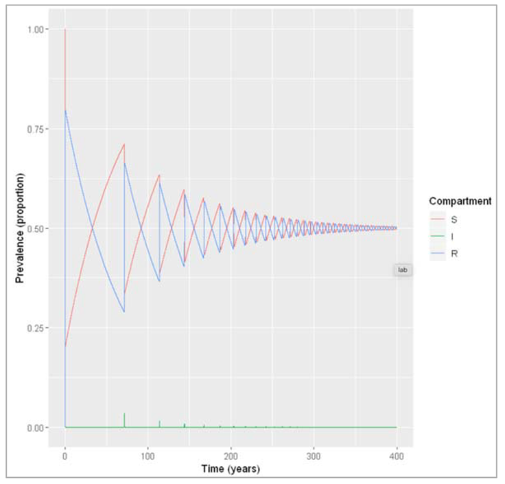
Figure []: Prevalence of susceptible, infected and recovered people over time. We are modelling a similar acute disease, but this time in a population with much faster turnover. The infection parameters are the same as before, assuming the lifespan is 4 weeks.
| Loading necessary libraries |
| We store the initial parameters with initial number of people in each compartment (at timestep 0), S = 10000000 – 1 = the whole population we are modelling is susceptible to infection I = 1 = the epidemic starts with a single infected person R = 0 = there is no prior immunity in the population |
| We store the parameters describing the transition rates in units of days^-1 beta = 0.4 = the infection rate, which acts on susceptibles gamma = 0.2 = the rate of recovery, which acts on those infected mu = 1/28 = the mortality rate, which acts on each compartment b = 1/28 = the birth rate |
| We store the sequence of time-steps to solve the model from 0 to 365 days in daily intervals |
| The model function takes time, state and parameters as input arguments N = S + I + R lambda = beta * I/N dS = -lambda * S – mu * S + b * N dI = lambda * S – gamma * I – mu * I dR = gamma * I – mu * R |
| Solving the ODE |
| We create prevalence proportion to long-format output prevalence = output/sum(initial_state_values) |
| Plotting the graph |
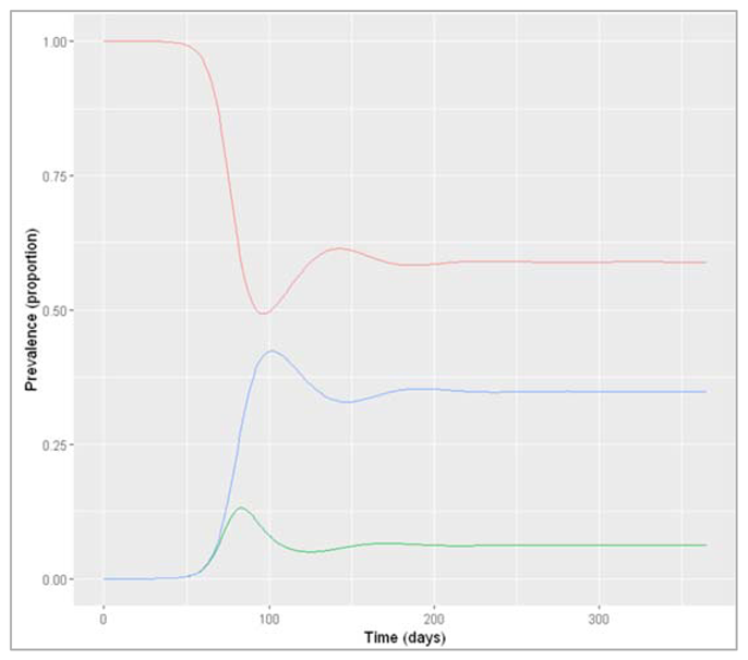
Figure []: Prevalence of infection, susceptibility and recovery over time
How do the disease dynamics compare to the previous example? Why does this occur (what is different compared to the disease in the human population)?
In the rapid-turnover population, we don't observe epidemic cycles like in the slow-turnover example. Instead, an epidemic occurs after about 80 days of introduction of an infectious case. After the peak, the prevalence of infection starts to decline - but this time not to 0! After the epidemic, the prevalence of susceptibles, infected and recovered people reaches a stable equilibrium, where around 6% remain infected. When the system is in equilibrium, we refer to this as endemicity. As opposed to an epidemic, an endemic infection does not die out but remains stable within a population.
In this example, an acute disease with the same infection parameters becomes endemic in the pig population because the population turnover is much faster compared to humans. The susceptible pool is replenished quickly through new births, so infectious individuals can cause at least 1 secondary case on average throughout. You should see that the proportion susceptible remains stable at a value > 0.5.
In the plot below, you can see how this corresponds to the effective reproduction number:
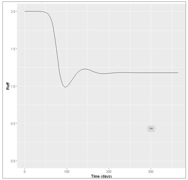
Figure []: Effective reproduction number over time
Other drivers for epidemic cycles:
- Several other factors could drive an oscillating pattern in infection dynamics, for example: seasonal transmission, if the epidemics always occur around the same time each year (e.g. measles transmission during the school term, flu transmission in winter)
- Environmental drivers are another very important cause for epidemic cycles, for example with humidity playing an important role in influenza transmission or other stochastic effects.
- Modelling a growing population: for the population to grow, the birth rate needs to be higher than the mortality rate. Another factor affecting population size could be migration.
- Modelling a disease where a proportion p of babies born to infected mothers are infected at birth:
To model mother-to-child transmission, we need to capture two aspects:
- infected mothers can infect a proportion p of their newborns
- babies born to uninfected mothers, and a proportion (1-p) of babies born to infected mothers, are born into the susceptible compartment where we can define:
the number of babies infected at birth as : birthsi = pbI
the number of babies born susceptible as: birthsu = (1-p)bI + bS + bR
Other ODEs as:
dS/dt = -β(I/N)S -μS + birthsu
dI/dt =β(I/N)S -γI -μI + birthsi
dR/dt =γI -μR
A simple model for vaccination
Modelling a disease where β = 0.4 days^-1, γ = 0.1 days^-1 and the vaccine coverage p = 0.5
| We load the necessary libraries |
| We initialize vaccine coverage p = 0.5 and total population size = 10^6 |
| We store the values of vectors with initial number of people in each compartment (at time-step 0) S = (1-p)*(N-1) = a proportion (1-p) of the total population is susceptible I = 1 = the epidemic starts with a single infected person R = p*(N-1) = a proportion p of the total population is vaccinated/immune |
| We initialize the vectors storing the parameters describing the transition rates in units of days^-1 where beta = 0.4 gamma = 0.1 |
| We initialize the vectors storing the sequence of timesteps to solve the model at 0 to 730 days in daily intervals |
| We create a SIR model function which takes time, state and parameters as input, N = S + I + R lambda = beta*(I/N) dS = -lambda*S = people move out of (-) the S compartment at a rate lambda (force of infection) dI = lambda * S – gamma * I = people move into (+) the I compartment from S at a rate lambda, and move out of (-) the I compartment at a rate gamma (recovery) dR = gamma * I = people move into (+) the R compartment from I at a rate gamma |
| Then we solve the ODE |
| Then we add a column for prevalence proportion and plot the relevant graph |
Figure[] : Prevalence of infection, susceptibility and recovery over time. This graph was built with vaccine coverage = 50%
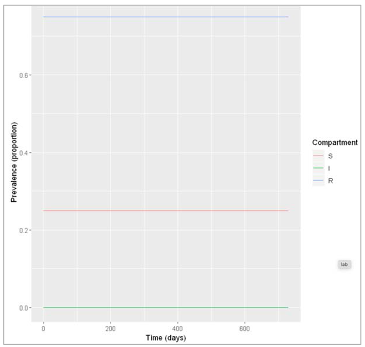
Figure []: Prevalence of infection, susceptibility and recovery over time. This graph was built with vaccine coverage = 75%
Does everyone in the population need to be vaccinated in order to prevent an epidemic? What do we observe if we model the infection dynamics with different values for p?
Not everyone in the population needs to be vaccinated in order to prevent an epidemic. In this scenario, if p equals 0.75 or higher, no epidemic occurs – 75% is critical vaccination/herd immunity threshold. Herd immunity describes the phenomenon in which there is sufficient immunity in a population to interrupt transmission – because of this, not everyone needs to be vaccinated to prevent an outbreak.
So what proportion of the population needs to be vaccinated in order to prevent an epidemic if p equals 0.75 or higher, no epidemic occurs – 75% is the critical vaccination/herd immunity threshold. Herd immunity describes the phenomenon in which there is sufficient immunity in a population to interrupt transmission. Hence, everyone needs to be vaccinated to prevent an outbreak.
What proportion of the population needs to be vaccinated in order to prevent an epidemic if β = 0.4 and γ = 0.2 days^-1, what if β = 0.6 and γ = 0.1 days^-1?
The herd immunity threshold is 50%. If β = 0.6 and γ = 0.1 days^-1, the required vaccination coverage is around 83%.
Vaccination changes the effective reproduction number, by reducing the number of people who are susceptible. Based on the previous questions, we can use the formula for the effective reproduction number Reff to derive a formula for calculating the critical vaccination threshold?
In mathematical modelling terms, herd immunity is just the same as saying that Reff < 1, where we can derive herd immunity threshold by solving the formula for Reff for p when Reff = 1:
Reff = R0 * S/N
Reff = R0 * (1-p)
p = 1- 1/R0
Modelling waning immunity
The SIR model structure with waning immunity can be visualised like this:
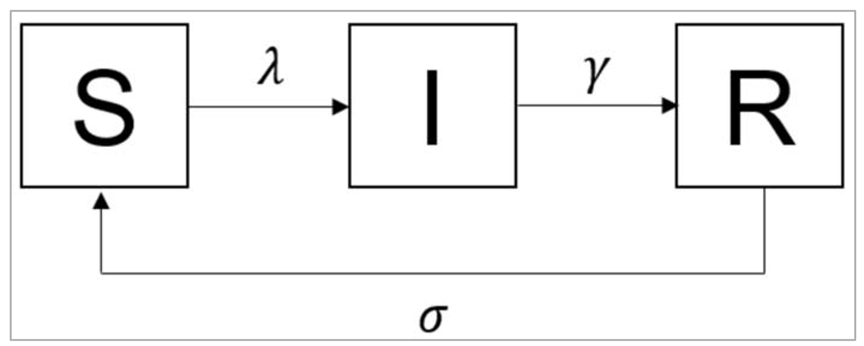
Figure[] :
What is the value of the waning rate σ if the average duration of immunity is 10 years?
σ = 1/10 = 0.1 years^-1
| Initialize the intended libraries |
| Initialise the vector which has initial number of people in each compartment (at timestep 0) S = 10^6 -1 = the whole population is susceptible I = 1 = the epidemic starts with a single infected person R = 0 = no one is immune yet |
| We initialize the vector describing the parameters consisting of transition rates in units of years^-1 beta = 0.4*365 = the infection rate, which acts on susceptibles gamma = 0.2*365 = the rate of recovery, which acts on those infected sigma = 1/10 = the rate of waning of immunity, which acts on those recovered |
| We store the sequence of time-steps to solve the model from 0 to 100 years of every 2 days |
| Initialize SIR model function: N = S + I + R lambda = beta * I/N dS = -lambda * S + sigma * R = recovered individuals now return to the susceptible compartment at a rate sigma dI = lambda * S – gamma * I dR = gamma * I – sigma * R = immune individuals leave the recovered compartment at a rate sigma |
| We add a column for prevalence proportion |
| Plotting the graph |
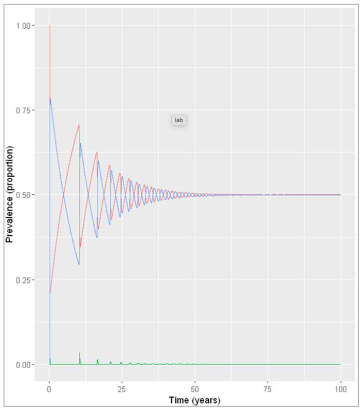
Figure [] : Prevalence of infection, susceptibility and recovery over time at sigma = 0.1 years^-1
What do you observe about the infection dynamics? How does this compare to the model with population turnover from the first notebook this week?
When modelling slow waning of immunity, we observe the same epidemic patterns as when we modelled an acute disease in a population with slow turnover: spikes of epidemics alternating with long deep troughs, reflected in the cycles of susceptibility and recovery, but eventually dying out. However, with an average duration of immunity of 30 years, the rate of waning is still quicker than human population turnover, and therefore the time between epidemics is shorter. While in the population turnover example, the source of new susceptibles were births, here it is the people losing their immunity that replenish the susceptible pool.
What implications would this have for a vaccination programme against this disease?
Due to waning of vaccine-induced immunity, one-off vaccination of the population is not sufficient to prevent an epidemic in the future. The model predicts a second smaller epidemic occurring about 10 years after vaccination, so it might be necessary to deliver a second booster vaccine within that time period to maintain sufficient herd immunity in the population. However, it is important to note that this model makes many simplifying assumptions and ignores other factors affecting susceptibility in the population, so we cannot draw a conclusion based on this result alone.
Changingσ to reflect fast waning of immunity:
| Initialize libraries |
| Initialize vector storing the parameters describing the transition rates in units of years^-1 beta = 0.4*365 = infection rate, which acts on susceptibles gamma = 0.2*365 = the rate of recovery, which acts on those infected sigma = 1/0.5 = the rate of waning of immunity, which acts on those recovered |
| We initialize timesteps to solve the model from 0 to 5 years in timesteps of every 2 days |
| We create prevalence proportion |
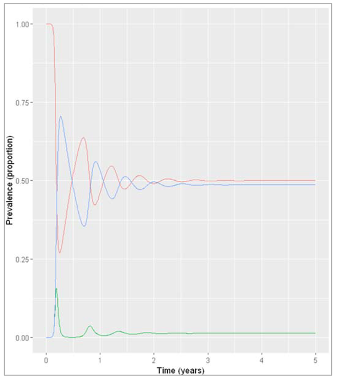
Figure []: Prevalence of infection, susceptibility and recovery over time with sigma = 2 years^-1
What do you observe about the infection dynamics? How does this compare to the model with slow waning of immunity, and with population turnover?
The outcome under these assumptions is very similar to what we observed when modelling an acute disease in the pig population with fast population turnover. The infection quickly reaches an endemic equilibrium with the effective reproduction number staying stable at just over 1, because just as in the pig population, the pool of susceptibles is continually replenished. As you can see from both these examples, waning immunity acts in a similar way to the birth rate in the SIR model dynamics.
Changing the initial state values to reflect endemicity:
| Initialize libraries |
| We initialize vector storing the initial number of people in each compartment (at timestep 0) S = 0.3*1000000 = 30% of the population are susceptible I = 0.1*1000000 = 10% of the population are infected R = 0.6*1000000 = 60% of the population are immune |
| Initialize vector storing the parameters describing the transition rates in units of years^-1 beta = 0.4*365 = infection rate, which acts on susceptibles gamma = 0.2*365 = the rate of recovery, which acts on those infected sigma = 1/0.5 = the rate of waning of immunity, which acts on those recovered |
| We initialize timesteps to solve the model from 0 to 5 years in timesteps of every 2 days |
| We create prevalence proportion |
| Plotting the graph |
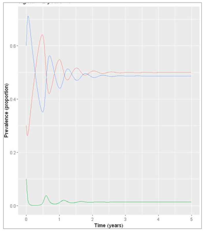
Figure []: Prevalence of infection, susceptibility and recovery over time where sigma = 2 years^-1
What do you observe about the infection dynamics if you change the initial state values?
As you can see, the system eventually stabilises at the same values as in the previous example where we assumed introduction of a single infected case (although over a slightly different timescale). Generally if we are modelling an endemic infection, with a combination of parameters that leads to a continuous addition of new susceptibles and reaches an endemic equilibrium, the initial number in the compartments we start off with does not affect the endemic prevalence that is eventually reached (as long as there is at least one infected person, of course)/ This is in contrast to what you saw in the previous section, where changing the initial proportion of the population that was susceptible determined whether an epidemic would occur or not!
Neonatal vaccination to reduce prevalence of an endemic disease in livestock
The SIR structure needs to be extended to incorporate vaccinated births (going into the R compartment), unvaccinated births (going into the S compartment), deaths, and waning immunity. As we are modelling an endemic infection, the initial conditions for the population don't matter as long as they add up to 300000 according to the instructions (this is because all initial conditions will end up at the same endemic equilibrium, given enough time). For the baseline scenario, we are assuming no vaccine coverage (p_vacc = 0) and no waning of immunity (σ = 0).
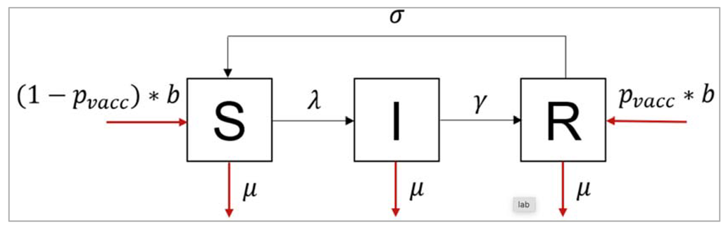
Figure []:
Modelling the baseline (no vaccination) assuming permanent immunity:
| Initialize the libraries |
| Initialize state values : N = 300000 S = 0.5*N I = 0.05*N R = 0.45*N the exact proportions here don't matter, we have chosen an infection prevalence of 5% to start with in line with the information that the disease is thought to be relatively rare in this population. As described above, any initial conditions will converge on the same endemic equilibrium, given enough time. |
| We initialize storing the parameters describing the transition rates in units of years^-1 beta = 365/1 = infection rate gamma = 365/20 = rate of recovery mu = 1/3 = background mortality rate b = 1/3 = birth rate p_vacc = 0 = neonatal vaccine coverage sigma = 0 = rate at which immunity wanes |
| We initialize storing the sequence of timesteps to solve the model from 0 to 5 years in daily intervals We are simulating over a period of 10 years to allow the model to come to equilibrium. We might need a different timespan depending on the initial conditions we chose |
| We initialize SIR model function with the time, state and parameters N = S + I + R lambda = beta * I/N dS = -lambda * S – mu*S + (1-p_vacc)*b*N + sigma*R dI = lambda*S – gamma*I – mu*I dR = gamma*I – mu*R + p_vacc*b*N – sigma*R Because this is a neonatal vaccine (given straight after birth), we model this simply as a proportion p_vacc of births entering the R compartment (Recovered/Immune), with the remaining births (1-p_vacc) entering the susceptible compartment. |
| We calculate proportion in each compartment |
| Plotting the graph |
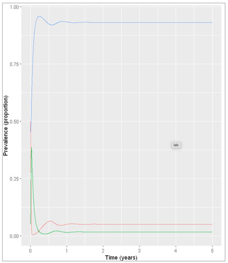
Figure []: Baseline prevalence of susceptible, infected and recovered animals over time.
What is the endemic prevalence of the disease currently (the baseline prevalence), assuming permanent immunity?
The prevalence seems to have stabilised by 2 years:
calculating the prevalence in year 2:
Note that here we are selecting the proportion infected at time-step 2,
but since the time-steps are not exact numbers, we are selecting the time-steps that, when rounded to 0 decimals,
is and display only the first one of those
The baseline prevalence is 1.7%.
From the output, we can also get the number in each compartment at endemic equilibrium and use these as the initial conditions in the vaccine model
t = 2, S = 15253.83, I = 5125.043, R = 279621.1
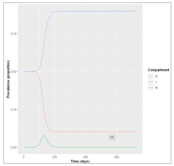
Reducing the prevalence to around 0.85% using the neonatal vaccine, assuming permanent immunity:
| Initialize the necessary libraries |
| Initialize a vaccine, change initial state values to baseline endemic equilibrium S = 15254 I = 5125 R = 279621 |
| We try different coverage values to find an endemic prevalence of half the baseline prevalence: p_vacc = 0.5 |
| We create prevalence population condition |
| Plotting the graph |
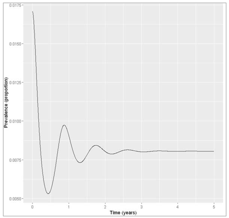
Figure []: Infection prevalence with neonatal vaccine coverage of 50%. Calculating the prevalence in year 5 (introduction of the vaccine at first perturbs the initial equilibrium, but we are interested in the new endemic equilibrium achieved with vaccination) = 0.00805833668900997
What proportion of newborn animals would you need to vaccinate to reduce the prevalence by half, assuming life-long immunity?
If immunity induced by infection and vaccination is lifelong, we only need to vaccinate around 50% of all newborns to achieve a reduction of the endemic prevalence to less than 0.85%.
Increasing the vaccine coverage to achieve elimination:
| We include the necessary libraries |
| We initialize parameters like p_vacc = 0.5 (try different coverage values to see if the disease persists) |
| We send the input parameters to SIR model input function |
| Calculating the prevalence population in each compartment |
| Plotting the graph |
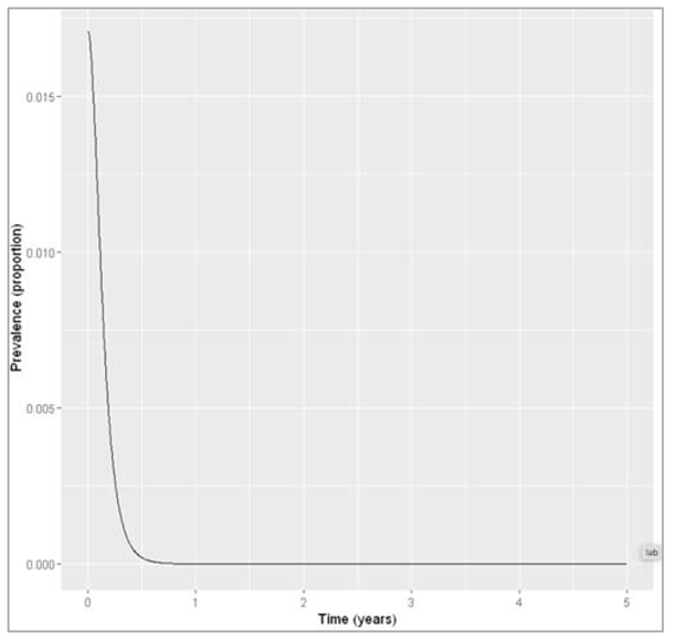
Figure []: Infection prevalence with neonatal vaccine coverage of 95%, we can check how many animals remain infected at the 5 year timestep = 4.90418380388917e-09.
Would it be possible to eliminate the disease from the population using neonatal vaccination under the assumption of lifelong immunity?
The model suggests that yes, with a vaccine coverage of 95% or higher, it appears that the disease dies out. We could define elimination as the reduction of prevalence to a certain threshold value. Here, we have simply checked that infection dies out eventually, with a prevalence that tends towards zero over time and less than 1 animal remaining infected at the end of the simulation.
Modelling the baseline prevalence and impact of vaccination assuming immunity with an average duration of 1 year:
| Initialize necessary libraries |
| Initialize state values: (graph 1)S = 0.5*NI = 0.05*NR = 0.45*Np_vacc = 0sigma = 1And then send it to ODE |
| We calculate the proportion in each compartment (graph 1) |
| p_vacc = 0.5 (graph 2)sigma = 1And then send it to ODE |
| We calculate the proportion in each compartment (graph 2) |
Figure []: Baseline prevalence with waning immunity
Figure []: Prevalence with waning immunity and vaccine coverage of 50%.
We calculate the baseline prevalence with waning immunity, we calculate the endemic prevalence with waning immunity and neonatal vaccination coverage of 50%
We calculate the reduction in prevalence achieved with 50% neonatal vaccine coverage:
(1-waning_vacc_prev/waning_baseline_prev) = 0.131705626078585
If the average duration of immunity is only 1 year, how would this impact the proportional reduction in the prevalence with the vaccine coverage you obtained above compared to the baseline?
If immunity is not permanent but wanes on average after a duration of 1 year in the recovered compartment, a neonatal vaccine coverage of 50% now only leads to a 13% reduction in disease prevalence compared to baseline, rather than 50%.
Modelling the impact of vaccination with 100% coverage assuming immunity with an average duration of 1 year:
| p_vacc = 1 (graph 3): vaccine scenario with waning immunity and increasing coverage to 100% sigma = 1 And then send it to ODE |
| We calculate the proportion in each compartment (graph 3) |
Figure []: Prevalence with waning immunity and vaccine coverage of 100%.
Would it be possible to eliminate the disease from the population using neonatal vaccination under these assumptions? What minimum vaccine coverage would this require?
If immunity only persists for 1 year on average, the model prediction suggests elimination of the disease using neonatal vaccination alone would not be possible. Even with 100% coverage, the prevalence remains at around 5%.
Modelling the baseline prevalence and impact of vaccination with 100% coverage assuming immunity with an average duration of 2.5 years:
| Initialize necessary libraries |
| Initialize state values: (graph 4) : baseline scenario with waning immunity S = 0.5*N I = 0.05*N R = 0.45*N p_vacc = 0 sigma = 1/2.5 And then send it to ODE |
| We calculate the proportion in each compartment (graph 4) |
| p_vacc = 0.5 (graph 5) : vaccine scenario with waning immunity sigma = 1 And then send it to ODE |
| We calculate the proportion in each compartment (graph 5) |
| Calculating the baseline prevalence with slower waning immunity waning_baseline_long$proportion[round(waning_baseline_long$time,0) == 2 & waning_baseline_long$variable == "I"][1] = 0.0366648134758358 Calculating the endemic prevalence with slower waning immunity and neonatal vaccination coverage of 100%: waning_vacc_long$proportion[round(waning_vacc_long$time,0) == 2 & waning_vacc_long$variable == "I"][1] = 0.0189942022696536 |
If an adjuvant (a vaccine promoter) was given along with the vaccine, that would extend the duration of immunity to 2.5 years on average, what vaccine coverage would be needed to reduce the baseline prevalence by half? Would it be possible to eliminate the disease from the population under these assumptions using neonatal vaccination?
If the average duration of immunity was increased to an average of 2.5 years by giving an adjuvant, the baseline prevalence could be reduced to about half (from 3.7% to 1.9%) by achieving a neonatal vaccine coverage of 100%. This means that neonatal vaccination alone is not enough to eliminate the disease from the population as it remains endemic even if every newborn animal is vaccinated.
Based on your results, what overall recommendation would you give to the Minister?
The modelling analysis suggests that neonatal vaccination can lead to substantial reductions in endemic prevalence of the disease if recovery and vaccination provide long-term immunity, even if not lifelong. However, the vaccine coverage required to achieve a halving of the endemic prevalence and the impact of the neonatal vaccination in general are strongly dependent on the assumptions we make about waning of immunity. If immunity is only short-term, even perfect coverage of the neonatal vaccine would have limited impact, and elimination of the disease seems only possible if immunity does not wane.
Therefore, the modelling results are inconclusive regarding the current prevalence and the impact of neonatal vaccination until further knowledge on the waning or persistence of immunity becomes available. The Minister could consider investing into further research on this. If neonatal vaccination is implemented and immunity is found to wane quickly, addition of an adjuvant could improve the impact of vaccination.
Also provide some information to help the Minister interpret these results. Write down the assumptions in your modelling approach that you think might affect your results. Are there any adaptations you could make to the model structure that would make it more realistic or that would allow you to answer more detailed questions?
The results have shown that the conclusions strongly depend on the assumptions we made about the rate of waning of immunity. Other assumptions that might impact our results are for example:
- we assume vaccination is applied to a proportion p_vacc of births at every time-step, i.e. to all newborns all the time
- we assume vaccine-induced immunity and immunity provided by recovery from natural infection confer the same protection and wane at the same time
- we assume transmission is independent of age-mixing, but the vaccine is only given to newborns, so Its effect might change depending on the rate at which different age groups transmit and acquire infection
In future weeks, we will see how to stratify the model into different age groups, to allow for mixing between these groups. We could also investigate the effect these assumptions have on the result by having separate immune compartments and waning rates for those recovered and those vaccinated. We could also give more information on the timescales of this intervention by modelling the baseline case and vaccine introduction chronologically. In this example, we have only modelled the disease with or without the intervention and compared the prevalence at an arbitrarily chosen time-point after the system has reached equilibrium. It would be more realistic and informative to model introduction of the vaccine at a specific time after the endemic equilibrium has been reached, i.e. by running the model with p_vacc = 0 until the current year and changing p_vacc for this time-step onwards to represent introduction of the vaccine. This would allow us for example to investigate how long it takes for prevalence to be reduced by half by the vaccine.
The spread of infectious diseases can be unpredictable. With the emergence of antibiotic resistance and worrying new viruses, and with ambitious plans for global eradication of polio and the elimination of malaria, the stakes have never been higher. Anticipation and measurement of the multiple factors involved in infectious disease can be greatly assisted by mathematical methods. In particular, modelling techniques can help to compensate for imperfect knowledge, gathered from large populations and under difficult prevailing circumstances.
The review illustrates how mathematical modelling can help us understand infectious disease transmission and how it is integral in the field of global health. This figure from the paper’s structured abstract puts mathematical modelling into context in terms of public health policy. A policy question arises, and models are built on existing data. Insights from these models can then inform further data collection and the development of health policy in response. Model development is iterative, and cyclical; models can be adapted and refined as more data is gathered. This is further illustrated within the review with the specific example of rubella and the question of how to best implement a vaccination programme with regard to different ages. The question is investigated by using a disease model, which divides the population up into different age groups (age-structured), and data on vaccinations and rubella incidence.
As there is no experimental system to study the spread of a disease in a population, models and simulations can help us investigate the effects of different biological and social factors, as well as the impacts of interventions. With advances in computational power, it is possible to create ever more complex models incorporating large amounts of data and investigating many different scenarios. Models can clarify non-intuitive effects which arise from non-linear dynamics, such as the finding that moderate control of dengue transmission could increase the incidence of severe complications (dengue haemorrhagic fever), explained further in Nagao and Koelle 2008 (https://www.pnas.org/content/105/6/2238, open access). As computational and technological power brings huge advances to other fields as well, such as genomics, models can be enhanced with ever more detailed phylogenetic data to provide insight into the origins of outbreaks as well as their potential future directions.
Modelling in real time has particular challenges, not least the speed at which data needs to be gathered and processed in order to inform models. The authors especially highlight that data on the effect of control measures can be lacking due to the “hectic circumstances of the most severely hit areas”. The review was written during the Ebola outbreak of 2014; at the time of launch of this course, the COVID-19 pandemic is bringing its own challenges to infectious disease modellers.
| Disease / group of diseases | Important aspects | Special considerations for models |
| Macroparasites eg parasitic worms | Variable parasite load, concurrent infections with different species, environmental reservoirs, water-borne transmission, intermediate hosts | Individual parasite load is important for morbidity (health impact of disease) and transmission, environmental and intermediate host reservoirs of infection |
| Vector-borne diseases, e.g. Malaria, Dengue | Insect vectors, environmental factors (climate, land use, etc) affect vector numbers and interactions with humans | Incorporate two species - host and vector - into modelEffect of environmental variables on model parameters |
| Measles | Affects children especiallyWidespread immunisation programmes, herd immunity | Age-structured models, Immunisation leads to stochastic (“random”) effects in small infected populations becoming important |
| Seasonal influenza | Age-structure, immunisation, prior partial immunity, differences between strains, virus evolution | Phylogenetic methods (relationships between strains), immunological dynamics |
| Sexually Transmitted Infections (STIs), eg HIV | Risk grouping, partnerships | Internal host dynamics, partnership models. |
| COVID19, SARS - emerging diseases and outbreaks | Zoonotic infection, global interconnectedness and rapid travel, contact tracing, isolation and quarantine, incubation period | Up to date data, accurate data collection efforts |
| Low-prevalence, emerging and drug-resistant bacterial infection eg MRSA | Resistance to one or more antibiotics, evolutionary adaptations | Stochastic effects more dominant in low infected numbers |
Table []: Particular diseases and scenarios bring certain complications and complexities to the basic infectious disease models. This table, adapted from Table 1 in the paper, lists infectious diseases in different categories according to their biology and epidemiology, and how models can be adapted to each category.
Modelling treatment:
Extending the SIR model to model a treatment which speeds up recovery:
| We initialize the necessary libraries |
| We initialize the number of people in each compartment S = 3000000 I = 1 R = 0 T = 0 = treatment compartment : no one is on treatment at the beginning of the simulation |
| Parameters describing the transition rates in units of days^-1 beta = 0.6 = infection rate gamma = 0.2 = the natural (untreated) rate of recovery h = 0.25 = the rate of treatment initiation gamma_t = 0.8 = the rate of recovery after treatment |
| We initialize sequence of time-steps to solve the model from 0 to 80 days in daily intervals |
| We create a SIR model with time, state and parameters (for population size N) N = S + I + R + T = need to add treated compartment here lambda = beta * (I+T)/N = force of infection depends on the proportion in the I and T compartment dS = -lambda*S dI = lambda * S – gamma * I – h * I = infected people initiate treatment at a rate h dT = h * I – gamma_t * T = people enter the treated compartment at rate h and recover at rate gamma_t dR = gamma * I + gamma_t * T = movement into the recovered treatment is from infected and treated compartment |
| Solving ODE |
| Plotting the intended graph |
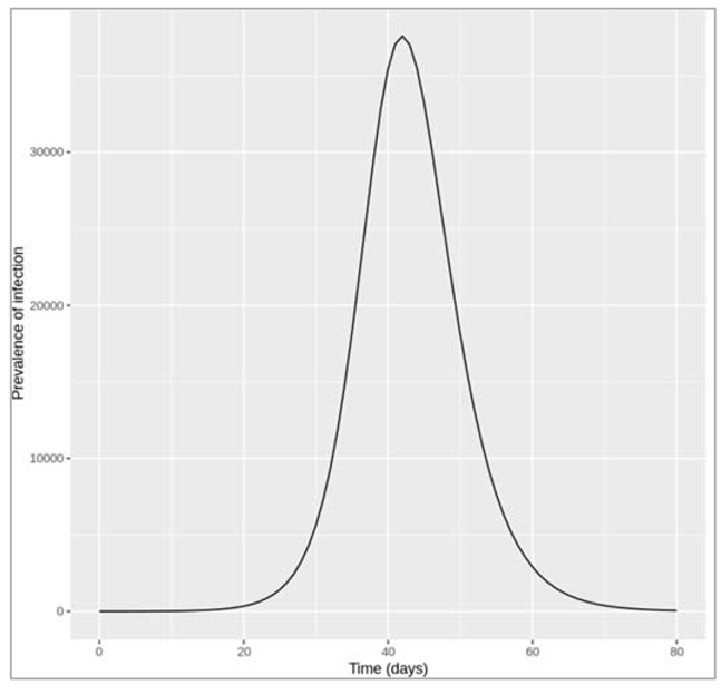
Figure []: Epidemic with treatment initiation rate of 0.25 per day
How many people are infected at the peak of the epidemic?
At the peak of the epidemic around 37600 are infected - this includes the I as well as the T (treated) compartment.
Increasing the treatment initiation rate to interrupt transmission (reduce R0 below 1):
| We initialize the intended libraries |
| We increase the treatment initiation rate: h = 1.6 |
| We simulate the model by integrating the parameters into ODE |
| Plotting the intended graph |
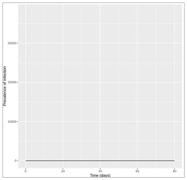
Figure []: Epidemic with treatment initiation rate of 1.6 per day
How rapidly does treatment need to be initiated in order to interrupt transmission, i.e. to bring R0 below 1? Based on this, do you think it is feasible to interrupt transmission through treatment alone? To interrupt transmission by bringing R0 below 1, the treatment initiation rate needs to be at least 1.6 per day, which means people need to start treatment less than a day after becoming infected on average.
To achieve a reduction in the treatment initiation rate, think about what it depends on: the time it takes people to go to a doctor, the time it takes to get a diagnosis, and the time from diagnosis to starting treatment for example. These in turn depend on many situational aspects such as whether the disease is symptomatic, the healthcare system, which test is required for a diagnosis etc. One way of increasing the rate of treatment initiation would be through active case-finding for example, rather than waiting for people to seek medical attention themselves. However, given all these factors, achieving a treatment initiation rate as high as required in this example does not seem feasible. Using only reasoning based on R0 (i.e. without computer simulation), what is the minimum value of h needed to interrupt transmission? Is this consistent with what you found using the model in the previous question?
Remember that R0 is defined as the average number of secondary infections caused by a single infectious case (in a totally susceptible population). We can derive the following equation:
R0 = β/(γ + h) + h/(γ + h) * β/(γT)
Here, we are taking the average of secondary infections caused by index cases in the I and the T compartment, keeping in mind that only a proportion = h/γ + h
move into the treatment compartment before recovering
Solving this equation with our parameter values to obtain R0 < 1:
1 > 0.6/(0.2 + h) + h/(0.2 + h) * 0.6/0.8
0.2 + h > 0.6 + 0.75h
h > 1.6
What other (theoretical) changes could you make to this treatment to improve its impact on the epidemic? In reality, the delay between people becoming infected and people starting on treatment is often the only thing that can be changed to some degree during an outbreak. However, given more time, improving the efficacy and biological action of the treatment itself is likely to improve its impact on reducing the prevalence, for example by:
- increasing the recovery rate of those on treatment
- developing a treatment that additionally reduces the infectiousness of those who take it
Keep in mind though that how the efficacy of a treatment translates into its population-level impact is not always obvious, and depends again on many other factors.
A separate compartment for vaccination
As can be seen that there are different ways of modelling such an intervention. There is the simple approach, where you merely add an additional rate into an existing model, and there is the slightly more complex approach, where you include additional compartments. This latter approach allows you to include factors such as the effectiveness of treatment, but at the expense of model simplicity. The same thing applies to vaccination. Remember in a previous activity, you modelled vaccination by simply assuming that a fixed proportion of people were moved from the S to the R compartment, in advance of the epidemic, representing the situation where a certain proportion of the population is successfully immunised before the epidemic starts.
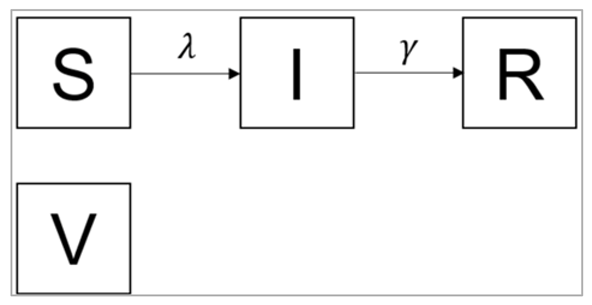
Figure []:
S0 = (1-p)*N
I0 = 1
R0 = 0
V0 = pN
where p is the effective vaccination coverage and N is the total population size
| Initialize the necessary libraries |
| Initialize N = 10^6, p = 0.3, initial_state_values: S = (1-p)*N = the unvaccinated proportion of the population is susceptible I = 1 = the epidemic starts with one single infected person R = 0 = there's no prior immunity in the population V = p*N = a proportion p of the population is vaccinated (vaccination coverage) |
| We initialize describing the transition rates in units of days^-1 : beta = 0.5, gamma = 0.1 |
| We initialize the timesteps from 0 to 100 days at daily intervals |
| We initialize vaccine SIR model function with: lambda = beta * I/N dS = -lambda * S dI = lambda * S – gamma * I dR = gamma * I dV = 0 : the number in the V compartment should stay the same over the whole situation, so the rate of change equals 0 |
| We solve the above using ODE algorithm |
| We initialize prevalence proportion |
| Plotting the graph |
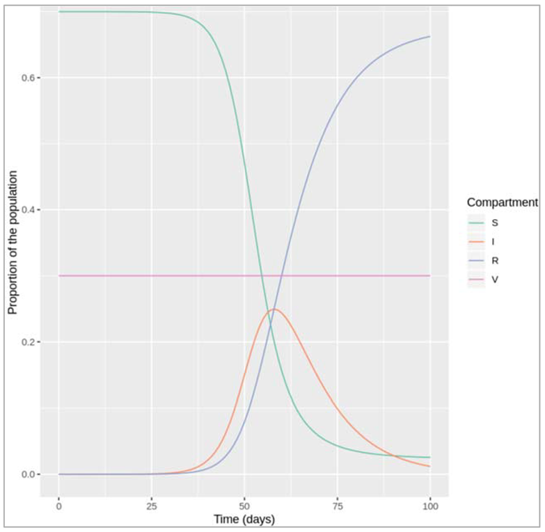
Our code gives a sensible output:
- if we chose no or a low vaccination coverage, we see an epidemic as we would expect given our choice of β and γ (R0 = 0.5/0.1 = 5)
- if we chose a vaccination coverage over the herd immunity threshold of 80% (> 1-1/R0), no epidemic occurs
- if the proportion of the population in the vaccinated compartment V stays constant over time
Note: Why do we need to specify V in the differential equations at all?
You might wonder why we specify the rate of change in the vaccinated compartment in our differential equations, despite this not changing over time. This is purely for practical reasons using deSolve. Technically all we need is to define the initial number of people in V, but remember that using deSolve, we need to return/output the rate of change variables at the end of the model function corresponding to the same order of variables in the initial_state_values vector. So by having V in the initial conditions, we also have to output its rate of change from the model function, else deSolve::ode() will print an error message saying "The number of derivatives returned by func() must equal the length of the initial conditions vector".
Modelling a leaky vaccine
Assuming β equals 0.25 days−1 and γ equals 0.1 days−1, what proportion of the population would have to be vaccinated with a perfectly effective vaccine to prevent an epidemic?
Using the formula for the herd immunity threshold, we need a vaccine coverage of 60% with a perfect vaccine:
pc = 1 – 1/R0 = 1- γ/β = 1 – 0.1/0.25 = 0.6
Given the parameter assumptions above, what proportion of the population would have to be vaccinated with an all-or-nothing vaccine with 70% efficacy to prevent an epidemic?
Under the assumption of an all-or-nothing vaccine, we can simply multiply the vaccine efficacy veff and the vaccine coverage to calculate the effective coverage peff:
veff * Peff = 0.6
Peff = 0.6/0.7 = 0.86
Therefore, we need at least 86% coverage of a leaky vaccine with efficacy of 70%, to interrupt transmission (R0 < 1)
Leaky vaccine:
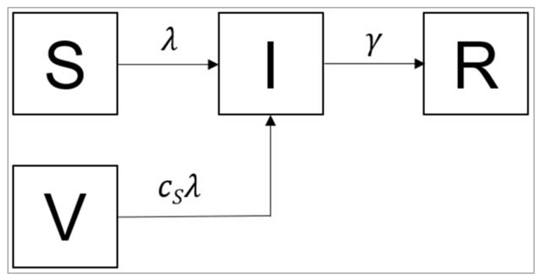
Figure []:
Based on the diagram, write down the differential equations for this model on paper. What is the value of cs for a leaky vaccine with 70% efficacy?
dS/dt = - β(I/N)S
dI/dt = β(I/N)S + csβ(I/N)V - γI
dR/dt = γI
dV/dt = -csβ(I/N)V
For a leaky vaccine with 70% efficacy, the value of cs would be 0.3, reflecting the degree to which susceptibility is reduced.
Modelling a leaky vaccine with 60% coverage:
| Initialize the necessary libraries |
| Specify the total population size: N = 1000000 p = 0.6 |
| We initialize the initial number of people in each compartment initial_state_values : S = (1-p)*N = the unvaccinated proportion of the population is susceptible I = 1 = the epidemic starts with a single infected person R = 0 = here is no prior immunity V = p*N = a proportion p of the population is vaccinated (vaccination coverage) |
| We initialize the parameters: beta = 0.25 = the infection rate in units of days^-1 gamma = 0.1 = the rate of recovery in units of days^-1 c_s = 0.3 = the reduction in the force of infection acting on those vaccinated, note that c_s is a multiplicative term and not a rate |
| We initialize the timesteps from 0 to 2 years at daily intervals |
| We create vaccination SIR model function: lambda = beta * I/N dS = -lambda * S dI = lambda *S - gamma * I + c_s * lambda * V = vaccinated people (V) can now also move into the I compartment dR = gamma * I dV = - c_s * lambda * V = vaccinated people become infected at a rate c_s * lambda |
| We implement ODE function |
| We create prevalence proportion |
| Plotting the graph as needed |
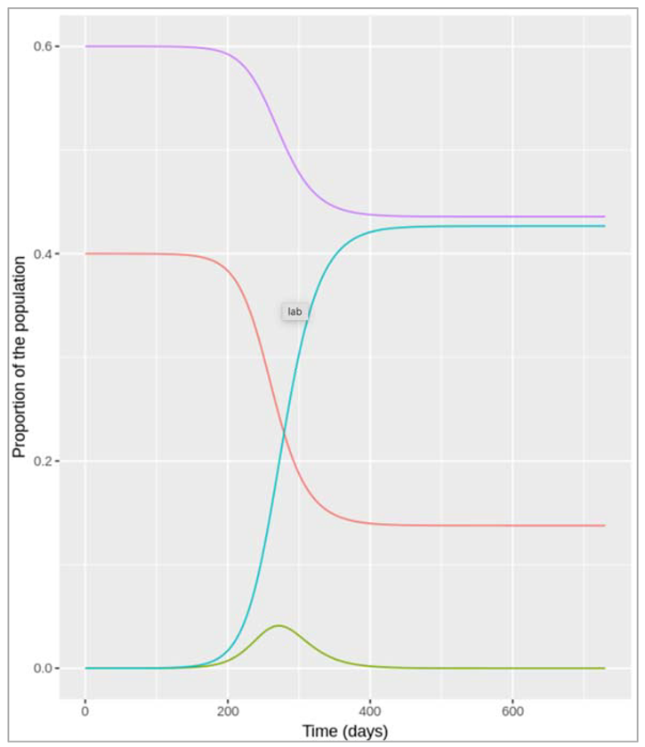
Figure []: Leaky vaccine with coverage of 60%
orange line = Susceptible
green line = infected
blue line = recovered
violet = vaccination
As you can see, a 60% coverage is not sufficient to prevent an epidemic if the vaccine is not perfectly effective.
Modelling a leaky vaccine with 86% coverage:
| Initialize the necessary libraries |
| We initialize the parameters N = 1000000 = total population size p = 0.86 = vaccination coverage |
| We initialize the initial number of people in each compartment initial_state_values : S = (1-p)*N = the unvaccinated proportion of the population is susceptible I = 1 = the epidemic starts with a single infected person R = 0 = here is no prior immunity V = p*N = a proportion p of the population is vaccinated (vaccination coverage) |
| We initialize the parameters: beta = 0.25 = the infection rate in units of days^-1 gamma = 0.1 = the rate of recovery in units of days^-1 c_s = 0.3 = the reduction in the force of infection acting on those vaccinated, note that c_s is a multiplicative term and not a rate |
| We initialize the timesteps from 0 to 2 years at daily intervals |
| We create vaccination SIR model function: lambda = beta * I/N dS = -lambda * S dI = lambda *S - gamma * I + c_s * lambda * V = vaccinated people (V) can now also move into the I compartment dR = gamma * I dV = - c_s * lambda * V = vaccinated people become infected at a rate c_s * lambda |
| We implement ODE function |
| We create prevalence proportion |
| Plotting the graph as needed |
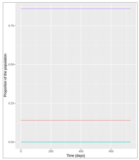
Figure []: Leaky vaccine with coverage of 86%
With a leaky vaccine with 70% efficacy, what proportion of the population would have to be vaccinated to prevent an epidemic (Reff < 1)? Try addressing this first through simulation.
Instead, the simulations above suggest that we need a coverage of at least 86% with a leaky vaccine with 70% efficacy to interrupt transmission and prevent an epidemic.
Now, can you confirm this result using equations, and not simulation? For this, think about the relationship between R0 and Reff.
We can calculate the critical vaccination coverage needed to interrupt transmission (Reff < 1), in the following way. Remember that in a simple homogenous model, Reff is proportional to the number of susceptible people in the population. In this case:
Reff=(1−p)×R0+pcS×R0
where p is the proportion of the population receiving the vaccine, and cs is the reduction in susceptibility owing to the vaccine.
Setting p = pc when Reff = 1, and solving this to find pc gives:
pc = 1- 1/Ro/1- cs = 0.86
Modeling additional vaccine effects
Differential equations for a vaccine model with combined leaky effect:
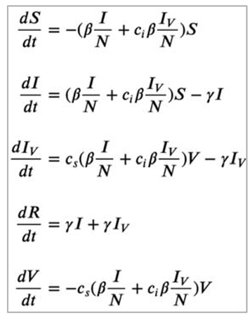
Figure []: Based on the code, what is the efficacy of the vaccine in terms of reducing susceptibility and in terms of reducing infectivity?
Since c_s = 0.3 and c_i = 0.5 in the code, the vaccine efficacy in terms of reducing susceptibility is (1−cs)×100 = 70% and the vaccine efficacy in terms of reducing infectivity is (1−ci)×100 = 50%. This means that those who are infected after being vaccinated are half as infectious as those who never received the vaccine.
Modelling the impact of the combined leaky vaccine with 60% coverage:
| Initialize the necessary libraries |
| We initialize the parameters as: N = 1000000 = total population size p = 0.6 = vaccination coverage |
| We initialize the initial number of people in each compartment initial_state_values : S = (1-p)*N = the unvaccinated proportion of the population is susceptible I = 1 = the epidemic starts with a single infected person R = 0 = here is no prior immunity V = p*N = a proportion p of the population is vaccinated (vaccination coverage) Iv = 0 = no vaccinated individual has been infected at the beginning of the simulation |
| We initialize the parameters: beta = 0.25 = the infection rate in units of days^-1 gamma = 0.1 = the rate of recovery in units of days^-1 c_s = 0.3 = the reduction in the force of infection acting on those vaccinated, note that c_s is a multiplicative term and not a rate c_i = 0.5 = the reduction in the infectivity of vaccinated infected people |
| We initialize the timesteps from 0 to 2 years at daily intervals |
| We create vaccination SIR model function: lambda = beta * I/N dS = -lambda * S dI = lambda *S - gamma * I dR = gamma * I + gamma * Iv = infected and vaccinated infected individuals recover at the same rate dV = - c_s * lambda * V = vaccinated people become infected at a rate c_s * lambda dIv = c_s * lambda * V - gamma * Iv = vaccinated people who become infected move into the Iv compartment |
| We implement ODE function |
| We create prevalence proportion |
| Plotting the graph as needed |
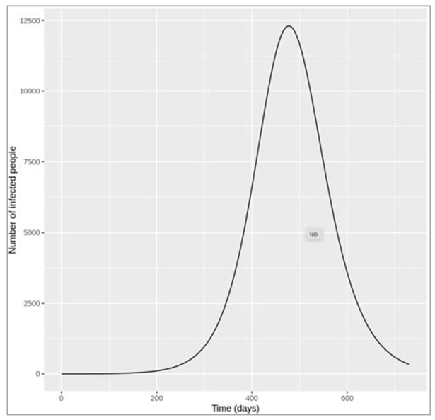
Figure [] : Combined leaky vaccine with coverage of 60%.
What is the peak prevalence (number of infected people) with a vaccine coverage of 60%?
The plot shows that nearly 12500 people are infected at the peak of the epidemic - this includes both vaccinated and unvaccinated people (the I and IVcompartment).
For this vaccine, what is the minimum vaccination coverage required to interrupt transmission, i.e. to bring Reff below 1? Calculate this on paper, then confirm the value you derived using your model.
We can calculate this in a similar way to the previous section, first relating Reff to R0:
Reff = (1-p) * R0 + pcsci * R0
Then, solving this equation for pC = p when Reff = 1:
pc = 1- 1/R0/ 1- cs*ci = 0.71
That is, we need to vaccinate at least 71% of the population in order to interrupt transmission (Reff < 1).
Modelling the minimum vaccine coverage required to interrupt transmission:
| Initialize p = 0.71 |
| We initialize the initial number of people in each compartment initial_state_values : S = (1-p)*N = the unvaccinated proportion of the population is susceptible I = 1 = the epidemic starts with a single infected person R = 0 = here is no prior immunity V = p*N = a proportion p of the population is vaccinated (vaccination coverage) Iv = 0 = no vaccinated individual has been infected at the beginning of the simulation |
| We implement ODE function |
| We create prevalence proportion |
| Plotting the graph as needed |
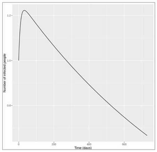
Figure []: Combined leaky vaccine with coverage of 71%.
The plot above shows that, with a coverage of 71%, the number of infected people immediately goes into decline (from the 1 infected case at the beginning of the simulation). The lack of epidemic can also be visualised by adding a limit to the y axis to show the whole population size in the ggplot code: +ylim(c(0,N)).
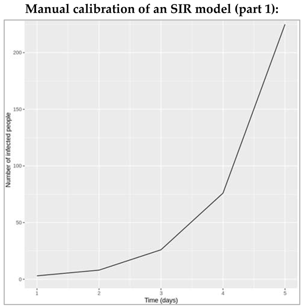
Figure [] : The epidemic curve shows an exponentially increasing number of infected people, which means the data corresponds to the initial growth phase of the epidemic.
Based on the code, what is the total size of the population you are modelling? For plotting, which variables in the model output correspond to the variables in the dataset?
The code shows that the initial conditions for S, I and R are 762, 1 and 0, which means the total population size is 763. The code shown is for the simple SIR model, so the I column in the model output corresponds to the observed data of the prevalence of infected people.
Example of the manual calibration:
As an arbitrary choice of parameters, let's first try β = 0.6 days−1, and γ = 0.1 days−1 (remembering that we want β/γ > 1, so that β > γ).
| Installing required packages |
| We initialize initial_state_values S = 762 I = 1 R = 0 |
| Adding the parameters vectors: beta = 0.6, gamma = 0.1 |
| We initialize timestep from 0 to 6 years with 10 days intervals |
| We create model function as: N = S + I + R lambda = beta * (I/N) dS = -lambda * S dI = lambda *S – gamma * I dR = gamma * I |
| We create ODE |
| Plotting the graph |
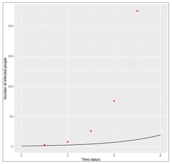
Figure []: model fit to the epidemic curve with beta = 0.6 and gamma = 0.1. With this parameter combination, the model strongly underestimates the growth of the epidemic. Let's try increasing β to 1.5 and reducing γ to 0.02 to get a closer match.
| Adding the parameters vectors: beta = 0.6, gamma = 0.1 |
| We initialize timestep from 0 to 6 years with 10 days intervals |
| We create model function as: N = S + I + R lambda = beta * (I/N) dS = -lambda * S dI = lambda *S – gamma * I dR = gamma * I |
| We create ODE |
| Plotting the graph |
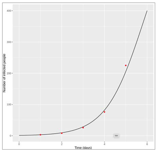
Figure []: Model fit to epidemic curve with beta = 1.5 and gamma = 0.02
Now we have the opposite problem. With these parameter values, the number of infected people is overestimated by the model at all but the first timepoint. Let's try reducing β again.
| Adding the parameters vectors: beta = 1.15, gamma = 0.02 |
| We initialize timestep from 0 to 6 years with 10 days intervals |
| We create model function as: N = S + I + R lambda = beta * (I/N) dS = -lambda * S dI = lambda *S – gamma * I dR = gamma * I |
| We create ODE |
| Plotting the graph |
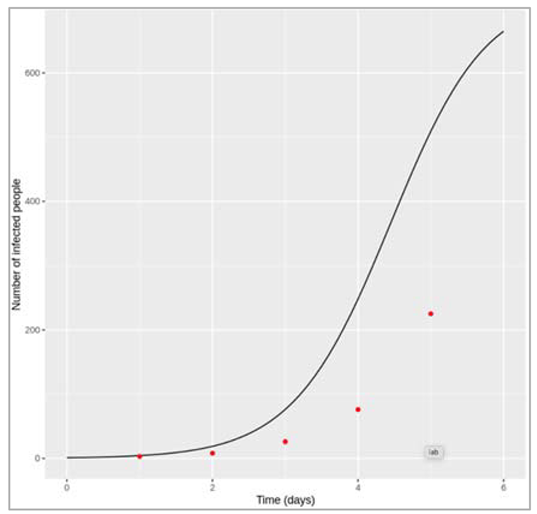
Figure []: Model fit to epidemic curve with beta = 1.15 and gamma = 0.02.
With β = 1.15 and γ = 0.02 days−1, the fit of the model prediction of the number of infected people over time to the data is looking quite good!
Manual calibration of an SIR model (part 2):
Now that we use the full dataset in the calibration, it is possible to identify values for β and γ that simulate the best match to the data.
This is what the model fit looks like if β = 1.7 and γ = 0.45 days−1:
| We create a dataset with time = 1:14 and number_infected = 3,8,26,76,225,298,258,233,189,128,68,29,14,4 |
| We load the necessary libraries |
| We initialise initial_state_values : S = 762, I = 1, R = 0, beta = 1.7, gamma = 0.45 |
| We initialise the time-step from 1 to 14 days for 0.1 daily intervals |
| We create SIR model function with time, state and parameters: N = S + I + R lambda = beta * (I/N) dS = -lambda * S dI = lambda * S – gamma * I dR = gamma * I |
| We integrate these parameters with ODE |
| Plotting the graph |
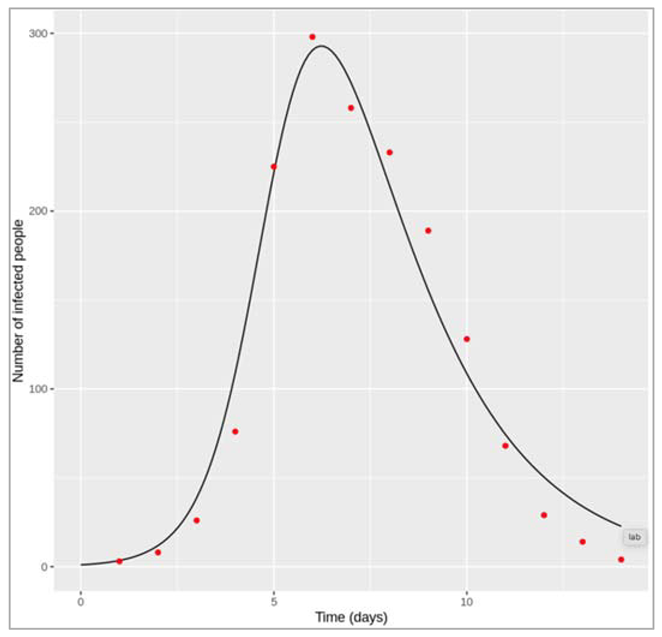
Figure []: Model fit to the epidemic curve with beta = 1.7 and gamma = 0.45.
Since this is real outbreak data, the datapoints don't neatly follow the SIR model prediction - they are for example influenced by measurement error. This means that we cannot match every single datapoint exactly, and there is some subjectivity involved in what the "best" fit looks like. For example, the model above matches the peak of the epidemic and the timing of growth and decline well, but it overestimates the number of infected people at the beginning and the end of the outbreak a little. Depending on what you consider the best visual fit, your parameter values might be slightly different to the ones presented here. Unlike the previous part, however, the values you find for β and γ should be roughly similar to the values that anyone else finds: in this part, there is sufficient data to fix unique values for both parameters.
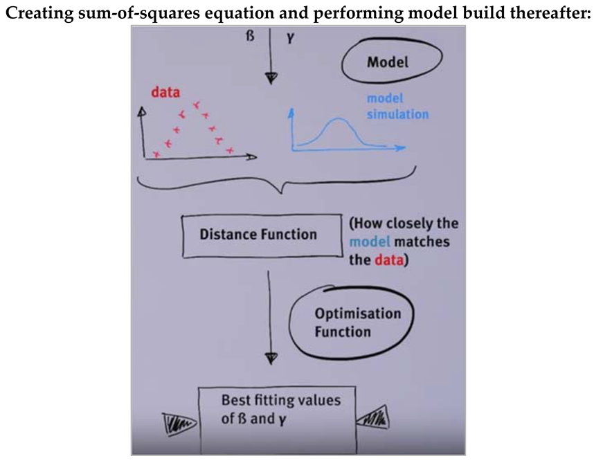
Figure []:
| Load necessary libraries |
| Create an SIR function for ode by initialising time, state and parameters: N = S + I + R dS = -beta * S * (I/N) dI = beta * S * (I/N) – gamma * I dR = gamma * I |
| Create sum-of-squares function: Input arguments = parameters, dat (dataframe or list containing a vector element I) SIR model function with result = ode() which takes arguments beta and gamma |
| SSQ calculation: You need to filter the model output to those timepoints in the observed data Calculate SSQ by squaring each delta - the difference between model output and observed data point and taking the sum of these squared deltas |
| Select only those points in result[I] where the times match the times in the data |
| Perform sum(deltas2): calculate the δ between that and the model output square each δ sum all the squared deltas together save and return that value. |
| Find the sum-of-squares for fits of models with parameters: β = 1.15, γ = 0.02 β = 1.7, γ = 0.45 |
| We send all these values to newly created SIR_SSQ function (we get the output as below): ssq = 2507764.33057048, where beta = 1.15, gamma = 0.02 ssq = 4630.302259291, where beta = 1.7, gamma = 0.45 |
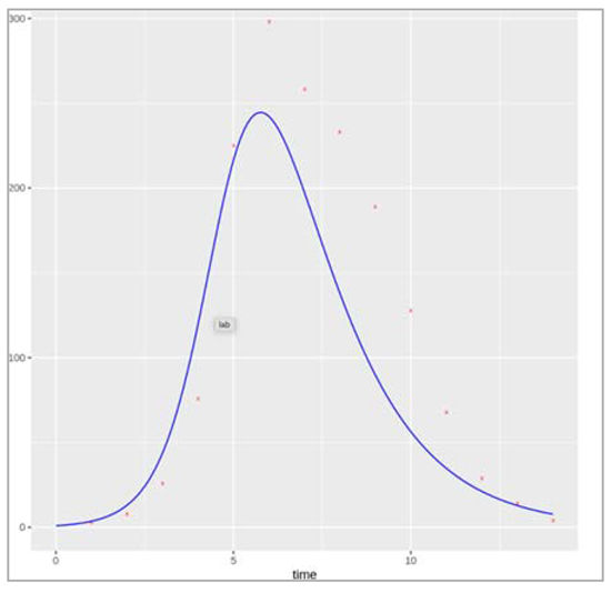
Figure []:
How caliberations inform policy?
We read data to plot a graph for time vs number of infected people.
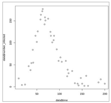
Figure[]: Plotting the dataset, this look like an epidemic curve for an outbreak starting with the introduction of one infected case. We have datapoints of the prevalence of infection spanning the entire duration of the epidemic (200 days), but not for every day.
Define the simple SIR model and model input:
| Initialize the necessary libraries |
| Initialize initial_state_values: Total population size = 500 S = 499 I = 1 R = 0 |
| Initialize the time sequence from 0 to 200 with a 1 day interval |
| Create SIR model function: N = S + I + R lambda = beta * I/N dS = -lambda * S dI = lambda * S – gamma * I dR = gamma * I |
| Then define a function that simulates the model for a given combination of parameters and calculates the sum-of-squares for the epidemic curve |
| We calculate distance function with inputs as parameters and dat |
| Simulate the model with initial conditions and timesteps and parameter values |
| Calculate the sum of squares by comparing the model output with the matching datapoints: This involves, for each time-point with available data, calculating the difference between the number of infections predicted by the model and the observed number of infections, squaring all these differences,and taking the sum of all squared differences SSQ <- sum((output$I[output$time %in% dat$time]-dat$number_infected)^2) |
| Optimise the sum-of-squares function using the optim() command to find the values for β and γ giving the lowest sum of squares value as output |
What are the best-fitting values for β and γ?
The optim() algorithm estimates β = 0.16 and γ = 0.05 per day, giving a minimum sum-of-squares value of 5161. We can confirm visually that this parameter set produces a good model fit to the data, by overlaying the datapoints on a plot of the model output:
| We initialize parameters beta = 0.16, gamma = 0.05 |
| We integrate these values with ode |
| Plotting the graph |
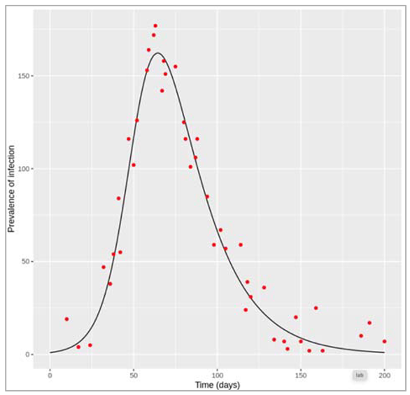
Figure []: Model fit to the epidemic curve with beta = 0.16 and gamma = 0.05
Based on your estimates parameter values, what would be the critical vaccination threshold required to prevent this epidemic, assuming an all-or-nothing vaccine with 75% efficacy?
We can calculate the critical effective vaccination coverage as:
Peff = 1 – 1/R0 = 1- 1/(β/γ) = 0.69
Since the all-or-nothing vaccine is only 75% effective, we can calculate the critical vaccination threshold as:
pc = Peff/veff = 0.69/0.75 = 0.92
To interrupt transmission and bring R0 below 1, 92% of the population would have to be vaccinated. We can confirm the absence of an epidemic under these conditions using the simulation code:
| We initialize initial_state_values: S = 0.08*499 = only 8% of the population are susceptible I = 1 R = 0.92*499 = 92% of the population are vaccinated/immune |
| We integrate these parameters with ode |
| Plotting the graph |
Figure []: Vaccine coverage of 92% with all-or-nothing vaccine with 75% efficacy
Performing maximum likelihood estimation
| First, load the dataset with the reported number of cases over time, along with the simple SIR model function and the input and necessary libraries |
| We intialize initial_state_values: S = 762 I = 1 R = 0 |
| We initialize timestep sequence from 0 to 14 with 0.1 days interval |
| We create SIR model function with parameters: N = S + I + R lambda = beta * (I/N) dS = -lambda * S dI = lambda * S – gamma * I dR = gamma * I |
| Then, define a function (the distance function described to in the lecture) that simulates the model for a given combination of parameters and calculates the Poisson log-likelihood for the epidemic curve of reported cases: parameters (beta, gamma), ode (initial_state_values, times, SIR_model, parameters) Calculate log-likelihood using code block 4 from the previous etivity, accounting for the reporting rate of 60%: LL <- sum(dpois(x = dat$number_reported, lambda = 0.6 * output$I[output$time %in% dat$time], log = TRUE)) |
| Finally, optimise this function using the optim() command to find the values for beta and gamma giving the highest log-likelihood value as output: parameters (beta/gamma), initialized function (as above), data, optim values |
| The "parameter" argument of optim() gives maximum-likelihood estimates of 1.69 and 0.48 for β and γ, respectively. With those parameters, the log-likelihood equals -59.24 ("value"). Confirm that these parameter values indeed produce a good visual fit to the real data of all infected cases. In the plot below we have also added the number of reported cases for comparison. |
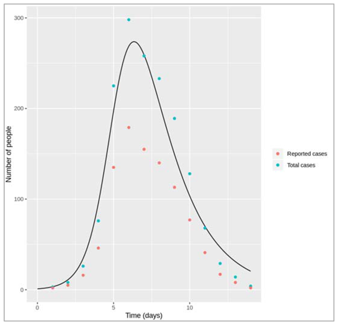
Figure[]: As you can see, calibrating the model to the number of reported cases and accounting for the reporting rate gives us a good fit to the total number of infections. In reality, in outbreaks we usually only have the number of reported cases, so with an assumption of the reporting rate we can use the model to predict the total number of current and future infections.
Stochastic simulations of novel pathogens
Part 1: Comparing deterministic and stochastic model output when R0 = 0.75
For the deterministic model, you should observe that infection goes extinct without causing an epidemic, since R0 is less than 1. As it is a deterministic model, this output will look the same each time we run this code. In the stochastic model, however, after performing at least 10 simulations with the same code, you should see that the output of each simulation looks slightly different. Most of the time, infection is not transmitted for long and will quickly die out. However, despite R0 < 1, small localised epidemics can still occur by chance! However, any such outbreak will eventually go extinct.
See below for an example output of the stochastic model (of course, your output will not look exactly the same). Notice the simulation shown in red - in this case, the infection persisted for over a month before finally going extinct, despite having R0 < 1.
| Initialize necessary libraries – in this case we are initializing GillespieSSA |
| Initialize initial_state_values: S = 1000000 I = 1 R = 0 cum_inc = 0 |
| Simulating the model 10 times and checkpointing at every iteration |
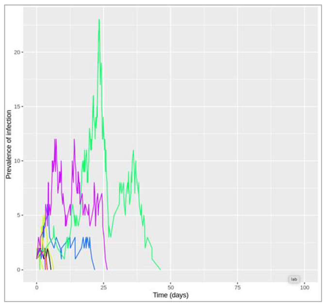
Figure []: Stochastic model output for R0 = 0.75 (10 simulations)
Part 2: Stochastic simulations with different R0
Simulating the stochastic model 100 times for R0 = 0.1:
Since γ is 0.4 per day, β = 0.1 * 0.4 = 0.04 per day
Figure []: Stochastic model output for R0 = 0.1 (100 simulations)
How often to you get an epidemic?
As you can see from the plot and the cumulative incidence in each iteration, in nearly all iterations the total number of infections does not exceed 2 - no outbreak occurs.
However, here just as in real life outbreak situations, it is not always obvious how we should define an epidemic. For the purpose of the current exercise, let us set an arbitrary threshold, that at least 10 people need to be infected, before we declare an epidemic.
In this case, with R0 = 0.1, out of 100 iterations the number of times an epidemic has occurred is: 0
Of course, with such a low R0, it is not surprising that even by chance we do not observe an epidemic. However, what if R0 is still below 1, but very close to it?
Simulating the stochastic model 100 times for R0 = 0.9:
Since γ is 0.4 per day, β = 0.9 * 0.4 = 0.36 per day
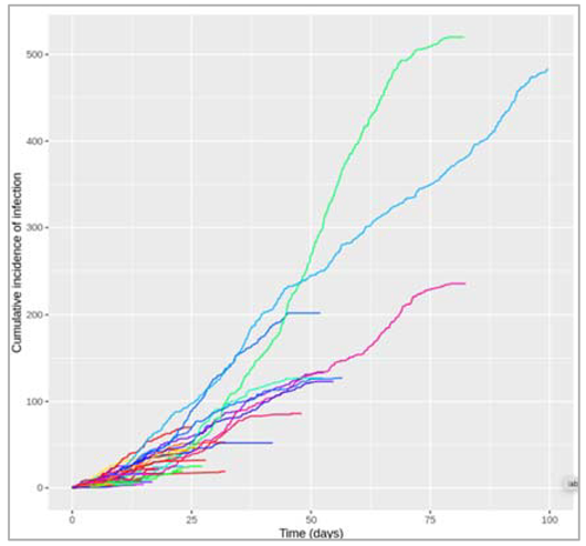
Figure []: Stochastic model output for R0 = 0.9 (100 simulations)
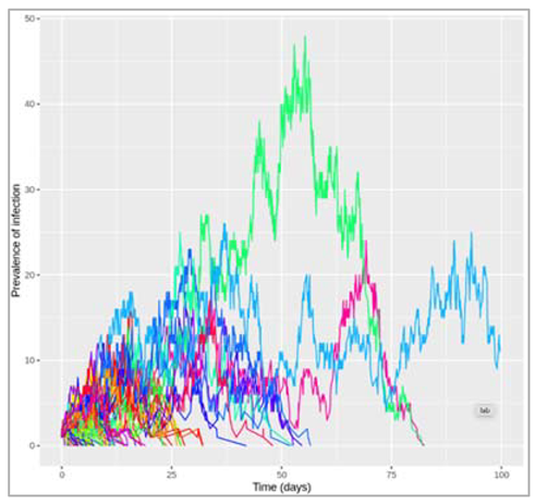
Figure []: Stochastic model output for R0 = 0.9 (100 simulations)
How often to you get an epidemic? : 33
This time, we observe an epidemic (according to our arbitrary definition) in around a quarter to a third of iterations. Keep in mind that had we used a deterministic model, we still would have seen no transmission and hence no outbreak because R0 < 1. In real life, chance events can play an important role in whether transmission is sustained or not - in the case of introduction of a novel pathogen in a naive population like here, using a stochastic model is therefore essential to capture the role of these chance events.
Also, note that although most simulations give only a few infections (in agreement with a deterministic model), it is in fact possible to get relatively large outbreaks when R0 is less than, but close to, 1. Notice, for example, the simulation in red, where over 500 people became infected during the epidemic. Additionally, as you can see from the prevalence plot, the epidemic in the turquoise iteration is still ongoing by the end of the simulation period of 100 days.
Simulating the stochastic model 100 times for R0 = 1.1:
Since γ is 0.4 per day, β = 1.1 * 0.4 = 0.44 per day
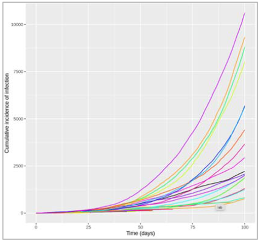
Figure []: Stochastic model output for R0 = 1.1 (100 simulations)
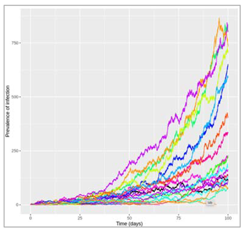
Figure []: Stochastic model output for R0 = 1.1 (100 simulations)
Now that we have R0 > 1, despite only a small increase from 0.9 to 1.1, the graph looks quite different, with some large outbreaks occurring (many of which have not yet reached their peak after 100 days when the plot/simulation ends).
How often to you get an epidemic? : 41
You will see that an outbreak now occurs in close to a half of iterations! Even though R0 is now greater than 1, an outbreak is still far from guaranteed.
Calculating incidence in a deterministic model
In the part on stochastic models, we have been introduced to the concept of infection incidence as opposed to prevalence. Incidence can be defined as the total number of new infections in a given time interval, and much of the epidemiological data used by mathematical modellers, for example for model calibration, represents incident rather than prevalent cases of infection. In this reading you will learn how to calculate the cumulative incidence of infection in a deterministic SIR model. This is a skill you will find useful in the other parts to follow.
A simple approach for the SIR model
Remember that in our model, the prevalence of infection is simply the number of people in the I compartment at any given time point - this is affected by new people moving into the compartment by becoming infected, and people leaving the compartment when they recover. Conversely, the incidence of infection is just the in-flow from S into the I compartment, which is not affected by what happens after (recovery). You might find it useful to go back to the video in IDM1 week 3, which has further explanations on the difference between incidence and prevalence. Given this definition, calculating the cumulative incidence is easy for a simple SIR model - the decline in susceptibility shows us how many people have become infected. First, notice that for every incident case, the value of S goes down by 1. So to calculate the total incidence in a given time interval, you just need to calculate the amount by which susceptiblity has fallen in that same time period. This is the approach in the following example.
| We initialize the necessary libraries |
| We initialize initial_state_values: S = 1000, I = 1, R = 0, beta = 0.4, gamma = 0.2 |
| We initialize time step sequence from 0 to 100 by 1 step |
| We create SIR model function with time, state and parameters: N = S + I + R lambda = beta * (I/N) dS = lambda * S dI = lambda * S – gamma * I dR = gamma * I |
| We integrate these values in ODE |
| Calculating the difference in susceptibility between the beginning and end of the epidemic gives you the total number of infections that have occurred during this period: Number susceptible at time 0: 1000 Number susceptible at time 100: 203.160641141653 Difference: 796.839358858347 From this, you can see that a total of 797 cases occurred during the epidemic. This number is the cumulative incidence. |
Apart from this, if we need to go into more depth in calculating cumulative incidence, there are few points we need to take a note of:
- If we want to add a model output, we need to include the same quantity to the initial conditions vector as well (in the same order as the output). The column in the model output will adopt the name from the initial conditions vector (not the variable in the model function).
- We can only output the cumulative incidence at each timestep from the model directly (that is, the total number of new cases that have occurred from the beginning of the simulation). From this, we can also calculate the number of new infections between any 2 timepoints.
We have created a new variable named "new_infections" within the model function to represent incident infections and replaced it in the differential equations.
Steps :
| Initialize initial_state_values: S = 1000, I = 1, R = 0, cum_incid = 0 : adding a variable for the incidence output in the initial conditions since no infections have occurred yet, the cumulative incidence is 0 beta = 0.4, gamma = 0.2 |
| We initialize a time step sequence from 0 to 100 with 1 day time intervals |
| We create a SIR model function: N = S + I + R lambda = beta * (I/N) = incident infections are the transitions from S to I at each timestep dS = -new_infections dI = new_infections – gamma * I dR = gamma * I |
| We simulate these parameters in the ODE and plot the graph |
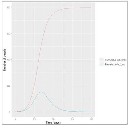
Figure []: Prevalence and incidence of infection
The plot shows us that at the peak of the epidemic on day 34, 154 people were infected. By that time, a total of 506 people had been infected. By the end of the epidemic, around 75 days after the start of the simulation, nearly 800 people had been infected in total.
From the cumulative incidence at each timestep, we can easily calculate how many infections occurred between any 2 timesteps, as follows:
output$incident_infections <- c(0,diff(output$cum_incid, lag = 1))
The diff() command simply calculates the difference between the cumulative incidence at each given timestep minus the cumulative incidence at the preceding timestep. Adding a 0 as the first value, the incident_infections vector shows you how many infections have occurred in the intervals between each timestep.
By day 0, 0 new infections have occurred. Between day 0 and day 1, 0.44 people became infected. Between day 1 and day 2, 0.54 people became infected, etc. This is the kind of data you might get from a public health agency, for example the weekly incidence of influenza. It is important to keep in mind that incidence is by definition always related to time - when reporting incident cases, we always need to specify over what time interval. We might also want to know how many new cases occurred during a specific time, such as after the peak of the epidemic, e.g. between day 40 and 75. We can calculate this in 2 ways:
#Sum of all incident infections between day 40 and day 75:
sum(output$incident_infections[output$time %in% c(41:75)]) = 145.07489250487
#Difference of cumulative incidence at day 75 and cumulative incidence at day 40:
output$cum_incid[output$time == 75]-output$cum_incid[output$time == 40] = 145.07489250487
Even after the peak of the epidemic was already reached, 145 new infections still occurred.
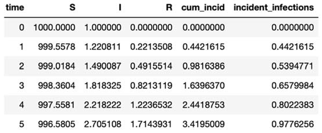
Stochasticity with pre-existing immunity:
Measles is highly contagious and transmitted via airborne particles or direct contact. Infection with the virus causes a variety of symptoms but can lead to serious disease. Infection begins in the lungs before causing symptoms such as fever, cough and red/watery eyes contact. These appear between 10-12 days post-infection and last between 4-7 days. Rash usually appears at around the same time (14 days post infection with a range of 7-18 days), which gradually spreads across the entire body.
Measles-related deaths often arise from complications, the most serious of which occur in children under the age of 5 and in adults over the age of 30. These include blindness, encephalitis, severe diarrhoea and pneumonia. Treatment is supportive, as no antiviral therapy exists, however vitamin A supplements can help reduce the risk of blindness and reduce mortality.
Prior to vaccine development and introduction in 1963, major epidemics occurred every 2-3 years, largely as a result of new susceptibles (through births). These epidemics resulted in an estimated 2.6 million deaths each year. Fortunately, due to the effectiveness of this well-tolerated vaccine (99% upon 2nd and final dose), and the duration of immunity (lifelong), cases plummeted. Given these factors and that measles does not show vaccine escape, in certain regions measles was near eliminated. Indeed the disease could be eradicated with adequate global vaccine coverage.
Interestingly, measles infection has been associated with an increase in the risk of other childhood infections, raising the hypothesis that measles impairs a child’s immune memory. Indeed further research has since confirmed this (1). Given that vaccination doesn’t have the same effect of impairing immune memory (since it’s an attenuated virus), vaccination not only immunises against measles infection but also prevents additional long-term harm to the immune system.
However, since safety concerns arose from a study (now withdrawn and debunked) that appeared to link the MMR vaccine to autism, along with other societal factors driving vaccine hesitancy (2), there has been a gradual fall in measles vaccination rates worldwide in recent years. Indeed in 2018, more than 140,000 people died from measles (3), most of whom were children under the age of 5. Notably, as measles has a particularly high R0 (usually between 12-18), any slight drop in herd immunity can result in outbreaks, therefore it essential that the critical vaccination threshold is met.
Developing an age-structured modelling
We develop SIR model stratified into 2 age groups (children and adults). For a detailed explanation on how to derive the force of infection by age group
| We initialize required libraries |
| We initialize initial_state_values: Initial state values for a naive population (everyone is susceptible except for 1 index case where the total population size N is (approximately) 1 million and 20% of this are children S1 = 200000 = 20% of the population are children - all susceptible I1 = 1 = the outbreak starts with 1 infected person (can be either child or adult) R1 = 0 S2 = 800000 = 100%-20% of the population are adults - all susceptible R2 = 0 I2 = 0 |
| We initialize parameters as: b = 0.05 = the probability of infection per contact is 5% c_11 = 7 = daily number of contacts that children make with each other c_12 = 6 = daily number of contacts that children make with adults c_21 = 1 = daily number of contacts that adults make with children c_22 = 10 = daily number of contacts that adults make with each other gamma = 1/5 = the rate of recovery is 1/5 per day |
| We run the simulation for 3 months with timestep from 0 to 90 days with 0.1 days interval |
| We create SIR age model function: N1 = S1+I1+R1 = the total number of children in the population N2 = S2+I2+R2 = the total number of adults in the population |
| Defining force of infection - Force of infection acting on susceptible children: lambda_1 <- b * c_11 * I1/N1 + b * c_12 * I2/N2 Force of infection acting on susceptible adults: lambda_2 <- b * c_21 * I1/N1 + b * c_22 * I2/N2 |
| Defining ODE: Rate of change in children: dS1 <- -lambda_1 * S1 dI1 <- lambda_1 * S1 - gamma * I1 dR1 <- gamma * I1 Rate of change in adults: dS2 <- -lambda_2 * S2 dI2 <- lambda_2 * S2 - gamma * I2 dR2 <- gamma * I2 |
| Integrating the above values in ODE and plotting the graph |
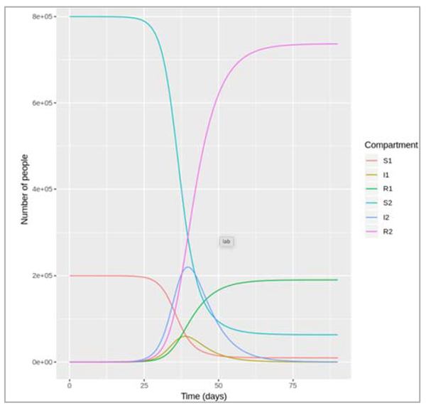
What was the cumulative incidence of infection during this epidemic? What proportion of those infections occurred in children?
In the SIR model, the cumulative incidence of infection is simply the decline in susceptibility.
The cumulative incidence as the number susceptible at the beginning of the epidemic minus the number : remaining susceptible at the end : 927447.320599114
The cumulative incidence in children + cumulative incidence in adults (proportion of infections in children)
0.205413854367985
927,447 people became infected during this epidemic, 20.5% of which were children.
Which age group was most affected by the epidemic?
Proportion of children that became infected = 0.952547881498216
Proportion of adults that became infected = 0.921169838227188
Over the course of this epidemic, 95% of all children and 92% of all adults were infected. Children were therefore slightly more affected in proportion to their population size, even though the majority of infections occurred in adults.
Extending the age structured modeling to 3 age groups:
We write this code for a model with 3 age groups is to proceed like in the previous part and define all age-specific compartments (S1, I1, R1, S2, I2, R2, S3, I3 and R3) and contact parameters (c11, c12, c13, c21, c22, c23, c31, c32 ad c33) individually.
Steps that we follow to build the code:
| We install the necessary libraries |
| Initial state values for a naive population (everyone is susceptible except for 1 index case), where the total population size N is (approximately) 1 million, 20% of this are children and 15% are elderly: S1 = 200000 = 20% of the population are children - all susceptible I1 = 1 = the outbreak starts with 1 infected person (can be of either age) R1 = 0 S2 = 650000 = 100%-20%-15% of the population are adults - all susceptible I2 = 0 R2 = 0 S3 = 150000 = 15% of the population are elderly - all susceptible I3 = 0, R3 = 0 |
| We initialize parameters: b = 0.05 = the probability of infection per contact is 5% c_11 = 7 = daily number of contacts that children make with each other c_12 = 5 = daily number of contacts that children make with adults c_13 = 1 = daily number of contacts that children make with the elderly c_21 = 2 = daily number of contacts that adults make with children c_22 = 9 = daily number of contacts that adults make with each other c_23 = 1 = daily number of contacts that adults make with the elderly c_31 = 1 = daily number of contacts that elderly people make with children c_32 = 3 = daily number of contacts that elderly people make with adults c_33 = 2 = daily number of contacts that elderly people make with each other gamma = 1/5 = the rate of recovery is 1/5 per day |
| We initialize the time-steps from 0 to 90 days with 0.1 day interval time |
| We create a SIR age model function with time, state and parameters values N1 = S1 + I1 + R1 = the total number of children in the population N2 = S2+I2+R2 = the total number of adults in the population N3 = S3+I3+R3 = the total number of elderly people in the population |
| Defining the force of infection: For each age group, need to add the infection rate due to contact with the elderly, and need to define add an equation for the force of infection experienced by the elderly Force of infection acting on susceptible children: lambda_1 <- b * c_11 * I1/N1 + b * c_12 * I2/N2 + b * c_13 * I3/N3 Force of infection acting on susceptible adults: lambda_2 <- b * c_21 * I1/N1 + b * c_22 * I2/N2 + b * c_23 * I3/N3 Force of infection acting on susceptible elderly people: lambda_3 <- b * c_31 * I1/N1 + b * c_32 * I2/N2 + b * c_33 * I3/N3 |
| Initializing ODE: Rate of change in children: dS1 = -lambda_1 * S1 dI1 = lambda_1 * S1 - gamma * I1 dR1 = gamma * I1 Rate of change in adults: dS2 = -lambda_2 * S2 dI2 = lambda_2 * S2 - gamma * I2 dR2 = gamma * I2 Rate of change in the elderly: dS3 = -lambda_3 * S3 dI3 = lambda_3 * S3 - gamma * I3 dR3 = gamma * I3 |
| Integrate all the parameters in ODE and graph the plots |
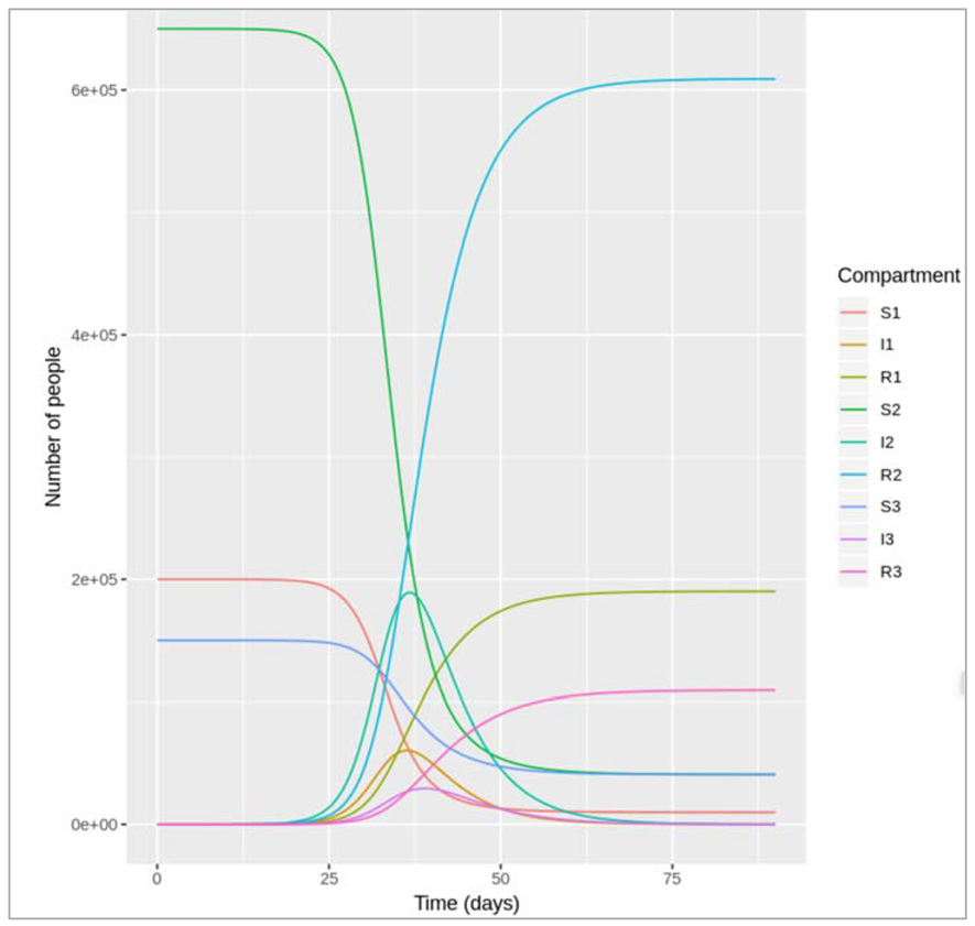
How many infections occurred in each age group over the course of the epidemic, and what proportion of children, adults and elderly individuals does this represent? How does this compare to your result from the previous etivity?
Cumulative incidence in children: 190215.371677112
Cumulative incidence in adults: 609095.450639459
Cumulative incidence in the elderly: 109311.074502144
190,215 children, 609,095 adults and 109,311 elderly people were infected over the course of this outbreak. Dividing these by the age-specific population sizes of 200,000, 650,000 and 150,000, the model predicts that 95% of children, 94% of adults and 73% of the elderly in this population would be infected in this epidemic.
As you can see, a smaller proportion of elderly people are infected than the population of children or adults, but we were unable to observe this with our previous model because we did not stratify the model in as much detail with regards to age. Instead, we only observed the average epidemiological pattern in all adults.
Interventions in an age-structured population
| Loading the necessary libraries |
| Set up an empty contact matrix with rows for each age group and columns for each age group contact_matrix[1,1] = 7 # daily number of contacts that children make with each other contact_matrix[1,2] = 5 # daily number of contacts that children make with adults contact_matrix[1,3] = 1 # daily number of contacts that children make with the elderly contact_matrix[2,1] = 2 # daily number of contacts that adults make with children contact_matrix[2,2] = 9 # daily number of contacts that adults make with each other contact_matrix[2,3] = 1 # daily number of contacts that adults make with the elderly contact_matrix[3,1] = 1 # daily number of contacts that elderly people make with children contact_matrix[3,2] = 3 # daily number of contacts that elderly people make with adults contact_matrix[3,3] = 2 # daily number of contacts that elderly people make with each other |
| We initialize the parameters as: b = 0.5 = the probability of infection per contact is 5% contact_matrix = the age-specific average number of daily contacts gamma = 1/5 = the rate of recovery is 1/5 per day |
| We run the simulation for 3 months from 0 to 90 days for 0.1 day interval |
| We create SIR_age_model function (with time, state and parameters): n_agegroups = 3 = number of age groups S = state[1:n_agegroups] = assign to S the first 3 numbers in the initial_state_values vector I = state[(n_agegroups+1):(2*n_agegroups)] = assign to I numbers 4 to 6 in the initial_state_values vector R = state[(2*n_agegroups+1):(3*n_agegroups)] = assign to R numbers 7 to 9 in the initial_state_values vector N = S+I+R = people in S, I and R are added separately by age group, so N is also a vector of length 3 |
| Defining the force of infection: Force of infection acting on susceptible children lambda = b * contact_matrix * matrix(I/N) = the lambda vector contains the forces of infection for children, adults and the elderly (length 3) |
| Differential equations: (Rate of change in children) dS = -lambda * S dI = lambda * S - gamma * I dR = gamma * I |
Modelling vaccination scenarios
If you can only give the vaccine to one of the 3 age groups, which one would you prioritise to minimise the number of infections in the elderly? Would this also be the best strategy to reduce the overall number of infections in the population?
Vaccinating only children:
There are more doses of vaccine than children in the population, so the vaccine coverage will be 100% in children and 0% in the other groups as per the question
| vacc_cov1 = 1 # vaccine coverage in children vacc_cov2 = 0 # vaccine coverage in adults vacc_cov3 = 0 # vaccine coverage in the elderly vacc_eff3 = 0.5 # vaccine efficacy in the elderly (100% in the other age groups) |
| Effective vaccine coverage for each age group: p1 = vacc_cov1 p2 = vacc_cov2 p3 = vacc_cov3 * vacc_eff3 |
| Population size in total and for each age group: N = 1000000 N1 = 0.2*N N2 = 0.65*N N3 = 0.15*N |
| Fill in initial state values for a naive population based on effective vaccine coverage: S1 = N1-p1*N1 S2 = N2-p2*N2 S3 = N3-p3*N3 I1 = 1 # the outbreak starts with 1 infected person (can be of either age) I2 = 0 I3 = 0 R1 = p1*N1 R2 = p2*N2 R3 = p3*N3 |
| Model output: We integrate the above values in ODE with initial_state_values, times, sir_model_age, parameters |
| Calculate cumulative incidence in each age group: child_cum_inc = 0 adult_cum_inc = 572797.7 elderly_cum_inc = 92941.04 total_cum_inc = 665738.7 |
Giving all available vaccine doses to children would prevent all infections in children, but still result in 92,941 infections in the elderly, and a total number of infections of 665,739 by the end of the epidemic.
Let's compare this with the output when giving all the vaccine doses to adults or the elderly instead:
| Vaccinating only adults : Vaccine coverage in adults = 250,000/650,000 (0% in the other groups as per the question) |
| vacc_cov1 = 0 # vaccine coverage in children vacc_cov2 = 0.38 # vaccine coverage in adults vacc_cov3 = 0 # vaccine coverage in the elderly vacc_eff3 = 0.5 # vaccine efficacy in the elderly (100% in the other age groups) |
| Effective vaccine coverage for each age group: p1 = vacc_cov1 p2 = vacc_cov2 p3 = vacc_cov3 * vacc_eff3 |
| Population size in total and for each age group: N = 1000000 N1 = 0.2*N N2 = 0.65*N N3 = 0.15*N |
| Fill in initial state values for a naive population based on effective vaccine coverage: S1 = N1-p1*N1 S2 = N2-p2*N2 S3 = N3-p3*N3 I1 = 1 # the outbreak starts with 1 infected person (can be of either age) I2 = 0 I3 = 0 R1 = p1*N1 R2 = p2*N2 R3 = p3*N3 |
| Model output: We integrate the above values in ODE with initial_state_values, times, sir_model_age, parameters |
| Calculate cumulative incidence in this age group |
|
Vaccinating only elderly people: There are more doses of vaccine than elderly people in the population, so the vaccine coverage will be 100% (0% in the other groups as per the question) |
| vacc_cov1 = 0 # vaccine coverage in children vacc_cov2 = 0 # vaccine coverage in adults vacc_cov3 = 1 # vaccine coverage in the elderly vacc_eff3 = 0.5 # vaccine efficacy in the elderly (100% in the other age groups) |
| Effective vaccine coverage for each age group: p1 = vacc_cov1 p2 = vacc_cov2 p3 = vacc_cov3 * vacc_eff3 |
| Population size in total and for each age group: N = 1000000 N1 = 0.2*N N2 = 0.65*N N3 = 0.15*N |
| Fill in initial state values for a naive population based on effective vaccine coverage: S1 = N1-p1*N1 S2 = N2-p2*N2 S3 = N3-p3*N3 I1 = 1 # the outbreak starts with 1 infected person (can be of either age) I2 = 0 I3 = 0 R1 = p1*N1 R2 = p2*N2 R3 = p3*N3 |
| Model output: We integrate the above values in ODE with initial_state_values, times, sir_model_age, parameters |
| Calculate cumulative incidence in this age group |
Comparing all three age group results:
| child_cum_inc | adult_cum_inc | elderly_cum_inc | total_cum_inc |
| 0.0 | 572797.7 | 92941.04 | 665738.7 |
| 181263.6 | 332793.4 | 89262.62 | 603319.6 |
| 188970.3 | 603879.1 | 50022.62 | 842872.0 |
The cumulative incidence in the elderly is lowest if we only vaccinate everyone in the elderly age group (only 50,023 infections), despite the low vaccine efficacy in this age group! However, with this strategy we also get a substantially larger total number of infections than if vaccinating only children or only adults (842,872 infections vs. 665,739 and 603,320 respectively).
The worst strategy for the given question would be to only vaccinate children, since this neither minimises the number of infections in the elderly nor in total.
If you distribute the vaccine doses among the 3 age groups in proportion to their population size, which group would benefit the most in terms of the percentage reduction in the cumulative incidence achieved with vaccination? Is the reduction in the total number on infections in the elderly what you would expect given the lower vaccine efficacy in this age group?
First, we need to calculate the baseline prevalence without vaccination, then the model the vaccine scenario:
Baseline prevalence (no vaccine):
| vacc_cov1 = 0 # vaccine coverage in children vacc_cov2 = 0 # vaccine coverage in adults vacc_cov3 = 0 # vaccine coverage in the elderly vacc_eff3 = 0.5 # vaccine efficacy in the elderly (100% in the other age groups) |
| Effective vaccine coverage for each age group: p1 = vacc_cov1 p2 = vacc_cov2 p3 = vacc_cov3 * vacc_eff3 |
| Population size in total and for each age group: N = 1000000 N1 = 0.2*N N2 = 0.65*N N3 = 0.15*N |
| Fill in initial state values for a naive population based on effective vaccine coverage: initial_state_values - S1 = N1-p1*N1 S2 = N2-p2*N2 S3 = N3-p3*N3 I1 = 1 # the outbreak starts with 1 infected person (can be of either age) I2 = 0 I3 = 0 R1 = p1*N1 R2 = p2*N2 R3 = p3*N3 |
| Integrate the model parameters with initial_state_values, times, sir_age_model, parameters |
| Calculate cumulative incidence in each age group |
| Distributing vaccine doses among age groups proportionally to population size # 250,000 doses/1 million = 25% coverage in each age group |
| vacc_cov1 = 0.25 # vaccine coverage in children vacc_cov2 = 0.25 # vaccine coverage in adults vacc_cov3 = 0.25 # vaccine coverage in the elderly vacc_eff3 = 0.5 # vaccine efficacy in the elderly (100% in the other age groups) |
| Effective vaccine coverage for each age group: p1 = vacc_cov1 p2 = vacc_cov2 p3 = vacc_cov3 * vacc_eff3 |
| Population size in total and for each age group: N = 1000000 N1 = 0.2*N N2 = 0.65*N N3 = 0.15*N |
| Fill in initial state values for a naive population based on effective vaccine coverage: initial_state_values - S1 = N1-p1*N1 S2 = N2-p2*N2 S3 = N3-p3*N3 I1 = 1 # the outbreak starts with 1 infected person (can be of either age) I2 = 0 I3 = 0 R1 = p1*N1 R2 = p2*N2 R3 = p3*N3 |
| Integrate the model parameters with initial_state_values, times, sir_age_model, parameters |
| Calculate cumulative incidence in each age group |
Results:
| child_cum_inc | adult_cum_inc | elderly_cum_inc | total_cum_inc |
| 190215.4 | 609095.5 | 109311.1 | 908621.9 |
| 130785 | 412563.8 | 77407.67 | 620756.4 |
Reduction in prevalence achieved with vaccination:
| child_cum_inc | adult_cum_inc | elderly_cum_inc | total_cum_inc |
| 0.3124374 | 0.3226615 | 0.2918589 | 0.3168155 |
Actually, the percentage reduction in prevalence achieved with this vaccination strategy is very similar across the 3 age groups! It is slightly higher in children and adults than in the elderly; the vaccine reduces the cumulative incidence in children and adults by 31-32%, compared to a 29% reduction in the elderly.
At first glance, it might seem counterintuitive that the reduction in incidence in the elderly is nearly as high as for children and adults, despite the vaccine efficacy and therefore the effective vaccine coverage being only half that of the other age groups. However, it makes sense when looking at the contact matrix:
[,1] [,2] [,3]
[1,] 7 5 1
[2,] 2 9 1
[3,] 1 3 2
On average, elderly people in this population make more contacts with children and adults (1+3) than with other elderly people (2) per day, which is why they benefit from a lower proportion of infected children and adults achieved with vaccination as well.
Modelling Influenza Vaccination Policy in the UK:
Assessing Optimal Target Populations for Influenza Vaccination Programmes
We used an age-structured model to investigate the impact on cumulative incidence of disease of vaccinating different age groups. This is the type of question which policy makers need to answer on a regular basis. The paper below (Baguelin et al., 2013, Assessing Optimal Target Populations for Influenza Vaccination Programmes: An Evidence Synthesis and Modelling Study) offers one example. It describes a study in England and Wales, that used a model with the same approach as the one you have just completed. The model involves a fairly sophisticated calibration approach, but the basic principle is the same: using different contact rates between different age groups, informed by diary-based contact surveys, the study examines the benefit of vaccinating schoolchildren. It informed the policy decision, which followed soon after this paper, to extend annual influenza vaccination in the UK; to include schoolchildren as well as specific vulnerable groups.
Arriving to create VBD model and how did we arrive to this modelling technique?
Disease and burden :Mostly, dengue infection results in a mild illness. There is an incubation period, of 4-10 days, after which symptoms last about 2-7 days. The symptoms are flu-like, and many mild infections go unreported and even unnoticed. However, some cases are severe and potentially fatal. Severe dengue can manifest with severe bleeding, plasma leakage, or organ impairment, requiring specialist treatment. These cases constitute a large health burden in Asian and Latin American countries, causing hospitalisation and death [7]. The incidence appears to have increased significantly in recent decades, with cases reported to the WHO rising from half a million in 2000, to 3.3 million in 2015. These numbers are only partly due to increased awareness and reporting. Severe epidemics used to occur in a small number of countries (pre-1970); now over 100 countries are endemic for dengue. Half the world's population are estimated to be at risk [7].
Stereotypes and epidemiology: There are four dengue serotypes: DENV-1, DENV-2, DENV-3 and DENV-4. These frequently co-circulate in countries across the world, although there is usually a predominant serotype responsible for the majority of dengue cases at any one time. Individuals who are infected and recover are subsequently immune to that serotype; however this does not stimulate immunity to other serotypes. Furthermore, subsequent infection by a different serotype increases the risk of severe disease, due to a complex effect termed antibody-dependent enhancement [8]. This makes dengue an especially complex challenge. Often, a change in the predominant serotype in a region leads to large outbreaks, which can generate thousands of cases per day, totally overwhelming local health capacity. Therefore tracking serotype-specific incident cases is important to assess the risks of first-time infection, the projected caseload of severe disease and to provide timely information in preparation for a potential outbreak [9].
Control : One vaccine is currently licensed, with more in development. The currently available vaccine has a different effectiveness against each serotype, and to complicate matters, is not recommended for seronegative individuals. Therefore vector control is the most feasible means to limit transmission at this time. While control of mosquito adults and larvae has been successful for periods of time in the past, these efforts require large resources and often employ the use of non-specific-insecticides. Human and societal factors, such as urbanisation and travel, as well as insecticide resistance and the difficulty of targeting mosquitoes indoors, further compound problems surrounding control. [10]. Consequently, significant funding into research and development remains important to tackle the global burden of disease, particularly in the areas of vaccines, modelling and vector control.
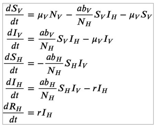
Coding a vector-borne disease (VBD) model:
Differential equations for the simple VBD model
What assumptions are you making using this model structure? Consider the host and vector population, transmission dynamics and biting behaviour, and the natural history of infection.
Some assumptions underlying this model structure are:
- host and vector population: there are no births, background deaths or disease-induced mortality in the host population. Vectors enter the population and die at the same rate, therefore the mosquito population size remains constant over time. Vector survival is independent of infection status, and recruitment of new vectors into the transmission cycle (μVNV) depends on the vector population size. There is no heterogeneity in the host or vector population, which means vectors and bites are homogeneously distributed among people.
- transmission dynamics and biting behaviour: transmission occurs only from vector to host and from host to vector (no host-host or vector-vector transmission). The mosquito takes all blood meals from humans (H=1 so this is not represented in the equations).
- natural history of infection: hosts are infectious as soon as they are infected, and can recover. Recovery induces permanent immunity in hosts, i.e. there is no re-infection. Vectors are infectious as soon as they get infected and remain infectious until they die.
Parameter values and their description:
- Biting rate a = 1 days−1 = Each mosquito bites a human once a day (all bloodmeals are taken from humans).
- Probability of infection from an infected host to a susceptible vector, bV = 0.4 = When a mosquito bites an infected human, the probability that the mosquito becomes instantaneously infected is 40%.
- Probability of infection from an infected vector to a susceptible host, bH = 0.4 = When a human gets bitten by an infectious mosquito, the human becomes infected with a probability of 40%.
- Mortality rate of the vector μV = 0.25 days−1 = the Aedes aegypti mosquito has an average life expectancy of 1/0.25 = 4 days.
- Recovery rate of the host, r = 0.167 days−1 = dengue infection in humans lasts 1/0.167 = 6 days on average.
Creating a single-serotype dengue model
| Install necessary libraries |
| Nh = 10000 # total number of hosts Nv = 20000 # total number of vectors |
| Initialize state values: Sh = Nh-0.0028*Nh Ih = 0.0028*Nh Rh = 0 Sv = Nv-0.00057*Nv Iv = 0.00057*Nv |
| A = 1 # mosquito biting rate per day b_v = 0.4 # probability of infection from an infected host to a susceptible vector b_h = 0.4 # probability of infection from an infected vector to a susceptible host u_v = 0.25 # mortality/recruitment rate of the vector r = 0.167 # recovery rate from dengue in humans |
| We initialize the timestep from 0 to 90 days at an interval of 1 day : simulate for 3 months (90 days) |
| We create a SIR model function with time, state and parameters: Nh = Sh + Ih + Rh # total human population Nv = Sv + Iv # total vector population # The differential equations # Host population dynamics: dSh = -a*b_h*Sh*Iv/Nh dIh = a*b_h*Sh*Iv/Nh - r * Ih dRh = r * Ih # Vector population dynamics: dSv = u_v * Nv - a*b_v*Sv*Ih/Nh - u_v * Sv dIv = a*b_v*Sv*Ih/Nh - u_v * Iv |
| We integrate the ODE with the aforementioned initialised values |
| We plot the graph |
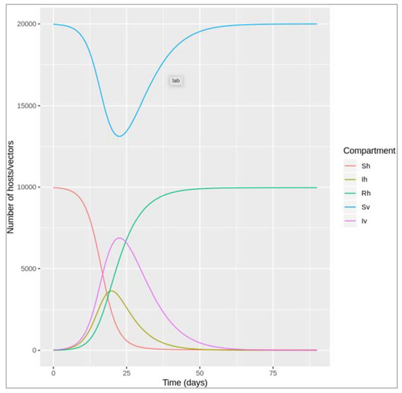
Figure []: Dengue model
| Initializing a_values with sequence from 0 to 1 in the intervals of 0.1 days : a vector of values for the biting rate, ranging from 0 to 1 per day |
| Initializing out_list |
| Simulating a model and storing the output |
| Extract the infected host column from the list and creating a dataframe by time |
| Plotting the graph |
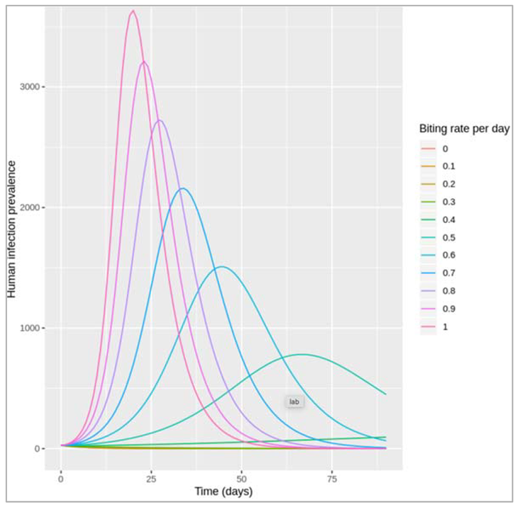
Figure []:
How do assumptions of the mosquito biting activity affect the human infection prevalence?
For an average number of 0-0.3 bites per mosquito per day, no dengue epidemic occurs. An outbreak only occurs for values of 0.4 and above, with increasing values of a producing higher peak epidemic sizes and shorter durations.
What might affect the average number of bites a mosquito takes per unit time? Is it realistic to assume that the biting rate stays constant over time in the simulation?
The biting rate, just like other vector-related parameters, can be influenced by a wide range of environmental factors such the temperature and rainfall. Over a short time period, assuming a constant biting rate may be fine, but accounting for seasonality is important over longer timescales (as is turnover in the human host population). The biting rate can also be affected by the host's behaviour, for example if humans take measures to avoid mosquito bites (e.g. wearing long-sleeve clothing).
How could you extend this model for a more realistic representation of dengue transmission dynamics?
This would depend on the research question, but in general a more realistic model structure could be achieved by representing mosquito population dynamics and the natural history of dengue infection. For example, dengue models usually account for the intrinsic incubation period (latent period in humans) and extrinsic incubation period (latent period in the vector), i.e. the time between exposure to infection and the bite becoming infectious. Only adult mosquitoes are involved in transmission, but different developmental stages from larvae to adult could be represented, particularly if we are interested in studying changes in the mosquito population e.g. in relation to environmental factors. Severe cases of dengue infection occur as a result of secondary infection with a different serotype, so the co-circulation of different serotypes would be important to account for when studying disease burden of dengue in humans.
While coding vector control interventions, we consider these points to take a step ahead:
Intervention1 : This if statement is defined within the vbd_model function, which means that it is executed at every timestep while solving the differential equations.
Based on the code, what effect does the intervention have on the natural history of the infection and how effective is it at this?
The modelled interventions works by reducing the biting rate a during a given time period (between days 15 and 60). It has a 75% efficacy at reducing the biting rate (from 1 per day to 0.25 per day).
Give an example of an intervention this might represent and describe in more detail how it is implemented (e.g. when, for how long).
This might represent implementation of a personal protective intervention on the population level, e.g. rolling out an insect repellent scheme to all individuals in the modelled community, which would reduce the biting rate on humans. At the beginning of the simulation and until the time-step corresponding to day 15, a=1 days−1. From the plot we can see that a dengue outbreak has started by that time. At day 15, the insect repellent is distributed and assumed to reduce the biting rate to 0.25 per day. Use of insect repellent is maintained for 45 days, but stops at day 60 so the biting rate increases again to its baseline value.
Based on the plot, how does the intervention affect the prevalence of infection in humans?
Compared to the scenario without intervention, the peak of the dengue outbreak occurs slightly earlier and is lower. However, the output at the later time-steps also shows that as soon as the intervention is no longer in effect, the number of infections in humans starts rising again.
Note: The dengue vector Aedes aegypti is a day-biting mosquito, which makes personal protective interventions like the one modelled here an important method of prevention. However, as always this simple model makes many simplifying assumptions, such as that uptake and compliance to the use of insect repellent is homogenous across the population. Also note that in this exercise we are looking at vector control interventions against dengue infection, but the general principle in the coding is the same for other types of diseases and control measures. The biting rate in this model, which changes as a result of an intervention, is an example of a time-dependent parameter.
Intervention 2:
Based on the code, what effect does the intervention have on the natural history of the infection and how effective is it at this?
Here, an event, defined in the "event-data" data-frame, is implemented while solving the differential equations (within the ode() command). Calling the ?events help file provides an explanation for this:
"An event occurs when the value of a state variable is suddenly changed, e.g. because a value is added, subtracted, or multiplied. The integration routines cannot deal easily with such state variable changes. Typically these events occur only at specific times. In deSolve, events can be imposed by means of an input data.frame, that specifies at which time and how a certain state variable is altered, or via an event function."
The "event-data" data-frame tells us that we are changing the number of susceptible vectors (Sv) and the number of infected vectors (Iv), both at time-step 15. We are multiplying the number in those states at that time-point by 0.5, which means we are modelling an intervention with 50% efficacy at reducing the vector population in the community.
Give an example of an intervention this might represent and describe in more detail how it is implemented (e.g. when, for how long).
This might represent a fogging intervention, whereby wide-scale spraying of an insecticide instantly kills a large number of mosquitoes. In the code, this happens 15 days into the simulation, at which point a dengue outbreak has started. In contrast to the continued use of the insect repellent, fogging represents a one-off event in this example.
Based on the plot, how does the intervention affect the prevalence of infection in humans?
The plot shows the abrupt drop in the number of susceptible and infected vectors at day 15, at which point the infection prevalence in humans also starts declining. The peak of the human dengue epidemic is thereby reduced compared to the scenario with no intervention.
Notes:
The plot also shows that right after the fogging event, the mosquito population slowly increases again, as new mosquitoes are recruited into the population through maturation of larvae (as defined in the μv parameter). This is because the mosquito larvae are not killed by fogging.
Dengue is an arbovirus transmitted by Aedes mosquitoes that bite during the daytime, usually early morning and early evening. There are an estimated 390 million infections annually across 141 countries, 58 million of these are symptomatic. From an economic perspective, the global burden is particularly high estimated at eight billion dollars, US. Interventions for dengue vary greatly and as you may recall there is no cure. Once infected, the patient can only rely on supportive therapies to allow time for their immune system to clear the infection. Therefore, two broad approaches remain. These are vaccination and vector control. In terms of vaccines, only one has been successfully tried and is currently available to countries for licensing and use. However, this vaccine is only partially effective meaning that the vaccine does not offer complete protection to all four dengue serotypes across all demographics. A few countries have opted for this vaccine, the Philippines and Mexico for example, but many have not. There are further vaccines in the pipeline which is good news but at this stage it remains likely that any vaccines will have to be used as a complement to our next topic of discussion: vector control. Vector control is quite a crowded area given the multitude of interventions currently available. Also, there is no significant body of evidence to suggest that any one form of vector control adequately reduces dengue incidence in all settings. For example, in high-income countries with substantial resources to commit to intense monitoring and surveillance plus with their compliant population, certain interventions are more favorable than others. Of course, the inverse is also true. So let's first look at some of the most prominent interventions which are most common in low income countries since this is where the majority of disease burden exists. In terms of insecticidal approaches that target the vector, the use of an aerosolized mist or fog is most frequent. There are different forms of fogging but the principle remains the same: to aerosolize enough insecticide to reach all mosquitoes in a given area that might be infected with dengue. A good example of the use of fogging would be in an area that has recorded confirmed dengue cases. In this instance, fogging would be conducted to eliminate all dengue infected mosquitoes from the area which would in turn protect the neighboring households. In theory, this might seem attractive especially as the intervention can be rolled out relatively quickly to effectively cover the surrounding neighborhood. However, there are a few drawbacks such as access to homes, noise,and the promotion of insecticide resistance. Importantly, although widely used, there is an absence of data on the effectiveness of fogging at reducing both mosquito densities and dengue incidence. Another prominent intervention that targets adult mosquitoes is indoor residual spraying or IRS. Coupled with resources for contact tracing plus the infrastructure and surveillance systems associated with high-income countries, IRS has proven effective at preventing dengue transmission in some cases. Long used against malaria-carrying mosquitoes and sandflies, this approach requires access to homes so technicians can cover the walls and the ceiling with a long-lasting insecticide. Such insecticides often last 6-9 months which is sufficient to endure through the rainy season during which vectors are most abundant. There are of course the same caveats as those mentioned previously for fogging. However, the process is also laborious and the equipment heavy, requiring significant time for deployment. Therefore this method would be best used well ahead of any foreseeable outbreak. A novel intervention currently undergoing evaluation in randomized control trials involves the use of the bacterium, Wolbachia. Wolbachia acts by making the mosquito refractory to dengue infection a process that could become self-sustaining among wild-type mosquito populations. That said, they've been fitness cost to mosquito and we are awaiting further news from ongoing international trials but results so far seem promising. Interventions that target the immature life stages, the egg, larvae, or pupa often focus on the elimination of all cleanup of breeding sites, more technically oviposit sites. These are the commonly found buckets, containers, barrels, and other water-holding receptacles found across households where access to piped water is either intermittent or absent. Households use a variety receptors to hold water for washing the dishes, clothing, bathing, cooking, and of course drinking. So the quantification and subsequent removal of these containers can be used to infer and reduce vector abundance. But note this important fact, transovarial transmission for dengue is extremely rare. Therefore by targeting immature life stages, one is not aiming to eliminate the development of dengue infected mosquitoes, only to reduce the vector abundance and therefore the host vector contact rate which should in theory reduce the associated risk of human dengue infection. Another recent approach utilises genetic technology. RIDL or the release of insects carrying dominant lethal genes are coded into male mosquitoes that are passed on to progeny. These genes results in 100 percent mortality in the offspring. Therefore by releasing RIDL males, it is possible to dramatically crash wild-type populations. In contrast to Wolbachia however, this technology cannot self-sustain. So to keep populations low, one must continually release genetically modified males. So I hope that's been a helpful rundown of some of the available interventions for dengue and indeed widely used vector control interventions for many vector-borne diseases.
We have used dengue as a case study to explore the mathematical basis behind the transmission dynamics of vector-borne diseases, and reviewed fundamental concepts such as vectorial capacity and R naught. Now only this, you can now implement vector-borne disease control tools in your compartmental models and fully understand how these interact with the various parameters and state variables. Finally, you have learned how to interpret your results and the importance of context when developing models, as well as the assumptions that one often has to make in the process. It is important that you recognise the limitations of modelling this respect and that modelling is a tool to be used along side and not instead of adequate field data. Let's recap on the most important aspects. Throughout this week screen-casts, you have seen how to model a vector-borne disease in a compartmentalised fashion using the Ross-Macdonald model and how to represent these models via differential equations. Following this, you have seen how interventions can influence your model through their effects on specific model parameters. You will also be clear that an overall R naught value for vector-borne diseases is calculated as a function of the transmission drivers between vector's host and host to vector. As discussed, there are many dengue interventions which include a partially effective vaccine. Recall that there is no cure for dengue and all remaining interventions target the vector, either the adult mosquito or immature stages. Remember when introducing interventions into a model, you should take time to clarify how the intervention impacts transmission process so that you can adjust your model parameters accordingly. Using the vectorial capacity equation and contemporary iterations will help with this.
In its most basic form, the equation captures the following variables. The mosquito to human ratio, the biting rate, the extrinsic incubation period, and the probability of mosquito survival over a single day. Remember also that there is a complex interplay between interventions, and that you will almost certainly have to make some assumptions in lieu of absent field data, especially, across multiple contexts. Finally, you will have further improve your critical appraisal skills, and should further be able to state their positive aspects and limitations of your models.
Application of measures in public health to epidemiology:
Measures of frequency:
- Odds = Number of people with disease/Number of people who don’t have the disease
- Prevalence = Number of people with disease/Total number of individuals in the population
- Cumulative incidence = Number of new cases during the period of interest/Number of disease-free individuals at the start of this time period
- Incidence rate = Number of new cases during the follow-up period/Total person-time by disease-free individuals
Relationship between Measures of Frequency:
Cumulative incidence and prevalence are proportions and, as such, are more intuitive for most people compared to odds. Odds are often used for technical reasons, so it is important to understand the relationship between odds and a proportion (prevalence or risk). For rare conditions or diseases, the numerical values of proportions and odds are very similar. But if the proportion is higher than 0.1, the numerical value of the odds deviates from the proportion. For example, when the prevalence of a disease is 0.10, the odds of having the disease is 0.11, a very good approximation. But when the prevalence is 0.50, the odds is 1. Therefore, the distinction between the two becomes more important as the prevalence or risk increases.
To calculate the odds when you know the proportion and vice versa, you can use the following formulas:
Odds = proportion/1-proportion
Proportion = odds/1+odds
Prevalence is dependent on the duration and incidence rate of a disease. Assuming that the population is in a steady state (i.e. inflow is the same as outflow) and incidence rate and duration (i.e. length of time an individual has the disease) are constant over time, prevalence is equal to the incidence rate multiplied by the duration.
Prevalence=Incidence rate×Duration
We can apply this to the real-life case of HIV/AIDS. The development of new treatments over the years prevent death from AIDS but do not cure the disease. Therefore, the increased duration of the disease has led to an increase in the prevalence of HIV/AIDS although incidence has not increased. On the other hand, acute conditions such as the common cold have a relatively short duration but high incidence, which means that the prevalence will be low at any given time.
Similar to prevalence, cumulative incidence is also a proportion. However, the relationship between cumulative incidence and incidence rate is different in comparison to the relationship between prevalence and incidence rate. Assuming a constant incidence rate, a rough approximation of the cumulative incidence of a disease is the incidence rate multiplied by time. However, this fails to consider that a population at risk declines over time and does not remain constant. Therefore, a more accurate mathematical equation describing the relationship between cumulative incidence and incidence rate must account for the exponential decay in the population at risk.
CIt=1−e^−IR×t : Assuming constant incidence rate (IR); t=time.
Measures of Association:
There are two categories of measures of association: relative and absolute measures.
Relative measures include the Risk Ratio (RR); the Incidence Rate Ratio (IRR) and the Odds Ratio (OR):
Risk ratio = risk in the exposed/risk in the unexposed
IRR = incidence rate in the exposed/incidence rate in the unexposed
OR = odds in the exposed/odds in the unexposed
Absolute measures include the Risk Difference (RD) and the Incidence Rate Difference (IRD):
Risk difference = risk among the exposed – risk among the unexposed
Incidence rate difference = Incidence rate among the exposed – Incidence rate among the unexposed
Attributable Risk:
Attributable Risk (AR) and attributable risk percent (AR%) quantify the impact of an exposure on the exposed group:
Attributable risk = risk difference or incidence rate difference
Attributable risk percent = (risk among the exposed – risk among the unexposed)/risk among the exposed
Population attributable risk (PAR) and population attributable risk percent (PAR%) quantify the impact of an exposure on the entire population. In addition to the formula described in the video, there are more -equivalent- ways to calculate the PAR and the PAR%.
PAR = attributable risk * prevalence of exposure
PAR = risk among the entire population – risk among the unexposed
PAR% = (risk among the entire population – risk among the unexposed)/risk among the entire population
We can use a variety of measures in Epidemiology to serve different purposes. Summarising what you have learnt during this course, we can divide measures in Epidemiology in three broad categories: measures of frequency; measures of association; and measures of impact. There is some overlap between measures of association and measures of impact, as attributable risk is essentially the risk (or incidence rate) difference.
Diagnostic test metrics:
Diagnostic test metrics include Sensitivity and Specificity, which are specific to the test, as well as Positive Predictive Value (PPV) and Negative Predictive Value (NPV) which may vary depending on the prevalence of the disease they are used to diagnose.
Sensitivity is the proportion of those with the disease who tested positive
Specificity is the proportion of those without the disease who tested negative
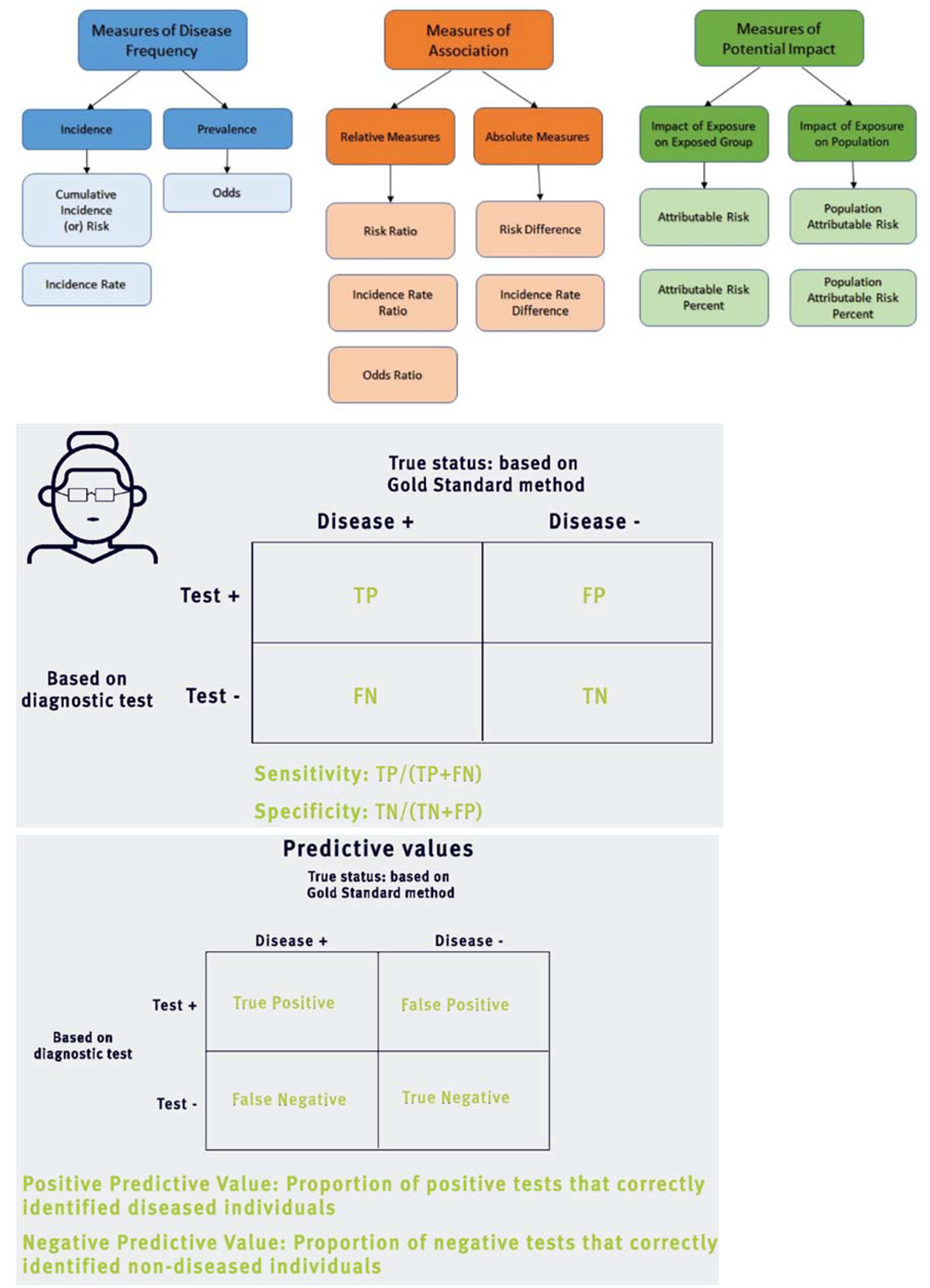
Diagnostic tests and the COVID-19 pandemic:
During epidemics of infectious diseases diagnostic tests are vital in the effort to monitor and control the spread of the disease, but also to identify individuals who are at risk and may require treatment. During the COVID-19 pandemic, two main types of tests have dominated the news:
(a) Those that detect whether an individual is currently infected with the virus. These are usually PCR tests that detect the presence of an antigen, i.e. genetic material of the virus. The numbers of cases reported by governments are mostly based on these tests.
(b) Those that detect whether someone has been infected in the past and has developed antibodies against the virus (SARS-CoV-2). These serological tests detect antibodies, which take some time to develop, usually 1-2 weeks after the initial infection.
There are a lot of questions and unknowns about both types of tests in the context of COVID-19, as well as other tests of interest. However, let's assume that all individuals who are infected by SARS-CoV-2 develop antibodies and are not susceptible to a new infection by the same virus. This may not be entirely true, but these assumptions will allow us to investigate how serological tests can be used in different populations and what kind of information they can provide. We will also ignore the delay between infection and the time antibodies become detectable, although this is an issue that needs to be considered in serological studies during an outbreak.
Let's consider a test which detects antibodies against SARS-CoV-2 and has been found to have sensitivity 85% and specificity 97.5%. This means that among all individuals who have been infected by the virus in the past, 85% test positive with this test. It also means that among all individuals who haven't been infected 97.5% test negative.
We will explore three different -hypothetical- areas, where the course of the epidemic has been very different and hence the prevalence of past infection varies. In Location A 20% of the population has already been infected, in Location B 2% of the population has been infected and in Location C only 0.2% of the population has been infected. In all locations we apply the antibody test to 10,000 people who are representative of the local population. The findings are interesting both for the individuals and at the population level. For instance, those who have developed antibodies could be protected against the virus and would be able to return to work, take care of the sick etc. without worrying that they are at risk of COVID-19. At the population level, we would be able to estimate the prevalence of past infection and hence decide on policies to protect the population, strengthen healthcare services and so on.
Location A - Prevalence 20%
By definition, 2,000 out of the 10,000 tested individuals have been infected by SARS-CoV-2; this is what prevalence of 20% means. Considering the sensitivity (85%) and specificity (97.5%) of the test, these will be the results of our study. Note that, in real life, we don't know whether an individual has been infected or not. This is what we are trying to discover based on the actual results of the test.
| Infected with SARS-CoV-2 | Not infected with SARS-CoV-2 | TOTALS | |
| Antibody test + | 1700 | 200 | 1900 |
| Antibody test - | 300 | 7800 | 8100 |
| TOTALS | 2000 | 8000 | 10000 |
Based on the table above, we can calculate the Positive Predictive Value (PPV) and the Negative Predictive Value (NPV).
PPV = 1700/1900 = 89.5% and NPV = 7800/8100 = 96.3%
These results mean that among those with a positive test almost 9 out of 10 will indeed have protective antibodies against the virus. However, 1 in 10 will falsely believe that they are not at risk. On the other hand, approximately 1 in 25 among those who receive a negative test will have antibodies. The estimated prevalence of past infection in Location A will be 1900/10000 = 19%, which is fairly close to the true prevalence of 20%.
Location B - Prevalence 2%
In Location B the virus has spread much less compared to Location A. Testing 10,000 people would provide the following results:
| Infected with SARS-CoV-2 | Not infected with SARS-CoV-2 | TOTALS | |
| Antibody test + | 170 | 245 | 415 |
| Antibody test - | 30 | 9555 | 9585 |
| TOTALS | 200 | 9800 | 10000 |
Based on the table above, PPV = 170/415 = 41.0% and NPV = 9555/9585 = 99.7%.
In this location, more than half of the positive tests are false positives, but essentially all negative tests are true negatives. For the tested individual, a negative test provides -almost- certainty that they haven't been infected, but a positive test is very ambiguous. The estimated prevalence of past infection in Location B will be 415/10000 = 4.15%, which is more than twice the real prevalence of 2%.
Location C - Prevalence 0.2%
Very few people have been infected in Location C. Applying the test to 10,000 individuals provides the following results:
| Infected with SARS-CoV-2 | Not infected with SARS-CoV-2 | TOTALS | |
| Antibody test + | 17 | 249 | 266 |
| Antibody test - | 3 | 9731 | 9734 |
| TOTALS | 20 | 9980 | 10000 |
Based on the table above, PPV = 17/266 = 6.4% and NPV = 9731/9734 = 99.97%.
These results suggest that, although a negative test is a very strong indication that the individual has not been infected, a positive test is hard to interpret. Among those who test positive, only 1 in 16 has been infected. The vast majority of those who test positive have not been infected. The estimated prevalence in Location C will be 266/10000 = 2.66%, which is 13 times as high as the true prevalence of 0.2%!
These examples highlight the importance of the context when screening a population using a diagnostic test. With the given sensitivity and specificity of the test results are reasonably useful in Location A, but are much harder to interpret in Locations B and C. Results may look quite different for a test with higher sensitivity and lower specificity. You can experiment with different test characteristics and explore the expected and actual results they would provide. Some of the issues discussed above have real-life implications during the pandemic for individuals that are tested, for policy makers who are trying to balance between imposing restrictions and returning to normality, and for researchers who are aiming to understand the true extent of the outbreak in a population.
Receiver Operative Characteristic (ROC) Curve
Many biological variables, such as cholesterol or blood pressure are measured in a continuum, and there is no clear threshold below or above which someone should be definitely considered healthy or sick. However, we tend to set such thresholds for practical reasons, especially in clinical practice. Similarly, many diagnostic tests provide measurements the numerical values of which cannot clearly distinguish between healthy and sick individuals.
The Receiver Operative Characteristic (ROC) curve is a tool which helps determine how well a diagnostic test is able to discriminate sick from healthy individuals. ROC curves are also used to decide on the optimal threshold for diagnosis.
To do this, you must plot the sensitivity against the false positive rate (i.e. 1 minus the specificity) for every possible threshold for a test or a combination of tests. This curve allows us to understand the trade-off between sensitivity and specificity depending on the threshold for diagnosis. Ideally, you want to pick a threshold which has the optimal combination of high sensitivity and low false positive rate.
In most circumstances, the closer the ROC to the top-left hand corner of your graph, the more accurate the test is overall. The area under the curve can also be used to calculate the accuracy and usefulness of a test. In other words, the larger the area under the curve, the better the test. The ROC curve is a helpful tool used to evaluate diagnostic tests, although, as you already know non-statistical considerations should also be taken into account.
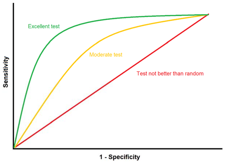
Primary and secondary data:
Data collection is crucial for epidemiological research. Whilst there are various methods to collect data, all information which is gathered can be categorised into two different types: primary and secondary.
Primary data is data that has been collected for the first time by an investigator. Primary data can be collected via questionnaires, interviews or tests. The advantage of primary data is that collection methods can be adapted to the objectives of the study. However, collecting primary data can be costly and time intensive, which may mean that it is not always feasible to obtain.
Secondary data, also known as existing data, is data which has already been collected for other purposes. Some examples of secondary data include census data, medical records, employment records and mortality registers. Secondary data is readily available and therefore cheaper to obtain. Moreover, secondary data often has large sample sizes and is collected both comprehensively as well as on a routine basis. This can be advantageous to researchers who want to compare data over time to detect population-level changes. On the other hand, the format of secondary data may not be suitable for the researcher. Similarly, data coverage could be insufficient or the type of data collected may not be tailored to the research objectives of the researcher. Primary and secondary data have strengths and limitations. The type of data which a researcher chooses to obtain or use can depend on a variety of factors such as the research question at hand, the time and resources available for the project, as well as the skills of the researcher. Several studies make use of both primary and secondary data to fulfil different requirements of the research.
Some COVID-19 examples : The rapid developments during the first few months of the COVID-19 pandemic created an urgent need for data and analyses that would provide much needed information about this new disease. Examples of primary data used for such analyses include (a) results of PCR tests among travellers leaving Wuhan early in the epidemic (e.g. all passengers in a repatriation flight) to assess the prevalence of infection among them; (b) data from seroprevalence studies in which a representative sample of the population is tested to measure antibodies against the SARS-CoV-2 virus; (c) data collected during clinical trials testing the effectiveness of potential treatments of COVID-19.
Examples of secondary data used for such analyses include (a) data on the number of confirmed cases or/and deaths by country or region used to conduct ecological analyses; (b) data from the electronic health records of patients hospitalised for COVID-19 to investigate potential risk factors for worse COVID-19 outcomes.
Selecting Controls in case-control studies:
Identifying the cases (i.e. individuals with the disease or outcome of interest) in a case-control study is often relatively straightforward. The most challenging element of the study is usually the selection of the controls.
Controls should be selected based on clearly defined eligibility criteria and must come from the same population as the cases. Depending on the context, controls can be selected from the following sources:
- Hospital - clinics. Cases are often identified within the healthcare system. Often, controls are selected from the same hospital or clinic as the cases, but they are individuals with conditions different from the one that we are studying. This is a convenient and inexpensive method and is likely to result in a control group that comes from the same population the cases have arisen from. People who are already in contact with the healthcare system may also be more likely to participate in the study. On the other hand, the exposure we are studying may be associated with the diseases the controls are suffering from, which would undermine our comparison.
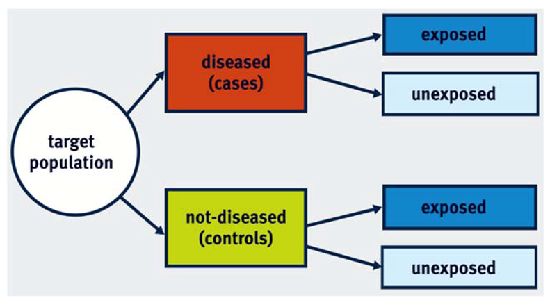
- Community - population. Another option is to go directly to the geographic area or community from which the cases arose and select a random sample. This sample will constitute the control group of the study. Although this has the clear advantage that it provides a representative sample of the population, it is rather expensive to conduct. Additionally, selected individuals may be reluctant to participate in the study and are susceptible to recall bias.
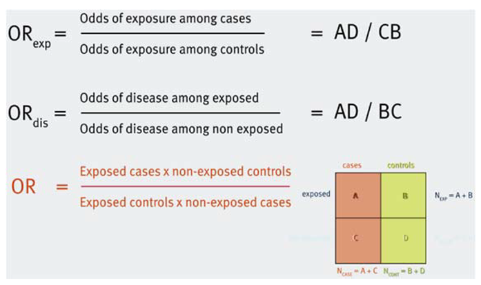
- Friends - family - neighbourhood. Sometimes, you can select controls from the immediate environment of the cases. This option has the advantage that you often end up with controls that are similar to the cases in key characteristics, such as age, ethnicity and socioeconomic status. However, they may also share environmental factors that are associated with the exposure of interest. This might result in a control group which is not representative of the source population with regard to the prevalence of the exposure.
Overall, it is important to remember that there is no perfect control group. Available resources and practical considerations may largely determine your choice of the control group.
Case-control studies:
The main principle of case-control studies is that we select a group of individuals with the outcome of interest (cases) and a group of individuals without the outcome (controls), and we explore whether they have been exposed to the exposure under study.
The measure of association that can be estimated in a case-control study is the odds ratio (OR).
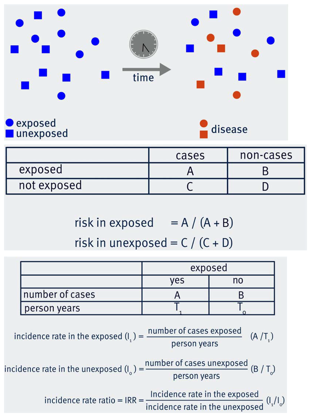
Cohort studies:
The key principal of a cohort study is that a number of individuals without the disease or outcome of interest are selected and followed up for a period of time. Some of them are exposed to the exposure under study, while the rest are unexposed. By the end of the study period, some individuals will have developed the disease/outcome of interest both in the exposed and in the unexposed group.
Depending on the data you have collected during the follow-up period, you can calculate the risk and/or the incidence rate of the disease in the exposed and the unexposed groups. Hence, you are able to calculate the Relative Risk or Risk Ratio (RR), the Risk Difference or Attributable Risk (AR) and the Incidence Rate Ratio (IRR).
relative risk = incidence in the exposed/incidence in the unexposed
AR = incidence in the exposed – incidence in the unexposed
Strengths and weaknesses of cohort and case-control studies:
In epidemiology, studies can be either observational or experimental. Observational studies are studies in which the investigator only observes populations or individuals, and does not interfere or manipulate the exposure. We will now discuss the strengths and limitations of two most commonly used observational study designs: cohort studies and case-control studies.
Cohort studies
In cohort studies, a group of individuals without the disease are followed-up over a period of time to observe what happens to them. Cohort studies try to find associations between previously defined characteristics of a cohort and the development of disease.
Advantages of cohort studies include:
- They enable researchers to investigate multiple outcomes simultaneously.
- The temporal relationship between exposure and disease can be explored. In other words, we can be certain that the exposure preceded the disease.
- Cohort studies can allow researchers to calculate incidence rates as well as risks (and the respective ratios).
- Cohort studies suffer from fewer ethical concerns as researchers are not assigning exposures or intervening with participants.
On the other hand, there are also limitations of cohort studies which should be acknowledged.
- One weakness of cohort studies is that they usually have a long duration which also implies larger costs.
- Cohort studies are not useful for studying rare diseases.
- Loss to follow-up which is likely to occur when running cohort studies can introduce bias.
- In occupational cohorts, the healthy worker effect may introduce bias. The healthy worker effect refers to the low mortality or disease incidence in healthy populations or industrial cohorts compared to the general population.
Cohort studies are warranted when the time between exposure and disease is relatively short, the occurrence of the disease is not rare, and when adequate funding is available.
Case-control studies
Case-control studies are another type of observational study where the investigator does not interfere or manipulate the exposure. In case-control studies, individuals with a particular disease are compared with individuals without the disease with regard to their exposure status.
Advantages of case-control studies include:
- One of the major strengths of a case-control study is that it is good for studying rare diseases.
- Compared to cohort studies, it is also relatively inexpensive and has a shorter duration, reducing the time required to acquire results.
On the other hand, like all study designs, case-control studies have limitations.
- Case-control studies are prone to selection bias. Selection bias can occur as a result of how the participants are recruited into the study; this bias can be related to the case-control status of the participant or the exposure status.
- Case-control studies do not allow the investigation of multiple outcomes.
Types of randomisation:
Several different approaches can be used to ensure random allocation of participants to treatment groups in RCTs. These include, among others:
Simple randomisation: This is the simplest method, equivalent to flipping a coin. It means that a randomly generated sequence of numbers is used to allocate each participant to one group or another. Although this simple approach can work well when the sample size is large, it can generate imbalanced intervention and control groups when the number of participants is relatively small.
Blocked randomisation: To address this problem, we often use blocked randomisation. The first step of this method is to create blocks of small size, e.g. 4 or 6. Each block contains a balanced combination of the available treatment. For example, if we are comparing treatments A and B, a block could be AABB, ABAB, ABBA etc. The second step is to randomise these blocks and allocate each ‘group’ of participants according to the block that has been randomised. For example, if the first block is AABB, then the first two patients will receive treatment A and the next two treatment B.
Stratified randomisation: Sometimes we wish to ensure that one or more characteristics, such as age, sex or comorbidities, are equally distributed between the intervention and control groups. Stratified randomisation achieves this. In practice, stratified randomisation means that we run a separate randomisation process within each stratum, for instance among men and among women. Although this sounds relatively simple, it can be problematic when we have multiple strata and small sample sizes.
Minimisation: This is most appropriate in small studies, where there is high risk of creating unbalanced groups. This approach considers the characteristics of the existing study sample to determine the next allocation, but it should include a random element to reduce predictability.
There are different variations as well as combinations of these randomisation approaches. One important variation is when the randomisation does not refer to individuals, but to clusters of participants. For example, in a trial where multiple clinics participate, it could be entire clinics that are randomised instead of each patient separately.
Phases of clinical trials:
Most of the clinical trials that are reported in the news involve a relatively large number of participants and may have direct implications for policy or/and disease treatment. However, these are usually one of the last steps in a long chain of clinical trials. These steps are called phases and describe different stages in the research process about a drug or intervention. Depending on the type of treatment or intervention, not all phases may be appropriate or relevant.
Phase 0: Phase 0 trials are often the first clinical trials done in humans. In Phase 0 trials a small number of participants receive very small doses of a drug and the researchers investigate how it is processed in the body and what its effects may be.
Phase I: In Phase I trials, researchers recruit a small group of people aiming to find the best dose of the drug under investigation. A key element of Phase I trials is safety and side effects, which are monitored very closely. The first patients receive small doses and if these are proven to be safe, subsequently recruited patients receive increased doses until the best dose, in terms of safety and treatment effects, is determined.
Phase II: Phase II trials involve more participants and allow researchers to further assess safety and the optimal dose. They also provide an indication on whether a treatment or intervention is effective. Sometimes they are randomised and compared with another treatment. If Phase II trials suggest that the treatment may be effective, it is tested in Phase III trials.
Phase III: These trials have substantially larger sample sizes and their main aim is to investigate whether the proposed treatment or intervention is more effective compared to the standard treatment or no treatment or placebo. Phase III trials are normally randomised and involve at least two groups. Because of their size, they also provide further information on safety, compliance and side effects. These are essential before a drug or vaccine is licensed for commercial use.
Phase IV: These are large clinical trials which are conducted after a treatment has been licensed. They can collect data on long-term effects and rare side effects, but are also used to investigate whether a drug can be used in conditions beyond the one that it has been approved for.
Design of RCTs:
RCTs can be conducted in a number of ways. The main distinction is between parallel and crossover designs.In RCTs with a parallel design, participants are randomised into two or more groups. Each group is given a different treatment (or placebo) and, after a follow-up period, their outcomes are assessed. Therefore, the groups are monitored ‘in parallel’. In RCTs with a crossover design, all participants receive both treatments or interventions (one of which could be placebo), but randomisation determines the order in which they will receive them. For example, some participants will receive treatment A for a period of time and then treatment B, while others will receive treatment B at first and then treatment A. The main advantage of crossover designs is that each participant is compared with themselves, which minimises variability between participants. However, this is not appropriate for studies which assess long-term outcomes. Similarly, crossover studies are not suitable for treatments that radically change the baseline condition of the participant, such as surgery. On the contrary, they can be quite efficient for the treatment of chronic conditions, such as hypertension. In these studies, ‘wash-in’ and ‘wash-out’ periods before and after each treatment are used to ensure that potential effects of previous treatments are not carried over to the period when the next treatment is applied. Other designs exist as well. For example, factorial design is used to test multiple interventions in one trial and adaptive designs allow modifications of the sample size, dose etc. during the trial.
Data analysis in RCTs:
Random allocation of participants is very important in Randomised Controlled Trials. However, there is no guarantee that the participants will actually follow the allocated treatment. Let's consider an RCT in which treatments A and B are being compared. At the beginning of the study, some participants will be randomised to receive treatment A and some will be randomised to receive treatment B. For various reasons, some participants might not receive the allocated treatment. For instance, some participants in group A may decline or discontinue their treatment or even follow treatment B in a different healthcare facility.
There are three different methods to analyse the data:
Intention-to-treat analysis
Intention-to treat analysis means that we compare the two groups based on the originally allocated treatment. Thus, participants who were originally allocated treatment A will be included in group A in our analysis, even if they never received treatment A.
Per-protocol analysis
In per-protocol analysis, we only include participants who completed the allocated treatment. Thus, participants who were initially allocated treatment A, but did not complete it, would be excluded from the analysis altogether.
As-treated analysis
As-treated analysis focuses on the received treatment. Thus, when comparing treatments A and B, group A would include all participants who received treatment A. These could be those who were initially randomised to receive treatment A and followed the protocol, but also those who may have been originally allocated treatment B, but ended up receiving treatment A.
Although intention-to-treat may appear counter-intuitive, it has a couple of really important advantages. First, it maintains random allocation with all its benefits. Those who didn't follow the treatment may be systematically different than those who did, so if we exclude them, we will spoil the comparability of the two groups. Additionally, they reflect real-life conditions where some people will not follow the recommended treatment. This is why it is often considered the optimal analytical approach in RCTs. Per-protocol and as-treated analyses also have merit, as they compare outcomes based on the actual received treatment. In ideal conditions, where all randomised participants follow the protocol, all types of analyses produce identical results. However, this very rarely happens, so researchers often conduct multiple analyses using all these methods.
Strengths and Weaknesses of Randomised Controlled Trials
Randomised Controlled Trials
Randomised Controlled Trials (RCTs) is often considered the optimal study design for a number of reasons.
- Randomisation substantially reduces the risk of bias in the study.
- RCTs are also relevant to actual interventions in populations and settings of interest.
- They can provide precise measures of efficacy which we can use to evaluate interventions.
However, RCTs are also subject to certain limitations, including:
- The results may not be generalisable to populations that are different than the sample used in the study.
- They can be quite complex and costly to conduct.
- Due to cost and practical considerations, they often rely on surrogate endpoints. For example, a biomarker is measured instead of a health outcome which might require a long time to develop.
- They are experimental studies, which raises ethical issues. Some exposures (e.g. smoking or radiation) cannot be studied with RCTs because it is unethical to intentionally expose people to them.
Overview of Study Designs:
You have learnt about several study designs throughout this course. There are many classifications of study designs which may slightly differ from each other, depending on the criteria they use to characterise studies. In one of the first videos of the course, you heard about two main categories of studies; analytic vs. descriptive, but one could also start with the contrast between experimental and observational studies. Based on what you have learnt in this course, a possible classification of the main study designs could look like this:
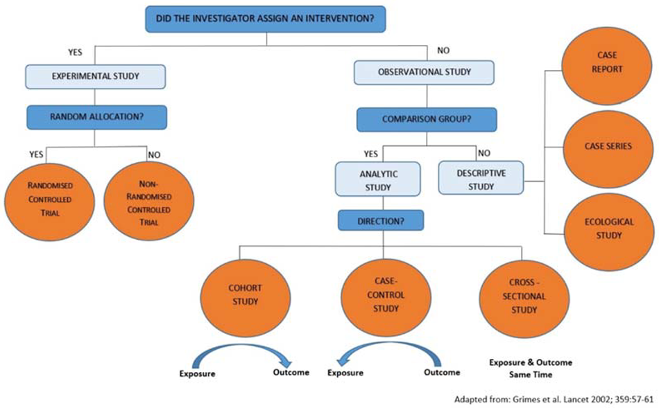
Note that a cross-sectional study can also be considered descriptive when, for example, its main purpose is to describe the prevalence of a disease. Experimental studies are, by definition, analytic. Study designs such as nested case-control and case-cohort also belong to the analytic studies.
How to identify confounding:
There are several different approaches which you can use to identify confounding in a study. You don't need to apply all of them each time to each potentially confounding factor. One of these approaches can be enough to inform your decisions around confounding.
You have learnt the following approaches:
- Subject matter knowledge. Factors identified in existing literature or plausible biological pathways can inform your decisions.
- Three criteria for confounding. You need to examine if the suspected extraneous variable satisfies three conditions. (a) It is associated with the study exposure in the control group (source population); (b) it is associated with the study outcome in the absence of study exposure; and (c) it is not a consequence of exposure, i.e. it is not in the causal path between the exposure and the disease.
- Stratification. Stratify data by the extraneous variable to examine if the estimates within strata of the extraneous variable are similar in magnitude and appreciably different from the crude (pooled) estimate.
- Statistical adjustment. Controlling for the extraneous variable, e.g. by logistic regression, appreciably (>15%) alters the estimate of the association between the exposure and the outcome.
Regression:
Regression is a commonly used method to predict the value of a ‘dependent’ (outcome) variable from one or more ‘independent’ (exposure) variables. In this course we mostly refer to regression as a way to adjust for confounding. This is done when multiple independent variables are included in the regression model.
Linear regression is appropriate when the outcome variable is continuous. For example, let’s consider a study investigating the association between the exposure alcohol consumption (in units per week) and the outcome systolic blood pressure (in mmHg). A simple linear regression model with only these two variables will yield a coefficient (with its 95% Confidence Interval), which can be interpreted as “the change in systolic blood pressure for one unit increase in alcohol consumption”. If the coefficient is 3, then the interpretation would be that our analysis showed that for one additional unit of alcohol per week, it is expected that the systolic blood pressure will increase by 3mmHg. If we are concerned that this estimate is biased due to confounding factors, we can include these factors in the regression model. Let’s assume we have data on sex, age and income and we consider them to be confounding factors. By including them as independent variables in the regression model, we control for confounding. The adjusted model may yield a coefficient (for alcohol) of 2.2, i.e. different than before. The respective interpretation would be that our analysis showed that for one additional unit of alcohol per week, it is expected that the systolic blood pressure will increase by 2.2mmHg, having adjusted for confounding by sex, age and income.
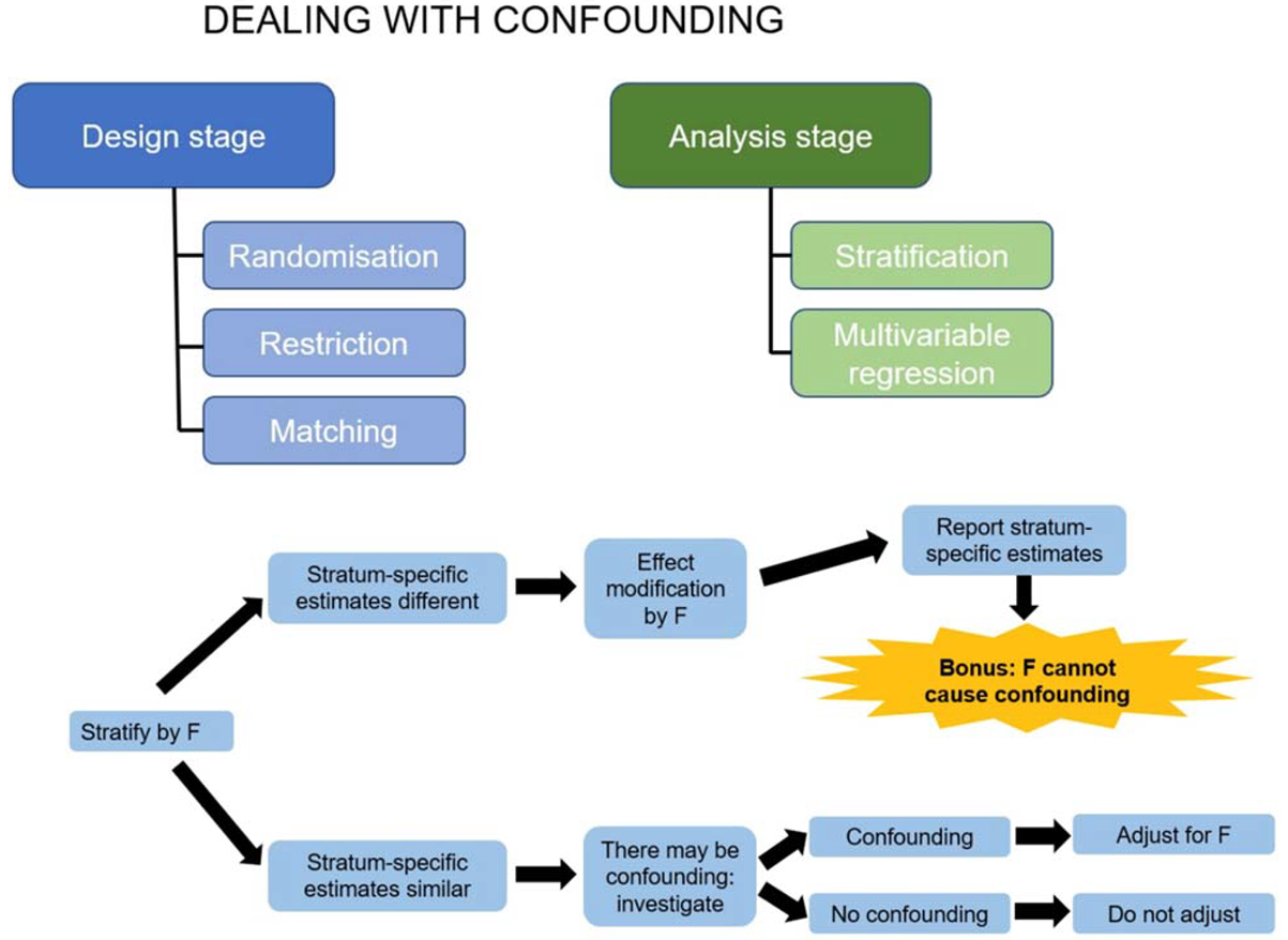
Logistic regression
is appropriate when the outcome is binary. For example, if the
outcome variable in the example above is cancer (yes/no), we can do a similar
analysis, but with a logistic regression model. A logistic regression model
yields a coefficient that can be expressed as an Odds Ratio (OR).
For example, the simple logistic regression model may yield an OR of 1.3. The
interpretation is that for each additional unit of alcohol per week, we expect
the odds of having cancer to increase by 1.3 times, or to increase by 30% (1.3
is 30% higher than the null value of 1). Similar to linear regression, we can
add additional independent variables and produce an estimate that has been
adjusted for confounding. Regression models can sometimes include interaction
terms between two independent variables, e.g. alcohol consumption and
age. The detailed interpretation of the respective coefficients is beyond the
scope of this reading, but we can use the results to decide whether there is effect
modification. For example, if the interaction term between alcohol
consumption and age is statistically significant (judging by the p-value or/and
the Confidence Interval), we conclude that age is an effect modifier in the
association between alcohol consumption and systolic blood pressure and we can
continue with our analysis accordingly.
Confounding or effect modification?
The simple strategy to deal with both of them, which was described in the previous video, is shown graphically below. Assume that you are investigating the association between an exposure E (smoking) and a disease D (cancer). You are interested to see whether the extraneous variable F (sex) causes confounding or/and effect modification in your study.
Warnings and precautions for Pearson’s correlation:
Pearson’s correlation is a measure of the strength of an association between two variables. Values range from -1 through to +1 and a guide for interpretation is as follows:
| Value | Strength of association |
| ±0.7 | Strong correlation |
| ±0.5 | Moderate correlation |
| ±0.3 | Weak correlation |
 | |
| ±0.0 | No correlation |
To be more precise it is a measure of the strength of the linear association. As a result, it is inappropriate to calculate Pearson’s correlation coefficient for the example below, where the strong relationship between the variables is not a linear relationship:
Visually inspecting the data on scatterplots will avoid these mistakes.
Scatter plots are also useful to spot outlying observations. Outliers can significantly alter the estimate. For example, the data plotted below corresponds to a Pearson’s correlation coefficient of 0.6, but without the plot you would be unaware that there is one unusual observation lying away from the majority of the data.
Pearson’s correlation coefficient can also be unduly influenced when there are gaps in the distribution, as exemplified in the plot below where there seem to be two distinct clusters of data. In this situation, the Pearson’s correlation coefficient is still calculable and equal to -0.95!
So, you need to be aware that Pearson’s correlation coefficient can be misleading if these necessary conditions are not satisfied:
- Both variables are continuous;
- Observations are a random sample from the population;
- Both variables are approximately normally distributed in the population.
Visual inspection of your data is a great way to check if items (i) and (iii) are satisfied, and it also helps to ensure there is a reasonable linear relationship. If you are satisfied that the Pearson’s correlation is an appropriate statistic, you might want to test whether your sample correlation (r) could be due to sampling variation by conducting a hypothesis test:
- H0: no correlation between the variables in the population: ρ = 0
- H1: correlation between the variables in the population: ρ ≠ 0
- Where ρ is the population correlation coefficient.
However, the significance test for Pearson’s correlation comes with a word of warning. This significance test is extremely sensitive to sample size. For example, if you take a random sample from your population of interest that looks like this:
n=4, r=0.85 (95% CI (-0.61, 0.99) p-value=0.15 (where r represents Pearson’s correlation coefficient in the sample). If you then take a further sample, doubling the sample size:
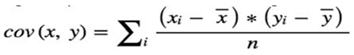
n=8, r=0.85 (95% CI (0.37, 0.97) p-value<0.01
You can see that increasing the number of observations from 4 to just 8 dramatically reduces the p-value. Eight observations are really not very many. Therefore, when conducting such tests you should be mindful of your sample size and the impact it is likely to have on your test result. Finally, some of you might be interested in knowing how to calculate the Pearson’s correlation coefficient. Consider a situation in which the two variables X and Y satisfy conditions (i-iii) above. The Pearson’s correlation is:
correlation = covariance (x, y)/(standard deviation (x) * standard deviation (y))
To indicate the correlation in a sample, correlation is commonly denoted by the letter r, so the above equation becomes:
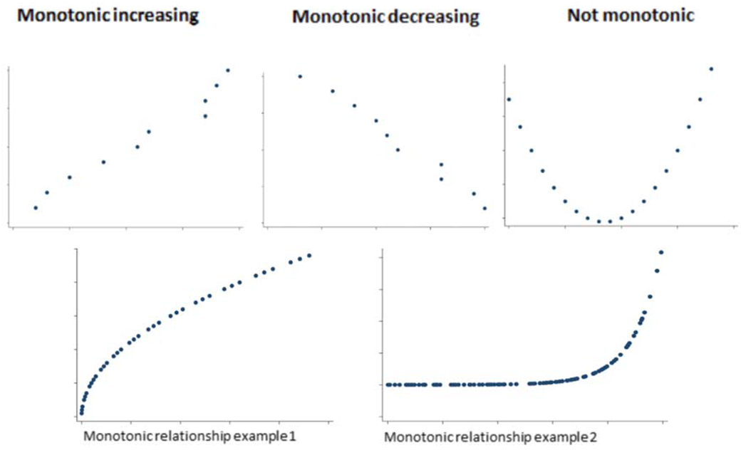
r = Sxy/SxSy
So what is covariance?
Covariance is another measure of the strength and direction of the relationship between two variables. Again, it is only useful as a measure of linear relationships. It is calculated as:
where x and y are the sample means for each variable, and covariance is simply the sum of each data point’s distance from the mean. Correlation is simply the covariance between your two variables put on a scale from -1 to 1.
Spearman’s correlation coefficient is the non-parametric version of the Pearson’s correlation coefficient. Non-parametric means that we do not make any assumptions around the form of the data, so we do not assume they follow a specific distribution. Spearman’s correlation measures the strength of a monotonic relationship (I’ll explain this term shortly). It is not as restrictive as Pearson’s correlation, which is only appropriate for linear relationships and requires that: (i) both variables are continuous; (ii) observations are a random sample from the population; and (iii) both variables are approximately normally distributed in the population. Spearman’s does not require any distributional assumptions about the variables. It simply requires that there be a monotonic relationship between them. It can also be used when one or both of the variables are ordinal as well as continuous. However, like Pearson’s, it does require that observations are a random sample from the population.
So what do we mean by a monotonic relationship?
So why do we say that it is not as restrictive as Pearson’s correlation?
The plots below are both non-linear, and as Pearson’s correlation is a measure of the linear strength of association, it would not be an appropriate measure to calculate. However, they are both monotonic increasing, so the Spearman’s correlation is applicable.
Let’s look at the impact of that.
In example 2, you can see that there is a perfectly increasing monotonic relationship (in fact y = exponential(x)). The Pearson’s correlation underestimates this and gives a correlation of 0.66. It tries to fit a linear relationship like so:
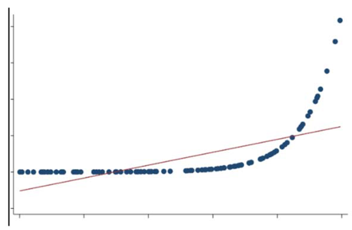
The interpretation of magnitude of Spearman’s correlation is as per Pearson’s:
| FEV1 | SGRQ |
| 1.54 | 76 |
| 1.42 | 46 |
| 2.43 | 48 |
| 1.28 | 62 |
| 1.67 | 29 |
| 2.71 | 36 |
| 1.88 | 67 |
| 1.61 | 35 |
| 1.46 | 37 |
| 1.96 | 25 |
The conditions required for Spearman’s correlation are:
- That there is monotonic relationship between the two variables;
- Both variables are either continuous or ordinal;
- Observations are a random sample from the population.
So what does it do differently that allows it to measure this monotonic relationship?
Pearson’s correlation uses the raw data values to calculate the coefficient; however, Spearman’s ranks the raw values. For example, in the Pearson’s Correlation videos, you saw the following data:
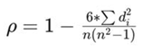
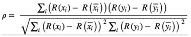
| FEV1 | FEV1 Rank | SGRQ | SGRQ Rank |
| 1.54 | 4 | 76 | 10 |
| 1.42 | 2 | 46 | 6 |
| 2.43 | 9 | 48 | 7 |
| 1.28 | 1 | 62 | 8 |
| 1.67 | 6 | 29 | 2 |
| 2.71 | 10 | 36 | 4.5 |
| 1.88 | 7 | 67 | 9 |
| 1.61 | 5 | 35 | 3 |
| 1.46 | 3 | 36 | 4.5 |
| 1.96 | 8 | 25 | 1 |
In this scenario, because there is no way to decide which of the tied observations should be ranked first, an average of the rankings they would have otherwise occupied is taken. For this example, these are positions 4 and 5, so these observations are both given the ranking 4.5. For those of you who are interested, the formulas to calculate the coefficient in both situations are given below. First of all, assume you have two variables X and Y that satisfy conditions (i-iii) above.
When there are no tied ranks the Spearman’s correlation is:
where di=R(xi)–R(yi), R(x) and R(y) are the ranks and n is the sample size.
When there are tied observations the Spearman’s correlation is:
Where R(x) and R(y) are the mean ranks for variable x and y respectively.
Partial correlation:
One final concept to mention is that of partial correlation.
Partial correlation is a measure of the strength of a linear association between two continuous variables that satisfy the relevant conditions for correlation, whilst controlling or adjusting for the effect of one or more other continuous variables. An example might include looking at the association between weight and blood pressure, whilst controlling for age. In practice, you will find that this is a fairly uncommon statistic to calculate. As you are about to learn, there is much better way to perform such analyses.
| 95% Confidence interval | This is an estimated range of values calculated from a given set of sample data which are likely to contain the ‘true’ population value, e.g. mean BMI. By ‘contain the true value’, we mean that the true value lies above the lower value of the confidence interval but below the upper values of the confidence interval. For example, suppose that the sample mean BMI is 25 with a 95% confidence interval for the mean BMI of 23.5 to 26.5. If you take 100 samples of patients, measure their mean BMI, and calculate the 95% CI for each sample, the population mean would lie within the 95 of that 100. |
| (point) Estimate | A single estimate of a measure that is calculated from the sample, e.g. mean BMI. It serves as a estimate of the population parameter (true value) |
| (population) Parameter | A single statistic or measure of interest in the population. We are unlikely to study the population as this is often unfeasible, so parameters are usually unobservable and instead we estimate them from the sample. |
| Alternate hypothesis | The alternative hypothesis is the converse of the null hypothesis. The alternative hypothesis is often that a difference between groups does exist. If the null is rejected due to a small p-value, then we can accept the alternative. If the null hypothesis is not rejected using statistical inference, we cannot assume that the alternative hypothesis holds. Instead, we can only conclude there was not enough evidence to reject the null hypothesis. |
| C statistic (area under the ROC curve) | Also known as the model's discrimination. For logistic regression, it measures how more likely the model is to give a higher probability to a patient who has the outcome of interest than to one who does not in fact have it. High values (nearer to 1) are best. 0.5 is useless. |
| Case | A case is an individual with the outcome under study. Epidemiological research is based on the ability to quantify the occurrence of disease in populations. This requires a clear definition of what is meant by a case. This could be a person who has the disease, health disorder, or suffers the event of interest (by “event” we mean a change in health status, e.g. death in studies of mortality or becoming pregnant in fertility studies). |
| Censoring | In survival analysis, censoring refers to our lack of knowledge about a patient, particularly whether they had the outcome of interest e.g., because the study ended or they were lost of follow-up |
| Chi-squared test | This is a statistical procedure for testing whether two proportions are similar (e.g. whether the proportion of people eating their five portions of fruit and veg a day in Ghana is significantly different from the proportion of people eating their five a day in India). |
| Collinearity | Collinearity is when predictor variables in a multiple regression model can be linearly predicted from the other predictor variables with a substantial degree of accuracy. This is a problem. |
| Control (as opposed to a case) | A control is a person without the outcome under study (in a type of epidemiological study called a case-control study) or a person not receiving the intervention (in a clinical trial, as in the Parkinson’s disease example). The choice of an appropriate control requires case, as we need to be able to draw useful comparisons between these controls and the cases/intervention group. |
| Correlation coefficient | A measure of how two variables depend on each other. The value of either the Pearson or the Spearman rank correlation coefficient can lie between -1 and +1, where zero means no correlation at all. |
| Count | The most basic measure of disease frequency is a simple count of affected individuals. The number (count) of cases that occurred in a particular population is of little use in comparing populations and groups. For instance, knowing that there were 100 cases of lung cancer in city A and 50 in city B does not tell us that people are more likely to get lung cancer in city A than B. There may simply be more people in city A. However, the number of cases may be useful in planning services. For instance, if you wanted to set up an incontinence clinic, you would want to know the number of people with incontinence in your population. |
| Covariate | See "Predictor". Literally, one thing that varies (is associated statistically) with another thing. |
| Exposure | When people have been ‘exposed’, they have been in contact with something that is hypothesised to have an effect on health, which can be either positive or negative e.g. tobacco, nuclear radiation, pesticides in food (all negative effects), physical exercise and eating fruit and vegetables (all positive effects). This is the most obvious meaning of 'exposed', but it can also refer to any patient characteristic or risk factor for the outcome of interest. |
| Hazard | In survival analysis, the hazard is the risk of having the outcome of interest, e.g. death, given that the patient has not already had it. One hazard is divided by another to give the hazard ratio for a particular predictor. |
| Heteroscedasticity | When the variability of a variable is unequal across the range of values of a second predictive variable. |
| Homoscedasticity | When the variability of a variable is equal across the range of values of a second predictive variable. |
| Hypothesis | A statement that can be tested using quantitative evidence (data) in a hypothesis test. |
| Interaction | An interaction occurs when a predictor variable has a different effect on the outcome depending on the value of another predictor variable. This is also called modification in epidemiology. |
| Least squares regression | The statistical method used to determine a line of best fit in a linear regression model by minimizing the sum of squared distances of the observations from the line. |
| Linear regression | The statistical method to fit a straight line to data to estimate the relationship between a dependent/outcome variable and independent/predictor variable. In Linear regression we obtain estimates for the intercept and slope (regression coefficients). Multiple linear regression is when two or more independent/predictor variables are used to explain a dependent/outcome variable. |
| Mean | A measure of central tendency – it is computed by summing all data values and dividing by the number of data values summed. If the observations include all values in a population the average is referred to as a population mean. If the values used in the computation only include those from a sample, the result is referred to as a sample mean. |
| Non-linear | Not a straight line or not in a straight line. |
| Normal distribution | This symmetrical distribution describes how common the values are of many things in nature, at least approximately, e.g. height, weight, blood pressure. It’s also the basis of many statistical tests because, if you know the average value (usually called the mean) and the standard deviation, then you can draw every point of a normal distribution and you know what proportion of values are greater than (or less than) any given point, e.g. the % of men more than two metres tall. Some things are not normally distributed (e.g. proportions of anything, serum concentrations of electrolytes) but can be made to fit quite well after some simple mathematical trickery. |
| Null hypothesis | The null hypothesis is what the investigator sets out to disprove in order to find evidence of an association between two or more things – the null hypothesis is often that there is no difference between the patient groups |
| Odds | The odds is a way to express probability, e.g. the odds of exposure is the number of people who have been exposed divided by the number of people who have not been exposed. The mathematical relationship between odds and probability is: Odds = probability / (1 – probability) |
| Odds ratio | The odds ratio for an exposure measure is the ratio between two odds, e.g. the odds of exposure in the cases divided by the odds of exposure in the controls in a type of study called a case-control study: Odds ratio = Odds of exposure in the diseased group (cases) |
| Outcome | This is the event or main quantity of interest in a particular study, e.g. death, contracting a disease, blood pressure. |
| Overfitting | Overfitting is a phenomenon that occurs when too many variables (with respect to number of observations) are included in a model and the model ends up explaining random error rather than real relationships. This is a problem. |
| p-value | This is the probability of obtaining the study result (relative risk, odds ratio etc.) or one that's more extreme - if the null hypothesis is true. The smaller the p-value, the easier it is for us to reject the null hypothesis and accept that the result was not just due to chance. A p-value of <0.05 means that there is only a very small chance of obtaining the study result if the null hypothesis is true, and so we would usually reject the null. Such as result is commonly called “statistically significant”. A p-value of >0.05 is usually seen as providing insufficient evidence against the null hypothesis, so we accept the null. |
| Pearson’s correlation coefficient | A statistic that can be calculated as a measure of the linear association between two continuous variables, it has a value between +1 and -1. |
| Population | The set of all people of interest to a study. We can’t study them directly and so must instead draw a sample of people from the population. |
| Predictor | Something that goes into a regression model that is potentially associated with the outcome variable. Predictors of death include age and disease. Predictors of disease include age and genes. |
| R-squared statistic | In linear regression, this is the proportion of the variation in the outcome variable that is explained by the model i.e. by the model’s predictors. In can be between 0 and 1. For non-linear regression, versions of the R-squared have been proposed, some more useful than others. |
| Rate | A rate expresses how quickly the outcome of interest occurs, so is subtly different from a risk (even if many non-epidemiologists use the two words interchangeably). The denominator is some measure of person-time |
| Residual | The difference between the observed value of the dependent/outcome variable (y) and the predicted value from the model (ŷ). Each type of regression has its own types of residuals. |
| Risk | The number of people with the outcome of interest divided by the total number of people at risk of the outcome. |
| Risk set | In survival analysis, this is the set of patients who are at risk of the outcome of interest. |
| Sample | A sample is a relatively small number of observations (or patients) from which we try to describe the whole population from which the sample has been taken. Typically, we calculate the mean for the sample and use the confidence interval to describe the range within which we think the population mean lies. This is one of the absolutely key concepts behind all medical research (and much non-medical research too). |
| Sample population | A subset of the population that can be used in a statistical analysis and for which to draw inference about the ‘population’. Choosing the sample is a crucial step. |
| Sample size | (usually) the number of people in our sample. |
| Sampling | The process by which people are selected from the population. To produce unbiased sample statistics the sample needs to be drawn at random from the population i.e. each member of the population should have an equal chance of being selected. |
| Scatter plot | A graph that plots the coordinates from two sets of data points (two variables). Scatter plots can reveal patterns between the two variables. |
| Spearman’s rank correlation | A statistic that can be calculated to measure the degree of agreement between two rankings for continuous and ordinal variables. It has a value between +1 and -1. |
| Standard deviation | The average squared difference from the mean, i.e. measure of “spread” |
| Standard error | The standard error of a statistic, e.g. the sample mean, is the standard deviation of its sampling distribution. In other words, it's a measure of the accuracy with which the sample represents the population. |
| Statistic | A numerical measure that describes some property of the population. A statistic is obtained from a sample. We hope the statistic estimated from the sample is statistically equal to the same statistic if we could collect it from the population. If so, the estimate is said to be an unbiased estimate (of the population value) |
| Statistical test | This is the only way to decide whether the results of our analysis, e.g. the measure for group A compared with measure for group B, are likely to be due to chance or could be real. |
| Stepwise regression | An unsatisfactory way to automate the approach to select variables for inclusion into a regression model. |
| t-test | A statistical test for comparing two means of a normally distributed variable. |
| Variable | A variable is a characteristic or item that can take different values. They can be categorical or numerical variables: for example, disease stage or age. |
| Variance | The average of the squared differences of the data values from the mean value of observations divided by N observations (or N-1 for sample variance). Its just the square of the standard deviation. |
Life tables are used to measure the probability of death at a given age and the life expectancy at varying ages. Actuarial sciences life insurance companies have two different kinds of life table:
- Cohort or generational life tables
- Current or period life tables
Cohort life tables take an actual set of people born at the same time, usually in the same year or even on the same day of the same year, and follow them up for their whole lives. Several countries, including Norway, Denmark and the US, have these “birth cohorts” such as the Millennium Cohort Study in the UK that follows up people born in 2000. The mortality experience of such a cohort teaches us a lot and is great for history, but it’s unlikely to be completely relevant to people born at other time points. Period life tables take a hypothetical cohort of people born at the same time and uses the assumption that they are subject to the age-specific mortality rates of a region or country. These rates are often calculated using census data as the base population and actual age-specific death rates during the census year (and typically also one year either side).
How are life tables constructed? In a common type of epidemiological study called a cohort study, a set or cohort of patients are enrolled at time zero and then followed up to see who gets the outcome of interest, such as death, and when they get it. The latter will often be measured in days since the study start, but not necessarily. In theory you could measure it in milliseconds, but that’s pretty silly unless you’re looking at something like biochemical reactions. At time zero, a table of the numbers of people with and without the outcome at each time point will look like this. Let’s suppose that we start off with 100 patients.
| Time (t) in days | Number of patients alive at time t | Number of patients who died at time t | Probability of survival past time t |
| 0 (study start) | 100 | 0 | 1 |
| 1 | 100 | ?? | ?? |
| 2 | ?? | ?? | ?? |
| 3 | ?? | ?? | ?? |
Everybody makes it past time zero, so the probability of surviving at least to time t=0 is 1, or 100%. This probability is technically known as the survival function, one of two core concepts in survival analysis. Let’s now say that two people die the day after they are enrolled. The life table then looks like this:
| Time (t) in days | Number of patients alive at time t | Number of patients who died at time t | Probability of survival past time t |
| 0 (study start) | 100 | 0 | 1 |
| 1 | 100 | 2 | 0.98 |
| 2 | 98 | ?? | ?? |
| 3 | ?? | ?? | ?? |
The calculations continue in that way. However, this assumes that everybody enters the study at the same time, t=0, and no one leaves it except by death. It ignores the more realistic case when people drop out or are “lost to follow-up”. The technical term for this is that these people are censored. Censoring is a really important concept in survival analysis. There are different forms, but the type due to people dropping out – or when people are still alive at the study end – is the most common. The Kaplan-Meier table and associated plot is the simplest (but not the only) way of estimating the survival time when you have drop-outs.
How to calculate a Kaplan-Meier table and plot by hand:
The plot of the survival function versus time is called the survival curve. The Kaplan-Meier method can be used to estimate this curve from the observed survival times without the assumption of an underlying probability distribution. Some other kinds of survival analysis do require some kind of underlying distribution for the survival times, which we’ll discuss later in the course, but one reason why the KM method is so popular is that it doesn’t make any such assumptions. As you’ve seen in previous courses, whenever you make an assumption in statistics, you have to test whether it’s valid.
To better understand the Kaplan-Meier method we’ll now use it to draw a survival curve. Suppose we are monitoring patients after a particular treatment. After 5 days of follow-up we have the following information (example adapted from https://www.ncbi.nlm.nih.gov/pmc/articles/PMC1065034)
| Time (t) in days | Event |
| 0 (study start) | 8 patients recruited |
| 1 | 2 patients die |
| 4 | 1 patient dies |
| 5 | 1 patient dies |
| etc | etc |
We are interested in event ‘death’. We can easily determine how many patients were alive at any given day and how many died and when.
| Time (t) in days | Number of patients alive at time t | Number of patients who died at time t | Proportion of patients surviving past time t | Probability of survival past time t |
| 0 (study start) | 8 | 0 | ||
| 1 | 8 | 2 | ||
| 4 | 6 | 1 | ||
| 5 | 5 | 1 |
But how do we compute the probability of survival past time t? Start by computing the proportion of patients that survive day t, i.e. of those alive at the beginning of day t, what proportion make it to the next day alive? On day 0, the day the study begins, there are no deaths. Everybody survives. Hence the proportion surviving is 1. On the following day, 2 out of 8 patients don't make it; in other words, 75% survive the day.
| Time (t) in days | Number of patients alive at time t | Number of patients who died at time t | Proportion of patients surviving past time t | Probability of survival past time t |
| 0 (study start) | 8 | 0 | (8-0)/8 = 1 | |
| 1 | 8 | 2 | (8-2)/8=0.75 | |
| 4 | 6 | 1 | (6-1)/6=0.83 | |
| 5 | 5 | 1 | (5-1)/5=0.8 |
Now we know the proportions, but what are the probabilities? With no deaths on day 0, the probability of surviving is 1. Computing the next probability is a bit trickier. The basic idea underlying Kaplan-Meier tables comes into play here: the probability of surviving past day t is simply the probability of surviving past day t-1 times the proportion of patients that survive on day t. Let's see it together:
| Time (t) in days | Number of patients alive at time t | Number of patients who died at time t | Proportion of patients surviving past time t | Probability of survival past time t |
| 0 (study start) | 8 | 0 | (8-0)/8 = 1 | 1 |
| 1 | 8 | 2 | (8-2)/8=0.75 | 1*0.75 = 0.75 |
| 4 | 6 | 1 | (6-1)/6=0.83 | 0.75*0.83 = 0.623 |
| 5 | 5 | 1 | (5-1)/5=0.8 | 0.623*0.8 = 0.498 |
If we now plot the time column against the probability column, we end up with a survival curve. We plot the time on the x-axis, running from 0 on the left to the highest day count, i.e. 5 in this example, on the right. The probability of survival goes on the y-axis, with 0 on the bottom and 1 as the maximum (Figure 1).
If we now connect the dots using steps, first horizontal then vertical, we have drawn our first survival curve (Figure 2).
You might wonder why the “steps” involve a horizontal line followed by a vertical line and not the other way around. This is because the probability is assumed to be the same until the next death occurs. For example, there’s a death at day 1 but then no more deaths until day 4. Let's follow up our patients for another two weeks. This is what we have:.
| Time (t) in days | Event |
| 0 (study start) | 8 patients recruited |
| 1 | 2 patients die |
| 4 | 1 patient dies |
| 5 | 1 patient dies |
| 6 | 1 patient drop out |
| 9 | 1 patient dies and 1 drops out |
| 22 | 1 patient dies |
As you can see, we now have some drop outs, i.e. patients whose outcome we don't know exactly. These patients are censored and should be treated differently from patients that die. When a patient is censored at time t, we know the patient was alive at time t, but we don't know whether the patient has died or survived. For this reason, censored patients are classified neither as 'survived' nor as 'died' on any given day. We simply deduct them from the number of patients alive. When there are censored patients at the same time as patients that die, we deal first with patients that die. Then we add a new line, mark it with a little '+' right after the time count and denote the censored patient(s) by taking them off the count of patients alive at time t.
| Time (t) in days | Number of patients alive at time t | Number of patients who died at time t | Proportion of patients surviving past time t | Probability of survival past time t |
| 0 (study start) | 8 | 0 | 1 | 1 |
| 1 | 8 | 2 | 0.75 | 0.75 |
| 4 | 6 | 1 | 0.83 | 0.75*0.83 = 0.623 |
| 5 | 5 | 1 | 0.8 | 0.623*0.8 = 0.498 |
| 6+ | 4 | 0 | 4/4 = 1 | 0.498*1 = 0.498 |
| 9 | 3 | 1 | (3-1)/3 = 0.667 | 0.498*0.667 = 0.332 |
| 9+ | 2 | 0 | 2/2 = 1 | 0.332*1 = 0.332 |
| 22 | 1 | 1 | 0/1 = 0 | 0 |
At time t=6 and t=9, we need to subtract one person from the risk set, the number of patients at risk of death. For t=6, for instance, 4 people enter that time period but one drops out, leaving 3 to go forward to t=7, which means that at the time of the next death, t=9, the proportion surviving is (3-1)/3. At times when no one dies, the proportion surviving that time point is 1, or 100%, so the (cumulative) probability of survival past time t in the last column is unchanged. At the last time point, t=22, there's only one person left in the risk set, i.e. only one person who we're still following up, and they then die, giving a final probability of survival beyond t=22 of zero.
Hazard Function and Risk set
The hazard function h(t) is the probability of the event happening at time t, given that it has not yet happened. In other words, h(t) is the probability of dying at time t having survived up to time t.
While the concept sounds fairly straightforward, there’s no easy formula to compute h(t) by hand. If you are comfortable with formulae, you can follow this link to an article explaining the hazard function.
An important concept involved in the calculation of the hazard is the risk set. Just like the risk of dying (or experiencing some specific event) changes over time, so the number of patients that are subjected to that risk change over time as people die or drop out.The risk set at time t is defined as the set of patients at time t that are at risk of experiencing the event.You saw this in the earlier calculations for the Kaplan-Meier method when we made adjustment for patients who dropped out. Survival analysis consists of a family of methods, and one way that they differ is in their handling of drop-outs and other issues when they define the risk set.Usually in survival analysis, we are interested in the difference between survival curves of different groups of patients. Earlier you saw the log-rank test, which gives a p value for comparing the survival curves between different groups of patients with a Kaplan-Meier plot. The p value tells you nothing about the size of the difference between the survival curves, however. This is done by dividing one hazard by another to give a hazard ratio. For example, dividing the hazard for females by the hazard for males gives you a hazard ratio for females compared with males. It tells you how much more likely female patients will die than male patients.
Missing data in survival analysis:
First we need to understand why some data is missing. This is important, because the techniques we decide to apply depend on the reason some data are missing. Be aware that there is no statistical test telling us why the data are missing. This is done by combining reason and knowledge on how the data were collected. Something I’ve emphasised throughout this course and the previous ones in the series is that there is no substitute for getting to know your data. Part of this is by tabulation and histograms etc, but another key part of it comes before any descriptive analysis – knowing how the data were generated and the potential for missing or invalid values in each data field. Let’s now recap patterns of missing-ness.
We say that data are 'missing completely at random' (MCAR) when the complete cases (patients without any missing values for a given data item) are a random sample of the whole dataset (all patients). One patient is just as likely to have missing values as any other patient: males just as likely as females, older patients just as likely as younger ones etc. This can happen when a participant didn't have time to fill out the questionnaire or some information was lost or misplaced - and none of these things happened in a systematic way. This is the easiest situation to deal with, though sadly it’s often rather an unrealistic assumption.
More often, you’ll have to deal with data that are 'missing at random' (MAR). In this case, missing-ness can be explained by other variables for which there is full information. For example, if people with a higher education are less likely to disclose their income, then income is MAR because the chance of income values being missing depends on the patient’s education. In this situation, which is pretty common, you can “fill in” the missing values on the basis of another variable, so if you know their education you can predict their income well. Statistical methods exist to deal with this that are beyond the scope of this course, though I’ll list them briefly below.
Finally, data that are 'missing not at random' (MNAR) are neither MAR nor MCAR. For example, you could be missing medical information on the severity of diabetes when they are too ill to see a doctor and provide that information; missing-ness depends partly on the diabetes status, as is the case for MAR, but it also depends on the severity of illness, which can’t always be captured. In general, data are MNAR when the missing-ness is specifically related to what’s missing and so the probability of the value being missing depends on unobserved variables, i.e., variables not in your data set. This is generally the most problematic type. Now that we know what we are talking about when we say missing data, we can have a look at different methods for dealing with incomplete data. Luckily, you only need to understand the general idea and pick the right tool, as the computer will do rest of the work. Here are some of the most used techniques for handling missing data.
Complete case analysis (or available case analysis, or list-wise deletion):
In this approach, the cases with missing data are simply omitted from the analysis. If the data are MCAR, this will produce unbiased estimates as long as the sample size is still sufficiently large. If the data are MAR or MNAR, the estimates will be biased. That’s a good reason why you need to understand the reason for the missing values. It’s tempting to just hope they’re completely random, but you need to think through the problem, run some descriptive analyses and ask the data provider if necessary and possible.
Mean substitution (or mean imputation):
Replace (“impute”) the missing values of a variable, with the mean of the available values of the same variable. For example, if some male patients are missing values, then just assign them the overall mean value for the male patients who do have values. This has the advantage of not changing the overall mean for that variable. However, it artificially decreases the estimated variation. It also makes it difficult to detect correlations between the imputed variable and other variables. Hence mean substitution always gives biased results and is not recommended.
Multiple imputation:
Missing variables are assumed to be MAR (or MCAR) and are imputed by drawing from a distribution. This is done multiple times and yields multiple different completed datasets. Each of these datasets is analysed, and the results are combined into a single overall result. Multiple imputation has been shown to yield unbiased results for MAR or MCAR data. It can be done in R.
Maximum likelihood:
This approach also gives unbiased results for MAR (or MCAR) data. Data are assumed to be normally distributed with a certain (multivariate) mean and variance. Observed data are used to compute the mean and variance, and missing data are drawn from the resulting normal distribution. We draw many times from the distribution until the mean and variance of the completed data are as close as they can get to that of the observed data.
How to choose predictors for a regression model?
Model selection methods: how to choose your predictors
This was covered in detail in the Logistic Regression for Public Health – similar principles apply to any type of regression, including Cox models. There, I explained some common ways of choosing predictors for a multiple regression model and that two such ways – forwards selection and stepwise selection – were simply too awful to contemplate using. A third common way, backwards elimination, does sometimes work OK. While it’s always good to make use of a priori knowledge from the literature and experts in the field, this isn’t always of sufficient help, particularly when you have a lot of possible variables. Less often you’ll have a good deal of a priori knowledge and therefore a large number of predictors that have been found to be associated with the outcome. In that situation, it can be useful to apply backwards elimination to the model with all these chosen predictors in order to reduce the size of the results table for presentation.
How to apply backwards elimination
Here are the steps:
- Fit the model containing all your chosen predictors – either all your a priori ones or all your available ones (if your data set isn’t too large)
- Store all the coefficients from that model
- Remove in one go all predictors whose p value is above the preset threshold, typically the usual 0.05 (in a variant of this, you remove the predictor with the highest p value and refit the model, repeating steps until all the predictors have p values above the chosen threshold)
- Compare the coefficients for the remaining predictors with their coefficients from the original model
Checks to make when using backwards elimination
If the coefficients haven’t changed much from the original model, then you now have your final model. You can go ahead and check the residuals and other model assumptions. If, however, you have a predictor whose coefficient has changed noticeably, then you need to find the variable(s) that you have removed that are correlated with this affected predictor. You can do this by trial and error, so add back in one of the removed variables at a time until the affected predictor’s coefficient is back to its original value. When that happens, you’ll need to keep the removed variable in the model.
For example, suppose that blood pressure was retained (original model HR=1.30, p=0.002) but cholesterol was removed because it was not statistically significant (original model HR=1.05, p=0.155). Then you removed cholesterol from the original model, and the HR for blood pressure changed from 1.30 to 1.50. You consider that a big enough change to worry about (see below for more on this). You add cholesterol back in, and the original HR for blood pressure is restored. You now need to keep both blood pressure and cholesterol in your final model. Such correlation between variables is a big reason why stepwise procedures are so unreliable.
NB: how big is “big enough to worry about” is arbitrary. Anything less than 0.05, e.g. a change from HR=1.30 to HR=1.34, is not big enough in my opinion. It’s up to you to decide this. It largely depends on how the results are going to be used, e.g. in a risk calculator for clinical decision-making, perhaps in a national screening programme, or for an epidemiological study of risk factors. In the former, where people can be invited for screening for some disease based on their estimated risk of developing that disease, using the coefficient of 1.30 instead of 1.50 can greatly affect the number of people invited. In the latter, however, such a difference won’t be of such importance, especially if all we do is take the table of hazard ratios and p values and say, “these are the predictors of the outcome, whereas these other factors are not”. The estimated size of the relation (the HR) is of secondary importance.
Conclusion: The question of how to choose the predictors in a regression model, be it linear, logistic, Cox or other type of regression, is a huge one when the number of possible predictors is bigger than a handful or two.
References
- https://pubmed.ncbi.nlm.nih.gov/25766240/.
- https://www.pnas.org/doi/10.1073/pnas.0709029105.
- Mina et al., 2015. Long-term measles-induced immuno-modulation increases overall childhood infectious disease mortality. Science 348 (6235), 694-699.
- 2019. Editorial: Vaccine hesitancy: a generation at risk. Lancet, 393 (10182), 1669.
- https://www.who.int/news-room/fact-sheets/detail/measles.
- https://journals.plos.org/plosmedicine/article?id=10.1371/journal.pmed.1001527.
- https://www.who.int/news-room/fact-sheets/detail/dengue-and-severe-dengue.
- https://science.sciencemag.org/content/358/6365/929.
- https://parasitesandvectors.biomedcentral.com/articles/10.1186/s13071-018-2830-8#Sec4.
- https://www.thelancet.com/journals/laninf/article/PIIS1473-3099(16)30518-7/fulltext#seccestitle50.
- http://data.princeton.edu/wws509/notes/c7s1.html.
Figure 1.
Data points for survival curve for Kaplan-Meier example.
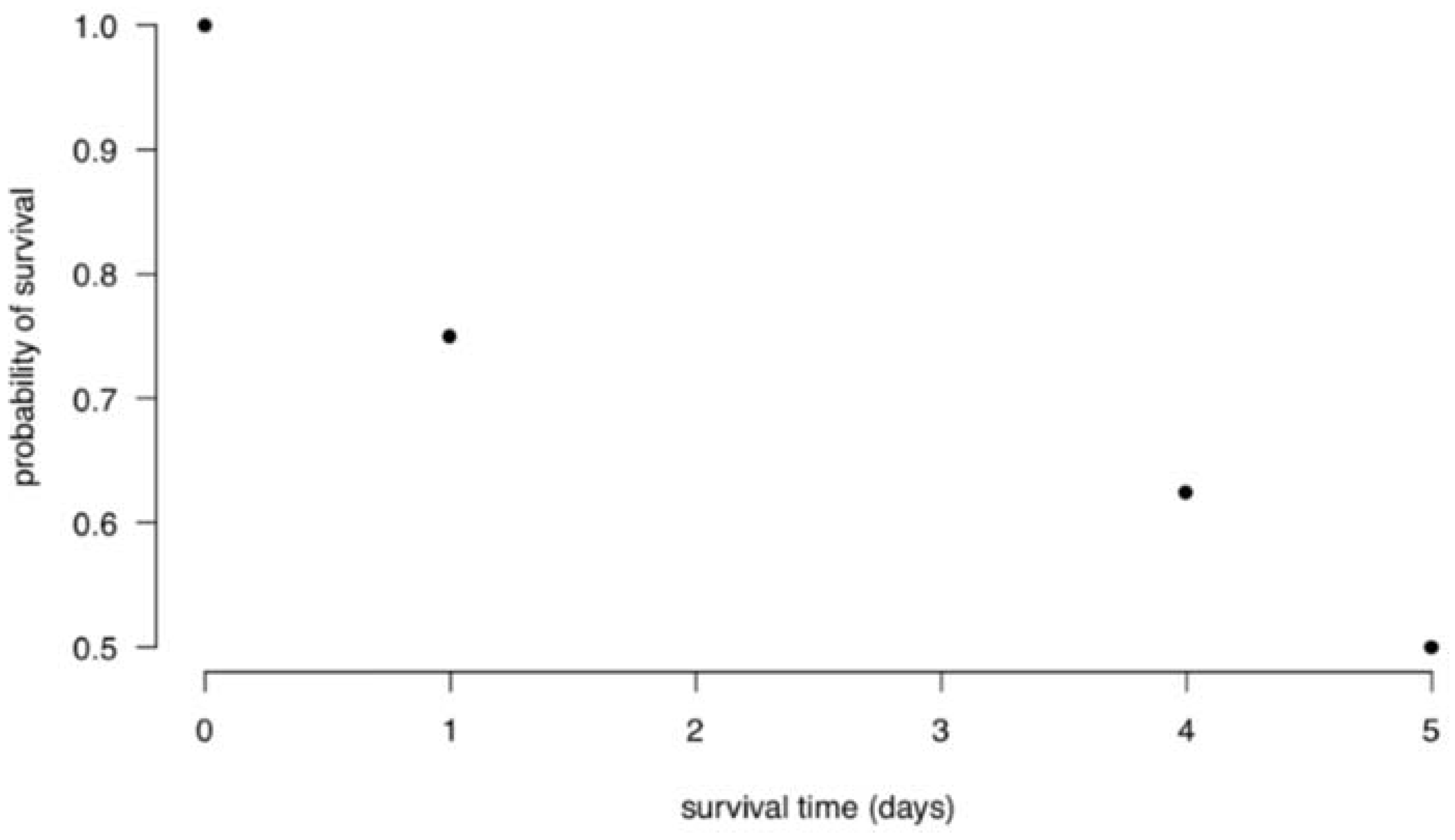
Figure 2.
Survival curve for Kaplan-Meier example.
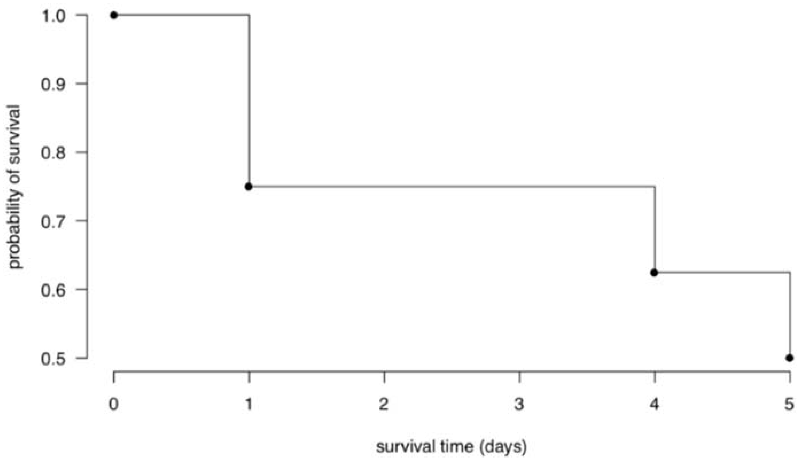
Disclaimer/Publisher’s Note: The statements, opinions and data contained in all publications are solely those of the individual author(s) and contributor(s) and not of MDPI and/or the editor(s). MDPI and/or the editor(s) disclaim responsibility for any injury to people or property resulting from any ideas, methods, instructions or products referred to in the content. |
© 2024 by the authors. Licensee MDPI, Basel, Switzerland. This article is an open access article distributed under the terms and conditions of the Creative Commons Attribution (CC BY) license (http://creativecommons.org/licenses/by/4.0/).
Copyright: This open access article is published under a Creative Commons CC BY 4.0 license, which permit the free download, distribution, and reuse, provided that the author and preprint are cited in any reuse.


