1. Introduction
Because of the high excess mortality caused by the Covid-19 virus in 2020 world’s medical system under the supervision of WHO started massive vaccination end of 2020 and at the beginning of 2021 with the aim to reduce excess mortality. Several articles’ conclusions are that Covid-19 vaccines decreased mortality [
1,
2,
3,
4]. Their research methods are not appropriate and do not respect the gold standard of science, namely, the efficacy of a massive vaccination can only be measured by comparing the death rate of the vaccinated population with the death rate of the non-vaccinated population. Recently this research was done and it has confirmed that the vaccinated part of the global population has increased mortality rate by about 14.5% with respect to the non-vaccinated population [
5].
In the research methodology we use, every element in the model corresponds to exactly one element in physical reality. The world is set X with n elements, and the model of the world is set Y with n models. Every element in set X has exactly one correspondent element in set Y. In physics, this methodology has given excellent results. It can also be applied in statistics and big data analysis. The entire population in a given country is set P, it has two subsets, set vaccinated PV and set nonvaccinated PN. In the set vaccinated, PV people are protected from covid-19 and should have a smaller mortality rate than people in the set of nonvaccinated PN. This means in set P, the subset PN will be the main source of excess mortality.
Figure 1.
Set P, subset PV, and subset PN.
Figure 1.
Set P, subset PV, and subset PN.
With the increase of vaccination in a given time period the subset PV is increasing and the subset PN is decreasing. This means more people are vaccinated slower should be the mortality rate. With the massive vaccination in time, the mortality rate should decrease. This hypothesis was checked by comparing the graphs of the rising subset PV and the graphs of the predicted diminished mortality rate. The more people were vaccinated in a given time period smaller should become mortality rate in the following time period. This bijective analysis of data was done for several states of the United States.
2. The bijective analysis of the graphs of the intensity of vaccination and graphs of mortality rate
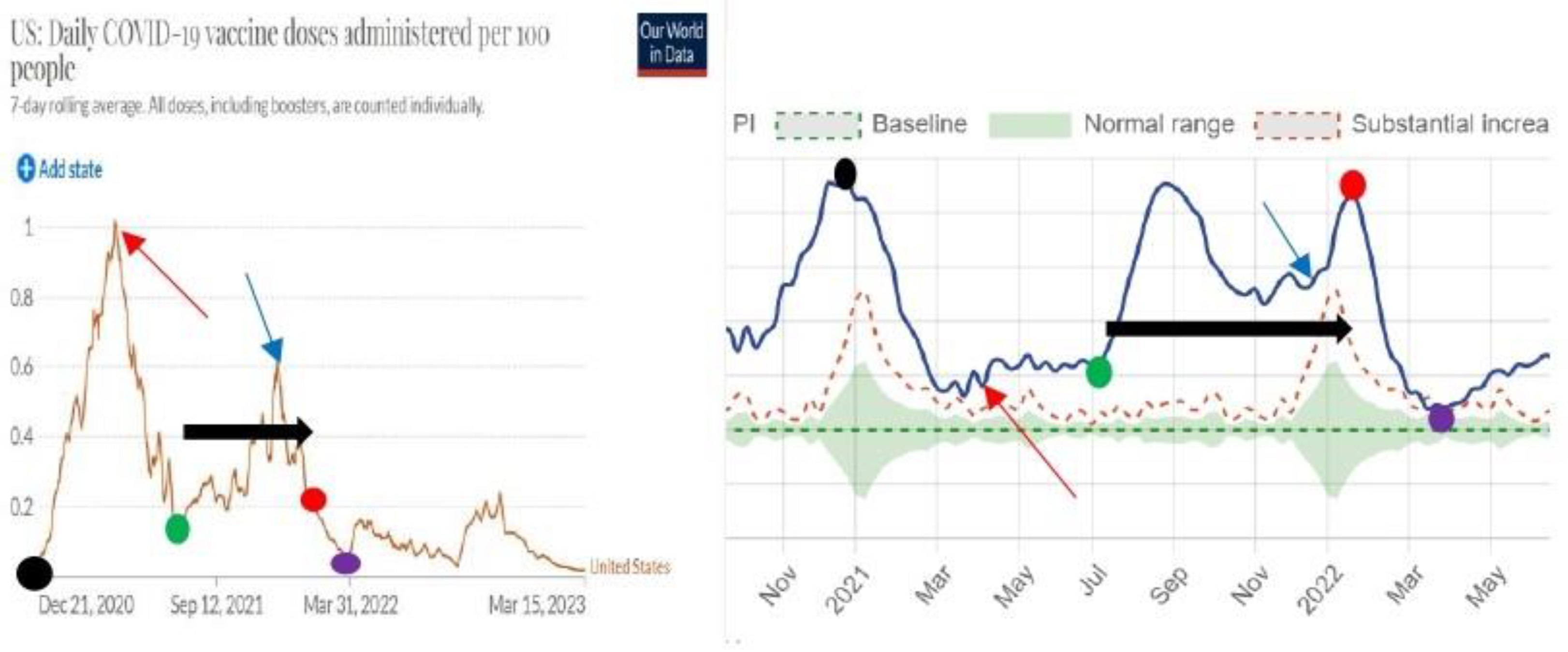
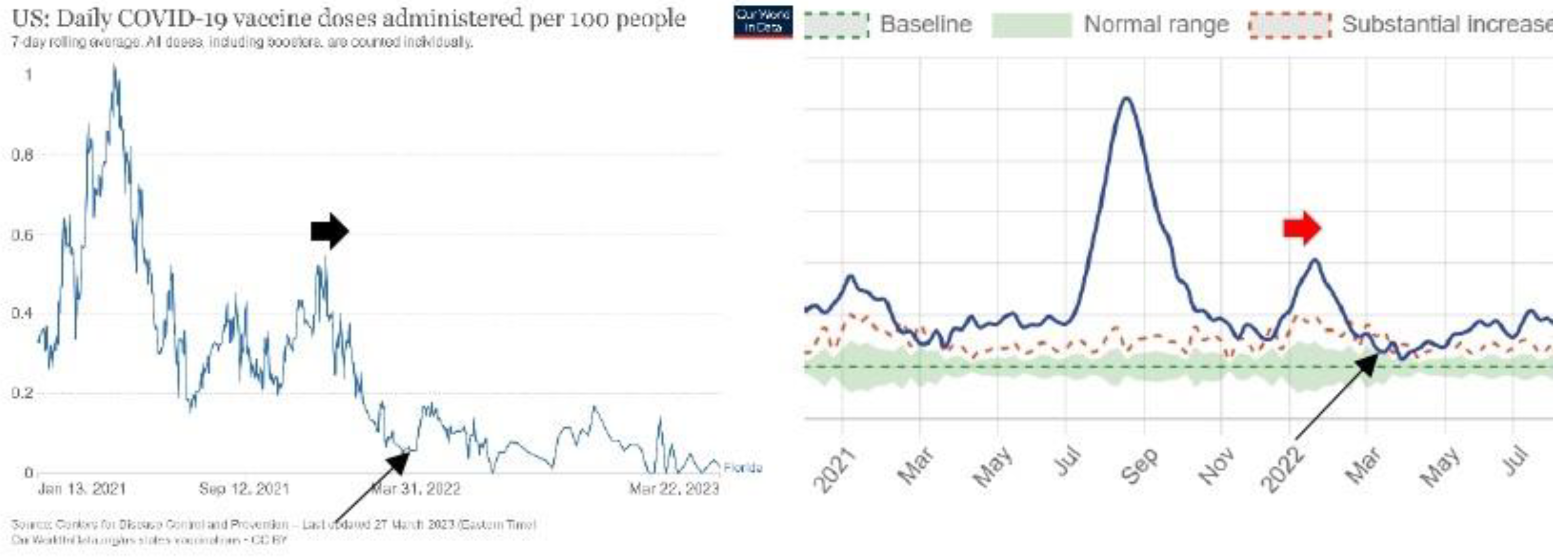
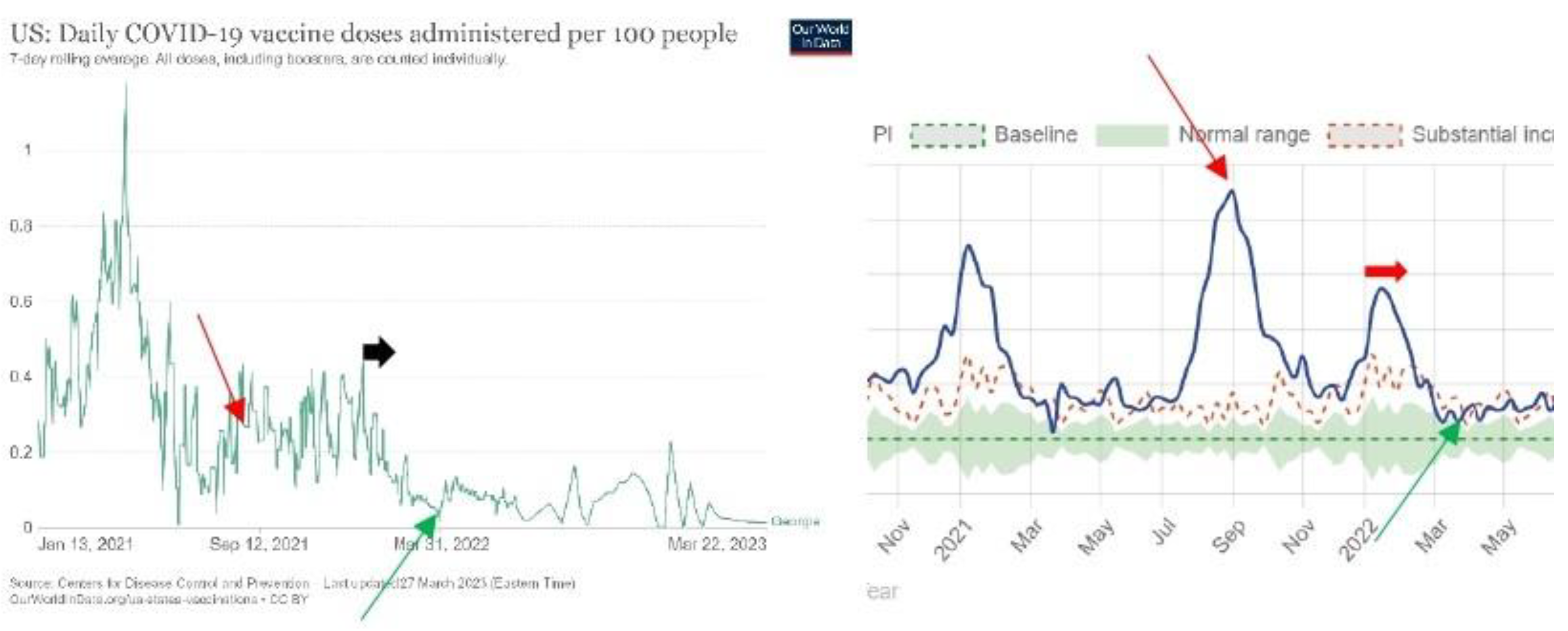
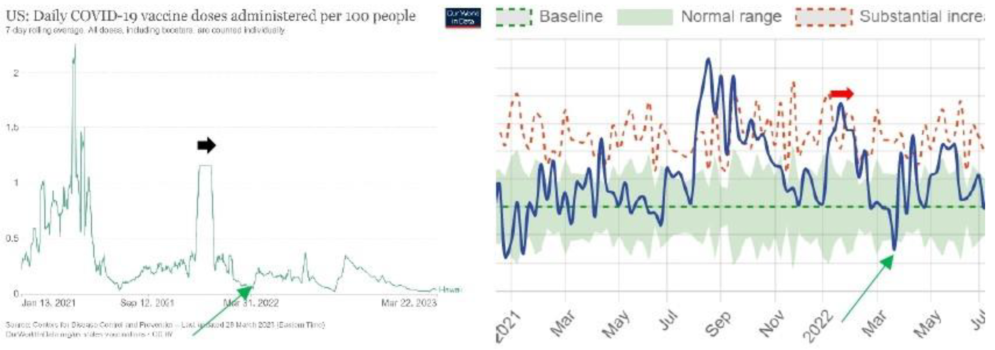
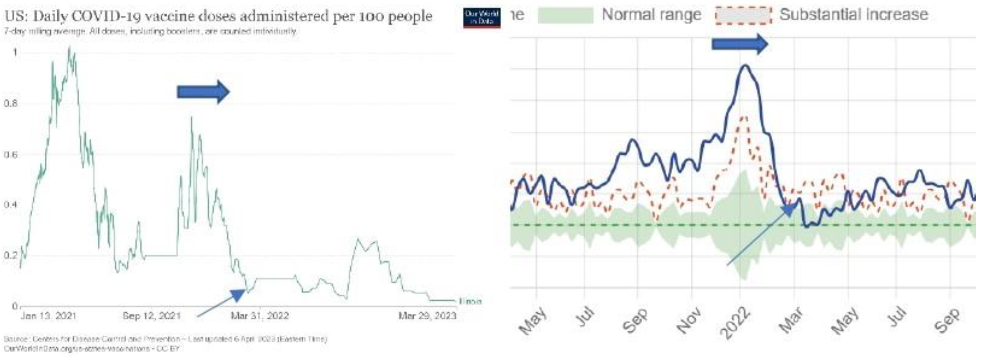
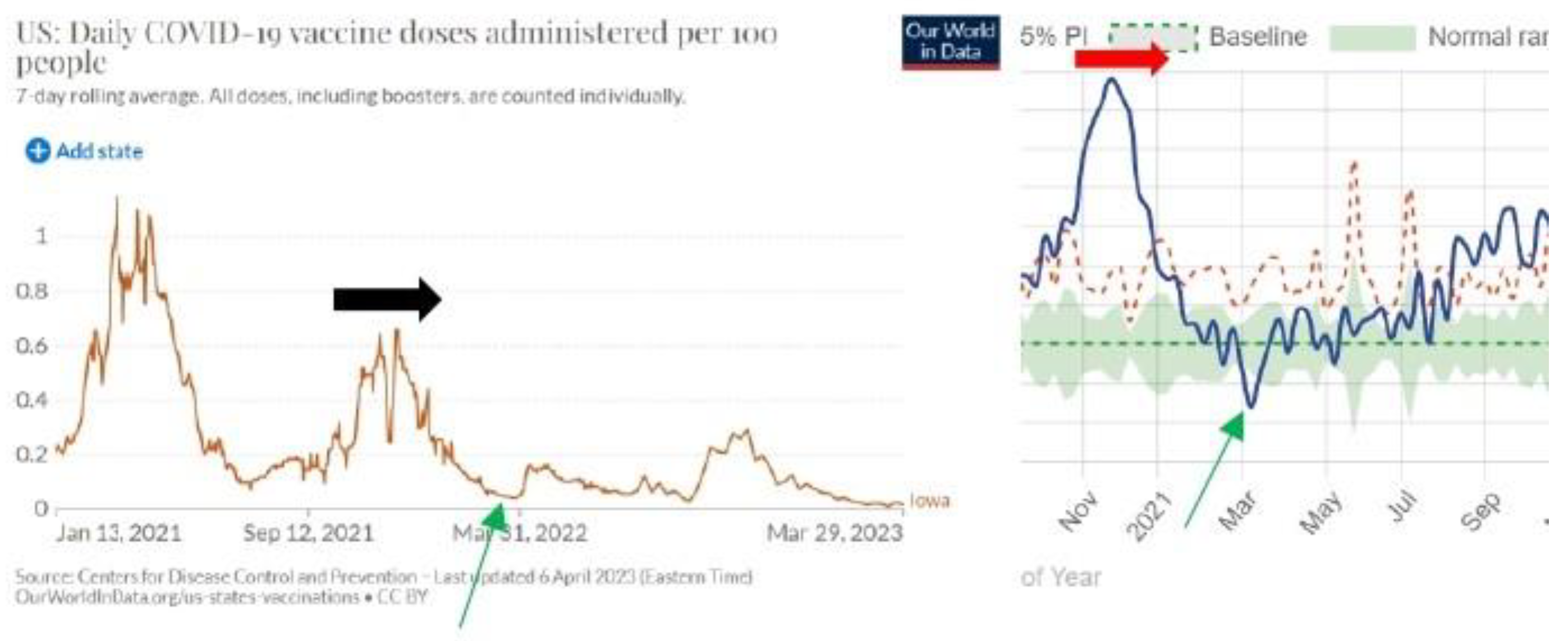
The sources of data are the following: Our World data [
6] is used to get the number of administered doses per 100 people. These are graphs on the left. US MORTALITY data are used to see the excess mortality rate over time [
7]. These are graphs on the right.
The dark on the left spot is the begging of vaccination on 31 December 2020 when excess mortality was at its peak. With the increase in vaccination that reached its peak on 13 April 2021, the mortality rate has decreased. The green spot is the minimum vaccination on 10 July 2021. With the increase in vaccination from 10 July 2021 to 31 January 2022 (from green to the red spot on the left) mortality rate reached its peak on 31 January 2022. The black arrow on the left is an intense vaccination period. The black arrow on the right is the period of high excess mortality that culminated at the end of intense vaccination on 31 January 2022.With the decrease in vaccination (from red point to violet point) also mortality rate has decreased. The violet spot is 26 March 2022.
The positive correlation of vaccination in the first month of vaccination is characteristic also for some other countries [
1]. The USA is an exception in the sense that in all other countries, this positive correlation lasted only to the end of March 2021.
The black arrow on the right is representing intense vaccination in March and April 2021. The black arrow on the right is the stable mortality in April and May 2021. The brown arrow on the left is intense vaccination in March and April 2021. The brown arrow on the right is the intense excess mortality in April and May 2021. The red arrow on the left is 31 January 2022 after intense vaccination. The red arrow on the right is the peak of excess mortality on 31 January 2022.
Data of state Alabama are confirming that when vaccination in a given period was intense in the following period the mortality rate increased. It should be the opposite, after intense vaccination in a given period mortality rate in the following period should decrease.
Figure 2 indicates that with a massive vaccination, the mortality rate of the population is increasing. An analysis of all states of the US will show if
Figure 2 is an exception or rule.
For Alaska, graphs do not show a significant causal correlation between the intensity of vaccination in a given period and the mortality rate in the following period.
Figure 2.
United States of America.
Figure 2.
United States of America.
The black spot on the left and right is the beginning of vaccination on 13 January 2021. The red spot on the left and right is the peak of vaccination on March 31. The red arrow on the left indicates the end of intense vaccination on July 12. The red arrow on the right indicates the peak of mortality on the day of July 12. The blue arrow on the left indicates the end of intense vaccination on the day of 12 September. The blue arrow on the right indicates the peak of excess mortality on the day of September 14. The green spot on the right is the end of intense vaccination in 2022 on March 21, and the green spot on the right is the end of the period of excess mortality in 2022 on Mach 21. The black arrow on the left is the end of massive vaccination on the day November 28 in 2002. The Black arrow on the right is the peak of mortality on November 29 in 2022.
The blue arrow on the left is the end of the massive vaccination on 21 January 2021. The blue arrow on the right is the peak of mortality on 18 January 2021. The red arrow on the left is the peak of the period of intense vaccination on 9 August 2021. The red arrow on the right is the peak of excess mortality on 9 August 2021. The green arrow on the left is the end of intense vaccination on 31 January 2023. The green arrow on the right is the peak of excess mortality on 7 February 2023.
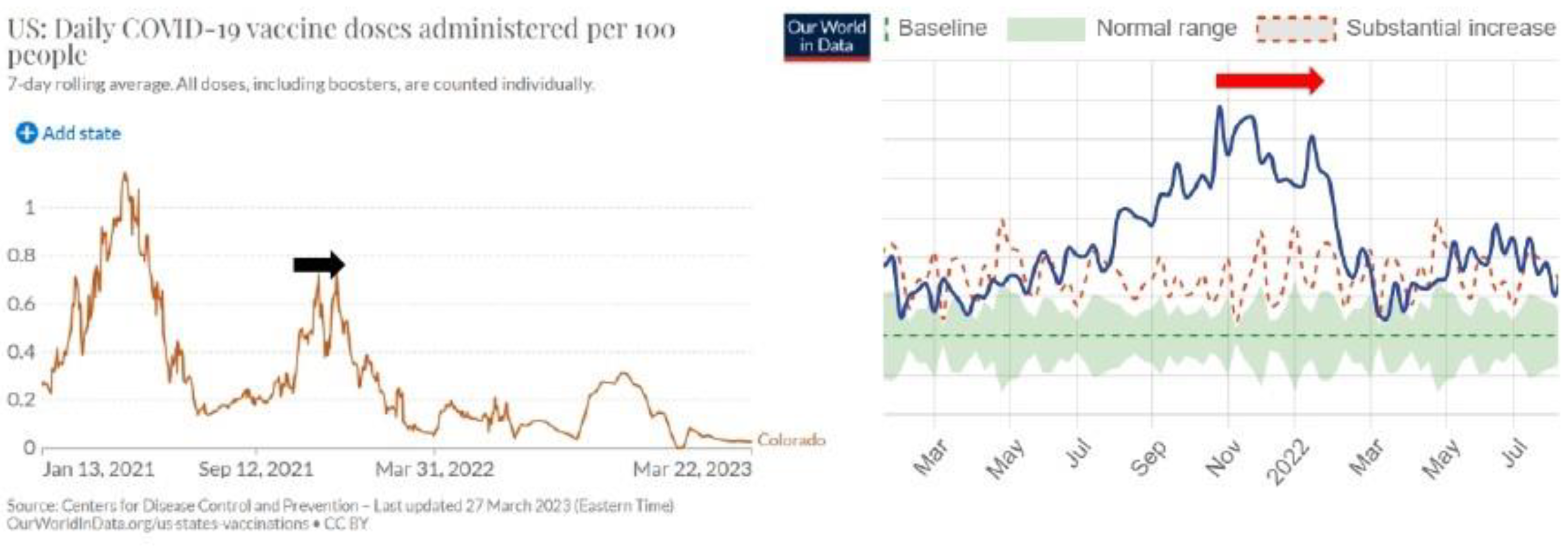
The black arrow on the left and right is 11 July 2021. The horizontal black arrow on the left is intense vaccination in December 2021 and in January 2022. The horizontal red arrow on the right is a period of excess mortality in January and February 2022.
The black arrow on the left is the intense vaccination in November and December 2021. The red arrow on the right is a period of intense excess mortality in November and December 2021 and January 2022. In general, after the period of intense vaccination, the excess mortality rate should decrease because people should have been protected from Covid-19. In general, the result is the opposite.
The horizontal black arrow on the left is intense vaccination in November and December 2021 and January 2022. The horizontal red arrow on the right is the period of excess mortality in December 2021 and January 2022. The thin red arrow on both sides is 25 March 2022.
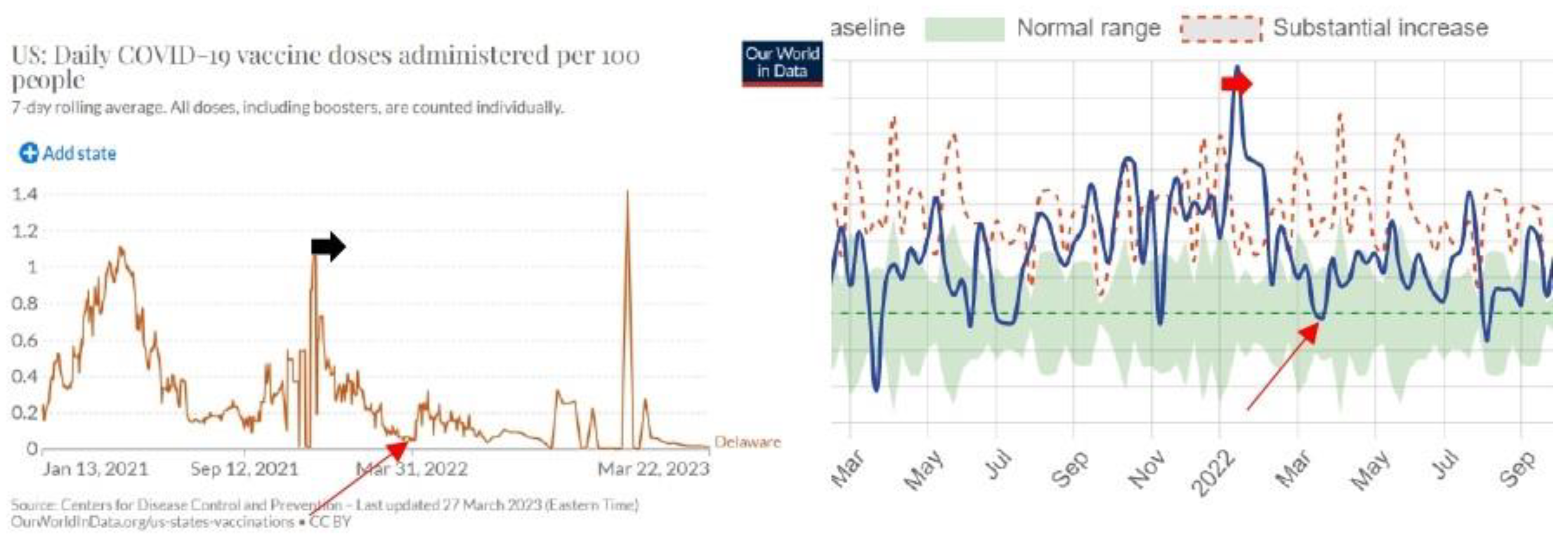
The horizontal black arrow on the left is intense vaccination in December 2021. The horizontal red arrow on the right is the period of excess mortality in January 2022. The thin red arrow on both sides is 1 April 2022.
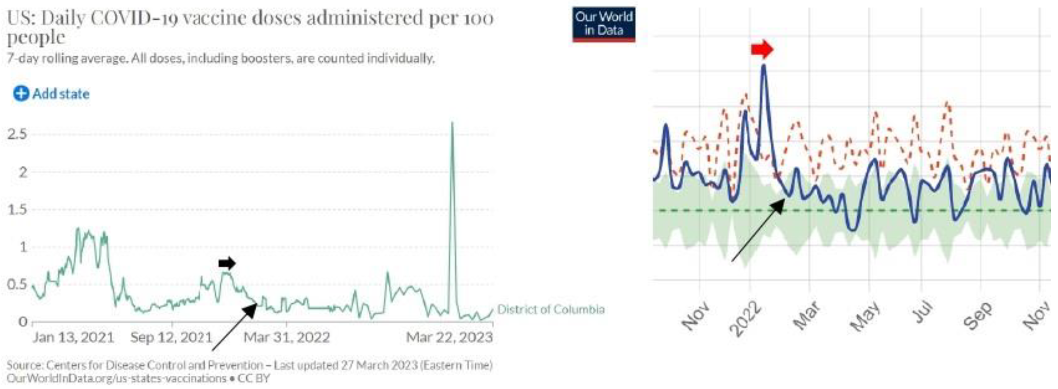
The horizontal black arrow on the left is intense vaccination in December 2021. The horizontal red arrow on the right is the period of excess mortality in January 2022. The thin red arrow on both sides is 15 February 2022.
Figure 11.
Figure 11. Florida.
Figure 11.
Figure 11. Florida.
The horizontal black arrow on the left is intense vaccination in December 2021. The horizontal red arrow on the right is the period of excess mortality in January 2022. The thin black arrow on both sides is 30 March 2022.
The red arrow on the left is 30 August 2021 after intense vaccination. The red arrow on the right is a peak of the intense mortality period on 6 September 2021. The horizontal black arrow on the left is intense vaccination in January 2022. The horizontal red arrow on the right is the period of excess mortality in January and February 2022. The thin green arrow on both sides is 30 March 2022.
The black arrow on the left is intense vaccination between 12 December 2021 and 20 January 2022. The red arrow on the right is the period of intense excess mortality rate between 14 January 2022 and 14 February 2022. The green arrow on both sides is 2 April 2022.
For Idaho, graphs do not show a significant causal correlation between the intensity of vaccination in a given period and the mortality rate in the following period.
The horizontal arrow on the left is intense vaccination in November, December 2021, and January 2022. The horizontal arrow on the right is a period of excess mortality in December 2021, January 2022, and the first two weeks of February 2022. The slanted arrow on the left is 10 Mach 2022, and the slanted arrow on the right is 10 Mach 2022.
The vertical arrow that points down on the left is 10 December 2021. The vertical arrow that points down on the right is 13 December 2921. The vertical arrow that points up on the left is 12 January 2022. The vertical arrow that points up on the right is 15 January 2022. The round spot on the left is 31 March 2022. The round spot on the right is 31 March 2022.
The dark arrow on the left is active vaccination in October, November, and December 2021, and the first five days of January 2022. The red arrow on the right is the period of high mortality from 25 October 2021 to 21 January 2022. The green arrow on both sides is 14 March 2022.
The dark arrow on the left is active vaccination in November, and December 2021. The red arrow on the right is the period of high mortality in January 2022 and the first two weeks of February 2022. The green arrow on both sides is 4 April 2022.
The first black arrow on the left is intense vaccination in August 2021. The first red arrow on the right is the intense high mortality from 15 August to 15 October 2021. The second black arrow on the right is intense vaccination in December 2021. The second red arrow on the right is a period of excess mortality from 15 January 2022 to 15 February 2022. The green arrow on both sides is 27 October 2021. The red arrow on both sides is 21 March 2022.
3. Discussion
Further analysis for other countries will not give surprises. The fact that intense periods of vaccination are followed by periods of higher excess mortality is obvious and nobody who understands the basic of science will not obey this fact. Claims in the article published in 2022 in the Lancet that Covid-19 vaccines have saved millions of lives are flawed: “COVID-19 vaccination has substantially altered the course of the pandemic, saving tens of millions of lives globally. However, inadequate access to vaccines in low-income countries has limited the impact in these settings, reinforcing the need for global vaccine equity and coverage” [
8].
Analysis of five-month vaccination in England has confirmed that the vaccinated part of the population has increased the mortality rate by bout 14,5% [
5]. Detailed analysis for the entire years 2021 and 2022 where calculations will be done for five age groups (0-20, 21.40, 41-60, 61-80, and above 80) will give the exact increased mortality rate due to the massive Covid-19 vaccination.
Covid-19 vaccines have been developed in an extremely short time and there were no necessary studies done that would clearly confirm the safety of these vaccines. If only 1000 people that were vaccinated in January 2021 would be followed up for three months and their health would be compared with the health of the control group of the same age that was not vaccinated, it would be clear by the end of April 2021 that these vaccines are hugely damaging people health and increasing excess mortality rate. Why such a study was not done is a question that medical science will need to find the answer to in order to regain people's trust.
The proof in this article does not require high-profile scientific education. One that can compare graphs of the intensity of vaccination and excess mortality immediately understands that graphs are proving the direct causal correlation between the intensity of vaccination and excess mortality. There is no need for a mathematical model and calculations that would prove the fact of damage of the Covid-19 vaccination on public health. One that has eyes can observe the graph and see the truth. A detailed mathematical analysis of these graphs can be done by using the mathematical algorithm which defines causality “Excess mortality rate period happens after the intense vaccination period” [
5].
The discussion that these vaccines are more harmful to health than beneficial to health is not appropriate because no convincing clinical studies were done that would prove these vaccines are effectively protecting health as, for example, ivermectin does [
9]. Why the WHO did not recommend ivermectin remains an open question. One thing is certain: an organization that is 80% in private hands cannot represent the interests of global public health.
One of the conclusions of Mark Skidmore’s article is the following: “Turning to the primary hypothesis, a respondent’s observations within his/her social circles have a significant influence on the decision to be vaccinated. Those who know someone who experienced a significant health problem from the COVID-19 illness have higher odds of being vaccinated (OR: 1.309, 95% CI 1.094–1.566). Conversely, those who know someone who had a health problem following inoculation have lower odds of being vaccinated (OR: 0.567, 95% CI 0.461–0.698). The impact of COVID-19 vaccine injury is larger than the impact of COVID-19 illness” [
10]. Skidmore’s article was published on 24 January 2023 and retracted on 11 April 2023. Why the article reference [
8] was not retracted yet remains an open question. The claim that Covid-19 vaccines saved millions of lives is a myth that should be dismantled in order to protect public health.
Conclusions
The Covid-19 vaccination was done worldwide in an extreme rush to diminish the excess mortality rate because of the Covid-19 virus. The expected result was not achieved, and the statistical data are proving the opposite. The WHO has failed to do its job to protect global public health. Their experts for public health should respect ordinary scientific procedures of the gold standard where first you check up on a new medicine on a limited group of people and when being sure that medicine is working well you consider it makes sense to use it worldwide. All research that concluded that Covid-19 vaccines were successful and they diminished mortality rates have no support in the analysis of the basic statistical data.

