Submitted:
03 May 2023
Posted:
05 May 2023
You are already at the latest version
Abstract
Keywords:
1. Introduction
2. Materials and Methods
2.1. Resources used
2.2. Experimental data acquisition
2.3. Interferometer readouts
3. Results
3.1. Dataset
3.2. Pre-processing
3.3. Clustering
3.4. Neural Network
4. Discussion
5. Conclusions
- Readouts provided by a -PA-OFDR (as OBR-4800 is) contains are capable of providing more information than what nowadays is used.
- Artificial Intelligence methods are suitable for analyzing DOFS data in order to decouple temperature and strain phenomena.
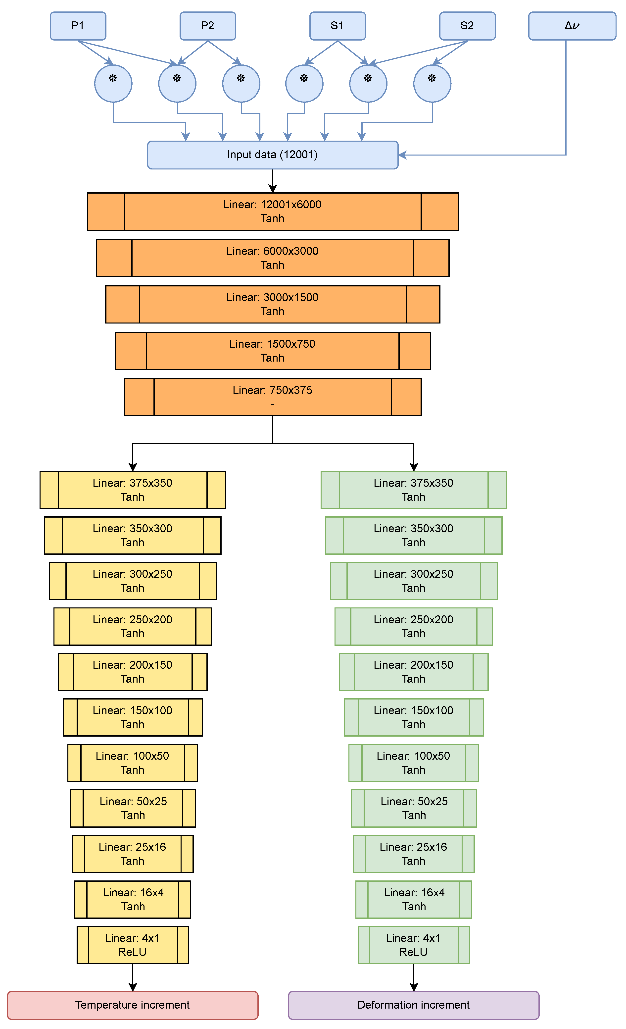
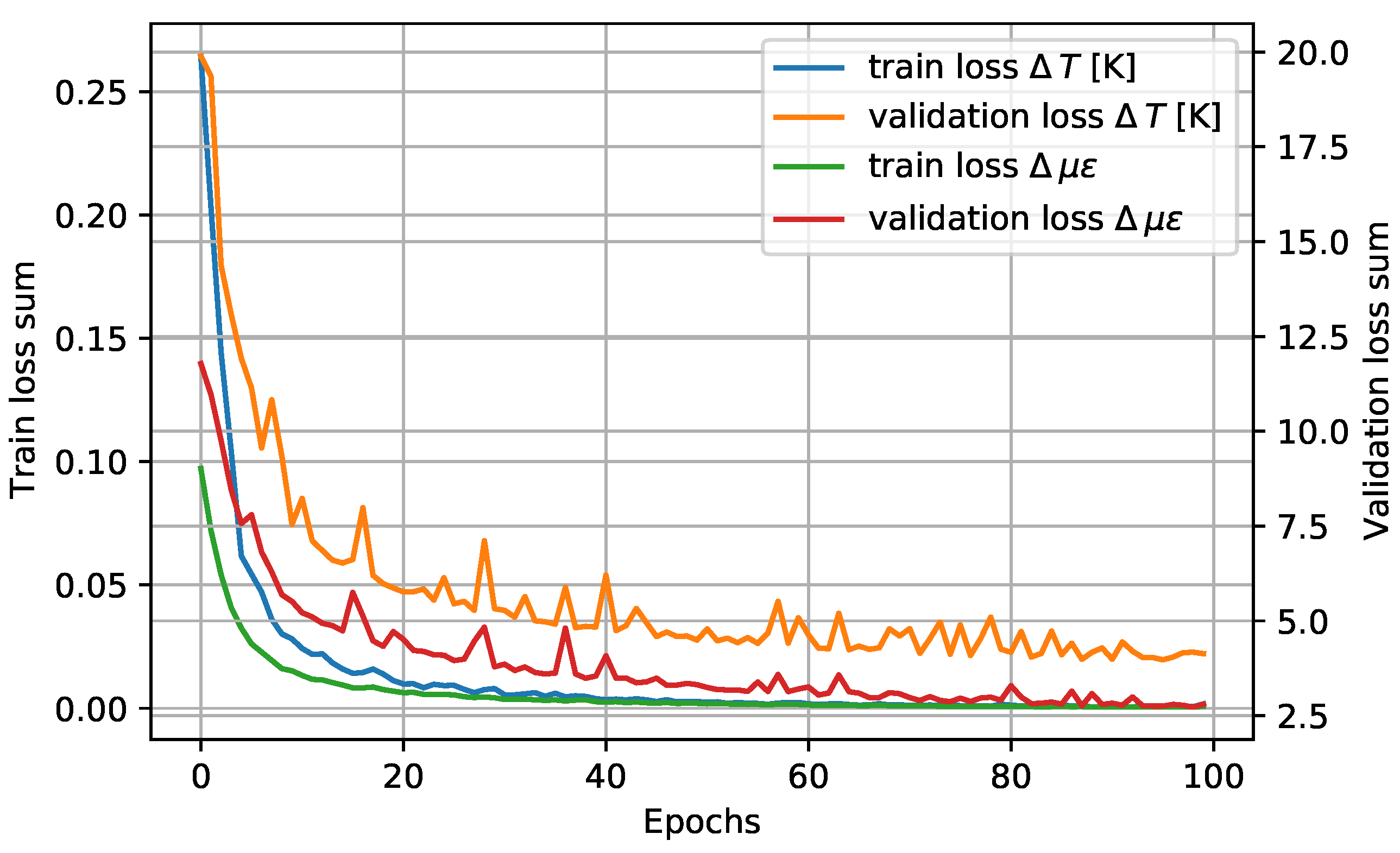
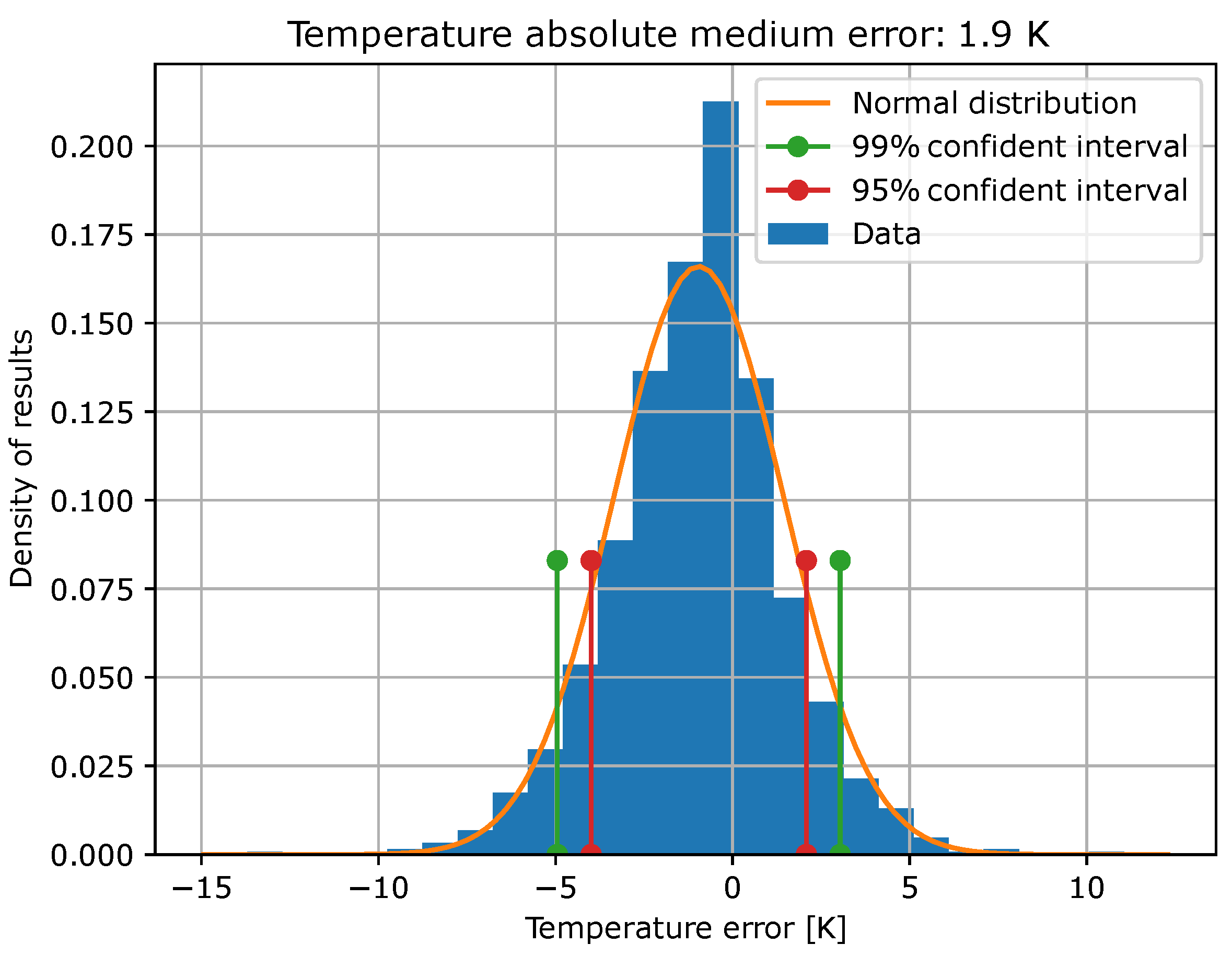
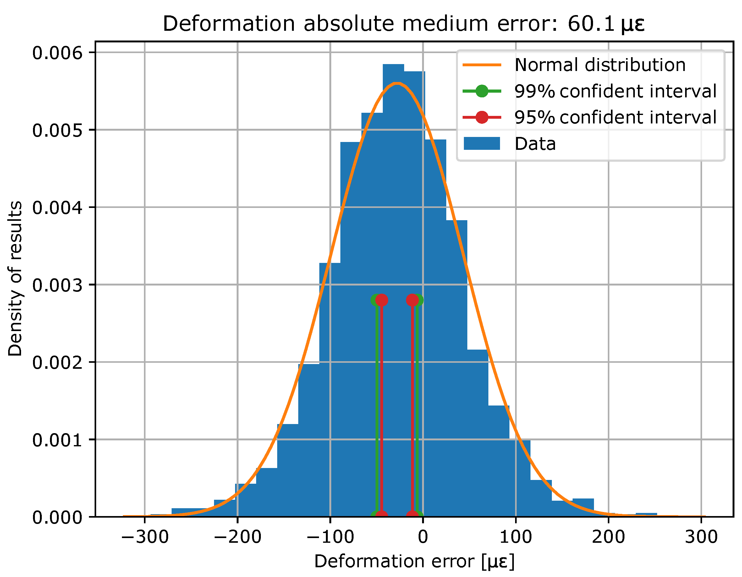
- More specifically, the Neural Network model designed and trained for this purpose in the present work has reached the precision and accuracy shown in Table 4.
- In addition, explainable AI offers a deeper analysis of the AI model, which can be used to chart the course for future research.
Acknowledgments
References
- Guestrin, C.; Ribeiro, M.T.; Singh, S. "Why Should I Trust You?": Explaining the Predictions of Any Classifier Proceedings of the 22nd ACM SIGKDD International Conference on Knowledge Discovery and Data Mining 2016.
- Schenato, L. A Review of Distributed Fibre Optic Sensors for Geo-Hydrological Applications Applied Sciences 2017.
- Lasn, K.; Wang, S. Accurate non-linear calculation model for decoupling thermal and mechanical loading effects in the OBR measurements Optics Express 2021.
- An Introduction to Preprocessing Data for Machine Learning. Available online: https://towardsdatascience.com/an-introduction-to-preprocessing-data-for-machine-learning-8325427f07ab.
- Chen, L.; Li, W.; Bao, X. Compensation of temperature and strain coefficients due to local birefringence using optical frequency domain reflectometry Optics Communications 2013.
- Cross-spectral analysis. Available online: https://nbviewer.org/github/mattijn/pynotebook/blob/master/2016/2016-05-25%20cross-spectral%20analysis.ipynb (accessed on 15/02/2023).
- Cross-spectrum. Available online: https://en.wikipedia.org/wiki/Cross-spectrum (accessed on 15/02/2023).
- Data Preprocessing in Machine learning. Available online: https://www.javatpoint.com/data-preprocessing-machine-learning.
- Palmieri, L.; Schenato, L. Distributed Optical Fiber Sensing Based on Rayleigh Scattering The Open Optics Journal 2013.
- Soller, B.J.; Gifford, D.K.; Froggatt, M.E.; Wolfe, M.S.; Kreger, S.T. Distributed Strain and Temperature Discrimination in Unaltered Polarization Maintaining Fiber Optical Fiber Sensors - OSA Technical Digest 2006.
- emanuel-metzenthin/Lime-For-Time: Application of the LIME algorithm by Marco Tulio Ribeiro, Sameer Singh, Carlos Guestrin to the domain of time series classification. Available online: https://github.com/emanuel-metzenthin/Lime-For-Time (accessed on 15/02/2023).
- Soller, B.J.; Gifford, D.K.; Froggatt, M.E.; Wolfe, M.S. High resolution optical frequency domain reflectometry for characterization of components and assemblies Optics Express 2005.
- Moore, J.; Froggatt, M.E. High-spatial-resolution distributed strain measurement in optical fiber with Rayleigh scatter OSA - Applied Optics 1998.
- How Much Training Data is Required for Machine Learning?. Available online: https://machinelearningmastery.com/much-training-data-required-machine-learning/ (accessed on 15/02/2023).
- How to use the cross-spectral density to calculate the phase shift of two related signals. Available online: https://stackoverflow.com/questions/21647120/how-to-use-the-cross-spectral-density-to-calculate-the-phase-shift-of-two-relate (accessed on 15/02/2023).
- Bellone, A.. Optical fibre sensors for distributed temperature monitoring during mini-invasive tumour treatments with laser ablation, Politecnico di Torino, 2020.
- Muga, N.J.. Polarization Effects in Fiber-Optic Communication Systems, Universidade de Aveiro, 2011.
- Venketeswaran, A.; Chorpening, B.; Wuenschell, J.; Chen, K.P.; Buric, M.; Badar, M.; Lalam, N.; Jr., P.R.O.; Lu, P.; Duan, Y. Recent Advances in Machine Learning for Fiber Optic Sensor Applications Advanced Intelligent Systems 2021.
- Chen, L.; Bao, X. Recent Progress in Distributed Fiber Optic Sensors Sensors 2012.
- Sample Size in Machine Learning and Artificial Intelligence. Available online: https://sites.uab.edu/periop-datascience/2021/06/28/sample-size-in-machine-learning-and-artificial-intelligence/ (accessed on 15/02/2023).
- Luo, B.; He, H.; Shao, L.; Yan, L.; Pan, W.; Zhang, Z.; Li, Z. Self-Mixing Demodulation for Coherent Phase-Sensitive OTDR System Sensors 2016.
- Eyal, A.; Shiloh, L. Sinusoidal frequency scan OFDR with fast processing algorithm for distributed acoustic sensing Optics Express 2017.
- Güemes, A.; López, A.F.; Pérez, J.S.; Pozo, Á.R. Structural Health Monitoring for Advanced Composite Structures: A Review Journal of Composites Science 2020.
- Ferdinand, P. The Evolution of Optical Fiber Sensors Technologies During the 35 Last Years and Their Applications in Structure Health Monitoring. In Proceedings of the European Workshop on Structural Health Monitoring.
- SMF-28e+ by Corning: Corning SMF-28e+ Optical Fiber. Available online: https://www.corning.com/optical-communications/worldwide/en/home/products/fiber/optical-fiber-products/smf-28e-.html.
- OBR-4600 by LUNA: Optical Frequency Domain Reflectometer. Available online: https://lunainc.com/product/obr-4600.
- OBR-4600 by LUNA: Optical Frequency Domain Reflectometer (User Guide). Available online: https://lunainc.com/sites/default/files/assets/files/resource-library/OBR-4600-UG6_SW3.10.1.pdf.
- Numpy. Available online: https://numpy.org/.
- Scipy. Available online: https://scipy.org/.
- SMF-28e+ by Corning: Corning SMF-28e+ 9/125/250µm OS2 Single Mode Fiber with NexCor Technology (G.652). Available online: https://www.fiberoptics4sale.com/products/smf-28e.
- Polarization-Maintaining Single Mode Optical Fiber. Available online: https://www.thorlabs.com/newgrouppage9.cfm?objectgroup_id=1596.
- Sklearn. Available online: github.com/scikit-learn/scikit-learn.

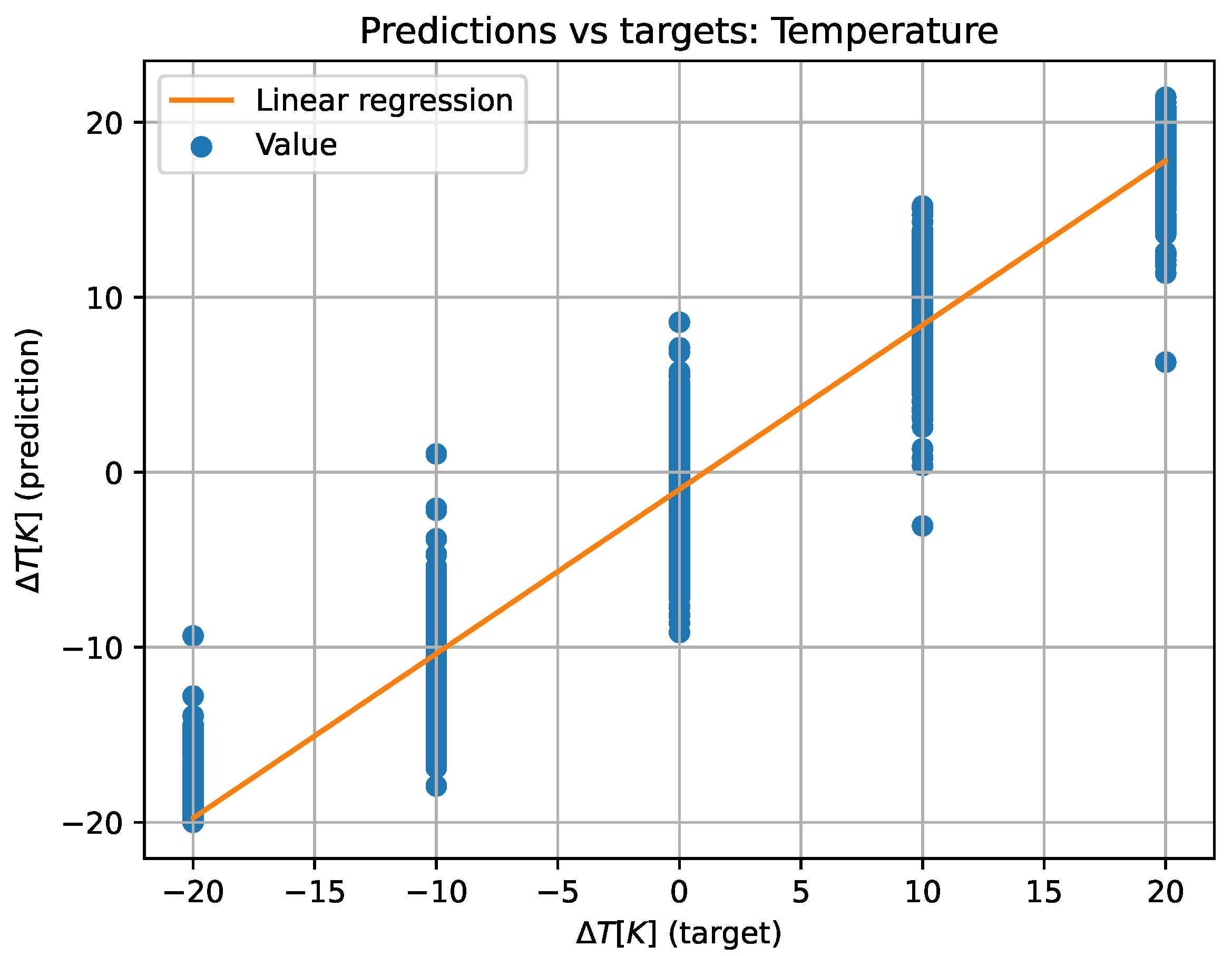
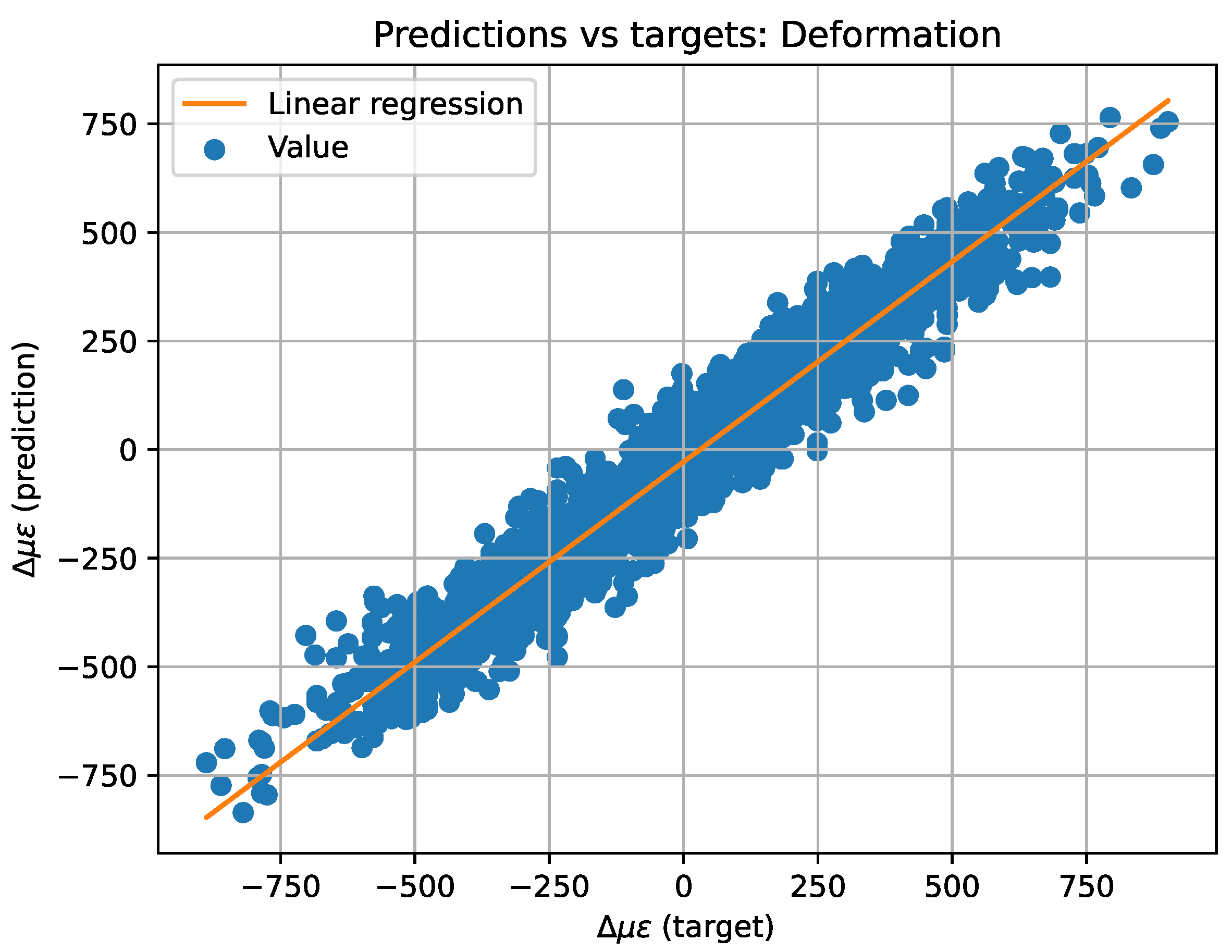
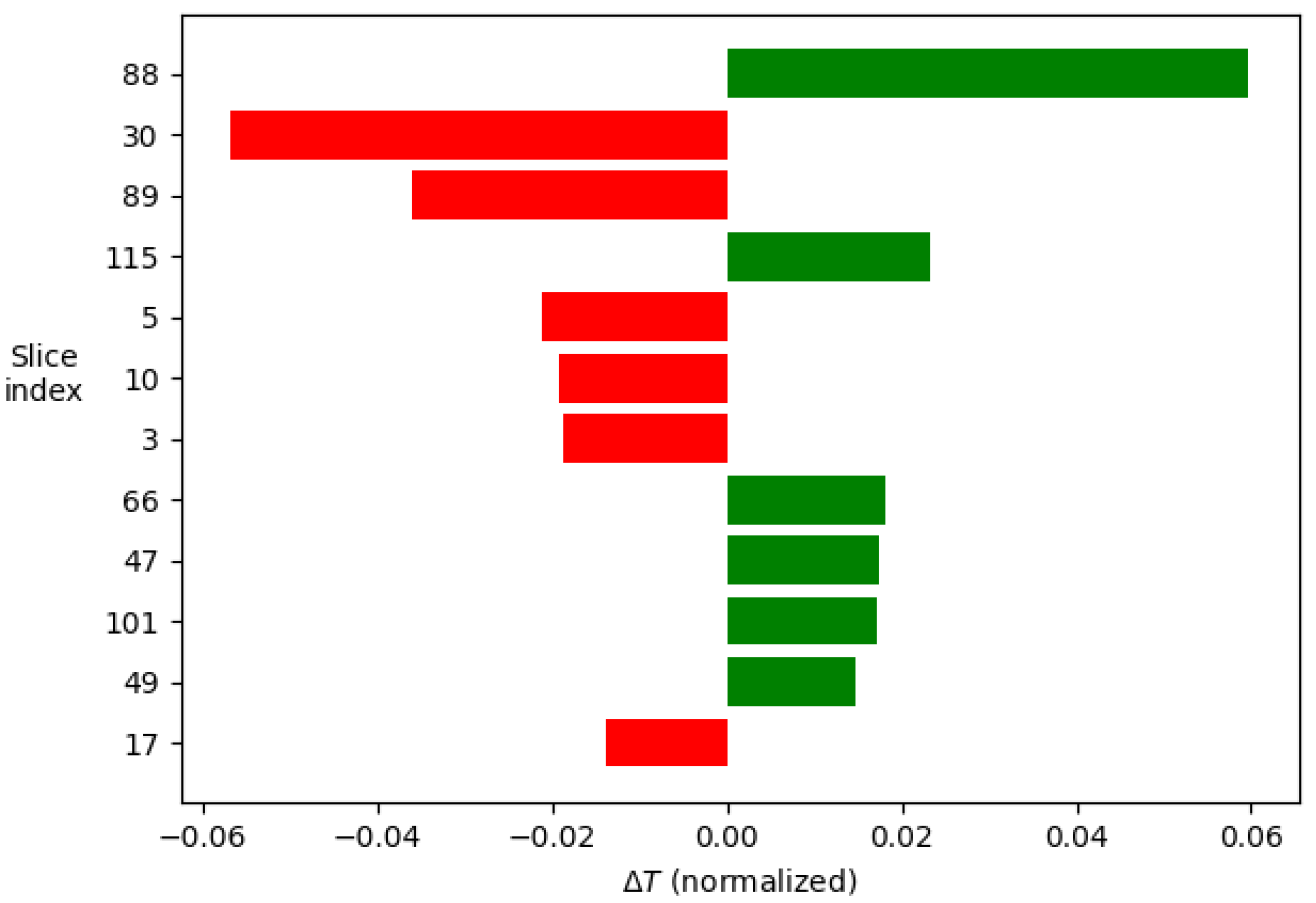
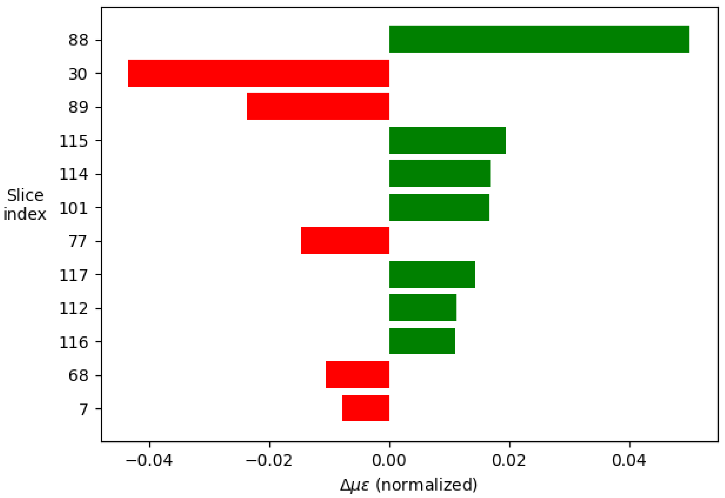

| Method | Configuration |
|---|---|
| Brillouin | Brillouin frequency shift Brillouin amplitude effects with LEAF fiber |
| Brillouin and Raman hybrid | Raman-Brillouin gains |
| Photonic crystal fiber (PCF) | Brillouin |
| FBG | Dual wavelength |
| FBG on PMF | Polarization Maintaining Fiber analysis |
| OFDR | PMF, Rayleigh scattering, autocorrelation function |
| Resource | Supplier | Model | Reference |
|---|---|---|---|
| Single Mode Fiber | Corning | SMF-28e+ | [25] |
| Optical Frequency Domain Reflectometer | LUNA | OBR-4600 | [26,27] |


Disclaimer/Publisher’s Note: The statements, opinions and data contained in all publications are solely those of the individual author(s) and contributor(s) and not of MDPI and/or the editor(s). MDPI and/or the editor(s) disclaim responsibility for any injury to people or property resulting from any ideas, methods, instructions or products referred to in the content. |
© 2023 by the authors. Licensee MDPI, Basel, Switzerland. This article is an open access article distributed under the terms and conditions of the Creative Commons Attribution (CC BY) license (http://creativecommons.org/licenses/by/4.0/).


