1. Introduction
The development of web applications of environmental and water resources has grown in popularity to serve a vast amount of data accessible to the public in some way. It is used regularly and integrated to help professionals and scientists take decisions[
1]. Several studies have reported such web development efforts which promote open analyses of the environment, hydrology and hydraulics [
2,
3]. The web applications provide one or more of the functions related to the conduct of hydrologic research, environmental data extraction, mapping visualizations [
3], geospatial data processing, statistical operations, as well as manipulating and analyzing data for domain specific [
4].
The knowledge on hydrologic variability inferred from climate and rainfall data is the fundamental basis of the design and operation of most hydraulic facilities such as dams, reservoirs, and bridge piers. It also provides the crucial information to develop water resources planning against natural disasters such as floods, droughts, and landslides. However, very often such rainfall data is not available because of the lack of a rainfall gage at the study location or the malfunction of existing rain gages [
5,
6]. Several platforms have been created for the collection and visualization of hydrological data from a variety of sources. Particularly, the Consortium of Universities for the Advancement of Hydrologic Science, Inc. (CUAHSI) HydroClient (
http://data.cuahsi.org/) accesses hydrologic data from over 95 sources stored in the CUAHSI Hydrologic Information System (HIS). This system was designed to take into account the syntactical and semantic heterogeneity of environmental data using a standard observation data model (ODM) database format for data storage and WaterOneFlow web-based services for data communication [
7].
A related platform, the Time Series Analyst (TSA) (
http://data.iutahepscor.org/tsa/) is capable of retrieving any data set published in the CUAHSI HIS and provides more innovative tools for data visualization, including a mapping interface, faceted filters and the possibility of displaying data using time series, box graphs or histograms. Furthermore, the TSA includes the calculation of data summary statistics [
8].
Also, the Great Lakes Dashboard (GLD) platform
https://www.glerl.noaa.gov/data/dashboard/GLD_HTML5.html) was specifically designed as a tool to visualize and download datasets from the North American Laurentian Great Lakes and displays plots for a multitude of different time series datasets [
9]. In addition, the Virtual Observatory and Ecological Informatics System (VOEIS) Data Hub (
https://voeis.msu.montana.edu/) is offering tools for users to compile, manage, view and redistribute data sets. The VOEIS Data Hub can be used by users to download data or retrieve data from networked sensors with QA/QC capabilities. Furthermore, the VOEIS Data Hub includes data access restriction features and allows users to publish data to a CUAHSI HIS Hydro Server [
10]. Despite the advancements of these platforms, they are limited by the lack of data analytic tools.
In the present paper, we propose a web application which allows the management of various data such as rainfall, dams, and climate data in the study area. This application is named ‘‘ClimInonda’’. This web application has the following major advantages:
ClimInonda is a web-based application, so any end users with Internet access and an internet browser can easily generate synthetic of different data. So, it can generate the rainfall time series at any engaged spatial location within this spatial boundary; the application is capable of generating different types of data for a different station in the study area. This article is organized in the following way:
Section 2 explains the structure of the web application; and the overall architecture of ClimInonda,
Section 3 explains the result,
Section 4 discusses the results, and
Section 5 concludes the study. The problem addressed in this article is related to visualizing and analyzing different data in the study area, along with its ubiquitous dissemination in a user-friendly manner. The goals of our work are as follows: Interactive visualization with analysis of big data in the Bayech basin and dissemination of this data via ClimInonda web for ubiquitous access. We describe our solution approaches, with a brief survey of related work, and processing of big data. We also discuss our ongoing work.
2. Materials and Methods
2.1. Study area
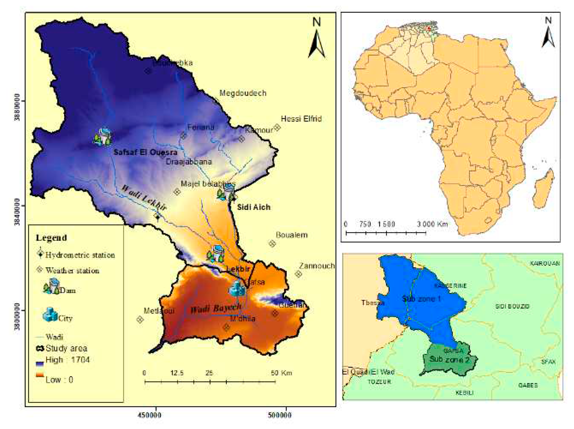
The present study aims at mapping flooding risk areas in the Bayech transboundary basin, (in south-west Tunisia/south-east Algeria). The study is focused on two main sub-zones (
Figure 1). Sub-zone 1 is called the Bayech basin, and is delimited at the junction of wadi Sidi Aich and wadi El Kebir (just upstream of the city of Gafsa). Sub-zone 2 is the urban area of the city of Gafsa and its old oasis. The total study area (sub-zone 1 and 2) covers 6491 km2 (of which 4508 km2 in Tunisia and 1983 km2 in Algeria), and has a perimeter of 813 km. It is situated between (451193 E and 3788894 N, UTM-32N). The area extends administratively over two governorates in Tunisia (Gafsa and Kasserine) and a single governorate in Algeria (Tebessa). It is characterized by a diversity of natural landscapes, comprising deserts, oasis and mountainous landscapes. Elevation ranges from 73 to 1704 m a.s.l. The climate of the study area is arid to semi-arid and it is characterized by an average annual rainfall not exceeding 300 mm.
2.2. Methodology
Web mapping applications offer an effective way to provide geospatial information to non-technical end users [
11]. Without any additional software, web applications offer increased responsiveness using modern techniques like Ajax (Asynchronous JavaScript and XML) and object-oriented architectures like the RESTful web service architecture [
12]
Recently, researchers have dealt with the development of web GIS applications [
13] on the basis of webservices, cloud computing platforms [
14] and mobile applications that critically depend on the same orientation [
15].
These applications can process and analyse large amounts of remote sensing data to produce maps and visualizations that can aid in identifying areas that are at high risk of flooding. The integration of web applications with geographic information systems (GIS) can also enhance the accuracy of flood mapping by combining remotely sensed data with other geospatial data, such as land use and topography. This integration allows for the creation of comprehensive flood risk maps that can be used by decision-makers and emergency responders to understand the potential impact of flooding on various areas and populations. Furthermore, web applications can provide real-time access to remotely sensed data, allowing for continuous monitoring of flood-prone areas.
This can be particularly useful during flood events, where the rapid dissemination of information can be critical for disaster response and management. In addition, we can provide interactive and dynamic visualizations of remote sensing data, allowing users to explore and analyze the data in a user-friendly way. This can help decision-makers and stakeholders to understand the current state of the environment and identify areas that are at high risk of flooding. The visualizations can include different types of data, such as satellite imagery, weather data, and terrain data, and can be displayed using various techniques, such as heat maps, contour maps, and 3D models. By providing easy-to-understand visualizations, web applications can help decision-makers and stakeholders to make informed decisions about flood risk management. For example, they can identify areas that are particularly vulnerable to flooding and prioritize infrastructure investments and emergency response planning accordingly. Additionally, the visualizations can be used to communicate the potential impacts of flooding to the public, raising awareness and encouraging preparedness measures.
2.2.1. Design and Analysis
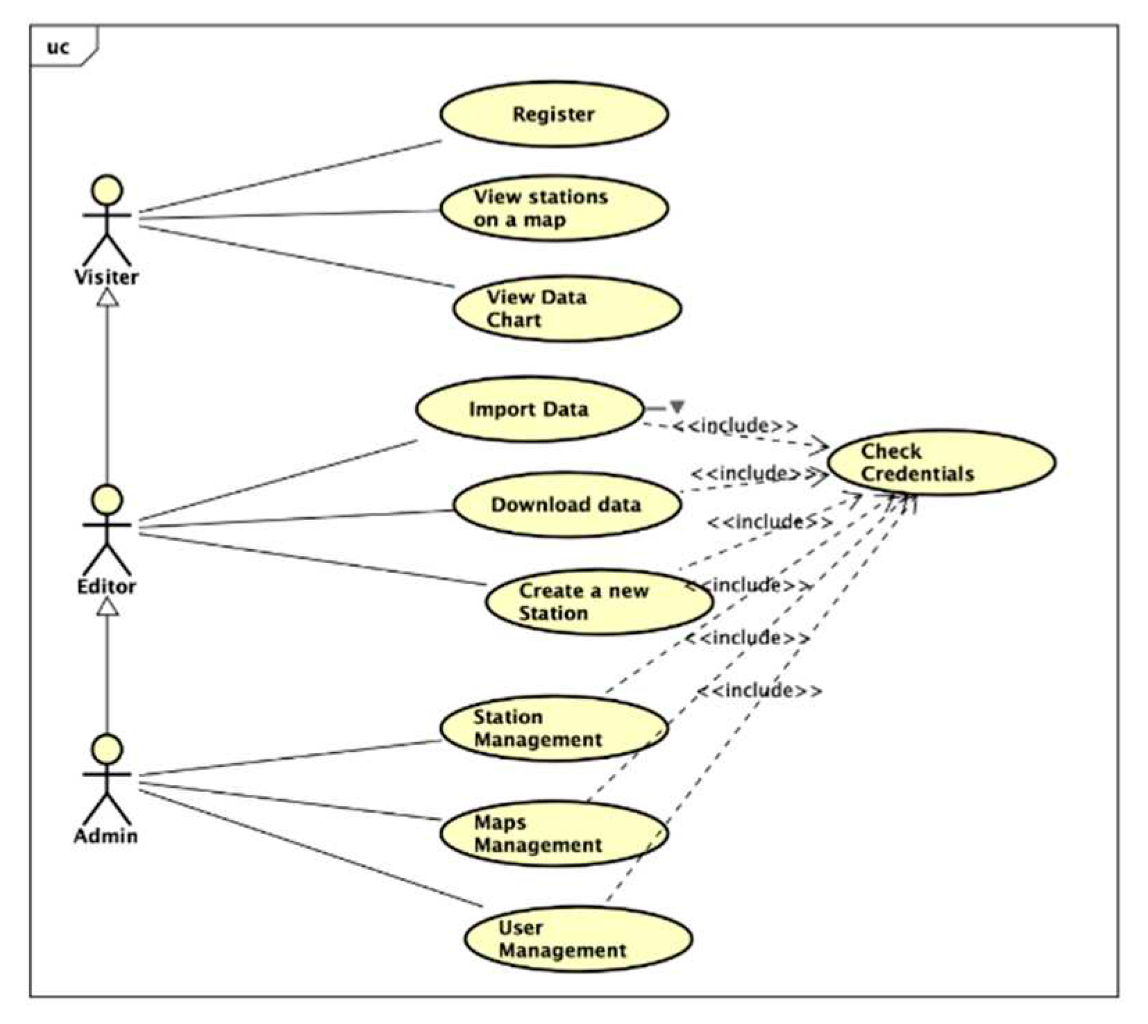
The application developed in this research work caters to a diverse range of users with varying needs and requirements. It has been carefully designed to accommodate different user roles and is organized into three distinct modes of use. The first mode is the visitor mode, which offers a user-friendly interface for individuals who want to explore the application's features without the need for an account. In this mode, users have the ability to visualize chart data, navigate through the map to locate different stations, and even register an account to unlock additional functionality. On the other side, we have the editor mode, specifically tailored for users who require more advanced capabilities.
In this mode, individuals with appropriate privileges can import and download data, as well as create and customize various stations within the application. The editor mode empowers users to manipulate and enhance the content of the application according to their specific requirements, facilitating a more personalized and tailored experience. Finally, there is the admin mode, which provides comprehensive management functionalities. Users assigned with administrative privileges can oversee the overall operations of the application. This includes managing stations, maps, and most crucially, the user accounts themselves. Administrators hold the responsibility of ensuring a smooth and secure user experience by overseeing user registrations, permissions, and resolving any issues that may arise.
Figure 2 illustrates the mode of use for our application, aiming to streamline and facilitate the management of the various modes available. This visual representation offers a comprehensive overview of the user journey and the interactions between different modes of use within the application.
2.2.1.2. Sequence Diagram
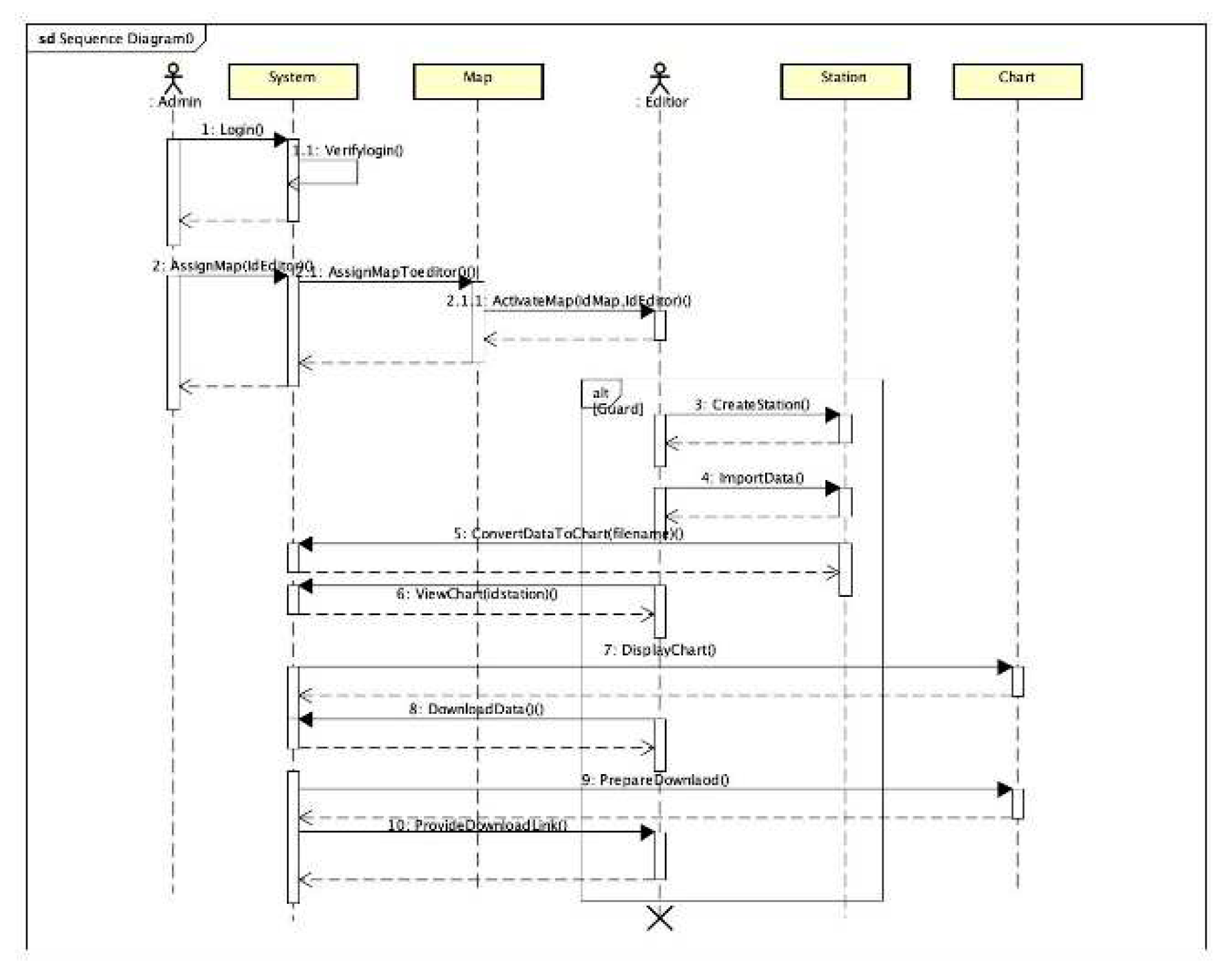
This sequence diagram provides a comprehensive visualization of the flow of interactions within a web-based system involving various actors, namely the Administrator, System, and Editor. It highlights the specific actions and responsibilities of each actor, showcasing their roles in accomplishing specific tasks and achieving desired outcomes. At the core of this diagram is the Administrator, who initiates the process by assigning a map to the Editor. This action sets the foundation for further interactions and tasks within the system. The Administrator, assuming their privileged role, ensures that the Editor has access to the necessary resources and permissions to carry out their responsibilities effectively.
Once the map is assigned, the Editor takes over and proceeds with creating a station on the designated map. This step involves leveraging the system's tools and features to define and establish the station's parameters, such as location, attributes, and associated data. Subsequently, the Editor's attention shifts towards importing data, an essential aspect of enriching the station's content. The data imported could originate from various sources, such as external files or databases. Through the system's capabilities, the Editor efficiently integrates the imported data into the station, ensuring its relevance and accuracy. With the station created and data imported, the Editor moves forward with the conversion of this data into a graph. This process may involve utilizing the system's built-in graphing functionality or employing external libraries and tools. By transforming the data into a graphical representation, the Editor enables users to comprehend and interpret the information in a more visual and intuitive manner. The result of this sequence is the availability of the graph, which can be viewed and downloaded by users. This functionality enhances the accessibility and usability of the system, empowering users to interact with the data and make informed decisions based on the presented insights.
By presenting the sequence of interactions and the roles of different actors, the diagram illustrates in figure 3 facilitates a clear understanding of the system's workflow and the responsibilities of each participant. It serves as a valuable reference, enabling users to comprehend the intricacies of the system's functionality and identify potential areas for optimization or refinement.
2.2.2. Database diagram
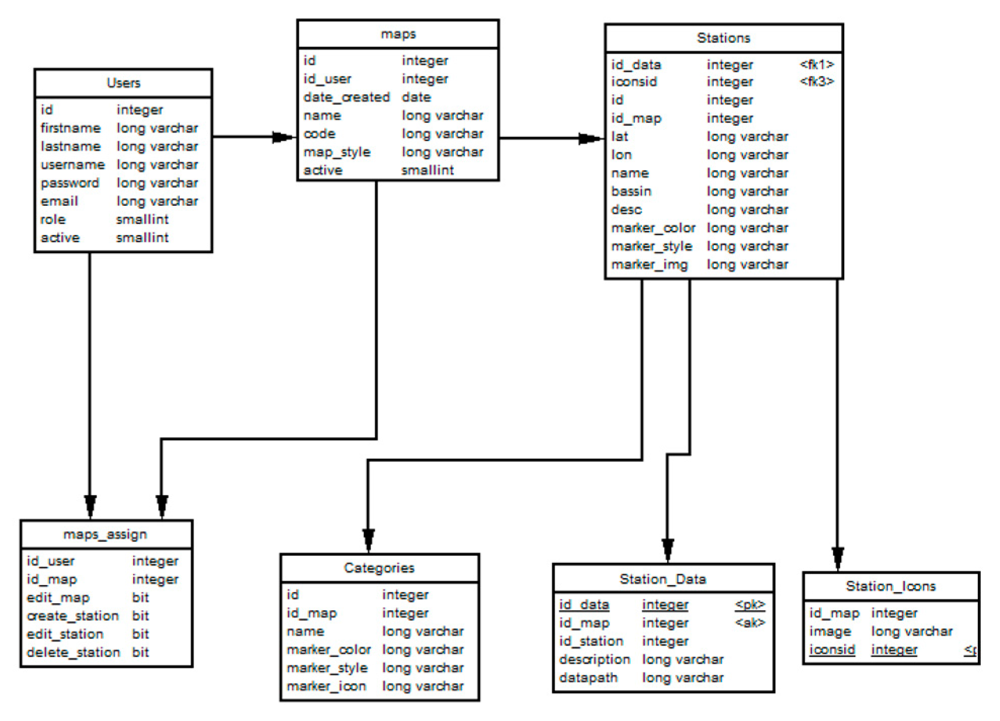
Our database comprises seven distinct tables, each serving a specific purpose, these tables are as follows:
Maps: This table stores comprehensive information about all created maps. It includes details such as map attributes, current status, and whether they require a password for access.
Station: The Station table contains data directly associated with individual stations. It encompasses information such as the station's name, latitude, longitude, and other relevant details. Additionally, it tracks the creator of each station and maintains a list of users who have access to that particular station. A status field has been incorporated to indicate whether a station is active, down, or in another state.
Maps_assign: This table represents the assignment of users to specific maps. It stores information about which maps each user is assigned to and the permissions granted to them, including the ability to create, modify, or delete content within those maps.
Users: The Users table records user information, including their email address, name, and other relevant data. It also includes a role designation, indicating whether the user is an administrator, editor, or visitor. The table further includes a status field, allowing us to track the user's confirmation status (pending confirmation by the administrator), deletion status, and other relevant states. Notably, all passwords are securely stored in an encrypted format using a specialized library to ensure data security.
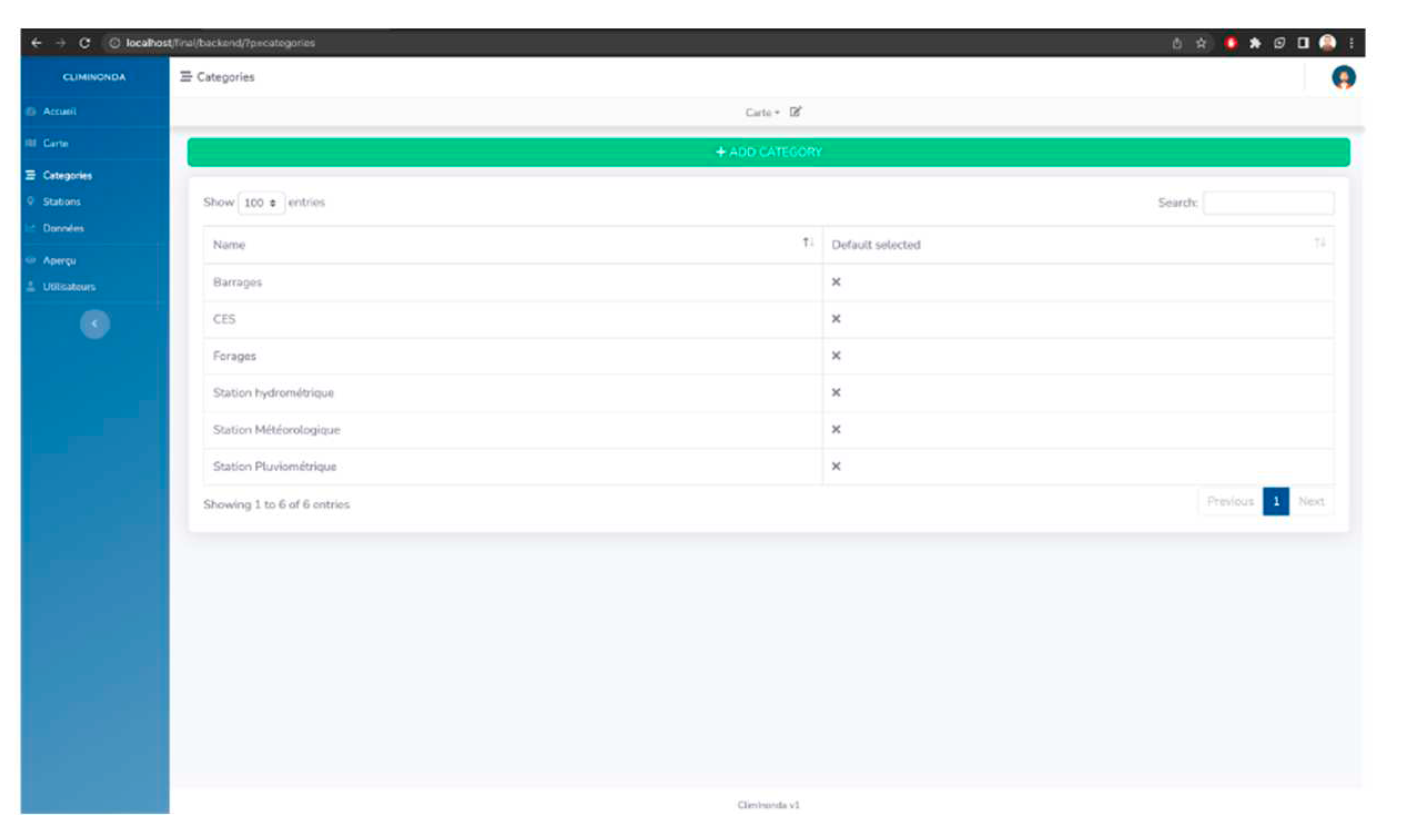
Categories: This table represents the various categories available for stations. Users have the ability to add new categories and define default markers for all stations within a specific category.
Station_Data: The Station_Data table stores all available data associated with a particular station. This data is typically imported by users and stored as JSON files. The table maintains references to the location of these JSON files, serving as the data source for generating graphs and visualizations.
Station_icon: The Station_icon table stores icons that represent markers for each station. These icons visually represent the station on maps or within the application's user interface.
By organizing data into these distinct tables, our database enables efficient storage, retrieval, and management of information related to maps, stations, users, categories, and station-specific data. This structured approach enhances data integrity, simplifies queries and updates, and supports the overall functionality and usability of our application.
Figure 4 and
Table 1 show the key words and the layout of our database, with A: Alphabétique, AN: Alphanumérique, N: Numérique, D: Date
During the registration process, we request several pieces of information from users to create their accounts. These essential details include:
Email address: Users are required to provide a valid email address, which will serve as their unique identifier within the system. This email address will also be used for communication purposes, such as account notifications and password reset requests.
First name: Users are asked to provide their first name, allowing us to personalize their experience within the application and facilitate effective communication.
Last name: Users are also requested to provide their last name, enabling us to accurately identify and address them in any correspondence or interactions.
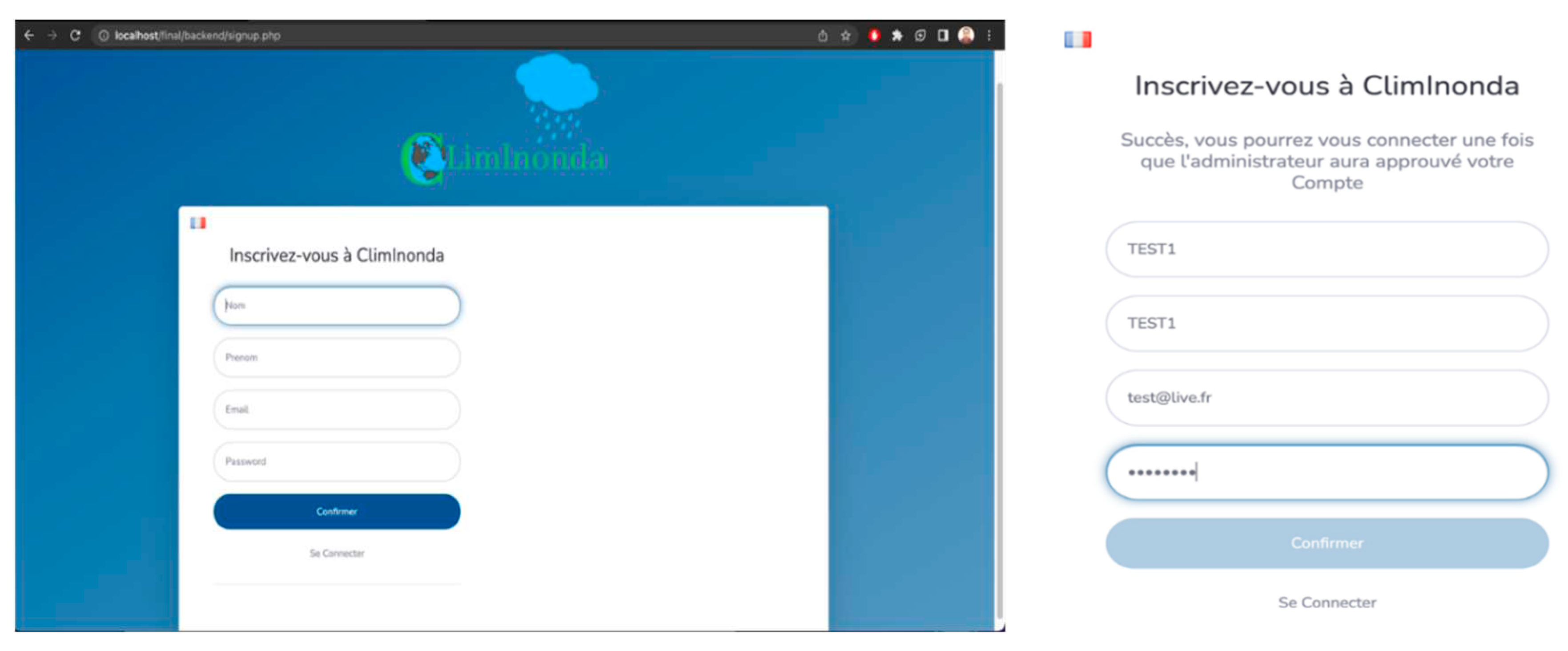
Once a user submits their registration request, it is forwarded to the administrator for review and confirmation. The administrator interface plays a pivotal role in managing user registrations and ensuring the security and integrity of the user base. The administrator reviews the provided information, verifies its accuracy, and evaluates the request before proceeding with confirmation. The administrator interface provides an intuitive and efficient platform for administrators to review and manage user requests. This interface allows administrators to access pending registrations, view the details provided by the user, and make an informed decision regarding their confirmation. This step ensures that only legitimate users are granted access to the system, maintaining its security and preventing unauthorized access. Upon confirming a new user via the administrator interface, the user is granted access to the application, and their account is activated. This confirmation process adds an extra layer of security and ensures that the user base consists of verified individuals. By implementing this registration workflow, we enhance the integrity and security of our user accounts. The involvement of the administrator in the confirmation process allows for careful screening of new registrations, preventing spam or malicious accounts from infiltrating the system. Additionally, this process enables administrators to proactively manage and maintain a trusted user community.
Figure 5 shows the registration interface.
On the login page, users can access their accounts only if their registration has been approved by the administrator. This additional layer of approval adds an important security measure, ensuring that only authorized users can log in and access the application. When users attempt to log in, they are prompted to enter their registered email address and password. Once the login credentials are submitted, the system checks whether the user's account has been approved by the administrator. If the account has not yet been approved, the user receives a notification informing them that their account is still pending approval.
1.2. User- application interface
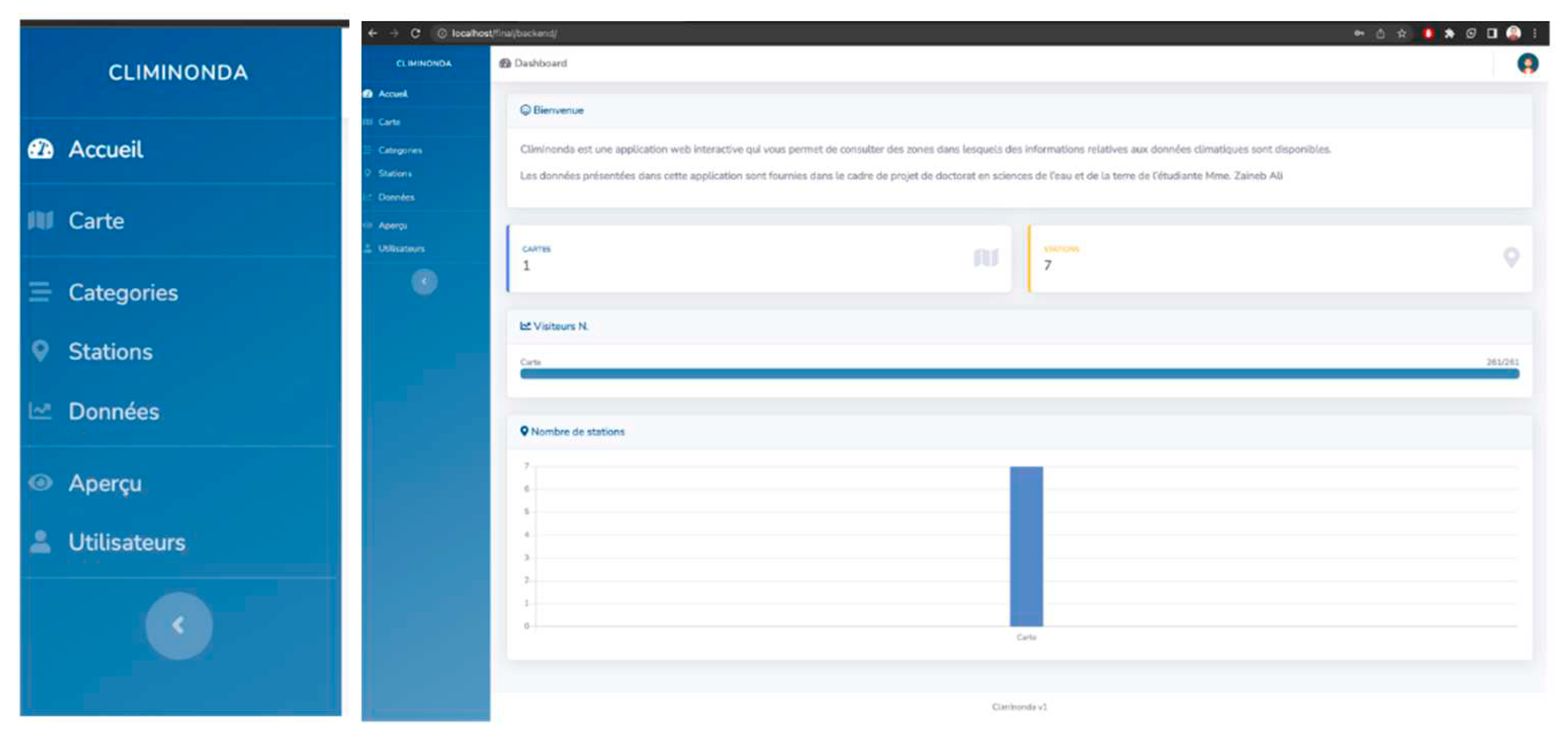
The lateral menu serves as a navigational hub within the application, providing users with easy access to the main tabs and functionalities. It presents a streamlined interface that enhances user experience and facilitates efficient interaction with the various features of the system. The lateral menu typically displays a set of main tabs, each representing a specific functionality or module within the application. These tabs serve as entry points to access different sections and actions, enabling users to seamlessly navigate through the application's capabilities.
Figure 6 shows the login menu.
One notable aspect of the lateral menu is its dynamic nature, where certain functionalities are conditionally displayed based on the user's access authorization. This access control mechanism ensures that users only see and can interact with the features and modules that are relevant and permitted based on their assigned roles and permissions. For instance, an administrator may have access to an array of advanced administrative tools and settings, allowing them to manage users, configure system preferences, and perform administrative tasks. On the other hand, an editor or a visitor may have access to a subset of functionalities tailored to their respective roles and responsibilities. The main page of our application greets users with a warm welcome message, setting a positive tone for their experience. Alongside this message, users will also find two handy widgets that provide valuable information and enhance the overall user interface. The first widget on the main page presents the number of available stations.
This widget serves as a quick reference, allowing users to get an instant overview of the total number of stations within the system. By displaying this information prominently, users can gauge the extent of the station database and gain insights into the breadth of available data. The second widget complements the first one by showcasing the number of available maps. This widget provides users with a snapshot of the map collection in the application, giving them an idea of the variety and scope of maps at their disposal. It serves as a useful indicator, especially for users who rely on maps for their specific tasks or interests within the application. Additionally, on the main page, we incorporate a visitor counter that tracks the number of visitors to our application. This counter captures valuable data about the user engagement and popularity of our system. By monitoring the visitor count, we gain insights into the application's usage trends, peak times, and overall user interest. This information can be used to analyze user behavior, optimize system performance, and make informed decisions for future enhancements.
1.2.1. Map
Within this section, we introduce the map manager, a powerful tool that empowers users to effectively manage maps within the application. The map manager serves as a central hub for users to view, create, and modify maps, offering a comprehensive set of features to enhance their map-related activities. One of the primary functions of the map manager is to provide users with an overview of the maps already created. Through an intuitive and organized interface, users can browse through a list or a visual representation of the existing maps. This allows them to quickly locate and access specific maps of interest, facilitating seamless navigation within the application. Furthermore, the map manager enables users to create new maps, giving them the freedom to design and customize their own geographical representations. Users can utilize various tools and options to define the map's attributes, such as title, description, and other relevant metadata. This flexibility empowers users to tailor maps according to their specific needs, ensuring that they align perfectly with their intended purposes.
Figure 7 shows the different maps used in our application.
In the dedicated tab, as illustrated in
Figure 8, users can explore and manage the categories associated with each station. This tab offers a comprehensive overview of the existing station categories, providing users with the ability to customize, edit, and create new categories based on their preferences and organizational requirements. By accessing this tab, users gain insights into the categorization system employed within the application. They can explore the various predefined categories that have been set up, each representing a distinct classification or grouping for stations. These categories serve as organizational labels or tags, helping users efficiently navigate and locate stations based on their specific criteria or interests. In addition to viewing the existing categories, users are empowered to modify and edit them. This functionality ensures that the category structure remains up-to-date and adaptable to evolving needs. Users can modify category names, descriptions, or any other relevant attributes, aligning them more accurately with their intended purposes or reflecting changes in the station landscape.
1.2.2. Stations
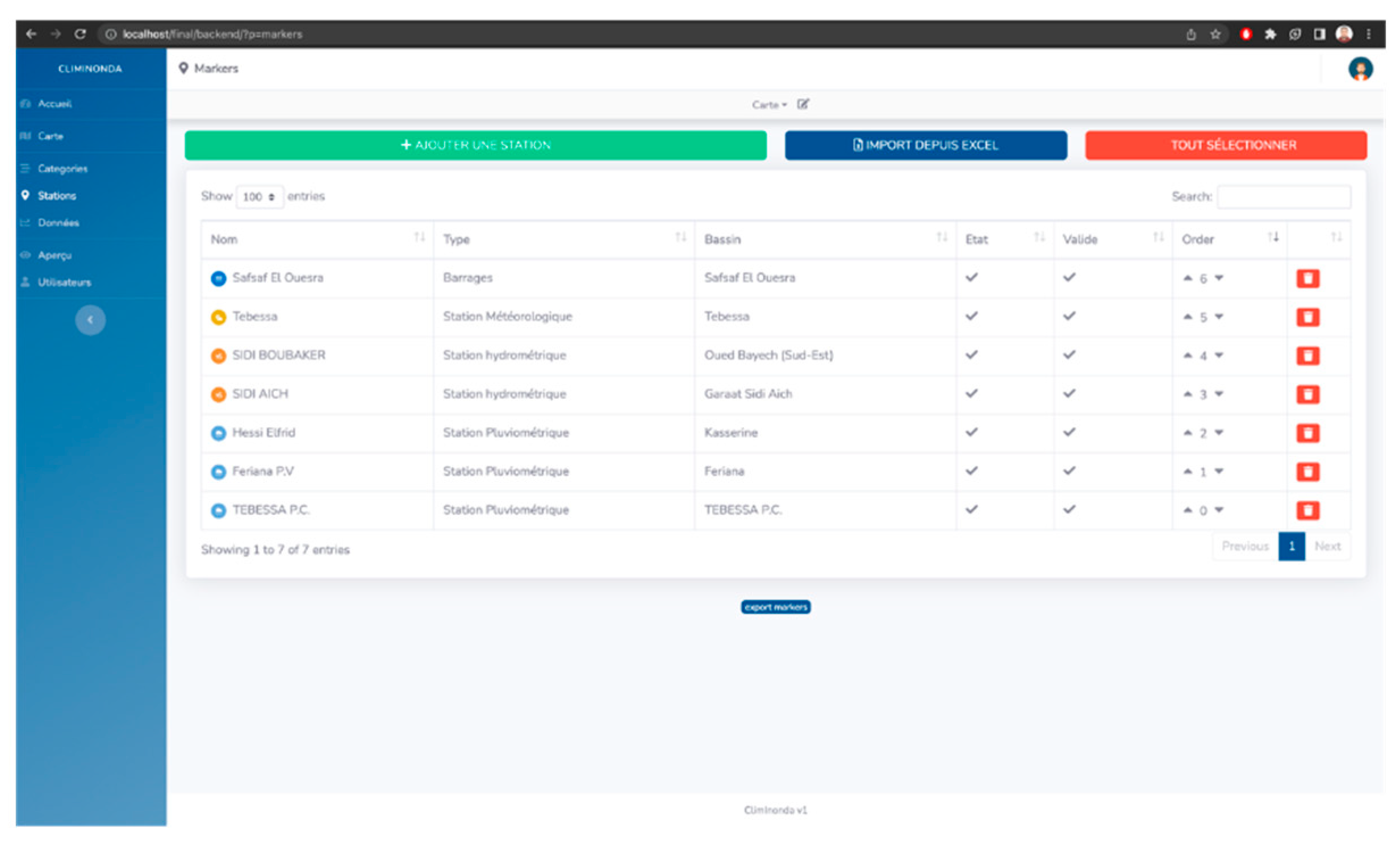
As a key processing mode within our application, the stations management tab focuses on efficient data management. This tab offers users comprehensive control over their stations, providing various tools and functionalities to streamline station-related tasks. Upon accessing the stations management tab, users are presented with a clear and organized list of stations. Each station is accompanied by relevant details such as its type and status, offering users a quick overview of the station database. This consolidated view facilitates easy identification and tracking of stations, allowing users to monitor their data effectively. To further enhance usability, the stations management tab incorporates a search bar and filters. These features enable users to quickly locate specific stations or filter the list based on their specific needs. The search bar allows users to enter keywords or station names, instantly narrowing down the list to the desired results. This functionality saves users valuable time by eliminating the need for manual scrolling and searching through a long list of stations. Additionally, the filters provide users with the flexibility to refine their station list based on specific criteria such as station type or status. By selecting the desired filter options, users can instantly update the displayed list, focusing only on stations that meet their specified criteria. This feature enhances user control and provides a customized view of stations based on their preferences and requirements. The ability to search and filter stations within the stations management tab streamlines data access and organization. Users can easily locate specific stations or sort them based on relevant criteria, improving efficiency and productivity. This feature is particularly beneficial in scenarios where users deal with a large number of stations or need to quickly find stations that match specific characteristics or attributes.
Figure 8 shows the Stations management part.
To add a station to our application, users are required to provide specific information that accurately represents the station's characteristics. This process ensures that the station is appropriately categorized and its details are accurately captured within the system.
The essential information needed to add a station includes:
Station Name: Users are prompted to enter a descriptive name for the station, allowing for easy identification and reference.
Type of Station: Users are prompted to select the appropriate type of station from predefined options or a customizable list. This categorization helps in organizing stations based on their specific characteristics or purposes.
Basin: Users can specify the basin or geographical region to which the station belongs. This information aids in further categorizing and organizing stations based on their location or regional relevance.
Description: Users have the option to provide a brief description or additional details about the station. This allows for a more comprehensive understanding of the station's purpose, features, or any other pertinent information.
Once the required information is provided, users can proceed to choose a suitable style for the station icon. The station icon serves as a visual representation of the station on maps or other graphical interfaces, enabling users to quickly identify and distinguish stations. Following the selection of the icon style, users need to input the latitude and longitude coordinates for the station's location. To simplify this process, an interactive map is integrated into the interface. This interactive map allows users to input the coordinates with ease by simply clicking on the desired location on the map. This feature eliminates the need for manual input and ensures accurate positioning of the station on the map. The integration of an interactive map not only simplifies the process of entering coordinates but also enhances user experience and reduces the chances of error. Users can visually confirm the accuracy of the selected location, improving the precision and reliability of the station's placement within the application shown in
Figure 9.
1.3. Implementation
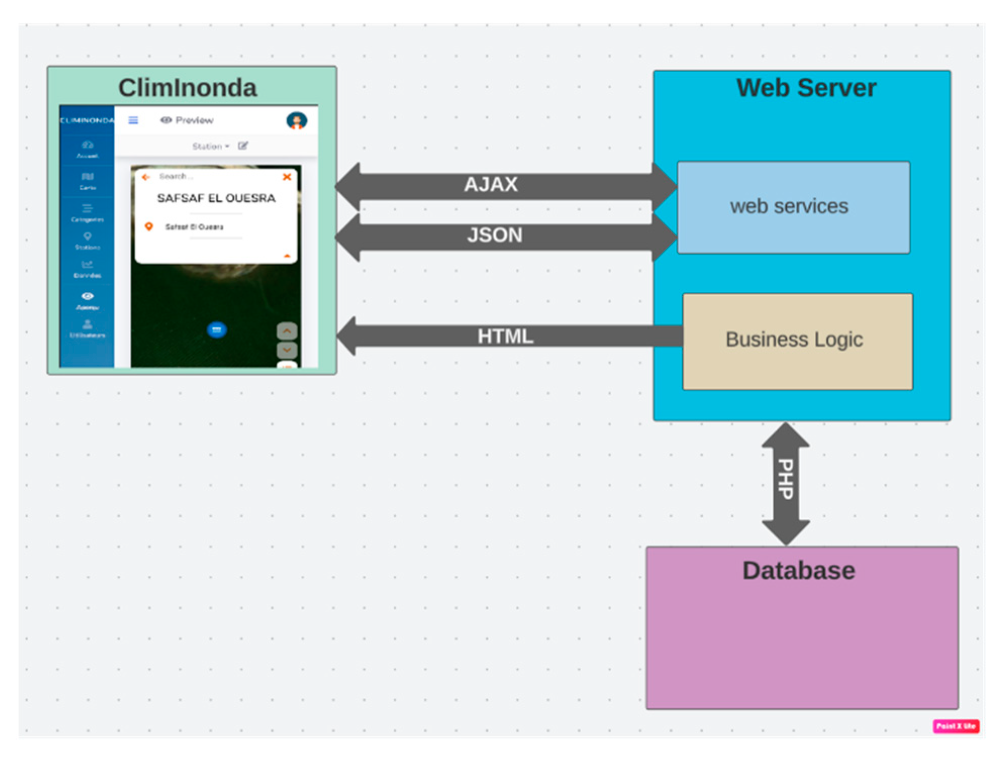
The application developed in our research work is structured into three distinct blocks, each serving a specific purpose in the overall functionality of the system.
Front-end: The front-end component encompasses the user interface and everything that users can see and interact with. It includes the visual elements, design, and layout of the application. Users can access various features and functionalities through the front-end, such as viewing maps, managing stations, and analyzing data. When the front-end requires data from the system, it communicates with the back-end using HTTP requests. These requests serve as a means for the front-end to retrieve and send data to the back-end for processing and retrieval.
Back-end: The back-end component represents the server-side of the application. It is responsible for handling the processing, calculations, and logic required to provide the requested data and perform necessary operations. The back-end interacts with the front-end by receiving HTTP requests and generating appropriate responses. It retrieves data from the database, performs required computations, and returns the results to the front-end. The back-end is designed to efficiently handle multiple user requests, ensuring smooth operation and responsiveness of the application.
Database: The database component plays a vital role in storing and managing the application's data. It serves as a repository for storing information related to maps, stations, user details, and other relevant data. The database communicates with the back-end through transactions, enabling seamless data retrieval, updates, and storage. It ensures data integrity, security, and efficient access to information when requested by the back-end. The database serves as a reliable and scalable storage solution, allowing the application to handle large volumes of data and support concurrent user interactions.
The division of the application into these three blocks ensures a modular and scalable architecture. The front-end provides an intuitive and user-friendly interface, facilitating user interactions. The back-end handles the computational and processing tasks, serving as the core engine of the application. The database serves as a reliable and efficient storage solution, ensuring data integrity and accessibility. By adopting this architecture, the application achieves a separation of concerns, making it easier to maintain, update, and scale. It allows for flexible development and facilitates the integration of additional features and enhancements in the future. The collaboration between the front-end, back-end, and database components ensures a cohesive and robust application that meets the needs of users and effectively manages the data of the system.
Figure 10 show an implementation graph for our developed application.
3. Results
Collecting data in the study area was very difficult because the relatively large study site, especially the basin, is the transboundary basin. Data collection and management is an essential and very important step towards a better understanding of the hydrological model and its requirements. The type of data (precipitation, hydrometric, meteorology, topographic, etc.) has a great influence on the model production. This is the reason we thought about creating a web application called ClimInonda.
This web application can be used in a PC or a mobile device (Android). As this web application is executed by means of a server, a web browser is necessary. The result of this work is a user interface that shows the information that users require and request. This information is taken from databases. Morever, this web application can be a good solution in the different governorates (Gafsa, Kasserine and Tebessa) in the study area. This application can be visualized the different data (rainfall, runoff and LULC) in the study area, and we can use this application in many ways for the management of the different data.
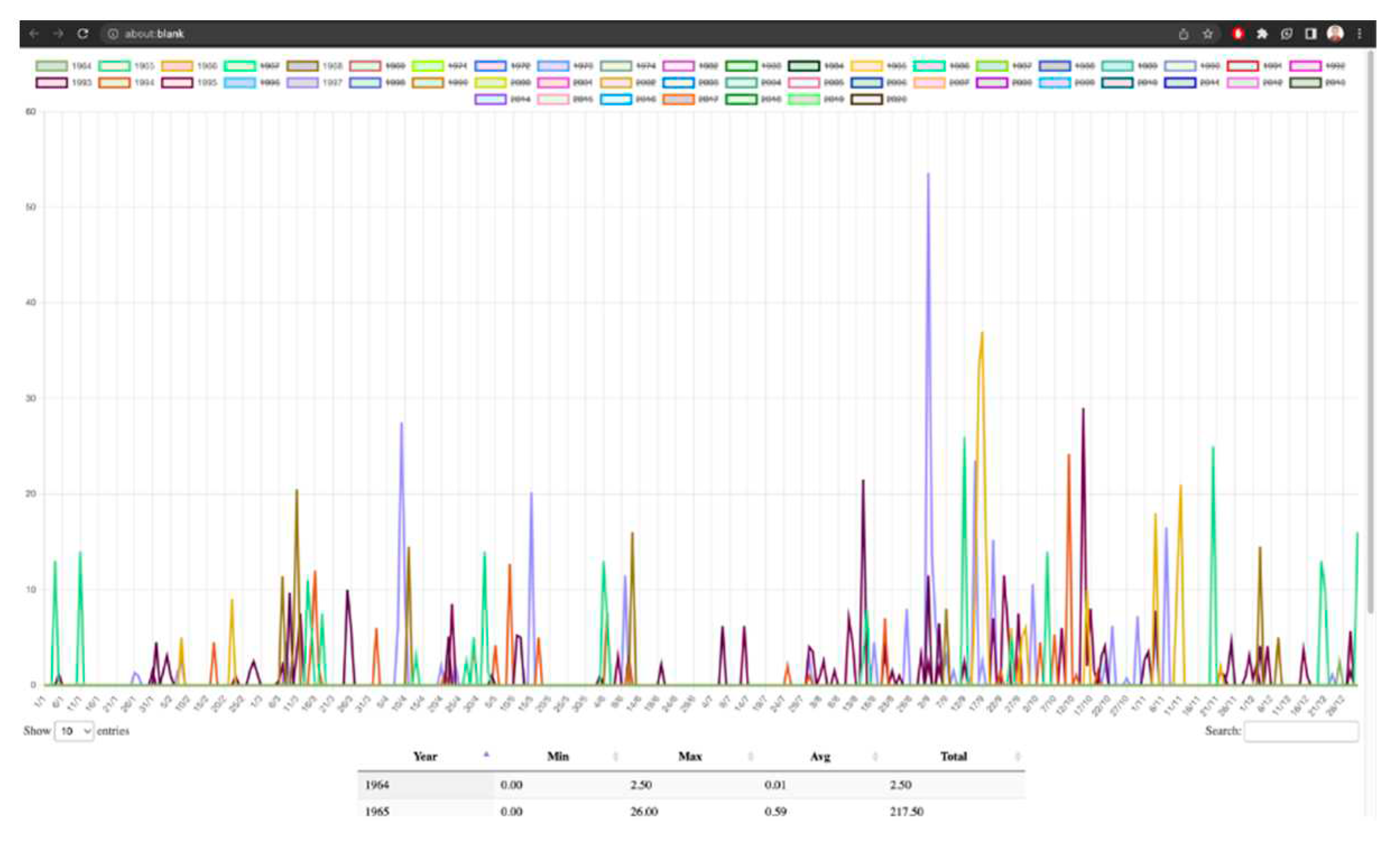
Data visualization is a very important step in our application, within this tab, users can access and explore the collected data available for a specific station. The tab provides a comprehensive view of the data, empowering users to analyze, download, and manage the collected information effectively. When accessing the tab, users are presented with a range of features that facilitate data exploration. Users can view graphs that represent the collected data, allowing for visual analysis and insights into trends, patterns, or relationships within the dataset. These graphs provide a visual representation of the data, enabling users to derive meaningful interpretations and make informed decisions based on the presented information. Additionally, users have the option to download the collected data for further analysis or offline use. By selecting the download feature, users can obtain a copy of the data in a suitable format, such as CSV or Excel. This functionality enables users to perform in-depth analyses, share the data with colleagues or external stakeholders, or integrate it into other applications or systems as needed. Furthermore, the tab allows users to delete specific data entries if necessary. This feature grants users the ability to remove unwanted or irrelevant data points from the dataset, ensuring data cleanliness and accuracy. Deleting data entries can be particularly useful in scenarios where erroneous or duplicate data has been collected or when data retention policies require the removal of certain records. By incorporating these features, the tab provides users with a comprehensive set of tools to manage the collected data effectively. Users can visualize the data through graphs, download it for further analysis, and selectively delete data entries when required. This functionality promotes data exploration, analysis, and decision-making within the application, empowering users to derive valuable insights from the collected data.
Figure 11 shows the data visualization icon.
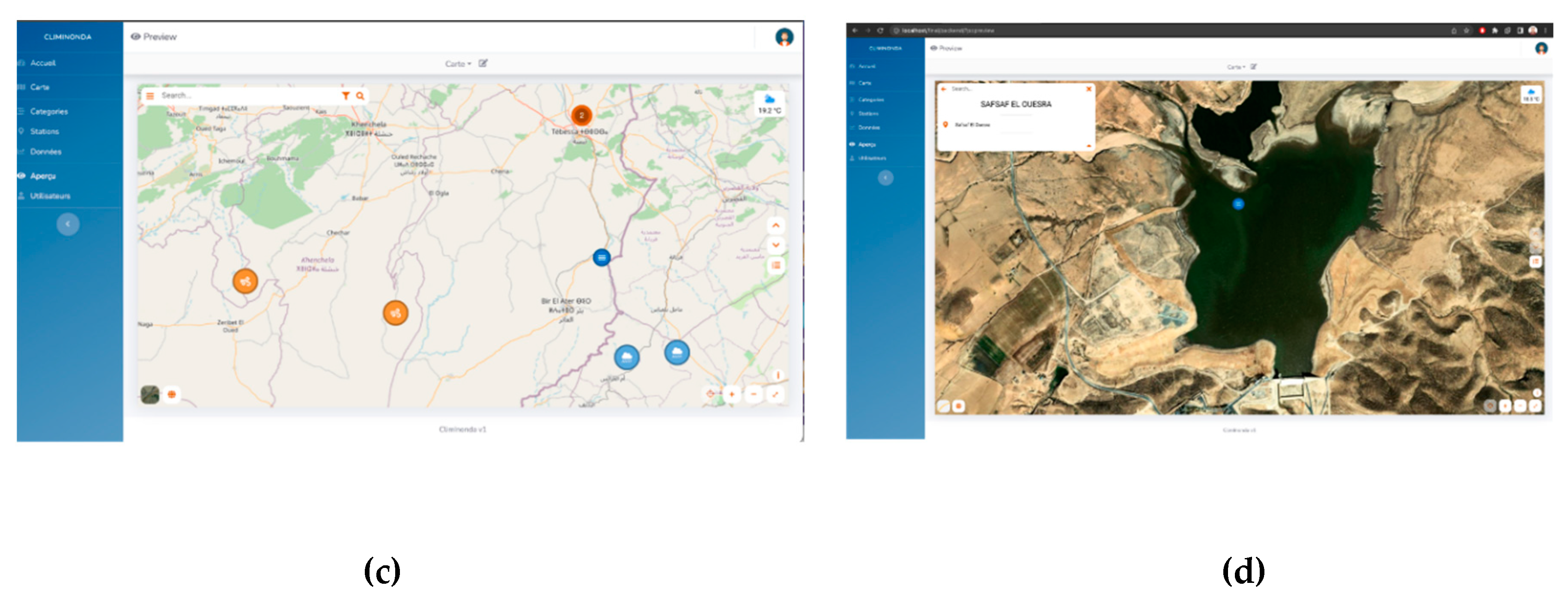
Additionally, our application includes a dedicated tab that provides users with a visual overview of all available stations and their corresponding status on a map. This tab offers a convenient and user-friendly interface to explore and interact with the station network, providing valuable insights at a glance. Upon accessing this tab, users are presented with an interactive map that displays the geographic locations of all stations. The map serves as a powerful visualization tool, allowing users to quickly assess the distribution and density of stations across different regions or areas of interest. To cater to individual preferences, users have the flexibility to choose between two viewing options: satellite view or field view. The satellite view provides a realistic representation of the actual geographic surroundings, incorporating aerial imagery and terrain features. On the other hand, the field view presents a simplified and schematic representation, focusing on the essential information and minimizing visual clutter. This choice empowers users to customize their viewing experience based on their preferences and specific requirements. Furthermore, the tab offers a robust search functionality that enables users to locate specific stations with ease. By utilizing the search feature, users can enter relevant keywords or station names to filter and highlight specific stations on the map. This capability significantly streamlines the process of finding stations, particularly when dealing with a large number of stations or when searching for stations in a specific area. Figure 12 shows the geographical representation and the data graph.
With this study, what has been accomplished is to unify valuable information for the user into a responsive web with user-friendly visualization on both PC and mobile devices. It also enables data integration within the ClimInonda platform.
4. Discussion
Our web application will be a solution for the decision-makers of various delegations in the study area, in terms of the services presented by the application, be it data, mapping, request for information on stations, dams. In Tunisia, there are applications aimed at irrigation, fire, agriculture in general, for example, examples of applications in Tunisia in the field of agriculture may be mentioned:
Smart Farm is developing a real-time decision-making plan for smart irrigation. Its solution consists of two parts: The Hardware part (soil sensor) which acts as a data collector. And the Software part (web and mobile platform) that acts as a business advisor.
In addition, Ezzayra has developed an agricultural software (ERP) to manage the daily operations of a company, by generating KPI (Key Performance Indicator) monitoring dashboards for detailed, real-time management of production factors. The software has a reliable traceability system. In addition, the startup iFarming has developed Phyt'Eau, which is a smart precision irrigation solution based on scientific algorithms that enable real-time simulation of crop water requirements while taking into account their natural factors. All this for a water conservation greater than 40%. In the field of hydrology and primarily the management of precipitation and hydrometric data and the prediction of flood risk in the future, and especially in arid and semiarid regions at this time, our application is the first model. Computerized climate data management systems give users unprecedented control and insight into their land and operations. All of this is achieved through an inspiring combination of research and development in engineering, computer science, and hydrological sciences.
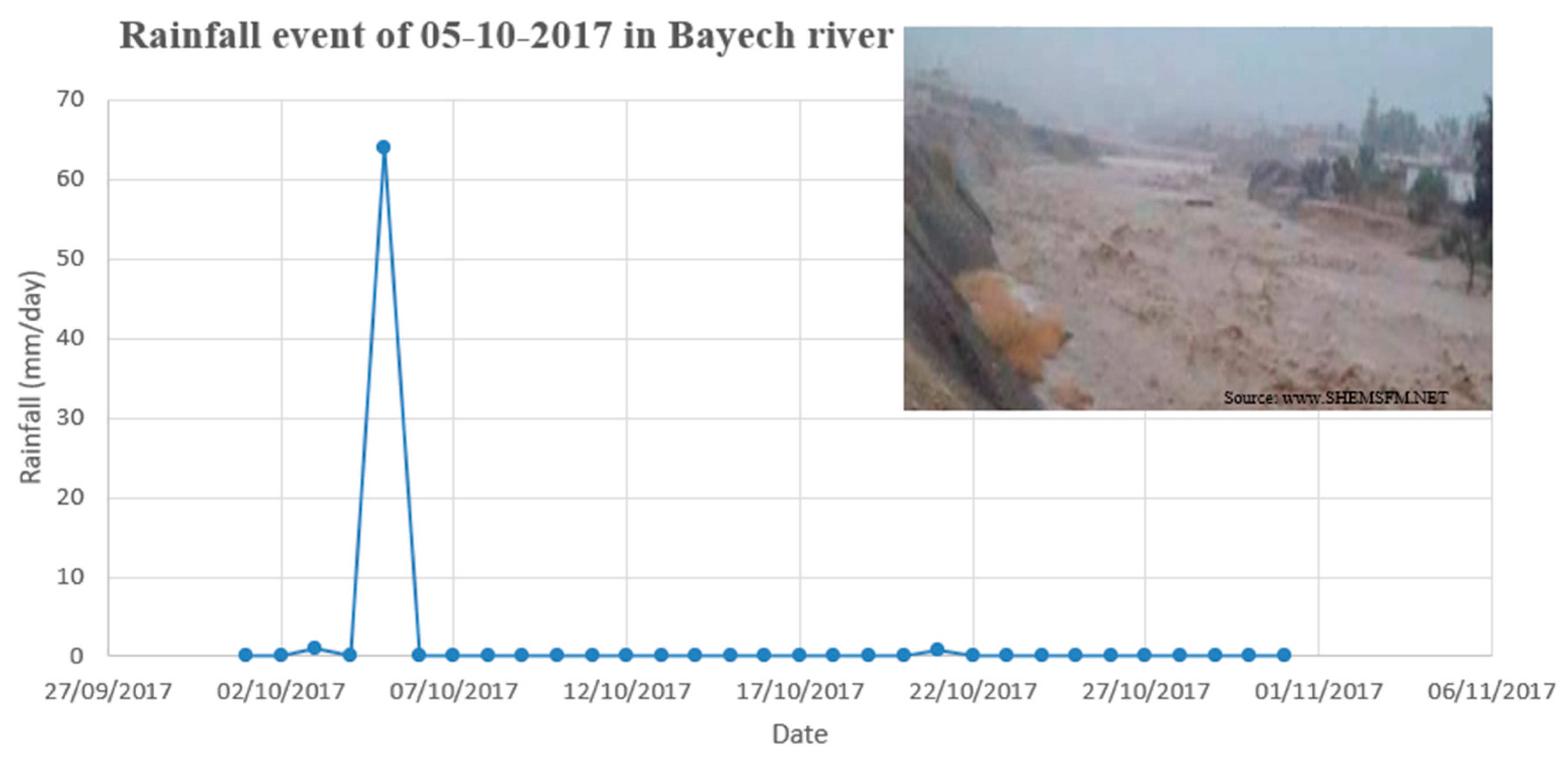
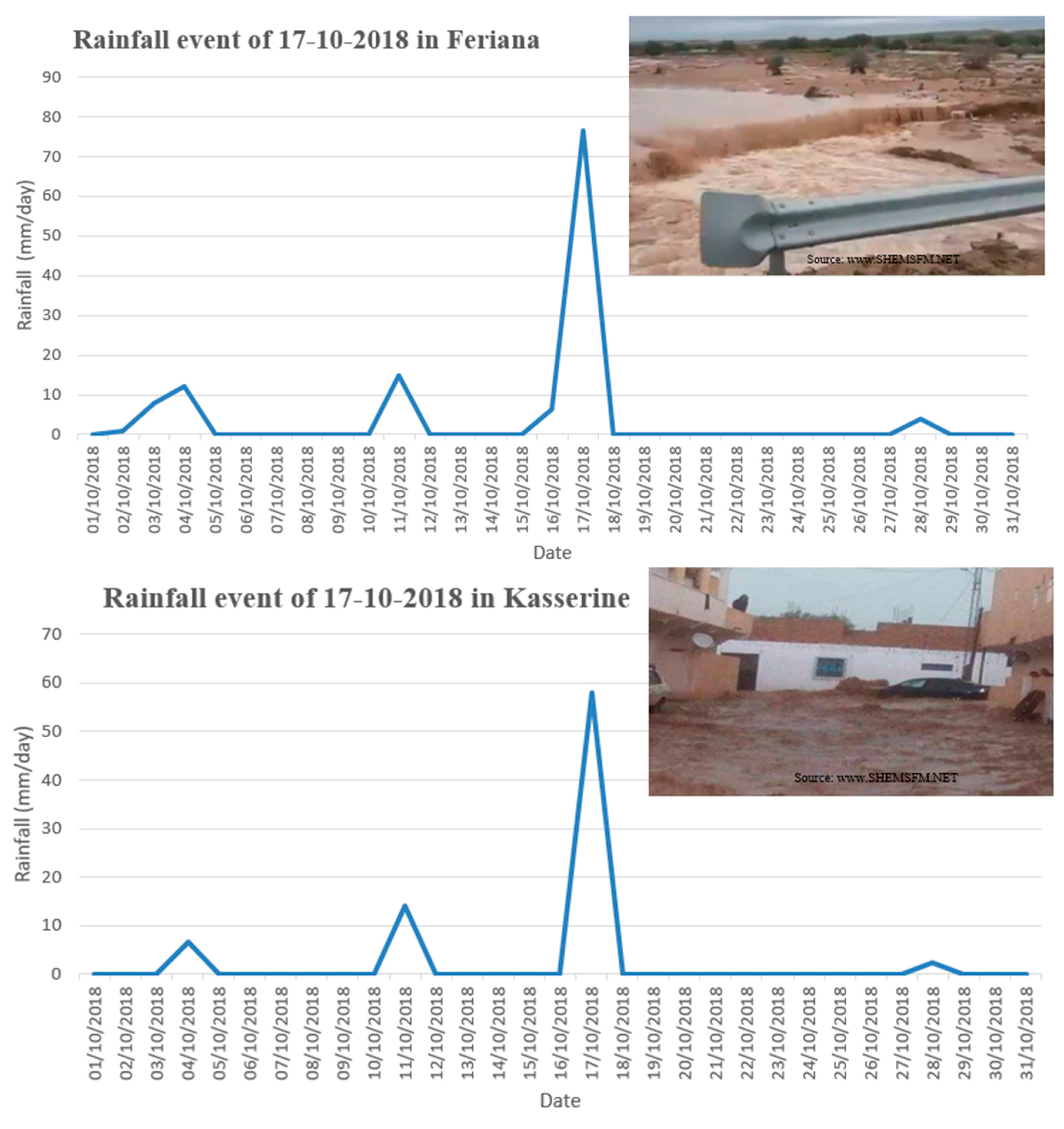
Table 2 presents the implications of a very wet event for various cities in the study area.
Table 2. Rainfall events in the study area.
5. Conclusions
The ClimInonda web application innovatively presents the different data collected from the sensors of meteorological and hydrometric stations supplied or held by different organisations. With the data offered by these stations, an adaptive and responsive web application has been developed which makes it possible to consult the daily, monthly or annual rainfall data for separate stations. With the developed web application, access can be obtained to all the information from any device in a much easier and more convenient way to consult the different types of data, weather forecasts and details of selected station. Also, we will have to work on the second part of the application, which will be on predicting the risk of flooding in real time from Landsat and Sentinel images and from previous flood observation points in different areas, including the type of land use (urban area, bare land, forest, wadis, agricultural area, etc.) on the study site.
Author Contributions
Conceptualization, Zaineb. Ali. and Mohamed. Ouessar.; Methodology, Zaineb. Ali., Mohamed. Ouessar., Amine. Saddik. and Adnane. Labbaci.; Software, Amine. Saddik. and Brahim. Erraha.; Validation, Zaineb. Ali.; Formal analysis, Mohamed Ouessar. and Adnane Labbaci.; Investigation, Zaineb Ali.; Resources, Zaineb. Ali.; Data curation, Zaineb. Ali.; Writing—original draft, Zaineb. Ali., Amine. Saddik. and Mohamed. Ouessar.; Writing—review & editing, Mohamed. Ouessar., Adnane. Labbaci. and Brahim. Erraha.; Visualization, Zaineb. Ali.; Supervision, Mohamed. Ouessar. and Adnane. Labbaci.; Project administration, Mohamed. Ouessar.; Funding acquisition, Mohamed. Ouessar. All authors have read and agreed to the published version of the manuscript.
Data Availability Statement
Not applicable.
Acknowledgments
This publication is part of the Ph.D. research of the first author, which was partly funded by the MHESR of Tunisia (Contrat Programme Labo LR16IRA01) and the EU-Prima AG-WaMED project. We also acknowledge special support from the MedAgriFood RESILIENCE project funded by SUSFOOD2We. We would like to thank Mr. Nabil Boulartal for his technical and field assistance and for their help and kindness during my scientific internship at the Faculty of Sciences of Ibn Zohr Agadir, Morocco. Thanks to CRDAs of Gafsa and Kasserine for providing data about rainfall and wadi flows.
Conflicts of Interest
The authors have no relevant financial or non-financial interests to disclose.
References
- Ewing, G.; Demir, I. An ethical decision-making framework with serious gaming: a smart water case study on flooding. J. Hydroinformatics 2021, 23, 466–482. [Google Scholar] [CrossRef]
- Dawson, C.; Abrahart, R.; See, L. HydroTest: A web-based toolbox of evaluation metrics for the standardised assessment of hydrological forecasts. Environ. Model. Softw. 2007, 22, 1034–1052. [Google Scholar] [CrossRef]
- Xu, H.; Demir, I.; Koylu, C.; Muste, M. A web-based geovisual analytics platform for identifying potential contributors to culvert sedimentation. Sci. Total. Environ. 2019, 692, 806–817. [Google Scholar] [CrossRef] [PubMed]
- Brendel, C.E.; Dymond, R.L.; Aguilar, M.F. An interactive web app for retrieval, visualization, and analysis of hydrologic and meteorological time series data. Environ. Model. Softw. 2019, 117, 14–28. [Google Scholar] [CrossRef]
- Cowden, J.R.; Watkins, D.W.; Mihelcic, J.R. Stochastic rainfall modeling in West Africa: Parsimonious approaches for domestic rainwater harvesting assessment. J. Hydrol. 2008, 361, 64–77. [Google Scholar] [CrossRef]
- Kigobe, M.; McIntyre, N.; Wheater, H.; Chandler, R. Multi-site stochastic modelling of daily rainfall in Uganda. Hydrol. Sci. J. 2011, 56, 17–33. [Google Scholar] [CrossRef]
- Horsburgh, J.S.; Tarboton, D.G.; Piasecki, M.; Maidment, D.R.; Zaslavsky, I.; Valentine, D.; Whitenack, T. An integrated system for publishing environmental observations data. Environ. Model. Softw. 2009, 24, 879–888. [Google Scholar] [CrossRef]
- J. S. Horsburgh.; A. S. Jones.; M. RamÃŁrez.;J. Caraballo. Time Series Analyst: Interactive Online Visualization of Standards Based Environmental Time Series Data.
- Smith, J.P.; Hunter, T.S.; Clites, A.H.; Stow, C.A.; Slawecki, T.; Muhr, G.C.; Gronewold, A.D. An expandable web-based platform for visually analyzing basin-scale hydro-climate time series data. Environ. Model. Softw. 2016, 78, 97–105. [Google Scholar] [CrossRef]
- Mason, S.J.; Cleveland, S.B.; Llovet, P.; Izurieta, C.; Poole, G.C. A centralized tool for managing, archiving, and serving point-in-time data in ecological research laboratories. Environ. Model. Softw. 2014, 51, 59–69. [Google Scholar] [CrossRef]
- T. Mitchell. Web Mapping Illustrated: Using Open Source GIS Toolkits. first ed. O’Reilly Media, 2005.
- Fielding, Roy Thomas. Architectural Styles and the Design of Network-Based Software Architecture. 2000.
- Gkatzoflias, D.; Mellios, G.; Samaras, Z. Development of a web GIS application for emissions inventory spatial allocation based on open source software tools. Comput. Geosci. 2013, 52, 21–33. [Google Scholar] [CrossRef]
- Bürger, C.M.; Kollet, S.; Schumacher, J.; Bösel, D. Introduction of a web service for cloud computing with the integrated hydrologic simulation platform ParFlow. Comput. Geosci. 2012, 48, 334–336. [Google Scholar] [CrossRef]
- Jonoski, A.; Alfonso, L.; Almoradie, A.; Popescu, I.; Van Andel, S.J.; Vojinovic, Z. Mobile phone applications in the water domain. Environ. Eng. Manag. J. 2012, 11, 919–930. [Google Scholar] [CrossRef]
|
Disclaimer/Publisher’s Note: The statements, opinions and data contained in all publications are solely those of the individual author(s) and contributor(s) and not of MDPI and/or the editor(s). MDPI and/or the editor(s) disclaim responsibility for any injury to people or property resulting from any ideas, methods, instructions or products referred to in the content. |
© 2023 by the authors. Licensee MDPI, Basel, Switzerland. This article is an open access article distributed under the terms and conditions of the Creative Commons Attribution (CC BY) license (http://creativecommons.org/licenses/by/4.0/).
