1. Introduction
This author entered the UK National Health Service (NHS) in the early 1990s and was quickly involved in planning for the construction of a new hospital. I was informed that the ‘correct’ way to forecast future bed numbers was to take age-banded current admission rates and use forecast population demographic changes (age-based forecasting) to estimate future inpatient admissions and to multiply such future admissions by the anticipated future average length of stay (LOS) to arrive at occupied bed days, and then apply an occupancy margin to arrive at the number of available beds.
I very quickly realized that this method was entirely unreliable and seemed to be deemed ‘correct’ simply because it grossly underestimated future demand, thereby ‘confirming’ the political view that the UK needed fewer hospital beds because the NHS was ‘inefficient’. The huge deficiency in this method is that the admission rate per head of population is assumed to stay constant, while the reality is that it increases over time [
1,
2], as the scope of medical interventions grows, hence the threshold to admission declines due to the realization that new interventions can extend lifespan. An example of this is given in
Figure 2 later in the text. In theory, this eventuality was supposed to be covered by an assessment of the likely impact of new technology, however in practice this was always underestimated.
Indeed, the reality was that although the NHS was operating with fewer and fewer available beds, the average overnight stay bed occupancy rate was rapidly rising (with associated operational problems), and the number of occupied beds had not changed since 1998/99 [
3] – although the models said they were supposed to be declining. This led to a 30-year search for reliable methods for both the number of occupied beds and their associated optimum average occupancy margin. Over 50 papers were subsequently published exploring the various issues directly relating to bed numbers and occupancy, while a further 200 were published on the issues of infectious outbreaks and the effects upon healthcare demand and costs - hence the financial risk implied to purchasers and providers [
4]. Throughout this review the body of supporting publications by this author will not be frequently referenced as it is assumed that the reader will make themselves aware of the scope of this wider evidence [
4].
This search eventually led to the interesting observation that occupied bed numbers appeared to be strongly influenced by the absolute number of deaths [
5,
6]. This seemingly contradictory finding to the currently accepted views arises for several reasons [
2,
7]:
Around 55% of a person’s lifetime hospital bed usage occurs in the last year of life, irrespective of the age at death.
Increased lifespan expands the opportunity for lifetime hospital admissions and hence the 55% figure (#1 above) leads to a steady inflation of bed demand with increasing longevity.
About half of medical bed occupancy appears to be influenced by fluctuations in the absolute number of deaths, seemingly due to local and national outbreaks of infectious agents. On this occasion deaths are serving as a proxy for the specific and nonspecific effects of wider infections, mediated by inflammatory and other processes, necessitating hospital admission but not leading to immediate death. The COVID-19 pandemic is an excellent example of this relationship where there are far more admissions than deaths.
In an ageing population with increasing multimorbidity, the ‘at risk’ population where (fluctuations in) the absolute number of deaths is serving as a proxy for morbidity, is also increasing with time.
In deprived/poorer areas the population tends to die at a younger age, hence, bed usage is moved forward in time due to #1 above.
One of the more interesting observations was that the trends in emergency admissions appeared to be behaving like a series of infectious outbreaks over and above the usual winter influenza outbreaks [
8,
9,
10,
11,
12]. Interesting confirmation of such a possibility comes from the fact that as of 2022 there were around 3,000 species of known human pathogens [
13]. The large majority are unexplored regarding their clinical effects, and indeed no one routinely tests for their presence – other than the more commonly known species. Modern high speed/volume travel (air/rail/road) implies that these pathogens are spread rapidly around the world [
14,
15,
16,
17]. As if 3,000 species of pathogen were not of sufficient concern, each species represents a wide range of sub-species strains and variants with a diverse range of clinical effects. Also, dual infections (superinfection and coinfection) are very common [
18,
19].
2. The case for unrecognized pathogen outbreaks
2.1. Evidence for such outbreaks
Is there any evidence that unknown pathogen outbreaks are a frequent occurrence? The best evidence for such a proposal comes from the small-area behavior of deaths – which are displaying apparently ‘unexplained’ short-term trends. Hence, for each area there will be a general long-term trajectory for deaths which depends on past births, changes in life expectancy, and net migration. This trajectory will be available in all developed countries and forms part of the population forecasting process. However, the shape of this trajectory will be a smooth line describing future population and deaths.
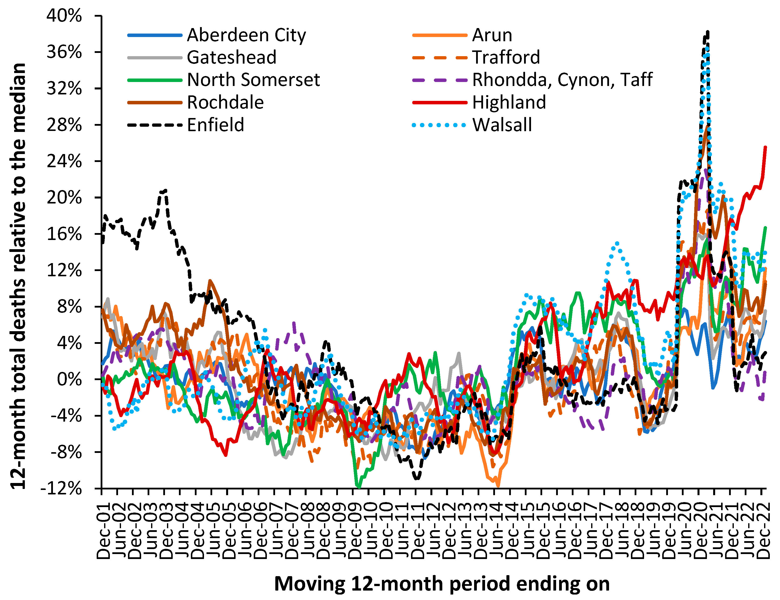
Figure 1 illustrates that the actual trajectory is far from smooth line. The UK local authorities in
Figure 1 were randomly chosen with the criteria of having just over 2000 deaths per annum in 2001. The displayed trajectory is a moving 12-month total commencing on Dec-01. In a moving 12-month total the usual level of seasonal cycles are removed since point includes all 12-months. The existence of such trajectories has been largely ignored by epidemiologists because it was assumed there was no explanation for the observed behavior. Winter cold-snaps or summer heatwaves cannot explain the behavior since they are usually of such short duration as to make a negligible impact on the 12-month total. By choosing local authorities with above 2000 deaths per annum the role of Poisson-based randomness is likewise excluded since 1 standard deviation of Poisson variation only accounts for ± 2% variation. This is reflected in the very small background ‘wriggles’ in the trendlines.
Figure 1.
Moving 12-month total of deaths, relative to the median value, 2001 to 2022 for a random selection of 10 local authorities in England, Scotland, and Wales. The selection criteria were between 2100 and 2600 total deaths in 2001. Monthly deaths for local authorities are from the Office for National Statistics (ONS) [
20].
To explain the residual peaks and troughs it is illustrative to point to the disruption caused by the COVID-19 pandemic where deaths peak in the 12-month total ending around Mar-21. This is the outcome of a very real pathogen. However, notice the vast difference in COVID-19 deaths between Enfield (London) and Walsall (Midlands) and the almost minor effect in Aberdeen City (Scotland) or Gateshead (N.E. England). The highly granular effect in
Figure 1 arises from the role of super-spreaders and super-spreader events (SSEs) upon infectious transmission [
21,
22,
23].
Figure A1 shows a similar situation for nine London Boroughs where proximity precludes wider effects due to weather patterns or other regional effects.
For example, note the very high deaths for the 12-month total in 2005 in Rochdale while Highland experiences a minimum. A similar situation exists in
Figure A1 with low deaths in Richmond-on-Thames during 2009 when the other boroughs are generally high. Sutton is worst affected during an event occurring in 2014/15 with highest moving 12-month total measured in March 2015, which barely affects Kensington and Chelsea.
Note the implication of the high/low points. Hence a peak implies an extended period of sustained high deaths, while a minimum implies a switch to low mortality. The low mortality extended periods can be inferred to have a low net pathogen health load and vice versa. Such switching is made possible due to pathogen interference, where infection with one pathogen modifies the frequency and clinical outcome of subsequent infections [
13]. Pathogen interference arises from the production of interferons, which is regulated by the expression of small noncoding RNAs (miRNAs) [
13,
24]. Discussed further in the next section. Pathogen interference then amplifies/dampens the local effects depending on the local mix of pathogens circulating at the point when the new pathogen is introduced via a super-spreader or SSE.
Differences in timing and magnitude are widely evident in
Figure 1 and
Figure A1. Spatial analysis of such events shows neighborhood-area behavior characteristic of infectious transmission [
9,
10,
12].
From
Figure 1 and
Figure A1 it is concluded that the possibility of previously undocumented (mainly local) infectious events is very real and has a direct effect upon total deaths and hence upon wider morbidity leading to hospital admission and bed demand. The key point being that the local events show high volatility, and by implication the need for an appropriate average occupancy in local hospitals to accommodate such fluctuations in demand – indeed the overwhelming bed demand seen during the early stages of the COVID-19 pandemic. The evidence has seemingly been lying right under our nose, but that traditional disease surveillance has completely failed to detect such small area impacts.
The central flaw in existing surveillance systems is that they are heavily biased to detect explosive disease outbreaks such as influenza or COVID-19. This bias is further exacerbated by the methods used to select the baseline for deaths. This problem is amply illustrated in
Figure 1 and
Figure A1 in that the ‘true’ baseline is hidden among high volatility. One solution is to select a low pathogen baseline which intersects the minimum points in the long-term trend [
25]. An example is given for the USA later.
At this point it must be noted that a moving 12-month total does not make any assumptions regarding a baseline and is especially useful at detecting non-standard outbreaks – which may be expected from 3000 species of pathogen [
13]. However, it only works retrospectively.
Current disease surveillance is also heavily focused on a narrow range of pathogens with identifiable symptoms, i.e., Ebola, hemorrhagic fever, influenza, etc., whilst it is suggested that some 3000 species of pathogen are likely to have a wide range of nuanced effects against pre-existing conditions and will therefore go unreported or more correctly misreported. One example of more nuanced associations is the well-known link between influenza and acute cardiovascular events [
26].
2.2. How pathogens interact with existing diseases
All will be familiar with the function of the immune system during infection; however, few will be aware that immune function and many diseases are regulated by small noncoding RNAs (miRNAs). The miRNAs act to regulate gene expression which then impacts upon metabolic pathways, etc. miRNAs therefore serve as the common interface between pathogens and disease initiation and exacerbation [
27,
28,
29,
30,
31] – hence the seeming inexplicable trends seen in
Figure 1 and
Figure A1.
One expression of this interaction is called ‘pathogen interference’ whereby infection with one pathogen stimulates the production of a range of miRNAs which then alter the expression of interferons which in turn then alter the ability of other pathogens to infect that individual [
13]. Changes in interferon production is only one of many induced changes in cellular function, metabolism, and immune responses such as inflammation which can include damaging cytokine storms [
27,
28,
29,
30,
31]. Such processes can then trigger autoimmune conditions and malignancies in genetically and epigenetically susceptible individuals [
32,
33].
In such a context
Figure 1 becomes entirely understandable and implies that so-called health service demand management may be far more nuanced than has been appreciated. The COVID-19 pandemic with associated long-COVID [
34] is an excellent example of the difficulty in ‘managing’ such events given unexpected knock-on effects. Such unexpected knock-on effects are probably more widespread than anticipated and may include poorly understood conditions such as chronic fatigue syndrome or myalgic encephalomyelitis (ME/CFS) and other syndromic conditions which are surprisingly like long-COVID.
2.3. Death as a proxy for wider admissions
The action of infections upon acute demand can be very subtle. For example, persons feeling unwell due to an infection may experience higher numbers of injuries, falls and fractures – most of which may not immediately lead to death. However, in other persons the same infection may exacerbate other conditions which may involve death. If we accept the proposal that deaths are serving as a proxy for acute admissions
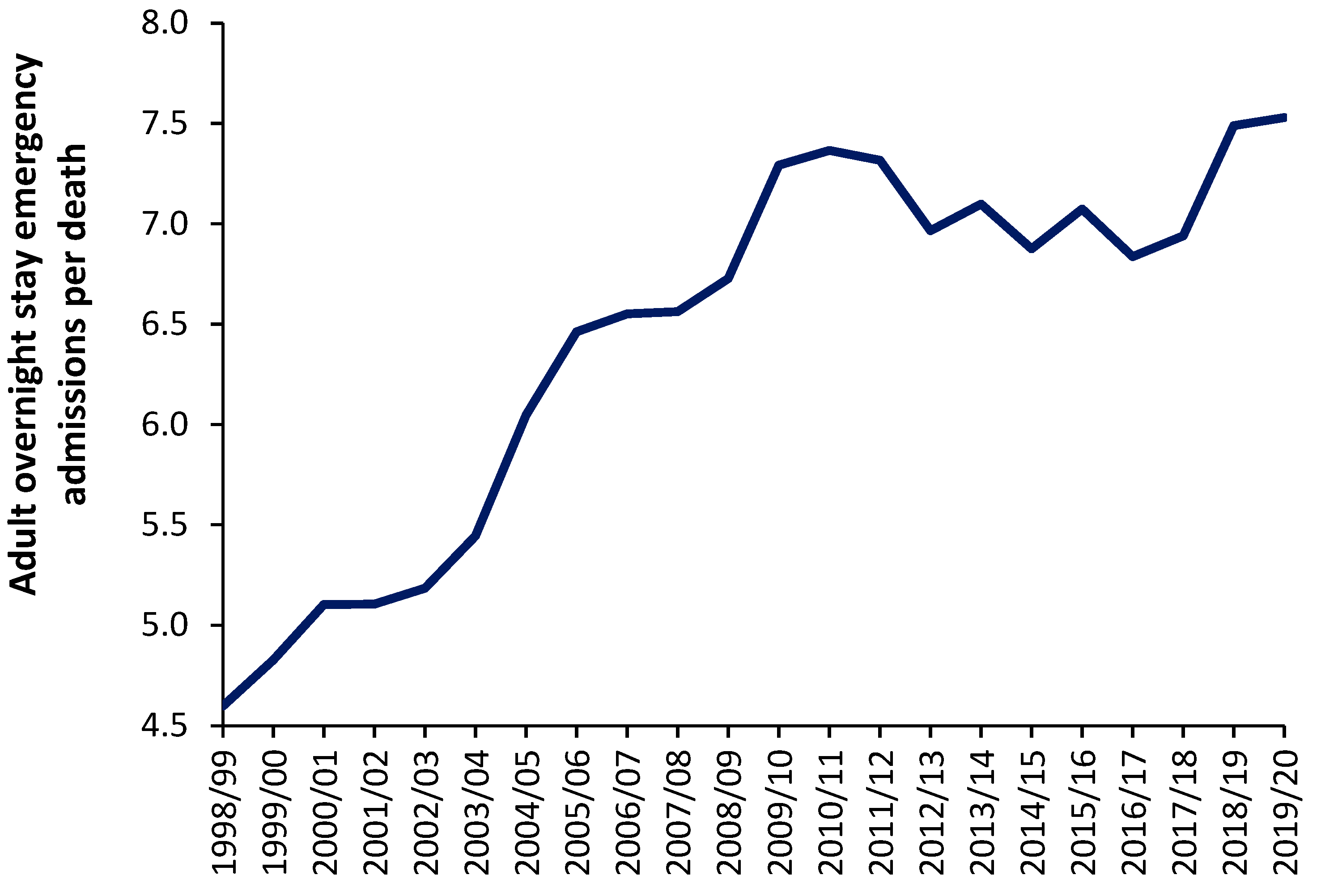
Figure 2 shows the trend in overnight stay emergency admissions per death in England from the financial year 1998/99 through to 2019/20 (the last financial year before the COVID-19 pandemic). Excluded from this analysis are all elective admissions, any same day stay admissions and any admissions relating to Maternity, Pediatrics, Community Care or Mental Health, i.e., acute hospital adult care.
Figure 2.
The ratio of overnight stay (adult) acute emergency admissions per all-cause death in England between 1998/99 and 2019/20. Data is from NHS Digital [
35] while deaths are from the Office for National Statistics [
20].
Figure 2.
The ratio of overnight stay (adult) acute emergency admissions per all-cause death in England between 1998/99 and 2019/20. Data is from NHS Digital [
35] while deaths are from the Office for National Statistics [
20].
As can be seen in
Figure 2 the number of such overnight stay (adult) admissions per death appears to range from around 4.5 before 1998/99 to 7.5 in 2019/20 It should be noted that deaths in England reach their minimum number between the 2009/10 and 2011/12 financial years. The general increase in this ratio from 1998/99 onward may reflect expansion in the range of acute medical/surgical interventions which can be offered for emergency hospital care. This range of care roughly expands at 0.12 adult emergency admissions per death per year – although perhaps more so before 2009/10. It should be noted that admissions for certain mental health conditions are also exacerbated by infections [
36]. Indeed one-third of COVID-19 survivors receive a neurological or mental health diagnosis in the six months following infection [
37].
Even if it were argued that the real ratio amenable to exacerbation by infections is only, say, 4 admissions per death the absolute number of deaths is still acting as a proxy of the demand for acute adult emergency care, and that this ratio is subject to year-to-year volatility - after correcting for underlying growth in the ratio.
Having discussed the role of unrecognized infectious outbreaks on human health and the consequent need for hospital beds we can now consider how the absolute number of deaths can be incorporated into hospital bed modelling.
2.4. Wider indicators of health are also affected
It should be noted that wider indicators of human health such as worker sickness absence and General Practitioner (GP) referrals for a specialist opinion in particular areas also appear to be influenced by the same forces which regulate the above fluctuations in deaths. See appropriate references in [
4]. If pathogens were exerting wider than expected effects against health such associations are to be expected.
At this point it should be highlighted that fluctuations in hospital admissions for certain diagnoses also appear associated with the same root cause [
11,
38]. Indeed, the unexplained fluctuations in the ratio of male to female deaths, hospital admissions and the costs for certain conditions may also fall into this category [
39,
40].
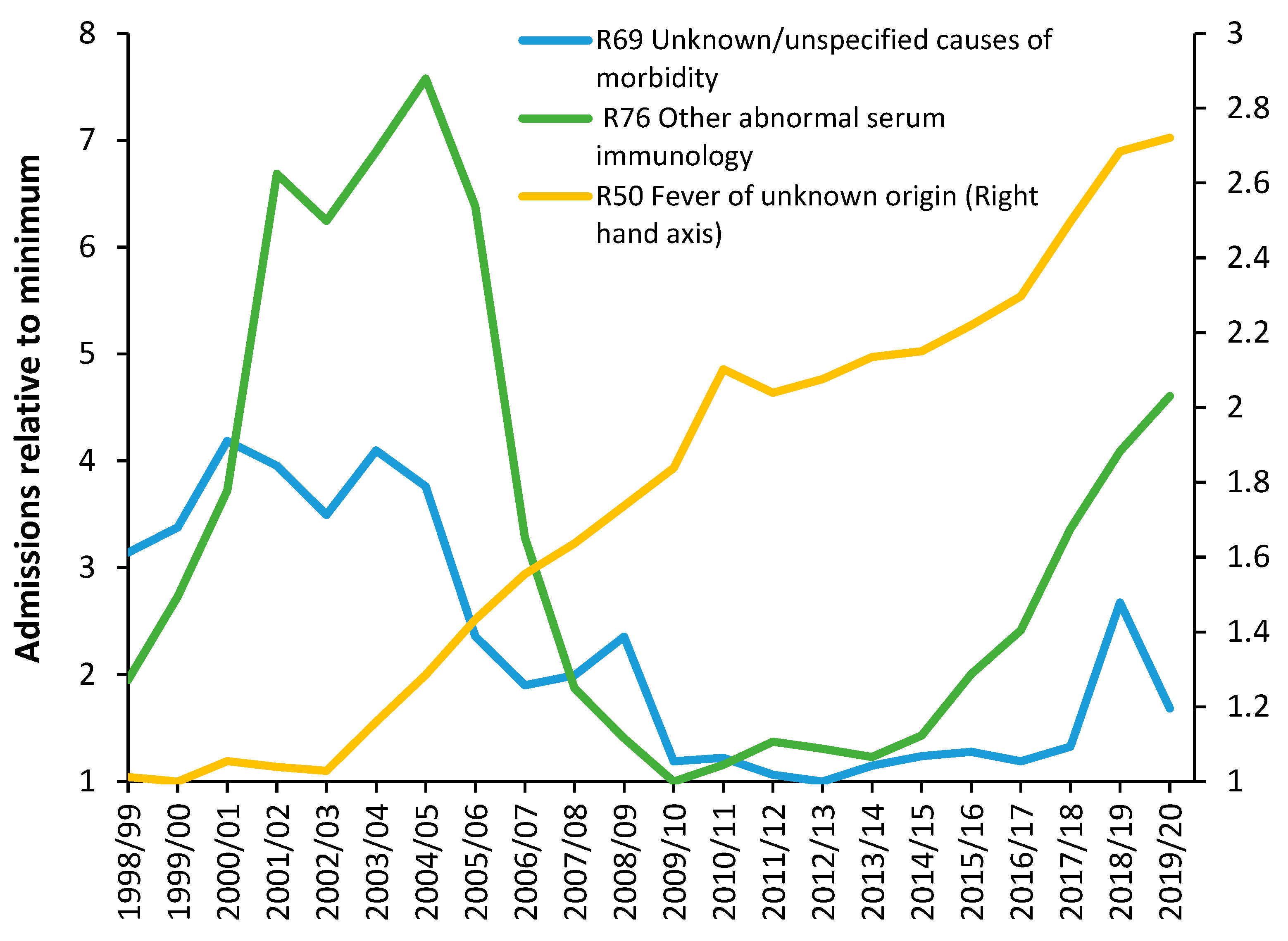
Figure 3 shows three among many unexplained trends in admissions for primary diagnoses in Chapter R (Signs and symptoms) of the ICD-10 primary diagnosis. No one investigates such unexplained trends and while some of the movement may be due to changes in how symptoms are coded the more interesting feature is the short-term fluctuations which cannot be explained by any long-term changes in the process of coding or definition of an admission.
For example, why the sudden spike in admissions for unknown/unspecified cause of morbidity in 2018/19, for fever of unknown origin in 2010/11, or the maximum in 2004/05 for abnormal serum immunology? Further investigation would show changes in the ratio of male to female admissions concealed in these trends – also largely unexplained.
Fluctuations in the gender ratio at birth and stillbirth rate are also likely outcomes from such infectious outbreaks [
41]. The hospital bed occupancy rate in England also shows otherwise unexplained patterns [
42].
The hypothesis is that any number of unknown infections by the 3000 species of known pathogens is highly likely to precipitate at least part of such unexplained trends. As stated earlier, the evidence has been there for many years but has been ignored.
3. The new model
3.1. Background to the model
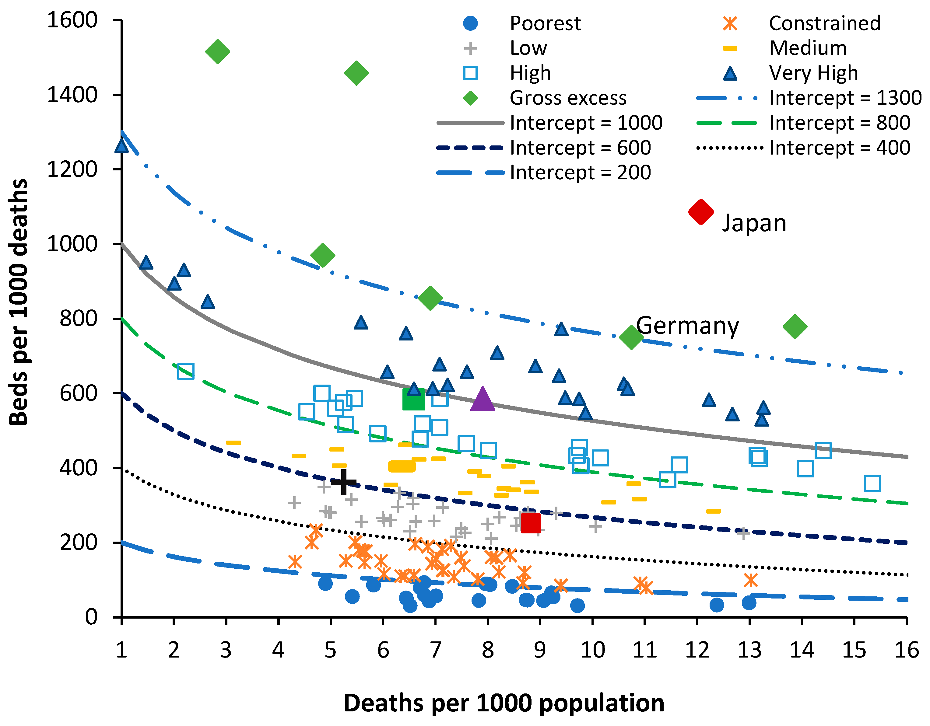
For any model of international bed comparison to be realistic it needs to be based on real-world mechanisms of disease and upon readily available data. All the above observations led to the development of the new model to compare international bed numbers, where the ratio of beds per 1000 deaths is plotted against the ratio of deaths per 1000 population. The latter is called the crude mortality rate and is an approximate (and widely available) measure of the population age structure. When international bed data is plotted using this method a series of lines of equivalence, as a logarithmic relationship, can be applied. For those who are unfamiliar with the method, data for world countries in 2019 (just before the disruption caused by the COVID-19 pandemic) is shown in
Figure 4 along with several lines of equivalence. The lines of equivalence are described later in this section.
The number of beds in each country is in 2019 or the nearest year after extrapolation of the recent trend to 2019, by either linear or polynomial regression. Most countries are trending down, or stationary, but a few such as China are trending upward.
Japan, North and South Korea are excessively high because they seemingly count ‘nursing home’ type care as a ‘curative’ bed [
2]. Germany is high due to a network of smaller hospitals with potential over-utilization to offset the higher costs of running a smaller hospital [
46]. Australia has a moderately higher number of beds simply because most elective surgery is conducted in smaller privately owned hospitals which flex their staffing to reflect the surgical workflow rather than staffing the beds per se. The region highlighted as ‘medium’ in
Figure 3 is probably close to the optimum number of beds which this study seeks to identify – which is then modified to reflect patterns of operation and hospital size as per Australia.
By way of comparison countries with similar bed provision to England are (deaths per 1000 population in brackets), Fiji (8.0), Equatorial Guinea (8.5), Sweden (8.6), Kiribati (6.3), Colombia (5.4), Comoros (8.2), and Uruguay (10.1). All these countries roughly lie along a line of equivalence which is 28% below a line with intercept = 700 or the middle of the ‘medium’ bed number region. None of these countries other than Sweden can lay claim to a highly effective health care system. Sweden invests heavily in outpatient and long-term care and has a higher number of doctors and nurses per person [
47] and has a history of policy investment in integrated care [
48]. The other countries have low bed numbers due to lack of funding.
The method has been applied to investigate disparate bed numbers in the states of Australia, the USA and India [
49,
50,
51,
52]. For both total curative, medical, and critical care beds [
53,
54,
55,
56,
57], and to investigate the expressed need for beds revealed as ‘occupied’ beds in Australian states and English Clinical Commissioning Groups (CCGs) [
2,
7]. In the case of Australian states adjustment was applied for the proportion of indigenous people (with known higher levels of poor health), and for the differing levels of social deprivation experienced between English CCGs [
2,
7].It was then discovered that the intercept and slope of the logarithmic relationships are directly linked such that the lines of equivalence can be defined using the value of the intercept as shown in
Figure 3 [
7].
Countries lying along or near to a line of equivalence have similar bed numbers, however, the reasons for equivalence can be many and varied. It has been noted that the average bed occupancy for a country depends greatly on the average size of the constituent hospitals [
58], and that acute bed demand may depend on the wider availability of nursing home beds [
2], and factors such as the implementation of integrated care [
59].
A further extension of the model was to define a likely feasible region for the optimum number of critical care beds in the absence of excessive ‘futile’ intervention which can occur in fee-for-service health systems [
57].
3.2. Beds per 1000 deaths compared to beds per 1000 population
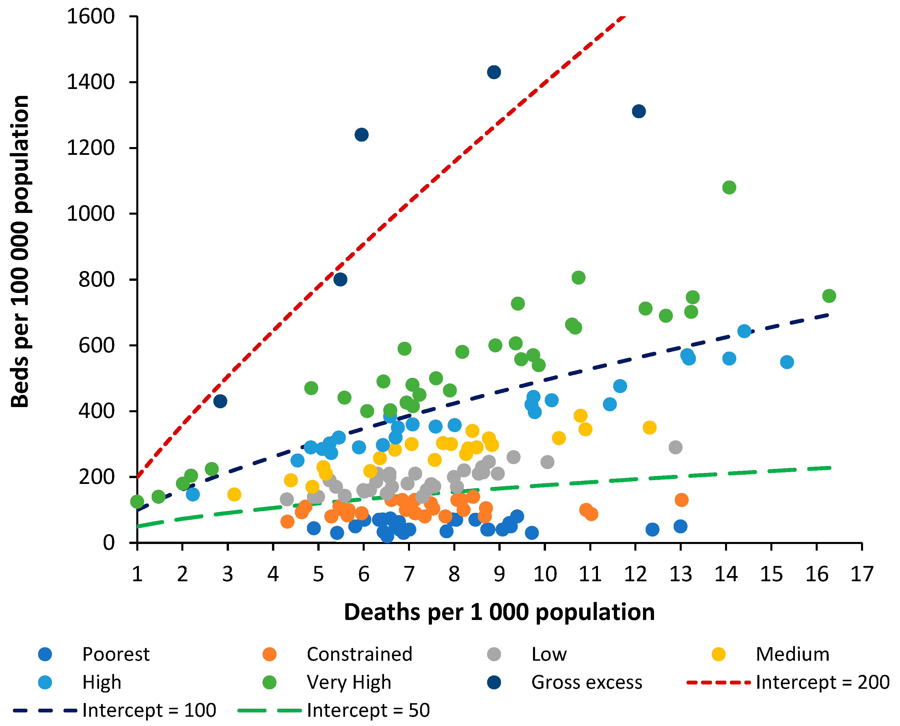
Beds per 100 000 population is a widely used international benchmark so it is useful to see how it relates to the new method. For any analysis of bed numbers to be successful there must be some adjustment to reflect the population age profile, and it is suggested that deaths per 1000 population is the measure which is most readily available. To this end
Figure 5 shows the same data as in
Figure 4 but using the ratio of beds per 1000 population versus deaths per 1000 population. Both Figures therefore share the same x-axis.
Investigation reveals that the relationship in
Figure 5 follows a power law function where:
Beds per 100 000 population = A x (Deaths per 100 000 population)B
The values A and B are likewise related such that the power function B equals:
B = 0.2168 x ln(A) – 0.3042 (R2 = 0.9864)
This then leads to a set of lines of equivalence defined by the intercept (the value of A) when deaths per 1000 population is equal to 1, which is the minimum international value for the crude mortality rate.
Hence, the two methods are approximately comparable. It must be pointed out that the method based on beds per 100 000 population gives slightly less discrimination between countries, and in addition has no theoretical basis as has been established for the role of deaths. The new method is therefore superior to beds per 100 000 population, even after adjustment for the role of population age structure as approximated by the crude mortality rate.
This review will attempt to extend this new method to different types of clinical need, i.e., acute care, medical care, mental health, longer-term (geriatric) care, etc., and to make a comparison of the levels of nurses, doctors, and surgeons.
It is emphasized that this method should be used alongside other methods when attempting to specify the exact size for a local hospital [
60,
61,
62,
63,
64,
65,
66,
67]. All models contain hidden assumptions, necessitating comparison between models.
Indeed, all models based on an annual average will underestimate true bed demand simply due to the seasonal nature of demand [
68]. Additionally, surge capacity is required to allow beds to be taken offline for a deep-clean and to cope with pandemics and catastrophes.
It should be noted that England went through the COVID-19 pandemic with fewer available beds than usual simply because vast amounts of ongoing surgical and medical care were shut down [
69]. Which then shifts the expressed demand to a future date - leading to one crisis followed by another.
6. Trends in bed supply
For the method to be valid it must be able to interpret the trends in bed supply over time. To this end
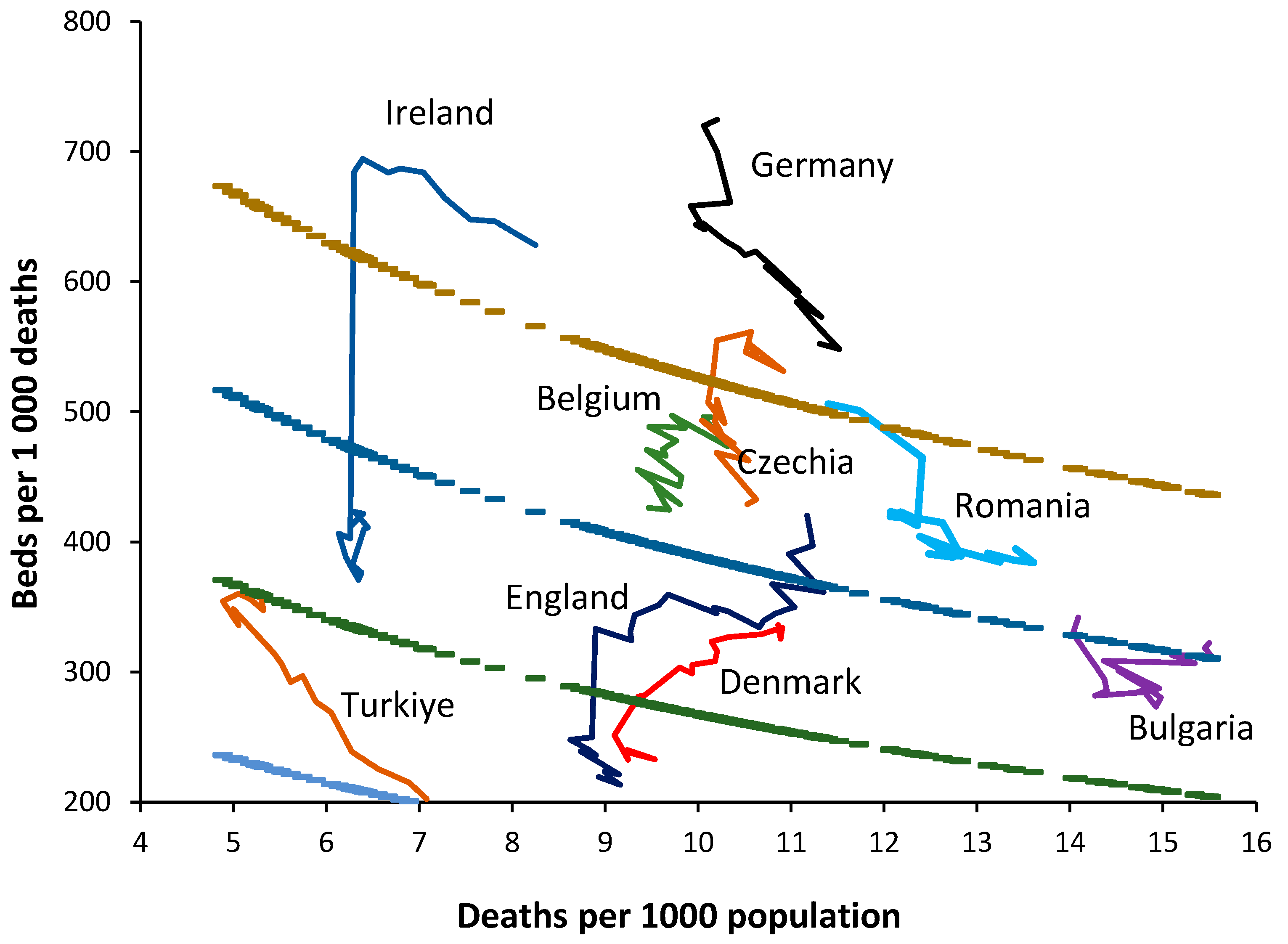
Figure 6 shows a 20-year trend in bed supply (2000-2019) for 8 randomly chosen European countries. By way of comparison a 30-year time series has been added for England.
Firstly, note that the crude mortality rate in all countries is changing with time. Declining in Türkiye through to rising in Germany. If the method is valid, in the absence of changes in bed supply each country should lie parallel to a line of equivalence. Countries with the fewest deaths will show higher levels of zig-zag movement depending on year-to-year changes as per
Figure 1. The following comments apply:
Germany commences with a very high bed supply which is rapidly reduced during the first six years. The reduction continues thereafter but at a slower pace. The rate of reduction in bed supply appears to be slowing and the most recent trend is decaying to approach a slope which is closer to a line of equivalence in an ageing population (higher crude mortality).
Ireland commences with high apparent bed supply and lies parallel to a line of equivalence for the first nine years. The sudden reduction in 2009 is due to a change in counting in which long-term-care beds are more correctly classified as ‘nursing home’ beds. Thereafter bed supply remains roughly unchanged.
Türkiye commences with very low bed supply in 2000 and then rapidly expands bed provision. By 2017 this expansion ceases and supply lies parallel to a line of equivalence.
Denmark commences with higher bed supply in 2000 and reduces bed numbers. From 2016 onward bed supply remains constant and lies parallel to a line of equivalence.
Romania commences with higher bed supply, which is then reduced. From 2010 onward supply remains constant and lies parallel to a line of equivalence.
Bulgaria shows no obvious changes in bed supply and lies roughly parallel to a line of equivalence. This country looks to be subject to higher volatility in year-to-year crude mortality suggesting higher volatility in infectious outbreaks.
Belgium commences with higher bed supply which is continuously reduced through to 2019. Belgium experiences the smallest change in crude mortality during the 20-year period with a slight trend to lower crude mortality over time.
Czechia commences with higher bed supply with slight reduction through to 2007. In this period the line is roughly parallel to a line of equivalence. Beyond 2007 bed supply is rapidly reduced. Czechia shows a U-shaped change in crude mortality reaching a minimum around 2008.
England commences in 1990 with higher beds which are rapidly reduced through to 2000. A scheme to increase bed supply then culminated in 2004, after which beds slowly declined but showed a dramatic decline due to measures to correct an NHS deficit implemented in 2010 which arose from an unfortunate coincidence of higher-than-average deaths in 2007 and 2008 and in response to austerity measures imposed on the NHS following the earlier 2008 international financial crash. The crude mortality rate declines from 1990 to 2011 after which it begins to increase.
Hence, the method does indeed appear to follow a line of equivalence under conditions when bed supply remains approximately unchanged. Changes in the definition of a curative bed are relatively easy to discern as for Ireland. The consequences of higher deaths in 2007 and 2008 upon health care financial pressures (the morbidity-mortality relationship), plus imposed financial austerity from 2010 onwards (from the 2008 financial crash) are shown in England as hospitals attempt to save costs by cutting bed numbers.
It is apposite to turn our attention to the factors which may influence the supply of beds in different countries.
7. Wealth and bed supply
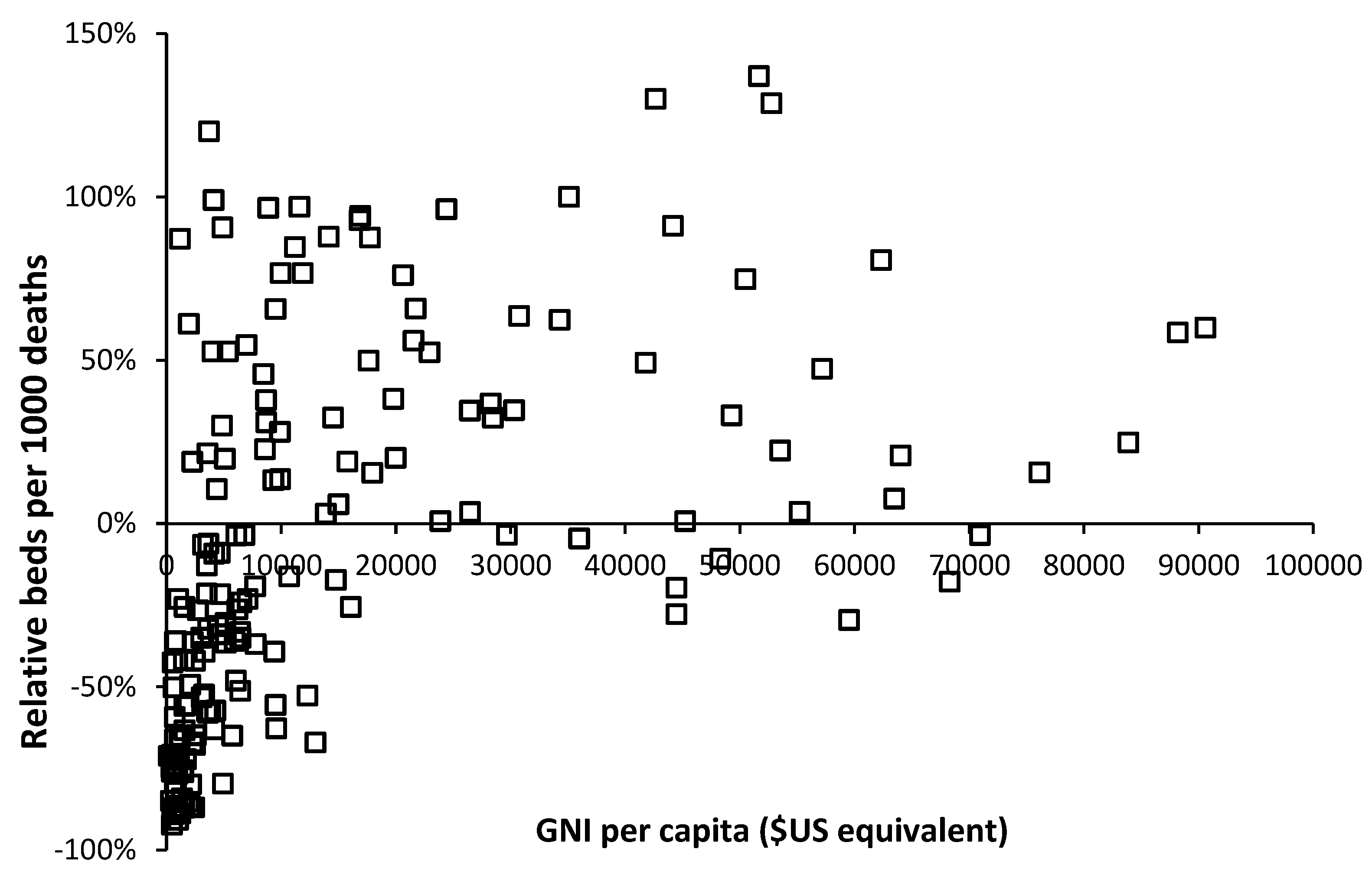
The availability of government funding for healthcare will have a profound effect on hospital bed numbers and
Figure 7 demonstrates this relationship using gross national income (GNI) per capita as a measure of wealth.
As can be seen in
Figure 7 below
$10 000 per capita there is a strong relationship between bed supply and GNI. The most notable exception is turbulent Venezuela where a GNI of
$13 000 is associated with a relative number of beds which is 67% below the reference line. This level of GNI should be associated with bed supply close to the reference line.
The group of countries with GNI below
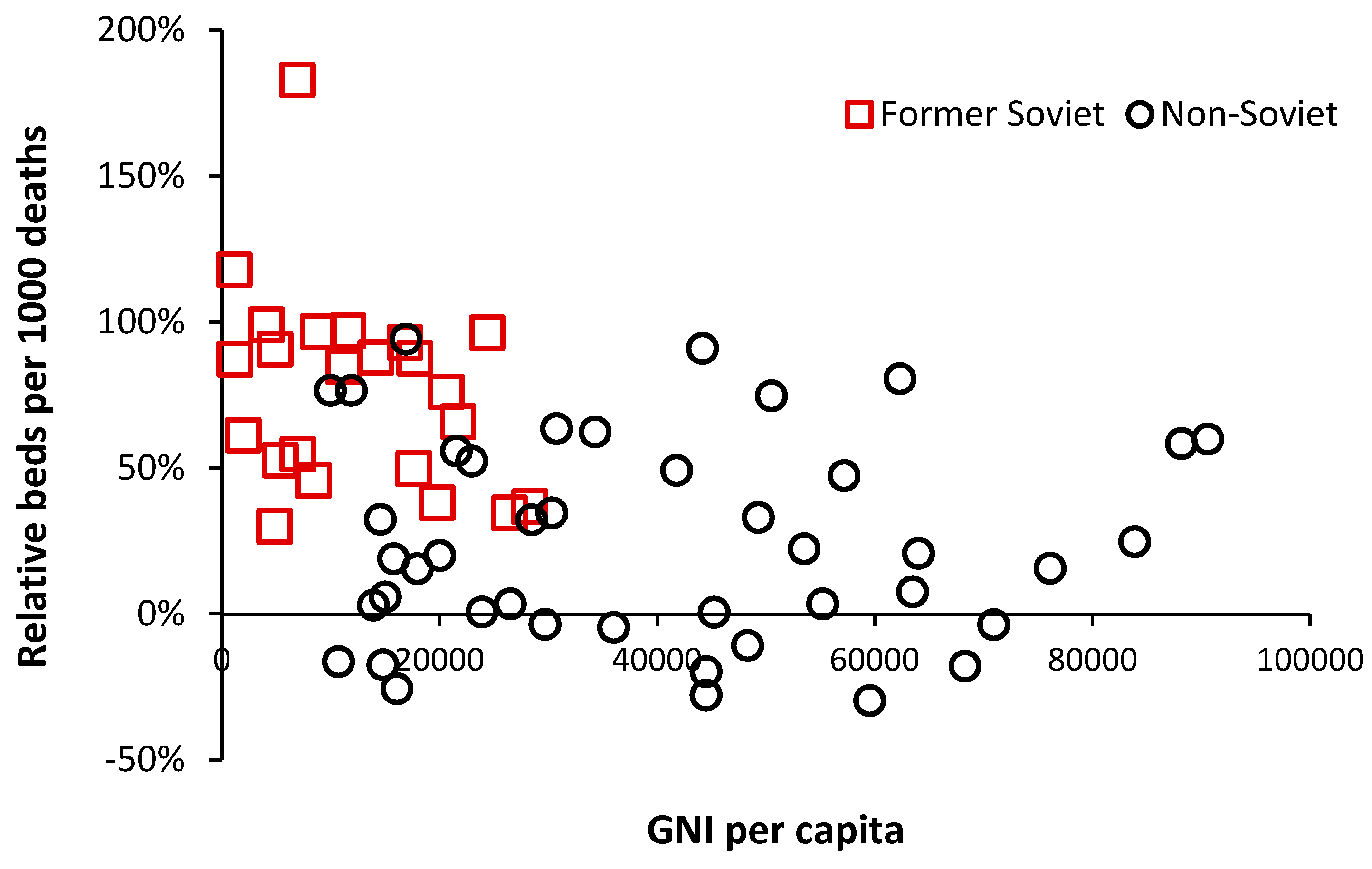
$10 000 but high relative beds are of interest and inspection reveals that these are all former or current Soviet bloc countries. This issue is explored in
Figure 8 where an inherited Soviet style health care system can be seen to be overly reliant on hospital beds.
Recall that many of the former Soviet bloc countries gained independence around 20 years ago, and after 20-years of reform and acquired higher GNI are beginning to approach levels of bed availability seen in non-Soviet countries. However, above a GNI of $20 000 per capita there is still gross divergence between countries indicating that different health care systems run at very different levels of bed supply.
8. Defining an optimum region
8.1. Medical and critical care beds
A likely optimum region for adult critical care beds has been recently investigated [
57]. It was concluded that in the absence of futile end-of-life interventions this optimum was likely to lie in the region for occupied beds between a line of equivalence with an intercept of 60 down to somewhere above 30 [
57]. This can then be turned into available beds based on the size of the CCU. This region encompasses the available CCU beds in the wealthiest Indian states and is at the lower edge for US states. The level of futile intervention in the USA is judged to be high, hence, all but nine US states lie above the line of equivalence with an intercept of 60. Nearly all wealthy Indian states lie below a line with intercept of 60.
The specific issue regarding medical beds was recently addressed [
53,
54,
55,
56]. A likely optimum region may lie below the line of equivalence with an intercept of 450 and above a line with intercept of 375. Occupied medical beds in England for the 21 years between 1998/99 and 2019/20 lie along the line of equivalence with an intercept of 375. Since it is known that England has too few medical beds (relative to current demand) then the optimum region will have its lowest limit somewhere above an intercept of 375.
It goes without saying that the demand for medical beds will depend on the mix of pathogens afflicting the population each year. In this respect the level of occupied beds in England can reach as high as a line of equivalence with an intercept of 420, hence, below 420 only copes with years when the pathogen mix is less malign in its actions.
8.2. Psychiatric beds
The required number of psychiatric inpatient beds is a highly debated topic. Before addressing the issue of an optimum level of beds we need to address the issue as to whether the patterns of deaths seen in
Figure 1 and
Figure A1 are impacting psychiatric bed demand. As was discussed earlier, infections play an important role in the initiation and exacerbation of mental health conditions. As a proxy for infectious outbreaks, deaths will therefore be one of the explanatory variables in any model for mental health beds. In the UK the specialty ‘Old Age Psychiatry’ is highly likely to be heavily influenced by nearness to death rather than age per se.
It has already been pointed out that average bed occupancy in acute hospitals in England show an unexplained pattern of occupancy which is roughly two years wide from trough to trough [
42], even after calculating a rolling 12-month average – which would remove any seasonal patterns.
Figure 9 confirms the same pattern for Mental Illness bed occupancy. Some explanation is required in that the 12-month periods from March 2011 onward encompasses a time of rapidly declining bed supply as care for mental illness is transferred into the community.
The curious pattern is observed prior to 2014 but is suppressed due to certain conditions/diagnoses seemingly not strongly affected by the pattern being still treated in an inpatient setting. However, after the loss of 600 beds from 2011 to 2014 the pattern becomes far stronger as the range of conditions undergoing inpatient treatment has been trimmed to a core set of conditions seemingly sensitive to the strange pattern.
Please note that in a moving 12-month average chart a pyramid-shaped pattern is indicative of on/off switching. I have proposed that at a national level the net contribution from all pathogens and their interactions via pathogen interference is to produce a set of on/off switching in human health. The on-part of the cycle (the upward face of the pattern) initiates roughly 12-months of poor human health while the off-part of the cycle (the downward face) represents roughly a 12-month period of ‘better’ human health. This cycle had a longer wavelength back in the 1980s, but the frequency gradually contracted to the current 2-year pattern seen since the 2010s [
9].
While other explanations may be possible the pattern is real, can be followed over many years and does indeed affect different medical and psychiatric diagnoses [
9,
10].
Regarding the optimum number of psychiatric beds an international board of advisors nominated some 65 Delphi panel members. Sixty psychiatric beds per 100 000 population were considered optimal and 30 the minimum, whilst 25-30 was regarded as mild, 15-25 as moderate, and less than 15 as severe shortage [
71]. As an approximate comparison 60 beds per 100 000 population at around 8.8 deaths per 1000 population is equivalent to 70 beds per 1000 deaths.
In less developed countries the median number of psychiatric beds decreased from 3.0 to 2.2 per 100 000 population (median percentage change = -16.1%) between 1990 and 2020. Beds in forensic and residential facilities are nonexistent in most less developed countries [
72].
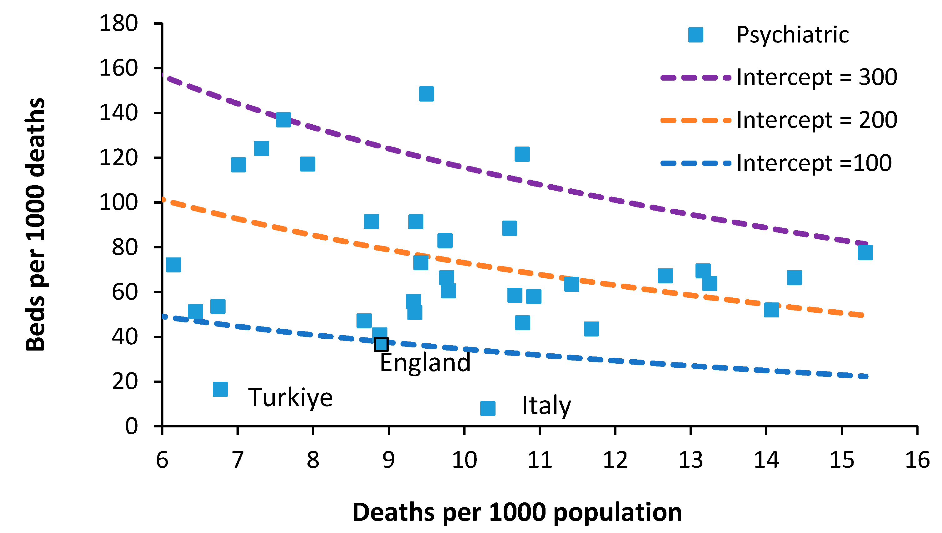
Figure 10 shows the availability of Psychiatric beds for European countries in 2019. As can be seen an optimum region (approximately equivalent to the 60 beds per 100 000 population mentioned above) could lie between lines of equivalence with intercepts of 100 and 200. Only England, Türkiye and Italy lie below this level.
In 1978 Italy implemented an aggressive shift from hospital-based to community-based care. Compulsory admissions dropped from 20,300 in 1978 to around 8800 in 2015 [
73]. Psychiatric beds fell from 160 beds per 100 000 population in 1978 down to less than 20 from 1999 onward [
73]. Hence it is possible to operate with few psychiatric beds provided that suitable levels of outpatient/community care are in place. However, note that this transition in Italy took about 20 years to fully implement and would require substantial investment in psychiatric community staff. This probably explains why all other countries lie above the lie of equivalence with an intercept of 100.
Note from
Figure 9 that the occupancy levels in English psychiatric hospitals rose from around 86.5% in 2011 to above 89.5% from 2015 onward. Given that the psychiatric bed pool encompasses everything from secure units, adolescent units, etc., the effect of size on the occupancy rate (discussed later) means that somewhere around 90% represents the upper possible limit. In the general psychiatric units, occupancy is often at 100% and patients are often moved to an available space which is many miles from their home. This implies that the level of outpatient/community support in England is inadequate relative to the available inpatient beds. The shift from an inpatient-based model has been hampered by the required investment in outpatient/community staffing.
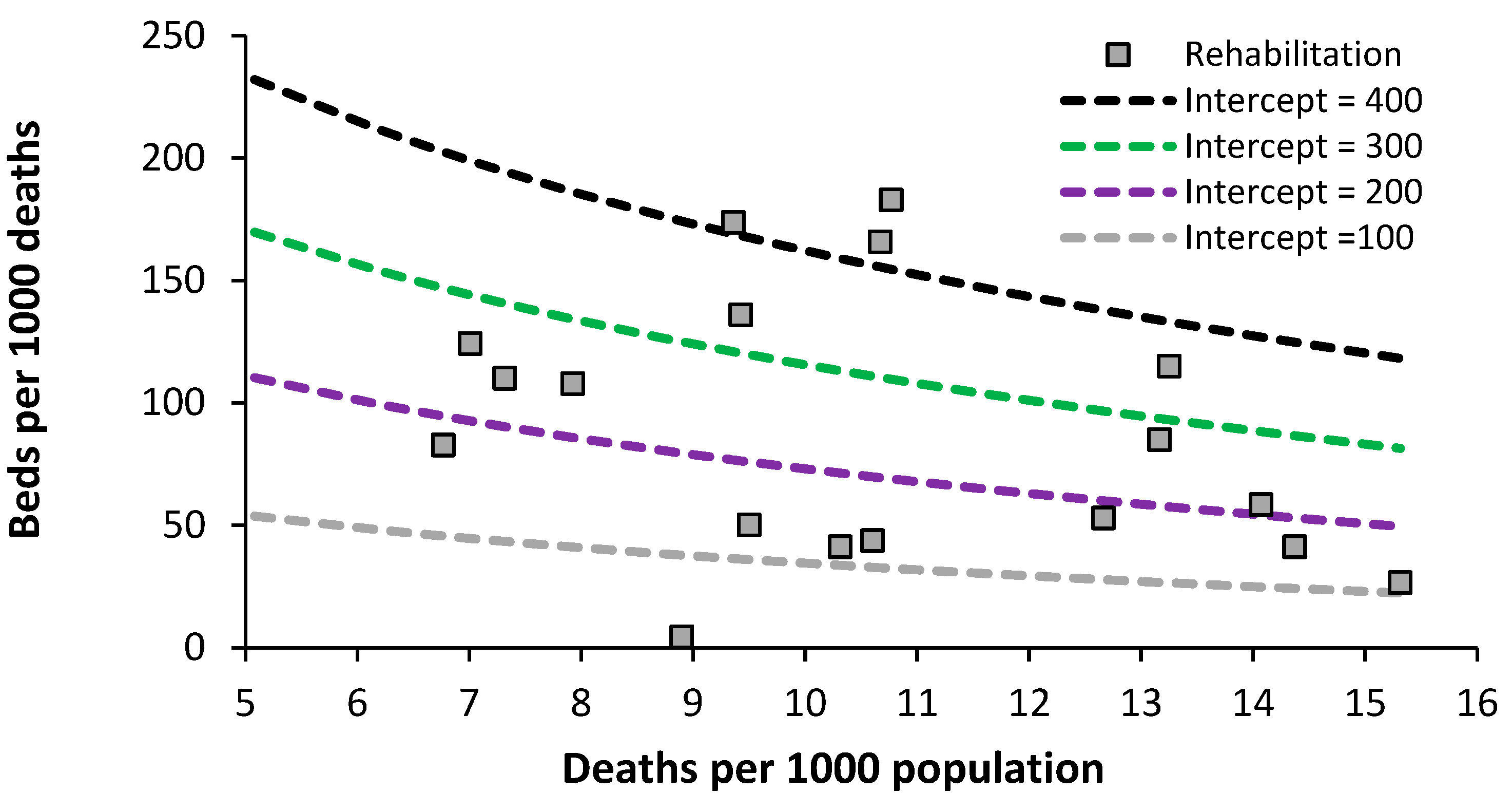
8.3. Acute rehabilitation beds
Data on the level of acute rehabilitation beds for European countries is presented in
Figure 11. The usual wide difference between countries is evident. It looks like an optimum region could exist lying between lines of equivalence with an intercept of 100 to 200.
As always this will rely on suitable investment in outpatient/community support.
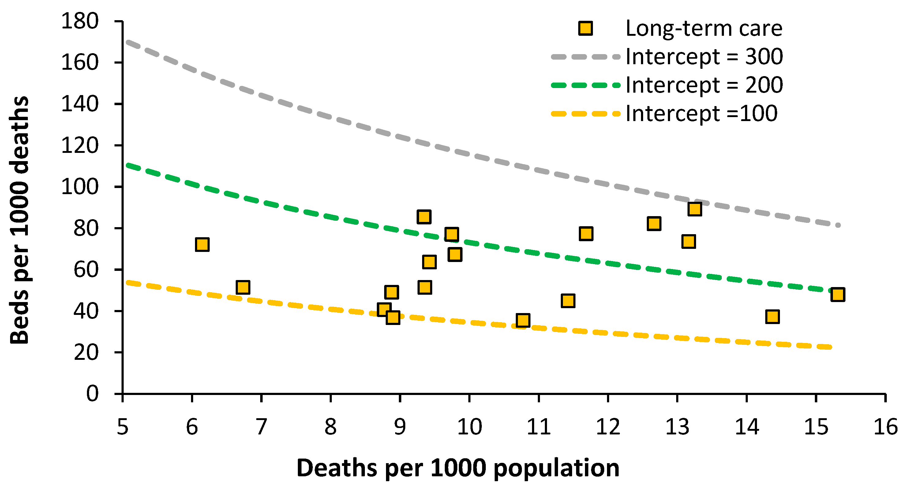
8.4. Acute long-term care beds
The situation for European countries is given in
Figure 12.
An optimum lying between lines of equivalence with an intercept of 100 to 200 looks possible. Data for England is the lowest data value along the intercept = 100 line. The England data has been taken from the inpatient specialty ‘Geriatric care’ which is delivered by consultant geriatricians. Both geriatricians and geriatric beds are in short supply relative to the demand. Patients requiring geriatric care can therefore be found in general medical.
Impatient provision lower than an intercept of 100 may be possible with suitable investment in outpatient/community staff.
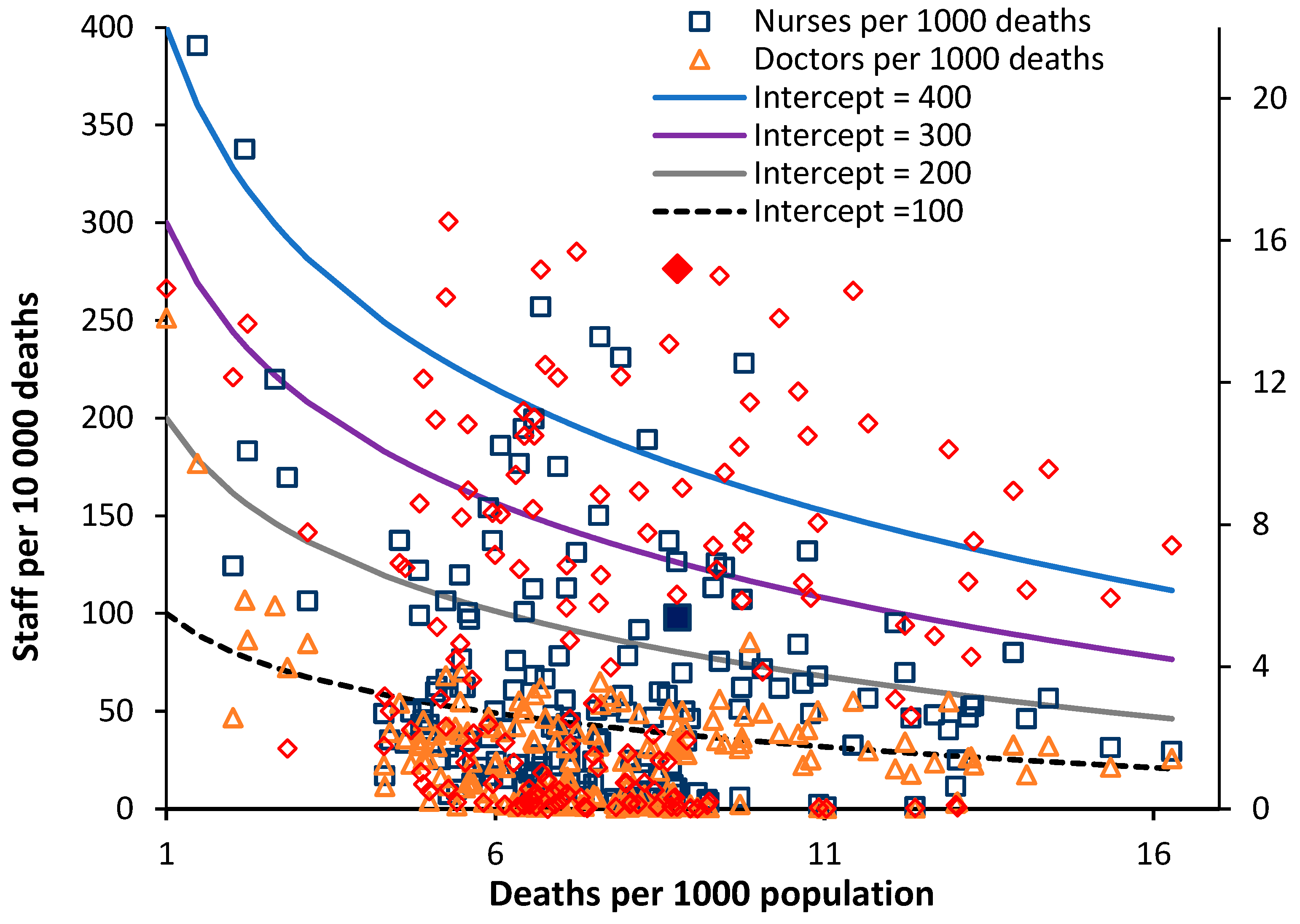
8.5. Physicians and nurses
The position regarding Nurses, Doctors and Surgeons are given in
Figure 13. The data has been scaled to fit with the lines of equivalence – which are there merely as a reference point. The most striking outcome is that surgeons in the UK appear to have one of the highest levels in the world matched only by Greece. Overprovision appears likely – subject to application of the definition.
The provision of nurses in the UK is on the low side and is equivalent to that in Brazil, Czechia, Lithuania, Maldives, and Russia.
The provision of doctors is also on the low side with the UK equivalent to Armenia, Antigua & Barbuda, Belgium, Chile, El Salvador, Malta, and Ukraine.
Compared to the UK, Sweden has 40% more nurses, 54% more doctors but 14% fewer surgeons. As I have constantly observed over the past 30 years politicians have made totally unsubstantiated claims that the NHS has too many beds and from
Figure 4 it is clearly evident that the lowest level of beds for a developed country has been achieved without the necessary investment in nurses and doctors (
Figure 13) to support such a low number of hospital beds.
8.6. Adjusting for relative population deprivation
It has been noted that adjustment needs to be made for some measure of ‘deprivation’. The study relating to English Clinical Commissioning groups used the UK Index of Multiple Deprivation (IMD) [
2], while a study in Australia used the proportion of state population which were indigenous people [
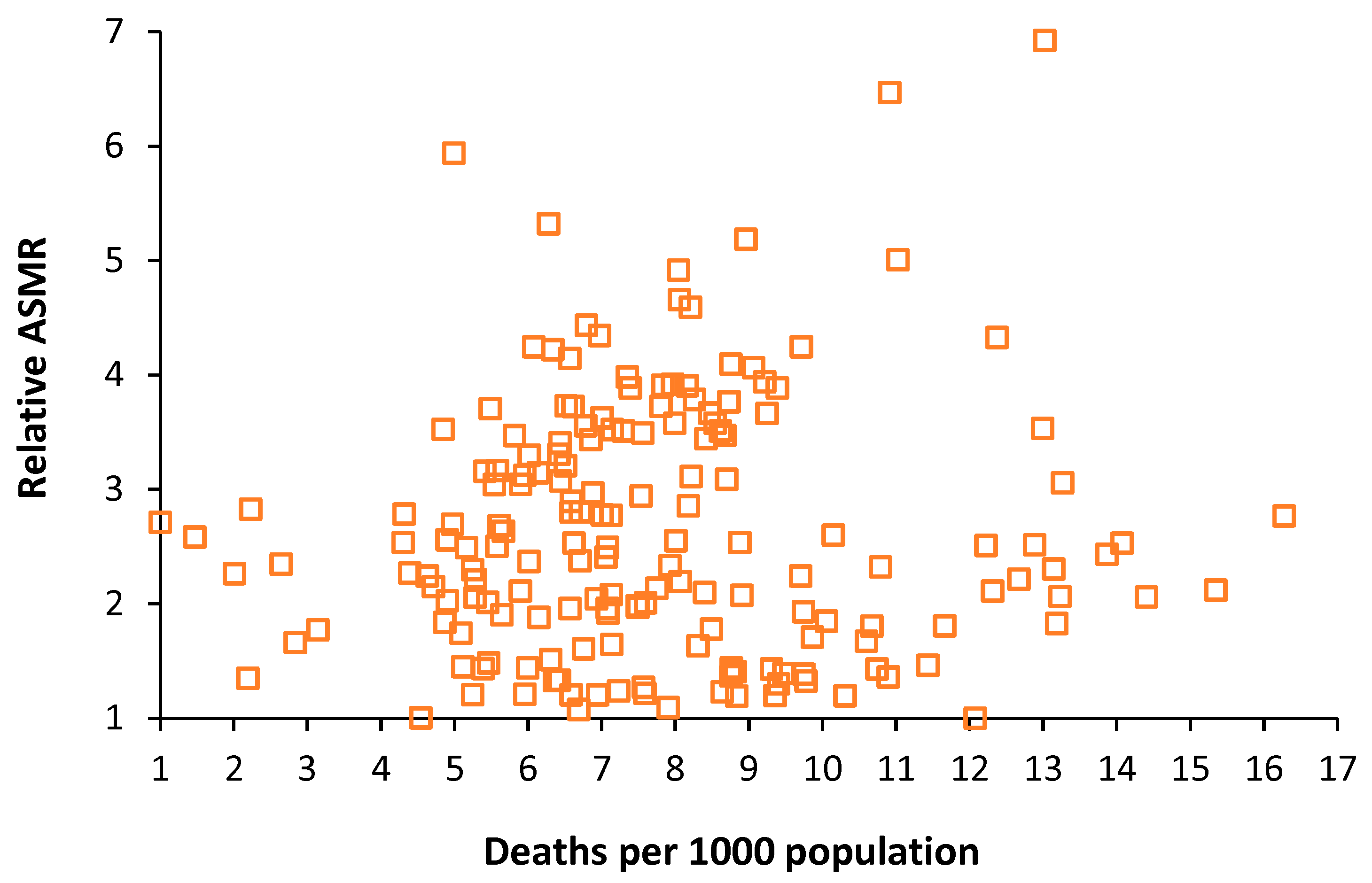
7]. Neither of these is applicable in an international context. One readily available indicator is the age standardized mortality rate (ASMR) which is available from the WHO and other sources [
77].
Figure 14 shows the range in ASMR for countries with different values of deaths per 1000 population. As can be seen ASMR can increase as the raw mortality rate increases, however, any such increase only tends to occur in the less developed countries. The key point is that at any value of the crude mortality rate there are a wide range of values for ASMR. If we assume that higher ASMR is a measure of deprivation or hardship, then countries with a higher ASMR would have a higher intrinsic demand for hospital beds – which will go unmet in the poorer countries.
As a reference point
Table 1 shows the ASMR for the 50 countries with the lowest value for this parameter. Sweden is shown as the reference point for the lowest number of total curative hospital beds in a developed country.
The key observation from
Table 1 is that England and the UK have 14% and 17% respectively higher ASMR than Sweden which suggests that the higher relative deprivation/lifestyle factors cannot justify the lower level of total curative beds noted in
Figure 4. The suggestion is that England and the UK have reached this point simply by restricting hospital bed numbers without the supporting investment in outpatient/primary care as has progressed over many years in Sweden. Hence the disruptively high bed occupancy in England to be shown later in
Figure 17.
Having investigated the relevant factors regarding bed supply and the use of the new model we can now turn to the topic of applying the new model at the local and regional level.
9. Defining optimum bed supply at local level
9.1. Data availability at local level
All developed countries have a system of collecting data on deaths, births, and population at regional, local, and small-area levels. The smallest area for such aggregation is usually called a ‘census tract’ in the USA or in the UK an ‘output area’. In the UK an output area contains roughly 300 persons while a census tract in the US contains about 4000 people. Each census small area will have a population centroid (Eastings, Northings) which is essentially a grid reference (Cartesian coordinates).
Either Geographic Information System (GIS) using travel time or simple spreadsheet calculation (using straight line distance) can then be used to allocate each census area into the catchment area of a hospital. Manual adjustment may be necessary when rivers or mountains prevent access. The relevant data can then be aggregated to give the effective deaths per 1000 population or beds per 1000 deaths for that hospital.
Conduct a sensitivity analysis for the inclusion/exclusion of marginal census areas, however, a more pressing issue relates to forecasting future trends.
9.2. The crude mortality rate at sub-national level
In all developed countries the crude mortality rate is available down to small-area level. This is important when attempting to take the model to a local level. As an illustration
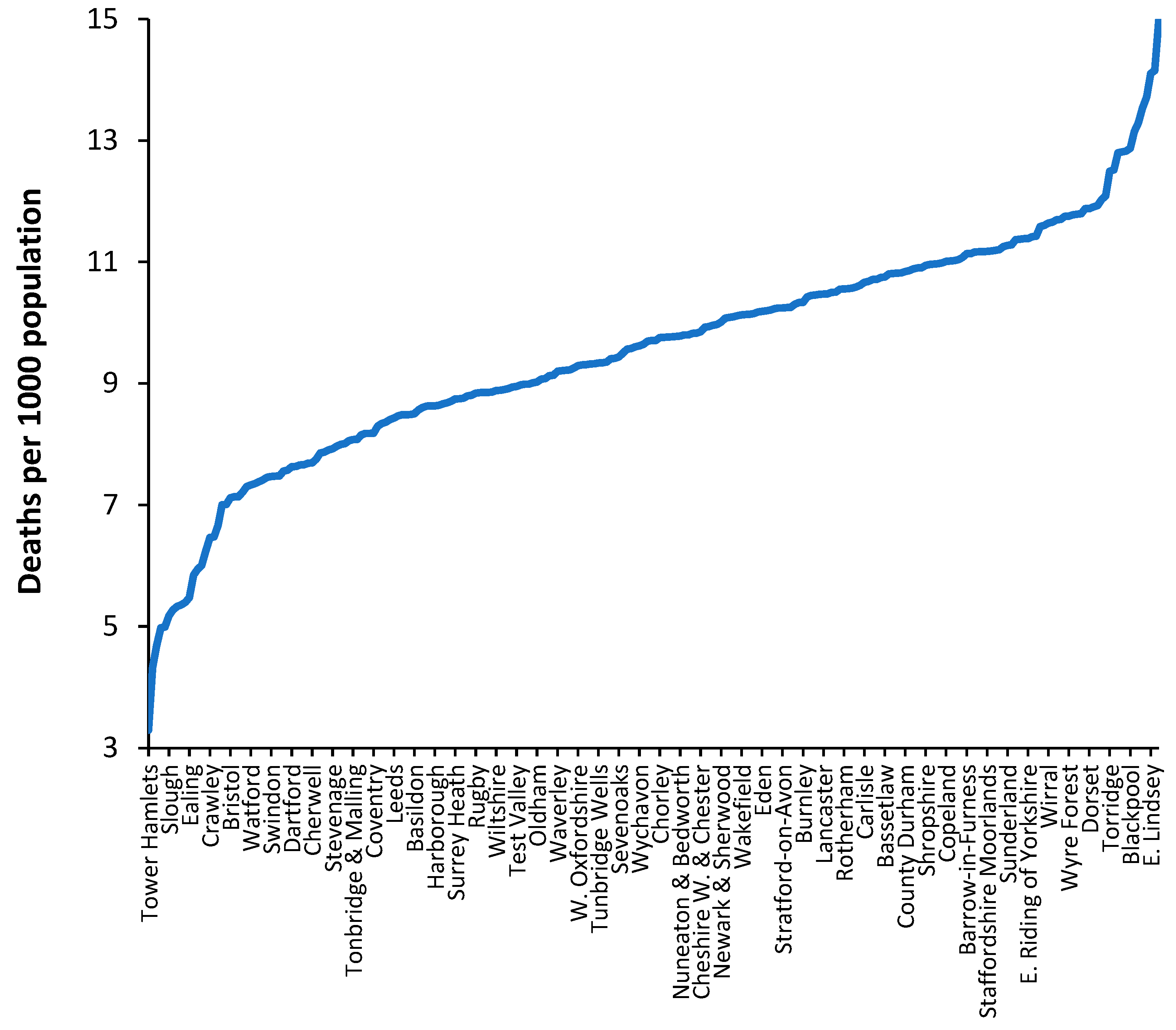
Figure 15 shows the crude mortality rate for a selection of English and Welsh local authorities in 2019 (the pre-COVID-19 year). While the value of the crude mortality rate for the UK was around 8.8 deaths per 1000 population in 2019 the range at local authority level goes from around 3 to 15, which roughly spans the international range shown in
Figure 4. In the UK low values of crude mortality only occur in inner city locations.
Figure 15.
Crude mortality rate (deaths per 1000 population) for a selection of 150 English and Welsh local authorities in 2019 (the year before COVID-19). Data is from the Office for National Statistics [
20,
78].
Figure 15.
Crude mortality rate (deaths per 1000 population) for a selection of 150 English and Welsh local authorities in 2019 (the year before COVID-19). Data is from the Office for National Statistics [
20,
78].
From an international perspective, values of crude mortality higher than 13 deaths per 1000 population only occurs in the former Soviet countries such as Moldova, Croatia, Hungary, Ukraine, Belarus, Serbia, Lithuania, Latvia, and Bulgaria (16.3 deaths per 1000 population). Such high levels of the crude mortality rate are only approached in a minority of ‘elderly’ communities. Clearly values of crude mortality above 15 deaths per 1000 population will occur at small area level, especially areas which have high numbers of nursing home beds.
Hence, the crude mortality rate is a widely available measure this enables discrimination between communities and their associated bed demand at local level.
9.3. Effect of the World War II baby boom
The cessation of WWII led to a baby boom in most participating countries. In addition, countries such as the USA and Australia initiated programs for inward immigration of the many displaced persons arising from the war. The leading edge of the baby boom turned 65 in 2011 – 65 being the age at which death occurs at increasing frequency. Such countries will all be experiencing rising deaths over the next 30 years. That part of bed demand relating to (changes in) deaths has therefore been activated [
11]. Trends in births and migration will imply that each country will have its own unique profile of future deaths. For example, the Russian Federation has a declining population arising from the loss of young men during the 1979-1989 Afghanistan war.
Such future trends are incorporated into the new model via the use of deaths per 1000 population in the x-axis, as was illustrated in
Figure 6. The effects of the WWII baby boom are then incorporated into national and local forecasts of both population and deaths.
9.4. Forecasting future deaths and population
All methods for bed planning rely on forecasting the future value of the model inputs. It is the authors’ experience that even national-level forecasts of deaths are highly unreliable due to the difficulty of defining the base-year for the forecast. Defining a base year is problematic simply because deaths as so volatile [
79], as witnessed in
Figure 1 and
Figure A1. To address this problem with the base-year a method based on 11 years of previous data has been proposed [
80]. The issue becomes more problematic at the local level and multiple scenario methods must be employed.
The aim of such scenarios is not to derive the minimum possible answer but to construct the likely range for the future.
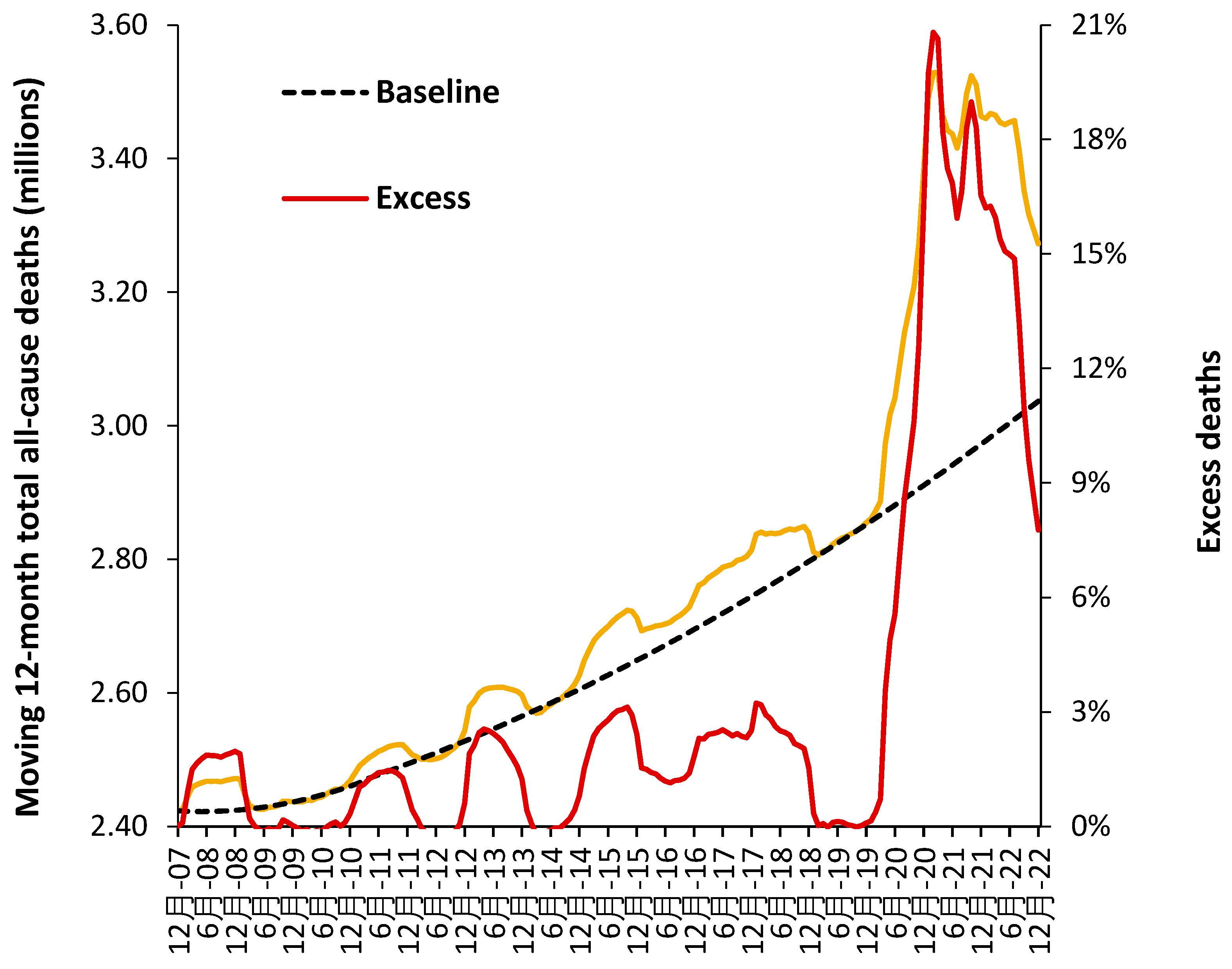
Figure 16 illustrates how such a baseline trend can be constructed.
Figure 16.
A baseline trend for total deaths in the USA using a moving 12-month total. A second order polynomial has been used to estimate the baseline trend which intersects the points of minimum deaths. The COVID-19 pandemic illustrates a period of unanticipated ‘shock’ demand which was far larger than similar ‘shock’ increases experienced prior to this pandemic.
Figure 16 uses data for the whole of the USA, but the method can be replicated at state and smaller geographies – where local issues become more influential. Note the existence of points for minimum mortality as for the 12-months ending Dec-07, Dec-08 to Dec-10, etc. Also note the existence of a period of higher deaths lying roughly between Dec-14 to Dec-19. This period of higher deaths is also seen in the UK [
81].
All forecasts must reflect the reality that deaths, and associated demand, are highly volatile.
10. Defining an optimum hospital size
10.1. Average bed occupancy as a measure of operational chaos
Hospital bed occupancy has been traditionally measured at midnight and for international comparison uses an annual average. There are several problems with this approach because:
The average occupancy rate shows seasonal changes with highest occupancy during the winter months (rainy season at the equator) due to the higher incidence of winter infectious diseases and the effects of cold. Other cycles operate nearer to the equator usually based on the rainy season.
Occupancy also has a daily cycle with a minimum around midnight and a maximum during the day.
Queuing theory clearly shows that the likelihood of a patient being ‘turned away’ due to no bed being available (hence a measure of chaos, inefficiency, delays to admission and waiting lists) increases as the real or instantaneous occupancy increases [
58].
Smaller hospitals or bed pools must operate at lower average occupancy due to the higher volatility in admissions as size decreases. Hence lower average occupancy in pediatric, maternity, and critical care bed pools, and in countries with smaller hospitals [
58].
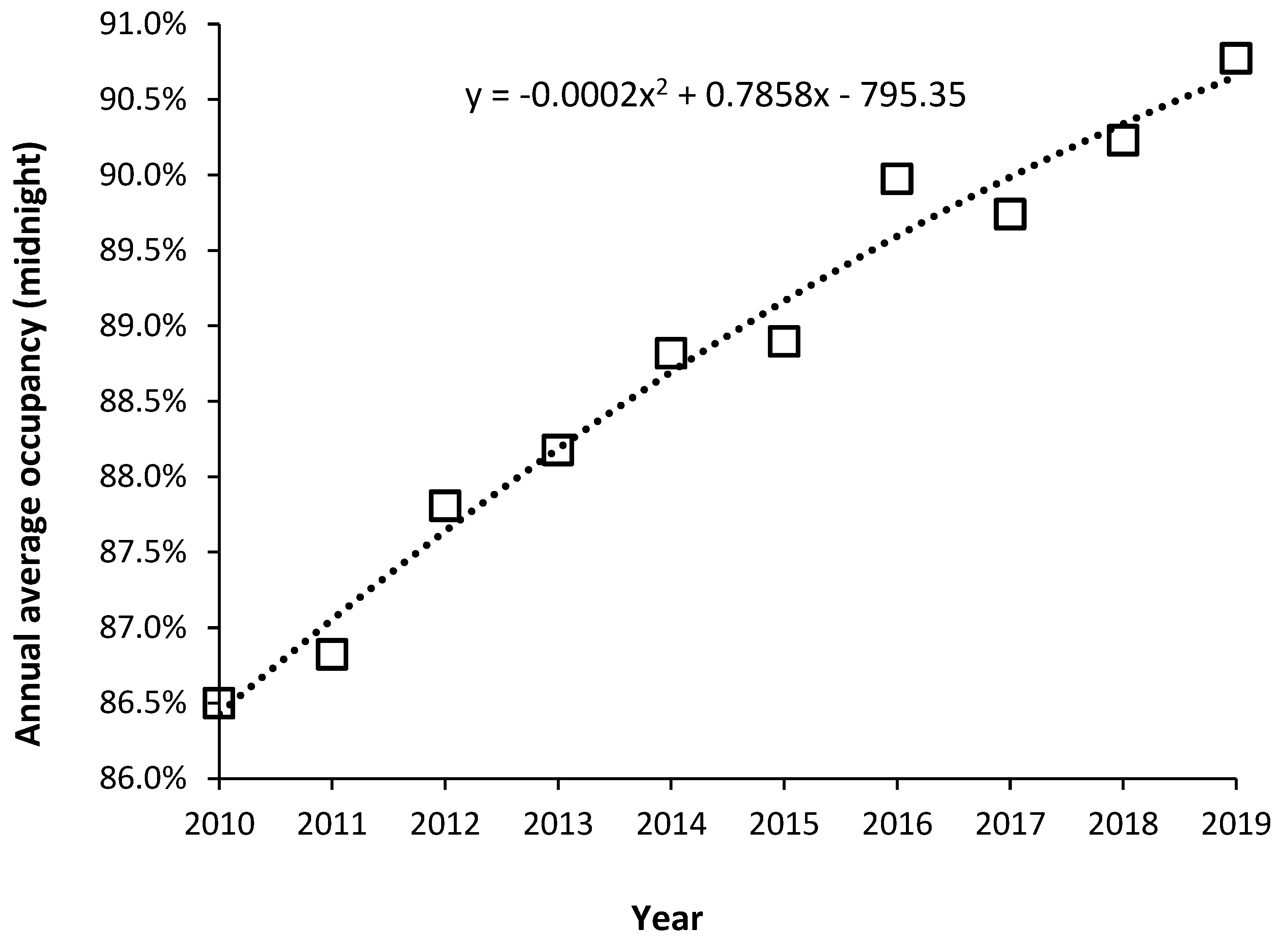
With these limitations aside, rising average midnight occupancy is an excellent measure that there are insufficient beds relative to the expressed demand. To this end
Figure 17 shows the trend in annual average midnight occupancy for curative beds in England from 2010 to 2019.
While 85% average occupancy is often quoted as the optimum for hospital occupancy there is no theoretical basis for this claim [
58,
82,
83]. An annual average rate of 85% does, however, roughly apply to very large hospitals [
58]. The reason that 85% is so often claimed to apply is that it also represents a measure of perceived busyness [
84], which would be independent of size.
Figure 17.
Trend in average annual midnight bed occupancy for curative beds in England from 2010 to 2019 (calendar year averages). Data is from NHS England [
3].
Figure 17.
Trend in average annual midnight bed occupancy for curative beds in England from 2010 to 2019 (calendar year averages). Data is from NHS England [
3].
In
Figure 6 it was noted that since 2010 financial austerity in the English NHS led to the closure of beds to reduce costs.
Figure 17 is therefore the outcome of such imposed austerity. Note that the increase in average occupancy slows with time simply because it becomes increasingly difficult during the daytime to admit a patient (leading to queues for admission and cancelled elective operations). Note that over this time the national waiting list for an elective operation grew by millions of persons [
85], and widespread curtailment of elective surgery regularly occurs during the winter months (further fueling growth in the waiting list), and there are typically queues of ambulances waiting outside hospitals during the winter. English hospitals have simply descended into unfunctional chaos, even though they are generally very large by international standards. This is a by-product of high population density and government attempts to minimize costs by limiting the number of hospitals. For example, small US towns will typically have two or more hospitals due to private healthcare company competition, and a network of small community hospitals throughout the extensive rural low density US population.
Each English hospital will have a large ‘bed management’ team attempting to squeeze patients into any available bed – called outlying patients who typically have higher average length of stay, receive poorer quality care, and have a higher readmission rate [
86,
87,
88]. The mortality rate may not be greatly affected, although adjustment for risk factors is difficult [
89].
By way of comparison in 26 European countries with data available for 2019 [
45], the median occupancy was 73% (69% lower quartile, 79% upper quartile). Minimum average occupancy was 62% in Cyprus (small country) up to 90% in Ireland. Germany had an average of 79%. Other countries lying in the range 78% to 79% were France, Italy, Luxembourg, and Liechtenstein. Ireland has recognized that occupancy is high due to a deficit in beds with plans to expand bed numbers [
64]. Occupancy in England is seemingly the highest in Europe.
As a final note beds per se do not make a large contribution to costs, it is the staff associated with the beds which is ‘expensive’.
10.2. Optimum hospital size as economy of scale
While the average bed occupancy rate gives insight into the level of operational chaos there is also the related issue of the optimum size for technical efficiency. Economy and diseconomy of scale issues were explored in the review of Giancotti et al [
90] which gave evidence for economies of scale in hospitals with 200–300 beds. Diseconomies of scale occur below 200 beds and above 600 beds [
90]. Queuing theory shows that larger hospitals can operate at higher average occupancy [
58,
82,
83] and as a hospital progresses beyond 600 beds it seems that increasing specialization leads to higher costs per patient. The diseconomy of scale below 200 beds is due to the lower average occupancy associated with small size leading to higher capital costs per patient and a higher staffing costs per patient [
46,
58,
82,
83].
10.3. Length of stay and the efficient hospital
During the 1970s to the 1990s hospital length of stay (LOS) experienced a rapid decline. This was mainly due to the simple discovery that rapid mobilization was far more effective than bed rest for recovery after injury and surgery [
91,
92,
93]. Had such rapid reduction continued the net LOS would have declined to zero well before the 2020s. Hence any model for LOS must incorporate a decline in the rate of reduction in LOS over time [
65,
66].
LOS does depend on age, however, one study on LOS in the adult medical intensive care unit showed that LOS was independent of age for patients who survived but depended strongly on age for those who died [
94]. This observation could suggest that hospitals which service a population with a high crude mortality rate will experience greater pressure to high LOS.
One potential effect of the aging population on LOS is that LOS may well reach an asymptote and then start to increase as the proportion of older persons increases. I have yet to see any models for hospital bed numbers which incorporate such a possible outcome.
In the English NHS the headline LOS has been declining but closer inspection reveals that this is largely due to the inclusion of millions of zero day stay emergency admissions due to ‘admission’ of persons into short stay emergency assessment units. I would claim that the majority of such ‘admissions’ are more correctly defined as an emergency department attendance. The reality was that many such ‘admissions’ were simply an attempt to circumvent the emergency department four-hour target introduced by the Blair government in 2004. The reality is that the residual genuine overnight stay LOS is not declining at any great pace or is staying roughly unchanged [
95].
This does not imply that emergency assessment units should not be opened but rather that the planning for such units should incorporate estimates of the real-time LOS in such departments. Assigning a zero LOS to any person admitted and discharged before midnight is simply an obfuscation of reality.
All hospital planning must be done based on reality and not on wildly optimistic ‘concocted’ estimates of future LOS.
While it is true that hospital processes and procedures of care can lead to a longer LOS it has been my observation that the processes of clinical coding, which includes the training of doctors on the nuances of recording patient information, often lead to spurious examples of long LOS. All hospitals are well advised to ensure that all available information is collected regarding every in-hospital death, i.e., blood biochemistry and other diagnostic test results, any imaging studies, etc. It is a fundamental risk to rely on some hastily written diagnosis by a junior doctor given that most deaths involve greater complexity of multimorbidity and other factors – all of which should be reflected in an extensive series of clinical codes for each patient. Some hospitals have an evident lack of detailed coding.
It is also far too easy for a Management Consultancy to construct a plausible story (on paper) as to why future LOS will be reduced of which hospital Executives and senior Managers will be unaware of the hidden pitfalls. The series of articles under the title of ‘Understanding Length of Stay’ should be studied [
4].
10.4. Flexible staffing regulates costs not the physical number of beds
It has been the author’s observation over many years that bed planning in the UK appears to be stricken by the fallacy that the number of beds is the primary driver of hospital costs. The initial sections of this review clearly showed that the demand for the beds is highly volatile, and this implies that the staffing of the beds needs to be highly flexible. The actual cost driver is the number of staff as full-time equivalents. A simple method is available to optimize the mix of full-time and flexible staffing requirements [
96], however, it is never used.
My discussions with UK NHS Directors of Personnel are that flexible staffing is viewed as an ‘impossible’ task. Clearly that which is imperative to achieving minimum operating cost is viewed as a ‘no go’ area and is not reflected in overall NHS policies for NHS staffing. Part of the problem is the very high bed occupancy levels which now afflict the UK NHS. At high levels of bed occupancy, the illusion is created that the beds are always fully staffed, hence, the number of beds becomes a perceived cost not a route to efficiency.
10.5. Delayed transfers of care (DTOC)
DTOCs arise at the interface between hospital and social care and can be reduced by local partnerships and discharge planning [
97]. They create increased length of stay.
Over a 30-year period it has also been my observation that DTOCs rise and fall in proportion to available funding which is influenced by the unrecognized financial pressures arising from unrecognized outbreaks of infectious agents. Any agent which will push a vulnerable proportion of the population toward death will simultaneously increase hospital admissions and the pressure on primary care, community nursing and social care. All parties will simultaneously experience higher demand/costs which will inevitably lead to subtle causes of DTOCs. On some occasions such insights can only be gained from experience.
11. The role of government policy
In theory, government policy is enacted to solve problems. However, conflicting objectives can sometimes generate unintended consequences. At this point we need to consider how a policy imperative, namely, the Private Finance Initiative (PFI), which commenced in the UK in 1992 [
98], had a perverse effect on public hospital bed planning. The PFI initiative was initially an ‘off-balance sheet’ method to build public infrastructure [
99]. The government of the time was seeking to convince the public that national debt was being ‘prudently’ managed [
100]. Effectively a private consortium borrowed the money and built the infrastructure and then charged for the infrastructure and subsequent maintenance which was paid out of revenue. The international rules of accounting were subsequently changed to recognize that such an ‘off-balance sheet’ illusion was in fact public debt [
101], and indeed a very expensive form of public debt [
102,
103,
104,
105].
Because PFI was such an expensive way to build hospitals, and other infrastructure, the government introduced rules stipulating that the schemes should be ‘affordable’ [
106]. The only way to achieve the ‘affordability’ criteria was to effectively manipulate or fiddle the future bed demand considerably downwards. NHS managers and external Management Consultancies ‘complied’ with the rules and smaller hospitals were duly constructed. The role of external Management Consultancies was to construct a believable narrative about increasing efficiency and demand ‘management’. The reality was the everyone in the NHS knew that the forecasts had been fiddled and the hospitals were far too small [
107,
108,
109,
110].
The public did not possess the detailed technical knowledge to realize that the use of LOS as an ‘efficiency’ measure is fraught with hidden dangers [
4], and that the decline in the real LOS within the NHS was far lower than was being predicted on paper – as above.
The point is that such manipulation was easily achieved partly because there were no international benchmarks. Hence, claims by politicians that the hospitals were too big due to inefficiency could not be adequately dismissed.
The sad truth is that the high bed occupancy caused by too few beds relative to expressed demand directly generates chaos, harm, and inefficiency [
96,
111,
112,
113,
114,
115], thereby reinforcing the claim by politicians that the NHS is ‘inefficient’. The inefficiency is more correctly, policy imposed.
A recent analysis by the King’s Fund of the performance of the UK NHS relative to international peers has concluded that while a publicly funded NHS avoids the risk of catastrophic costs from falling ill it has suffered from substantial capital (buildings and equipment) and manpower underinvestment leading to poor health care outcomes [
116].
11.1. The ‘Westminster bubble’
Journalists often refer to the ‘Westminster bubble’ into which politicians seemingly disappear into a world somewhat divorced from reality.
In England, a new Secretary of State for Health and Social Care seems to emerge about every two years. Despite the obvious failures of their predecessors each new incumbent appears to think that they ‘must’ have some wonderful new way ahead for the NHS. Massive reorganizations are frequent and seemingly meet with the same failures as before and waste billions in futile ‘rearranging the deckchairs on the Titanic’ [
117]
Alas, such is the reality of politics where it is more important to be seen to be doing something than achieving anything of substance. A classic example was the reforms initiated by Lansley in 2012 [
118]. His plan was to ‘rescue’ the NHS via market-based ideals. Doctors and NHS commentators alike said that this was entirely the wrong approach, and that cooperation and integration were the way forward. Such entirely sensible opposition was brushed aside as Lansley sought to get his name immortalized and the members of parliament duly voted through the new bill -despite well informed opposition. Indeed, Lansley’s proposed local Clinical Commissioning Groups (CCGs) were far too small to be financially stable [
119] – was appropriate advice sought over this critical factor? The proposed small CCGs came out of the political theory of localization. Over the years there have been endless promises of millions to be saved and NHS ‘inefficiency’ to be cured.
My summary would be that the English NHS survives despite the best efforts of politicians to destroy it. Given that the NHS is perceived to be a ‘vote winner’, short-term headline-grabbing reforms will continue to the detriment of the NHS for years to come. The fundamental problem is that Whitehall is reluctant to commit to the required levels of funding of both capital investment and staffing (including training) and attempts to get integrated health and social care on the cheap.
12. Key Recommendations
From the above discussion and observations several key recommendations can be listed:
Length of stay should be measured in real time. Occupied bed days with 2 decimal places should be sufficient (equivalent to hours and minutes).
Length of stay should be measured from the decision to admit which may include time in the emergency department waiting for a bed to be found and the time waiting in an Ambulance outside of the emergency department.
Occupied beds are the real measure of demand. Occupied bed days are the sum of all real-time LOS including time spent waiting for a bed to be found or queuing outside and inside the emergency department.
Available beds can be split into two parts:
Staffed beds – the usual measure of available beds.
Physical beds – includes staffed beds, plus beds which may be closed over the weekend, beds in day surgery units which are closed outside working hours, and beds held in reserve for infection control, deep cleaning, and surge capacity.
Hospital average bed occupancy should be measured as a real-time average and can be reported annually, monthly, weekly, or daily.
The average bed occupancy is not applicable at whole hospital level but reflects the occupancy applicable to the different sized bed pools which are specific to types of patient care, i.e., critical care, pediatrics, neonates, adult medicine, adult surgical, oncology, hematology, etc., plus the need to separate males and females in the wards.
The optimum whole hospital occupancy is therefore the weighted average of the constituent patient-and sex-specific bed pools.
Hospital bed planning cannot be done using annual averages as this will guarantee that the bed numbers are too small. Both circadian, weekday and seasonal cycles must be included along with appropriate stand-by for infection control, deep cleaning, and surge capacity.
Hospital staffing should be flexible to allow for the natural fluctuations in demand which characterize the real-world environment, i.e., levels of local pollution, fluctuations in temperature (with extremes), and known and unknown infectious outbreaks.
Hospital planning should include a measure of unmet demand which may have accumulated in surgical waiting lists, and waiting in an outpatient queue., i.e., Demand = Admissions + change in the number waiting.
Building a hospital which is too small is a gross waste of scarce resources since it creates inefficiency, poor patient care, staff burnout and general chaos.
It has been the author’s observation over the past 30 years that all the above are regularly ignored in England in a seemingly lemming-like urge to build publicly funded hospitals which are too small to operate at maximum effectiveness and efficiency.
13. Conclusions
The new model for acute beds appears to work well and has a relevant theoretical framework. It can also be used to compare staffing levels between countries. Both beds per 1000 deaths and beds per 1000 population give approximately similar outcomes only if the crude mortality rate is used as the x-axis. However, beds per 1000 population does not have an associated theoretical basis.
The method has been expanded to investigate the likely optimum numbers of beds and staff relating to different types of care. This feasible region depends greatly on the levels of supporting outpatient and community care and the implementation of genuinely joined-up integrated care. The latter requires a high level of supporting political will, including relevant policies and a persistent process of implementation, reevaluation, and investment.
England has been used as an example of dysfunctional political ‘management’ leading to a level of acute services which are sliding into chaos and third world levels of provision.
Appendix A
Figure A1.
Rolling 12-month total of deaths for nine London boroughs. Each borough has been normalized to the median value of the 22-year time series. Each borough has around 2000 to 3000 deaths per annum. The average London borough is only 49 square kilometers (0.02% of the size of the UK). Monthly data is from the ONS [
20].
References
- Beeknoo, N.; Jones, R. The demography myth - how demographic forecasting underestimates hospital admissions and creates the illusion that fewer hospital beds or community-based bed equivalents will be required in the future. Journal of Advances in Medicine and Medical Research 2017, 19(2), 1-27. The Demography Myth, How Demographic Forecasting Underestimates Hospital Admissions, and Creates the Illusion that Fewer Hospital Beds and Community-based bed Equivalents, will be Required in the Future | Journal of Advances in Medicine and Medical Research (journaljammr.com).
- Jones, R. Were the hospital bed reductions proposed by English Clinical Commissioning Groups (CCGs) in the sustainability and transformation plans (STPs) achievable? Insights from a new model to compare international bed numbers. Int J Health Plann Manage. 2021, 36(2), 459-481. [CrossRef]
- 3. NHS England. Bed availability and occupancy data – overnight. Available online, Statistics » Bed Availability and Occupancy Data – Overnight (england.nhs.uk) (Accessed on 13 June 2023).
- Jones, R. List of publications. Available online, (PDF) A collection of over 200 papers relating to health service research in the area of forecasting demand, financial risk and the calculation of optimum hospital bed numbers and occupancy (researchgate.net) (Accessed on 13 June 2023).
- Jones, R. Myths of ideal hospital size. Med J Aust. 2010, 193(5), 298-300. [CrossRef]
- Jones, R. Does hospital bed demand depend more on death than demography? Brit J Healthc Manage. 2011, 17(5), 190-197. [CrossRef]
- Jones, R. A model to compare international hospital bed numbers, including a case study on the role of indigenous people on acute ‘occupied’ bed demand in Australian states. Int J Environ Res Public Health. 2022, 19, 11239. [CrossRef]
- Jones, R. Volatility in bed occupancy for emergency admissions. Brit J Healthc Manage. 2011, 17(9), 424-430. [CrossRef]
- Jones R. Recurring outbreaks of an infection apparently targeting immune function, and consequent unprecedented growth in medical admission and costs in the United Kingdom, A review. Brit J Med Medical Res. 2015, 6(8), 735-770. Recurring Outbreaks of an Infection Apparently Targeting Immune Function, and Consequent Unprecedented Growth in Medical Admission and Costs in the United Kingdom, A Review | Journal of Advances in Medicine and Medical Research (journaljammr.com).
- Jones, R. Unexpected and Disruptive Changes in Admissions Associated with an Infectious-like Event Experienced at a Hospital in Berkshire, England around May of 2012. J Adv Med Medical Res. 2015, 6(1), 56-76. Unexpected and Disruptive Changes in Admissions Associated with an Infectious-like Event Experienced at a Hospital in Berkshire, England around May of 2012 | Journal of Advances in Medicine and Medical Research (journaljammr.com).
- Jones, R. Condition specific growth in occupied beds in England following a sudden and unexpected increase in deaths. Brit J Healthc Manage 2019, 25(6), 1-8. [CrossRef]
- Jones, R. Is cytomegalovirus involved in recurring periods of higher than expected death and medical admissions, occurring as clustered outbreaks in the northern and southern hemispheres? J Adv Med Med Res. 2016, 11(2), 1-31. https://journaljammr.com/index.php/JAMMR/article/view/9833.
- Jones R, Ponomarenko A. Roles for pathogen interference in influenza vaccination, with implications to vaccine effectiveness (VE) and attribution of influenza deaths. Infect Dis Rep. 2022;14(5):710–758. [CrossRef]
- 14. Mangili A, Vindenes T, Gendreau M. Infectious Risks of Air Travel. Microbiol Spectr. 2015 Oct;3(5). PMID, 26542037. [CrossRef]
- Hertzberg, V.; Weiss, H.; Elon, L.; Si, W.; Norris, S.; FlyHealthy Research Team. Behaviors, movements, and transmission of droplet-mediated respiratory diseases during transcontinental airline flights. Proc Natl Acad Sci U S A. 2018, 115(14):3623-3627. [CrossRef]
- Mathai, V.; Das, A.; Bailey, J.; Breuer, K. Airflows inside passenger cars and implications for airborne disease transmission. Sci Adv. 2021, 7,eabe0166(2021). [CrossRef]
- Yang, X.; Ou, C.; Yang, H.; Liu, L.; Song, T.; Kang, M.; Lin, H.; Hang, J. Transmission of pathogen-laden expiratory droplets in a coach bus. J Hazardous Materials. 2020, 397, 122609. [CrossRef]
- Wark, P. Viral and bacterial interactions in pneumonia. Expert Review Resp Med. 2010, 4(2), 221-228. [CrossRef]
- Griffiths, E.; Pedersen, A.; Fenton, A.; Petchey, O. The nature and consequences of coinfection in humans. J Infect. 2011, 63(3), 200-206. [CrossRef]
- Office for National Statistics. Deaths registered monthly in England and Wales. Available online, Deaths registered monthly in England and Wales - Office for National Statistics (ons.gov.uk) (accessed on 9 May 2023).
- Wong, G.; Liu, W.; Liu, Y.; Zhou, B.; Bi, Y.; Gao, G. MERS, SARS, and Ebola, The Role of Super-Spreaders in Infectious Disease. Cell Host Microbe. 2015 Oct 14;18(4):398-401. [CrossRef]
- Wanelik, K.; Begon, M.; Fenton, A.; Norman, R.; Beldomenico, P. Positive feedback loops exacerbate the influence of superspreaders in disease transmission. iScience. 2023, 26(5), 106618. [CrossRef]
- Kyriakopoulos, A.; Papaefthymiou, A.; Georgilas, N.; Doulberis, M.; Kountouras, J. The Potential Role of Super Spread Events in SARS-COV-2 Pandemic; a Narrative Review. Arch Acad Emerg Med. 2020, 8(1), e74.
- Sedger, L. microRNA control of interferons and interferon induced anti-viral activity. Mol Immunol. 2013, 56(4), 781-93. [CrossRef]
- Jones R. A time series of infectious-like events in Australia between 2000 and 2013 leading to extended periods of increased deaths (all-cause mortality) with possible links to increased hospital medical admissions. Internat J Epidemiologic Res. 2015, 2(2), 53-67. http://ijer.skums.ac.ir/article_12869_2023.html.
- Chow, E.; Rolfes, M.; O'Halloran, A.; Anderson, E.; Bennett, N.; Billing, L.; Chai, S.; Dufort, E.; Herlihy, R.; Kim, S.; Lynfield, R.; et al. Acute Cardiovascular Events Associated With Influenza in Hospitalized Adults. Ann Intern Med. 2020, 173(8), 605-613. [CrossRef]
- Vishnoi, A.; Rani, S. MiRNA Biogenesis and Regulation of Diseases, An Overview. Methods Mol Biol. 2017, 1509, 1-10. [CrossRef]
- Riahi Rad, Z.; Riahi Rad, Z.; Goudarzi, H.; Goudarzi, M.; Mahmoudi, M.; Yasbolaghi Sharahi, J.; Hashemi, A. MicroRNAs in the interaction between host-bacterial pathogens, A new perspective. J Cell Physiol. 2021, 236(9), 6249-6270. [CrossRef]
- Zhou, X., Li, X. & Wu, M. miRNAs reshape immunity and inflammatory responses in bacterial infection. Sig Transduct Target Ther 3, 14 (2018). [CrossRef]
- Chandan, K.; Gupta, M.; Sarwat, M. Role of Host and Pathogen-Derived MicroRNAs in Immune Regulation During Infectious and Inflammatory Diseases. Front Immunol. 2020 Jan 24;10:3081. [CrossRef]
- Vaghf, A.; Khansarinejad, B.; Ghaznavi-Rad, E.; et al. The role of microRNAs in diseases and related signaling pathways. Mol Biol Rep 49, 6789–6801 (2022). [CrossRef]
- Di Marco, M.; Ramassone, A.; Pagotto, S.; Anastasiadou, E.; Veronese, A.; Visone, R. MicroRNAs in Autoimmunity and Hematological Malignancies. Int J Mol Sci. 2018, 19(10), 3139. [CrossRef]
- Lee, B.; Li, JL.; Marchica, J.; et al. Mapping genetic variability in mature miRNAs and miRNA binding sites in prostate cancer. J Hum Genet 2021, 66, 1127–1137. [CrossRef]
- O'Mahoney, .; Routen, A.; Gillies, C.; Ekezie, W.; Welford, A.; Zhang, A.; Karamchandani, U.; Simms-Williams, N.; Cassambai, S.; Ardavani, A.; Wilkinson, T.; et al. The prevalence and long-term health effects of Long Covid among hospitalised and non-hospitalised populations, A systematic review and meta-analysis. EClinicalMedicine. 2022, 55, 101762. [CrossRef]
- 35. NHS Digital. Hospital admitted patient care activity. Available online, Hospital Admitted Patient Care Activity - NHS Digital (Accessed on 20 June 2023).
- Tucci, V.; Moukaddam, N.; Meadows, J.; Shah, S.; Galwankar, S.; Kapur, G. The Forgotten Plague, Psychiatric Manifestations of Ebola, Zika, and Emerging Infectious Diseases. J Glob Infect Dis. 2017, 9(4), 151-156. [CrossRef]
- Taquet, M.; Geddes, J.; Husain, M.; Luciano, S.; Harrison, P. 6-month neurological and psychiatric outcomes in 236 379 survivors of COVID-19, a retrospective cohort study using electronic health records. Lancet Psychiatry. 2021, 8(5), 416-427. [CrossRef]
- Jones, R. Unexpected and Disruptive Changes in Admissions Associated with an Infectious-like Event Experienced at a Hospital in Berkshire, England around May of 2012. Journal of Advances in Medicine and Medical Research 2015, 6(1), 56-76. Unexpected and Disruptive Changes in Admissions Associated with an Infectious-like Event Experienced at a Hospital in Berkshire, England around May of 2012 | Journal of Advances in Medicine and Medical Research (journaljammr.com).
- Jones R. Multidisciplinary Insights into Health Care Financial Risk and Hospital Surge Capacity, Part 2, High Population Density is Associated with Enhanced Year-to-Year Volatility in Many Aspects of Poor Health Including Health Care Worker Sickness Absence. J Health Care Finance. Winter 2021, 47(3), 1-27. Vol. 47, No. 3, Winter 2021 (healthfinancejournal.com).
- Jones, R. Cycles in gender-related costs for long-term conditions. Brit J Healthc Manage. 2011, 17(3), 124-125. [CrossRef]
- Jones, R. Outbreaks of a presumed infectious agent associated with changes in fertility, stillbirth, congenital abnormalities and the gender ratio at birth. Journal of Advances in Medicine and Medical Research 2017, 20(8): 1-36. Outbreaks of a Presumed Infectious Agent Associated with Changes in Fertility, Stillbirth, Congenital Abnormalities and the Gender Ratio at Birth | Journal of Advances in Medicine and Medical Research (journaljammr.com).
- Jones, R. Curious patterns in hospital bed occupancy data. Brit J Healthc Manage. 2020, 25(3), 71-72. [CrossRef]
- The World Bank. Death rate, crude (per 1000 people). Available online, Death rate, crude (per 1,000 people) | Data (worldbank.org) (accessed 9 May 2023).
- World Health Organisation. Hospital beds (per 10000 population). Available online, Hospital beds (per 10 000 population) (who.int) (accessed 9 May 2023).
- Eurostat. Hospital beds by type of care - historical data (1960-2020) [HLTH_RS_BDS]. Available online, Healthcare resource statistics - beds - Statistics Explained (europa.eu) (Accessed on 20 June 2023).
- Jones, R. A guide to maternity costs – why smaller units have higher costs. Brit J Midwifery. 2013, 21(1), 54-59.
- 47. OECD/European Observatory on Health Systems and Policies (2021). Sweden, Country Health Profile 2021, State of Health in the EU, OECD Publishing, Paris/European Observatory on Health Systems and Policies, Brussels. Available online, Sweden, Country Health Profile 2021| European Observatory on Health Systems and Policies (who.int) (accessed on 19 May 2023).
- Bäck, M.; Calltorp, J. The Norrtaelje model, a unique model for integrated health and social care in Sweden. Int J Integr Care. 2015, 15, e016. [CrossRef]
- Jones, R. A pragmatic method to compare hospital bed provision between countries and regions, Beds in the states of Australia. Intl J Health Plan Mgmt. 2019, 35(3), 746-759. [CrossRef]
- Jones, R. With 1.9 million hospital beds why is India struggling? J Health Care Finance. 2021, 47(3), Special Guest Authors (healthfinancejournal.com).
- Jones, R. Multidisciplinary insights into health care financial risk and hospital surge capacity, Part 1, Nearness to death, infectious outbreaks, and Covid-19. Journal of Health Care Finance. 2021, 47(3), Vol. 47, No. 3, Winter 2021 (healthfinancejournal.com).
- Jones, R. Would the United States have had too few beds for universal emergency care in the event of a more widespread Covid-19 epidemic? Int J Environ Res Public Health. 2020, 17(14), 5210. [CrossRef]
- Jones, R. How many medical beds does a country need? An international perspective. Brit J Healthc Manage. 2020, 26(9), 248-259. [CrossRef]
- Jones, R. Does the ageing population correctly predict the need for medical beds over the next 40 years? Part one, Fundamental principles Brit J Healthc Manage. 2021, 27(8), 1-10. [CrossRef]
- Jones, R. Does the ageing population correctly predict the need for medical beds over the next 40 years? Part two, Wider implications. Brit J Healthc Manage. 2021, 27(10), 1-9. [CrossRef]
- Jones, R. A simple method to validate medical bed number calculations. Eur J Internal Medicine 2021, 94, P108-P109. [CrossRef]
- Jones, R. A pragmatic method to compare international critical care beds, implications to pandemic preparedness and non-pandemic planning. Int J Health Plan Mgmt. 2022, 37(4), 2167-2182. [CrossRef]
- Jones, R. Hospital bed occupancy demystified and why hospitals of different size and complexity must operate at different average occupancy. Brit J Healthc Manage 2011, 17(6), 242-248. [CrossRef]
- Charles, A. Integrated care systems explained, making sense of systems, places and neighbourhoods. The Kings Fund, 19 August 2022. Available online: Integrated care systems explained | The King's Fund (kingsfund.org.uk) (accessed on 8 May 2023).
- Ravaghi, H.; Alidoost, S.; Mannion, R.; Bélorgeot, V. Models and methods for determining the optimal number of beds in hospitals and regions, a systematic scoping review. BMC Health Serv Res. 2020, 20(1), 186. [CrossRef]
- Najibi, S.; Seyedi, S.; Farhadi, P.; Kharazmi, E.; Shojaei, P.; Delavari, S.; Lotfi, F.; Kavosi, Z. Development of a model for predicting hospital beds shortage and optimal policies using system dynamics approach. BMC Health Serv Res. 2022, 22(1), 1525. [CrossRef]
- Nguyen, J.; Six, P.; Antonioli, D.; Glemain, P.; Potel, G.; Lombrail, P.; Le Beux, P. A simple method to optimize hospital beds capacity. Internat J Medical Informatics, 2005, 74(1), 39-49. [CrossRef]
- Rachet-Jacquet, L.; Rocks, S.; Charlesworth, A. Long-term projections of health care funding, bed capacity and workforce needs in England. Health Policy. 2023, 132, 104815. https://doi,org/10.1016/j.healthpol.2023.104815.
- Walsh, B.; Brick, A. Inpatient bed capacity requirements in Ireland in 2023: Evidence on the public acute hospital system. QEC Research Note 20230101. [CrossRef]
- Nowossadeck, E. Population aging and hospitalization for chronic disease in Germany. Deutsches Arzteblatt International 2012; 109(9): 151-157.
- Nowossadeck, E.; Prutz, F.; Teti, A. Population change and the burden of hospitalization in Germany 2000–2040: Decomposition analysis and projection. PLoS ONE. 2020, 15(12), e0243322. [CrossRef]
- Kramer, J.; Schreyogg, J. Demand-side determinants of rising hospital admissions in Germany: the role of ageing. Eur J Health Economics 2019, 20(5), 715-728. [CrossRef]
- Jones, R. Emergency admissions and hospital beds. Brit J Healthc Manage. 2009, 15(6), 289-296. [CrossRef]
- NHS England. Delivery plan for tackling the COVID-19 backlog for elective care. February 2022. Available online: Coronavirus » Delivery plan for tackling the COVID-19 backlog of elective care (england.nhs.uk) (accessed on 5 July 2023).
- The World Bank. GNI (current US$). Available online: GNI (current US$) | Data (worldbank.org) (accessed on 9 May 2023).
- Mundt, A.; Rozas Serri, E.; Irarrázaval, M.; O'Reilly, R.; Allison, S.; Bastiampillai, T.; Musisi, S.; Kagee, A.; Golenkov, A.; El-Khoury, J.; Park, S.; Chwastiak, L.; Priebe, S. Minimum and optimal numbers of psychiatric beds, expert consensus using a Delphi process. Mol Psychiatry. 2022, 27(4), 1873-1879. [CrossRef]
- Mundt, A.; Langerfeldt, S.; Maphisa, J.; Sourabié, O.; Yongsi, B.; Serri, E.; Bukasa Tshilonda, J.; Te, J.; Bitta, M.; Mathe, L.; et al. Changes in rates of psychiatric beds and prison populations in sub-Saharan Africa from 1990 to 2020. J Glob Health. 2022, 12, 04054. [CrossRef]
- Barbui, C.; Papola, D.; Saraceno, B. Forty years without mental hospitals in Italy. Int J Ment Health Syst. 2018, 12, 43. [CrossRef]
- The World Bank. Nurses and midwives (per 1,000 people). Available online: Nurses and midwives (per 1,000 people) | Data (worldbank.org) (accessed on 9 May 2023).
- The World Bank. Physicians (per 1,000 people). Available online: Physicians (per 1,000 people) | Data (worldbank.org) (accessed on 9 May 2023).
- The World Bank. Specialist surgical workforce (per 100,000 people). Available online: Specialist surgical workforce (per 100,000 population) | Data (worldbank.org) (accessed on 9 May 2023).
- Our World in Data. Age standardized deaths from all causes. Available online: Age-standardized death rate from all causes, 2019 (ourworldindata.org) (accessed on 5 July 2023).
- Office for National Statistics. Detailed population estimates. Available online: Estimates of the population for the UK, England, Wales, Scotland and Northern Ireland - Office for National Statistics (ons.gov.uk) (accessed on 6 July 2023).
- Jones, R. End of life care and volatility in costs. Brit J Healthc Manage 2012, 18(7), 374-381. [CrossRef]
- Jones, R.P.; Ponomarenko, A. Age Profiles for SARS-CoV-2 Variants in England and Wales and States of the USA (2020 to 2022), Impact on All-Cause Mortality. Preprints.org. 2023, 2023050911. [CrossRef]
- Jones, R. The calendar year fallacy, The danger of reliance on calendar year data in actuarial calculations. Intl J Health Plan Management 2019, 34(4), e1533-e1543. [CrossRef]
- Kakad, M.; Utley, M.; Rugkåsa, J.; Dahl, F. Erlang could have told you so-A case study of health policy without maths. Health Policy. 2019, 123(12), 1282-1287. [CrossRef]
- Proudlove NC. The 85% bed occupancy fallacy: The use, misuse and insights of queuing theory. Health Serv Manage Res. 2020 Aug;33(3):110-121. [CrossRef]
- Jones, R. Optimum bed occupancy in psychiatric hospitals. Psychiatry On-Line. 2013. http://www.priory.com/psychiatry/psychiatric_beds.htm.
- NHS England. Referral to treatment (RTT) waiting times. Available online: Statistics » Referral to Treatment (RTT) Waiting Times (england.nhs.uk) (accessed on 7 July 2023).
- Hughes, A.; Horrocks, D Jr.; Leung, C.; Richardson, M.; Sheehy, A.; Locke, C. The increasing impact of length of stay "outliers" on length of stay at an urban academic hospital. BMC Health Serv Res. 2021, 21(1), 940. [CrossRef]
- Stowell, A.; Claret, P.; Sebbane, M. et al. Hospital out-lying through lack of beds and its impact on care and patient outcome. Scand J Trauma Resusc Emerg Med 2013, 21, 17. [CrossRef]
- Nardi, R.; Mazzone, A.; Fontanella, A.; Campanini, M.; Manfellotto, D.; Bellandi, T.; Gussoni, G.; Tartaglia, R.; Squizzato, A. What Quality and Safety of Care for Patients Admitted to Clinically Inappropriate Wards, a Systematic Review. J Gen Intern Med. 2019, 34(7), 1314-1321. [CrossRef]
- Stylianou, N.; Fackrell, R.; Vasilakis, C. Are medical outliers associated with worse patient outcomes? A retrospective study within a regional NHS hospital using routine data. BMJ Open. 2017, 7, e015676. [CrossRef]
- Giancotti, M.; Guglielmo, A.; Mauro, M. Efficiency and optimal size of hospitals, Results of a systematic search. PLoS One. 2017, 12(3), e0174533. [CrossRef]
- Epstein, N. A review article on the benefits of early mobilization following spinal surgery and other medical/surgical procedures. Surg Neurol Int. 2014, 16;5(Suppl 3), S66-73. [CrossRef]
- Yakkanti, R.; Miller, A.; Smith, L.; Feher, A.; Mont, M.; Malkani, A. Impact of early mobilization on length of stay after primary total knee arthroplasty. Ann Transl Med. 2019, 7(4), 69. [CrossRef]
- Tazreean, R.; Nelson, G.; Twomey, R. Early mobilization in enhanced recovery after surgery pathways: current evidence and recent advancements. J Comp Eff Res. 2022, 11(2), 121-129. [CrossRef]
- Gavilanes, E.; Gavilanes, N.; Fleming, R. The effect of age on length of stay in the medical intensive care unit. Chest. 2010, 138(4), S225A. [CrossRef]
- Jones, R. Growth in NHS admissions and length of stay: A policy-based evidence fiasco. BJHCM2017, 23(12), 603-606. [CrossRef]
- Beeknoo, N.; Jones, R. A simple method to forecast next years bed requirements, a pragmatic alternative to queuing theory. J Adv Med Medical Res. 2016,18(4), 1-20. [CrossRef]
- Malisauskaite, G.; Jones, K.; Allan, S.; Birks, Y.; Baxter, K.; Gridley, K. How local partnerships to improve urgent and emergency care have impacted delayed transfers of care from hospitals in England, an analysis based on a synthetic control estimation method. BMJ Open 2022, 12, e054568. [CrossRef]
- Broadbent, J.; Laughlin, R. Control and legitimation in government accountability processes, the private finance initiative in the UK. Critical Perspectives on Accounting. 2003, 14(2), 23-48. [CrossRef]
- Hodges, R.; Mellett, H. The U.K. private finance initiative, An accounting retrospective. The British Accounting Review. 2012, 44(4), 235-247. [CrossRef]
- Grout, P. The economics of the private finance initiative. Oxford Review of Economic Policy. 1997, 13(4), 53-66. [CrossRef]
- Holt, G. Off balance sheet activities. CPD technical article 1 July 2010. Available online: Off balance sheet activities | ACCA Global (accessed 7 April 2023).
- Hellowell, M.; Pollock, A. New Development, The PFI, Scotland's plan for expansion and its implications. Public Money and Management. 2007, 27(5), 351-354.
- Hellowell, M.; Pollock, A. Do PPPs in Social Infrastructure Enhance the Public Interest? Evidence from England's National Health Service. Aust J Public Admin. 2010, 69, S23-S34. [CrossRef]
- Gaffney, D.; Pollock A. PFI in the NHS—is there an economic case? BMJ 1999, 319, 116. [CrossRef]
- Gaffney, D.; Pollock, A. Pump-priming the PFI, why are privately financed hospital schemes being subsidized? Public Money and Management, 1999, 19(1), 55-62.
- GOV.UK. PFI/PPP finance guidance. Available online, PFI/PPP finance guidance - GOV.UK (www.gov.uk) (accessed 7 April 2023).
- Pollock, A.; Dunnigan, M.; Gaffney, D.; Macfarlane, A.; Majeed, F. What happens when the private sector plans hospital services for the NHS, three case studies under the private finance initiative. BMJ, 1997, 314(7089), 1266.
- Dunnigan, M.; Pollock, A. Downsizing of acute inpatient beds associated with private finance initiative, Scotland's case study. BMJ, 2003, 326(7395), 905.
- Pollock, A. The NHS goes private. The Lancet. 1995, 346(8976), 683-684.
- Pollock, A.; Shaoul, J.; Vickers, N. Private finance and “value for money” in NHS hospitals, a policy in search of a rationale? BMJ, 2002, 324(7347), 1205-1209.
- Madsen, F.; Ladelund, S.; Linneberg, A. High levels of bed occupancy associated with increased inpatient and thirty-day hospital mortality in Denmark. Health Aff (Millwood). 2014 Jul;33(7):1236-44. [CrossRef]
- Friebel, R.; Fisher, R.; Deeny, S.; Gardner, T.; Molloy, A.; Steventon, A. The implications of high bed occupancy rates on readmission rates in England, A longitudinal study. Health Policy. 2019, 123(8), 765-772. [CrossRef]
- Wyatt, S.; Joshi, R.; Mortimore, J.; Mohammed, M. Relationship between emergency department and inpatient occupancy and the likelihood of an emergency admission, a retrospective hospital database study. Emergency Medicine Journal 2022, 39, 174-180.
- Jones, S.; Moulton, C.; Swift, S.; Molyneux, P.; Black, S.; Mason, N.; Oakley, R, Mann C. Association between delays to patient admission from the emergency department and all-cause 30-day mortality. Emerg Med J. 2022, 39(3), 168-173. [CrossRef]
- Bosque-Mercader, L.; Siciliani, L. The association between bed occupancy rates and hospital quality in the English National Health Service. Eur J Health Econ. 2023, 24, 209–236. [CrossRef]
- 116. The King’s Fund. How does the NHS compare to the health care systems of other countries? June 2023. Available online, How does the NHS compare to the health care systems of other countries (kingsfund.org.uk) (accessed on 30 June 2023).
- Lister, J. NHS reorganization – a never ending story. June 2021. Available online: NHS Reorganisation – a never ending story - The Lowdown (lowdownnhs.info) (accessed on 4 July 2023).
- Timmins, N. Breaking with Lansley’s Act. October 2020. Available online: Breaking with Lansley’s Act - The Health Foundation (accessed on 4 July 2023).
- Jones R. Multidisciplinary insights into health care financial risk and hospital surge capacity, Part 4, What size does a health insurer or health authority need to be to minimise risk? Journal of Health Care Finance. 2021, 47(3), http://www.healthfinancejournal.com/~junland/index.php/johcf/index.
|
Disclaimer/Publisher’s Note: The statements, opinions and data contained in all publications are solely those of the individual author(s) and contributor(s) and not of MDPI and/or the editor(s). MDPI and/or the editor(s) disclaim responsibility for any injury to people or property resulting from any ideas, methods, instructions or products referred to in the content. |
© 2023 by the authors. Licensee MDPI, Basel, Switzerland. This article is an open access article distributed under the terms and conditions of the Creative Commons Attribution (CC BY) license (http://creativecommons.org/licenses/by/4.0/).
