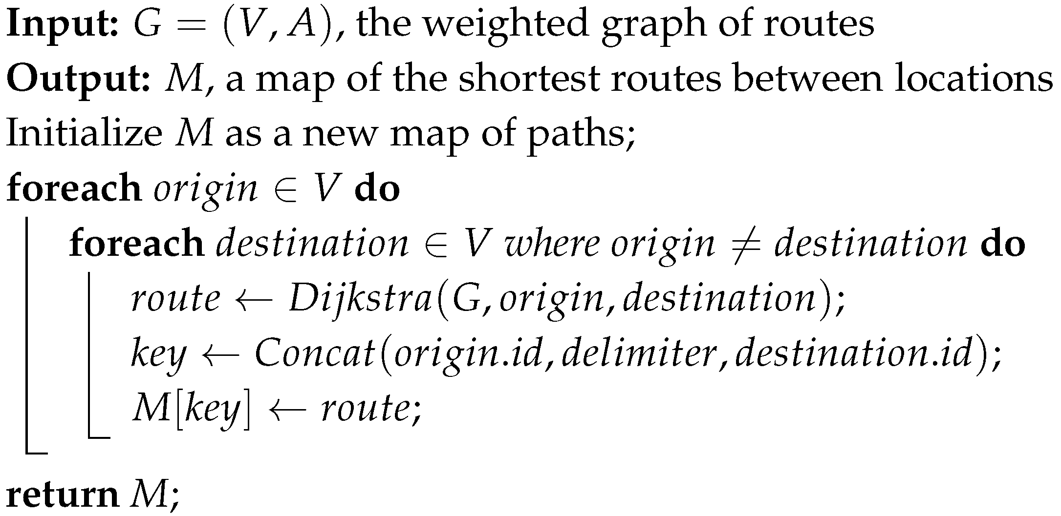
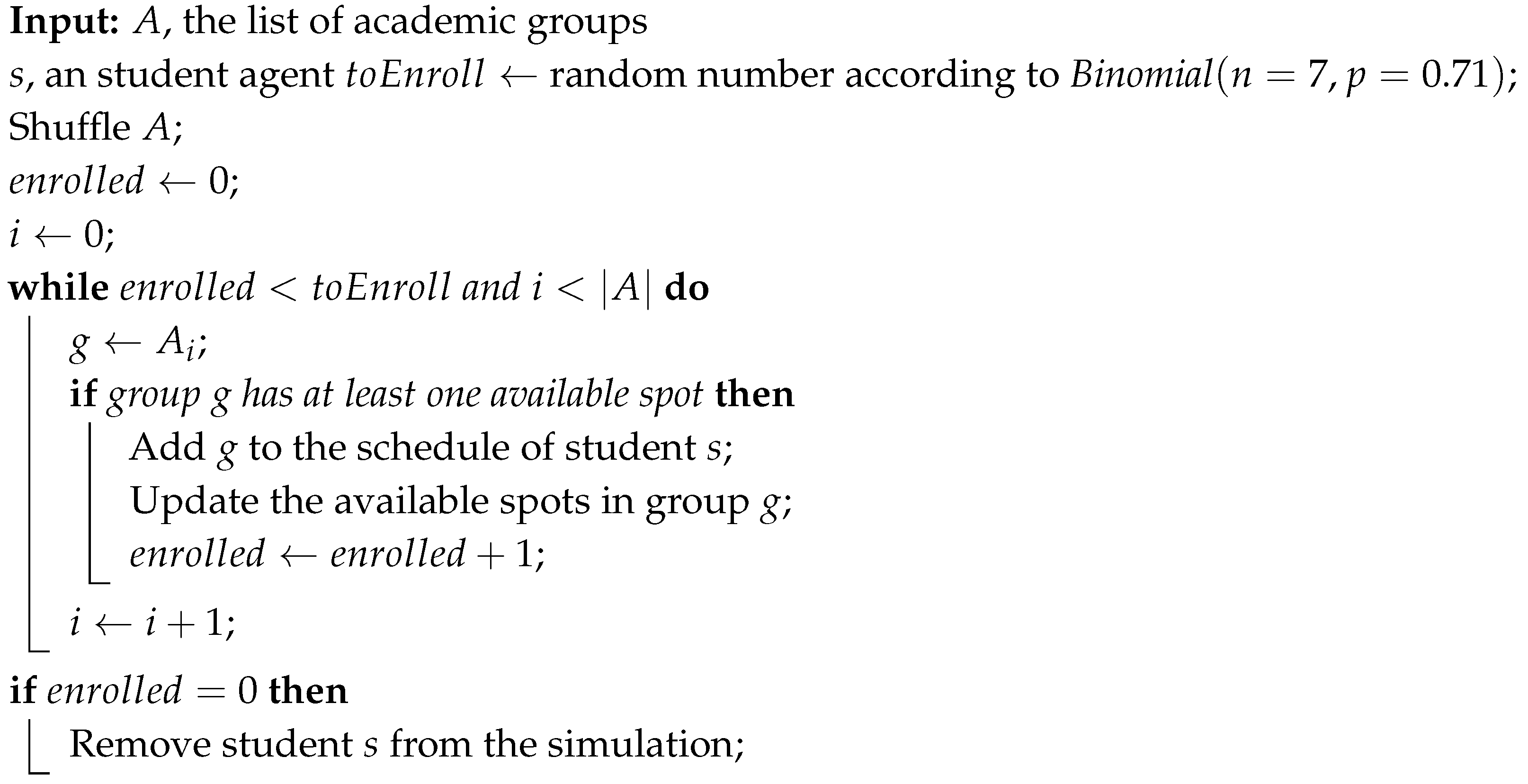
In this section, we present the outcomes of our research, investigating how reinforcement learning impacts social distancing on a simulated campus and, by extension, its influence on the spread of COVID-19. Our main objective was to determine if RL-driven adjustments in behavior could effectively reduce crowding on campus and potentially mitigate the virus’s transmission. Having discussed the theoretical foundations and detailed our experimental setup in previous sections, the focus is now on integrating RL-based adaptive learning into the ABMS model. Additionally, we evaluate the influence of this adaptive learning on campus density and the evolution of the COVID-19 outbreak within our simulation scenarios. We analyze the effects of different RL parameters, such as learning rate (), exploration probability (), and discount factor (), on key metrics like campus density and epidemic dynamics. Through rigorous statistical analysis, we assess the practical implications of these findings, shedding light on the potential of RL-based strategies to reshape social behavior during a pandemic.
3.1. Adaptive learning integration with ABMS
In this subsection, we go into the specifics of the adaptive mechanism we have employed. It is important to recall that our aim with this mechanism is to facilitate agents in learning social distancing behaviors while preserving the normalcy of campus life. We operate under the assumption that individuals within the community are rational and prioritize avoiding infection. This inherent drive motivates them to adapt their behaviors to minimize exposure to potential risks willingly. It is important to note that in our scenario, agents act solely based on their personal experiences and not due to external influences.
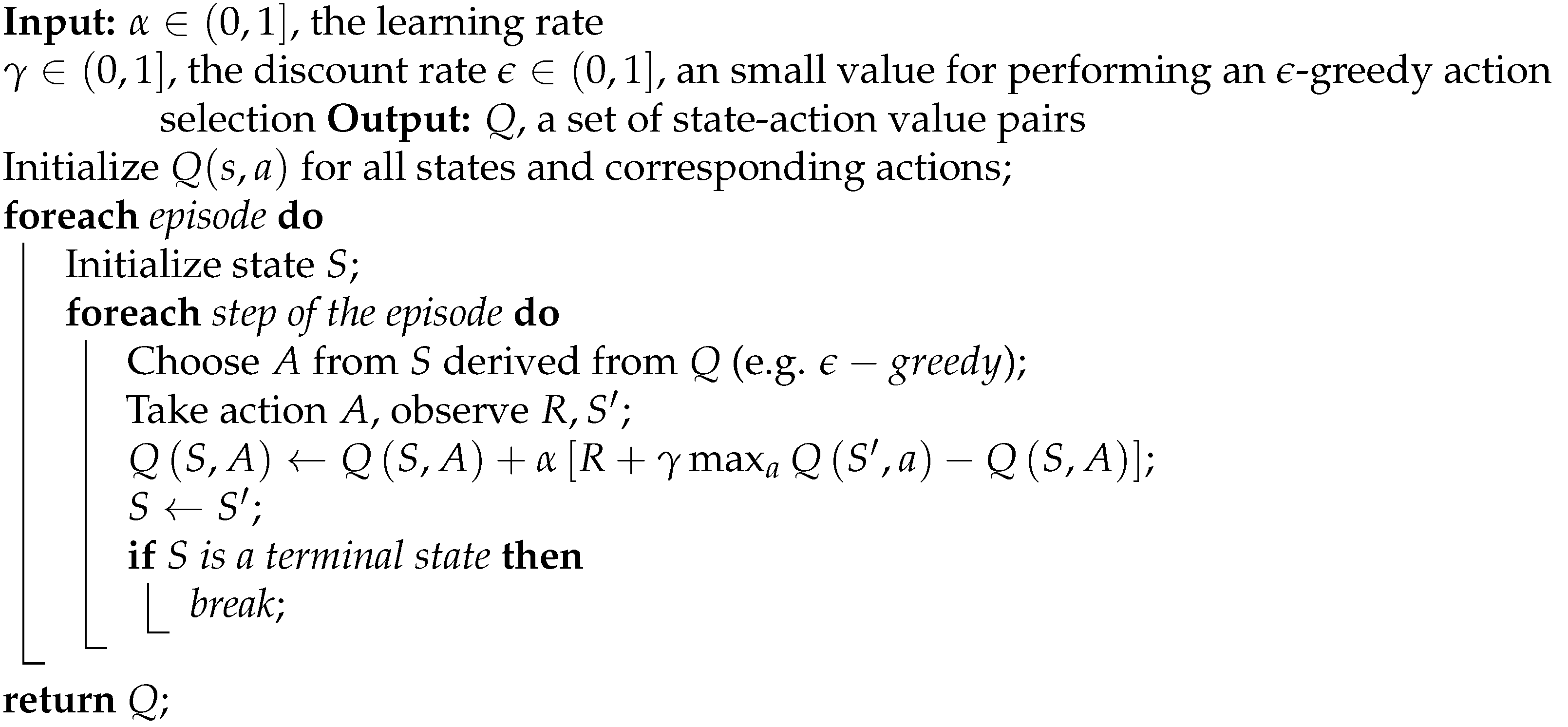
Our chosen learning approach is grounded in a Q-learning scheme with -greedy action selection. We opted for this strategy due to its adaptability, versatility, and ease of implementation. Among the various tabular methods we explored, Q-learning offers a straightforward method for estimating state-action values and is well-suited for navigating a dynamic environment comprising thousands of knowledgeable agents vying for limited resources. Each agent operates independently, mirroring the concurrent adaptation of a small-sized community within the simulation.
There are four fundamental components in our proposed design. Firstly, we have the representation, which defines what states, actions and values signify. Secondly, initialization outlines how the scenarios are set up initially. Thirdly, action selection elucidates the process of choosing the next action in the current state. Lastly, value update elucidates how estimations are revised based on the reward signal. Regarding representation, states correspond to specific locations on campus, with each state representing a distinct available location to visit. Actions, on the other hand, symbolize the act of moving from one location to another. The value associated with a state-action pair indicates the desirability of selecting a particular destination while currently situated in another place. Consequently, the value function is modeled as a lookup table comprising entries, where ’s’ represents the state and ’a’ denotes an available action.
Only the following amenities are considered in the learning process: teaching facilities, common areas, and eating places. It is evident that there is a vast amount of Q values as locations are taken in pairs. On the subject of initialization, preliminary experiments suggested the best setup was leaving all initial figures at zero, thus implying that all places have the same attractiveness factor in the first iteration. The referred situation does not match the classical scheme that recommends a random initialization procedure.
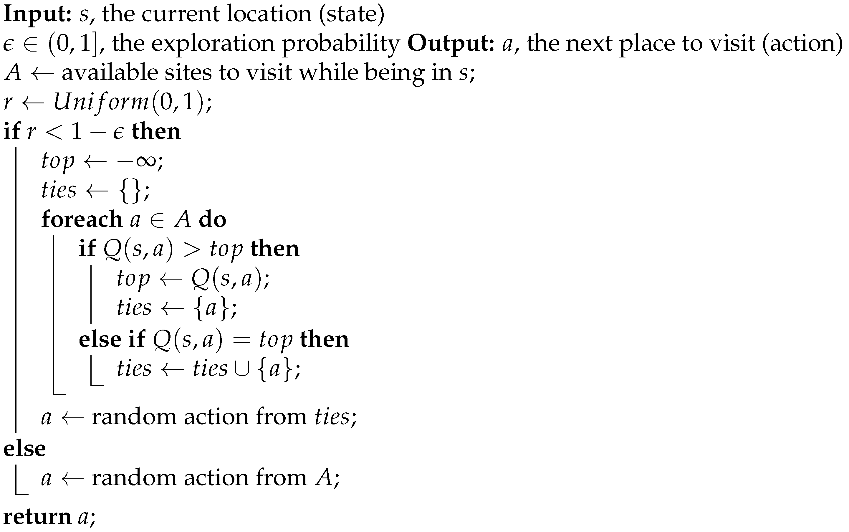
An -greedy strategy was implemented in the matter of action selection. The idea behind this procedure is that actions should be picked considering the exploration-exploitation dilemma. To be exact, the best available action, referring to the one with the highest Q figure, is selected with probability , while a random one is chosen in the opposite case. By way of explanation, the examined method is sketched in Algorithm 4.
Regarding the Q values’ update, a reward signal was picked to outcome positive figures for safe places and negative amounts for sites that exceed the ideal social distancing measure (as described in
Table 4). The proposed payment for landing in a certain location is described by Equation
7, where the social distancing is measured in meters, and the current density of the place is estimated as the number of people in that location over its superficial area in square meters. As an illustration, if the social distancing policy is set to 2 meters, then densities over the 0.5
mark will be considered threatening.
|
Algorithm 4:-greedy action selection |
 |
Considering the four preceding ingredients, the learning scheme can be summarized in Algorithm 5. Essentially, adaptation only happens when the agent faces site selection circumstances. It is crucial to clarify that the convergence of the algorithm greatly depends on the parameter configuration, as careful attention is required to balance the exploration-exploitation dilemma [
13]. For that purpose, a three-factor factorial design of experiments is applied to analyze each parameter’s effects. Despite everything, results are expected to show different outcomes, good or bad, under each scenario. Anyhow, the intention was not to reveal pleasing results in all examined situations; instead, the idea is to identify the key differences under various settings.
|
Algorithm 5: Q-learning scheme for crowding reduction |
 |
In order to assess the influence of the implemented RL-based adaptive features, a base scenario is defined. The selected reference settings render a population of 10,000 students and 200 staffers and fix both the infectious radius and social distancing measure to 2 meters. Besides, we use a uniform random procedure to select facilities (similar to an
setup). Therefore, the picked parameter values are the same as those reported in the default value column in
Table 4. However, bear in mind that learning parameters
,
, and
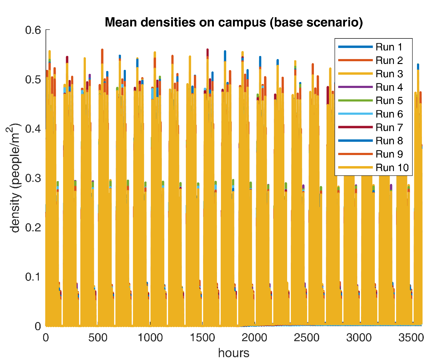
have no effect at all in the course of the earlier described scenario. For descriptive purposes, mean on-campus densities for ten repetitions are shown in
Figure 5.
Figure 5 reveals recurrent patterns of density peaks over the 0.5
threshold, which indicates that the current crowding dynamics do not comply with recommended social practices. However, a more in-depth analysis is required to identify the temporal fragment that poses the greatest threat to the community. Next, some descriptive statistics for the density output are reported in
Table 6.
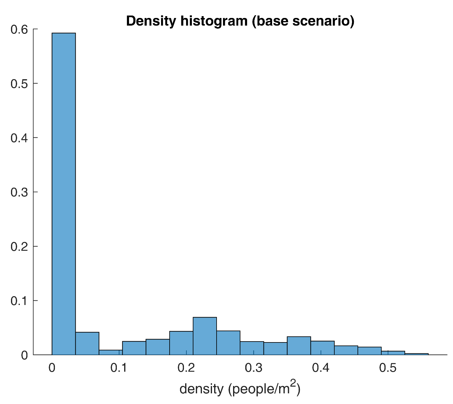
Table 6 shows that the mean density on campus is around 0.10 people per square meter, meaning that agents are 10 meters apart on average. Still, the median value is utterly different from the aforesaid measure, suggesting the presence of outliers. Yet, anomaly detection techniques are not applicable here as the outliers are of special interest in the analysis. Having said that, the recorded high skewness value exhibits a significant positive asymmetry. Simultaneously, the kurtosis figure displays a slight tendency of greater deviations to the mean that conforms with previous findings. In summary, computed metrics agree that density values are not homogeneous and that outliers’ demeanor is meaningful. Along with it, a histogram of densities is plotted in
Figure 6 according to Sturge’s criteria.
As expected, the histogram in
Figure 6 provides further details on the distribution of the density figures. For instance, around 60% of the measurements are lower than the 0.1 people per square meter mark, while only 0.9 percent of the values are actually larger than the social distancing measure. In simpler terms, results show that potentially dangerous situations happen less than 1% of the time.
For good measure,
Figure 6 could raise some doubts about the densities’ distribution since the graphic may lead to thinking that these could be drawn from a mixing of two random variables. One way of making sure that results are legit is by means of an analysis of independence. By this study’s standards, the densities should follow some foreseeable structure, given that gatherings are based upon the academic schedule. Due to this, an overlapped scatter plot should evince non-random patterns, and an autocorrelation plot is likely to exhibit substantial correlations for some lag values.
Figure 7 conveys the previously mentioned diagrams.
Unsurprisingly,
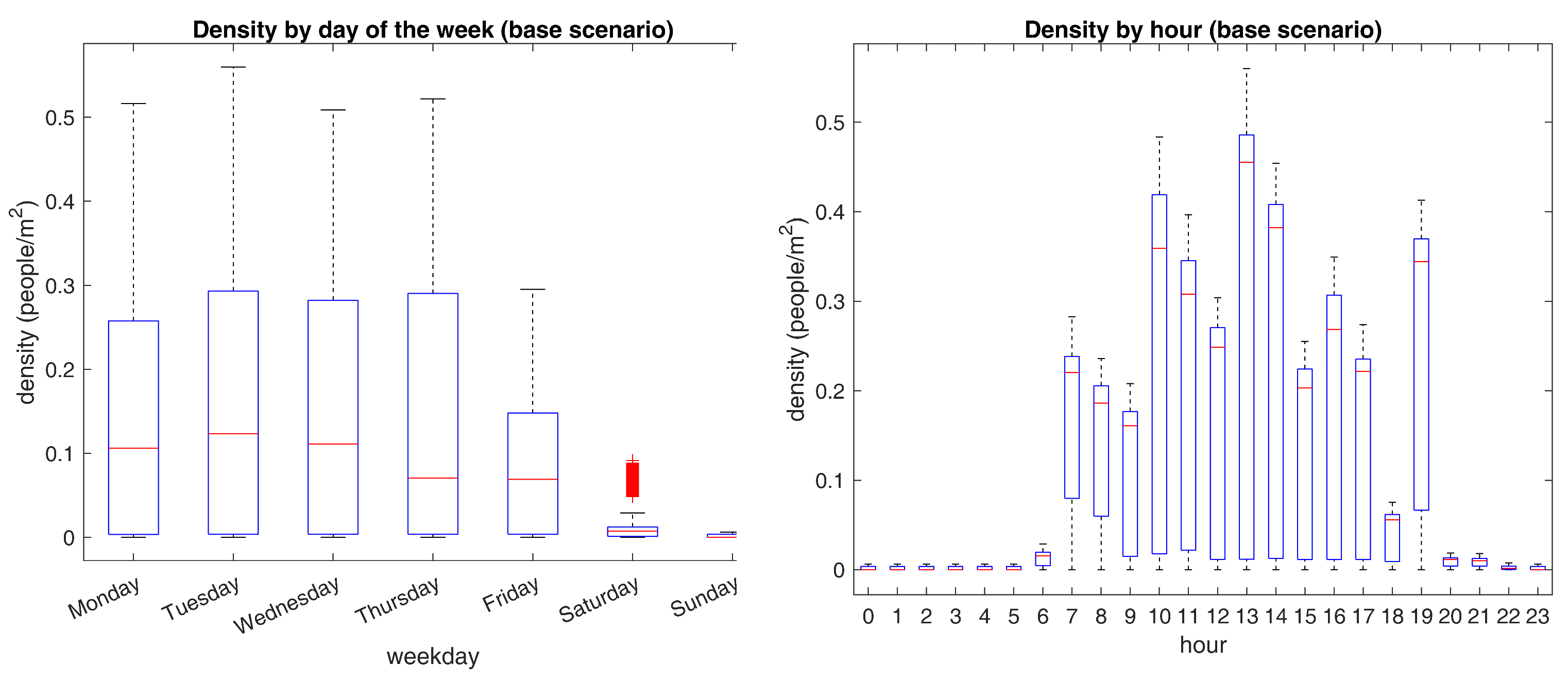
Figure 7 illustrates that densities are not random at all. For all intents and purposes, density values follow a temporal arrangement that bears a linear association with the three preceding data points. To continue with the analysis, two box-plots are brought into the examination to browse how densities behave in various temporal groupings.
Figure 8 presents the above-stated charts.
A closer inspection of
Figure 8 shows noticeable differences between the examined temporal partitions. For instance, it is apparent from the figure on the left that weekends’ densities are almost negligible. Besides, Friday’s quantities do not exceed the 0.35 bar, implying that unfavorable gatherings are not likely to occur from Friday to Sunday. At the same time, Monday to Thursday’s maximum measurements are close to the 0.5 benchmark, with the highest values being recorded on Tuesdays. Setting aside, the figure on the right shows that bigger congregations happen close to lunchtime, where most agents look for a place to eat in one of the few available. Other distinctive top figures are seen near common arrival and departure times, suggesting that agents crowd in places near the entrances and exits at these time frames. Altogether, evidence suggests that Tuesdays close to lunchtime deliver the utmost risk of clustering. For a proper validation of the last statement,
Table 7 presents the mean confidence intervals for the densities each day and in the whole week.
Evidence in
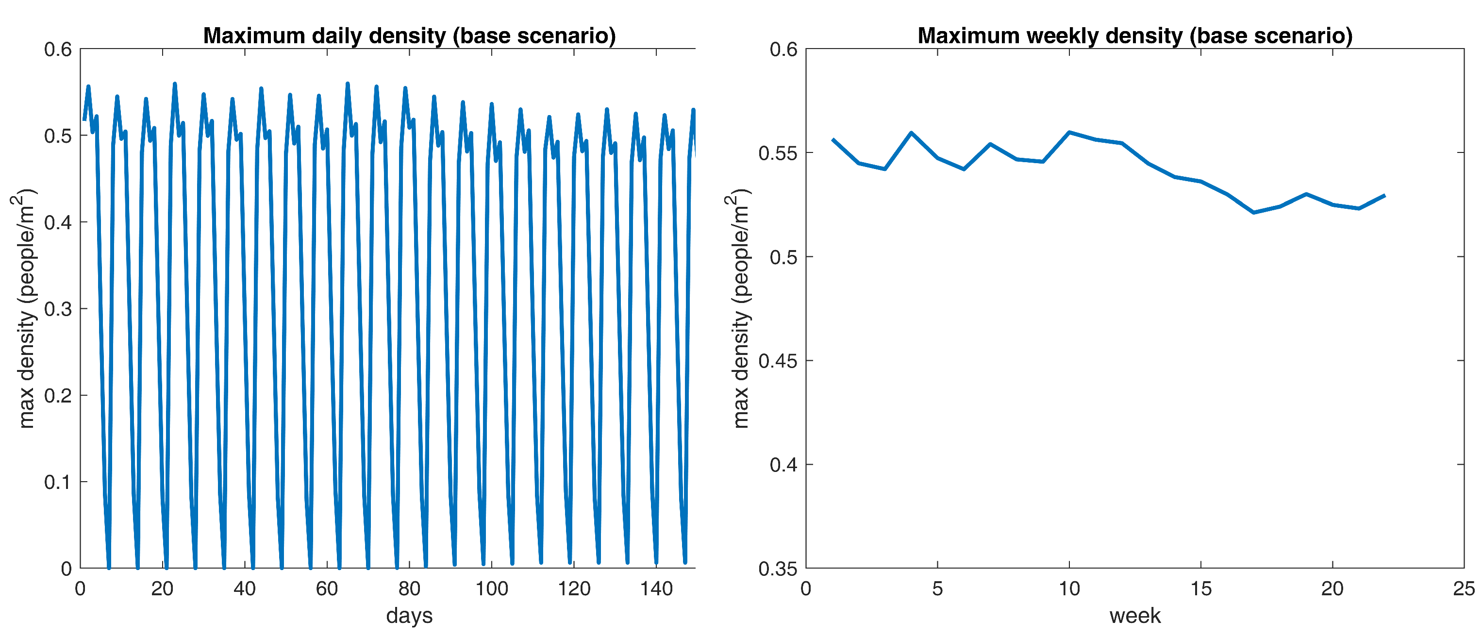
Table 7 supports that Tuesdays hold noticeably larger gatherings than any other day of the week. Now, in relation to the comparison with the implemented learning method, a reference densities curve should be selected. In this case, the maximum weekly density time series is picked, the reason being that it suppresses the effect of the weekend figures and allows for a smoother comparison with experimental results.
Figure 9 displays the aforementioned data points on the right.
What is interesting about the data in
Figure 9 is that maximum densities seem to shift randomly near the 0.55 yardstick up to the 80th day. Then, the specified figures go down a little bit and converge near 0.53. Noticeably, the above behavior matches the scheduled outbreak progression since it starts at day 60 and should begin reporting dead cases in the following 15 to 20 days. The differences suggest that the epidemic itself reduces the maximum crowding values by 0.02, which is not meaningful at all.
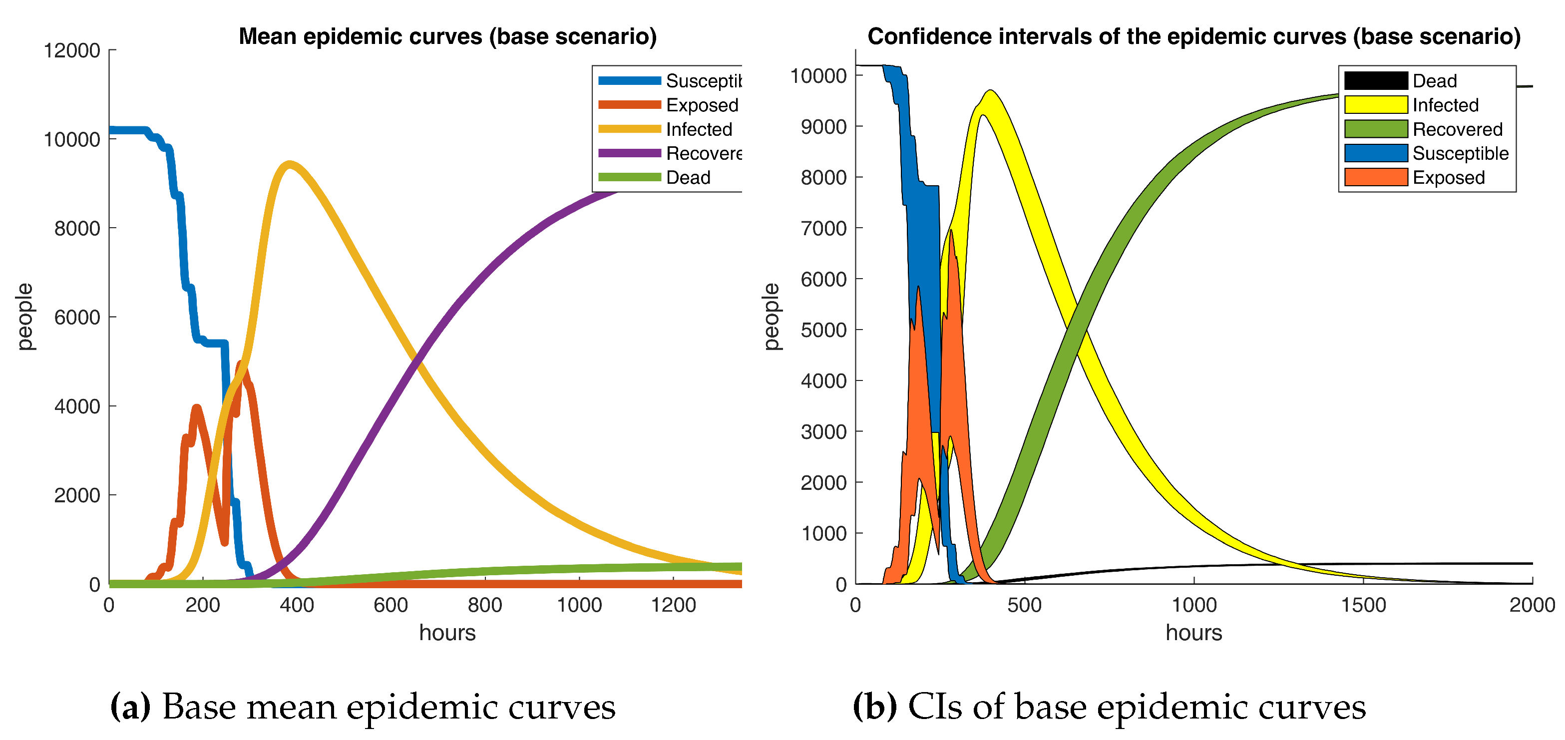
Base epidemic outcomes are showcased in
Figure 10. It is apparent from the graphic that a broad compartmental dynamics holds on the grounds that the manifested behavior resembles a classical SEIRD scheme. Despite that, notable differences are revealed since irregularities are detected in the susceptible and exposed curves. The results are quite revealing in several ways. First, a peak of 9424 infected subjects on day 16 conveys that COVID-19 progresses astonishingly fast in a semi-enclosed community where no action is taken, recording a 0.92 prevalence rate in a couple of weeks from the initial case. Second, a 3.9% mortality rate is registered, comparable to recently reported fatalities ratios [
69]. Finally, a rather odd phenomenon is observed in the exposed curve, as the data does not follow a bell-shaped form; more precisely, exposed cases break in the middle and go up a few days later. The last proceeding could be explained due to the latency term being around 2.4 days shorter than the incubation period and no new infections appearing on weekends.
Robinson [
70] states that multiple replications are required to obtain a good enough estimate of a model’s mean performance. Unequivocally, a central question is: How many simulation runs need to be performed? A rule of thumb hints that at least five repetitions should be carried out. Howbeit, a precise derivation is preferred instead. For instance, a statistically reliable method involves rearranging the confidence interval formula, as shown in Equation
8. Where
X is the variable of interest,
is its expected value,
is its estimated standard deviation,
is the selected significance level, and
d is the percentage deviation of the confidence interval about the mean. Now, taking the maximum weekly density as the variable under study, a significance level of five percent (
) and a deviation of ten percent (
),
minimum replications are obtained. Therefore, at least six simulation runs are recommended per experiment. Indeed, that means that the initial ten runs are sufficient.
3.2. Experimentation
Preceding results show that the learning-lacking scenario does not comply with the social distancing policy. Thus, a design of experiments is aimed to determine the effect of RL-based social distancing with different sets of parameters. Truly, it would be ideal to examine a vast array of parameter settings. Still, extensive simulation times constrain the number of trials to perform in a reasonable time and with limited computing resources. Consequently, a
factorial design is chosen, where
k is the number of factors to analyze. Specifically,
factors are considered according to parameters
,
, and
.
Table 8 presents the figures selected as the low and high levels for each experimental factor.
Factor’s levels were selected intuitively following their effects. Namely,
was assigned a 0.1 low level as smaller values will likely lead to imperceptible corrections and a 0.25 high level as larger figures could potentially head to oscillatory behavior. Similar arguments were examined while choosing the bounds of the remaining parameters.
Table 9 describes the proposed
factorial design.
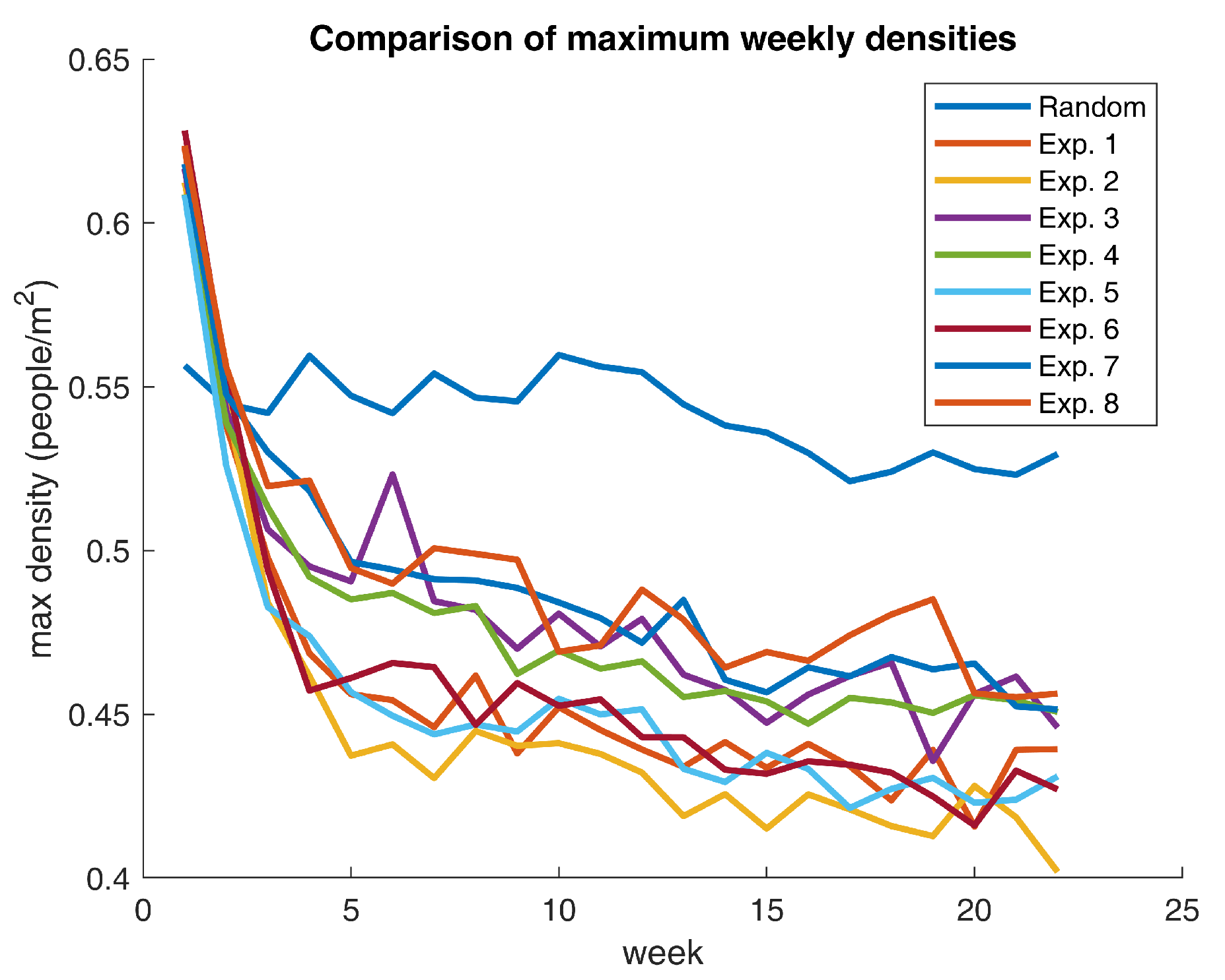
The experiments were repeated six times, as previously stated, to capture the variability of the model’s outcomes up to a 10% confidence interval deviation from the mean. Remarkably, results show that agents are absolutely capable of learning to avoid crowds on campus. Thus validating the hypothesis that the suggested RL-based approach is suitable for implementing the adaptive learning mechanism. As expected, maximum weekly densities reduce progressively while agents accumulate experiences in their daily activities.
Figure 11 exhibits the mentioned behavior.
Figure 11 contrasts the base scenario with the eight experiments. What is striking about the outcomes is that all parameter settings significantly reduce maximum weekly densities with respect to the base case. Notwithstanding, some scenarios provide better results than others. For example, Experiment 2 affords the greatest decline in supreme densities and ends up in a situation where on-campus gatherings are, on average, below the 0.40 mark (10 points below the recommended social distancing policy). Extraordinarily, all experiments render a behavioral shift that positions the community in a sweet spot regarding compliance with the minimum physical distancing measures.
Table 10 displays some relevant density figures for each one of the scenarios.
What stands out in
Table 10 is that the experiments with the highest relative reduction in the maximum weekly densities (Experiments 2 and 6) share the same parameter values for
and
. All in all, evidence suggests that the second setup is a local optimum with respect to the chosen experimental space. Nevertheless, the aforementioned settings are not guaranteed to be a globally optimal selection of learning parameters. Undoubtedly, a more in-depth optimization procedure is required to establish the Pareto set of learning factors to procure the maximum decline in density figures. Having said that, the obtained density reductions represent ideal learning configurations, meaning that these figures do not necessarily reflect actual human behavior. In contrast, those values portray fanciful conditions that could lead to the lowest attainable crowding level on campus.
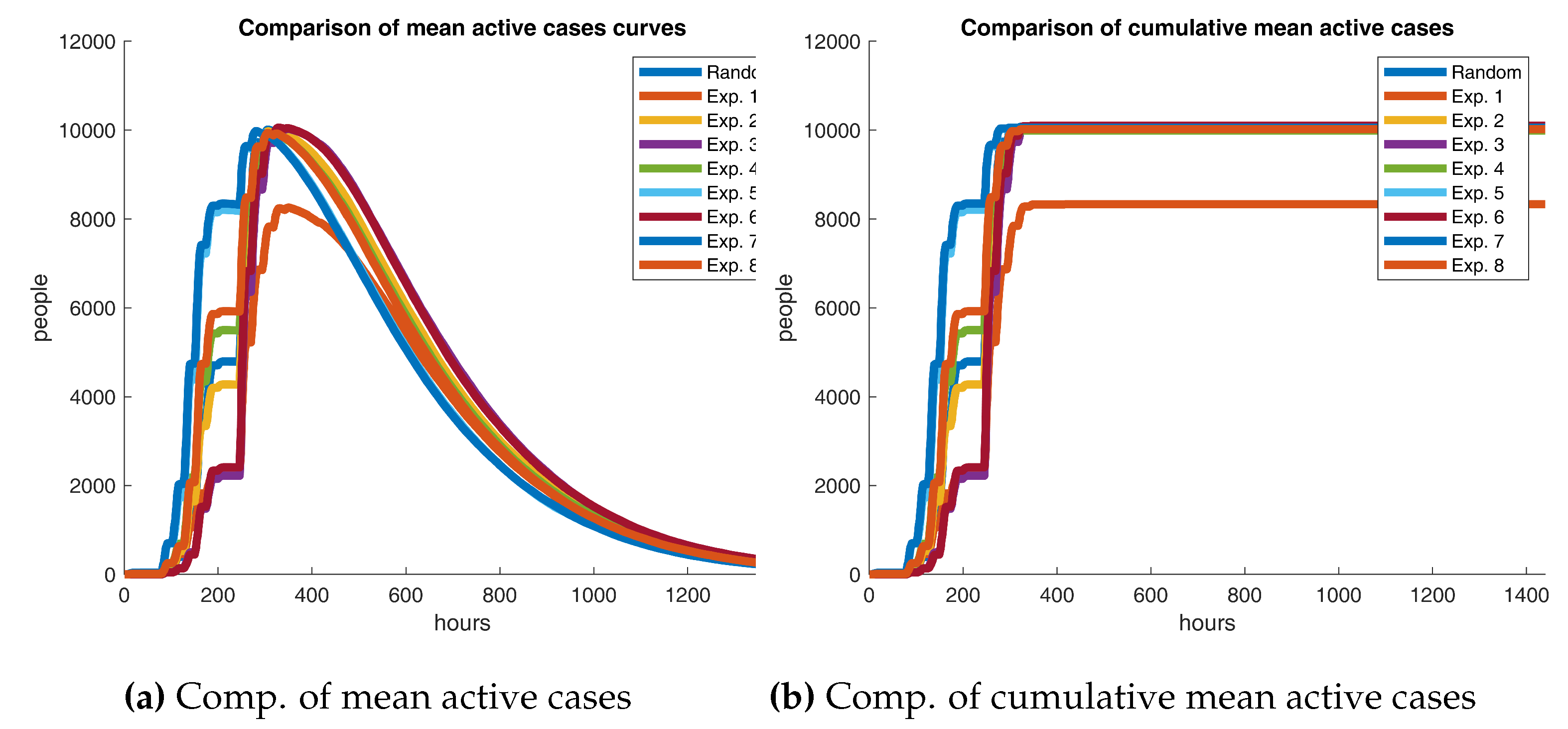
Results show that a significant drop in density values is plausible through a well-calibrated learning mechanism. However, an essential question is: Do these improvements have a meaningful impact on the epidemic? The answer is not straightforward. We will start the analysis by visually inspecting the outcomes.
Figure 12 contrasts the experiments’ active cases curves against the reference scenario. In fact, both graphics show that Experiment 1 seems to drive a massive decrease in the number of infections, leading to a bit more than 1800 people not being exposed at all. One could argue that the first scenario has a positive effect on the outbreak. But are these results statistically significant?
Table 11 presents two other relevant figures to grasp how different the base scenario and the experiments are. The relative mean cumulative difference measures how large is the average distance between the base scenario’s accumulated active cases curve and the same one for a certain experiment with respect to the population size (
N). If the precedent is positive, one could allege that the base scenario produces a relatively higher number of infections on average than the experiment under consideration. Equation
9 presents the formulation of the earlier mentioned metric.
Where, k is the number of hours the epidemic lasts, is the accumulated active cases at hour i in the reference scenario, and is the same as the last one for the experiment under study. Also, the spline difference measurement estimates the area between the two previously mentioned curves. If the area is greater than zero, then the base case furnishes a larger number of contagions than its counterpart in at least one timeframe.
Results in
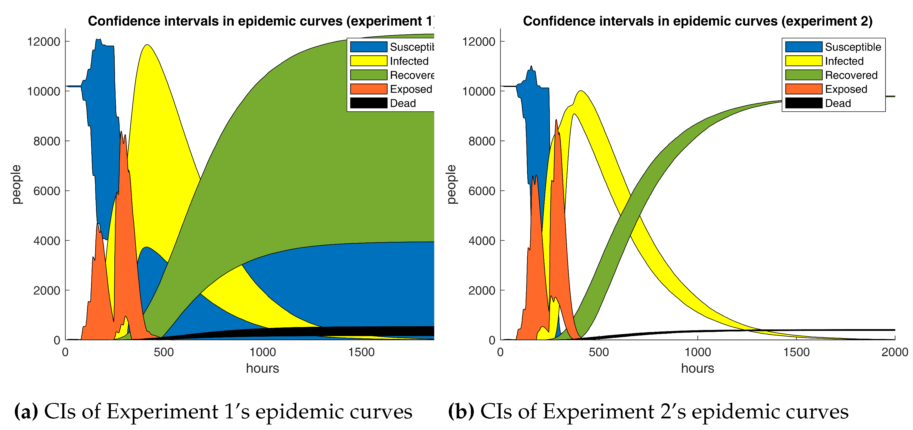
Table 11 are inconsistent with the preceding findings. Unmistakably, both figures should have the same sign if one time series dominates the other one. Nonetheless, signs do not always match, suggesting that the base curve does not entirely surpass the opposite. It is apparent from the data that absolute relative mean differences, excluding Experiment 1, are lower than 2.5%, bespeaking that infections in the base and test scenarios are not strongly dissimilar. Unusually, Experiment 1’s metrics diverge significantly from the remainder, which should not be the case as Experiments 1 and 2 only differ in 0.15 in the discount factor, hence implying the presence of outliers. So far, there is no concrete evidence yielding that adaptive learning has a substantial impact on the outbreak at all. But are Experiment 1’s results legit?
Figure 13 deep dives in this issue.
As predicted, Experiment 1’s results are not reliable. The computed confidence intervals are so broad that they reveal an immense variability in the outputs. Closer inspection unveiled that one of the simulation runs did not lead to a massive outbreak as patient zero recovered very quickly. Thus, the outcomes of Experiment 1 should be ignored in the analysis. As yet, the employed analysis techniques have fallen short. So, non-parametric procedures are put in the mix.
Table 12 displays the p-values of three non-parametric tests to examine if the base scenario and the experiments have sufficient differences to classify them as belonging to separate sets of samples.
Friedman’s test is an ideal statistic to estimate if a particular factor influences the outputs of a process that is measured several times. In particular, its null hypothesis states that the medians of the examined groups of samples are all the same. On the other hand, Wilcoxon’s and Kruskal-Wallis’s tests employ the mean for the comparison. As
Table 12 shows, most experiments reject Friedman’s
, alluding to the median cumulative cases are distinct. Notwithstanding, the remaining tests are never rejected, denoting that no solid evidence confirms the experiments and the reference scenario are statistically different on average. Thereupon, formal methods have proven that although RL-based learning has a meaningful impact on campus densities, nothing suggests the same happens with the epidemic. In addition, the ANOVA procedure in
Table 13 confirms the verdict.
In synch with earlier resolutions,
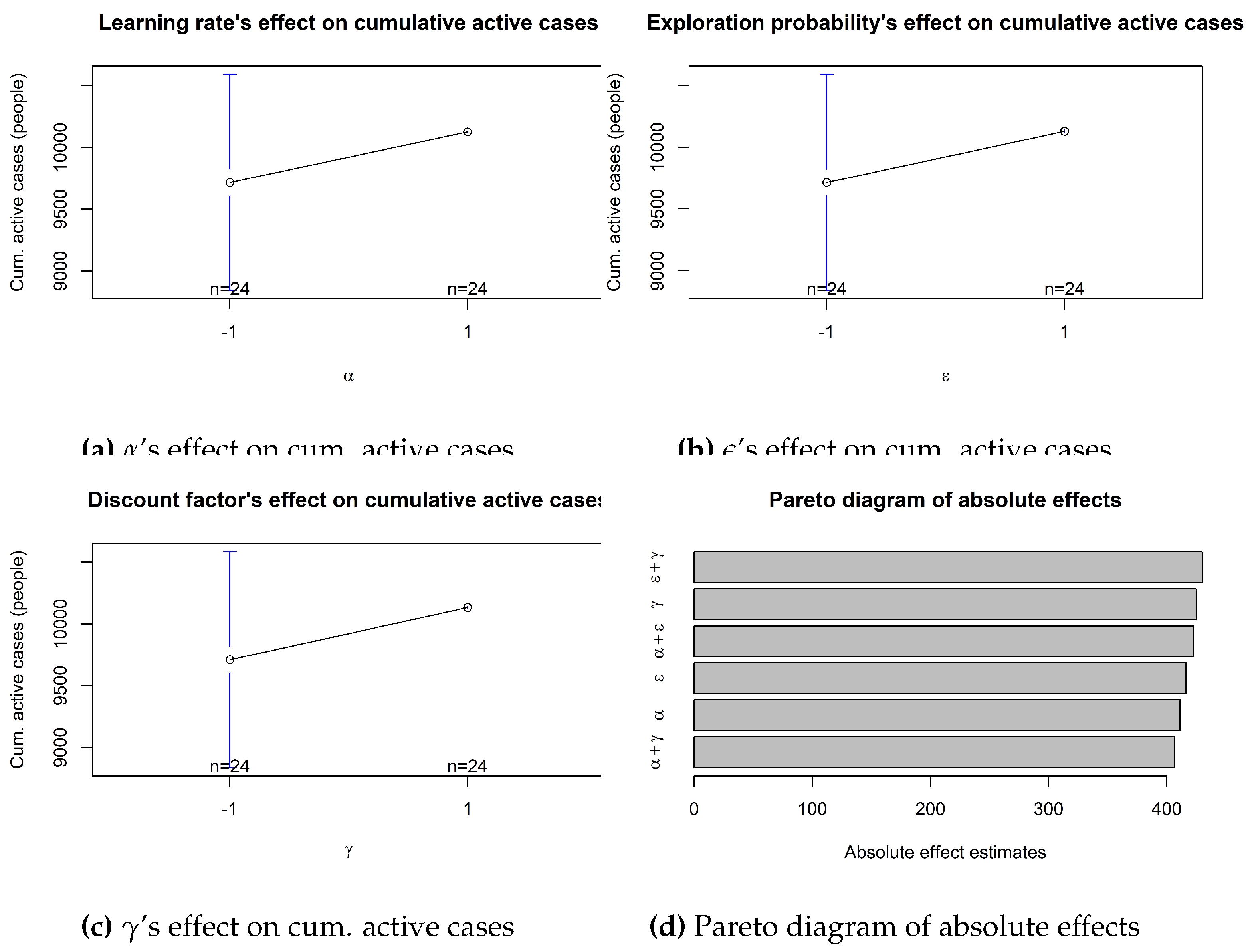
Table 13 unfolds that no factor or combination of factors is significant in the epidemic outcomes, the reason being that all the p-values are higher than the 0.05 significance level. Consequently, all evidence points in the same direction. As an illustration,
Figure 14 displays the estimated effect of each parameter. Unsurprisingly, these effects are quite similar to each other as the ANOVA technique is unable to determine each factor’s influence and, therefore, distributes the impact across the parameters space.
Overall, these results indicate that RL-based learning successfully reduces crowds on campus to the point that the social distancing policy is obeyed on average. However, no statistically significant proof was found of the effect of adaptive learning regarding the epidemic results. The current hypothesis on that matter is that COVID-19 is so contagious that physical distancing in a small semi-enclosed community helps but is not enough to render a substantial decline in the number of infected subjects.
