Submitted:
02 October 2023
Posted:
03 October 2023
You are already at the latest version
Abstract
Keywords:
1. Introduction
1.1. COVID-19: A Brief Overview
1.2. Twitter: A Globally Popular Social Media Platform
1.3. Gender Diversity on Social Media Platforms
2. Literature Review
2.1. A Brief Review of Recent Works related to Sentiment Analysis of Tweets about COVID-19
2.2. Review of Recent Works in Twitter Data Mining and Analysis related to Online Learning during COVID-19
3. Methodology
3.1. Data Description
3.2. System Design and Development
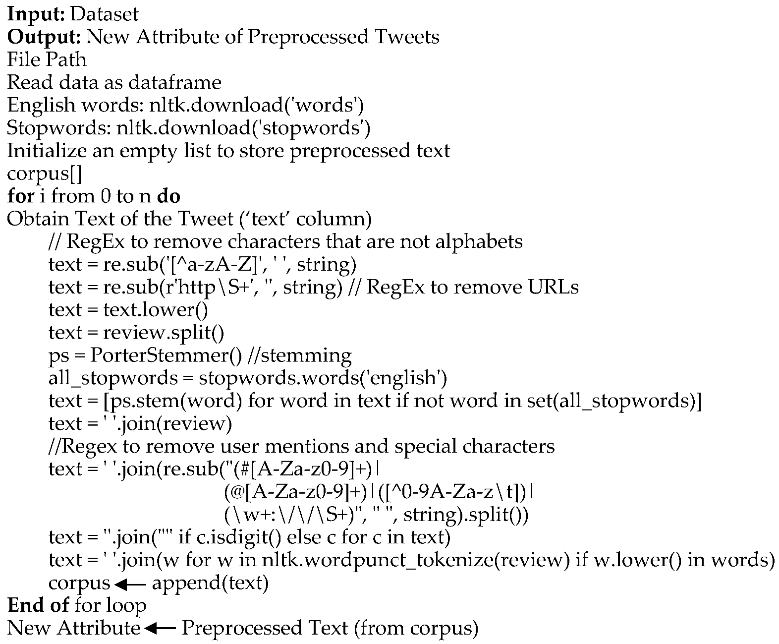
- a)
- Removal of characters that are not alphabets.
- b)
- Removal of URLs
- c)
- Removal of hashtags
- d)
- Removal of user mentions
- e)
- Detection of English words using tokenization.
- f)
- Stemming and Lemmatization.
- g)
- Removal of stop words.
- h)
- Removal of numbers
| Algorithm 1: Data Preprocessing |
 |
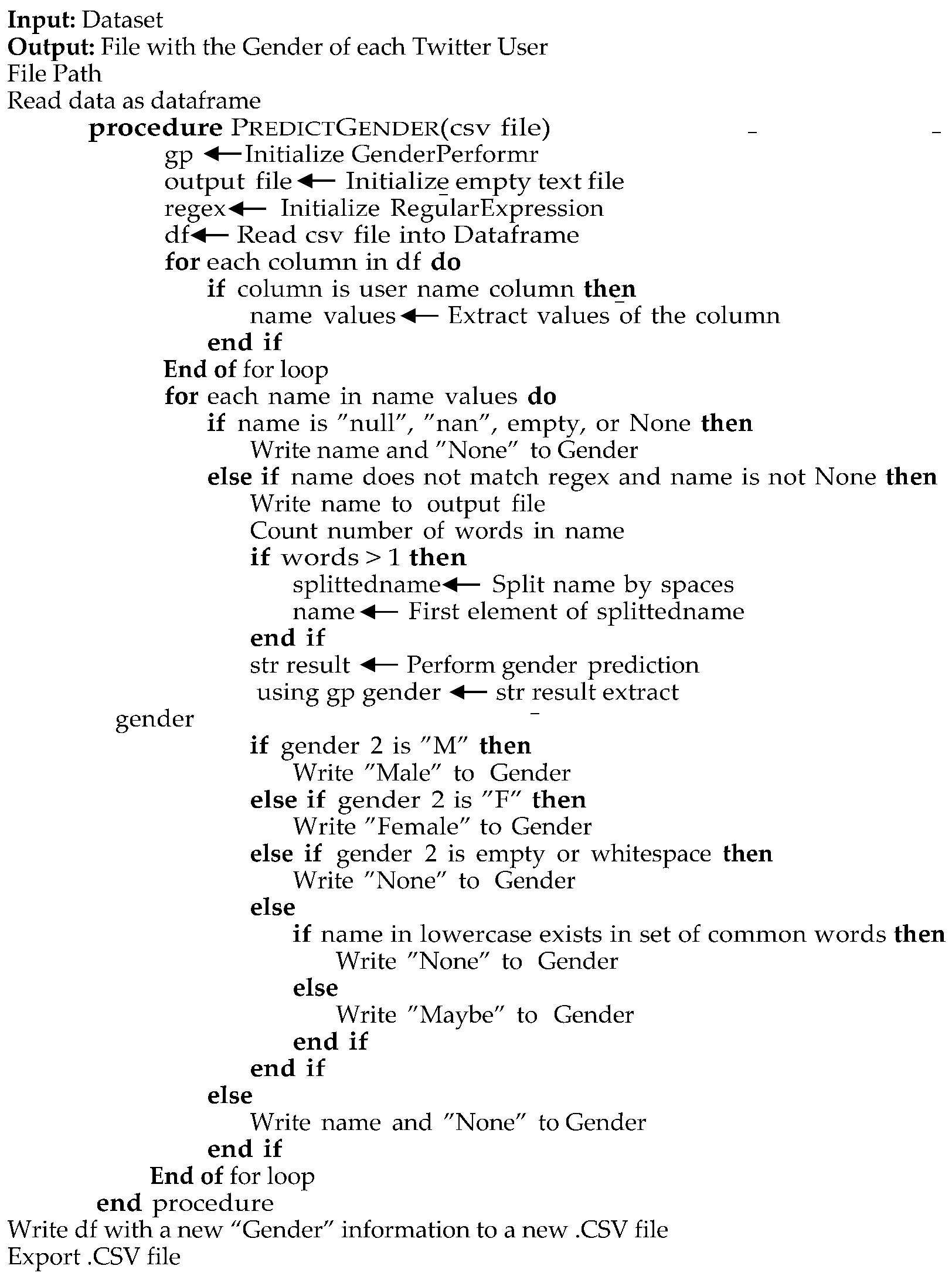
| Algorithm 2: Detect Gender from Twitter Usernames |
 |
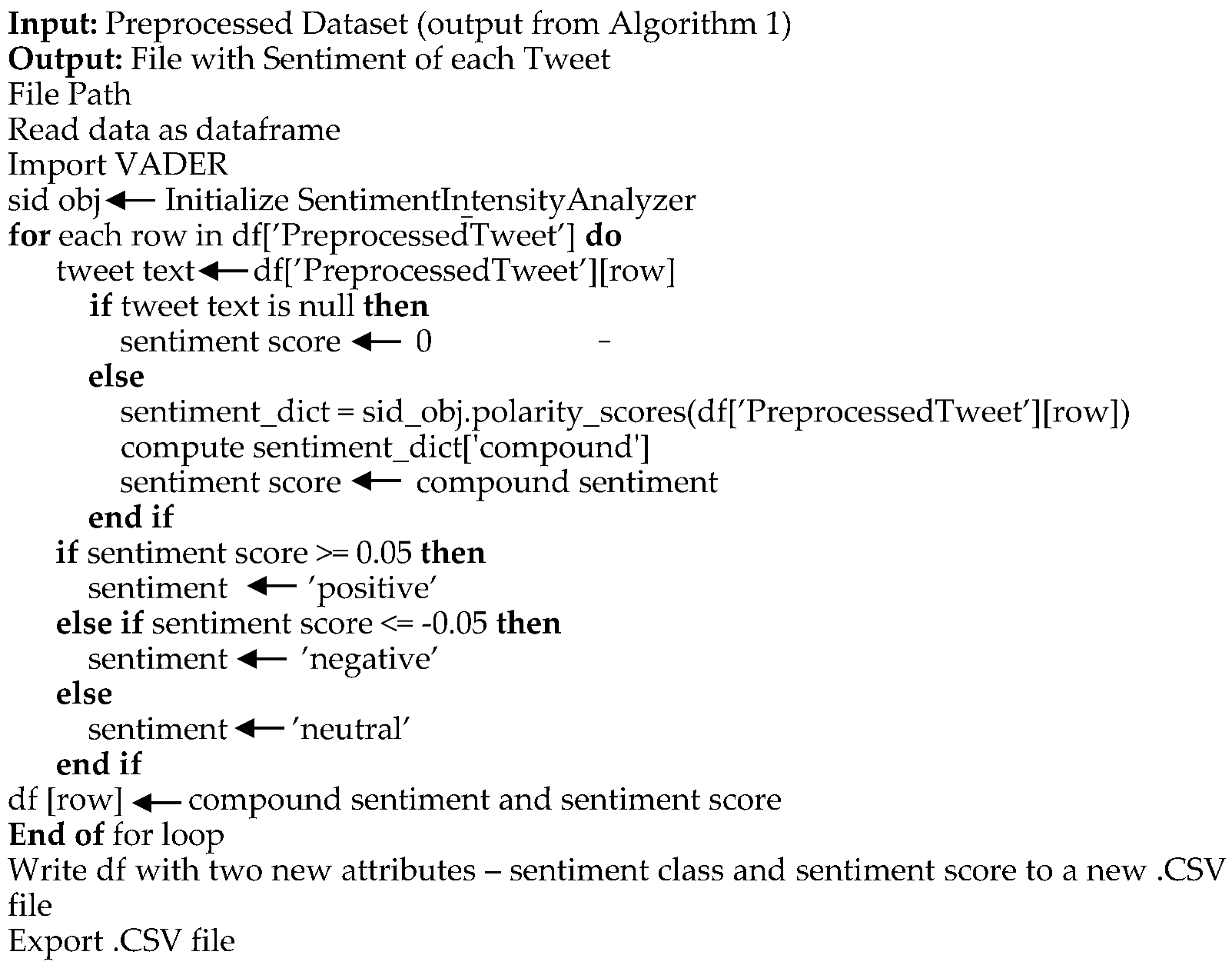
| Algorithm 3: Detect Sentiment of Tweets Using VADER |
 |
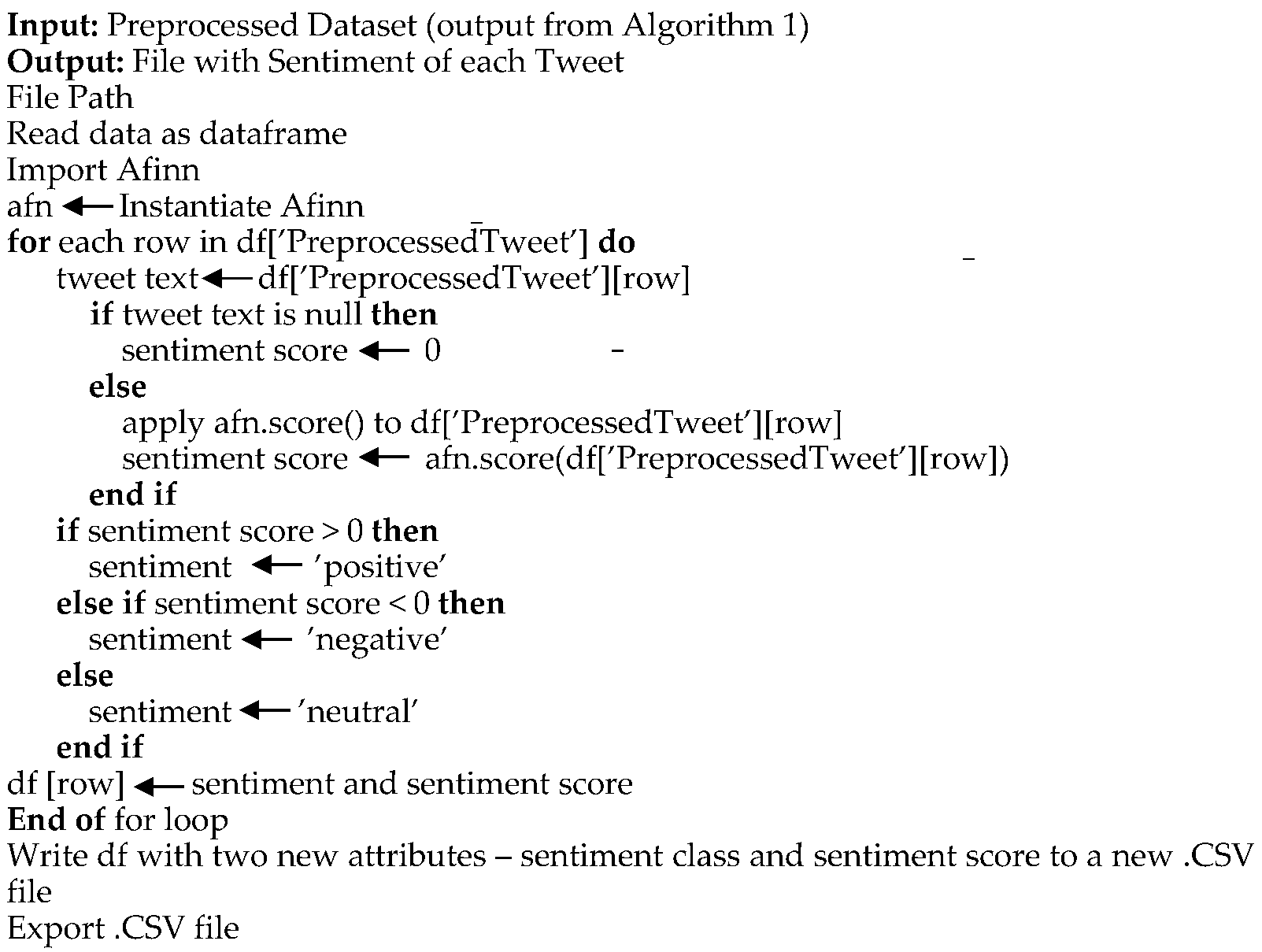
| Algorithm 4: Detect Sentiment of Tweets Using Afinn |
 |
| Algorithm 5: Detect Polarity and Subjectivity of Tweets Using TextBlob |
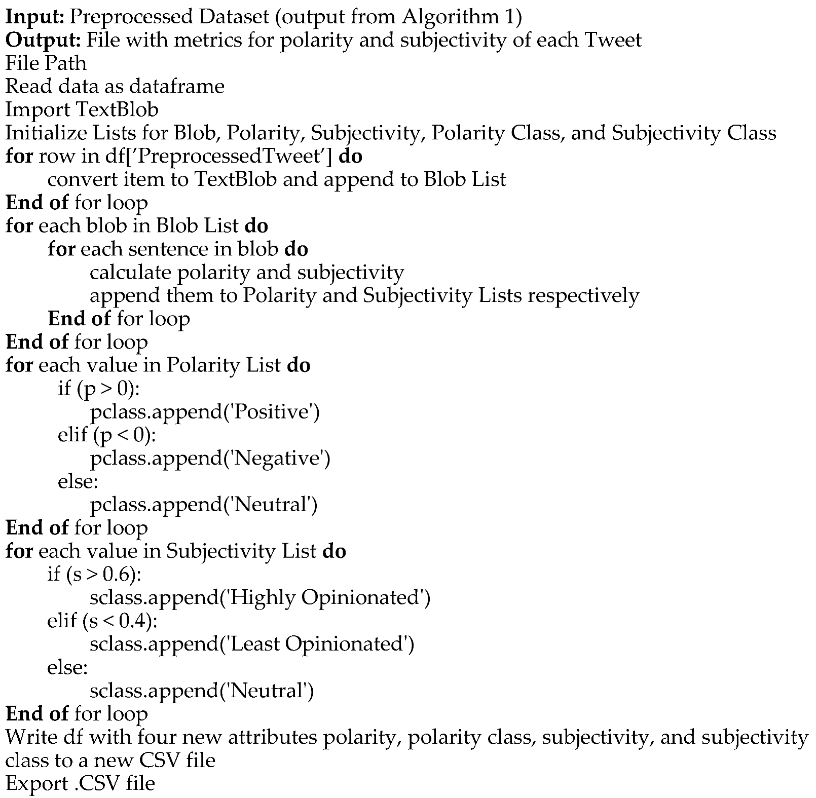 |
| Algorithm 6: Perform Toxicity Analysis of the Tweets Using Detoxify |
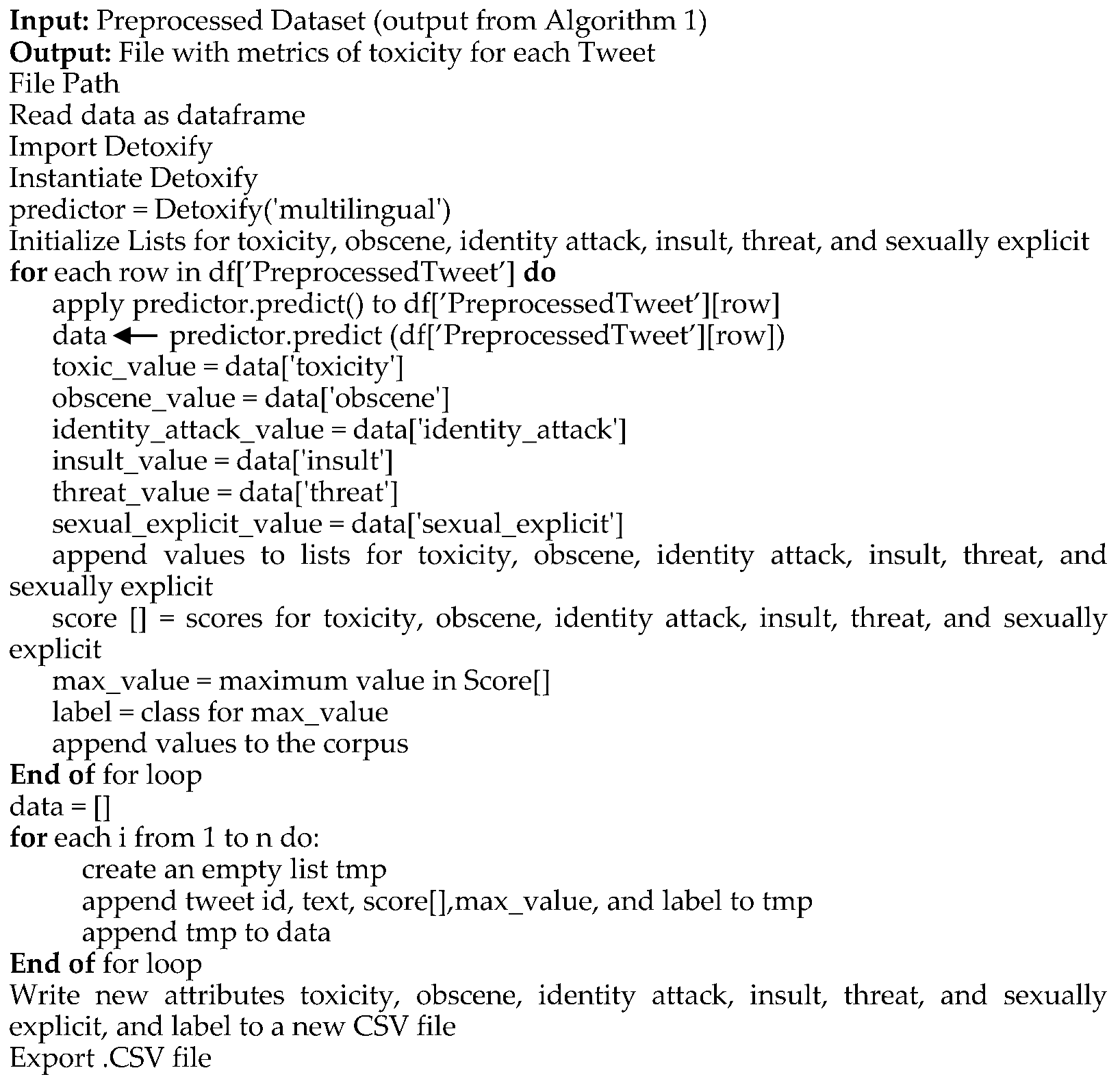 |
| Algorithm 7: Compute Average Activity of different Genders on a monthly basis |
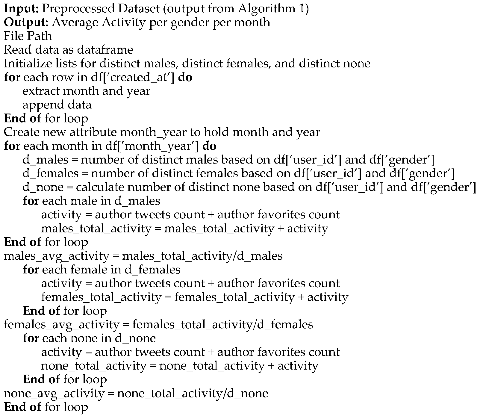 |
| Algorithm 8: Detect Locations of Twitter Users, Visualize Gender-Specific Tweeting Patterns |
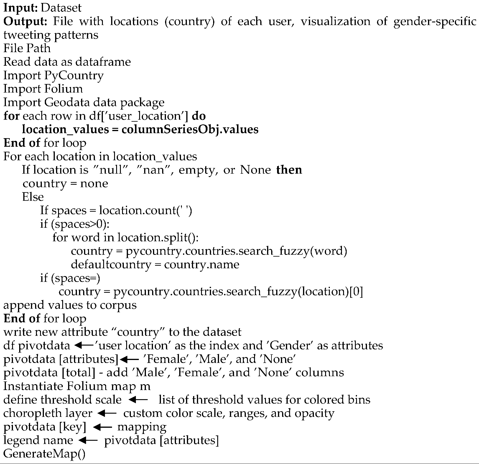 |
4. Results and Discussion
5. Conclusions
Author Contributions
Funding
Institutional Review Board Statement
Informed Consent Statement
Data Availability Statement
Conflicts of Interest
References
- Shi, Y.; Wang, G.; Cai, X.-P.; Deng, J.-W.; Zheng, L.; Zhu, H.-H.; Zheng, M.; Yang, B.; Chen, Z. An Overview of COVID-19. J. Zhejiang Univ. Sci. B 2020, 21, 343–360. [Google Scholar] [CrossRef] [PubMed]
- Fauci, A.S.; Lane, H.C.; Redfield, R.R. Covid-19 — Navigating the Uncharted. N. Engl. J. Med. 2020, 382, 1268–1269. [Google Scholar] [CrossRef] [PubMed]
- Alanagreh, L.; Alzoughool, F.; Atoum, M. The Human Coronavirus Disease COVID-19: Its Origin, Characteristics, and Insights into Potential Drugs and Its Mechanisms. Pathogens 2020, 9, 331. [Google Scholar] [CrossRef] [PubMed]
- Ciotti, M.; Ciccozzi, M.; Terrinoni, A.; Jiang, W.-C.; Wang, C.-B.; Bernardini, S. The COVID-19 Pandemic. Crit. Rev. Clin. Lab. Sci. 2020, 57, 365–388. [Google Scholar] [CrossRef]
- Cucinotta, D.; Vanelli, M. WHO Declares COVID-19 a Pandemic. Acta Bio Medica : Atenei Parmensis 2020, 91, 157. [Google Scholar] [CrossRef]
- WHO Coronavirus (COVID-19) Dashboard. Available online: https://covid19.who.int/ (accessed on 26 September 2023).
- Allen, D.W. Covid-19 Lockdown Cost/Benefits: A Critical Assessment of the Literature. Int. J. Econ. Bus. 2022, 29, 1–32. [Google Scholar] [CrossRef]
- Kumar, V.; Sharma, D. E-Learning Theories, Components, and Cloud Computing-Based Learning Platforms. Int. J. Web-based Learn. Teach. Technol. 2021, 16, 1–16. [Google Scholar] [CrossRef]
- Muñoz-Najar, A.; Gilberto, A.; Hasan, A.; Cobo, C.; Azevedo, J.P.; Akmal, M. Remote Learning during COVID-19: Lessons from Today, Principles for Tomorrow. World Bank 2021. [Google Scholar]
- Simamora, R.M.; De Fretes, D.; Purba, E.D.; Pasaribu, D. Practices, Challenges, and Prospects of Online Learning during Covid-19 Pandemic in Higher Education: Lecturer Perspectives. Stud. Learn. Teach. 2020, 1, 185–208. [Google Scholar] [CrossRef]
- DeNardis, L. The Internet in Everything; Yale University Press: New Haven, CT, 2020; ISBN 9780300233070. [Google Scholar]
- Gruzd, A.; Haythornthwaite, C. Enabling Community through Social Media. J. Med. Internet Res. 2013, 15, e248. [Google Scholar] [CrossRef]
- Belle Wong, J.D. Top Social Media Statistics and Trends of 2023. Available online: https://www.forbes.com/advisor/business/social-media-statistics/ (accessed on 26 September 2023).
- Morgan-Lopez, A.A.; Kim, A.E.; Chew, R.F.; Ruddle, P. Predicting Age Groups of Twitter Users Based on Language and Metadata Features. PLoS One 2017, 12, e0183537. [Google Scholar] [CrossRef] [PubMed]
- Zhou, P.; Yang, X.-L.; Wang, X.-G.; Hu, B.; Zhang, L.; Zhang, W.; Si, H.-R.; Zhu, Y.; Li, B.; Huang, C.-L.; et al. A Pneumonia Outbreak Associated with a New Coronavirus of Probable Bat Origin. Nature 2020, 579, 270–273. [Google Scholar] [CrossRef] [PubMed]
- Zhou, P.; Yang, X.-L.; Wang, X.-G.; Hu, B.; Zhang, L.; Zhang, W.; Si, H.-R.; Zhu, Y.; Li, B.; Huang, C.-L.; et al. Discovery of a Novel Coronavirus Associated with the Recent Pneumonia Outbreak in Humans and Its Potential Bat Origin. bioRxiv 2020.
- Wrapp, D.; Wang, N.; Corbett, K.S.; Goldsmith, J.A.; Hsieh, C.-L.; Abiona, O.; Graham, B.S.; McLellan, J.S. Cryo-EM Structure of the 2019-NCoV Spike in the Prefusion Conformation. Science 2020, 367, 1260–1263. [Google Scholar] [CrossRef]
- Huang, Q.; Herrmann, A. Fast Assessment of Human Receptor-Binding Capability of 2019 Novel Coronavirus (2019-NCoV). bioRxiv 2020.
- Çalıca Utku, A.; Budak, G.; Karabay, O.; Güçlü, E.; Okan, H.D.; Vatan, A. Main Symptoms in Patients Presenting in the COVID-19 Period. Scott. Med. J. 2020, 65, 127–132. [Google Scholar] [CrossRef]
- Larsen, J.R.; Martin, M.R.; Martin, J.D.; Kuhn, P.; Hicks, J.B. Modeling the Onset of Symptoms of COVID-19. Front. Public Health 2020, 8. [Google Scholar] [CrossRef]
- Dial, #infinite The Infinite Dial 2022. Available online: http://www.edisonresearch.com/wp-content/uploads/2022/03/Infinite-Dial-2022-Webinar-revised.pdf (accessed on 26 September 2023).
- Twitter ‘Lurkers’ Follow – and Are Followed by – Fewer Accounts. Available online: https://www.pewresearch.org/short-reads/2022/03/16/5-facts-about-twitter-lurkers/ft_2022-03-16_twitterlurkers_03/ (accessed on 26 September 2023).
- Shewale, R. Twitter Statistics in 2023 — (Facts after “X” Rebranding). Available online: https://www.demandsage.com/twitter-statistics/ (accessed on 26 September 2023).
- Lin, Y. Number of Twitter Users in the US [Aug 2023 Update]. Available online: https://www.oberlo.com/statistics/number-of-twitter-users-in-the-us (accessed on 26 September 2023).
- Twitter: Distribution of Global Audiences 2021, by Age Group. Available online: https://www.statista.com/statistics/283119/age-distribution-of-global-twitter-users/ (accessed on 26 September 2023).
- Feger, A. TikTok Screen Time Will Approach 60 Minutes a Day for US Adult Users. Available online: https://www.insiderintelligence.com/content/tiktok-screen-time-will-approach-60-minutes-day-us-adult-users/ (accessed on 26 September 2023).
- Hootsuite Inc Digital Trends - Digital Marketing Trends 2022. Available online: https://www.hootsuite.com/resources/digital-trends (accessed on 26 September 2023).
- Demographic Profiles and Party of Regular Social Media News Users in the U.S. Available online: https://www.pewresearch.org/journalism/2021/01/12/news-use-across-social-media-platforms-in-2020/pj_2021-01-12_news-social-media_0-04/ (accessed on 26 September 2023).
- Countries with Most X/Twitter Users 2023. Available online: https://www.statista.com/statistics/242606/number-of-active-twitter-users-in-selected-countries/ (accessed on 26 September 2023).
- Kemp, S. Twitter Users, Stats, Data, Trends, and More — DataReportal – Global Digital Insights. Available online: https://datareportal.com/essential-twitter-stats (accessed on 26 September 2023).
- Singh, C. 60+ Twitter Statistics to Skyrocket Your Branding in 2023. Available online: https://www.socialpilot.co/blog/twitter-statistics (accessed on 26 September 2023).
- Albrecht, S.; Lutz, B.; Neumann, D. The Behavior of Blockchain Ventures on Twitter as a Determinant for Funding Success. Electron. Mark. 2020, 30, 241–257. [Google Scholar] [CrossRef]
- Kraaijeveld, O.; De Smedt, J. The Predictive Power of Public Twitter Sentiment for Forecasting Cryptocurrency Prices. J. Int. Financ. Mark. Inst. Money 2020, 65, 101188. [Google Scholar] [CrossRef]
- Saura, J.R.; Palacios-Marqués, D.; Ribeiro-Soriano, D. Using Data Mining Techniques to Explore Security Issues in Smart Living Environments in Twitter. Comput. Commun. 2021, 179, 285–295. [Google Scholar] [CrossRef]
- Mubin, O.; Khan, A.; Obaid, M. #naorobot: Exploring Nao Discourse on Twitter. In Proceedings of the Proceedings of the 28th Australian Conference on Computer-Human Interaction - OzCHI ’16; ACM Press: New York, New York, USA, 2016.
- Siapera, E.; Hunt, G.; Lynn, T. #GazaUnderAttack: Twitter, Palestine and Diffused War. Inf. Commun. Soc. 2015, 18, 1297–1319. [Google Scholar] [CrossRef]
- Chen, E.; Ferrara, E. Tweets in Time of Conflict: A Public Dataset Tracking the Twitter Discourse on the War between Ukraine and Russia. Proceedings of the International AAAI Conference on Web and Social Media 2023, 17, 1006–1013. [Google Scholar] [CrossRef]
- Tao, W.; Peng, Y. Differentiation and Unity: A Cross-Platform Comparison Analysis of Online Posts’ Semantics of the Russian–Ukrainian War Based on Weibo and Twitter. Commun. Public 2023, 8, 105–124. [Google Scholar] [CrossRef]
- Jongman, B.; Wagemaker, J.; Romero, B.; de Perez, E. Early Flood Detection for Rapid Humanitarian Response: Harnessing near Real-Time Satellite and Twitter Signals. ISPRS Int. J. Geoinf. 2015, 4, 2246–2266. [Google Scholar] [CrossRef]
- Madichetty, S.; Muthukumarasamy, S.; Jayadev, P. Multi-Modal Classification of Twitter Data during Disasters for Humanitarian Response. J. Ambient Intell. Humaniz. Comput. 2021, 12, 10223–10237. [Google Scholar] [CrossRef]
- Dimitrova, D.; Heidenreich, T.; Georgiev, T.A. The Relationship between Humanitarian NGO Communication and User Engagement on Twitter. New Media Soc. 2022, 146144482210889. [Google Scholar] [CrossRef]
- Weller, K.; Bruns, A.; Burgess, J.; Mahrt, M.; Twitter, C.P.T. Pages, 447 Twitter and Society. Available online: https://journals.uio.no/TJMI/article/download/825/746/3768 (accessed on 26 September 2023).
- Olza, I.; Koller, V.; Ibarretxe-Antuñano, I.; Pérez-Sobrino, P.; Semino, E. The #ReframeCovid Initiative: From Twitter to Society via Metaphor. Metaphor Soc. World 2021, 11, 98–120. [Google Scholar] [CrossRef]
- Li, M.; Turki, N.; Izaguirre, C.R.; DeMahy, C.; Thibodeaux, B.L.; Gage, T. Twitter as a Tool for Social Movement: An Analysis of Feminist Activism on Social Media Communities. J. Community Psychol. 2021, 49, 854–868. [Google Scholar] [CrossRef]
- Hargittai, E.; Walejko, G. THE PARTICIPATION DIVIDE: Content Creation and Sharing in the Digital Age1. Inf. Commun. Soc. 2008, 11, 239–256. [Google Scholar] [CrossRef]
- Trevor, M.C. Political Socialization, Party Identification, and the Gender Gap. Public Opin. Q. 1999, 63, 62–89. [Google Scholar] [CrossRef]
- Verba, S.; Schlozman, K.L.; Brady, H.E. Voice and Equality: Civic Voluntarism in American Politics; Harvard University Press: London, England, 1995; ISBN 9780674942936. [Google Scholar]
- Bode, L. Closing the Gap: Gender Parity in Political Engagement on Social Media. Inf. Commun. Soc. 2017, 20, 587–603. [Google Scholar] [CrossRef]
- Lutz, C.; Hoffmann, C.P.; Meckel, M. Beyond Just Politics: A Systematic Literature Review of Online Participation. First Monday 2014. [Google Scholar] [CrossRef]
- Strandberg, K. A Social Media Revolution or Just a Case of History Repeating Itself? The Use of Social Media in the 2011 Finnish Parliamentary Elections. New Media Soc. 2013, 15, 1329–1347. [Google Scholar] [CrossRef]
- Vochocová, L.; Štětka, V.; Mazák, J. Good Girls Don’t Comment on Politics? Gendered Character of Online Political Participation in the Czech Republic. Inf. Commun. Soc. 2016, 19, 1321–1339. [Google Scholar] [CrossRef]
- Gil de Zúñiga, H.; Veenstra, A.; Vraga, E.; Shah, D. Digital Democracy: Reimagining Pathways to Political Participation. J. Inf. Technol. Politics 2010, 7, 36–51. [Google Scholar] [CrossRef]
- Vissers, S.; Stolle, D. The Internet and New Modes of Political Participation: Online versus Offline Participation. Inf. Commun. Soc. 2014, 17, 937–955. [Google Scholar] [CrossRef]
- Vesnic-Alujevic, L. Political Participation and Web 2.0 in Europe: A Case Study of Facebook. Public Relat. Rev. 2012, 38, 466–470. [Google Scholar] [CrossRef]
- Krasnova, H.; Veltri, N.F.; Eling, N.; Buxmann, P. Why Men and Women Continue to Use Social Networking Sites: The Role of Gender Differences. J. Strat. Inf. Syst. 2017, 26, 261–284. [Google Scholar] [CrossRef]
- Social Media Fact Sheet. Available online: https://www.pewresearch.org/internet/fact-sheet/social-media/?tabId=tab-45b45364-d5e4-4f53-bf01-b77106560d4c (accessed on 26 September 2023).
- Global WhatsApp User Distribution by Gender 2023. Available online: https://www.statista.com/statistics/1305750/distribution-whatsapp-users-by-gender/ (accessed on 26 September 2023).
- Sina Weibo: User Gender Distribution 2022. Available online: https://www.statista.com/statistics/1287809/sina-weibo-user-gender-distibution-worldwide/ (accessed on 26 September 2023).
- QQ: User Gender Distribution 2022. Available online: https://www.statista.com/statistics/1287794/qq-user-gender-distibution-worldwide/ (accessed on 26 September 2023).
- Samanta, O. Telegram Revenue & User Statistics 2023. Available online: https://prioridata.com/data/telegram-statistics/ (accessed on 26 September 2023).
- Shewale, R. 36 Quora Statistics: All-Time Stats & Data (2023). Available online: https://www.demandsage.com/quora-statistics/ (accessed on 26 September 2023).
- Gitnux The Most Surprising Tumblr Statistics and Trends in 2023. Available online: https://blog.gitnux.com/tumblr-statistics/ (accessed on 26 September 2023).
- Social Media User Diversity Statistics. Available online: https://blog.hootsuite.com/wp-content/uploads/2023/03/twitter-stats-4.jpg (accessed on 26 September 2023).
- WeChat: User Gender Distribution 2022. Available online: https://www.statista.com/statistics/1287786/wechat-user-gender-distibution-worldwide/ (accessed on 26 September 2023).
- Global Snapchat User Distribution by Gender 2023. Available online: https://www.statista.com/statistics/326460/snapchat-global-gender-group/ (accessed on 26 September 2023).
- Villavicencio, C.; Macrohon, J.J.; Inbaraj, X.A.; Jeng, J.-H.; Hsieh, J.-G. Twitter Sentiment Analysis towards COVID-19 Vaccines in the Philippines Using Naïve Bayes. Information (Basel) 2021, 12, 204. [Google Scholar] [CrossRef]
- Boon-Itt, S.; Skunkan, Y. Public Perception of the COVID-19 Pandemic on Twitter: Sentiment Analysis and Topic Modeling Study. JMIR Public Health Surveill. 2020, 6, e21978. [Google Scholar] [CrossRef]
- Marcec, R.; Likic, R. Using Twitter for Sentiment Analysis towards AstraZeneca/Oxford, Pfizer/BioNTech and Moderna COVID-19 Vaccines. Postgrad. Med. J. 2022, 98, 544–550. [Google Scholar] [CrossRef] [PubMed]
- Machuca, C.R.; Gallardo, C.; Toasa, R.M. Twitter Sentiment Analysis on Coronavirus: Machine Learning Approach. J. Phys. Conf. Ser. 2021, 1828, 012104. [Google Scholar] [CrossRef]
- Kruspe, A.; Häberle, M.; Kuhn, I.; Zhu, X.X. Cross-Language Sentiment Analysis of European Twitter Messages Duringthe COVID-19 Pandemic. arXiv [cs.SI], 2020. [Google Scholar]
- Vijay, T.; Chawla, A.; Dhanka, B.; Karmakar, P. Sentiment Analysis on COVID-19 Twitter Data. In Proceedings of the 2020 5th IEEE International Conference on Recent Advances and Innovations in Engineering (ICRAIE); IEEE, 2020.
- Shofiya, C.; Abidi, S. Sentiment Analysis on COVID-19-Related Social Distancing in Canada Using Twitter Data. Int. J. Environ. Res. Public Health 2021, 18, 5993. [Google Scholar] [CrossRef] [PubMed]
- Sontayasara, T.; Jariyapongpaiboon, S.; Promjun, A.; Seelpipat, N.; Saengtabtim, K.; Tang, J.; Leelawat, N.; Department of Industrial Engineering, Faculty of Engineering, Chulalongkorn University 254 Phayathai Road, Pathumwan, Bangkok 10330, Thailand; International School of Engineering, Faculty of Engineering, Chulalongkorn University, Bangkok, Thailand; Disaster and Risk Management Information Systems Research Group, Chulalongkorn University, Bangkok, Thailand Twitter Sentiment Analysis of Bangkok Tourism during COVID-19 Pandemic Using Support Vector Machine Algorithm. J. Disaster Res. 2021, 16, 24–30. [CrossRef]
- Nemes, L.; Kiss, A. Social Media Sentiment Analysis Based on COVID-19. J. Inf. Telecommun. 2021, 5, 1–15. [Google Scholar] [CrossRef]
- Okango, E.; Mwambi, H. Dictionary Based Global Twitter Sentiment Analysis of Coronavirus (COVID-19) Effects and Response. Ann. Data Sci. 2022, 9, 175–186. [Google Scholar] [CrossRef]
- Singh, C.; Imam, T.; Wibowo, S.; Grandhi, S. A Deep Learning Approach for Sentiment Analysis of COVID-19 Reviews. Appl. Sci. (Basel) 2022, 12, 3709. [Google Scholar] [CrossRef]
- Kaur, H.; Ahsaan, S.U.; Alankar, B.; Chang, V. A Proposed Sentiment Analysis Deep Learning Algorithm for Analyzing COVID-19 Tweets. Inf. Syst. Front. 2021, 23, 1417–1429. [Google Scholar] [CrossRef]
- Vernikou, S.; Lyras, A.; Kanavos, A. Multiclass Sentiment Analysis on COVID-19-Related Tweets Using Deep Learning Models. Neural Comput. Appl. 2022, 34, 19615–19627. [Google Scholar] [CrossRef]
- Sharma, S.; Sharma, A. Twitter Sentiment Analysis during Unlock Period of COVID-19. In Proceedings of the 2020 Sixth International Conference on Parallel, Distributed and Grid Computing (PDGC); IEEE, 2020; pp. 221–224.
- Sanders, A.C.; White, R.C.; Severson, L.S.; Ma, R.; McQueen, R.; Alcântara Paulo, H.C.; Zhang, Y.; Erickson, J.S.; Bennett, K.P. Unmasking the Conversation on Masks: Natural Language Processing for Topical Sentiment Analysis of COVID-19 Twitter Discourse. AMIA Summits on Translational Science Proceedings 2021, 2021, 555. [Google Scholar]
- Alabid, N.N.; Katheeth, Z.D. Sentiment Analysis of Twitter Posts Related to the COVID-19 Vaccines. Indones. J. Electr. Eng. Comput. Sci. 2021, 24, 1727. [Google Scholar] [CrossRef]
- Mansoor, M.; Gurumurthy, K.; U, Anantharam R; Prasad, V.R.B. Global Sentiment Analysis of COVID-19 Tweets over Time. arXiv [cs.CL] 2020.
- Singh, M.; Jakhar, A.K.; Pandey, S. Sentiment Analysis on the Impact of Coronavirus in Social Life Using the BERT Model. Soc. Netw. Anal. Min. 2021, 11. [Google Scholar] [CrossRef] [PubMed]
- Imamah; Rachman, F.H. Twitter Sentiment Analysis of Covid-19 Using Term Weighting TF-IDF and Logistic Regresion. In Proceedings of the 2020 6th Information Technology International Seminar (ITIS); IEEE, 2020; pp. 238–242.
- Sahir, S.H.; Ayu Ramadhana, R.S.; Romadhon Marpaung, M.F.; Munthe, S.R.; Watrianthos, R. Online Learning Sentiment Analysis during the Covid-19 Indonesia Pandemic Using Twitter Data. IOP Conf. Ser. Mater. Sci. Eng. 2021, 1156, 012011. [Google Scholar] [CrossRef]
- Althagafi, A.; Althobaiti, G.; Alhakami, H.; Alsubait, T. Arabic Tweets Sentiment Analysis about Online Learning during COVID-19 in Saudi Arabia. Int. J. Adv. Comput. Sci. Appl. 2021, 12. [Google Scholar] [CrossRef]
- Ali, M.M. Arabic Sentiment Analysis about Online Learning to Mitigate Covid-19. J. Intell. Syst. 2021, 30, 524–540. [Google Scholar] [CrossRef]
- Alcober, G.M.I.; Revano, T.F. Twitter Sentiment Analysis towards Online Learning during COVID-19 in the Philippines. In Proceedings of the 2021 IEEE 13th International Conference on Humanoid, Nanotechnology, Information Technology, Communication and Control, Environment, and Management (HNICEM); IEEE, 2021.
- Remali, N.A.S.; Shamsuddin, M.R.; Abdul-Rahman, S. Sentiment Analysis on Online Learning for Higher Education during Covid-19. In Proceedings of the 2022 3rd International Conference on Artificial Intelligence and Data Sciences (AiDAS); IEEE, 2022; pp. 142–147.
- Senadhira, K.I.; Rupasingha, R.A.H.M.; Kumara, B.T.G.S. Sentiment Analysis on Twitter Data Related to Online Learning during the Covid-19 Pandemic. Available online: http://repository.kln.ac.lk/handle/123456789/25416 (accessed on 27 September 2023).
- Lubis, A.R.; Prayudani, S.; Lubis, M.; Nugroho, O. Sentiment Analysis on Online Learning during the Covid-19 Pandemic Based on Opinions on Twitter Using KNN Method. In Proceedings of the 2022 1st International Conference on Information System & Information Technology (ICISIT); IEEE, 2022; pp. 106–111.
- Arambepola, N. Analysing the Tweets about Distance Learning during COVID-19 Pandemic Using Sentiment Analysis. Available online: https://fct.kln.ac.lk/media/pdf/proceedings/ICACT-2020/F-7.pdf (accessed on 27 September 2023).
- Isnain, A.R.; Supriyanto, J.; Kharisma, M.P. Implementation of K-Nearest Neighbor (K-NN) Algorithm for Public Sentiment Analysis of Online Learning. IJCCS 2021, 15, 121. [Google Scholar] [CrossRef]
- Aljabri, M.; Chrouf, S.M.B.; Alzahrani, N.A.; Alghamdi, L.; Alfehaid, R.; Alqarawi, R.; Alhuthayfi, J.; Alduhailan, N. Sentiment Analysis of Arabic Tweets Regarding Distance Learning in Saudi Arabia during the COVID-19 Pandemic. Sensors (Basel) 2021, 21, 5431. [Google Scholar] [CrossRef]
- Asare, A.O.; Yap, R.; Truong, N.; Sarpong, E.O. The Pandemic Semesters: Examining Public Opinion Regarding Online Learning amidst COVID-19. J. Comput. Assist. Learn. 2021, 37, 1591–1605. [Google Scholar] [CrossRef]
- Mujahid, M.; Lee, E.; Rustam, F.; Washington, P.B.; Ullah, S.; Reshi, A.A.; Ashraf, I. Sentiment Analysis and Topic Modeling on Tweets about Online Education during COVID-19. Appl. Sci. (Basel) 2021, 11, 8438. [Google Scholar] [CrossRef]
- Al-Obeidat, F.; Ishaq, M.; Shuhaiber, A.; Amin, A. Twitter Sentiment Analysis to Understand Students’ Perceptions about Online Learning during the Covid’19. In Proceedings of the 2022 International Conference on Computer and Applications (ICCA); IEEE, 2022; Vol. 00, p. 1.
- Waheeb, S.A.; Khan, N.A.; Shang, X. Topic Modeling and Sentiment Analysis of Online Education in the COVID-19 Era Using Social Networks Based Datasets. Electronics (Basel) 2022, 11, 715. [Google Scholar] [CrossRef]
- Integrating Information Gain Methods for Feature Selection in Distance Education Sentiment Analysis during Covid-19. TEM J. 2023, 12, 285–290.
- Fauzan, M.; Setiawan, T. Acts of Hate Speech in News on Twitter Related to Covid-19. Available online: http://icollate.uny.ac.id/sites/icollate.uny.ac.id/files/download-file/PROCEEDING%20ICOLLATE-4%202021-Muhammad%20Fauzan1%2C.pdf (accessed on 27 September 2023).
- Martinez, M.A. What Do People Write about COVID-19 and Teaching, Publicly? Insulators and Threats to Newly Habituated and Institutionalized Practices for Instruction. PLoS One 2022, 17, e0276511. [Google Scholar] [CrossRef] [PubMed]
- Thakur, N. A Large-Scale Dataset of Twitter Chatter about Online Learning during the Current COVID-19 Omicron Wave. Data (Basel) 2022, 7, 109. [Google Scholar] [CrossRef]
- Wilkinson, M.D.; Dumontier, M.; Aalbersberg, I.J.; Appleton, G.; Axton, M.; Baak, A.; Blomberg, N.; Boiten, J.-W.; da Silva Santos, L.B.; Bourne, P.E.; et al. The FAIR Guiding Principles for Scientific Data Management and Stewardship. Sci. Data 2016, 3, 1–9. [Google Scholar] [CrossRef]
- Genderperformr. Available online: https://pypi.org/project/genderperformr/ (accessed on 27 September 2023).
- Wang, Z.; Jurgens, D. It’s Going to Be Okay: Measuring Access to Support in Online Communities. In Proceedings of the Proceedings of the 2018 Conference on Empirical Methods in Natural Language Processing; Association for Computational Linguistics: Stroudsburg, PA, USA; pp. 33–45.
- Hutto, C.; Gilbert, E. VADER: A Parsimonious Rule-Based Model for Sentiment Analysis of Social Media Text. Proceedings of the International AAAI Conference on Web and Social Media 2014, 8, 216–225. [Google Scholar] [CrossRef]
- Nielsen, F.Å. A New ANEW: Evaluation of a Word List for Sentiment Analysis in Microblogs. arXiv [cs.IR] 2011.
- TextBlob. Available online: https://media.readthedocs.org/pdf/textblob/latest/textblob.pdf (accessed on 27 September 2023).
- Jumanto, J.; Muslim, M.A.; Dasril, Y.; Mustaqim, T. Accuracy of Malaysia Public Response to Economic Factors during the Covid-19 Pandemic Using Vader and Random Forest. J. Inf. Syst. Explor. Res. 2022, 1, 49–70. [Google Scholar] [CrossRef]
- Bose, D.R.; Aithal, P.S.; Roy, S. Survey of Twitter Viewpoint on Application of Drugs by VADER Sentiment Analysis among Distinct Countries 2021.
- Borg, A.; Boldt, M. Using VADER Sentiment and SVM for Predicting Customer Response Sentiment. Expert Syst. Appl. 2020, 162, 113746. [Google Scholar] [CrossRef]
- Newman, H.; Joyner, D. Sentiment Analysis of Student Evaluations of Teaching. In Lecture Notes in Computer Science; Springer International Publishing: Cham, 2018; pp. 246–250. ISBN 9783319938455. [Google Scholar]
- Gan, Q.; Yu, Y. Restaurant Rating: Industrial Standard and Word-of-Mouth -- A Text Mining and Multi-Dimensional Sentiment Analysis. In Proceedings of the 2015 48th Hawaii International Conference on System Sciences; IEEE, 2015.
- Gabarron, E.; Dechsling, A.; Skafle, I.; Nordahl-Hansen, A. Discussions of Asperger Syndrome on Social Media: Content and Sentiment Analysis on Twitter. JMIR Form. Res. 2022, 6, e32752. [Google Scholar] [CrossRef]
- Lee, I.T.-L.; Juang, S.-E.; Chen, S.T.; Ko, C.; Ma, K.S.-K. Sentiment Analysis of Tweets on Alopecia Areata, Hidradenitis Suppurativa, and Psoriasis: Revealing the Patient Experience. Front. Med. (Lausanne) 2022, 9. [Google Scholar] [CrossRef]
- Nalisnick, E.T.; Baird, H.S. Character-to-Character Sentiment Analysis in Shakespeare’s Plays. Available online: https://aclanthology.org/P13-2085.pdf (accessed on 27 September 2023).
- Hazarika, D.; Konwar, G.; Deb, S.; Bora, D.J. Sentiment Analysis on Twitter by Using TextBlob for Natural Language Processing. In Proceedings of the Annals of Computer Science and Information Systems; PTI, 2020; Vol. 24.
- Mas Diyasa, I.G.S.; Marini Mandenni, N.M.I.; Fachrurrozi, M.I.; Pradika, S.I.; Nur Manab, K.R.; Sasmita, N.R. Twitter Sentiment Analysis as an Evaluation and Service Base On Python Textblob. IOP Conf. Ser. Mater. Sci. Eng. 2021, 1125, 012034. [Google Scholar] [CrossRef]
- Mansouri, N.; Soui, M.; Alhassan, I.; Abed, M. TextBlob and BiLSTM for Sentiment Analysis toward COVID-19 Vaccines. In Proceedings of the 2022 7th International Conference on Data Science and Machine Learning Applications (CDMA); IEEE, 2022.
- Hermansyah, R.; Sarno, R. Sentiment Analysis about Product and Service Evaluation of PT Telekomunikasi Indonesia Tbk from Tweets Using TextBlob, Naive Bayes & K-NN Method. In Proceedings of the 2020 International Seminar on Application for Technology of Information and Communication (iSemantic); IEEE, 2020.
- Detoxify. Available online: https://pypi.org/project/detoxify/ (accessed on 27 September 2023).
- Jigsaw Unintended Bias in Toxicity Classification. Available online: https://www.kaggle.com/c/jigsaw-unintended-bias-in-toxicity-classification (accessed on 27 September 2023).
- Jigsaw Multilingual Toxic Comment Classification. Available online: https://www.kaggle.com/c/jigsaw-multilingual-toxic-comment-classification (accessed on 27 September 2023).
- Toxic Comment Classification Challenge. Available online: https://www.kaggle.com/c/jigsaw-toxic-comment-classification-challenge (accessed on 27 September 2023).
- Sharma, S.; Gupta, V. Role of Twitter User Profile Features in Retweet Prediction for Big Data Streams. Multimed. Tools Appl. 2022, 81, 27309–27338. [Google Scholar] [CrossRef]
- Zambon, V. Gender Identity. Available online: https://www.medicalnewstoday.com/articles/types-of-gender-identity (accessed on 28 September 2023).
- Pycountry. Available online: https://pypi.org/project/pycountry/ (accessed on 28 September 2023).
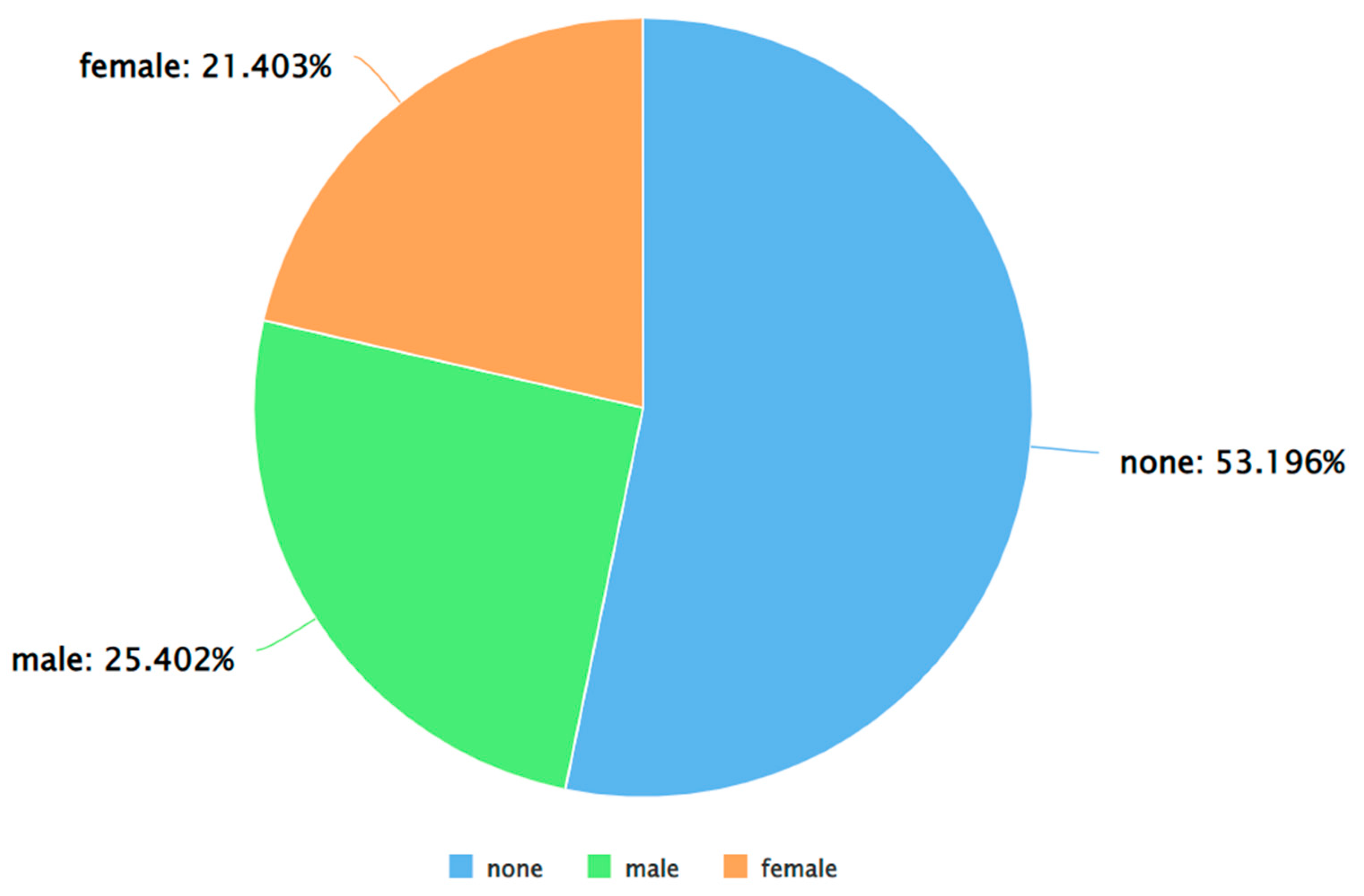

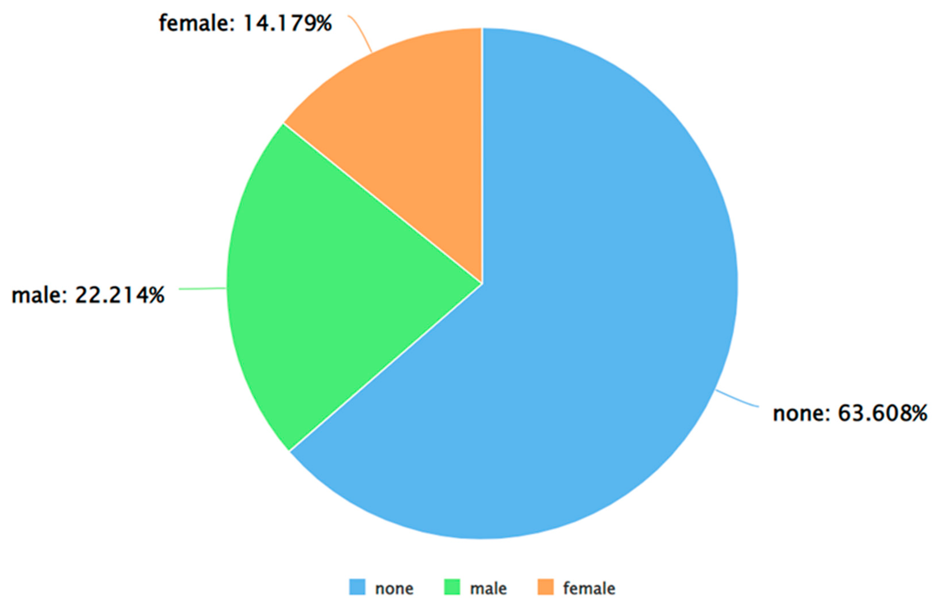
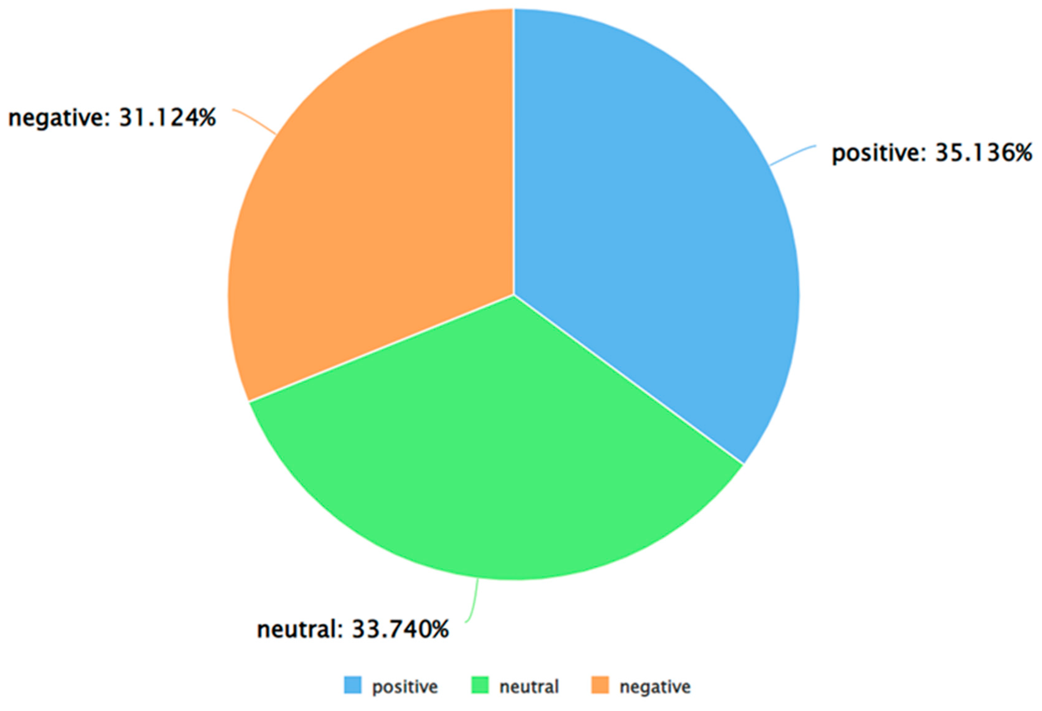
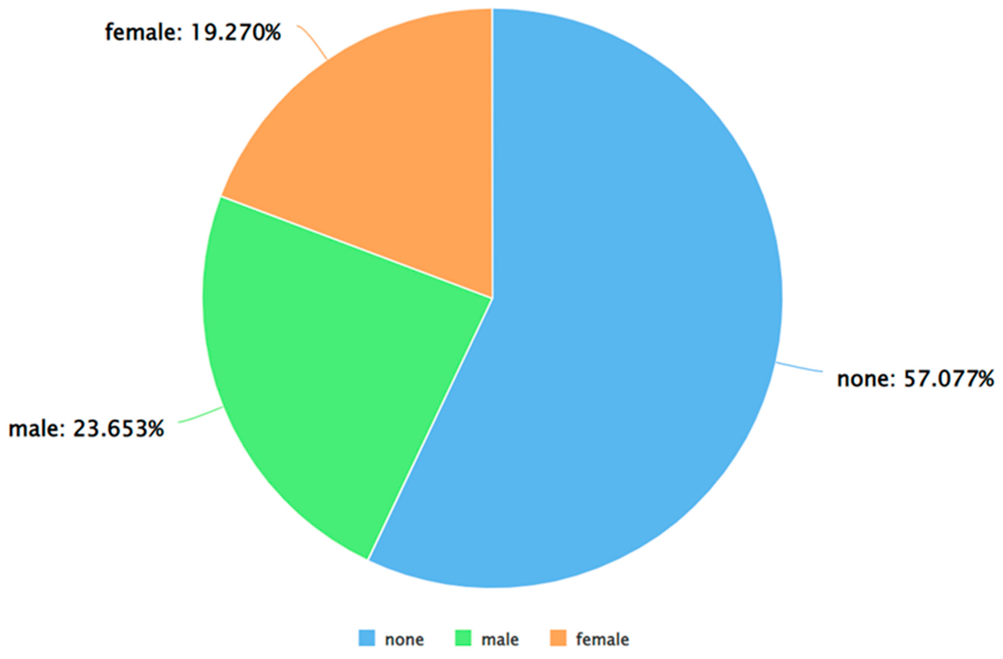


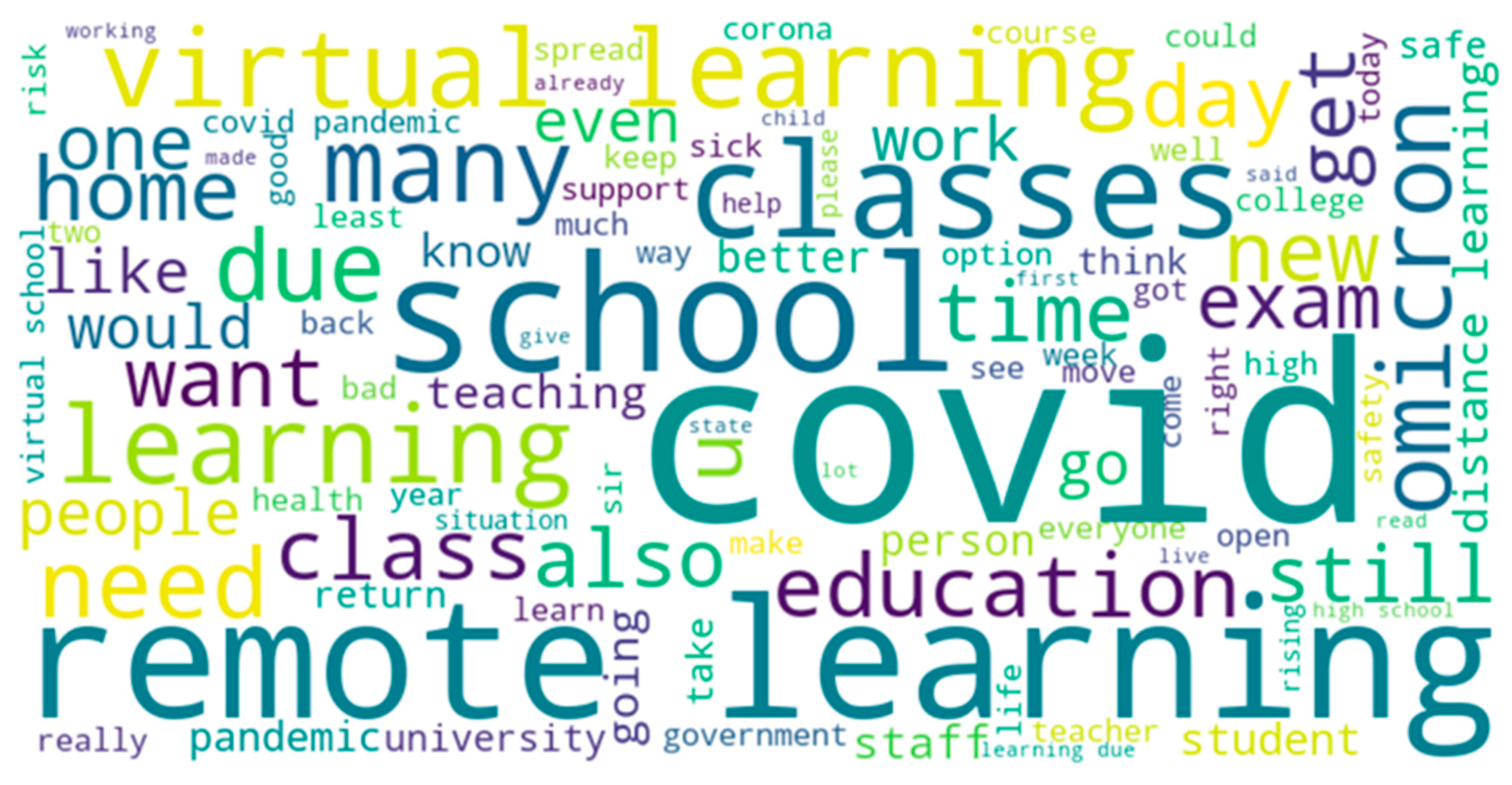
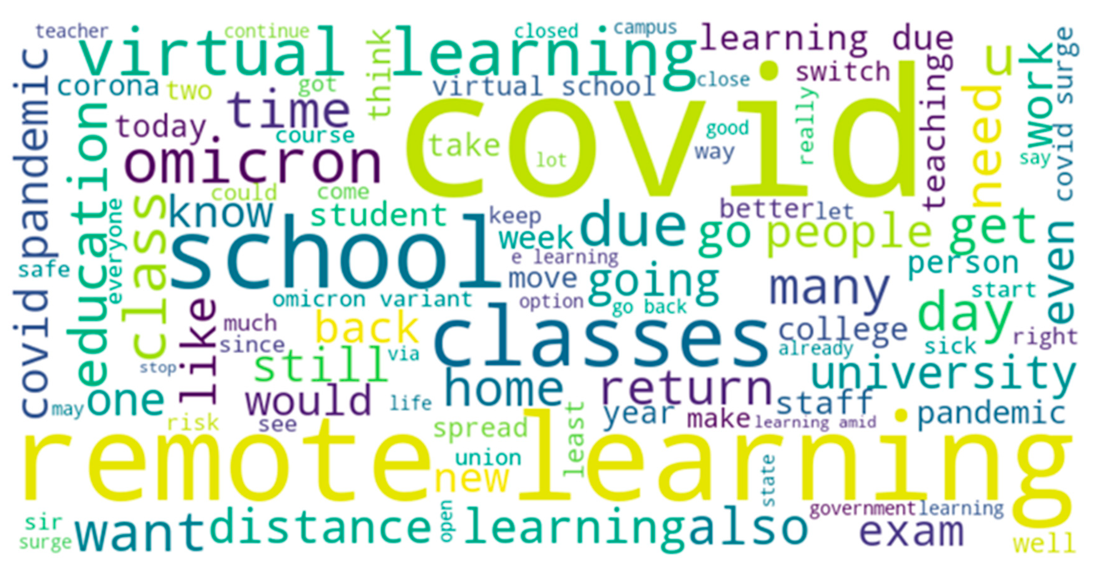
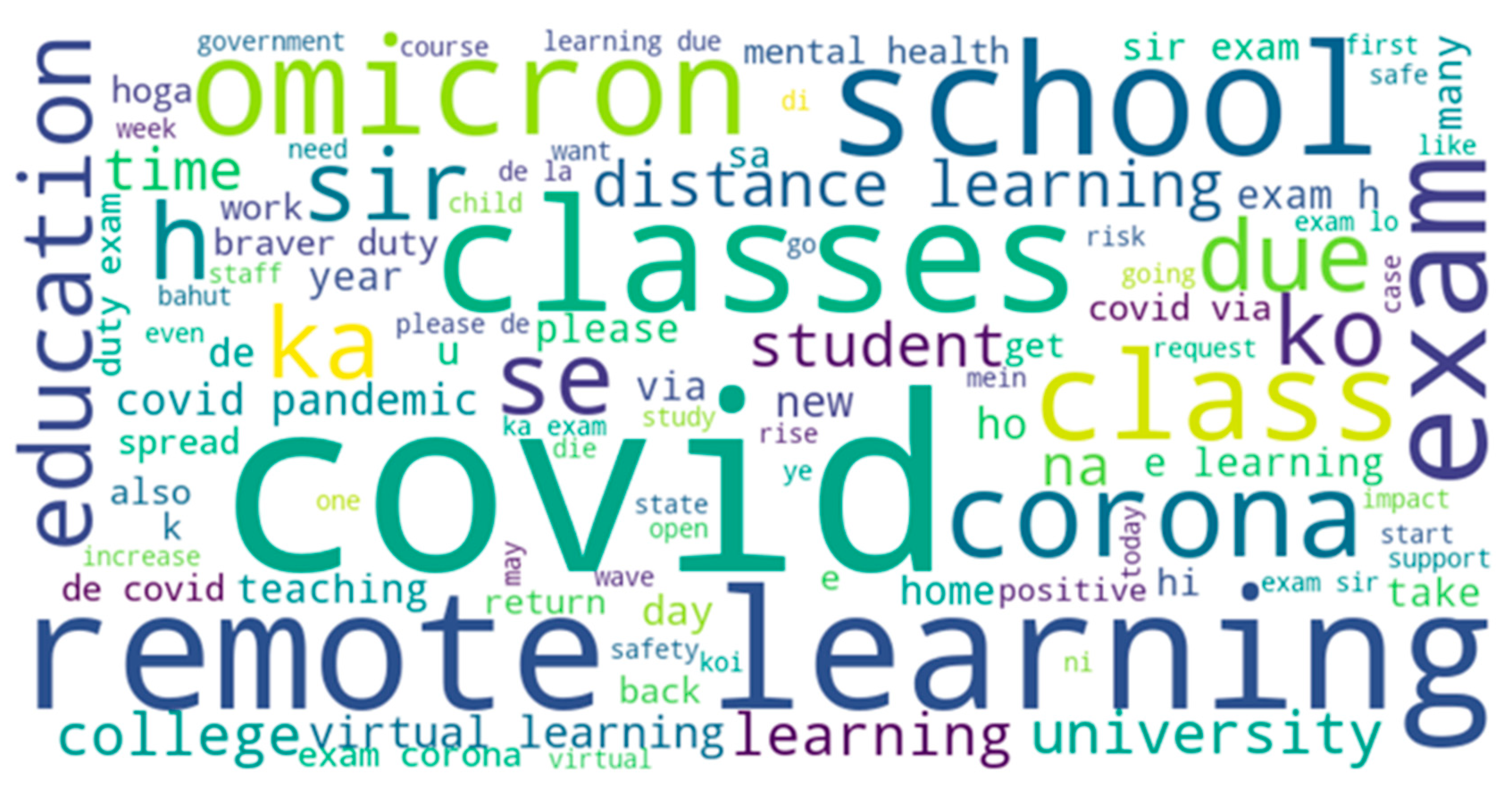
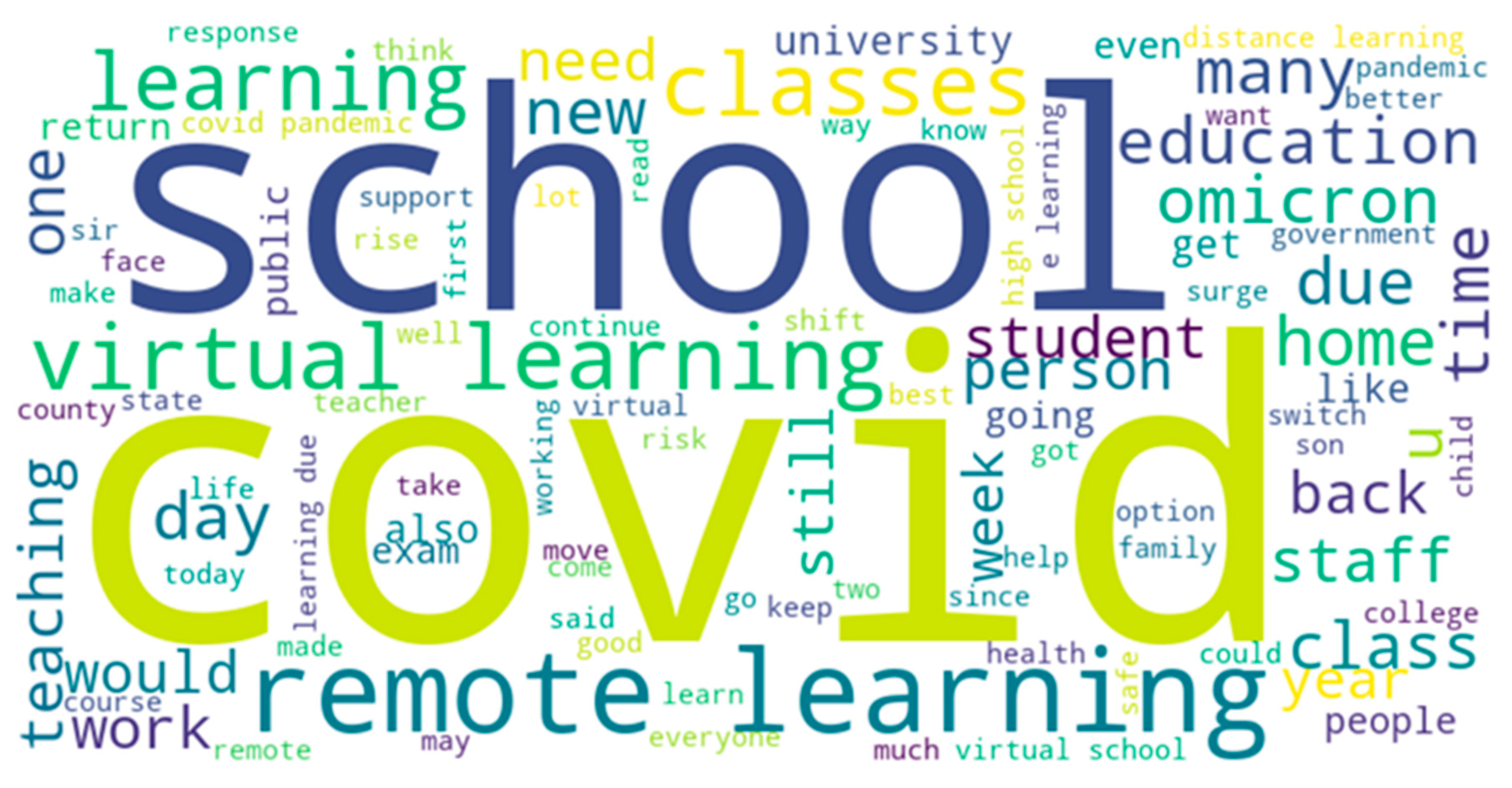
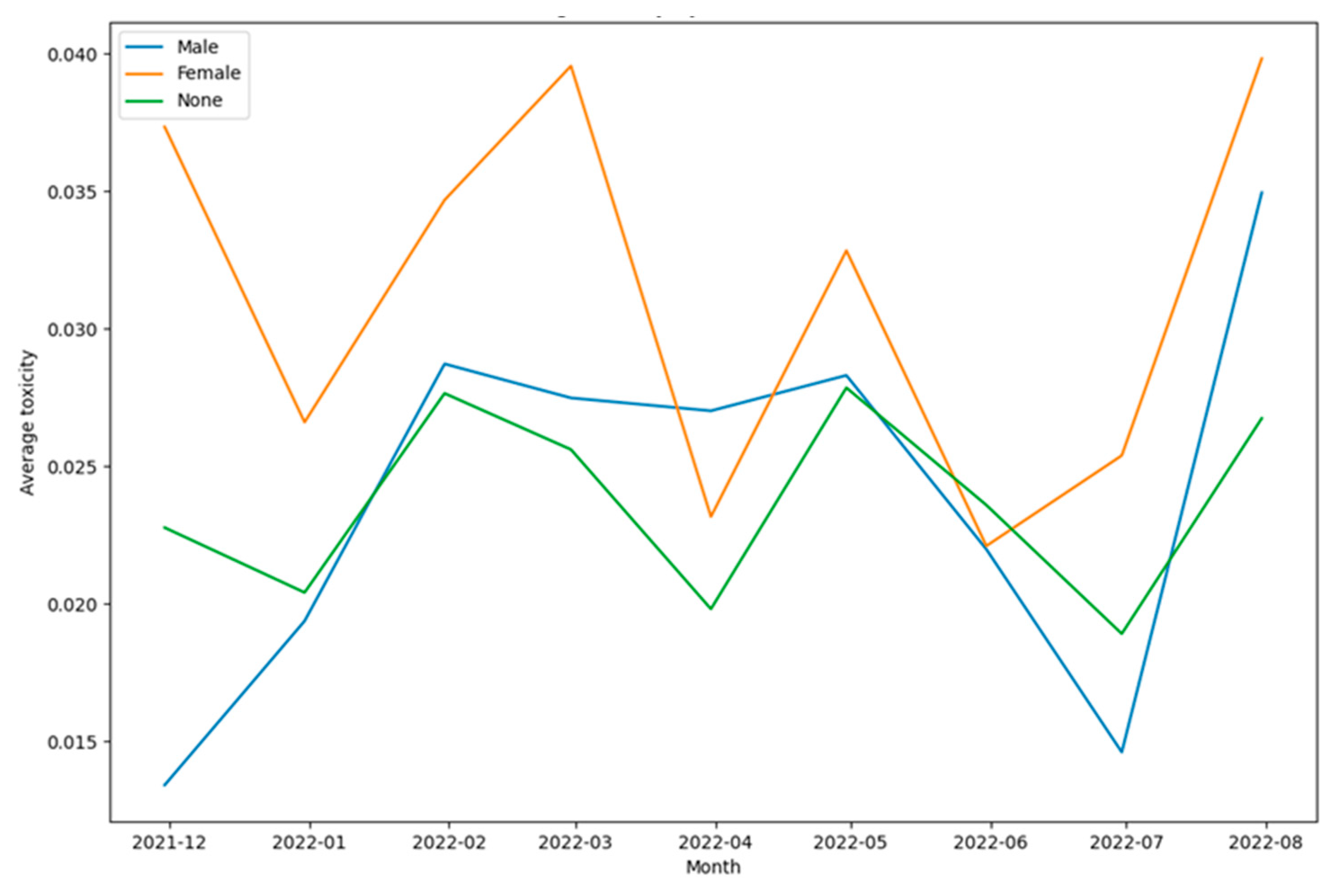
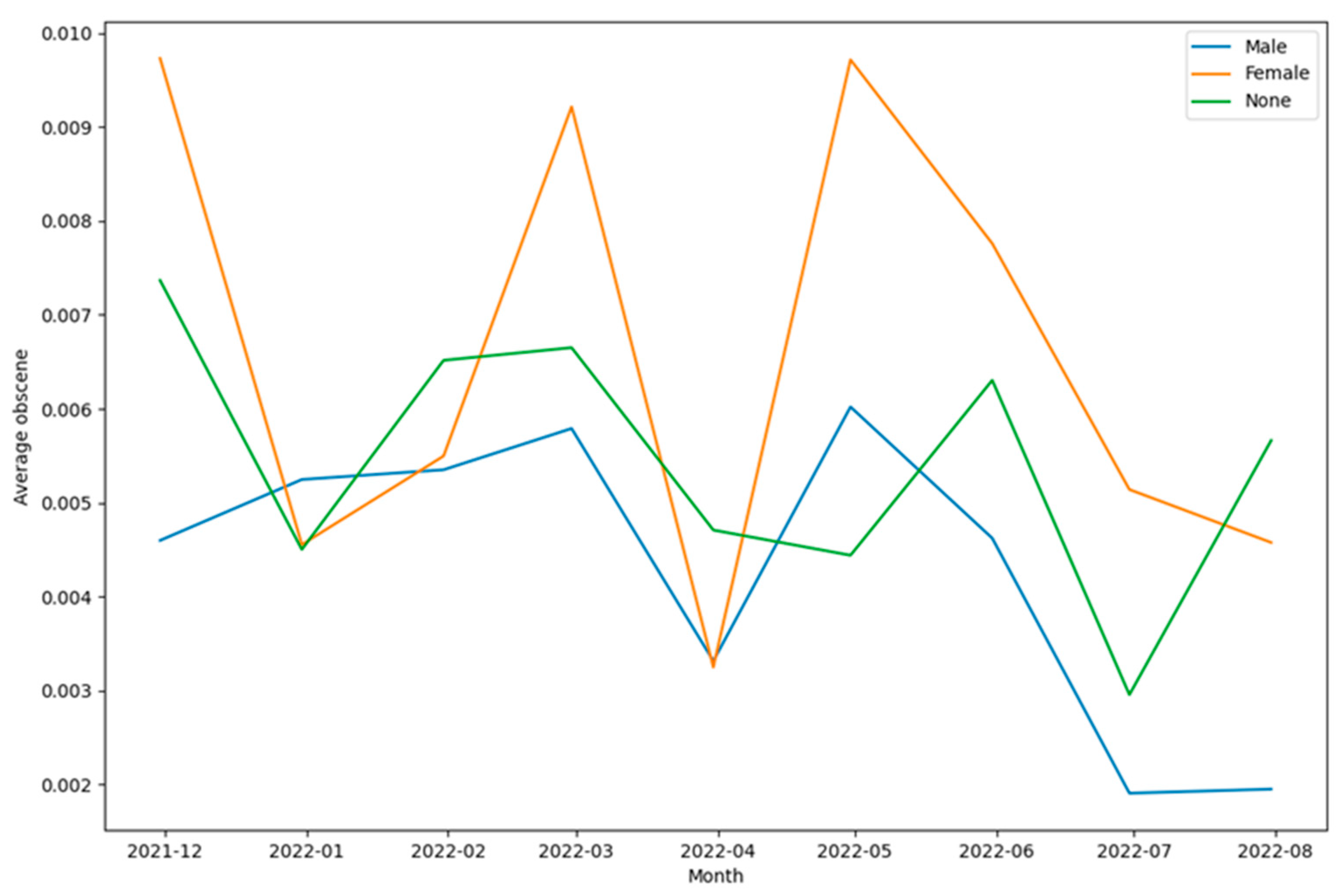
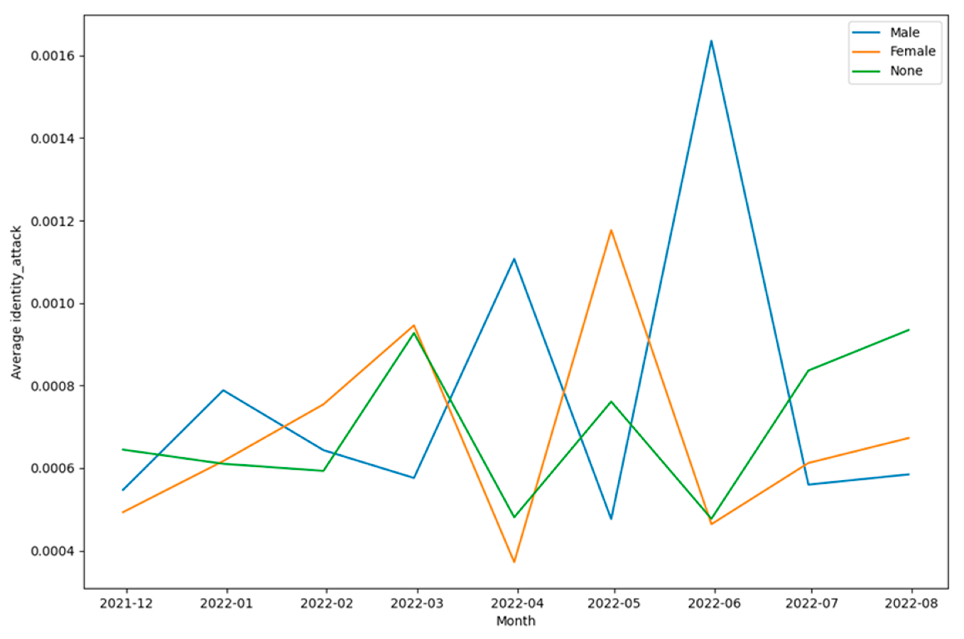
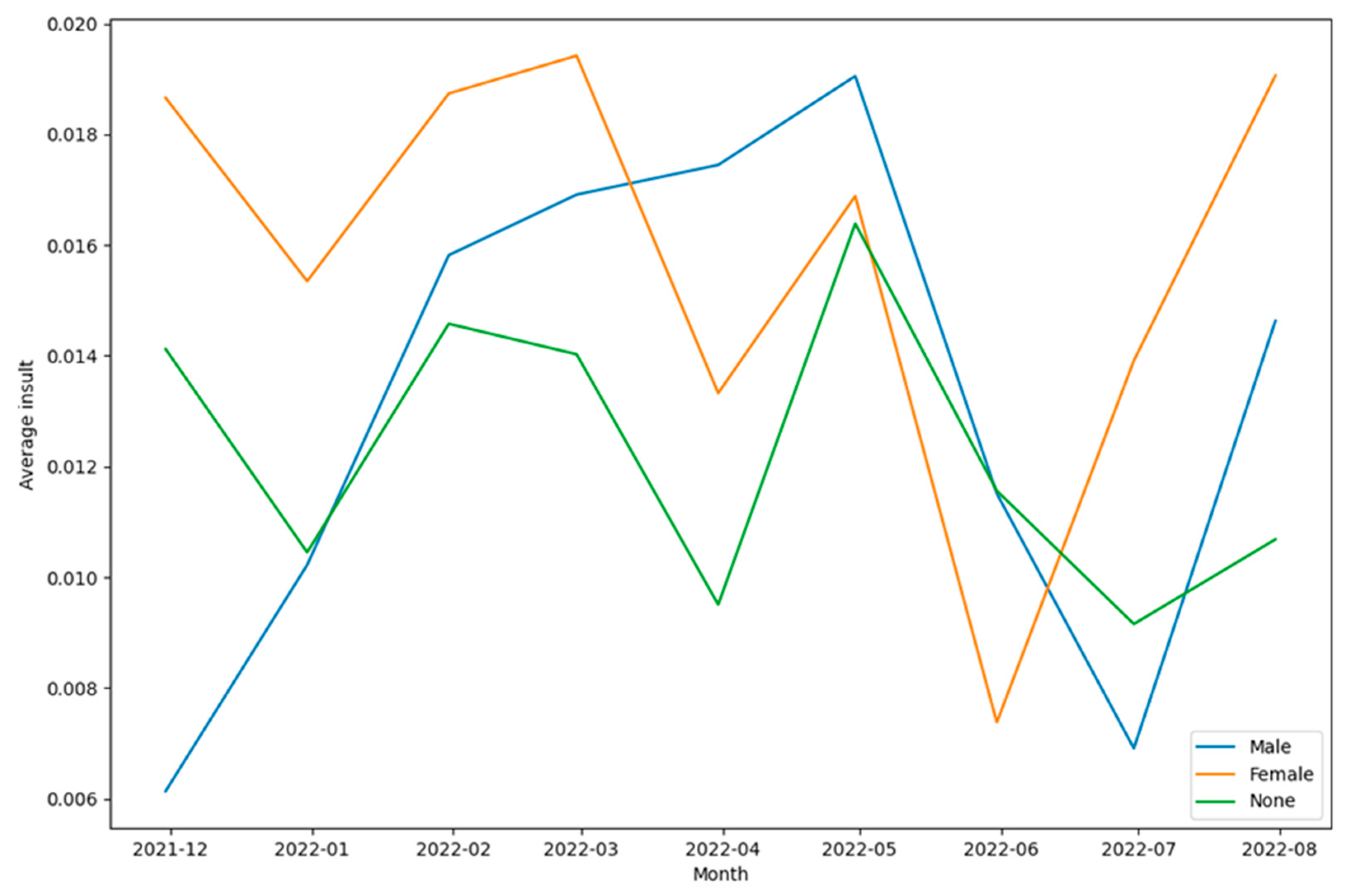
| Social Media Platform | Percentage of Male Users | Percentage of Female Users |
|---|---|---|
| 63 | 37 | |
| Instagram Tumblr Quora Telegram Sina Weibo SnapChat |
51.8 52 53.2 53.5 55 56.3 57.2 58.6 51 51.7 48.2 |
48.2 48 46.7 46.5 45 43.7 42.8 41.4 49 48.3 51 |
| Work | Text Analysis of Tweets about Online Learning during COVID-19 | Sentiment Analysis of Tweets about Online Learning during COVID-19 | Analysis of types of toxic content in Tweets about Online Learning during COVID-19 | Subjectivity Analysis of Tweets about Online Learning during COVID-19 |
|---|---|---|---|---|
| Sahir et al. [20] | ✓ | |||
| Althagafi et al. [21] | ✓ | |||
| Ali et al. [22] | ✓ | ✓ | ||
| Alcober et al. [23] | ✓ | |||
| Remali et al. [24] | ✓ | |||
| Senadhira et al. [25] | ✓ | ✓ | ||
| Lubis et al. [26] | ✓ | ✓ | ||
| Arambepola [27] | ✓ | ✓ | ||
| Isnain et al. [28] | ✓ | ✓ | ||
| Aljabri et al. [29] | ✓ | ✓ | ||
| Asare et al. [30] | ✓ | ✓ | ✓ | |
| Mujahid et al. [31] | ✓ | ✓ | ||
| Al-Obeidat et al. [32] | ✓ | |||
| Waheeb et al. [33] | ✓ | ✓ | ||
| Rijal et al. [34] | ✓ | |||
| Martinez [36] | ✓ | |||
|
Thakur et al. [this work] |
✓ | ✓ | ✓ | ✓ |
Disclaimer/Publisher’s Note: The statements, opinions and data contained in all publications are solely those of the individual author(s) and contributor(s) and not of MDPI and/or the editor(s). MDPI and/or the editor(s) disclaim responsibility for any injury to people or property resulting from any ideas, methods, instructions or products referred to in the content. |
© 2023 by the authors. Licensee MDPI, Basel, Switzerland. This article is an open access article distributed under the terms and conditions of the Creative Commons Attribution (CC BY) license (http://creativecommons.org/licenses/by/4.0/).


