We present the main results of the correlated multi-layered networks composed of the TI and AQI as described above.
3.1. The characteristics of O3 network
In order to visually display the network connection between various monitoring sites in China. First, we constructed the O
3 link network according to the above link weight calculation method [
30,
31,
32,
35,
36,
37,
38,
39]. According to the method in Section Ⅱ B we get the connection weights of
cities in China and build an O
3 network, which consists of 336×335=112560 edges. To better describe the network structure, we extract the edge whose weight
with
=3.8 and obtain 1942 edges, which satisfies the sparse network requirement
[
41]. Additionally, we discuss the effect of edge weights in Section Ⅲ C. The extracted network in
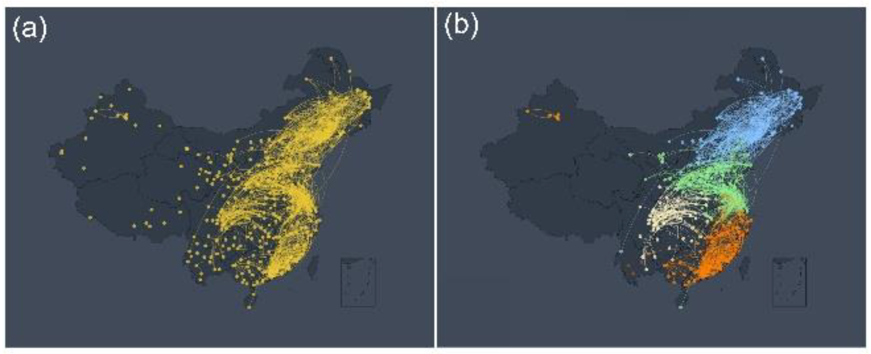
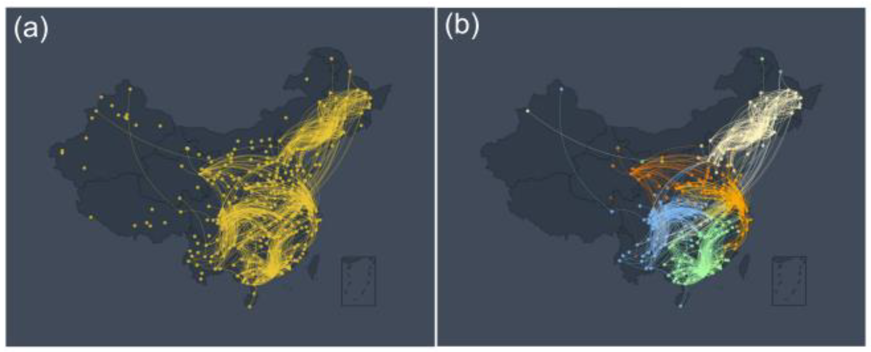
Figure 1 (a) indicates more reasonable and understandable relationships. As can be seen from it, the network community structure can be observed through the above network construction method. For example, there are obvious community effects in Northeast China, North China, Sichuan-Chongqing, and Southeast coastal areas. These results are similar to the regional community effects seen in other previous meteorological studies [
28,
40]. Of course, we observe a sporadic and isolated distribution of nodes in the southwest and most of the northwest. One reason is that due to the limitation of data acquisition, currently there are only a small number of data collection sites in the southwest and northwest, resulting in a long distance between the sites and little mutual influence between the sites. As an illustration, consider the scenario where the distance between stations within a given community spans 500 kilometers, while the separation between stations in distinct communities extends to 1,500 kilometers. An additional factor contributing to this phenomenon could be attributed to the topographical features of the southwest and northwest regions. These areas are characterized by a multitude of mountains and basins, thereby impeding the free movement of air to a notable extent. It is therefore speculated that our O
3 network construction method is effective and has practical value to a certain extent and can provide a new idea for the research and analysis of O
3 to a certain extent.
To further verify the community structure presented by the O
3 network, we use the network community partition algorithm to divide the community of the O
3 network. Network community division is a commonly used network analysis technique, which has a large number of applications in social, biological, and other networks
[41,42]. In this work, we employ the Louvain community partitioning algorithm, which is especially suitable for the current O
3 network due to that it can quickly and effectively divide the community of directed weighted networks.
Figure 1(b) shows several obvious community structures after segmentation according to the Louvain community partitioning algorithm with
. These community structures corroborate our intuitive observations in
Figure 1(a). For similar reasons as in
Figure 1(a), community network structures rarely appear in northwest and southwest China. Nevertheless, the structure of the community partitioning algorithm can still confirm our intuitive conjecture that the community structure exists in the O
3 network. This result implies that there are spatial and temporal characteristics of regional aggregation among the O
3 networks, e.g., the Yangtze River Delta [
43,
44,
45,
46]. In general, the O
3 detection data can be correlated according to network analysis techniques, and obvious community structure can be observed, suggesting the spatiotemporal characteristics of O
3 distribution.
Figure 1.
The O
3 Network and Community Structure. (a) A network of O
3 monitoring stations in China constructed according to the link weight calculation method. Yellow nodes represent O
3 observation stations, and links between stations indicate links between stations that meet the connectivity threshold TC = 3.8. (b) This figure is a network structure diagram after the community division of
Figure 1(a) according to the Louvain community partitioning algorithm. The nodes and edges of different colors represent different network communities. For example, blue nodes represent the Northeast China community, green nodes represent the North China community, orange nodes represent the Southeast coastal community, and yellow nodes represent the Sichuan-Chongqing community.
The aim of this study is to observe the network connectivity between various monitoring points in China during different periods. Initially, we constructed the O
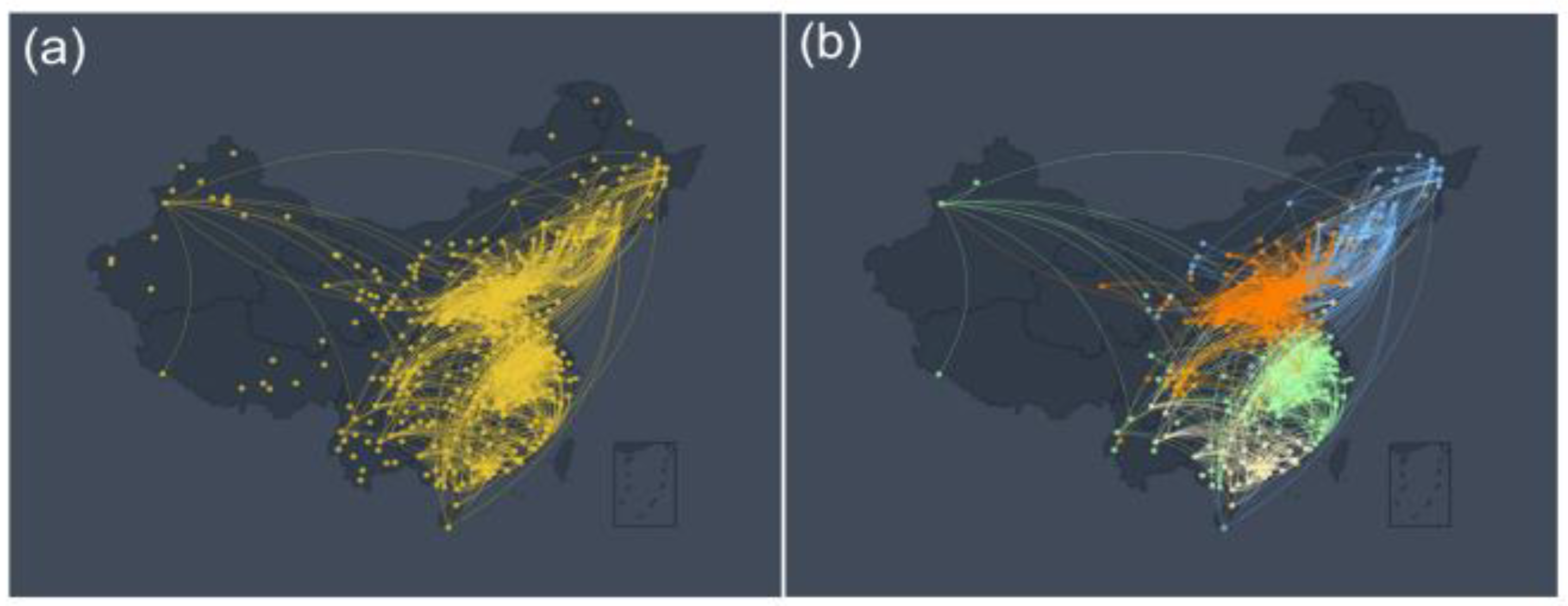
3 link network according to the above link weight calculation method. As can be seen from
Figure 2(a) and
Figure 3(a), the network community structure can be clearly observed, and these results are similar to
Figure 1(a). To ensure comparability between different networks, we take the same number of edges in different networks. The edge thresholds of the corresponding networks for these two time periods are
TC =3.3 and
TC =3.1, respectively. However, an interesting phenomenon is that although there are obvious community structures in the network at different periods, there are significant differences in the size of these community structures. These results suggest that different times have important effects on the construction of the O
3 link network. Future research should focus more on the explainable practical role of these network structures.
To further verify the community structure presented by the O
3 network in different periods, we employ the Louvain community partitioning algorithm to divide the community of the O
3 network. Obviously,
Figure 2(b) and
Figure 3(b) show several obvious community structures divided according to the Louvain community division algorithm into two different periods respectively. Their thresholds are
TC=3.3 and
TC=3.1, respectively. These community structures corroborate our intuitive observations in
Figure 2(a) and
Figure 3(a). At the same time, these results indicate that the community structure formed has changed slightly over time. For example, there are certain differences in the community structure between North China and the Yangtze River Delta. In general, these results verify the existence of a distinct community structure in the O
3 network and also confirm the spatiotemporal characteristics of O
3 distribution.
Figure 3.
The O
3 Network and Community Structure from October to February. (a) A network of O
3 monitoring stations in China constructed according to the link weight calculation method. Yellow nodes represent O
3 observation stations, and links between stations indicate links between stations that meet the connectivity threshold TC = 3.1. (b) This figure is a network structure diagram after the community division of
Figure 3 (a) according to the Louvain community partitioning algorithm. The nodes and edges of different colors represent different network communities. For example, blue represents the Northeast China community, green represents the Yangtze River Delta community, orange represents the North China community, and yellow represents the Southeast coastal community.
3.2. Control Algorithms and Drivens Nodes
This study aims to explore the controllability of the O
3 network, we select the maximum matching algorithm to distinguish the driven and non-driven nodes of the network [
47]. This is due to the steps of the maximum matching algorithm and the results are easy to understand.
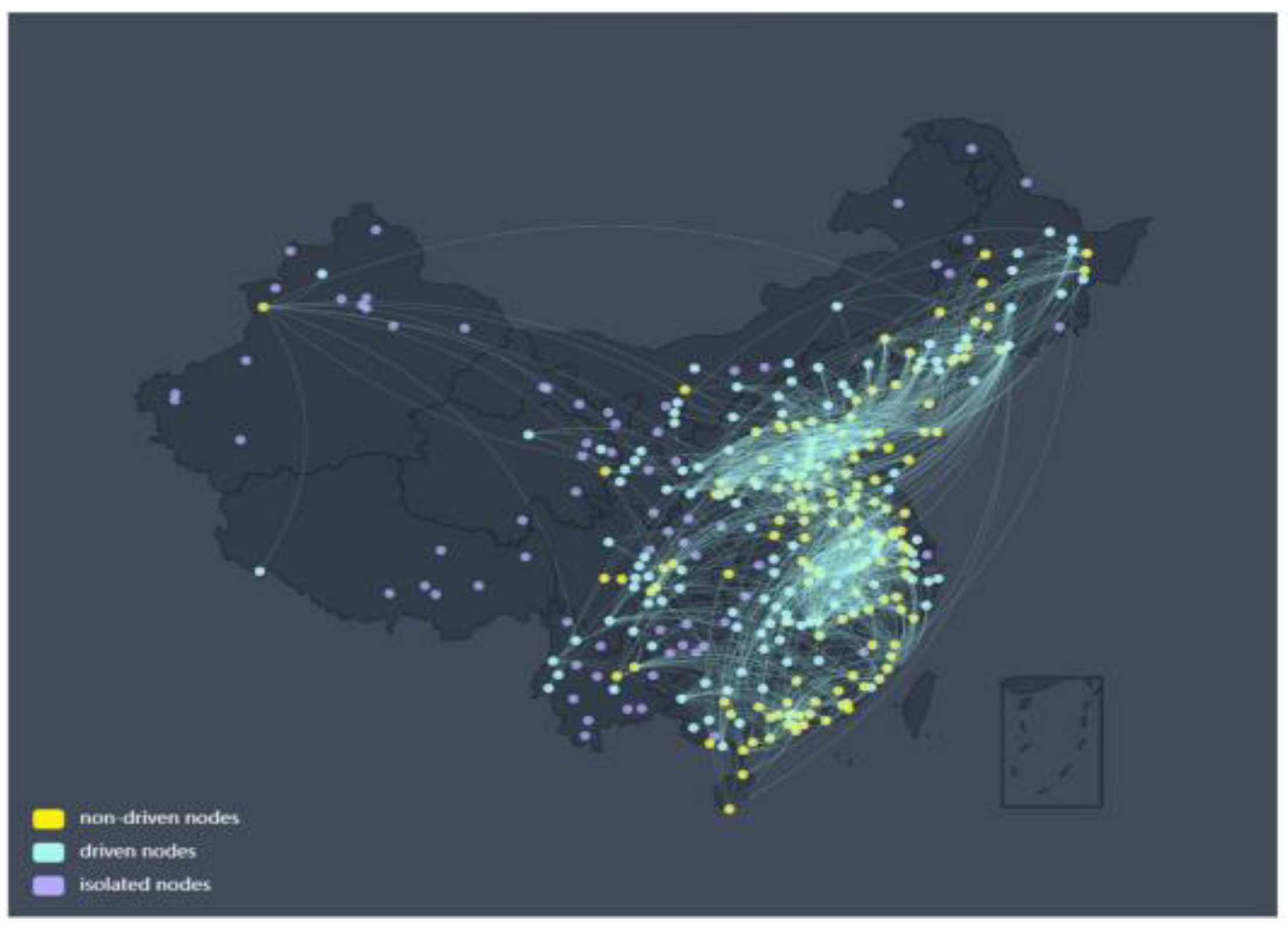
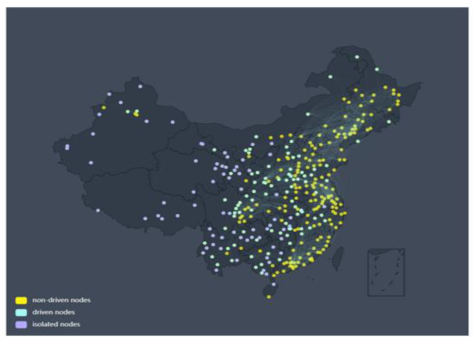
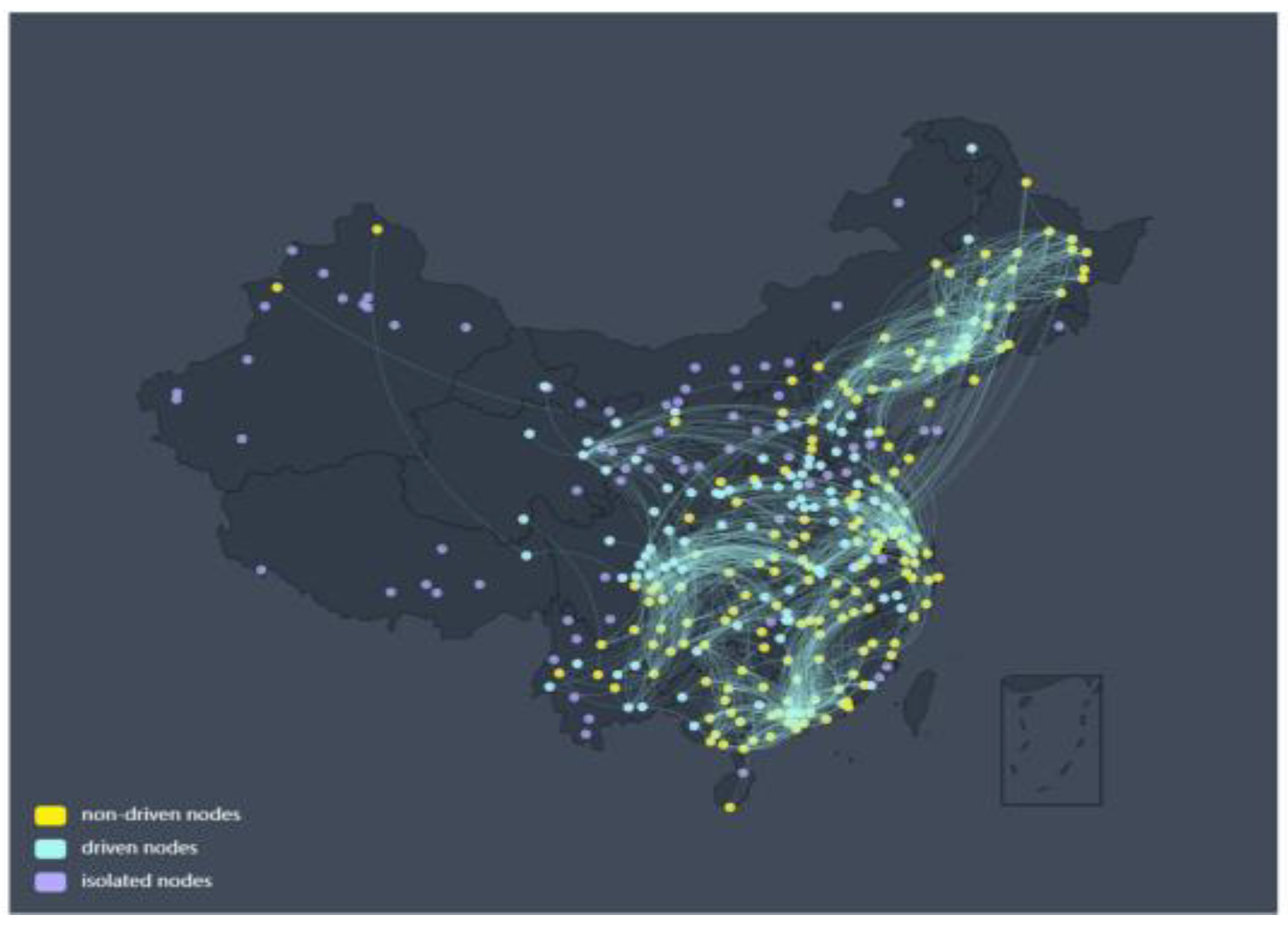
Figure 4 shows the schematic diagram of the control network obtained by the maximum matching method. The edge threshold in this network is the same as the previous one and still takes
Tc =3.8. Here, the yellow nodes represent the non-driven nodes, and the cyan nodes indicate driven nodes. The outcomes depicted in
Figure 4 incontrovertibly establish the presence of driven nodes within the network. For instance, driven nodes predominantly inhabit the central region, while non-driven nodes are primarily situated in coastal areas. The distribution of these driving nodes in space concurs with the region-dependent phenomena observed in conventional O
3 studies. These results fill the gap in our understanding of the O
3 network-driven nodes and have certain enlightening significance. This method of using control theory to understand the O
3 network, especially its drivers, is novel and interesting. Future work should therefore focus on understanding the practical significance and use of driven nodes in O
3 networks. This suggests that the network control theory and technology can be tried to be applied to studying O
3 networks.
To gain a deeper understanding of the relationship between the O
3 control network and different periods, we compare the O
3 control network in two different periods from May to September and from October to February. The O
3 control networks for two different periods are shown in
Figure 5 and
Figure 6, respectively. Similar to the previous results in
Figure 2 and
Figure 3, the edge thresholds of the corresponding networks in these two time periods are
and
, respectively. From these figures, it can be seen that there are significant differences in the O
3 control network during the two different periods. Although the methods and processing procedures used in these two networks are the same as before, their results are significantly different.
Figure 5 is a schematic diagram of the control network for O
3 data from May to September obtained by the maximum matching method. To ensure comparability between different networks, we take the same number of edges in different networks. The edge threshold in this network is
. Similar to
Figure 4, yellow nodes represent the non-driven nodes, and cyan nodes indicate driven nodes. Comparing
Figure 4,
Figure 5 and
Figure 6, it can be seen that in different periods, the control network presents significant differences, and the nodes change from driven nodes to non-driven nodes in different periods, and vice versa. For example, some nodes in the Yangtze River Delta are non-driven nodes from May to September and change into driven nodes from October to February. These results are similar to the seasonal variation of climate characteristics in the Yangtze River Delta region in previous studies [
45,
46]. These results indicate that it is meaningful to use control theory to understand the O
3 network. Future research should focus more on understanding the practical implications of seasonal changes in O
3 network nodes over time.
Figure 6.
O3 Network from October to February from the Perspective of Network Control Theory. The figure shows the isolated, driven, and non-driven nodes of the O3 network with a threshold of TC = 3.1. Yellow represents non-driven nodes, cyan for driven nodes, and purple for isolated nodes.
Figure 6.
O3 Network from October to February from the Perspective of Network Control Theory. The figure shows the isolated, driven, and non-driven nodes of the O3 network with a threshold of TC = 3.1. Yellow represents non-driven nodes, cyan for driven nodes, and purple for isolated nodes.
3.3. Weights effect
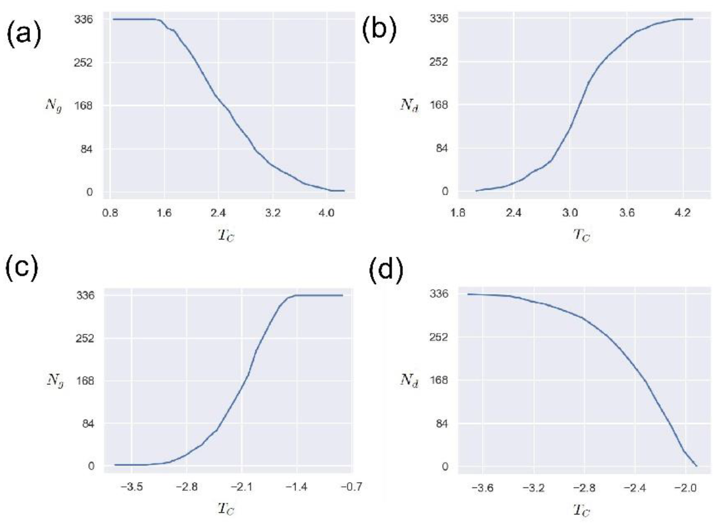
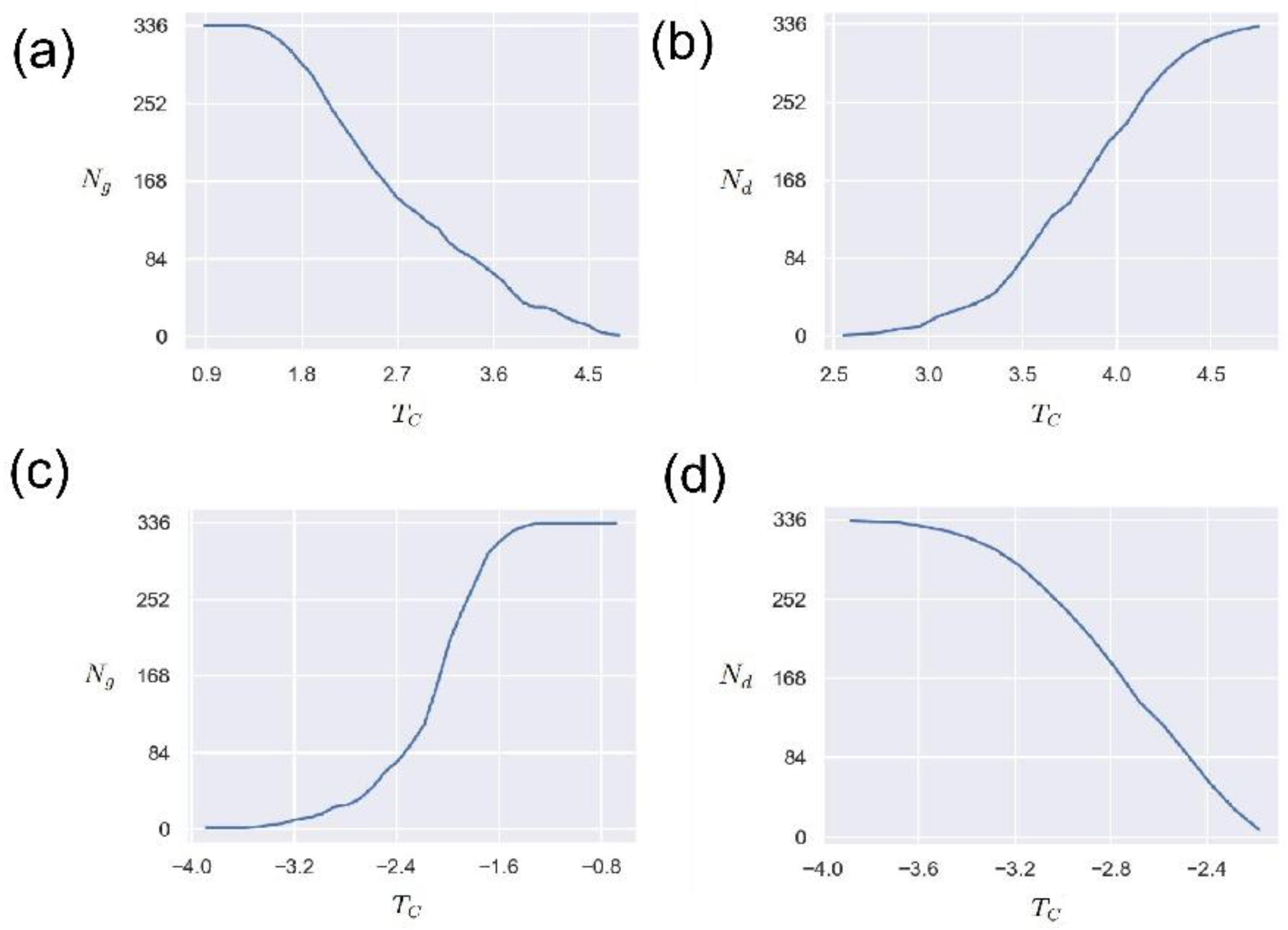
In order to study the influence of the network edge weight threshold , we study the changes in the number of nodes () in the network’s giant connected community (GCC) and the number of driven nodes () when the threshold changes in this section. The maximum connected community of the network is one of the important indicators reflecting the connectivity of the network, that is, the number of nodes contained in a connected maximum sub-network.
Figure 7 (a) shows the variation of the number of nodes
in the giant connected community with the threshold
. It can be seen that for the positive edge network, the threshold
has an obvious anti-correlation with the number of nodes in the giant connected community. This means that the larger the threshold, the smaller the number of giant connected community nodes. This is because the larger the threshold
is, the less the number of eligible edges is, and the corresponding network connectivity is reduced. Such results imply that the threshold
can be used as an indicator to measure and control the connectivity of the O
3 network.
Figure 7 (b) presents the relationship between the number of driven nodes
and the threshold
. As can be seen from
Figure 7 (b), as the threshold increases, the number of driven nodes also increases, demonstrating a positive correlation. This phenomenon is understandable. As the threshold increases, the connectivity of the O
3 network decreases, and the number of isolated nodes increases, thereby driving the increase in the number of nodes. It should be noted that this positive correlation is not linear, but a nonlinear relationship. Future research should pay more attention to the significance of these nonlinear relationships in practical O
3 application scenarios. In conclusion, these results provide an attempt to understand the O
3 network through network control theory, and the network weight threshold
has an important influence.According to the cross-correlation function network construction method, the case where the edge weight takes a negative value is also a direction that needs to be explored. Therefore, here we explore the effect of the threshold
on the maximum number of connected community nodes
and the number of driven nodes
when the edge weight is negative.
Figure 7(c) and
Figure 7(d) display the changing trends of
and
when the edge connection weight threshold is negative, respectively. It is worth noting that these trends are the opposite of those in
Figure 7(c) and
Figure 7(d). That is, with the increase of the threshold
,
increases with the increase, but
shows a downward trend. These results are reasonable. One reasonable explanation is that as the threshold
increases, more and more qualified edges are connected, so
increases accordingly. For
, the stronger the network connectivity is, the stronger its controllability is, and the fewer driven nodes to be controlled. It is difficult to find a meaningful threshold, or what are the criteria and operating steps for taking a suitable threshold. These issues are worthy of in-depth research and analysis. Overall, these curves indicate that the complex network method can be applied to the analysis of O
3 networks, and how selecting the threshold is a key point.
Figure 8(a) and
Figure 9(a) show the change in the number of nodes
in the giant connected community of the O
3 network for two different periods when the thresholds are
and
. It can be seen that for the positive edge network, the threshold
has an obvious inverse correlation with the number of nodes in the giant connected community. Such results are similar to those of
Figure 7(a). This means that the larger the threshold, the smaller the number of connected mega-community nodes. This is because the larger the threshold
is, the less the number of eligible edges is, and the corresponding network connectivity is reduced.
Figures 8(b) and
Figure 9(b) show the relationship between the number of driving nodes
and the threshold
in the O
3 network in two different periods, respectively. A similar trend can be observed from these two figures, that is, as the threshold
increases, the number of driving nodes
increases too, showing a positive correlation. This is due to the fact that as the threshold increases, the connectivity of the O
3 network decreases and the number of isolated nodes increases, thereby driving the increase in the number of nodes. It should be noted that this positive correlation is not linear, but a nonlinear relationship. The above results are similar to those of Figure7(b), however, it can be observed that their thresholds
have different ranges. These results further verify that the network weight threshold
has a consistent and stable important influence on the O
3 network.
Figure 8.
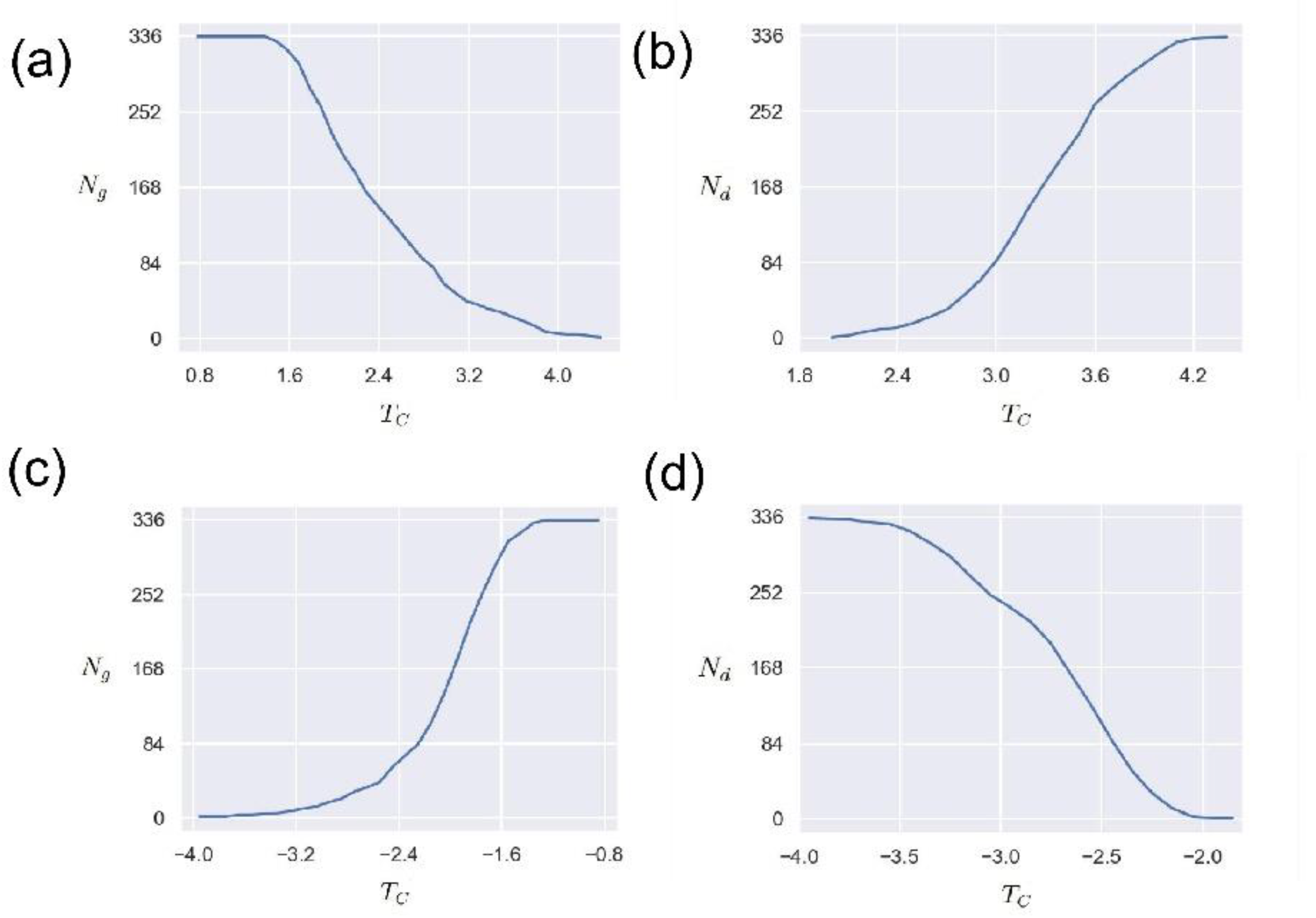
The effect of threshold TC versus the number of GCC Ng and the number of driven nodes Nd from May to September. (a) The relationship between the threshold TC and the giant connected community nodes Ng. The horizontal axis is the value of threshold TC, and the vertical axis is the value of Ng. The network edge weights are positive. (b) The relationship between the threshold TC and the number of driven nodes Nd. The horizontal axis is the value of threshold TC, and the vertical axis is the value of Nd. The network edge weights are positive. (c) The relationship between the threshold TC and the giant connected community nodes Ng. The horizontal axis is the value of threshold TC, and the vertical axis is the value of Ng. The network edge weights are negative. (d) The relationship between the threshold TC and the number of driven nodes Nd. The horizontal axis is the value of threshold TC, and the vertical axis is the value of Nd. The network edge weights are negative.
Similar to
Figure 7(c) and
Figure 7(d),
Figure 8(c),
Figure 9(c),
Figure 8(d) and
Figure 9(d) present the relationship between the threshold
on the maximum number of connected community nodes
and the number of driven nodes
when the edge weights are negative at two different periods. It can be seen from the above figures that the trend of the negative edge weights in the two different periods is basically similar. That is, as the threshold
increases,
increases with the increase, but
tends to decrease. These results demonstrate that although the range of the threshold
varies in different periods, the impact of the threshold value on the maximum number of connected community nodes
and the number of driven nodes
in the network is consistent. These results indicate that it is a feasible scheme to study the O
3 networks using
,
, and
. Future research should focus more on exploring the practical implications of these results.
Figure 9.
The effect of threshold TC versus the number of GCC Ng and the number of driven nodes Nd from October to February. (a) The relationship between the threshold TC and the giant connected community nodes Ng. The horizontal axis is the value of threshold TC, and the vertical axis is the value of Ng. The network edge weights are positive. (b) The relationship between the threshold TC and the number of driven nodes Nd. The horizontal axis is the value of threshold TC, and the vertical axis is the value of Nd. The network edge weights are positive. (c) The relationship between the threshold TC and the giant connected community nodes Ng. The horizontal axis is the value of threshold TC, and the vertical axis is the value of Ng. The network edge weights are negative. (d) The relationship between the threshold TC and the number of driven nodes Nd. The horizontal axis is the value of threshold TC, and the vertical axis is the value of Nd. The network edge weights are negative.
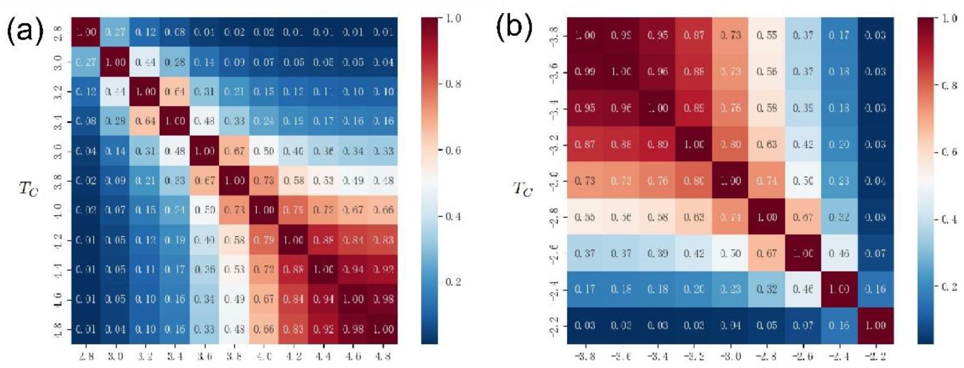
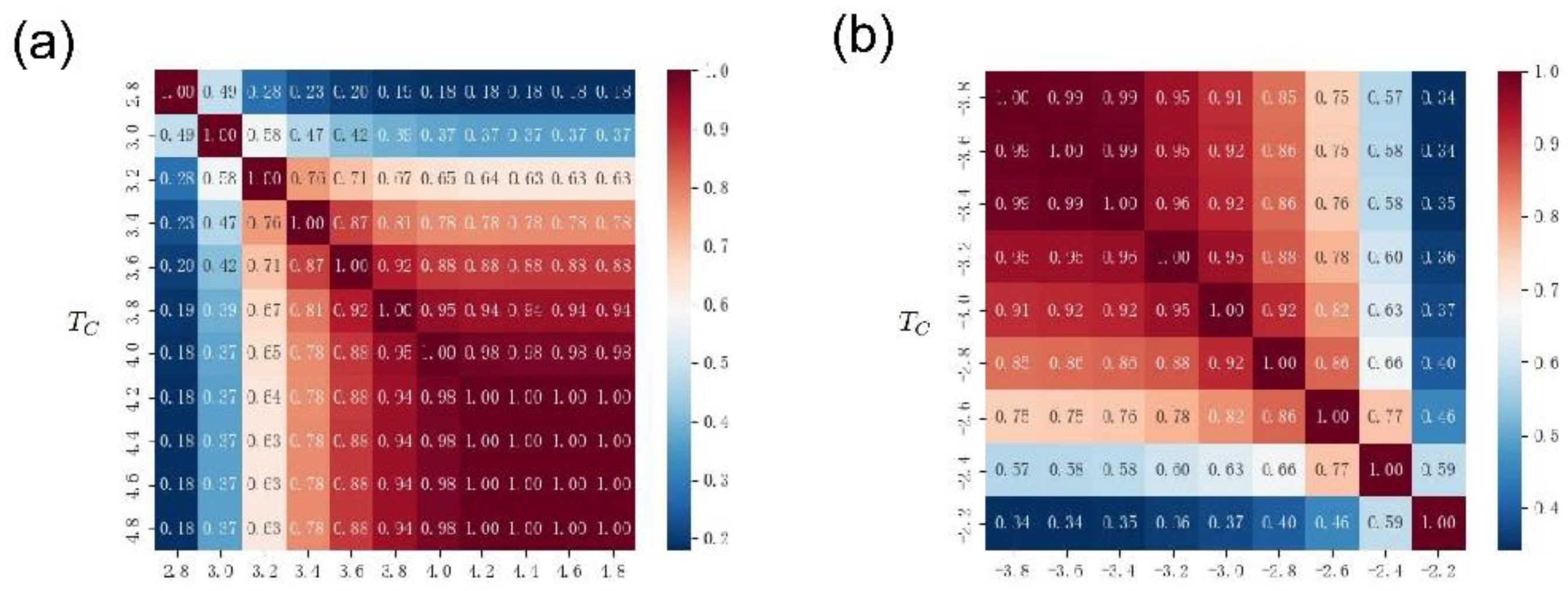
The coincidence degree of the driven node is a problem that needs attention, which can reflect the reliability of the driven node to a certain extent. Here, we propose to use the Jaccard coefficient to represent the coincidence of the driven nodes at two different thresholds [
48]. That is the ratio of intersection over union
, where
and
represent the set of driven nodes when the thresholds are
and
, respectively.
Figure 10(a) presents the Jaccard coefficients of the driven nodes for different thresholds
. In general, the closer the threshold, the higher the Jaccard coefficient. This result indicates that the closer the two thresholds are, the more identical nodes are obtained for the two sets of driven nodes. Meanwhile, an interesting phenomenon is that when both thresholds are large, the Jaccard coefficient is large, and vice versa. Such results on the one hand confirm that the size of the edge connection threshold
controls the number of driven nodes by controlling the network connectivity. On the other hand, it demonstrates that there are some deep mechanisms in the O
3 network, that is, some nodes could be selected repeatedly instead of just randomly selected. Future research should pay more attention to the mechanism behind the above phenomenon. The above results indicate that the O
3 network can be understood and analyzed using controllability methods, and is a research area worthy of further understanding.
Figure 10(b) presents the Jaccard coefficients of the co-occurrence of drive nodes with different thresholds
when the edge weights take negative values. In general, the closer the threshold, the higher the Jaccard coefficient. This result is similar to that in
Figure 10(a) when the edge weights are taken as positive values. However, an interesting phenomenon is that when both thresholds are small, the Jaccard coefficient of the co-occurrence of the driven node is large, and vice versa. This result is opposite to the result when
Figure 10(a) is connected with a positive value. A possible explanation is that in the case of negative edge weights, the smaller the threshold
, the more isolated nodes in the network, so the higher the co-occurrence ratio of driven nodes. This result is basically consistent with the previous findings in Figures 7(c) and (d).
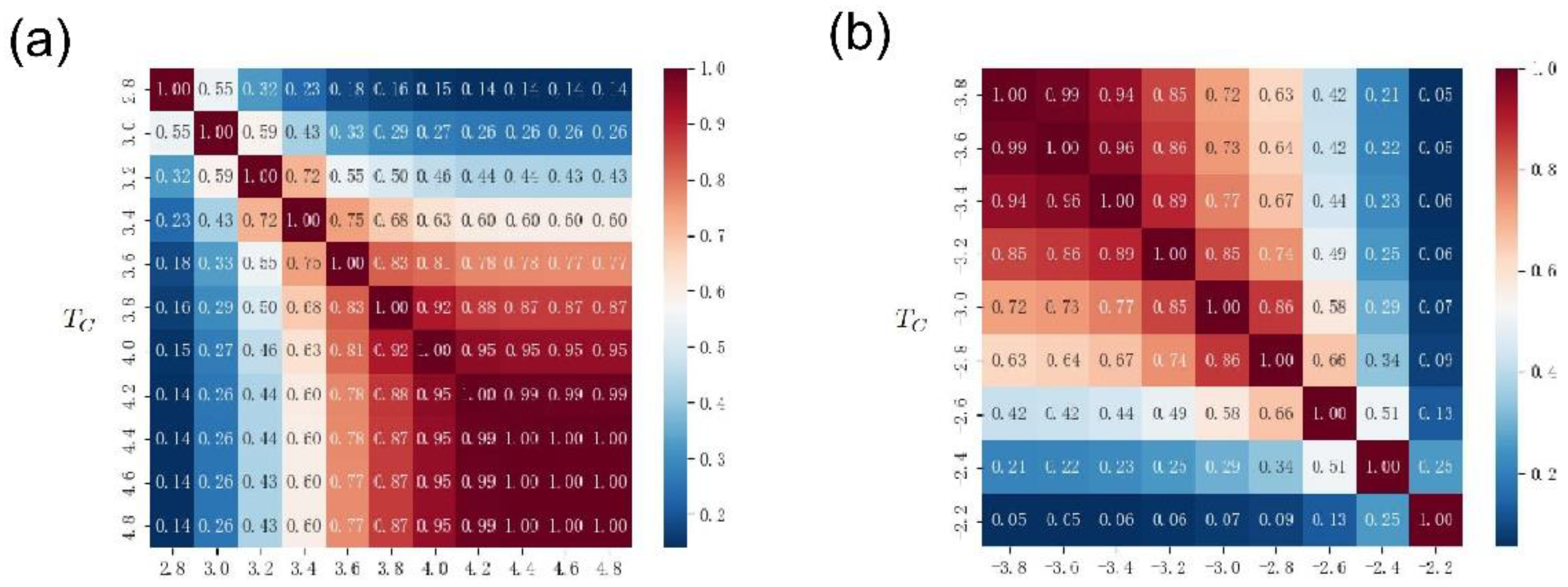
Figure 11(a) and
Figure 12(a) show the Jaccard coefficients of the driving nodes with different thresholds
in two time periods, respectively. Similar to the results in
Figure 10(a), the closer the threshold, the higher the Jaccard coefficient. That is, the closer the two thresholds are, the more identical nodes are obtained by the two groups of driven nodes. Meanwhile, an interesting phenomenon is that when both thresholds are large, the Jaccard coefficient is large, and vice versa. Moreover, when the threshold is large, the coincidence degree of the Jaccard coefficients of the two different periods is 1. On the one hand, this result is similar to the phenomenon in
Figure 10(a), that is, the size of the edge connection threshold
is controlled by Network connectivity to control the number of driven nodes. On the other hand, if divided by different periods, a stronger repeated selection mechanism can be observed. That is to say, there is a stable strong link relationship between some nodes. Future research should focus on the underlying mechanisms leading to these phenomena.
Figure 11(b) and
Figure 12(b) display the Jaccard coefficients for the co-occurrence of driving nodes with different thresholds
when edge weights take negative values. These results are similar to those in
Figure 10(b), the closer the two thresholds are, the higher the Jaccard coefficient. When both thresholds are small, the co-occurrence Jaccard coefficient of the driving node is large, and vice versa. This result is in contrast to the positive-valued edge results shown in
Figure 11(a) and
Figure 12(a). The possible reason for this phenomenon is that in the case of negative edge weights, the smaller the threshold
, the more isolated nodes in the network, and therefore the higher the co-occurrence rate of driving nodes.
3.4. Geographic distance and Spearman coefficient
In order to further distinguish driven nodes from non-driven nodes, we use prediction methods to measure the difference between the two types of nodes. An increasing number of studies use predictive methods to understand the correlation between different quantities [
49], for example, defining the influence of different variables by the predictability of one variable on another variable [
50].
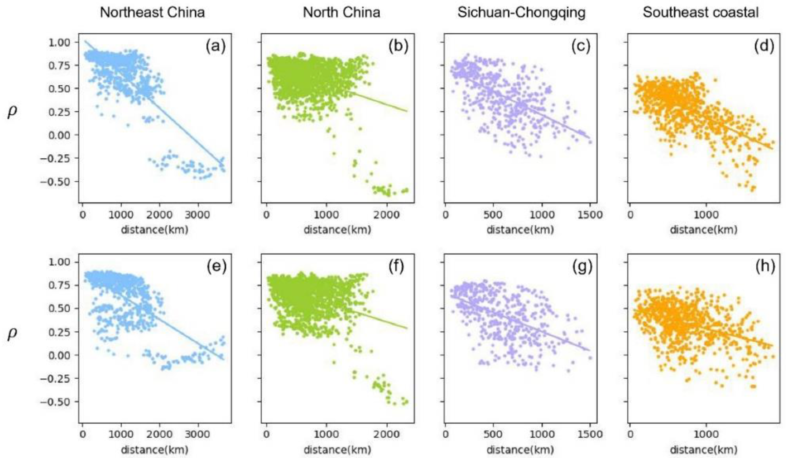
Figure 13 shows the degree of correlation between the predicted results and the true sequence for the driven and non-driven nodes. On the one hand, we employ the LSTM algorithm and use the O
3 data sequence
of the driven node to predict the O
3 data sequence
of the non-driven node; then calculate the Spearman correlation
between the predicted non-driven O
3 data sequence
and the original non-driven sequence
; finally, Figures 13(a-d) displays the relationship of Spearman correlation
and distance from driven nodes to non-driven nodes in four different regions. Here we use the Spearman correlation coefficient calculation because the method has a better correlation calculation effect on nonlinear data. It can be seen from these figures that there is a significant negative correlation between the Spearman coefficient and the distance. These results are consistent with the trends of other pollutants changing with distance obtained in the past. It should be noted that in the Northeast and North China regions, there are different node clusters, which may be due to the relatively wide and uneven geographical distribution of cities in these regions.
On the other hand, we apply the same method and obtain the Spearman correlation of non-driven nodes predicting driven node sequences, and the relationship between and distance is shown in Figures 13(e-h). A similar trend was observed in all cases, with no sudden changes. This trend further validates the role of distance in O3 variation between different sites. Comparing Figures 13(a-d) with Figures 13(e-h), it can be seen that the negative correlation of driven nodes predicting non-driven nodes is stronger than that of non-driven nodes predicting driven nodes. These results suggest that driven nodes have more influence in the O3 network than non-driven nodes.
Figure 13.
Scatter diagram of the relationship between the distance of city Ci and city Cj and the Spearman coefficient of their O3 data in the Northeast China, North China, Sichuan-Chongqing and Southeast coastal areas. Figures (a-d) are the data of the direction of the driven to non-driven nodes, the vertical axis represents the Spearman coefficient between the O3 data of the city Ci (Ci ∈ driven nodes) and the city Cj (Cj ∈ non-driven nodes), the horizontal axis represents the geographical distance between the city Ci and the city Cj. Figures (e-h) are the data of the direction of the non-driven to driven nodes, and the vertical axis represents the Spearman coefficient between the O3 data of city Ci (Ci ∈ non-driven nodes) and city Cj (Cj ∈ driven nodes). The fitted slopes of scattered data are as follows, −3.74×10⁻⁴, −2.17×10⁻⁴, −5.04×10⁻⁴, −3.82×10⁻⁴, −2.60×10⁻⁴, −2.06×10⁻⁴, −4.12×10⁻⁴, −2.11×10⁻⁴. Overall, we observe the distance between nodes is negatively correlated with their Spearman coefficient.

This section may be divided by subheadings. It should provide a concise and precise description of the experimental results, their interpretation, as well as the experimental conclusions that can be drawn.
