1. Introduction
Advances in technology have introduced remarkable capabilities, particularly in the realm of gathering and accessing vast amounts of data. The rapid advancement of sensor technology, coupled with seamless communication facilitated by the 5G network, has ushered in the "Big Data" era [
1], generating exciting opportunities to harness the wealth of the available information. However, this progress comes with two significant challenges: limited storage capacity and the need for efficient data management [
2]. Recognizing that not all collected information remains relevant over time, the crucial tasks of grouping and editing similar data have become paramount [
3].
Traffic data usually involve microscopic data i.e. traffic flow, mean speed and occupancy and microscopic data i.e. vehicle trajectories. These types of data have both a spatial and a temporal dimension that need to be considered in their analysis. The most common data sources that are frequently used for spatiotemporal analysis in the transportation field, specifically in the traffic analysis sector, comprise loop detectors or GNSS. In their research [
4] used data collected from two loop detectors and developed a hybrid model that combined spatial correlation, Type-2FCMNN and BP neural network for traffic prediction purposes. Additionally, information from 358 traffic detectors were also employed in [
5] for the extraction of spatiotemporal characteristics and the analysis of different traffic prediction steps. Various methodologies, such as the creation of spatiotemporal speed diagrams [
6,
7] and the development of hybrid models like HDSTF [
8] have been applied for spatiotemporal analysis of GNSS data to capture patterns in traffic behavior.
The integration of the spatiotemporal factor has been widely applied in various research studies. The analysis is most frequently used as an intermediate step for traffic state estimation or traffic prediction. For instance, [
9] explored data imputation using a spatiotemporal probabilistic principal component analysis (PPCA)-based method. In traffic state estimation, [
10] proposed a model for predicting traffic conditions by applying a spatiotemporal correlation algorithm and integrating Technique for Order of Preference by Similarity to Ideal Solution (TOPSIS) for ranking critical road sections based on their degree of importance. Additionally, [
11] introduced a spatiotemporal (PST) network that combined Convolutional Neural Network (CNN) and Long Short-Term Memory (LSTM) to capture spatial and temporal characteristics of traffic, improving prediction accuracy for large-scale traffic networks in Shanghai.
A widely adopted technique for visualizing data and identifying spatiotemporal patterns are heatmaps, their utilization is established on various research studies. In [
12], heatmaps were used to present different missing rates in two scenarios: missing data completely at random and temporal missing data. Another study [
13] utilized heatmaps to visualize the regional distribution of bus travel demand. Additionally, in [
14] heatmaps were designed to present the differences between true speed and predicted speed. Analogous to this research, an analysis that incorporates k-means clustering and heatmaps visualization was also applied in [
15] in order to extract trends from spatiotemporal traffic data.
Similar to heatmaps, clustering also comprises a valuable tool following data collection. Due to its simplicity and low computational complexity k-means is considered as one of the most popular clustering methods [
16]. In the transportation field the application of k-means has been used for multiple purposes such as: determining the demand for taxis stops and services [
17], grouping traffic data in working and non-working days [
18], data mining and detection of flow-based anomalies [
19], and so on. While k-means is considered to be a simple clustering method, previous research has demonstrated that its calculation time and clustering accuracy surpass those of other methodologies [
20,
21].
Finally, extensive analysis has been conducted on the speed behaviour levels of professional drivers [
22], with particular emphasis on taxi [
23] and truck drivers [
24]. However, the speed behaviour of freeway patrol services has not been as extensively analysed. Expanded research was conducted by UC Berkeley evaluating the impact of this patrol vehicle at a San Francisco freeway section [
25], while in Los Angeles a study [
26] investigated the use of patrol vehicles as probe vehicles and explored factors affecting patrol driver speeding magnitude.
The primary objective of this paper is to monitor motorway operation by employing spatiotemporal analysis and visualization techniques utilizing different sources of real-traffic data, while at the same time identify specific opportunities that rise with the availability of such data and corresponding limitations. Two distinct data types are utilized: static location based aggregated traffic data and probe vehicle data, that is data from loop detectors and from patrol vehicles’ GNSS (Global Navigation Satellite System) devices; both types of data are usually collected by motorway traffic management centers. Additionally, the present study explores the speed behavior of patrol drivers through data combination of these distinct sources. The research confirms the advantages of temporal and spatiotemporal analysis and highlights its ability to discern unique behaviors by integrating data from multiple sources. Through this approach, the study contributes valuable insights into understanding and optimizing traffic management strategies, particularly in relation to patrol drivers' actions and speed patterns.
This paper is organized in four sections: Introduction, Methodology, Results and Discussion. In the next section all the employed steps, tools, and techniques applied in the research are described in detail. Analysis results are then presented. Findings, limitations, future applications and possible extensions are presented in Discussion section.
2. Materials and Methods
2.1. Data collection
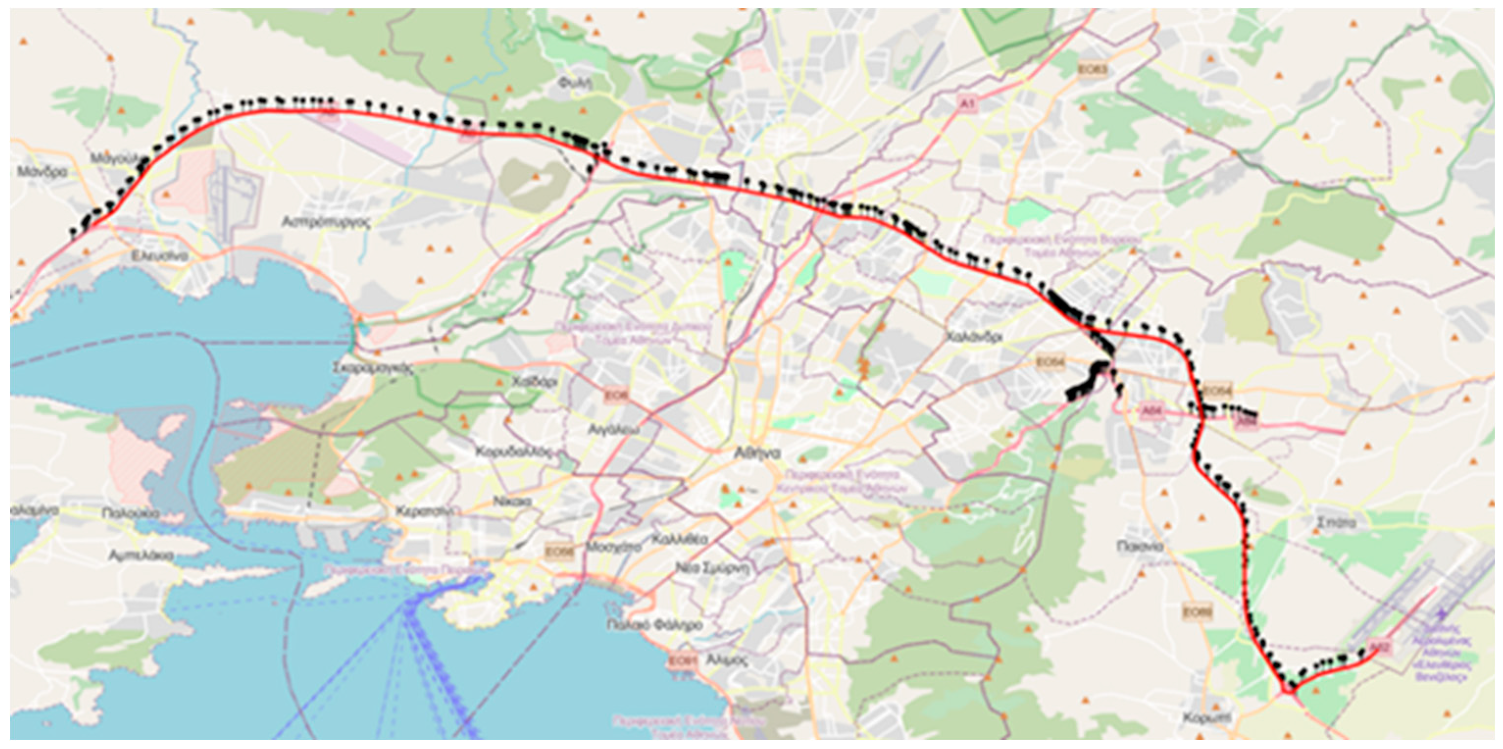
The area under investigation is Attica Tollway, a 70 km interurban motorway that serves as a crucial transportation route connecting various modes of transportation, throughout the Attica prefecture in Greece. The central segment of Attica Tollway comprises a vital part of the Athenian Road network as it serves as a bypass for a large number of commuters, absorbing a significant portion of the daily traffic and improving the main road network conditions. The motorway has a traffic management center (TMC) to support its operation through monitoring road network conditions and responding to traffic incidents. Traffic data is collected from loop detectors the motorway is equipped with, placed approximately every 500 meters in the open sections and every 60 meters inside tunnels (see
Figure 1). Traffic incidents are mainly detected from TMC personnel checking CCTV cameras and about 55 patrol drivers who perform continuous drives in 8-hour shift 24/7.
The data collected for this research consisted of traffic measurements, including traffic flow, mean speed and occupancy, by the loop detectors installed on the main motorway, specifically for the direction from Eleysina to the Airport. The data collection period was almost two months from September 12th till the end of October 2022. To ensure the accuracy and completeness of the data, the raw information underwent imputation and correction processes internally by the Operation and Maintenance Company. After these steps, a final dataset was prepared, comprising nearly 3.4 million records. This refined dataset (of 5-min intervals recordings) was provided for research purposes, serving as a valuable resource for further analysis and investigation. In this research the traffic quantity of speed was utilized, as it provides a more direct representation of prevailing traffic conditions (e.g. in comparison with traffic flow), while it can also be extracted at a disaggregate level.
During the same time period, trajectory data was also collected from GNSS devices installed on patrol vehicles. The collected data includes information about vehicle, route and driver ID, speed and location indicated by longitude and latitude coordinates. A substantial amount of 2.3 million records were gathered in total. By using multiple data sources, insights into the speed behavior of patrol vehicle drivers can be gained as it allows comparison with aggregate traffic patterns.
2.2. Heatmaps
Rectangular data matrices known as heatmaps consist of rows and columns intersecting to form cells. These cells are shaded with colors that correspond to the values of the respective elements. The utilization of this type of display can be traced back to the late 19th century [
27]. In the present study, three heatmaps have been generated to visualize the average vehicle speed across all weekdays, Saturdays, and Sundays. The data is presented in 5-minute intervals, covering a 24-hour period at specific locations (detectors).
Figure 2 and
Equation 1 provide additional clarity on the steps and calculations involved in the process.
Figure 2 presents the x-axis with the names of detectors arranged based on their location on the motorway, while the y-axis represents the time of day in 5-minute intervals, starting from 00:00 at the top and progressing to 23:55 at the bottom. The visualization of speed fluctuations employs a color gradient that represents the value
of speed.
where
is the mean value of speed in the specific timestep
of the day for the specific detector
.
is the speed on detector
for the timestep
on day
.
This methodology was followed for the utilized data for three distinct categories: Weekdays, Saturdays days and Sundays days.
2.3. Clustering
Clusters are useful in data mining serving the purpose of grouping datasets with similar characteristics to each other and identifying interesting distributions and patterns in the underlying data [
28]. This organized grouping empowers data analysts to conduct thorough analyses, efficiently detecting and rectifying errors or anomalies within datasets. Such meticulous data exploration enhances overall data quality, fostering more dependable and informed decision-making processes. Clustering serves as a critical preparatory step before data combination, streamlining the entire process and yielding several key benefits. By organizing similar data points into clusters, it simplifies the dataset, allowing for more efficient feature extraction and improved handling of diverse data sources. Ultimately, this approach optimizes the combination process, leading to enhanced accuracy and better insights from the combined data.
K-means as the clustering method in this research was chosen as it is one of the most widely utilized such methodologies due to its popularity in handling unsupervised machine learning tasks, especially when dealing with spatiotemporal datasets. By applying k-means on the spatiotemporal 3-D graph, distinct regions based on intensity levels can be identified, effectively reducing dimensionality by grouping similar data points. Moreover, this method has the potential to reveal spatial patterns, trends or relationships that may not be immediately evident from the raw heatmap visualization of speed. Utilizing k-means in this manner offers valuable insights and aids in better understanding the underlying structure and dynamics within the data.
K-means clustering involves grouping observations into sets to minimize the Within-Cluster Sum of Squares (WCSS). This algorithm finds the best arrangement of observations based on their similarity. The clustering was performed using the scikit-learn Python library. More information about the algorithm can be found in [
29].
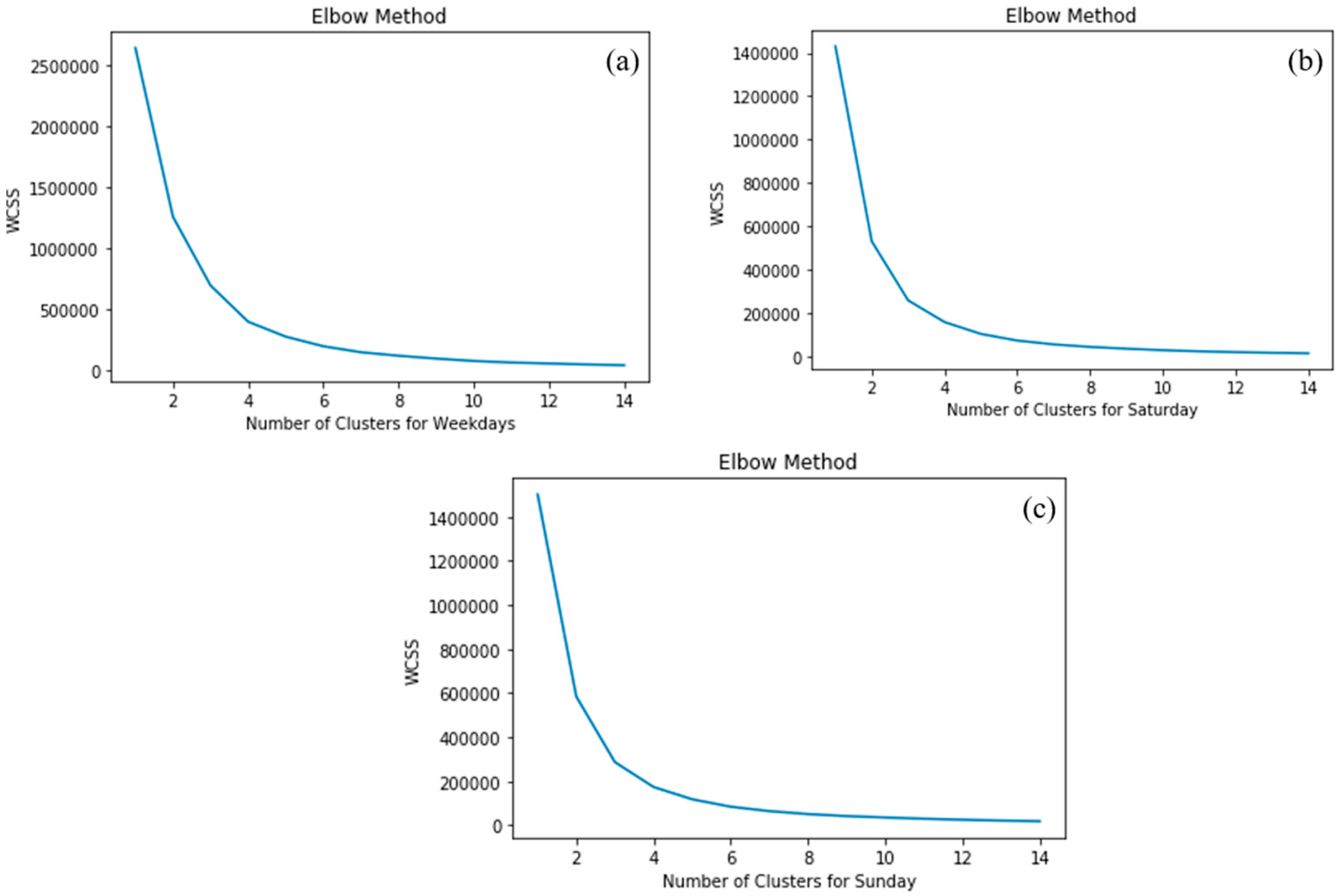
Despite the numerous advantages of using k-means, its main limitation lies on its dependence on the initial cluster number. The user needs to define in advance the number of clusters the datasets should be divided into. Different initializations can lead to varying clustering outcomes, and the random selection of cluster numbers may converge to local optima instead of the global optimum, resulting in suboptimal clustering. Two are the most commonly applied methods for determining the optimal number of clusters: the Elbow method and Silhouette score. The Elbow method calculates the squared difference for different numbers of clusters [
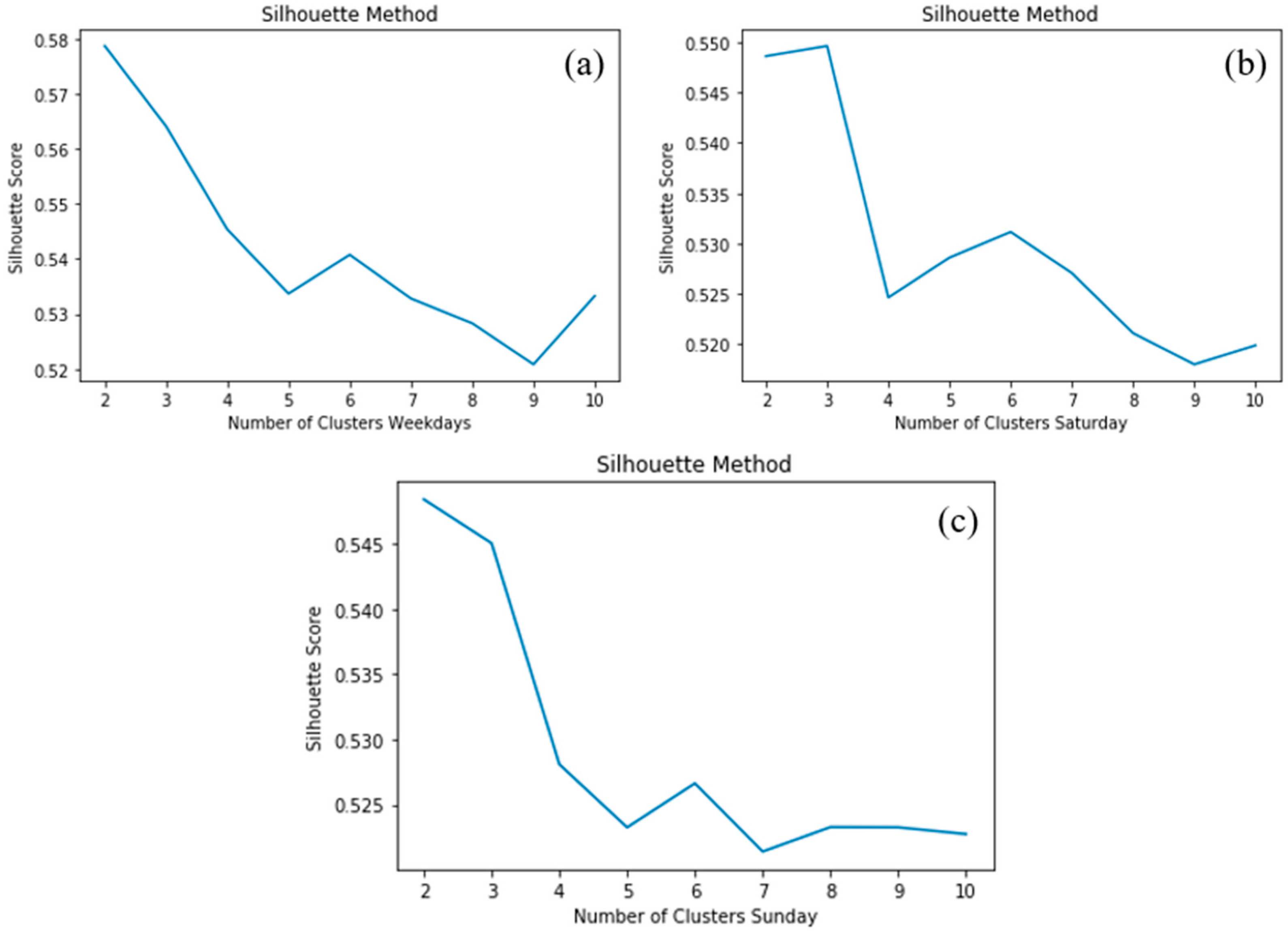
30]. The resulting Elbow diagram shows the number of clusters on the x-axis and the Within-Cluster Sum of Squares (WCSS) value on the y-axis. The optimal number of clusters is indicated by the point where the diagram starts to flatten out. On the other hand, the Silhouette score is a metric that assesses the quality of clustering, ranging from -1 to +1. A coefficient value close to +1 indicates that the samples are far from neighbouring clusters, making the clusters more coherent. A score close to 0 suggests that the samples are on or very close to the decision boundary between two neighbouring clusters. A value close to -1 indicates that the sample was probably placed to the wrong cluster.
To determine the optimal number of clusters, both the highest Silhouette score and the need to have enough clusters to represent traffic condition stages observed on the heatmaps were considered. Based on the findings and graphical representation of both methods, the number of clusters was chosen to be the same for all three groups, resulting in the selection of three clusters.
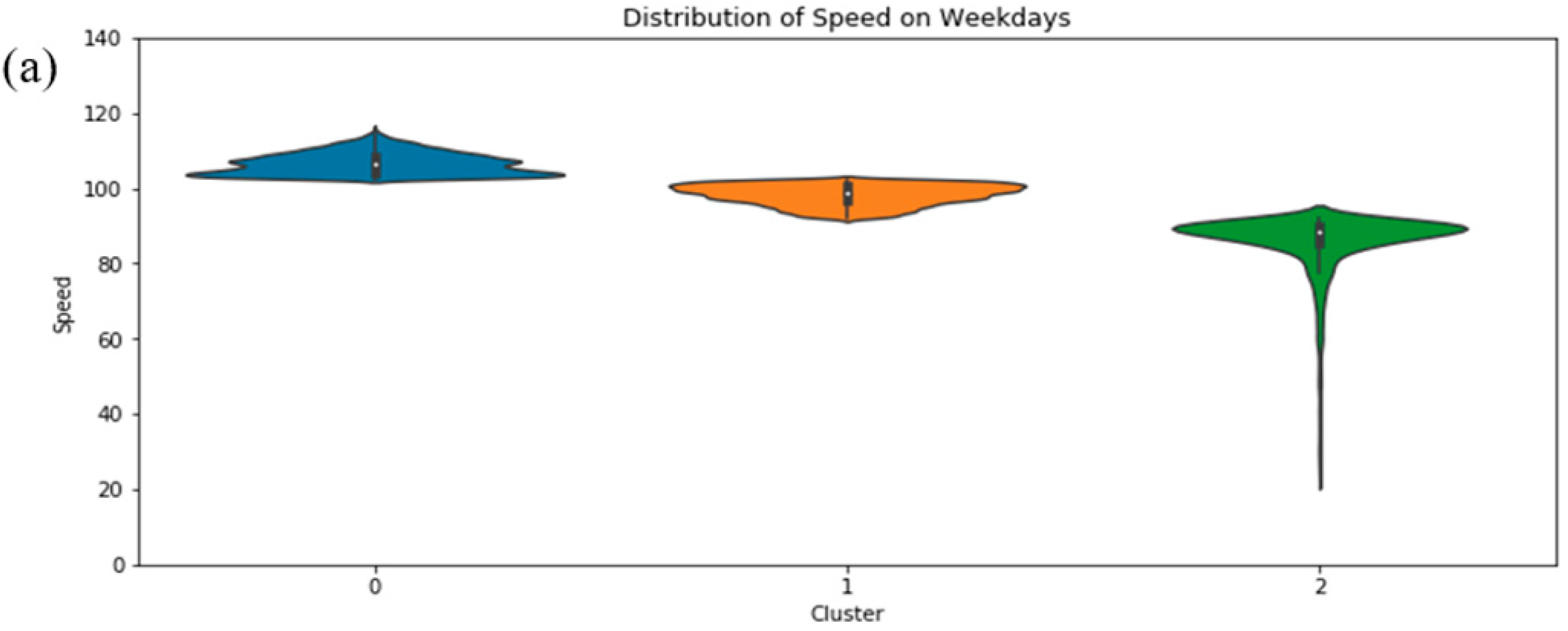
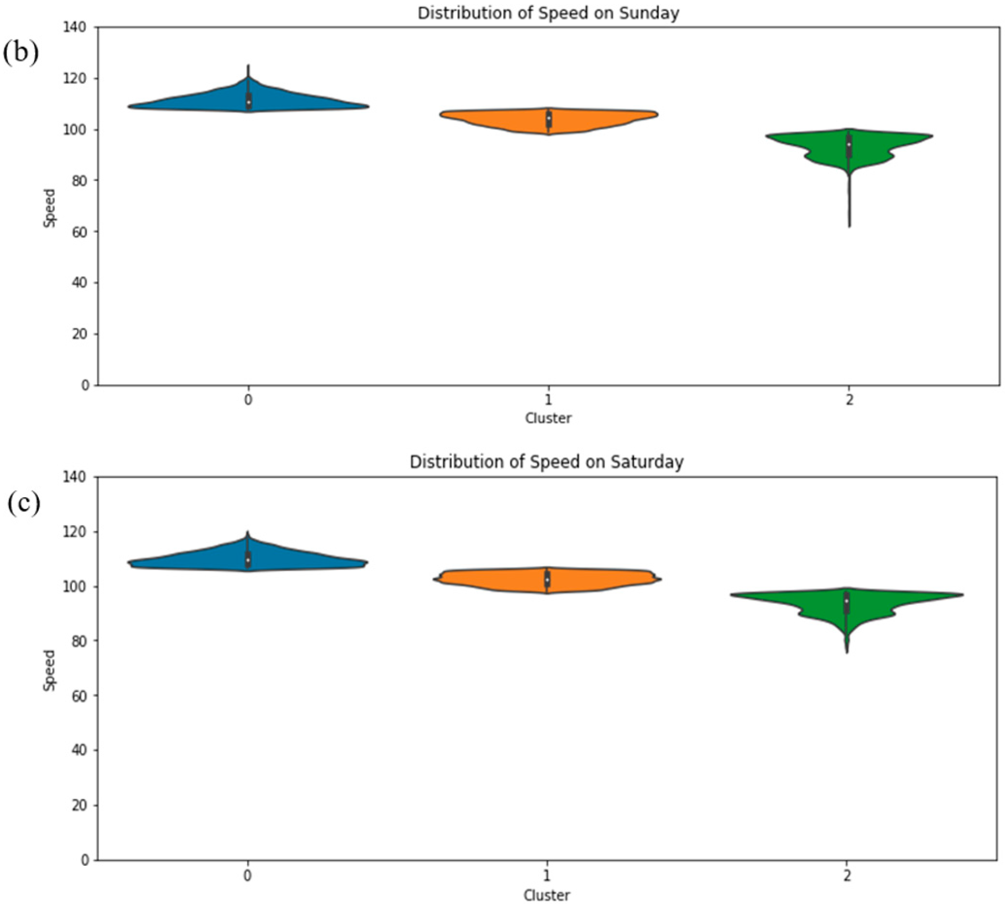
In order to understand the inner characteristics of each cluster for each grouping and bring to the front information related to speed distribution, violin graphs were created for each cluster for the three created groups (Weekdays, Saturdays and Sundays). In the violin figures the speed range of the dataset is shown on the x-axis, while the y-axis indicates the number of clusters analyzed in each plot. The data's median, dividing it equally with 50% of the points below and 50% above, is represented by a white dot. The data's spread and variability are demonstrated by a black box extending vertically from the 25th percentile (lower quartile) to the 75th percentile (upper quartile). The density plot displays symmetrically distributed shapes relative to the position of the box. Each shape's bottom corresponds to the minimum value, and the top represents the maximum value within its respective cluster. At this point it is important to mention that the overall speed limit of the motorway is 120km/h except for toll segments, tunnels, weave, merge and diverge sections where the speed limit is lower. The application of a violin graph, which is a hybrid representation of a box plot and kernel density graph, can enable the visualization of outcomes and present them in an easily comparable form.
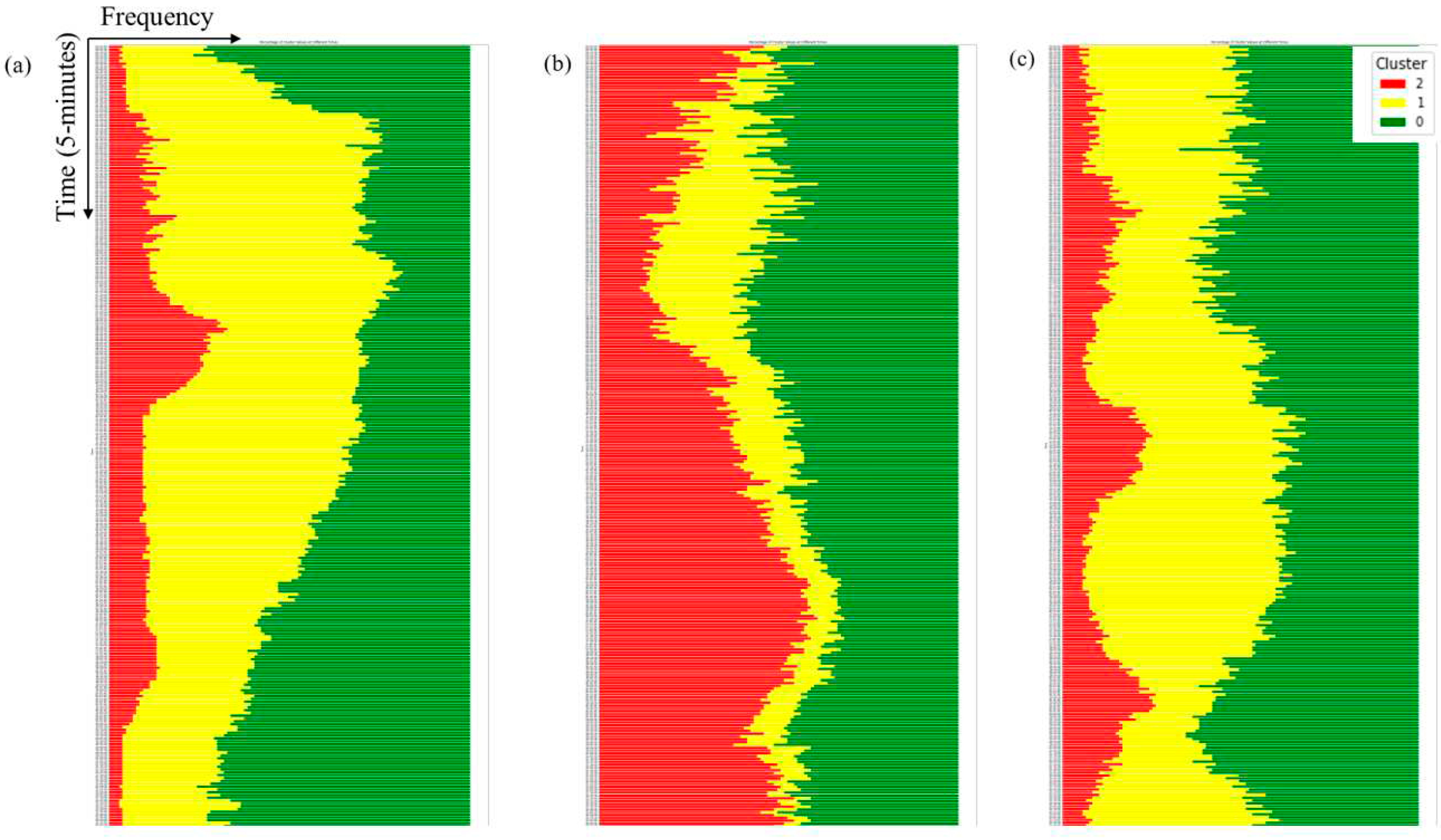
The significance of the clustering step in the traffic state identification process was confirmed through both temporal and spatiotemporal analyses. Temporal speed patterns were identified by creating a graph that illustrates the frequency of each cluster in 5-minute intervals. This was based on the average calculated values for each cluster over a 24-hour period. In the graph, the x-axis denotes the frequency percentage of a specific cluster at a given time step, while the y-axis represents the time steps throughout the day. Each cluster is represented by a unique color. The goal of this frequency detection is to facilitate the identification of speed variations along the motorway, enabling the assessment of motorway operation from one-time step to another.
To conduct more detailed analysis and include the dimension of space spatiotemporal 3-D graphs similar to the aforementioned ones were created. This approach highlights the importance of understanding traffic behavior from the spatiotemporal aspect. Consequently, this methodology allows for the evaluation of not only the motorway conditions in time, but also the distinct sections of the infrastructure separately.
2.4. Data combination
After conducting the pre-processing of the loop detectors data to organize and gain insights into traffic patterns and conditions within the examined road network section, the subsequent step involves utilizing them as directional information to better understand the data provided by probe vehicles. This approach allows for a better understanding of how probe drivers interact with the traffic conditions, captured by the loop detectors effectively, providing valuable insights into their behavior and interactions in the traffic network.
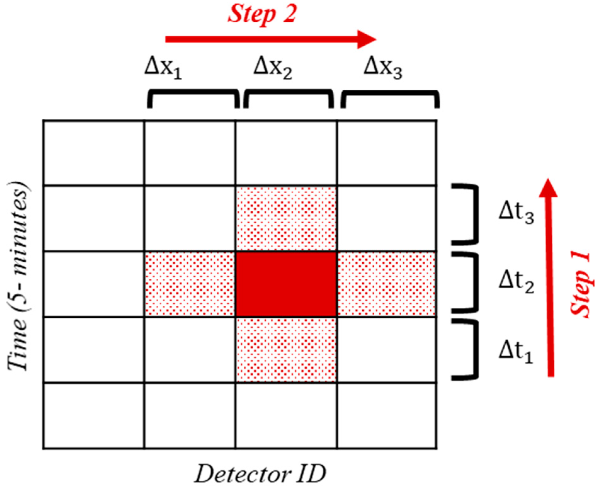
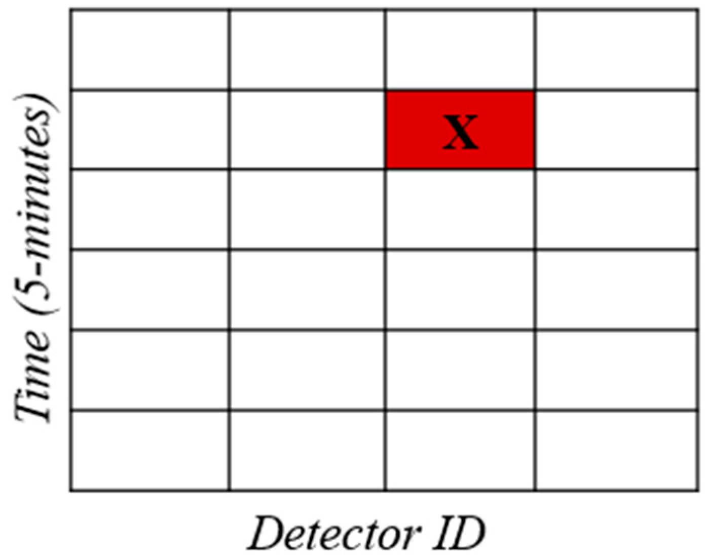
To combine data from loop detectors, which pertain to overall traffic, with data from probe vehicles a combination process was carried out using a 5-minute time step designated from detectors measurements. The entire process was completed in two steps, as depicted in
Figure 3:
Step 1: The GNSS database lacked a standardized time-step, and data was collected at irregular intervals (every t second), depending mainly on the original recording frequency, signal availability and accuracy. Therefore, the data was organized and aligned to the nearest 5-minute interval, with the smallest denoting the corresponding 5-minute frame of loop detectors.
Step 2: A similar procedure was applied to the spatial dimension of the collected data. The collected points were projected onto the Center Lines of the Network, and the mileage distance was utilized to identify the nearest detector (with the smallest corresponding to the detector's name). Map-matching algorithms were utilized in this step.
By following these two steps, the combination of loop detector data and probe vehicle data was achieved, enabling a comprehensive analysis of overall traffic conditions and valuable information about patrol drivers.
Figure 3.
Visualization of the combination process based on spatiotemporal data.
Figure 3.
Visualization of the combination process based on spatiotemporal data.
The data format and the Python-based searching procedure used to merge the two datasets, are visually illustrated in
Figure 3. The combination process resulted in the creation of a unified database where the patrol driver information was embedded with the corresponding loop detector information for each case. The data from both sources were structured and aligned to facilitate the merging process, as observed through the visualization. A searching algorithm was implemented in Python to identify the most relevant loop detector data for each patrol driver.
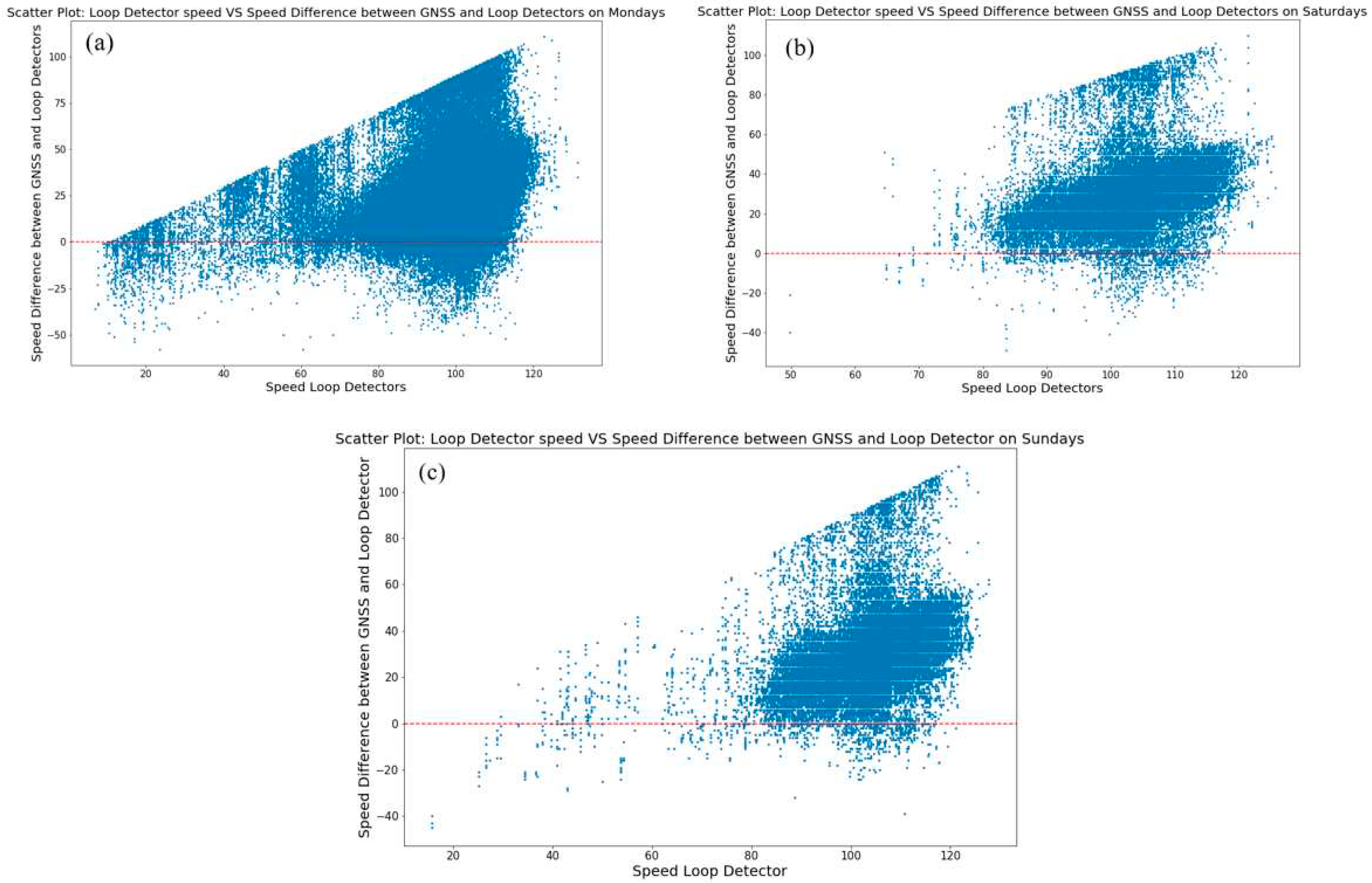
Moreover, scatter plots were generated for each group day to illustrate the relationship between speed difference (macro vs micro) and detector location. These scatter plots visually represent the patterns and variations in driving behaviour observed for patrol drivers in comparison to aggregate traffic conditions. In the first group of scatter plots the x-axis represents the loop detector mean speeds collected by loop detectors, while the y-axis displays the evaluated speed differences between the collected loop detector speed values and the matched patrol vehicle speeds.
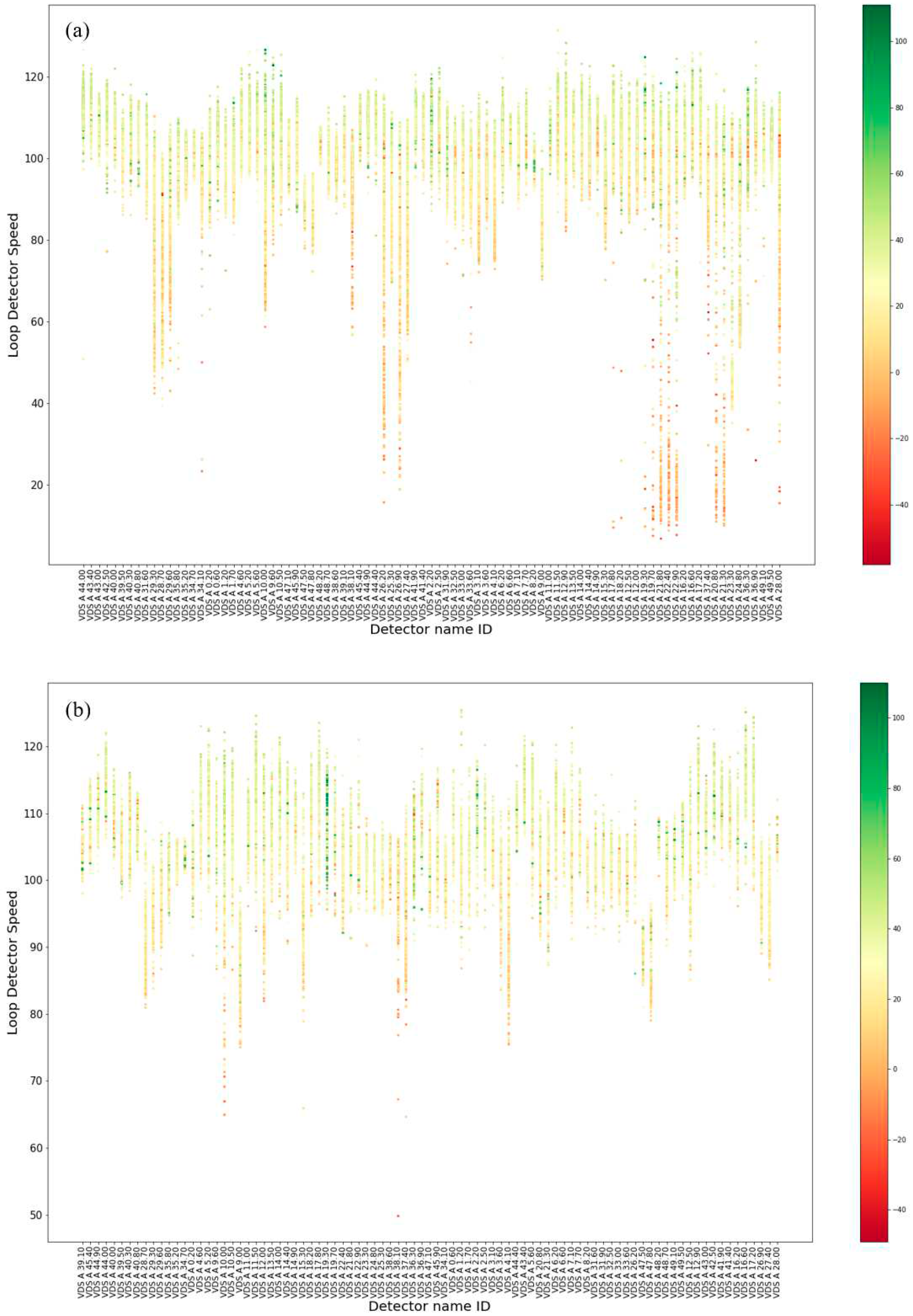
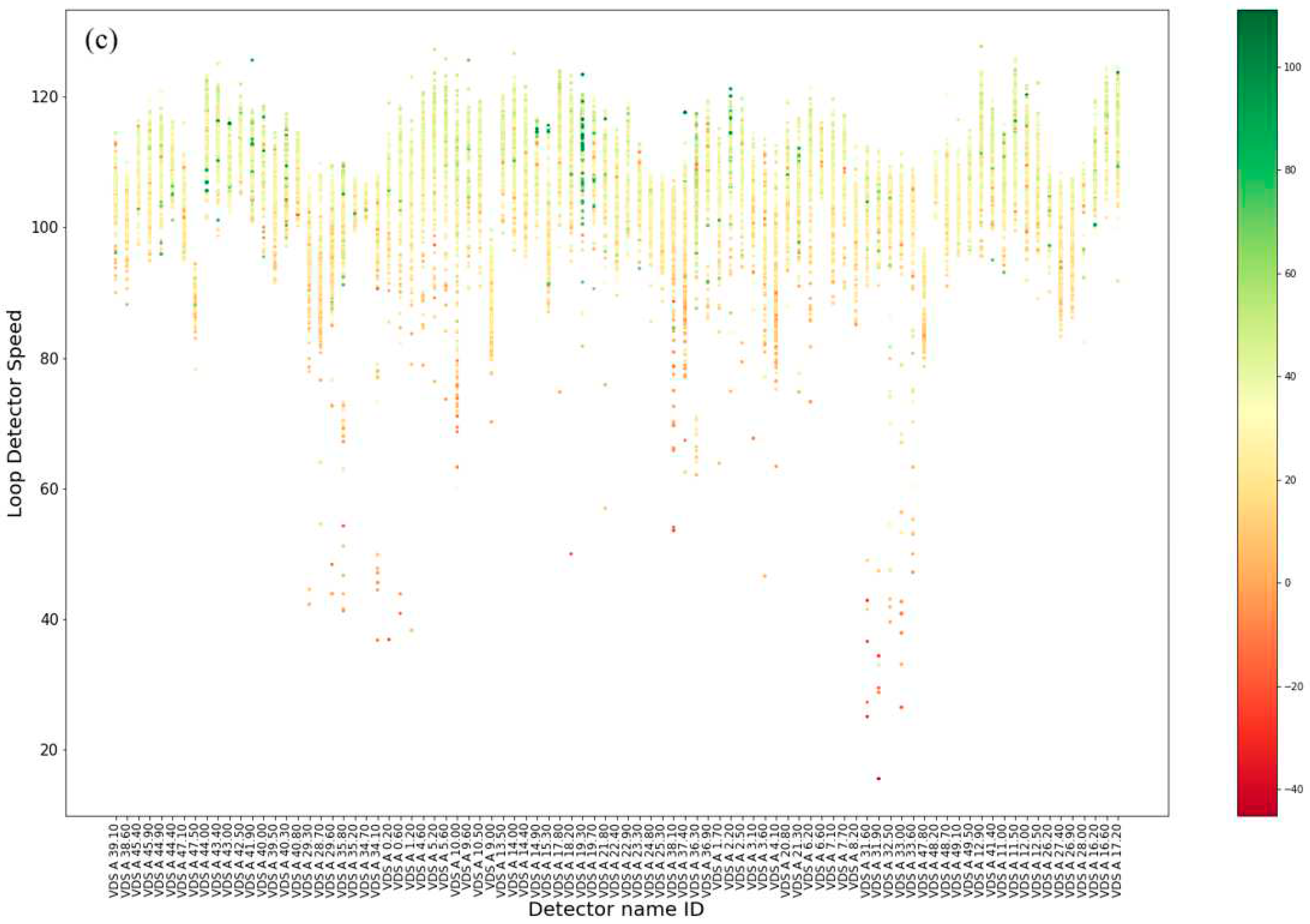
The second group scatter plot showcases the three dimensions of loop detectors speed in the x-axis, with loop detector name IDs sorted based on their mileage in the network segment in the y-axis. The evaluated speed differences (SD) are visually represented through color, and their quantification is shown using a colorbar. The scatter plot tends to visualize the transition of SD in relation to aggregate traffic mean speed and location on the motorway network.
3. Results
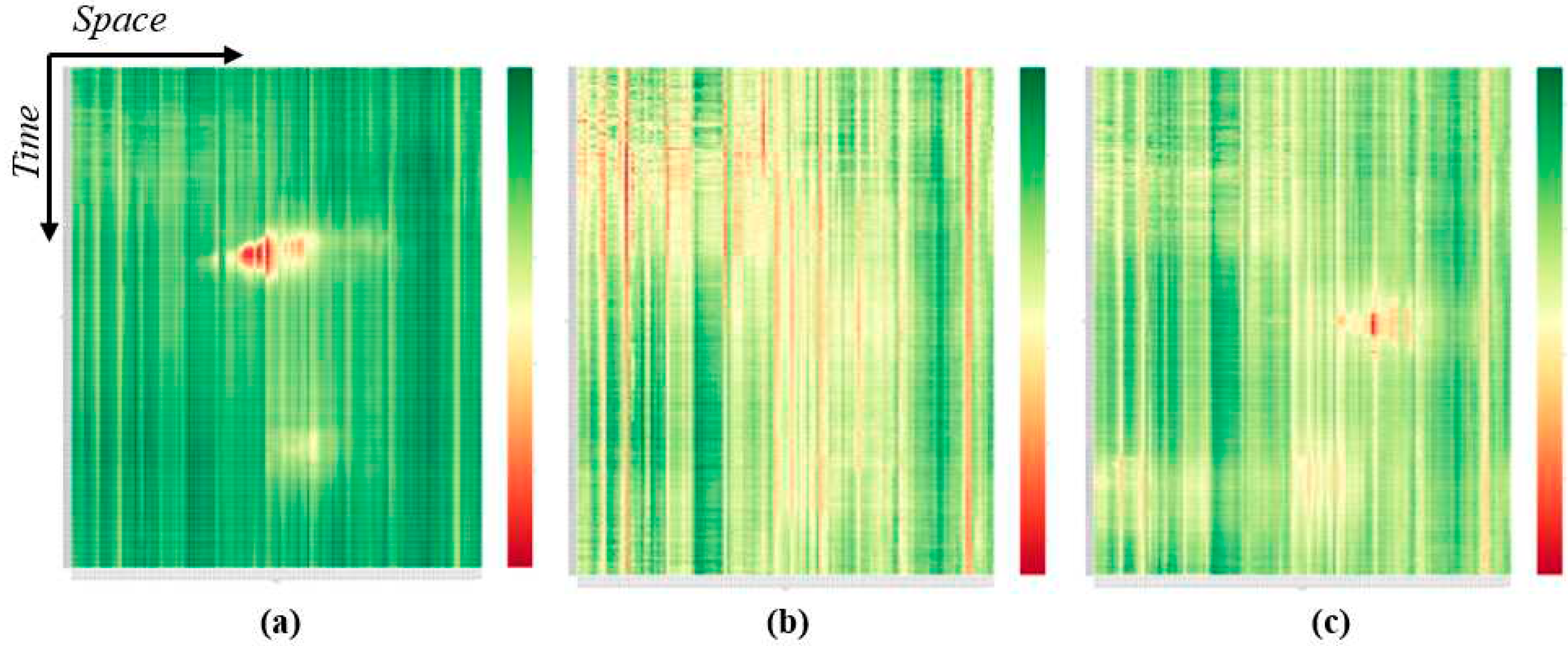
Initially, heatmaps for each day group were created and observed and their mean values are shown in
Figure 4. This process identified distinct speed patterns for weekdays, Saturdays, and Sundays. Daily heatmaps are not included in the manuscript due to space limitations.
On weekdays in the central motorway segment and near densely populated areas, two peaks (morning and afternoon) are depicted (
Figure 4a). Moreover, certain detectors display constant speeds throughout the day. Saturdays, on the other hand, illustrate low speed through the day, with reddish nuances more location-based than time-based (
Figure 4b). However, similar to weekdays the uniformity of speed for some detectors remained stable. Sundays exhibited lower speeds than weekdays but higher than Saturdays, with two peaks being observed at different times (
Figure 4c).
The variations mentioned earlier, along with the unclear picture from the heatmaps, highlight the importance of grouping similar data and reducing dimensionality. Before clustering, the Elbow and Silhouette scoring methods were applied to provide some interim results, requiring decision-making (see
Figure 5 and
Figure 6).
The Elbow method consistently suggested three clusters for all groups, relying solely on Euclidean distance. On the other hand, Silhouette scoring considered various variables like variance skewness and high-low differences. During Weekdays and Sundays the two clusters' scores exceeded those of the three clusters. However, considering the observed peaks in the heatmaps, two clusters were not sufficient to describe traffic conditions effectively. This emphasize the significance of the previous step i.e. heatmap creation, in the overall procedure. To create easily comparable clusters, it was decided to select the same number of clusters that is three for all groups.
The differences in speed in each cluster and for each group are presented in
Figure 7 and the clustering results in
Figure 9.
Figure 7.
Speed distribution with violin plot a) Weekdays, b) Saturdays and c) Sundays.
Figure 7.
Speed distribution with violin plot a) Weekdays, b) Saturdays and c) Sundays.
The use of violin representations and statistical analysis offered further insights into the observed distribution patterns and the underlying data of clusters in each case study. During Weekdays (
Figure 7a), the main distribution of speed values was found to range between 80 km/h and 120 km/h, with a notable proportion of speed values below 80 km/h also being observed. Cluster 2 was characterized by values around 86 km/h, and a long "tail" extending to the 24 km/h mark was observed. Cluster 1 displayed a nearly uniform shape along the vertical axis, while cluster 0 showed a pointed shape directed towards the upper limit, without exceeding 120 km/h. Both weekend days showed similar shapes for clusters 0 and 1, but cluster 2 exhibited lower speeds on Sundays.
The statistical results, presented in
Table 1, mathematically describe the speed range between the created clusters. For Weekdays, cluster 2 displayed a difference of 68 km/h between the minimum and maximum values, significantly higher than the differences of 5 km/h and 9 km/h observed in clusters 1 and 0, respectively. For the weekend, the differences between the highest and lowest values were 21 km/h, 3 km/h, and 9 km/h for clusters 2, 1, and 0 respectively for Saturdays. For Sundays, the differences were 35 km/h, 9 km/h, and 16 km/h for cluster 2, 1, and 0, respectively. Regarding speed peaks, both high and low ones, the lowest speeds were noted during Weekdays at 24 km/h, with higher lows observed on Saturdays. Sundays exhibited higher speeds or higher maximum speeds. Cluster 0 was more populated during Weekdays compared to the others, with cluster 1 dominating. In summary, during the weekends, speeds were higher and more evenly distributed, whereas Weekdays showed more fluctuations.
Graphical representations of cluster frequency variation through 5-minute timesteps within 24 hours are illustrated in
Figure 8. The aim of the cluster frequency graph is to understand speed variation for the different day groups within the day. Related to weekdays it can be observed that cluster 1 prevails in comparison with the other two (
Figure 8a). Furthermore, fluctuations of cluster 2 (red color) can clearly distinguish the two peaks and their duration. The dominance of cluster 0 (cluster with the highest speed variation) is mostly observed early in morning and late in the night time slot. During Sundays cluster 1 (mid-speeds) is the least observed and cluster 2 (lower speeds) occupies most of the graph area especially after the morning hours (
Figure 8b). It is critical to underscore that speed variation between weekdays and weekends of the same cluster differs (
Figure 7 and
Table 1). Finally, during Sundays similarly to weekdays cluster 1 is mostly observed and the shape of cluster 0 can clearly present three peaks, early in morning, morning peak and afternoon peak. Cluster 2 during Sundays is the least noticed.
Going a step further and considering the space factor as a crucial variable that affects speed variability, spatiotemporal distribution 3-D graphs for each day based on the identified cluster are produced and presented in
Figure 9.
Figure 8.
Average cluster frequency for 5min timesteps over 24 hours a) Weekdays, b) Saturdays and c) Sundays.
Figure 8.
Average cluster frequency for 5min timesteps over 24 hours a) Weekdays, b) Saturdays and c) Sundays.
Figure 9.
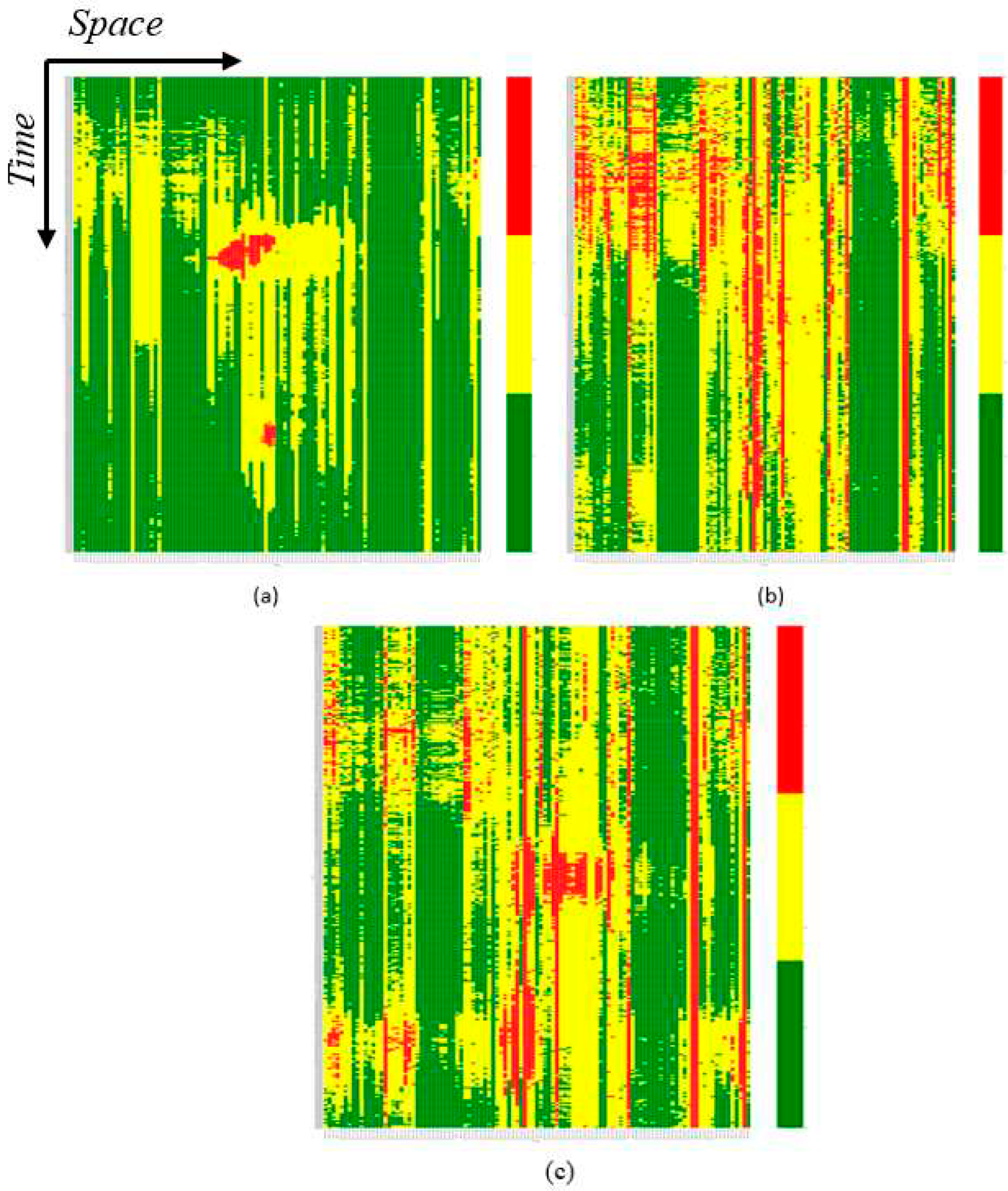
K-means clustering on spatiotemporal 3-D graph based on the day of the week a) Weekdays, b) Saturdays and c) Sundays.
Figure 9.
K-means clustering on spatiotemporal 3-D graph based on the day of the week a) Weekdays, b) Saturdays and c) Sundays.
Representing the Weekdays cluster (
Figure 9a) the two previously identified lowest speed peaks (see
Figure 7a cluster 2) from the heatmaps are now clearly allocated while the red zones, surrounded by yellow points (
Figure 7a cluster 1), indicate smooth speed transitions between phases. The green zones represented areas where speeds approximated free flow values (
Figure 7a cluster 0). As expected from the 3-D graphs throughout the Saturdays (
Figure 9b) showed high-speed values throughout the day and the network, with no concentrated red zones indicating absence of distinct peak hours. The shift from high speeds (green) to low speeds (red) occurred gradually, with yellow enclosing most of the red points. In contrast, for Sundays clustering (
Figure 7c) exhibited two prominent peaks represented by red colors, however, scattered points with low-speed values were also observed. Sundays were dominated by mid-speed values, easily understood due to the dominance of yellow clustering. Location factors seemed to have a greater influence on Sundays, with green zones mainly around specific detectors. Once again, the independent behavior of some specific detectors was analogous for the third group. These detectors, identifiable in cluster images, were vertical lines belonging to the same cluster throughout the day, differing from neighboring detectors in their cluster category. Further geospatial analysis (using ArcGIS Pro) revealed that infrastructure characteristics caused the variation in speed values. By identifying the location of detectors whose cluster is differentiated from their neighbors on road network geometry, it was found that the specific detectors were mainly located near tunnels, tolls, merging sections, or notable changes in the road geometry such as curves.
The following phase involves utilizing these findings to assess speed patterns collected from other sources. Scatter plots analyzing the driving behavior of patrol drivers in comparison to aggregate traffic behavior are now introduced in
Figure 10 and
Figure 11.
The analysis of the speed patterns of patrol drivers reveals interesting insights (
Figure 10). Results indicate that patrol vehicles generally exhibit lower speeds in comparison to the aggregate vehicle speed. The first scatter plot showcases a majority of positive values, which are mainly concentrated within the speed range of 80-120 km/h (
Figure 10a). This concentration of points indicates a prevailing trend where most patrol vehicles tend to travel at speeds within this range.
Upon further examination three distinct patterns emerge in relation to the detector loop mean speed during weekdays. The first pattern indicates that patrol drivers tend to adopt higher speeds than general traffic, and this difference is mostly noticed when traffic is moving at relatively low speeds, typically up to 40 km/h. It appears that patrol drivers, during such congested situations, are able to maintain higher speeds compared to the general flow of traffic. The second pattern is characterized by a "cloud" of values observed for speeds higher than 80 km/h. In this range, the SD between patrol vehicles and vehicle traffic remains relatively consistent, usually less than 50 km/h. This suggests that when traffic flows at higher speeds, the SD between patrol and general vehicles tends to stabilize around a certain range. The third and most significant pattern is identified in the upper limit of the graph, which presents a nearly linear form. This linear trend indicates that the higher the aggregate speed, the larger the potential SD between patrol vehicles and general traffic.
Saturdays (
Figure 10b) and Sundays (
Figure 10c) show similar correlations, but with a noticeable distinction. In these figures, the values are predominantly concentrated on traffic detector speed values exceeding 80 km/hr. Additionally, the SD between general traffic and patrol vehicles are primarily within the range of 0-40 km/hr. This finding suggests that when speed is relatively high, the differences in speed between patrol and general traffic are generally smaller. Furthermore, when considering weekends, in continuation with the analysis and findings of heatmaps and clustering, patrol vehicles tend to move with higher speeds and exhibit fewer differences from the general traffic.
The analysis of speed-location scatterplot (
Figure 11) reveals that detectors and their locations significantly affect the level of SD observed in patrol drivers. It becomes evident that certain detectors, particularly those placed on the main segment of the network, experience SD regardless of the overall speed of the vehicles passing through them (
Figure 11a). This suggests that specific road segments may have inherent characteristics or conditions that lead to consistent SD for patrol vehicles.
Analysis on weekends (
Figure 11b and
Figure 11c) further reinforces the previously observed results regarding the movement at higher speeds. In all three graphs (
Figure 11), negative values SD are depicted in red, indicating SD where patrol vehicles are generally faster compared to the general traffic. These negative values are primarily observed at lower speeds. On the other hand, positive values of SD are shown in green, representing SD where patrol vehicles are generally slower than the overall traffic. These positive values are mainly observed at higher speeds. This finding reinforces the earlier observation that patrol vehicles tend to be affected in regard to the general traffic speed.
Another notable pattern that emerges from the analysis is the consistency of positive or negative values of certain detectors. This consistency is especially evident during weekdays (
Figure 11a
). Patrol drivers' behaviour appears to be influenced by the specific locations of detectors. In some detectors, their speed consistently remains higher or lower than the overall traffic speed. Additionally, at some detectors, patrol vehicles exhibit SD across all loop detector speed range. This consistency in SD may be indicative of unique road conditions, traffic patterns, or enforcement strategies in these specific areas.
4. Discussion
4.1. Findings
Big data plays a vital role in the transportation sector by enabling access to, gathering, organizing, and analyzing vast amounts of information from various sources. Through data management techniques and data mining processes, stakeholders can uncover hidden patterns, correlations, and trends. Effectively handling big data has become essential for improving overall efficiency in the transportation sector.
In traffic engineering, speed is a crucial variable measured and collected by sensors, both at aggregate and disaggregate level. Understanding the dynamic nature of speed and the factors influencing it, is essential for better management, decision-making, and more accurate traffic predictions. Real-life situations are influenced by interactions between different variables, some of which are inseparable. In traffic management, one such case is the interplay between temporal and spatial dimensions.
Data combination in transportation involves cross-validating data from different sources to draw meaningful conclusions and insights. By comparing and reconciling information obtained from various sensors and systems, transportation stakeholders can ensure the accuracy and reliability of the data. By utilizing multiple sources and conducting comparisons, we can discern patterns that would be otherwise undetectable with just a single source. This research highlights the significance of incorporating spatiotemporal factors in data mining and combination within the context of transportation. By analyzing real traffic data and conducting cross-validation of two different data sources, the study successfully uncovered specific speeding behavior patterns among particular groups of drivers (patrol vehicle drivers). Moreover, the integration of spatiotemporal analysis and visualization proved to be instrumental in transitioning from general conclusions about traffic movement to more specific insights about patrol drivers' driving behavior. Analyzing the overall traffic conditions of all vehicles before focusing on a specific target group ensures that the data used is representative of typical traffic situations, while also eliminating any unusual or erroneous information from the final dataset. The combination of these techniques allowed for a deeper understanding of the data, enabling researchers to identify and examine patterns, trends, and specific behavior in the context of patrol drivers' actions and overall traffic. This level of granularity and precision in analyzing driving behavior or any vehicle category can lead to more targeted and effective strategies for traffic management and law enforcement on the roads.
To start with a general traffic conclusion examining data according to daily frequency and categorizing it into three groups: Weekdays, Saturdays, and Sundays comply with previous research conducted on Attica area [
31], but differs from approach adopted in other cities [
32]. This finding emphasized the importance of understanding the lifestyle trends and habits in each investigated area before conducting traffic analysis. The identified patterns on weekend days can be attributed to the varying business hours in Greece, with most businesses open on Saturdays but closed on Sundays. The reliability of this grouping approach was evidenced by accurately illustrating Greeks' active social life during their day-off and the specific timeframes for these trips, demonstrating its effectiveness in capturing distinct travel behavior patterns on different days of the week.
The visualization of spatiotemporal speed patterns through heatmaps proved highly successful in identifying specific trends, as two distinct peaks on the Attica tollway during weekdays were revealed: one in the morning and another in the afternoon. Previous studies had only represented the time duration and space extension of the morning peak for four days on the same motorway [
33]. However, this study captured all speed fluctuations for 24 hours, based on the day of the week. Notably, speeds on Saturdays on the motorway were not characterized by any peak. Additionally, the peak patterns differed between weekdays and Sundays in terms of duration, location, and timeframe. In conclusion, day frequency emerges as a crucial factor that should be considered when analyzing speed behavior in the transportation network.
Taking a step further, the utilization of k-means clustering, and detailed analysis helped validate the conclusions drawn from the graphs and the heatmaps and revealed internal patterns within the dataset. The temporal analysis emphasizes the impact of time and the observed fluctuations. Similar to [
34], representing cluster frequency considering the time of day can be highly effective in determining peaks. Considering the specific analysis that was conducted at a day-of-the-week level in Athens an uncommon patter during Sundays compared to the international literature was observed. In the city of Athens, during Sundays, traffic patterns tend to exhibit three peaks in contrast with previous studies [
34] that distinguish only two peaks. This observation is closely tied to the busy nightlife observed in the capital, which appears to have a significant impact on speed ranges especially on the early morning hours. Additionally, this underscores the necessity for additional analysis on the spatial aspect as well, to further understand the locations that the phenomenon is taking place.
Clusters proved to be effective in understanding the necessity for spatiotemporal analysis, as many detector points exhibited changes in their cluster category throughout the day, with some even switching between multiple clusters within a 24-hour period. These locations can be characterized as critical by motorway operators, as traffic management strategies are required to improve their operation. Variable speed limits for example, can offer a potentially effective tool, especially for road segments that exhibited sharp speed reductions. Spatial analysis uncovered significant variations in speed values among neighboring detectors, while certain detectors maintained consistent speed values throughout the day. In particular, detectors located upstream, downstream or inside of tunnels, on tolls, merging sections or on notable and sharp alterations on road design characteristics such as curves exhibit noticeable changes in speed variations, usually speed reductions, irrespectively of the time of day. In order to control traffic conditions in those sections it is important to consider the space factor. Targeted measures such as ramp-metering at merge sections or variable speed limits upstream of tunnels could support the smoothing running of traffic and hence enhance road safety and operational performance.
Upon examining the violin graphs and statistical table the Attica Tollway displayed a very high probability of trips being conducted at speeds exceeding 80 km/h, especially on weekends. Based on these findings, the proposed visualization methodology effectively evaluated the operation of the network and highlighted the crucial supportive role of the Attica Tollway in enabling efficient travel within urban areas at high speeds. These results align with previous research [
35] that has also emphasized the tollway's significance in facilitating fast and efficient transportation within the urban environment.
In reference to the analysis of combined data that was further performed, valuable insights into the speed behavior of patrol drivers were revealed. In concurrence with the research [
26], findings reveal that patrol vehicles comprise a poor estimator of ambient speed especially at low and heavy traffic conditions. Speed information from patrol vehicles may be misleading when utilized to assess road network operating conditions, for example in motorways where loop detectors or other similar data recording stations are not installed. Furthermore, combined data analysis indicated that although patrol drivers may adopt speeds higher than the posted speed limit, their compliance rate is higher than that of the rest of the road user population.
In conclusion, the comprehensive analysis of spatiotemporal speed patterns and speed behaviour of patrol drivers has provided valuable insights. The integration of data combination, heatmaps, clustering and statistical analysis has enabled a deeper understanding of traffic patterns and driver actions, enabling the support of more effective traffic management strategies. The impact of detector locations on speed differences emphasizes the importance of specific road sections influencing patrol drivers' speeds and general driving patterns. These findings contribute to the optimization of law enforcement approaches, enhancing overall transportation safety and efficiency. The present study highlights the crucial role of big data in the transportation sector, empowering stakeholders to make informed decisions for a more streamlined and secure transportation network.
4.2. Limitations and Future work
Limitations and assumptions were acknowledged in this research. The dataset used was limited to two months of data and only on the basic roadway segment, thus not being representative of various conditions that would also affect traffic patterns such adverse weather conditions, and on- and off-ramps segments. To gain a deeper understanding, extending the study to cover the entire year and encompassing various segments would be highly beneficial, as additional insights into how speed behavior varies across different prevailing road conditions and locations could be revealed.
Moreover, the choice of k-means clustering method was found to be effective, but exploring alternative clustering techniques that incorporate the spatiotemporal factor in their methodology similar to [
36] might be worthwhile. Future work could involve extending the research to address the limitations mentioned earlier. Moreover, progressing research from speed to speeding behaviour and understanding how different groups behave concerning speeding could contribute to the development of targeted road safety measures and enforcement strategies. Furthermore, it would be valuable to explore a more detailed approach by analyzing the data at lane level [
37], as vehicles often exhibit different speeds across the various lanes of a motorway, studying the speed differences within each lane. This granular analysis has the potential to uncover specific patterns of speed behavior, leading to a better understanding of how vehicles drive in different lanes. By addressing these future directions, the research could further deepen our understanding of speed patterns on the motorway and provide valuable insights for enhancing road safety and optimizing traffic management strategies.
