2. Materials and Methods
Smart cities represent a paradigm shift in sustainable urban development, tackling the intricacies of dynamic urban environments. At the core of our methodology lies a fusion of advanced data analytics, predictive modeling, and digital twin techniques. Predictive analytics stands as the linchpin, empowering cities to proactively plan for evolving challenges. Simultaneously, digital twin methodologies provide a virtual mirror of the urban landscape, enabling real-time monitoring, simulation, and analysis. Our research emphasizes the criticality of real-time monitoring, simulation, and analysis for supporting test scenarios, revealing bottlenecks, and optimizing smart city efficiency.
This work uses a dataset of 144 text files that include 93,053 citizen reports retrieved through the API from the Sense City platform, a service launched by the Municipality of Patreon, available to the public since 2018. This platform enables citizens to report various issues based on geographic graphical coordinates, offering a direct channel for community feedback on issues such as infrastructure, services, and various aspects of urban life..
Structured in JSON format, each report includes key details like a unique report identifier (_id), a bug identifier (bug_id), the current status of the reported issue (status), geographic coordinates (loc), the reported issue's type (issue), a bilingual description in Greek and English (value_desc), and the timestamp of the report submission (reported). These details provide a comprehensive understanding of reported incidents, encompassing nature, location, and reporting status.
Figure 1 shows a sample of a single report.
The report consists of : _id: "6540dcf9d18942dac7c2b2e2"( Unique identifier for the report), bug_id: 146753 (Bug identifier associated with the report), status: "CONFIRMED" (Current status of the reported issue, indicating that it has been confirmed), loc: {"type": "Point", "coordinates": [21.7475708, 38.2666247]} (Location information for the reported issue, specifying that it is a point on the Earth's surface with latitude 38.2666247 and longitude 21.7475708), issue: "road-constructor"(Type or category of the reported issue, indicating a problem related to road construction), value_desc: "Κατάληψη Πεζοδρομίου" (It is encoded using Unicode escape sequences specifically in Greek. When decoded, it represents the text "Κατάληψη Πεζοδρομίου," which translates to "Occupation of the Sidewalk" in English. This is a common method of representing non-ASCII characters in a Unicode string using escape sequences.), reported: "2023-10-31T10:54:52.113Z" (Date and time when the issue was reported, which is October 31, 2023, at 10:54:52 UTC).
This report provides details about a confirmed issue related to road construction. The reported problem is the occupation of the sidewalk, and the report includes location coordinates, status, and a timestamp of when it was reported. The bug_id and _id serve as unique identifiers for tracking and referencing the report.
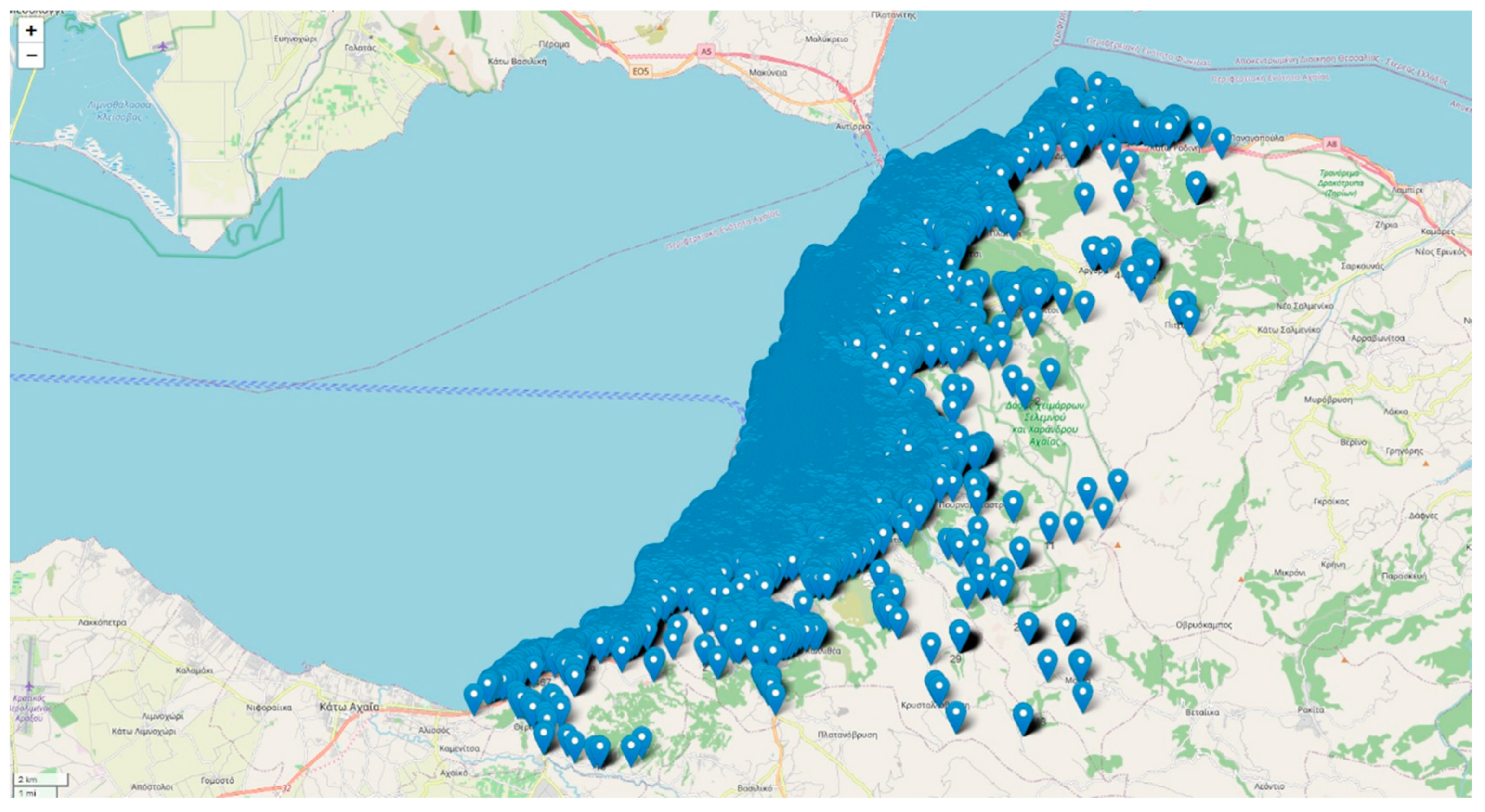
Geographically, the reports span various locations within Patras, reflecting the broad coverage of citizen concerns across the city. The spatial distribution offers insights into localized challenges and aids in understanding the dynamics of urban issues. The 'issue' field, categorizing reported problems, showcases the diversity of concerns raised by citizens, ranging from road construction to public space-related matters.
In terms of anonymity, the provided JSON seems to be structured in a way that focuses on the details of the reported issue and its location rather than revealing personal information about the citizen making the report. More specifically, the "bug_id" and "_id" fields serve as unique identifiers for the reported issue. These identifiers are important for tracking and managing reports and they don't reveal personal information about the individual making the report. The "loc" field provides coordinates (latitude and longitude) indicating the location of the reported issue. This information points to a specific geographic location and it doesn't directly reveal the identity of the person making the report. The "issue" field specifies the type of problem reported, in the sample, "road-constructor." This field, along with the "value_desc" (description) field, provides information about the nature of the issue but does not reveal personal details. The "reported" field indicates the date and time when the issue was reported. This information can be used for tracking and managing reports, it does not compromise the anonymity of the individual making the report.
In our exploration of the intricate urban fabric, we focus on the neighborhood level, recognizing the pivotal roles of citizen report analytics, prediction, and digital twin technologies. This study integrates Extract, Transform, Load/Extract, Load, Transform (ETL/ELT) processes, artificial intelligence (AI) techniques, and a digital twin methodology [
6,
7,
8,
9,
10,
11,
12,
13,
26,
27,
28,
29]. This integration processes and interprets urban data streams emanating from citizen interactions with the city's coordinate-based problem mapping platform. The synergy of an interactive GeoDataFrame within the digital twin methodology creates dynamic entities, facilitating simulations across diverse scenarios.
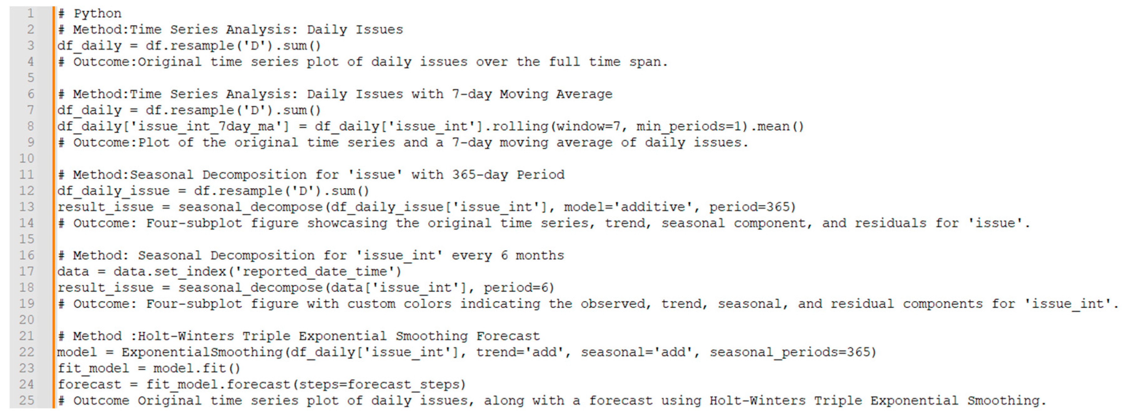
Part of the initial stages of the methods in this work is time series analysis with Python serves as a critical methodology for uncovering temporal patterns and trends inherent in sequential data. This analytical approach enables researchers to derive valuable insights, make informed predictions, and understand the dynamics of urban issues. As the work delves into time series analysis for both urban and region-specific issues, the goal is to equip research with a powerful toolbox for interpreting underlying patterns in the data [
29,
30,
31].
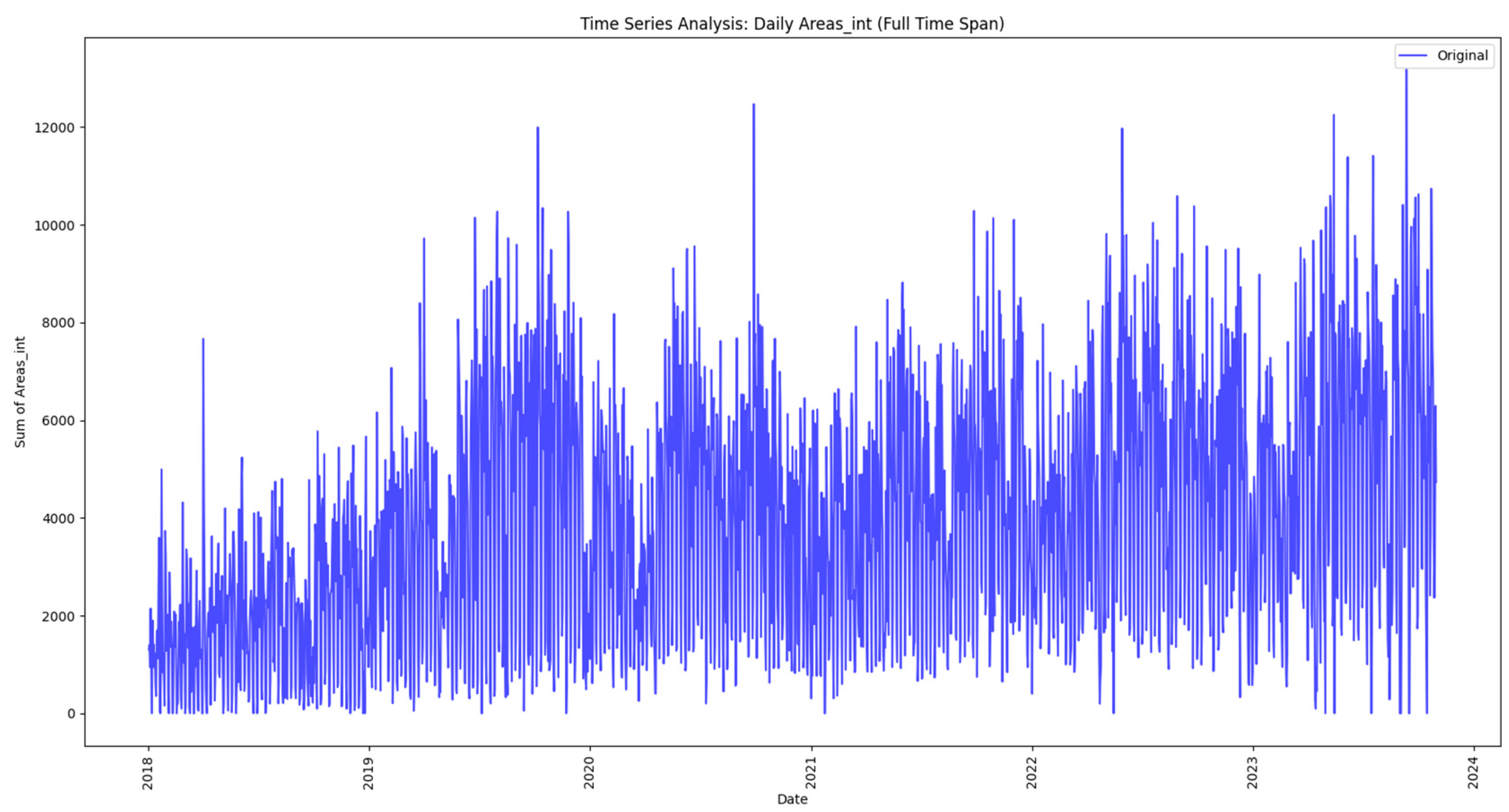
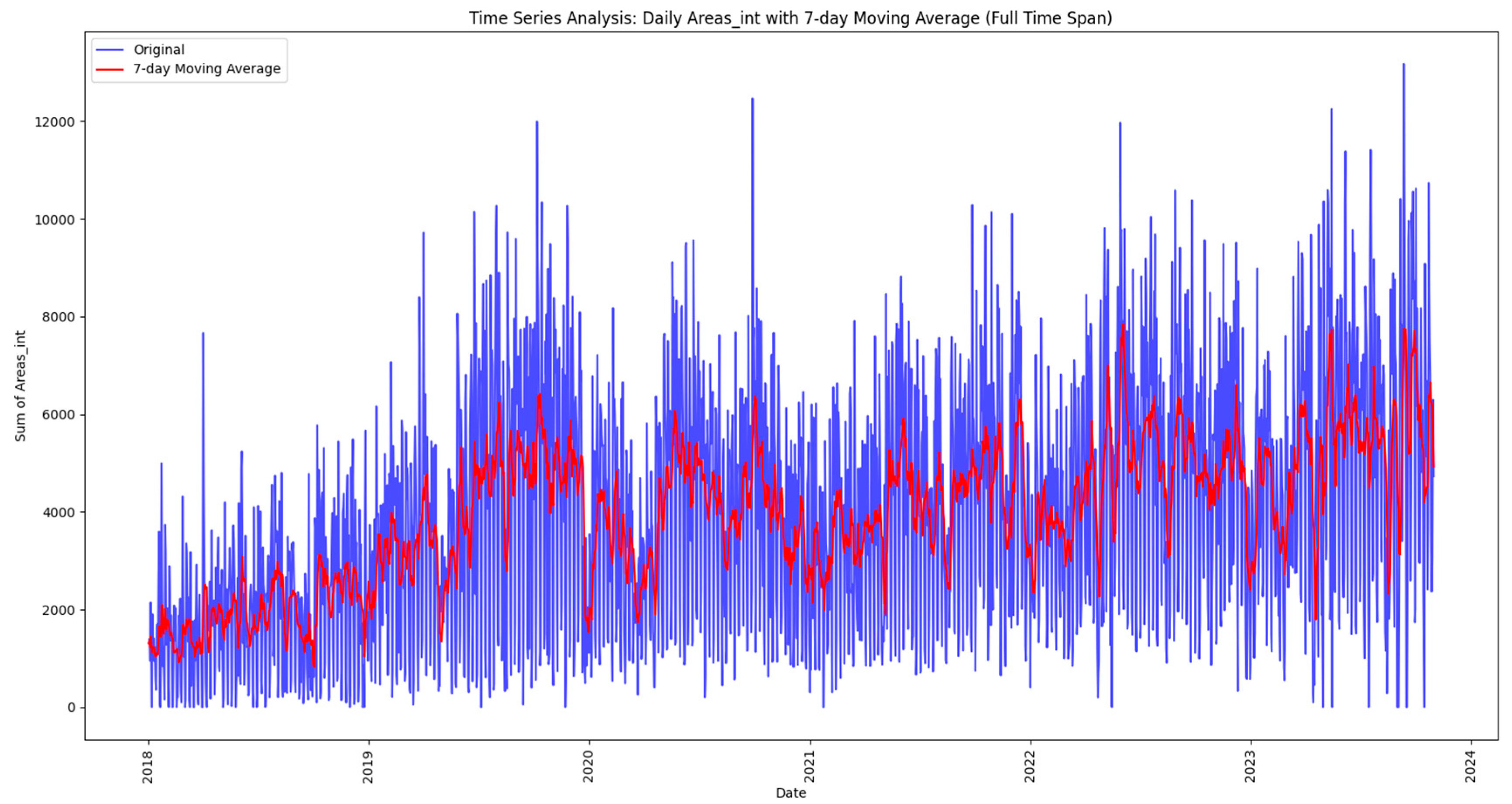
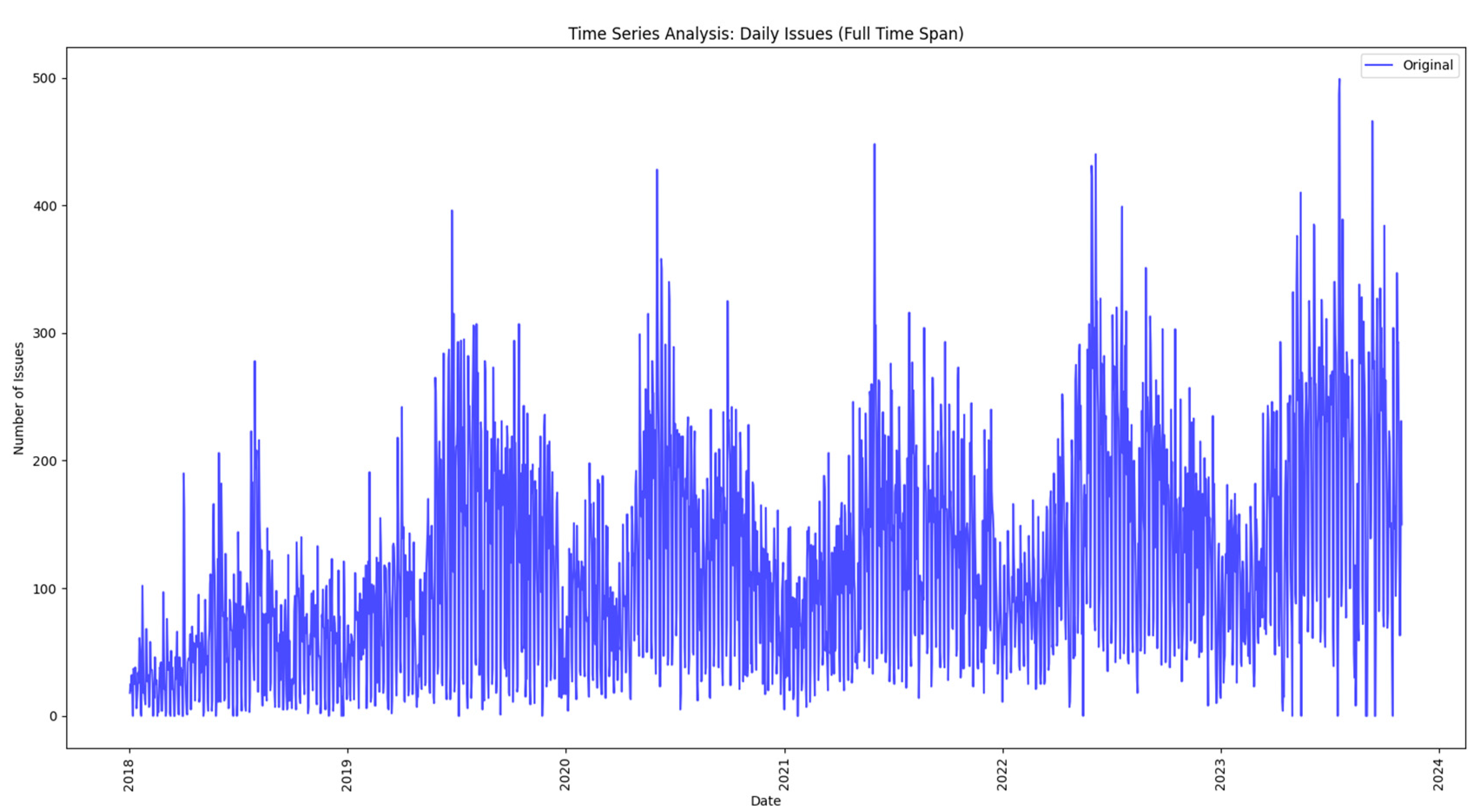
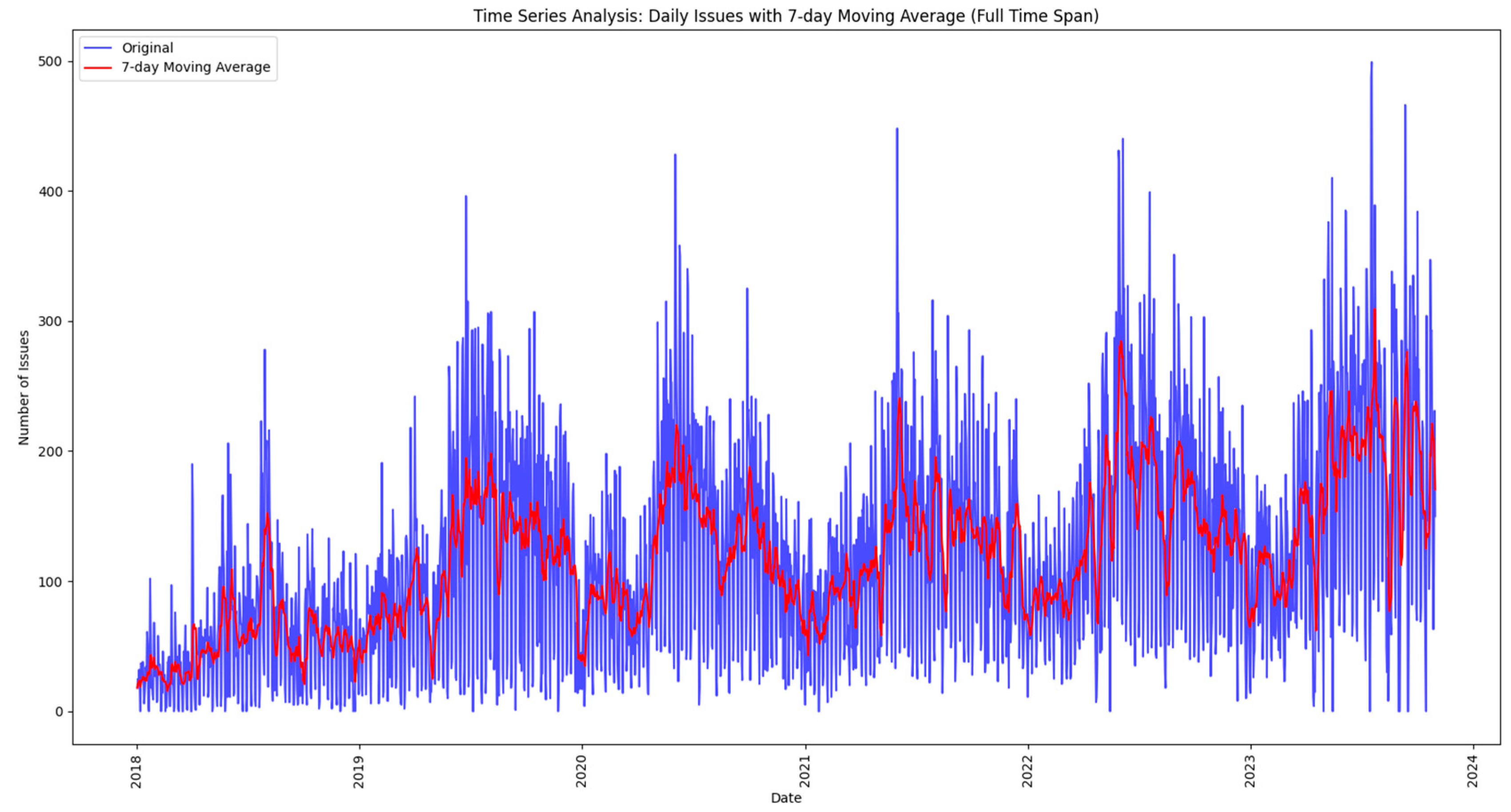
The analysis begins by exploring the daily reported issues that are loaded and processed from a data lake, as discussed in the next methodology steps. The initial time series plot provides a fundamental understanding of overall trends, and then the paper uses a 7-day moving average to smooth out fluctuations, revealing subtler patterns and helping to identify trends. These techniques not only demonstrate the ebb and flow of everyday reported issues but also set the stage for more sophisticated analyses.
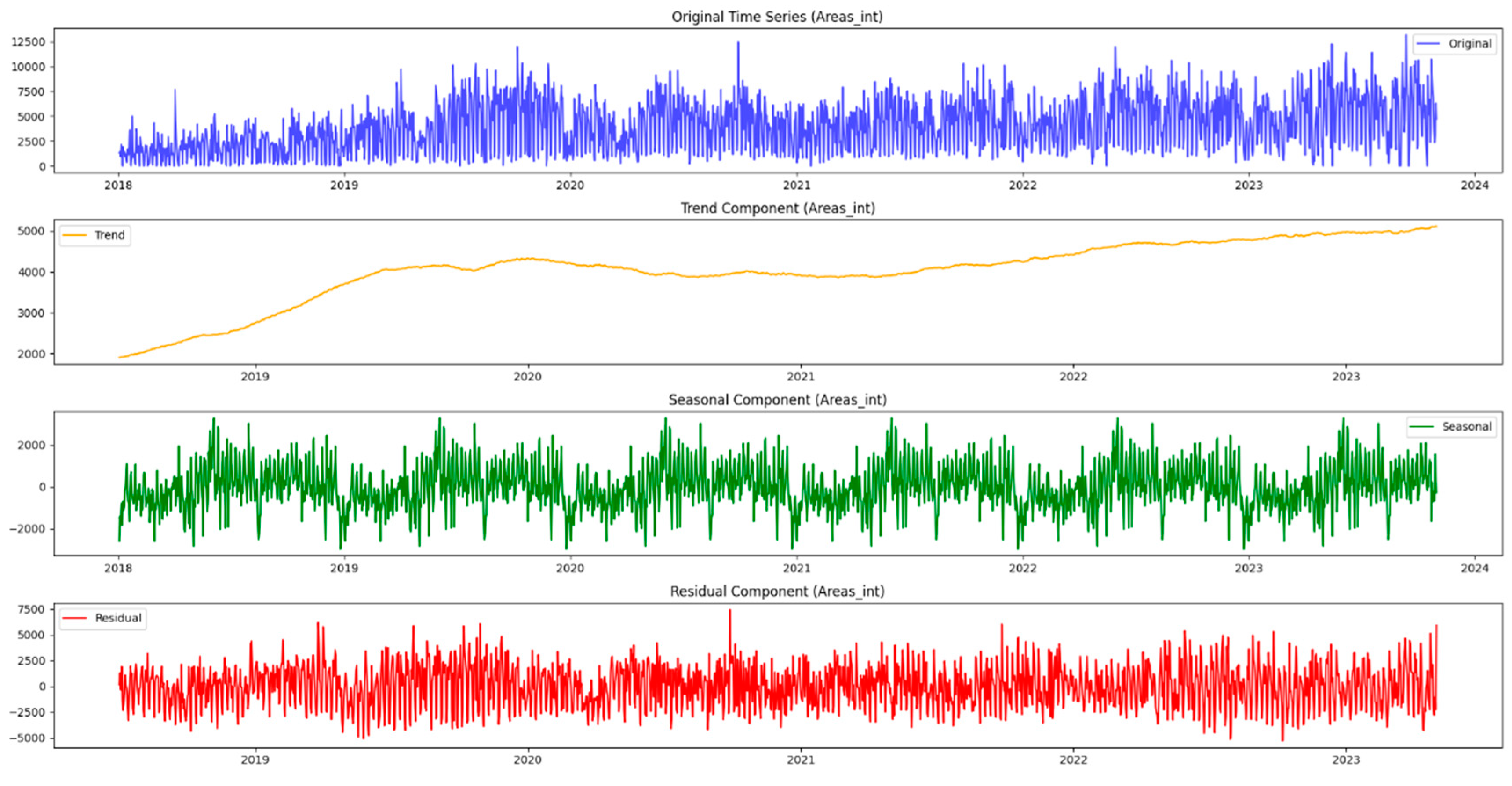
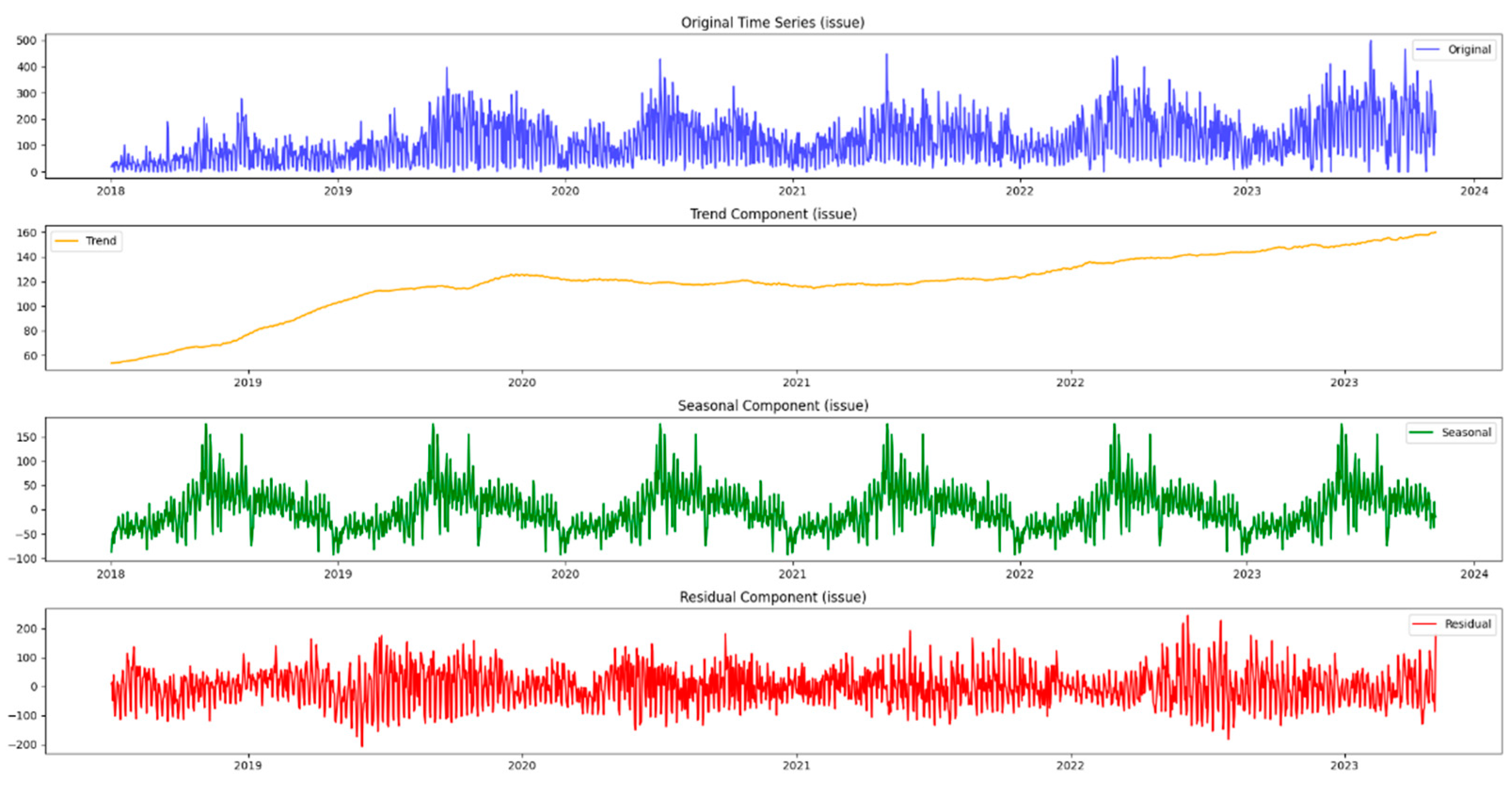
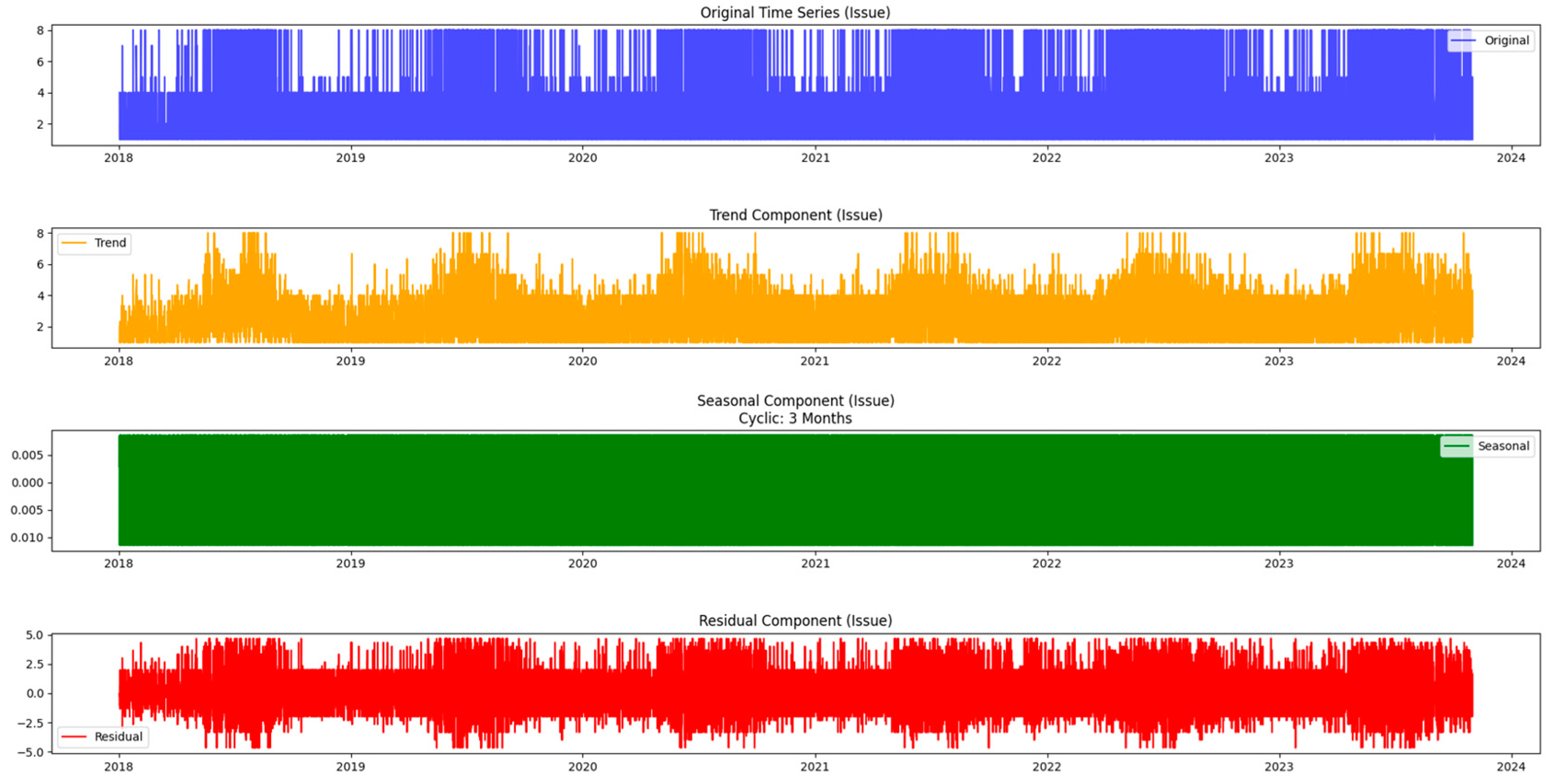
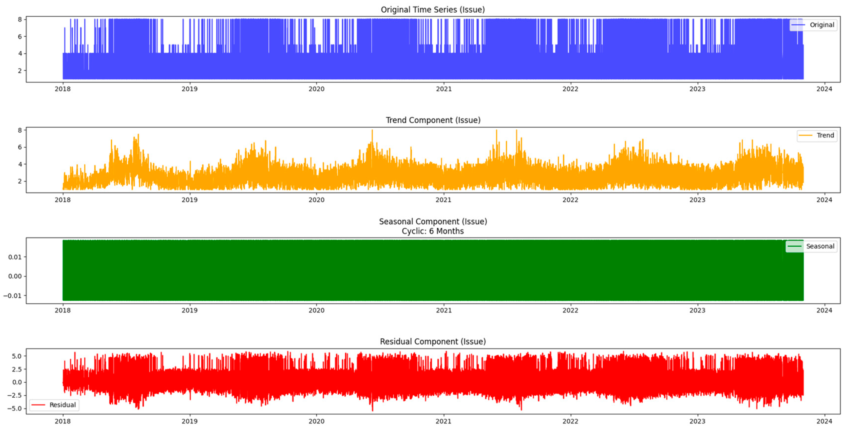
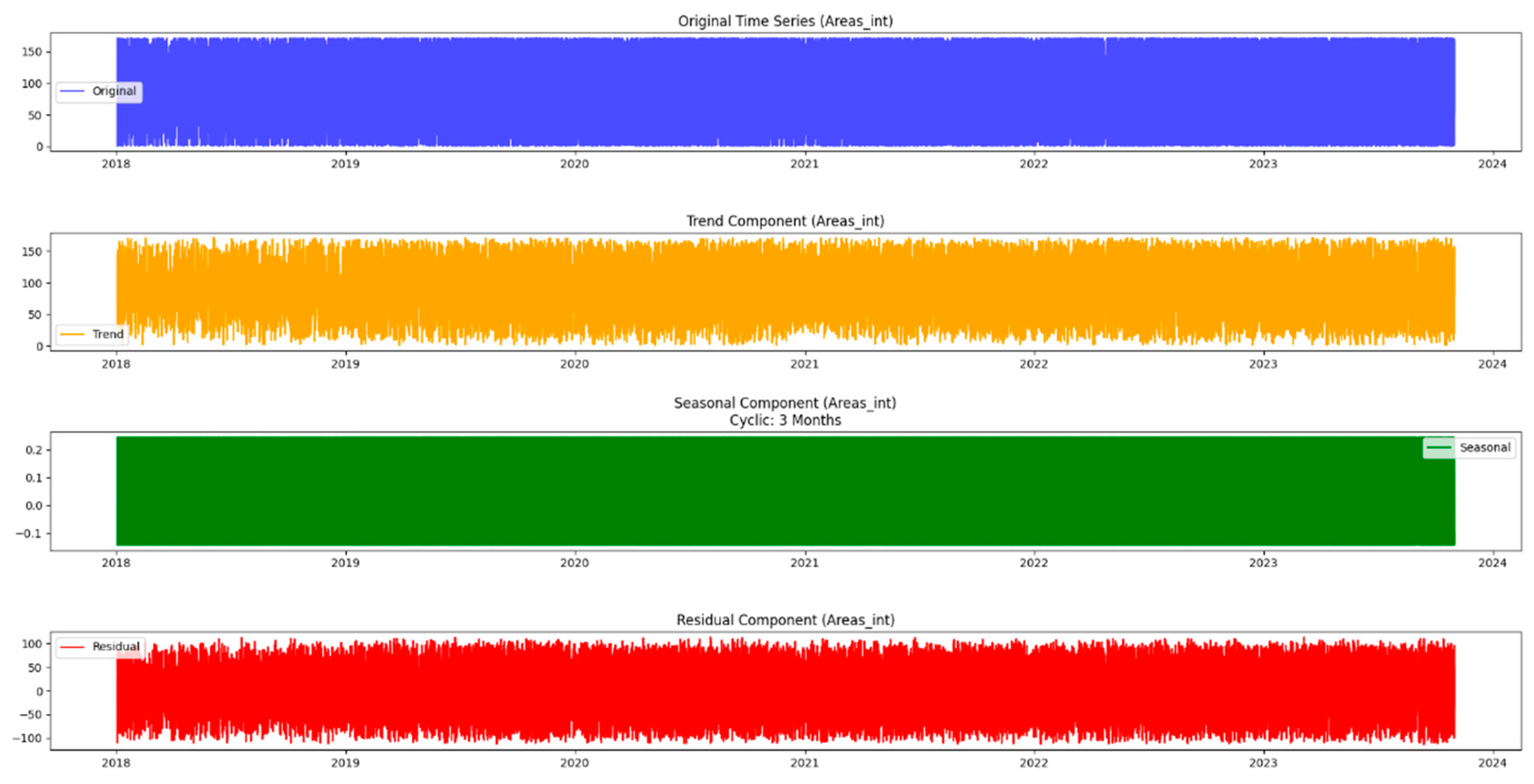
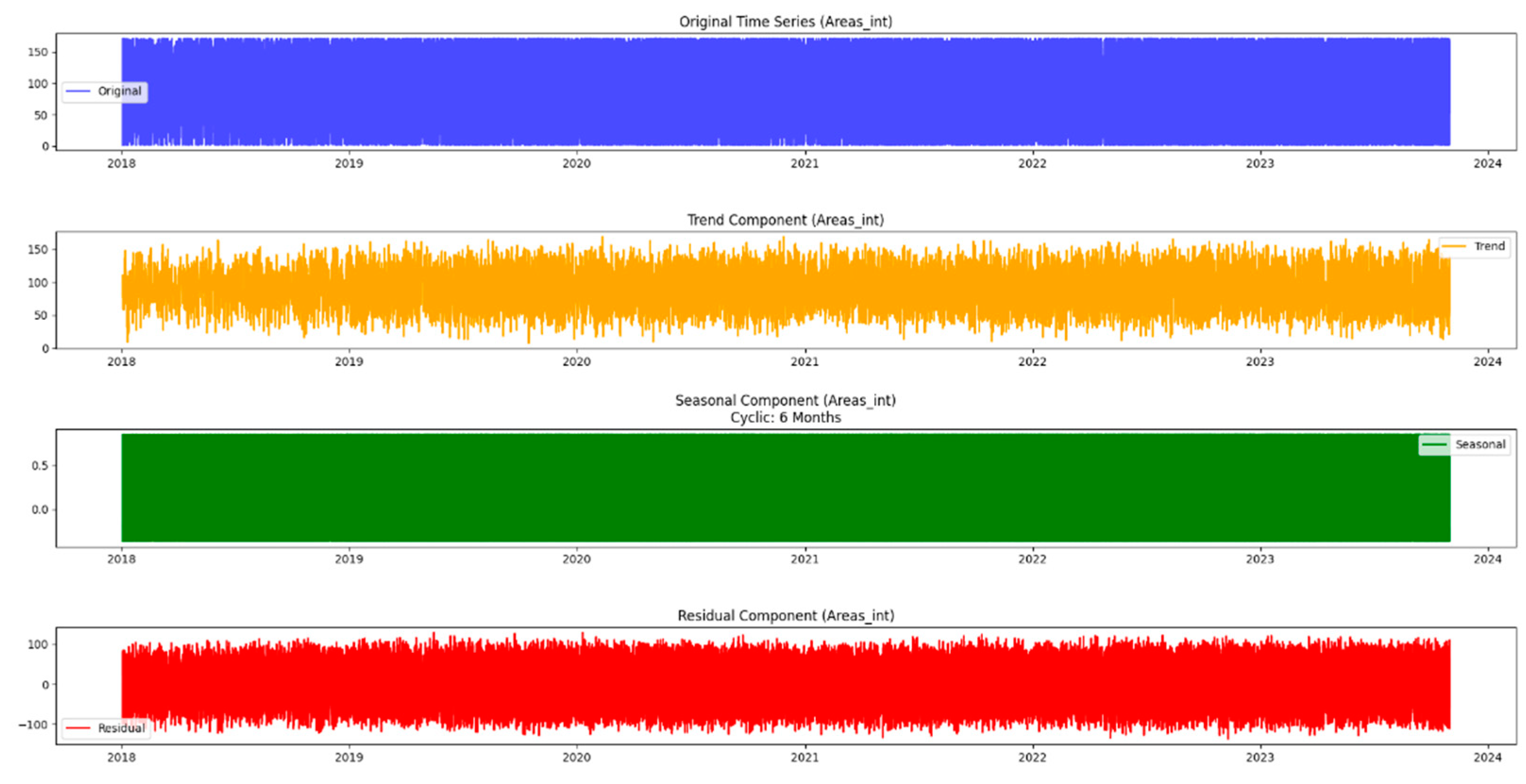
Moving beyond the basics, this methodology incorporates seasonal decomposition for a detailed understanding of cyclical patterns within the data. This process breaks down the time series into components—trend, seasonality, and residuals—providing a comprehensive picture of the underlying dynamics. In addition, this paper extends the analysis to urban areas, recognizing that the dynamics of the mentioned issues may differ significantly between different areas. Using similar time series techniques, it gains insight into the temporal dynamics of both urban issues and neighborhoods, providing a holistic picture of the challenges facing the city.
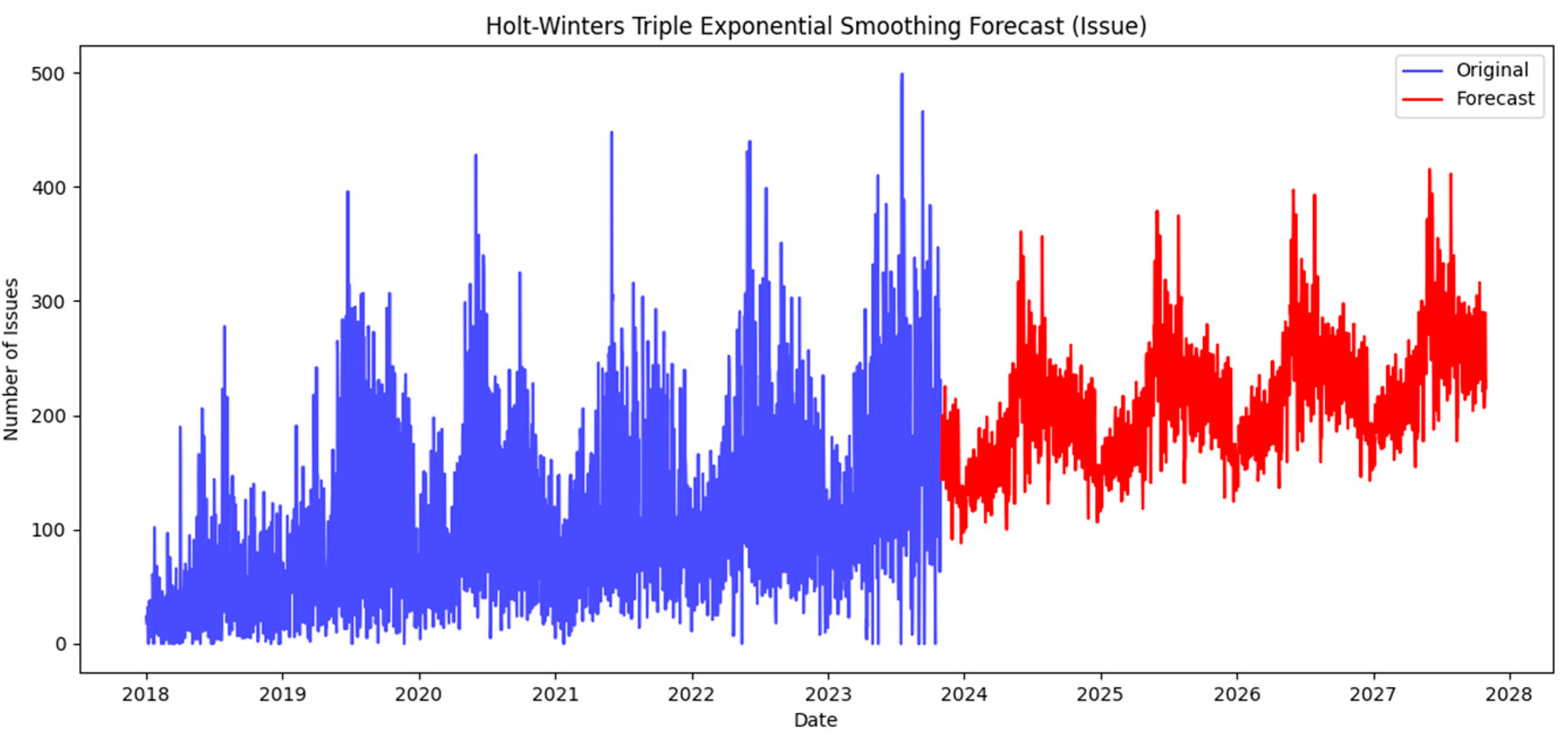
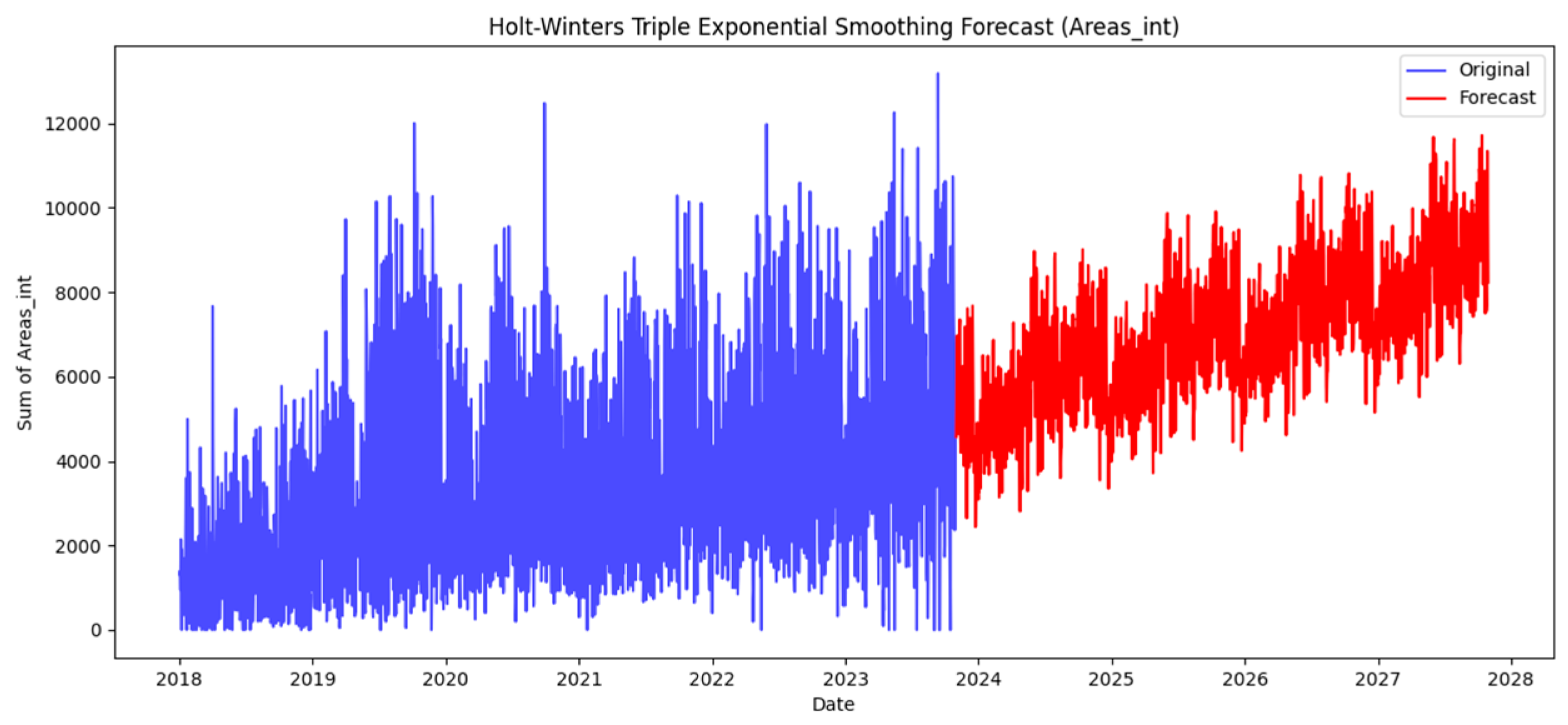
In this neighborhood-centric approach, the article also incorporates prediction techniques such as Triple Exponential Smoothing Holt-Winters. This enables the projection of future values, facilitating proactive decision-making based on expected trends. Through this multifaceted methodology, researchers can not only visualize historical patterns but also anticipate future challenges and opportunities, ultimately contributing to more efficient urban planning and resource allocation. Exploration through time series analysis is part of the initial stage in uncovering the complexity of urban issues and regions.
Figure 2 illustrates the time series analysis methodology.
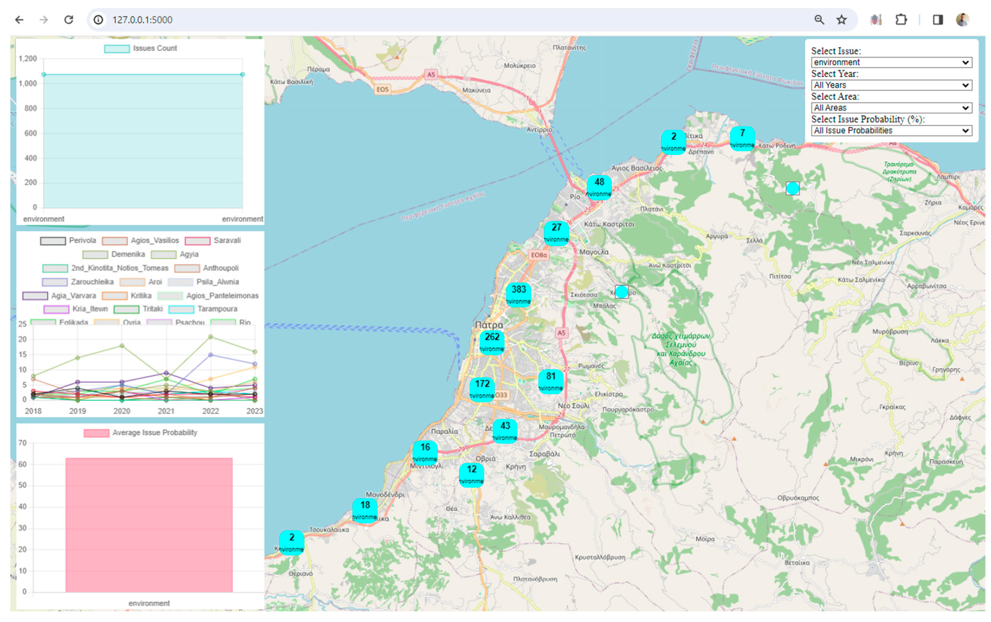
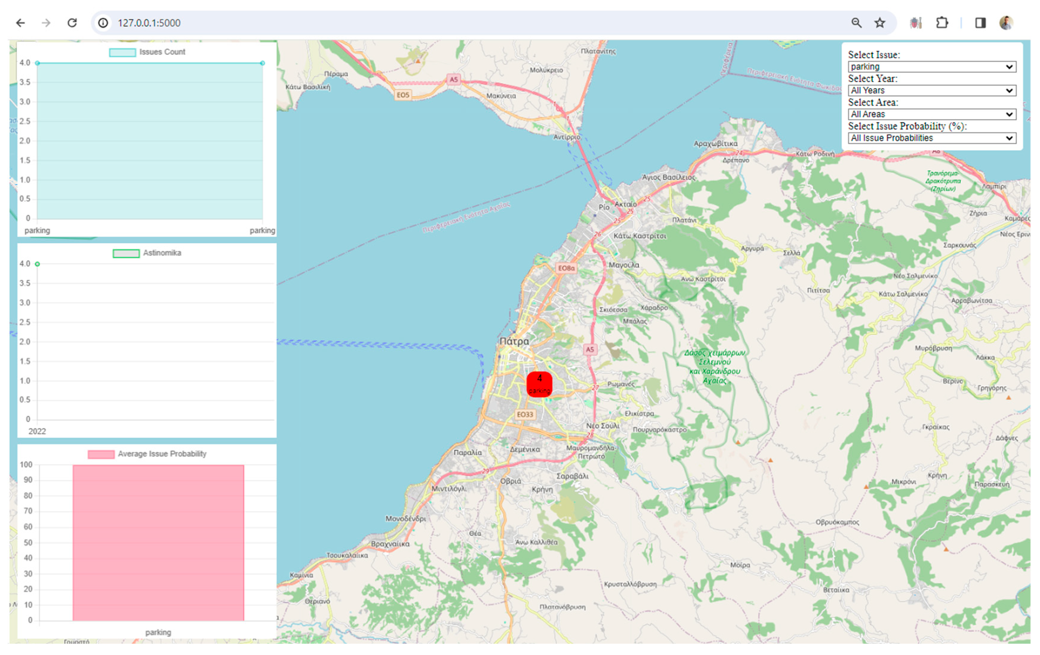
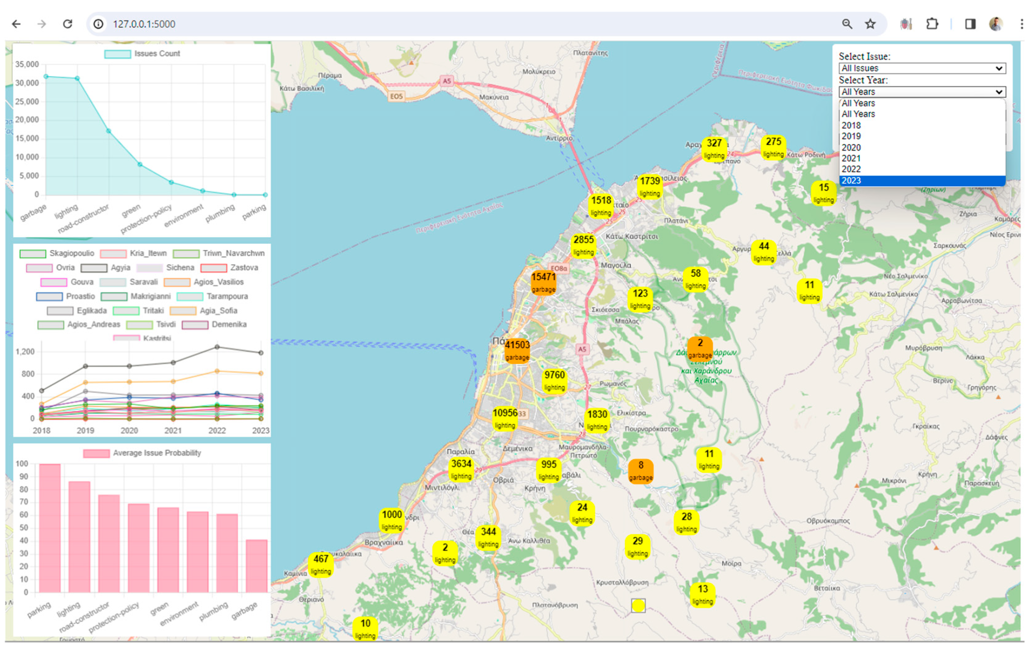
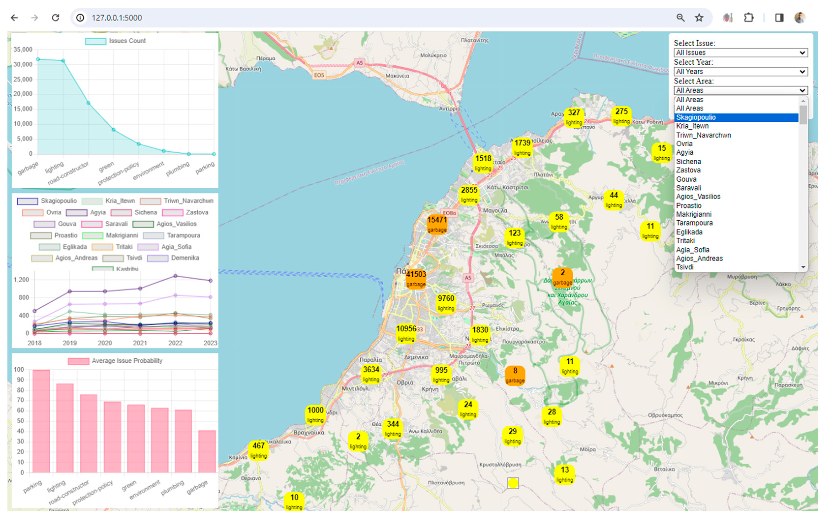
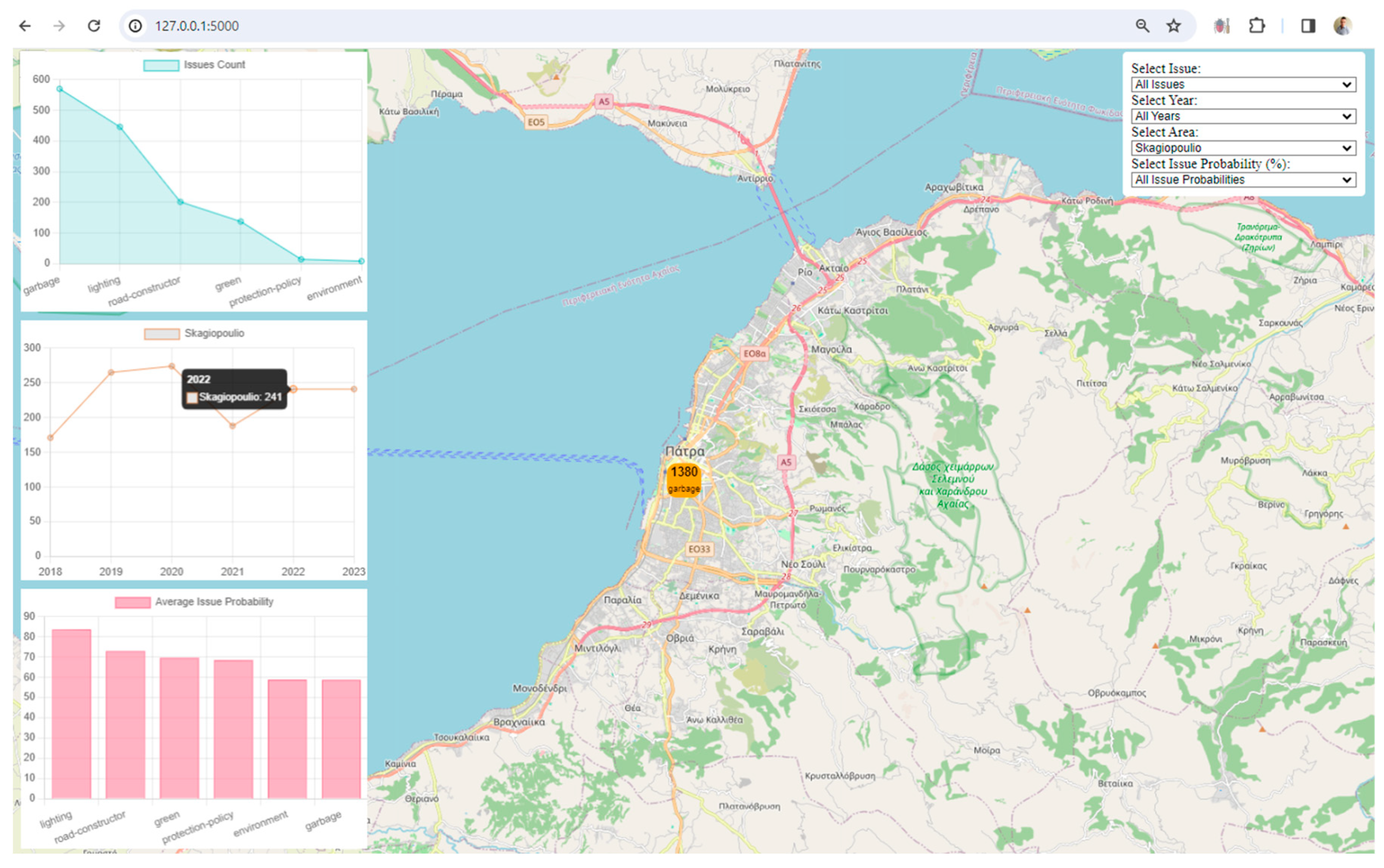
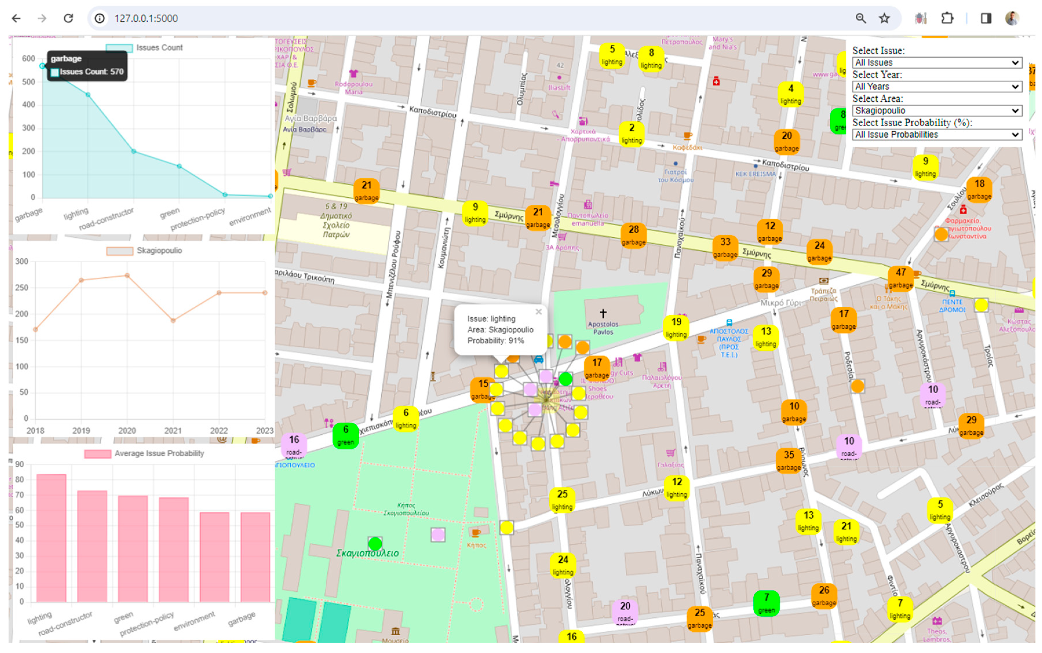
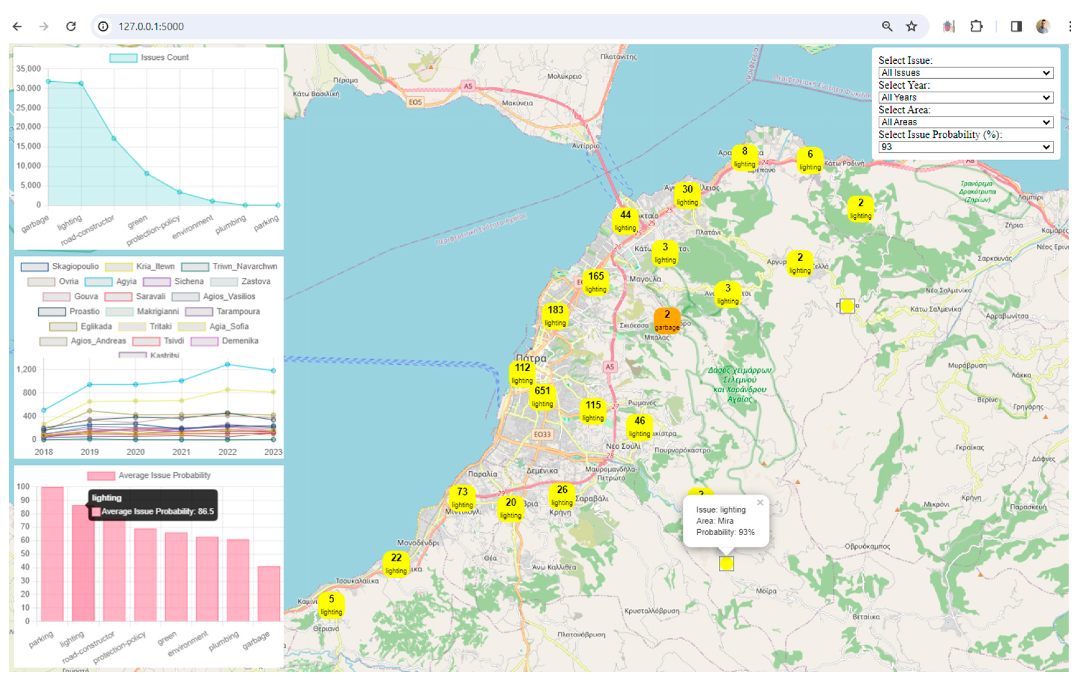
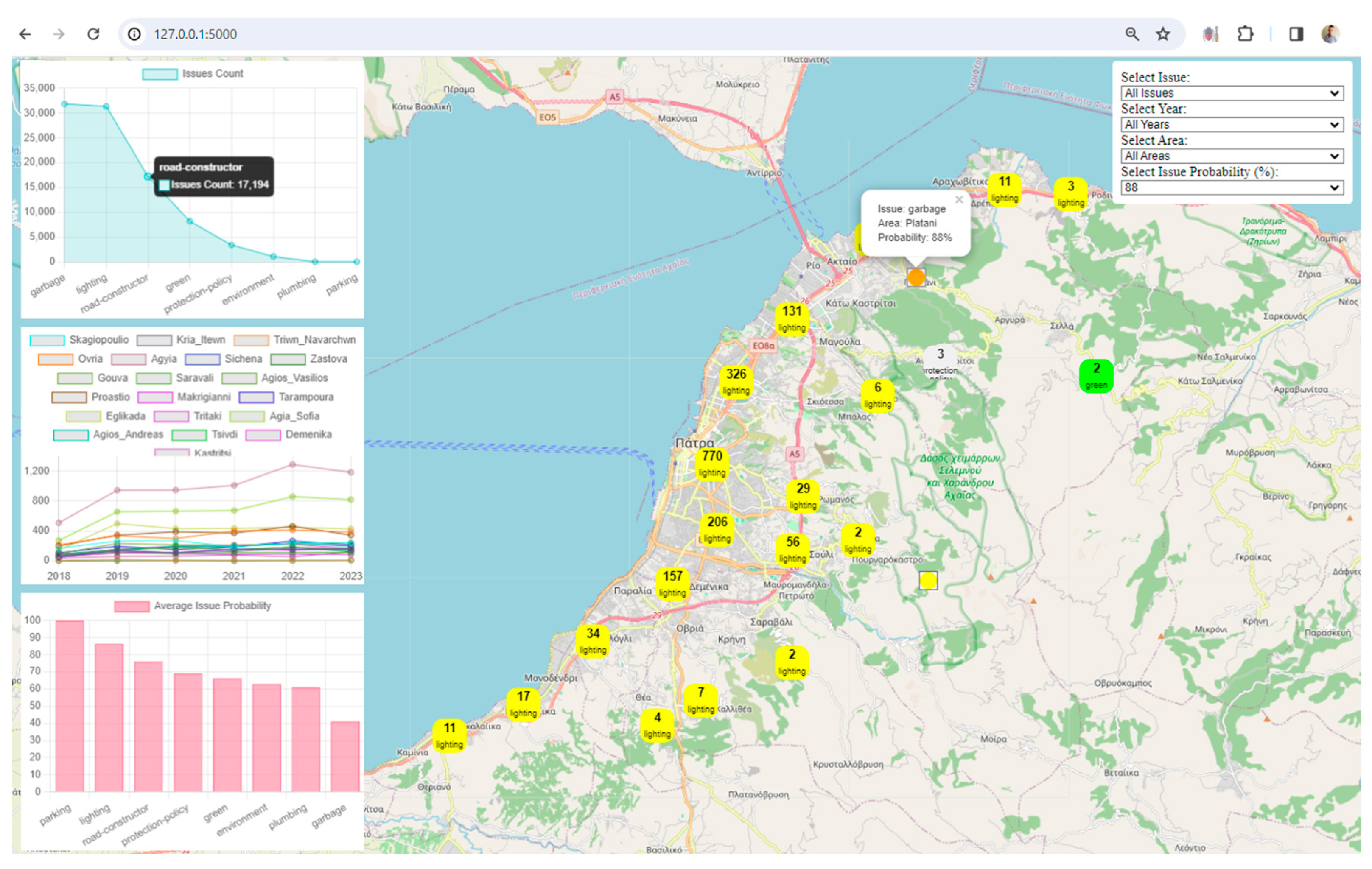
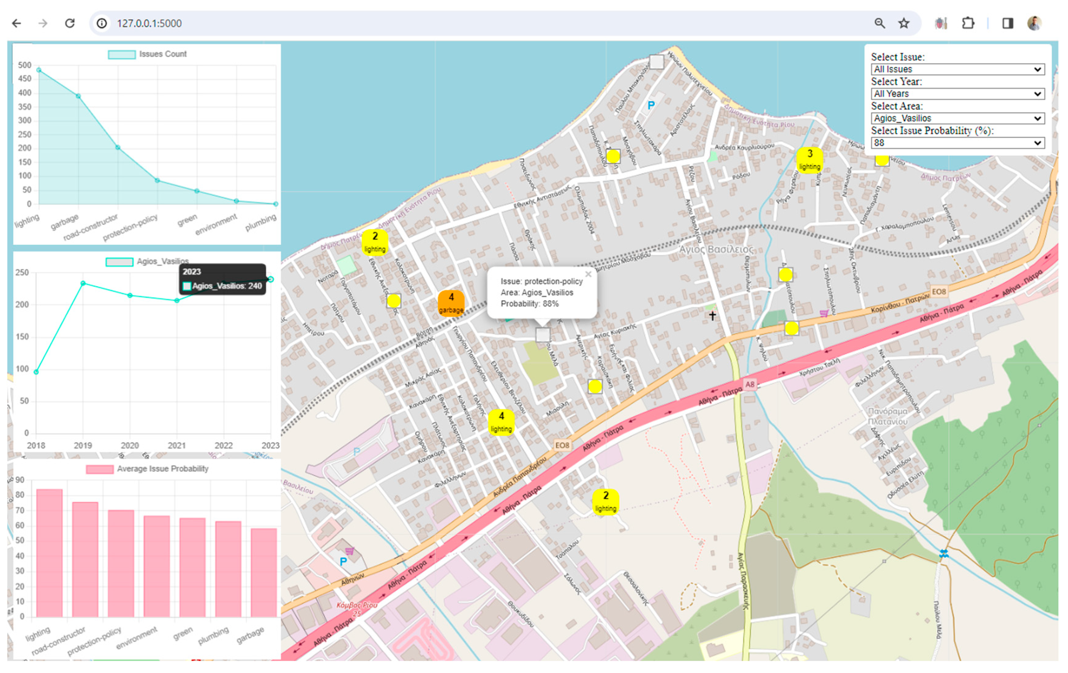
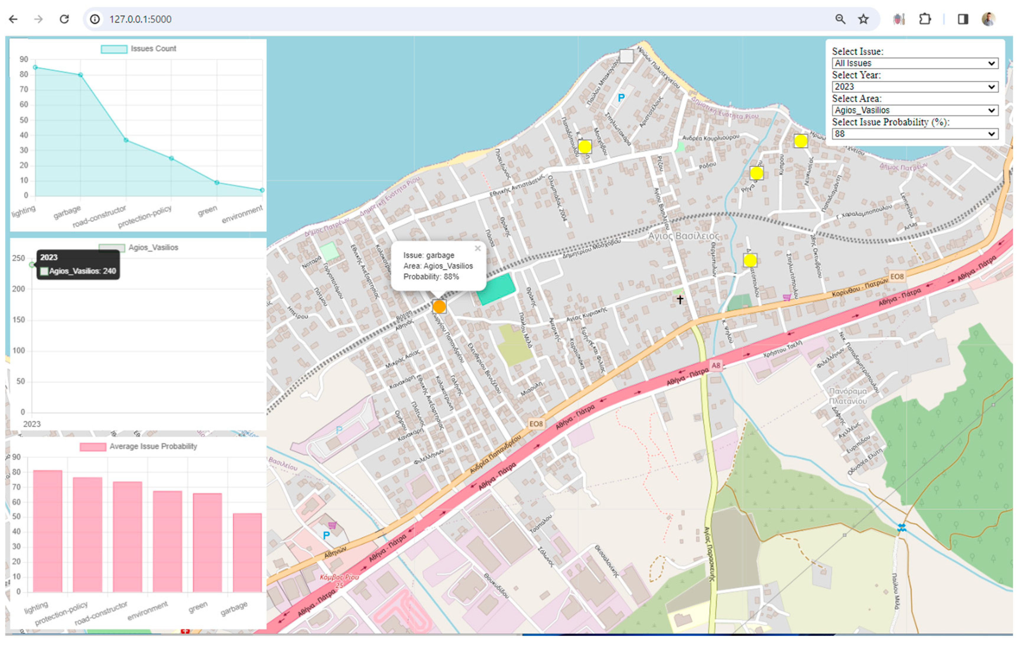
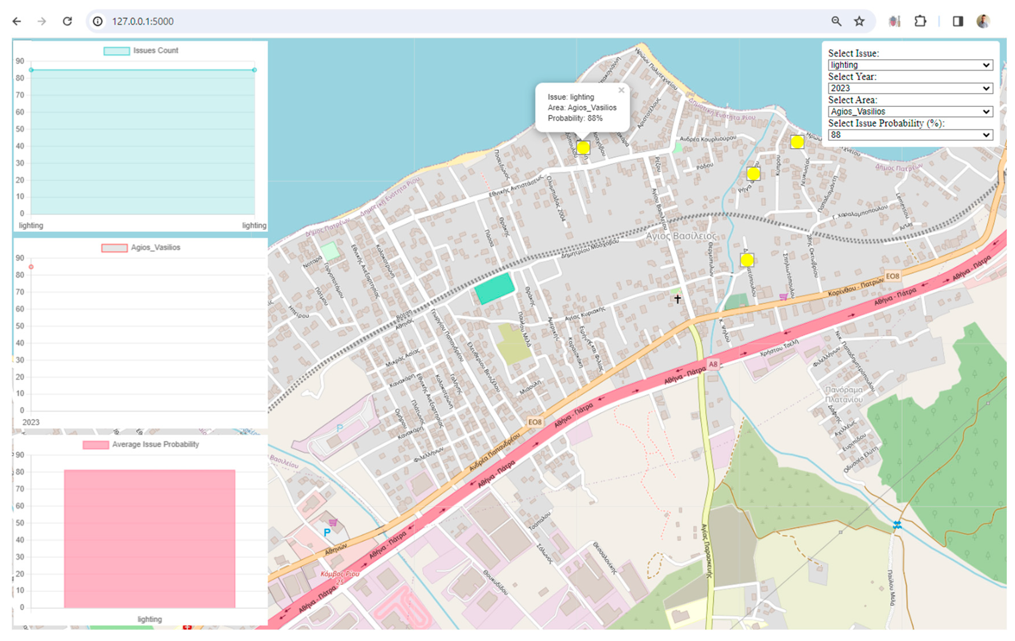
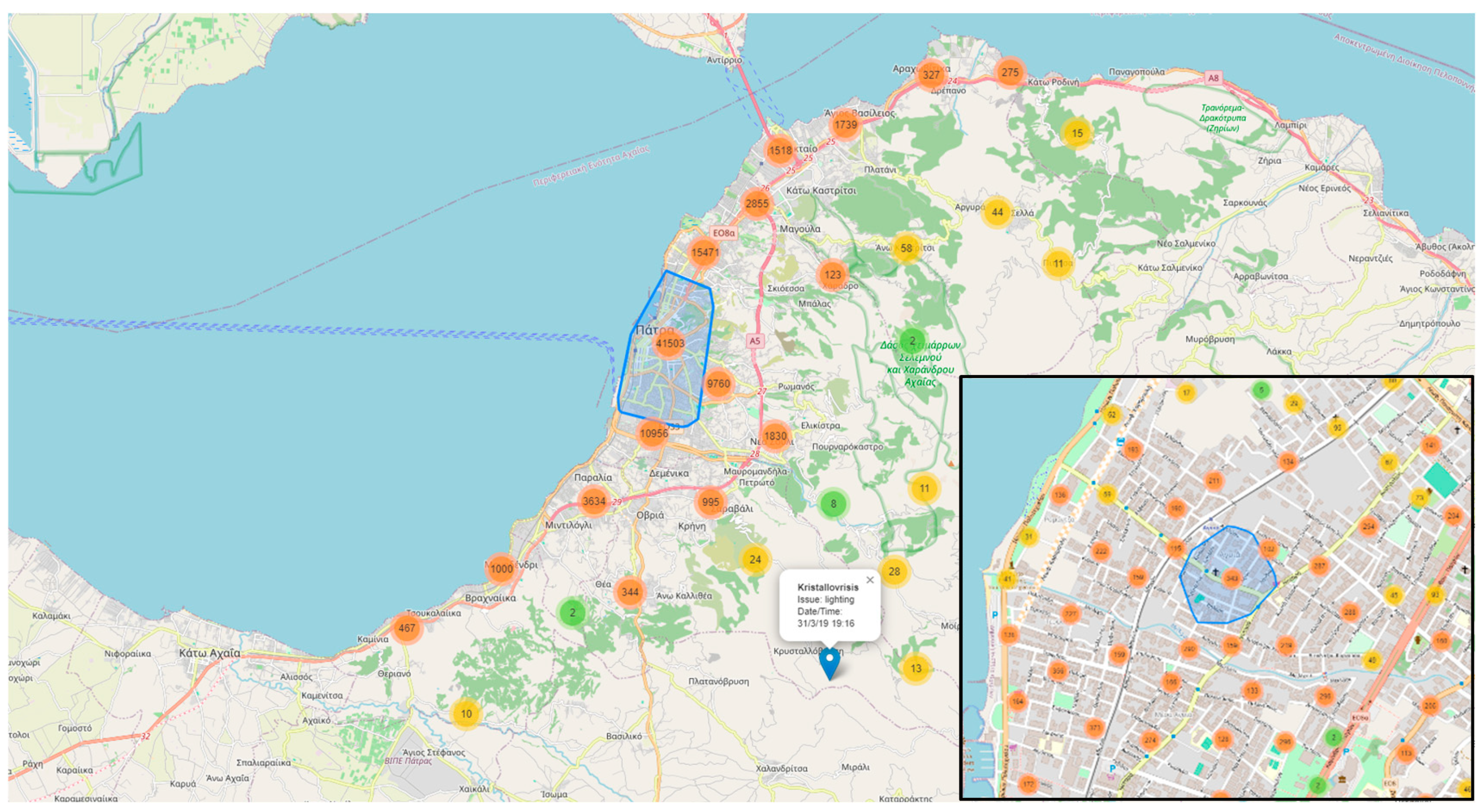
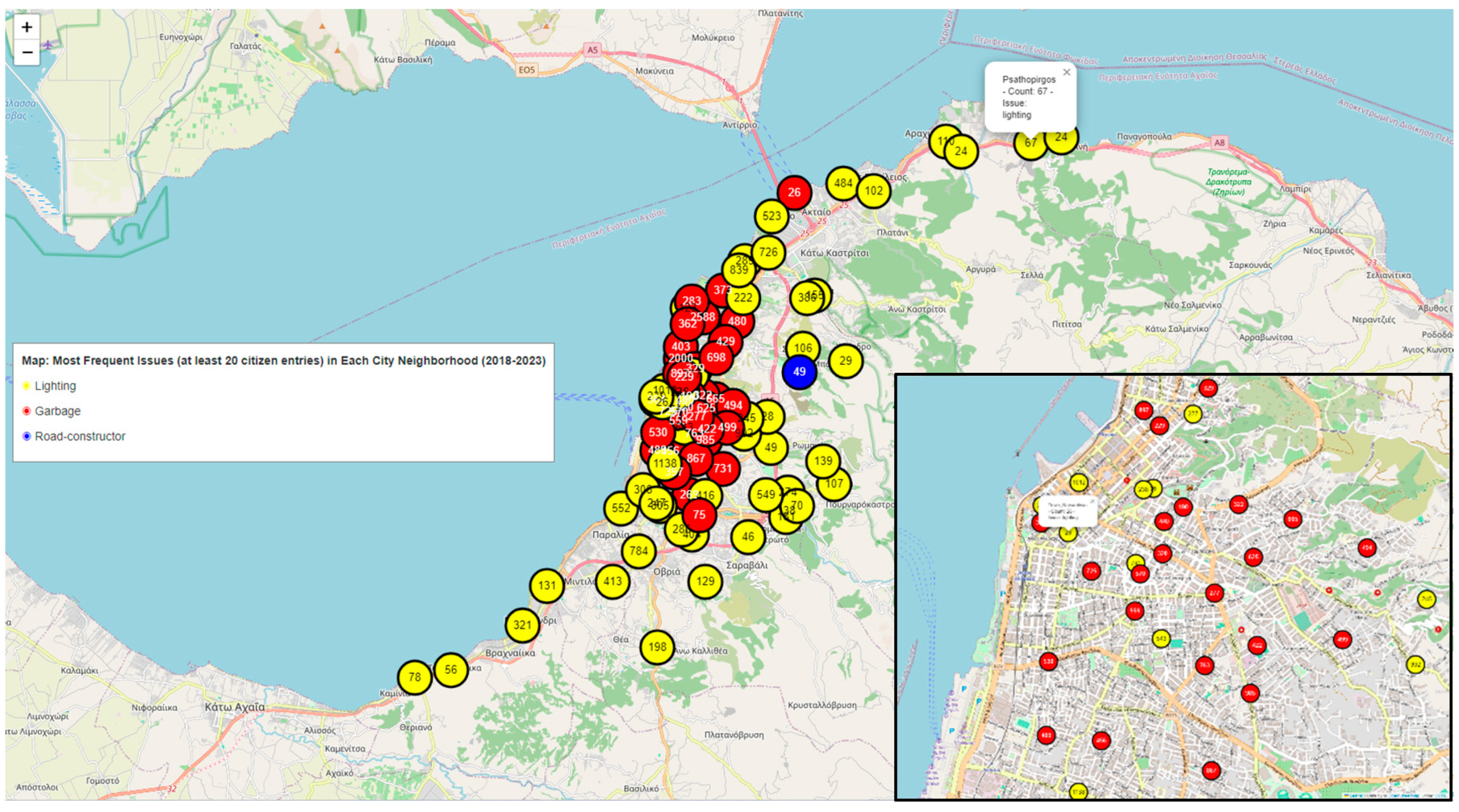
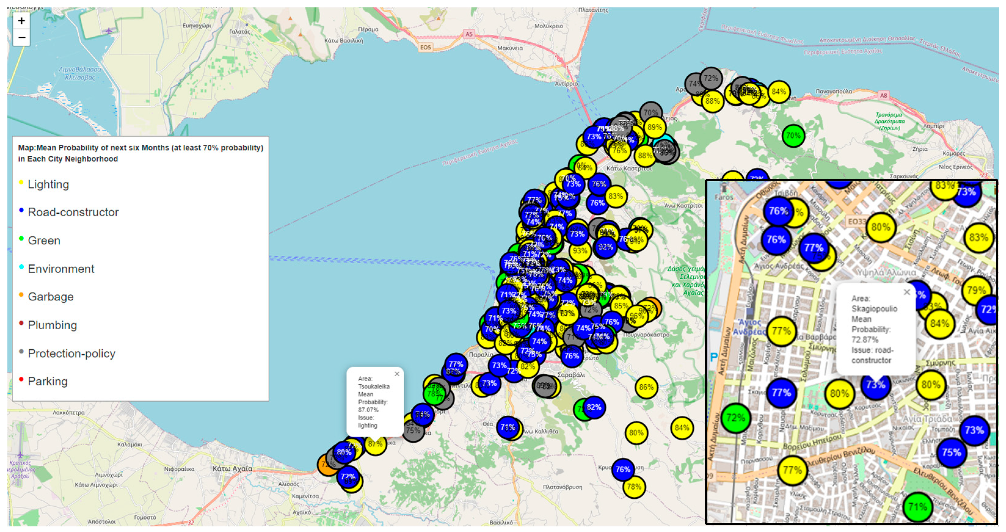
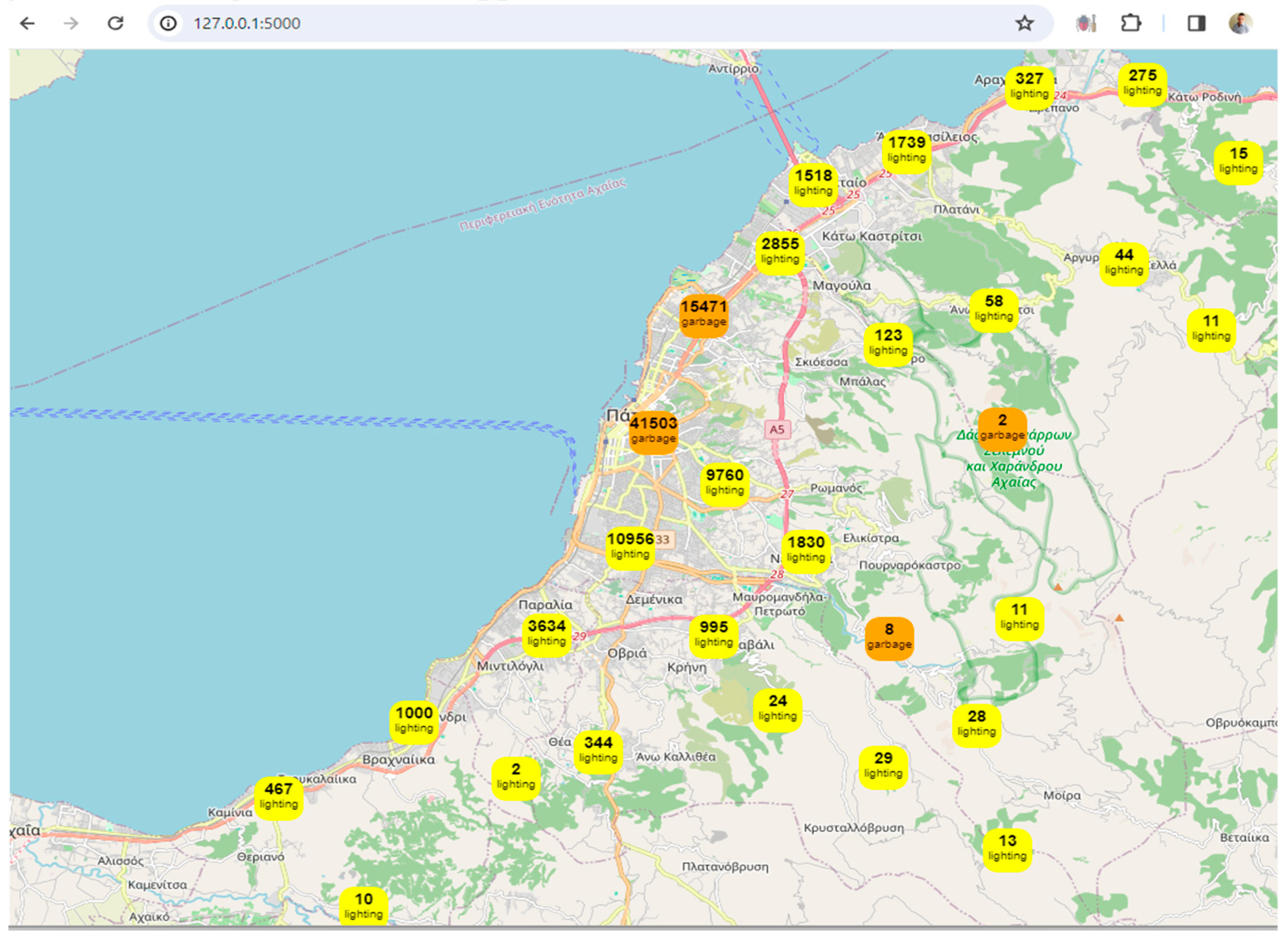
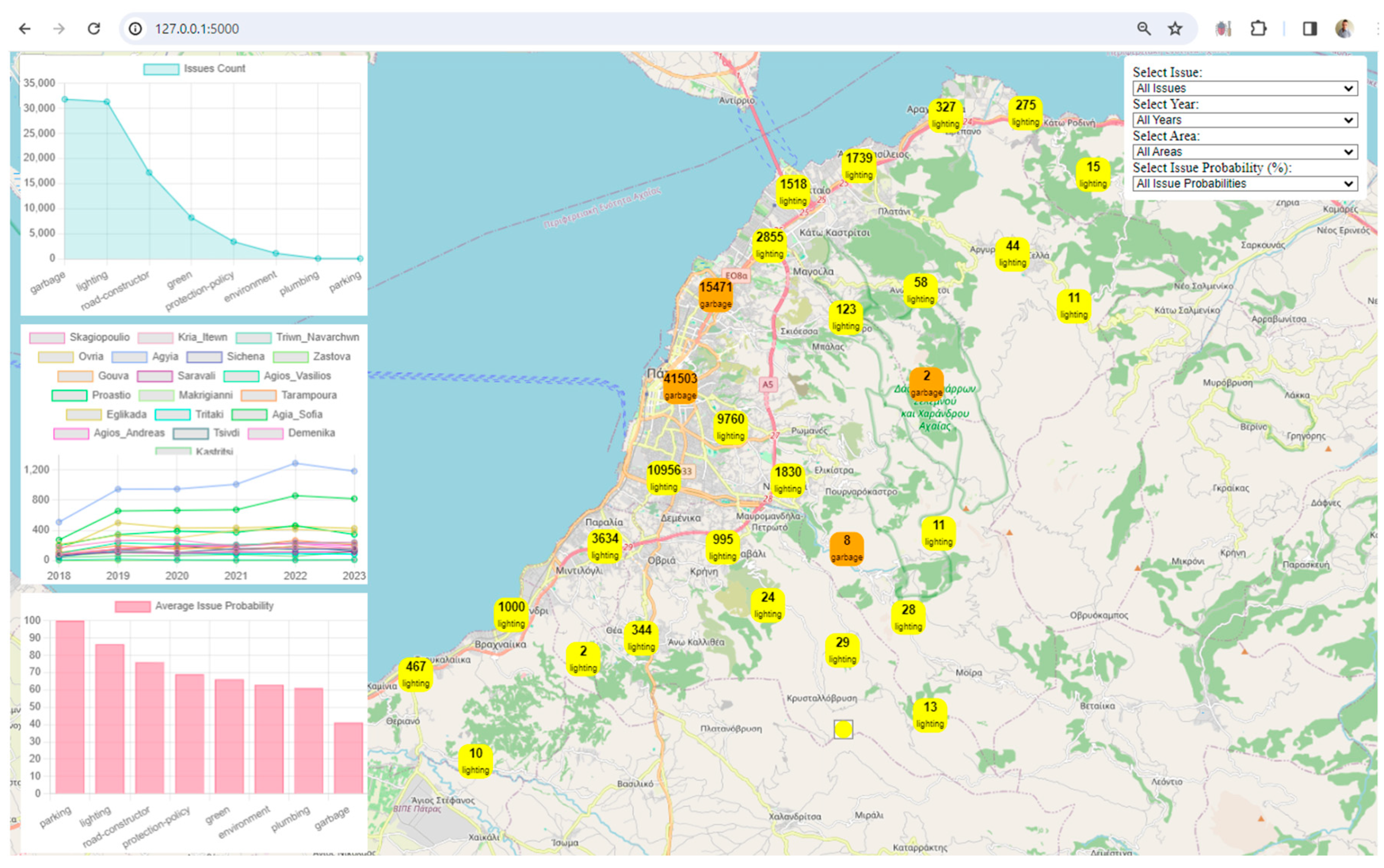
Our approach transcends theoretical frameworks, inviting users to actively engage with urban data through an interactive Flask application. This meticulously designed methodology empowers users to navigate urban probabilities, filter narratives, and visualize insights, because of the creation of an interactive map (map.html). This dynamic interface provides a tangible platform for users to explore, analyze, and predict the urban system's response at the neighborhood level. The visualization reveals antecedent and predictive patterns, trends, and correlations, laying the groundwork for tangible enhancements in urban functionality, resilience, and resident quality of life.
As we unfold the specific steps of our methodology, each stage is connected, reflecting a holistic approach to unraveling the complexities of urban dynamics. These steps are not static; rather, they form a continuous loop that can be automated to create a system that perpetually checks and downloads new data from the API, performs necessary data manipulations, updates the machine learning model, and refreshes the digital twin framework. This automation ensures a seamless and real-time experience for users, providing consistently updated maps, charts, scenarios, and probabilities through the Flask app.
The benefits of such automation are manifold. Users experience continuous monitoring, gaining real-time insights into the city's dynamics, and fostering a deeper understanding of urban complexities. Proactive planning becomes a reality, empowering city planners and residents to address emerging challenges with up-to-date predictive capabilities. The user interface evolves dynamically, enhancing engagement and satisfaction. The system proves scalable, accommodating growing data volumes while maintaining responsiveness, and efficiency is optimized through regular automation, minimizing manual intervention.
With these automated processes in place, the system transforms into a powerful tool for urban management. Residents, planners, and decision-makers gain access to a holistic and real-time view of the city's dynamics, enhancing their ability to make informed decisions. The automated digital twin framework cone become a keystone in the evolution of smart cities, paving the way for a more resilient, responsive, and livable urban environment. Here are the steps of this effort:
Step 1: Data Retrieval (ApiFetch.py)
Initiating the study, the researchers started a data retrieval process from the Sense City API, laying the groundwork for subsequent analyses. Serving as the starting point, this phase ensured the acquisition of high-quality data. Leveraging the Python 'requests' library, they seamlessly interfaced with the API, extracting meaningful statistics regarding confirmed urban issues within a specified timeframe and geographic location.
Step 2: Check Data (.py)
The researchers embarked on a comprehensive examination, integrating the Extract, Transform, Load (ETL)/Extract, Load, Transform (ELT) methodology. Employing the Pandas library, they systematically scrutinized the dataset's structure and intrinsic attributes. This ETL/ELT-driven exploratory analysis yielded valuable insights into data types, forming a basis for subsequent processing and enhancement within the sophisticated data lake infrastructure. ETL involves extracting data from the source system, transforming it into a format that can be used by the digital twin, and then loading it into the digital twin. ELT approach involves extracting data from the source system, loading it into the digital twin, and then transforming it as needed.
Step 3: Convert the 'Reported' Column to Datetime Format (.py)
Recognizing the importance of temporal precision in urban analytics, the researchers transformed the 'reported' column into a datetime format. This not only established a standardized temporal reference but also laid the foundation for sophisticated temporal analyses, enriching the dataset's temporal dimension.
Step 4: Correct a Row of Coordinates (.py)
Addressing the imperative of spatial accuracy in urban studies, the methodical approach to coordinate correction played a pivotal role in ensuring data integrity. This step validated each entry in the 'loc' column for adherence to the expected format, contributing to the spatial reliability of our dataset.
Step 5: Coordinates to Area and New Column (.py)
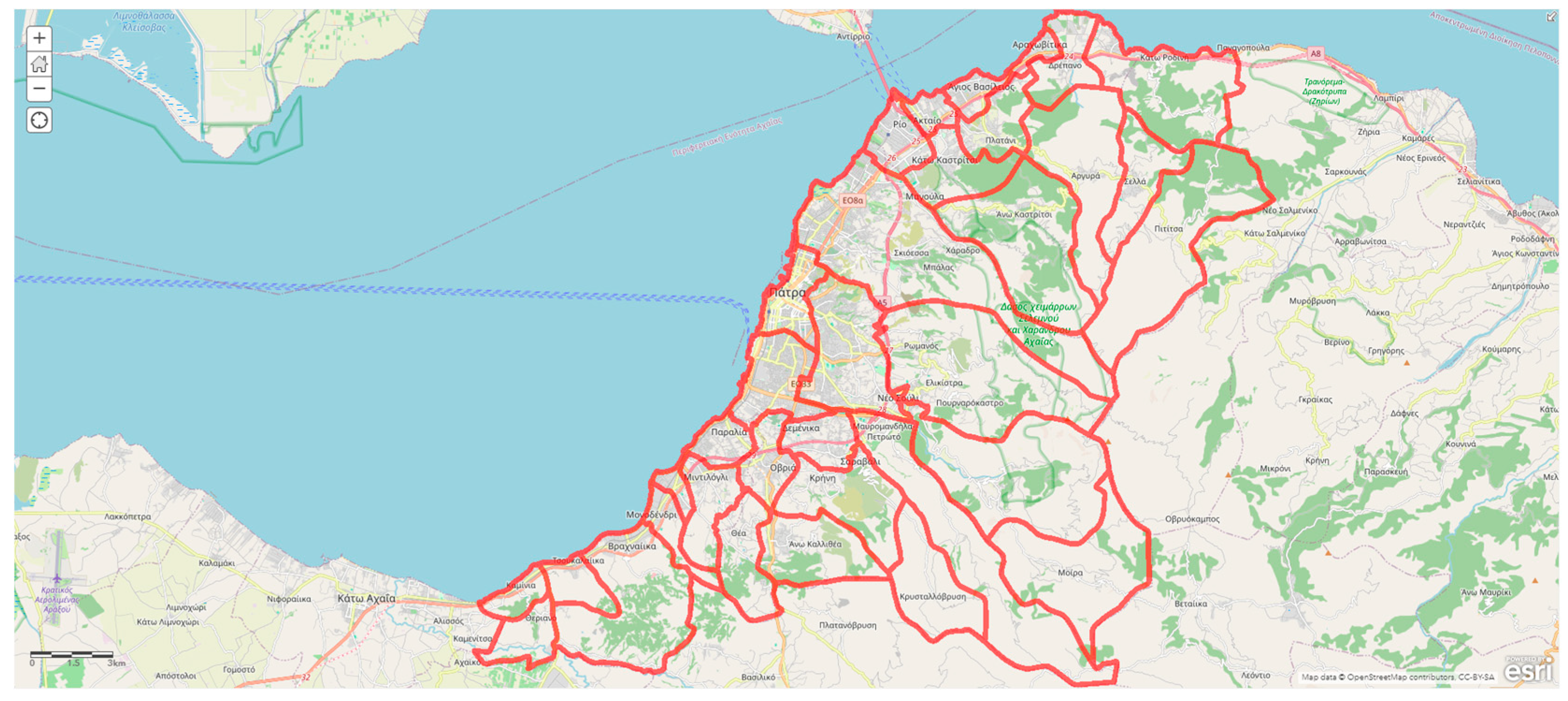
Delving into the geospatial context, this work executed a precise conversion of coordinates to human-readable area names, further enhancing the spatial granularity of the dataset. OpenLayers, the chosen open-source mapping library, facilitated reverse geocoding, at-tributing each citizen report to its corresponding urban area, a crucial step for robust spatial analyses within the data lake environment.
Step 6: Weird Characters to Greek (.py)
Addressing encoding intricacies is vital for uniform linguistic representation. The application of 'utf-8-sig' encoding has harmonized character encoding complexities, resulting in a linguistically coherent dataset. This linguistic clarity is integral for diverse analyses within the data lake.
Step 7: Columns Need Intervention for Predictions (.py)
A meticulous assessment of data types revealed nuanced characteristics, necessitating thoughtful consideration. Identification of non-numeric columns, requiring specialized intervention for predictive modeling, set the stage for subsequent machine learning endeavors within our data framework
Step 8: Count the Different Categories Issue_Area (.py)
An enumeration of urban issues and associated areas unfolded, providing a comprehensive understanding of the dataset's categorical composition.
Step 9: Check the Data (.py)
An examination of the dataset unfolded, encompassing essential checks for integrity, completeness, and overall structure. This step, executed within the data lake environment, ensured that subsequent analyses were founded upon a robust and reliable dataset.
Step 10: Converting Non-Numeric Columns (.py)
In preparation for machine learning endeavors, the researchers encoded non-numeric columns. This step involved the precise conversion of categorical variables into a format suitable for predictive modeling, fostering an optimal representation of features within our data lake infrastructure.
Step 11: Train RandomForest and Save the Model (.py)
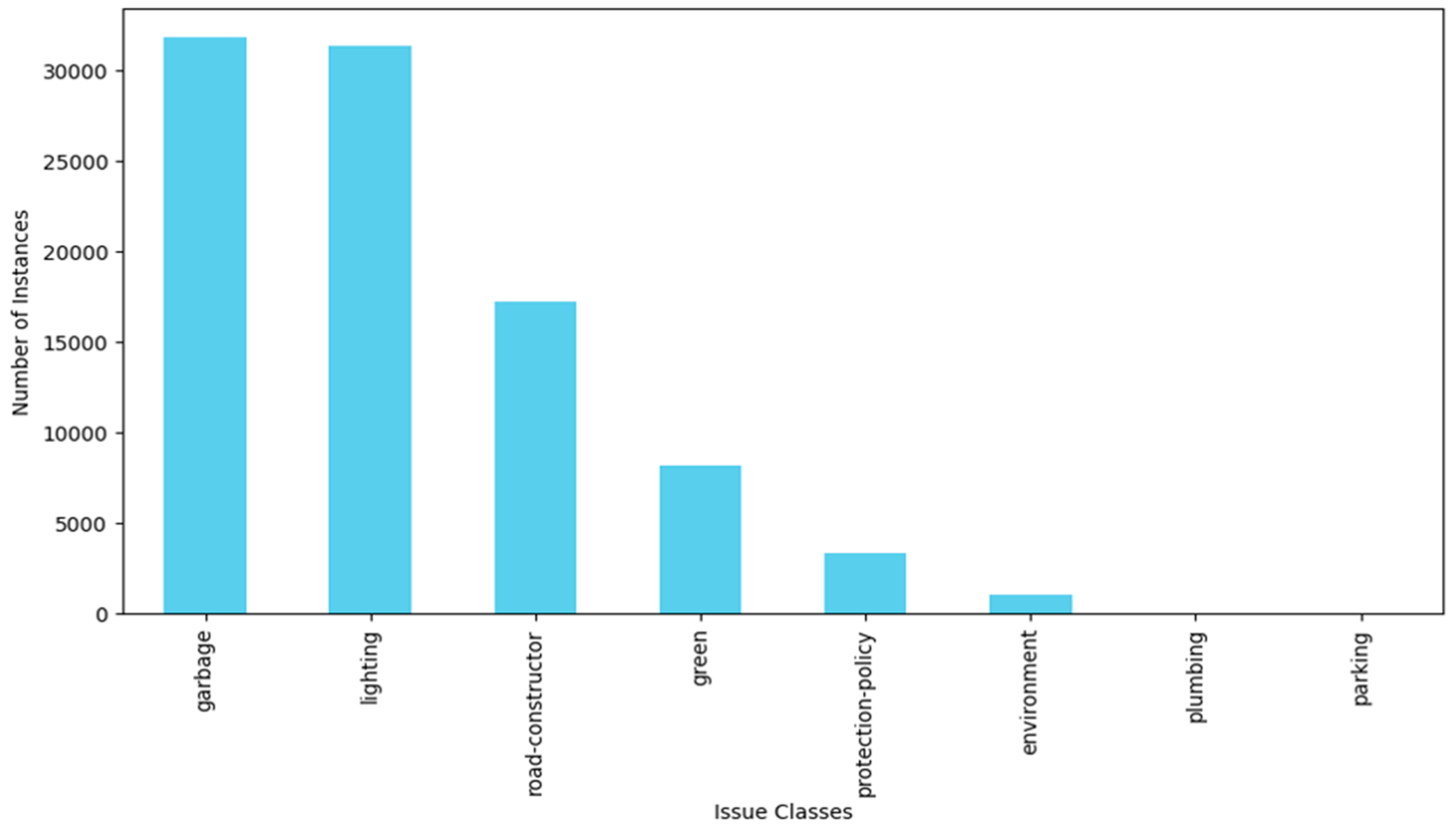
In the pursuit of predictive modeling, we employed AI techniques, specifically machine learning, the RandomForest Classifier, as the vehicle for understanding complex patterns within the data. Trained with precision, this model serves as an analytical instrument, capable of discerning intricate relationships among various features. The selection of the classifier was a result of a thorough performance comparison among various models tailored to the specific dataset. Specifically, we approached the urban issues in the city as a multiclass classification problem, given the presence of eight categories of issues (garbage, lighting, road constructor, green, protection-policy, environment, plumbing, and parking). Recognizing the intricacies of this multiclass classification task, we initially assessed the data distribution to address the imbalance, scrutinizing the class distribution within the target variable.
Figure 3 shows the distribution of the issues classes.
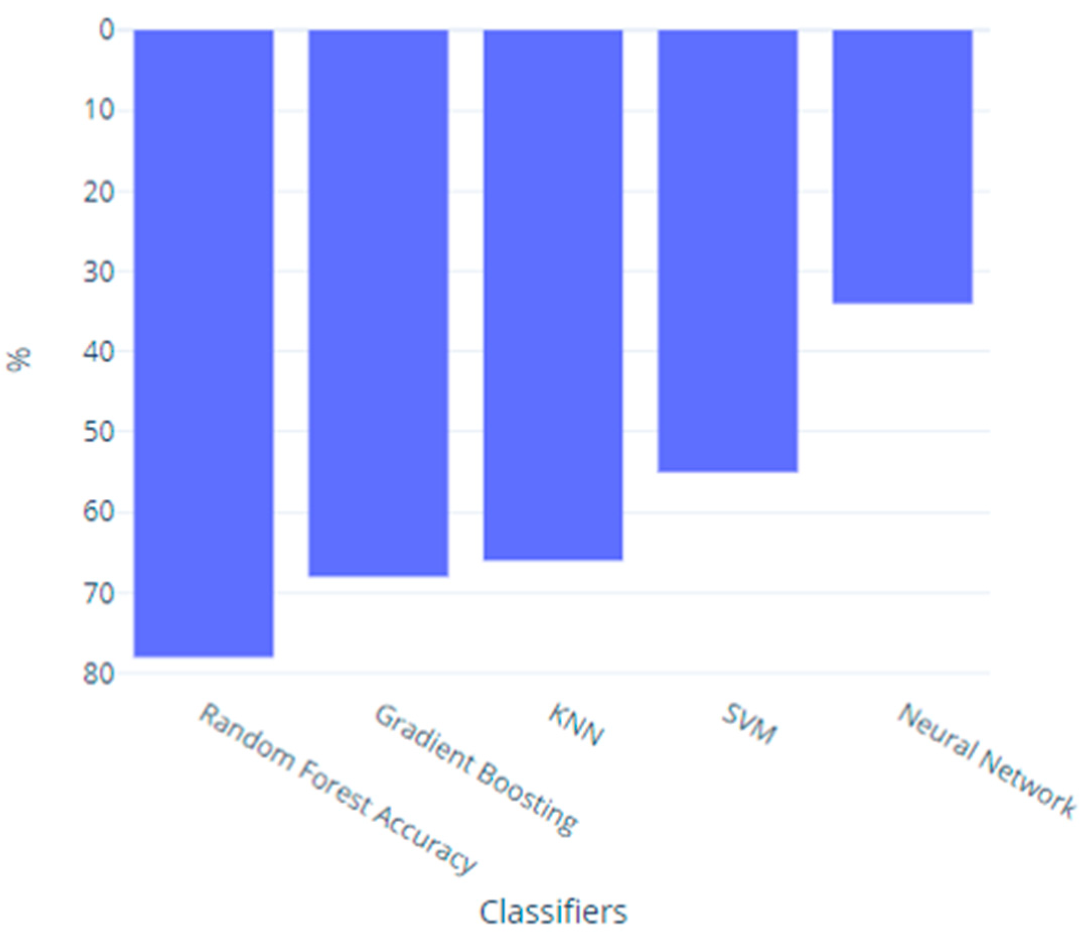
Confronted with data imbalance, the researchers proceeded to employ Resampling Techniques, combining oversampling and undersampling to effectively manage class imbalance, and trained several classifiers capable of handling unbalanced data, including Random Forest, Gradient Boosting, KNN, SVM, and Neural Networks, on the designated training set [
28]. The Random Forest classifier emerged as the top performer based on accuracy, achieving a very good score of 79.04%. This accuracy metric denotes the proportion of correctly predicted cases within the test set, showcasing the model's effectiveness in discerning and categorizing urban issues.
Figure 4 illustrates the accuracy of the trained classifiers. Regarding ROC -AUC is a commonly used metric for binary classification problems.
Step 12: Pretrained Model and Predict 6 Months Later (.py)
With the trained model at the disposal of this work, the researchers projected the analyses into the future, specifically a six-month horizon. This step not only showcases the predictive capabilities of the model but also places the research in a long-term time frame, laying the groundwork for future urban insights.
Step 13: Patras Flask Laptop Filters Probability (.py)
The deployment of a Flask application marked an interactive phase, allowing end-users to navigate through intricate probabilities and filter urban narratives with ease. This immersive approach fosters user engagement, turning abstract data into tangible urban narratives through an intuitive and visually appealing interface.
The Flask application [
11], in combination with Leaflet and Chart.js, leverages digital twin concepts and technologies to model and visualize urban data. Digital twins, in the context of smart cities, refer to virtual replicas of physical objects, processes, or systems. The framework facilitates the integration of various data sources and provides tools for visualization, prediction analysis, and interaction. Here's why the provided approach aligns with a digital city framework:
Data Integration and Processing: The Flask application loads urban data from the output of the data lake, representing a digital twin of the city. This data includes information about reported issues, areas, years, and issue probabilities. The data is processed to enhance its quality and to provide additional insights. For example, a 'year' column is added based on the 'reported_date_time' field.
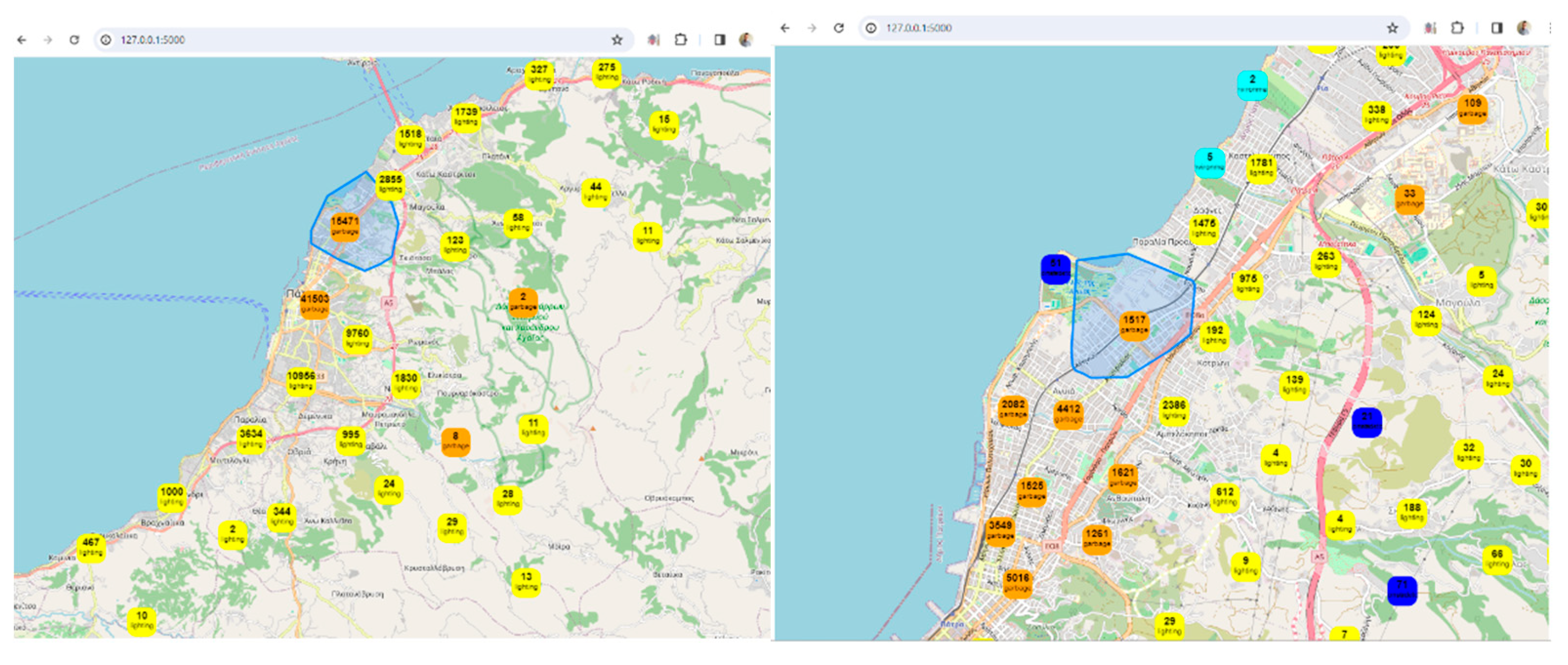
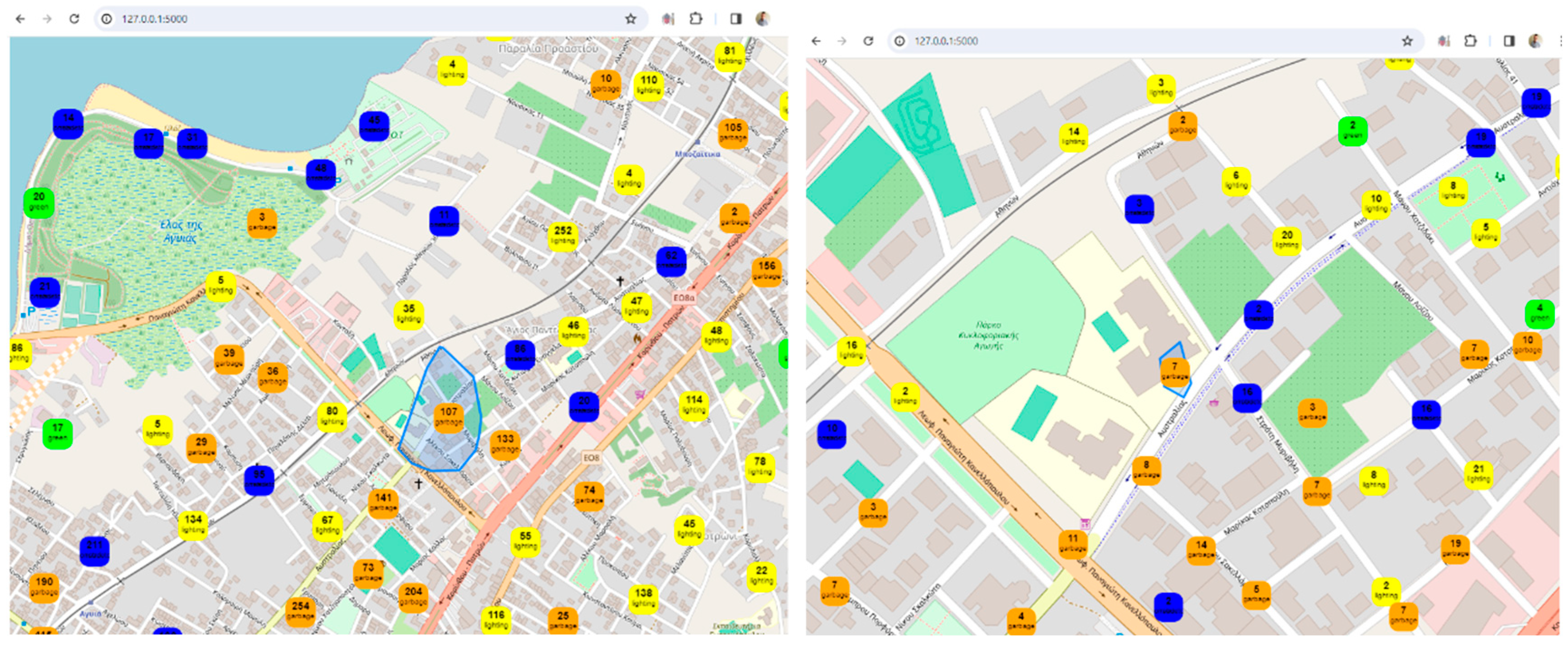
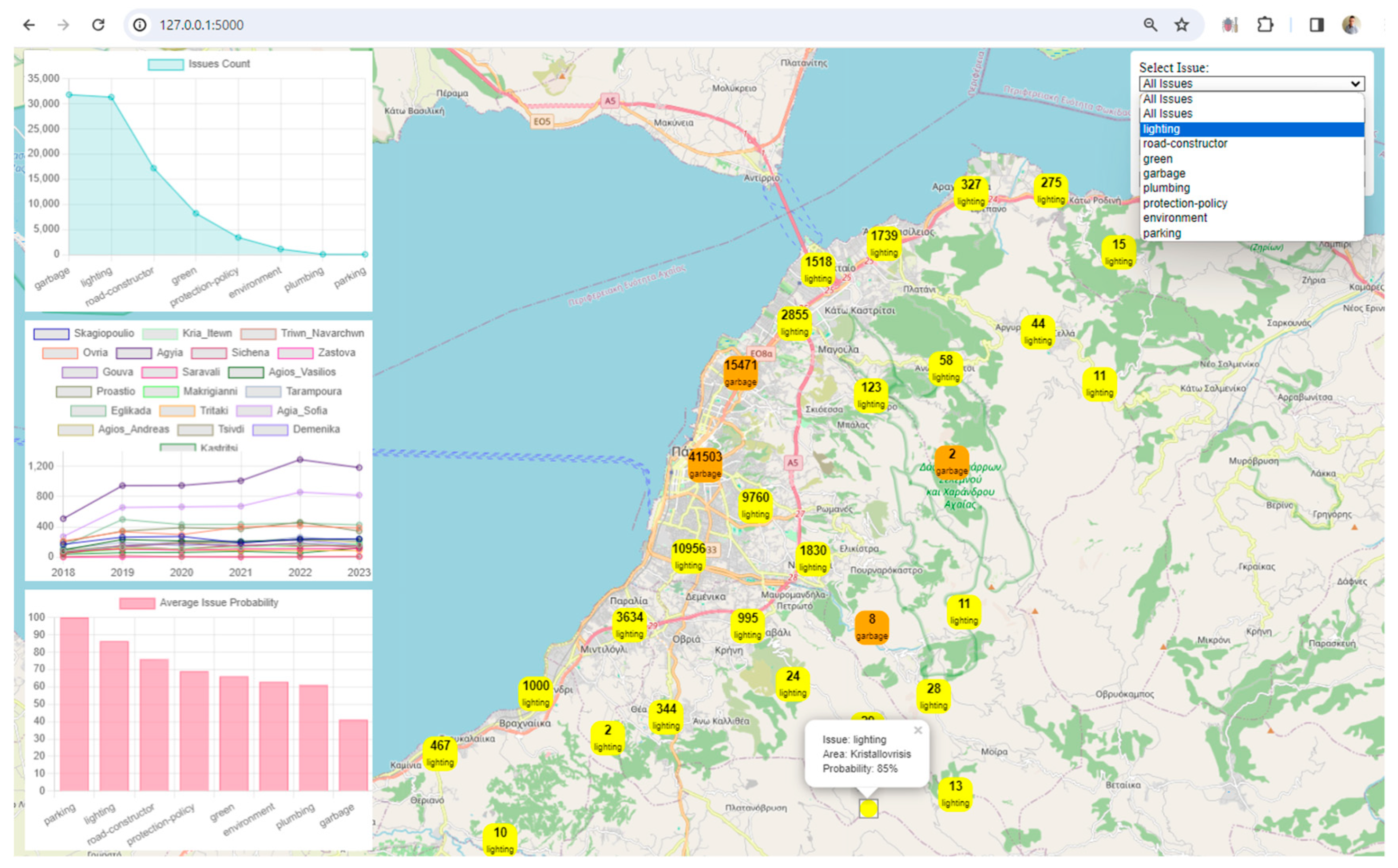
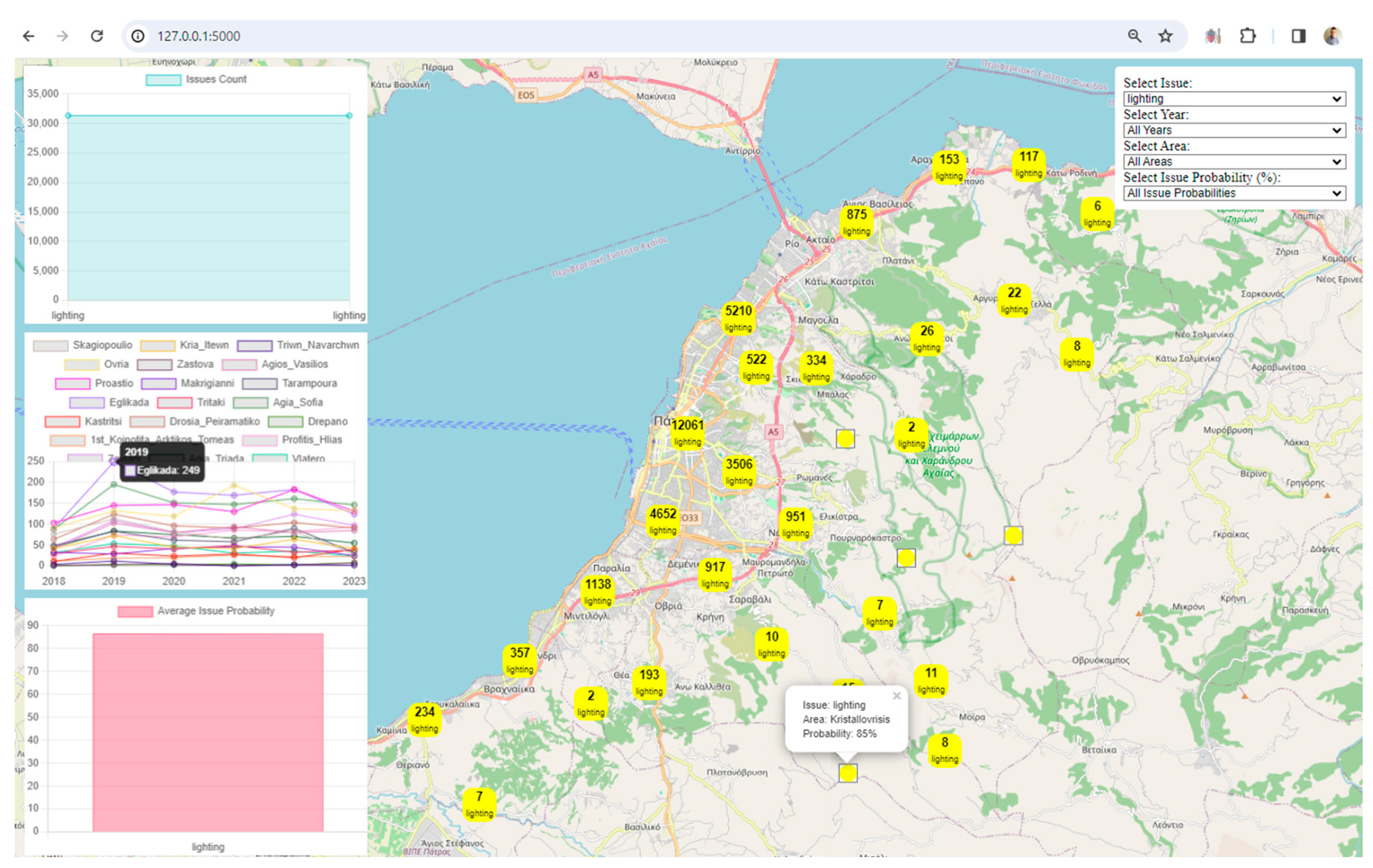
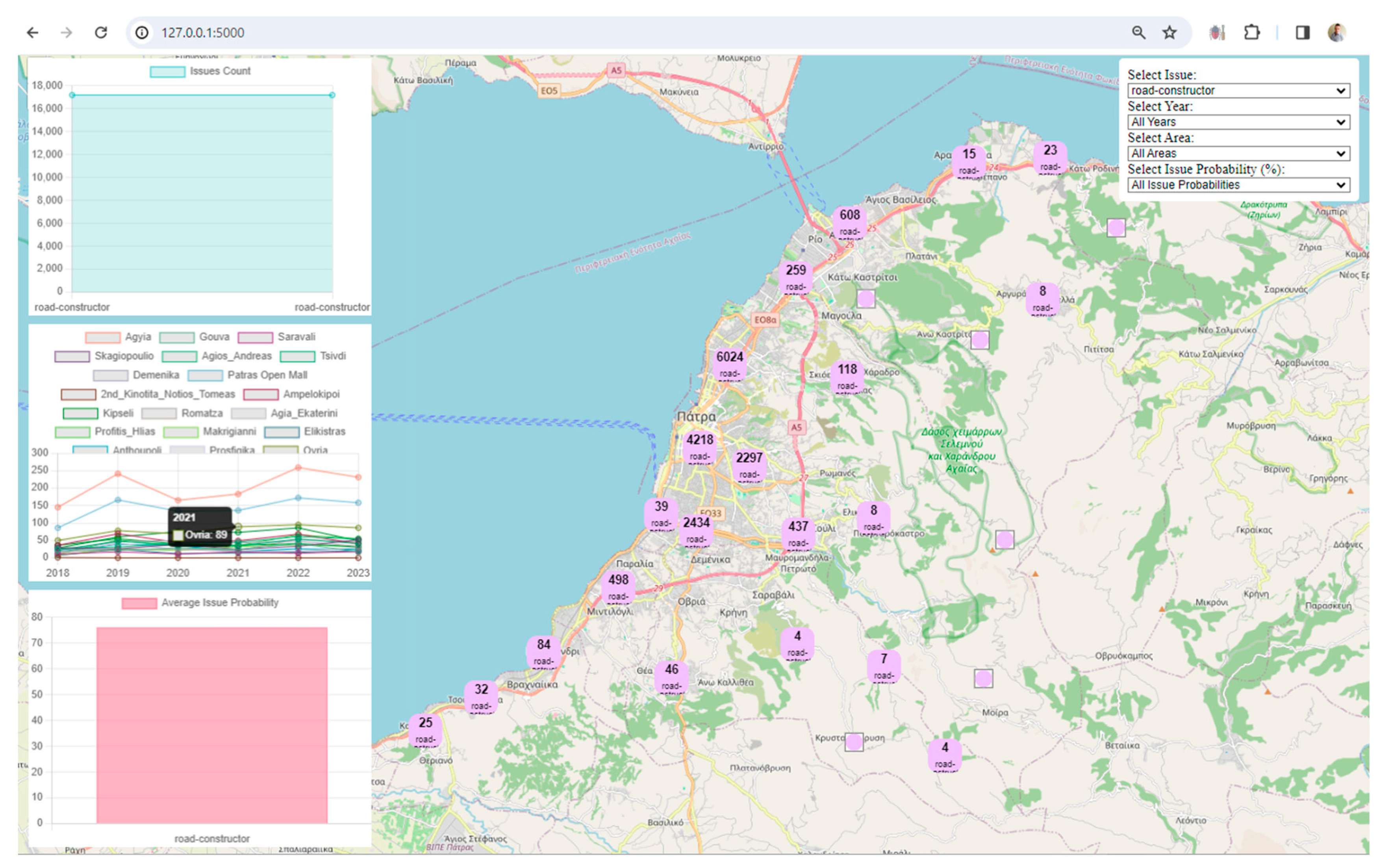
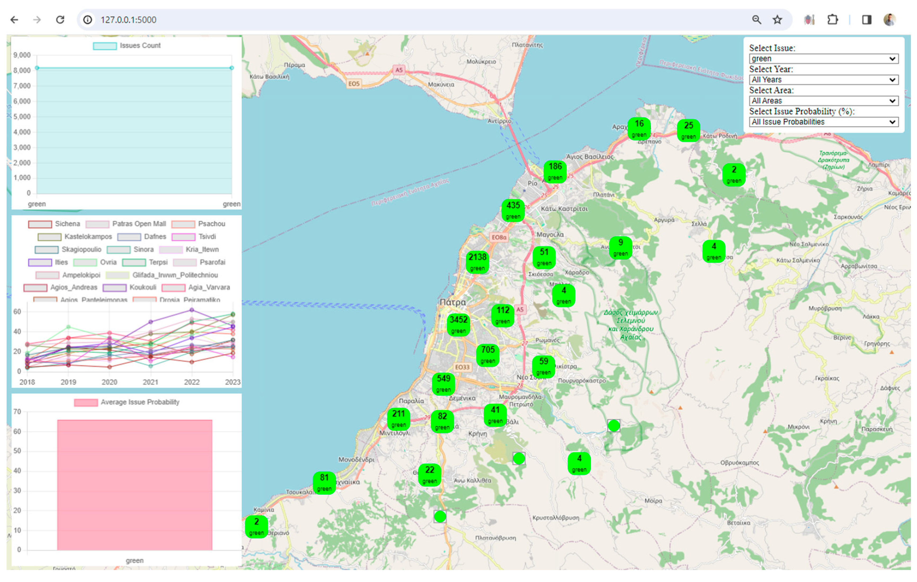
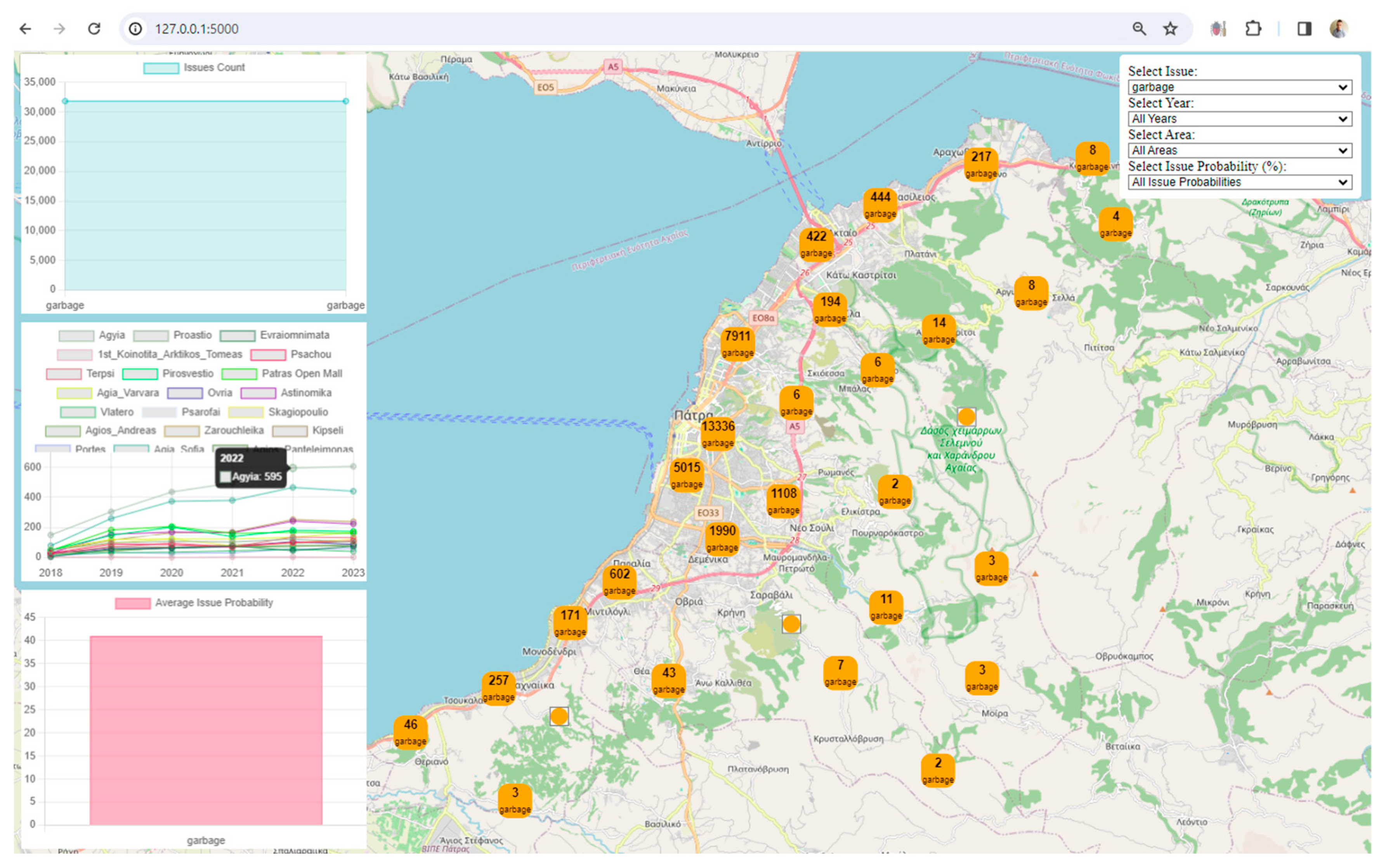
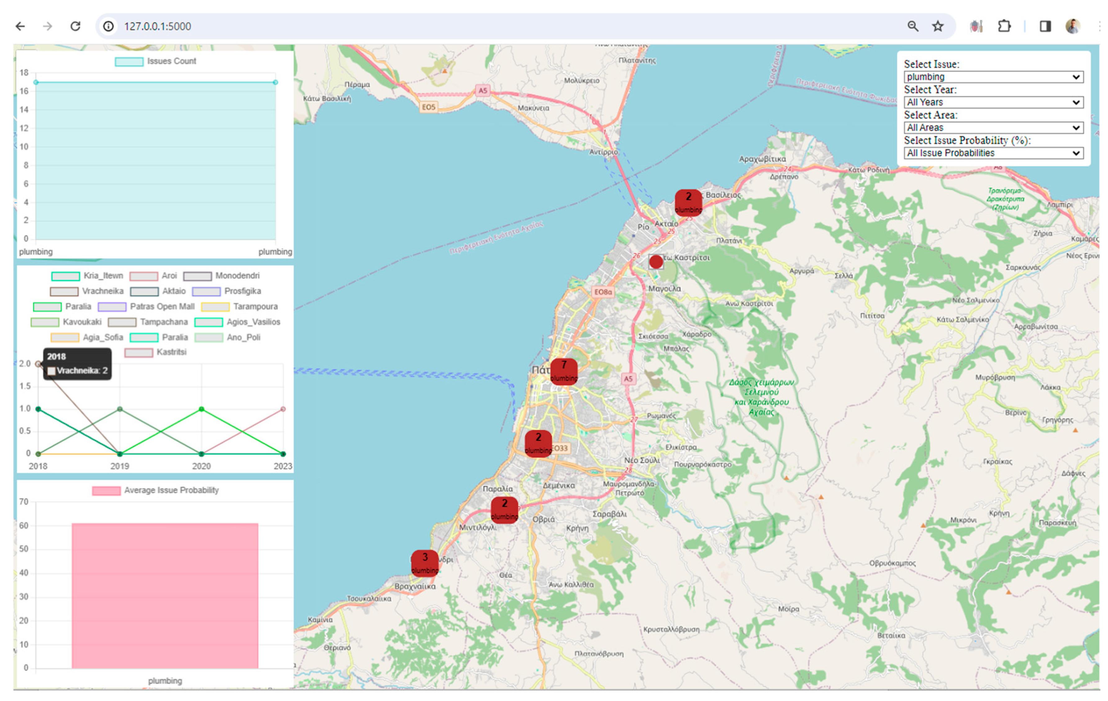
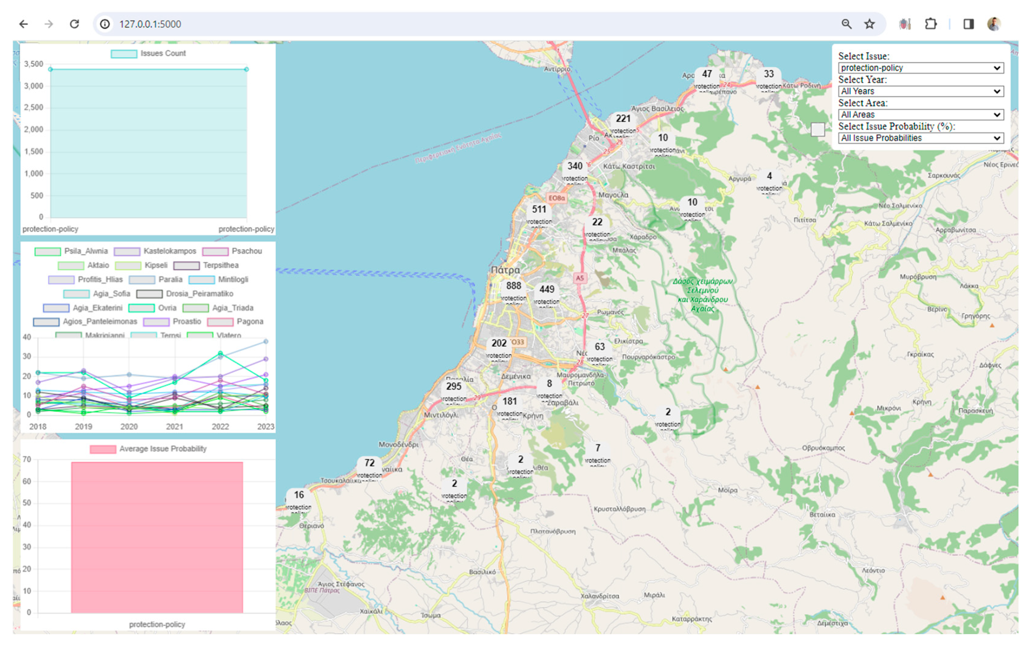
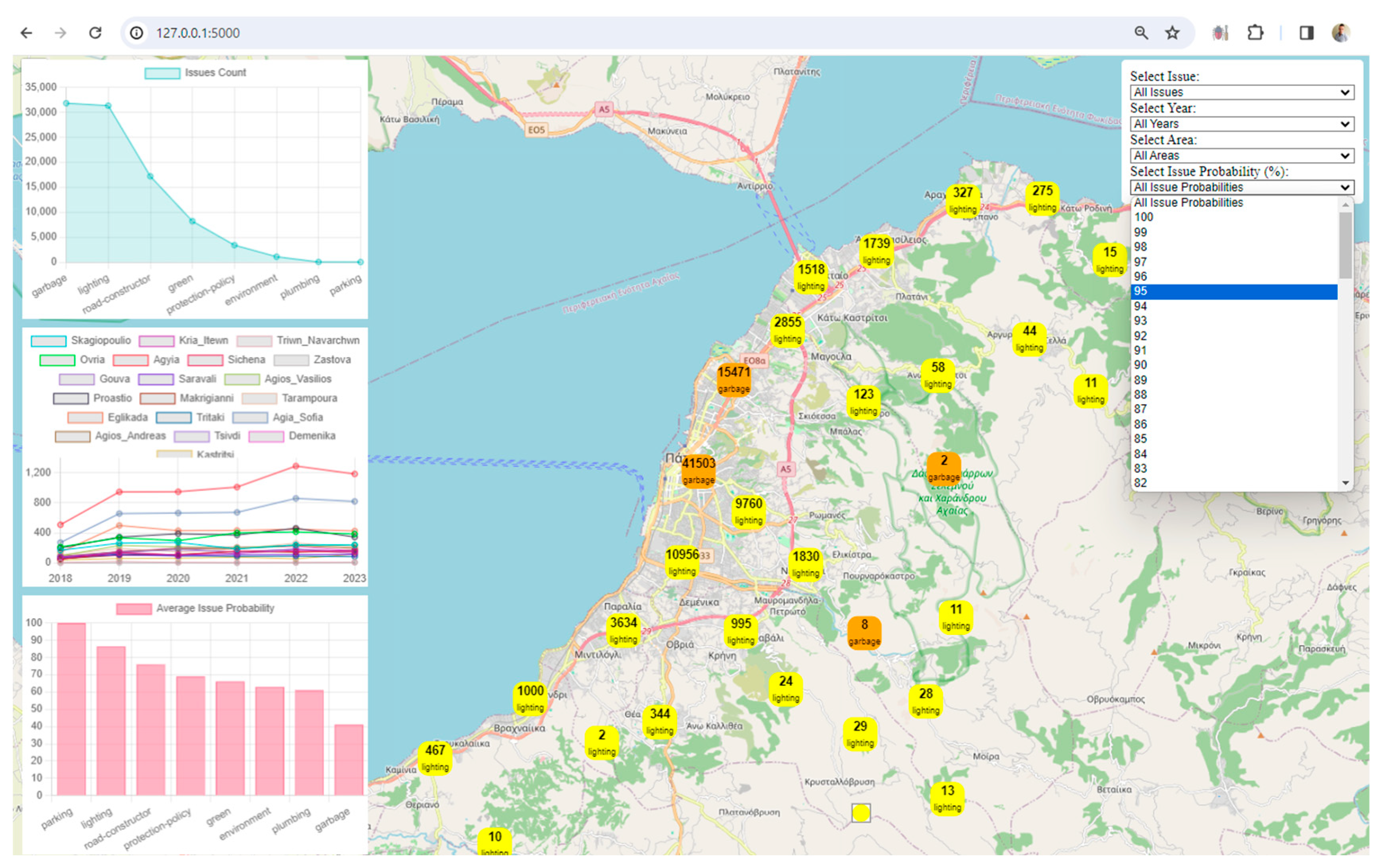
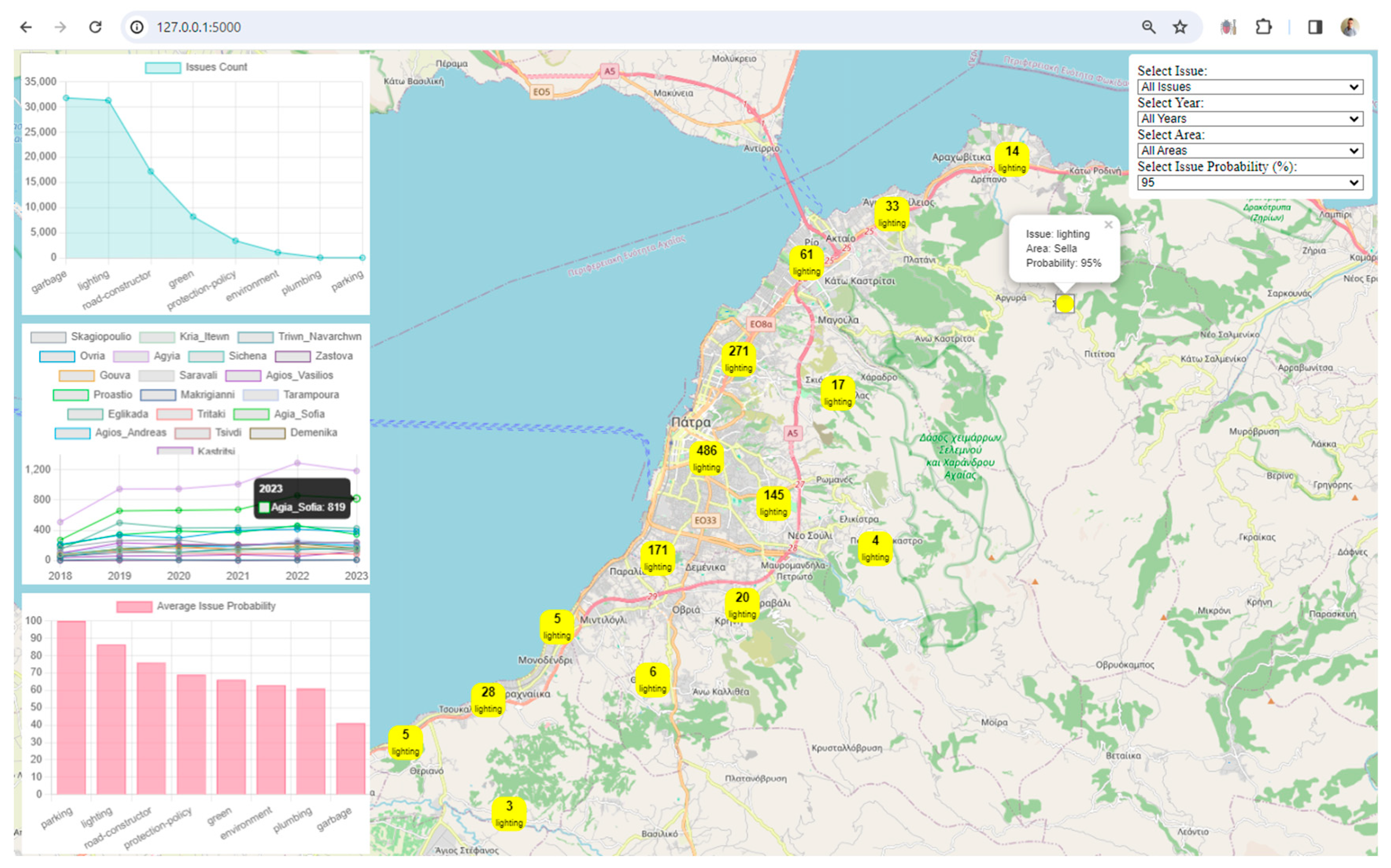
Visualization: The framework uses Leaflet, a popular JavaScript library for interactive maps, to visualize spatial data. The map displays markers and clusters representing different issues and their locations in the city. Chart.js is utilized to create visualizations such as charts representing issue counts, area counts, and average issue probabilities. These visualizations enhance the understanding of urban data trends.
Interactivity and User Engagement: The application provides an interactive user interface with filters for issues, years, areas, and issue probabilities. Users can dynamically explore and analyze the digital twin data based on their preferences. Users can choose specific filters to update the displayed data on the map and charts, allowing for a more personalized and insightful exploration of the city's digital twin.
Real-Time Updates and Monitoring: The framework can be extended to support real-time updates from various sensors and IoT devices in the city. This would enable monitoring and analysis of the city's state in near real-time.
Scalability and Extensibility: The architecture of the Flask application allows for scalability and extensibility. Additional features, data sources, or visualization components can be integrated to enhance the overall framework.
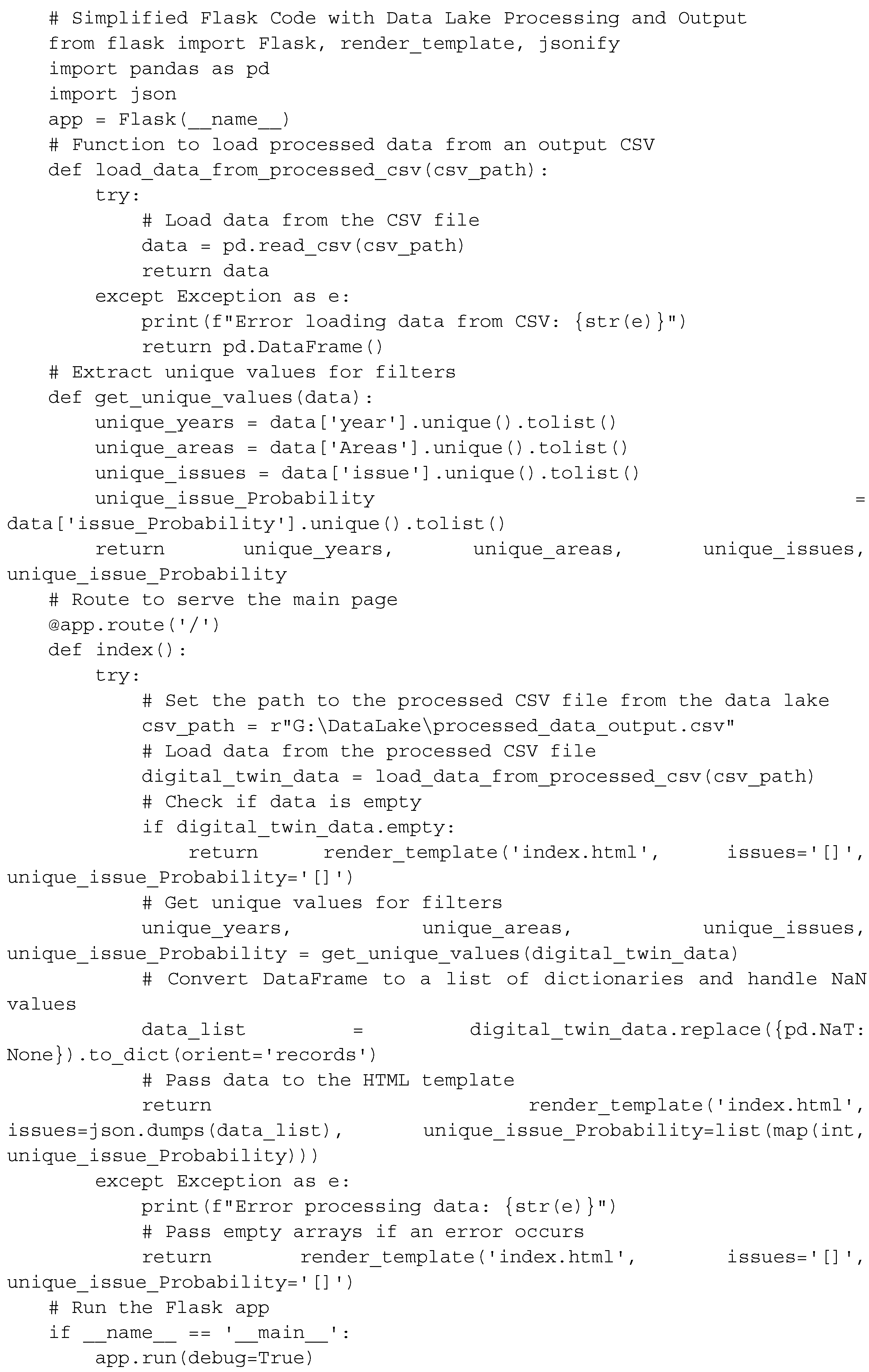
Below is a more general structure for Flask code that separates the backend (Flask) from the front end (HTML and JavaScript) and serves as a web page that includes a map, graphs, and filters. Further implementation of map preparation, graphs, manipulation filters, and data updates in JavaScript will depend on each specific requirement.

Key points about the general structure of the Flask code:
Load Data from data lake output: The load_data_from_processed_csv function is responsible for loading processed data from the output csv file specified by the csv_path variable. This function handles exceptions and returns an empty DataFrame if there is an error loading the data.
Error Handling: The code includes try-except blocks for loading data from the csv file. If an error occurs during data loading, it prints an error message to the console, and an empty DataFrame is returned.
Data Processing: The code assumes that the processed data is stored in the specified csv file. The csv_path variable appends to the correct path of the csv file of the processed data.
Unique Values Extraction: The get_unique_values function extracts unique values for years, areas, issues, and issue probability according to the data of the current work. This information is likely used for setting up filters on the frontend.
HTML Template Rendering: The code renders the HTML template ('index.html') and passes the processed data to it. If the data is empty, it passes empty arrays to ensure that the frontend gracefully handles the absence of data.
Run the Flask App: The script runs the Flask app when executed directly. The if __name__ == '__main__': block ensures that the app starts only when the script is executed directly, not when it's imported as a module.
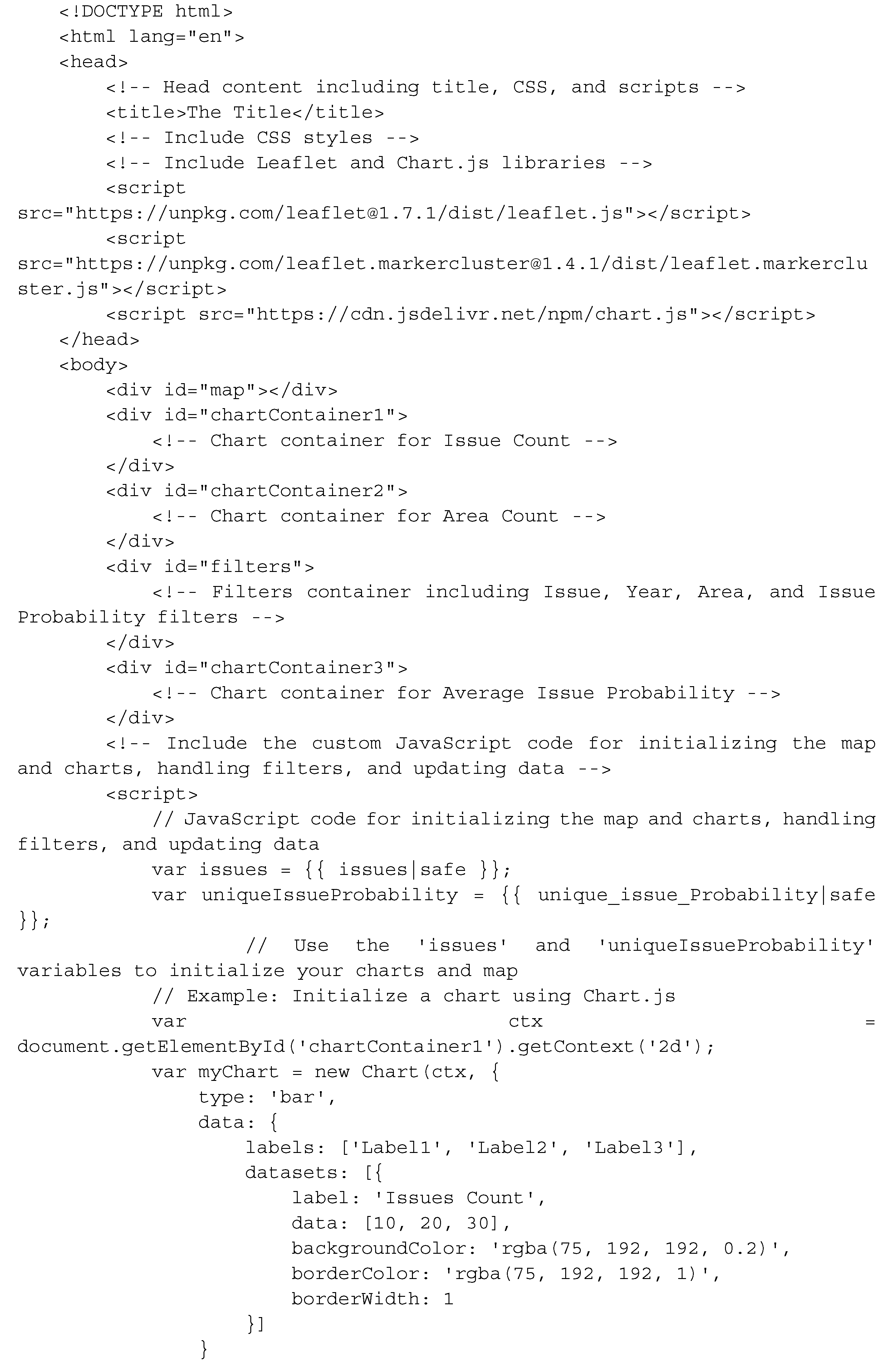
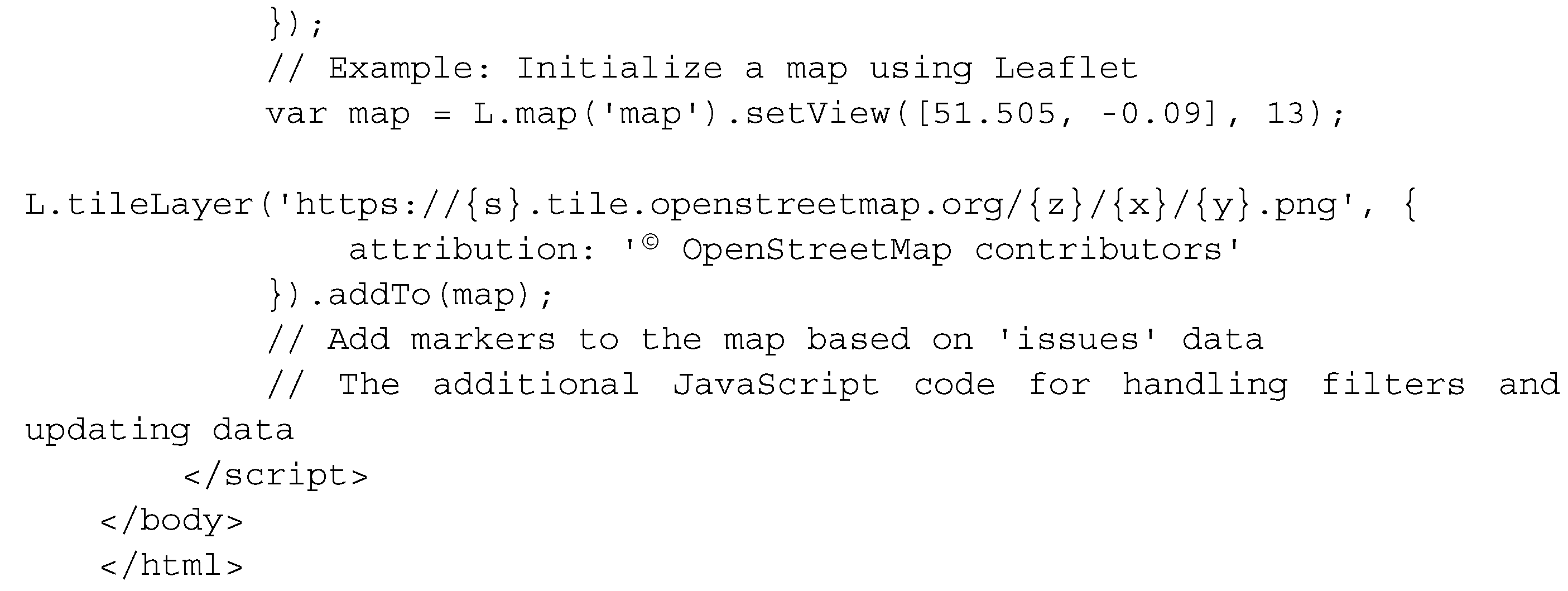
The following code is a general template of the templates/index.html structure based on the placeholders used in the previous Flask code and can be replaced with the appropriate HTML and JavaScript code according to the needs of each project.


Key Points about the general structure of templates/index.html code:
Dynamic Data: The Flask variables {{ issues|safe }} and {{ unique_issue_Probability|safe }} are used to dynamically inject data into the HTML template. The structure of these variables must align with the expected data format in the project's JavaScript code.
Leaflet and Chart.js: The HTML file includes the necessary scripts for Leaflet and Chart.js. and using the provided placeholders, the initialization of the map and charts can be customized.
Custom JavaScript: The <script> tag includes a placeholder for your custom JavaScript code. Replace this with the actual code needed to initialize the map and charts, handle filters, and update data based on your application's requirements.
CSS Styling: You may want to include CSS styles for styling your HTML elements. Add a <link> tag in the <head> section to link your CSS file if needed.
The provision of the Flask and HTML code frameworks serves the purpose of offering readers an overview of the project's development structure without delving into the extensive details inherent in the Python programming language code. This framework allows readers to grasp the project's rationale and development flow efficiently. Regarding the specific elements used in Flask and the HTML code of the work, it is necessary to note the following aspects:
The highlighted aspects of this work's detailed Flask application code
Efficient Data Loading: The code efficiently loads data from the data lake output in csv format, demonstrating a seamless pandas integration for data manipulation.
Data Processing for Enhanced Analysis: The addition of the 'year' column based on the 'reported_date_time' field demonstrates thoughtful data processing, enabling users to analyze data over time.
Dynamic Filtering Options: The collection of unique years, areas, issues, and issue probabilities allows users to dynamically filter and explore the dataset. This feature enhances the user's ability to derive insights based on specific criteria.
Error Handling and Graceful Degradation: The code includes error-handling mechanisms that print informative messages. In case of an error, the application gracefully provides default values for filters, ensuring a smooth user experience even in unexpected situations.
Interactive HTML Rendering: The render_template function dynamically renders the 'map.html' template, passing data to the front end for display. This approach supports an interactive and responsive user interface.
Conversion to JSON for Frontend Integration: The conversion of the DataFrame to a list of dictionaries and subsequent conversion to JSON ensures seamless integration with the frontend. This is a key aspect of rendering dynamic content.
User-Friendly Display of Data: The application provides a user-friendly display, passing empty arrays if no data is available. This thoughtful consideration contributes to a positive user experience.
Debugging Information: The use of print statements for debugging purposes during data loading ensures that developers can quickly identify and address any issues.
Conditional Execution: The if __name__ == '__main__': block ensures that the Flask app is only run when the script is executed directly, promoting modular and reusable code.
Support for Future Enhancements: The modular structure and integration with a frontend template suggest a codebase that is extensible and open to future enhancements. This is crucial for the longevity and adaptability of the application.
The highlighted aspects of this work's detailed maps.html code
Integration of Maps and Charts: The seamless integration of Leaflet for interactive maps and Chart.js for dynamic charts creates an engaging user experience. This combination allows users to visually explore spatial and statistical aspects of the data.
User-Friendly Filters: The inclusion of user-friendly filters for issues, years, areas, and issue probabilities empowers users to tailor their data exploration. This level of interactivity is crucial for a meaningful and personalized user experience.
Clustered Marker Representation: The use of clustered markers on the map, each representing the most frequent issue in that cluster, adds a layer of sophistication. It condenses information while providing insights into prevalent issues in specific geographical areas.
Dynamic Data Loading: The code demonstrates flexibility by allowing data to be loaded from the data lake output. This adaptability showcases a robust system capable of handling different data sources, increasing its applicability in various scenarios.
Real-Time Data Updates: The real-time update functionality, triggered by filter changes, ensures that users receive instant feedback. This feature facilitates a dynamic and responsive data exploration experience.
Appealing Visual Design: The use of custom styles, including vibrant colors, clear typography, and strategic layout, contributes to an aesthetically pleasing design. A visually appealing interface can captivate users and make the exploration process more enjoyable.
Chart Variety: The inclusion of different chart types (line and bar charts) adds diversity to data representation. This variety not only caters to different learning styles but also provides a comprehensive view of the dataset.
Random Color Generation: The inclusion of a function to generate random colors for chart elements adds a playful and dynamic element to the visual representation. It enhances the overall visual appeal and contributes to a lively user interface.
Responsive Design: The implementation of responsive design principles ensures that the application remains accessible and functional across various devices and screen sizes. This adaptability reflects a commitment to user convenience.
Potential for Further Customization: The code structure and modular design suggest a foundation that can be easily extended or customized. This feature encourages further development, allowing users to adapt the application to their specific needs or integrate additional functionalities.
Before the next section, the paper illustrates the data distribution and statistical analysis so that the reader can derive additional information and seamlessly delve into the body of results.
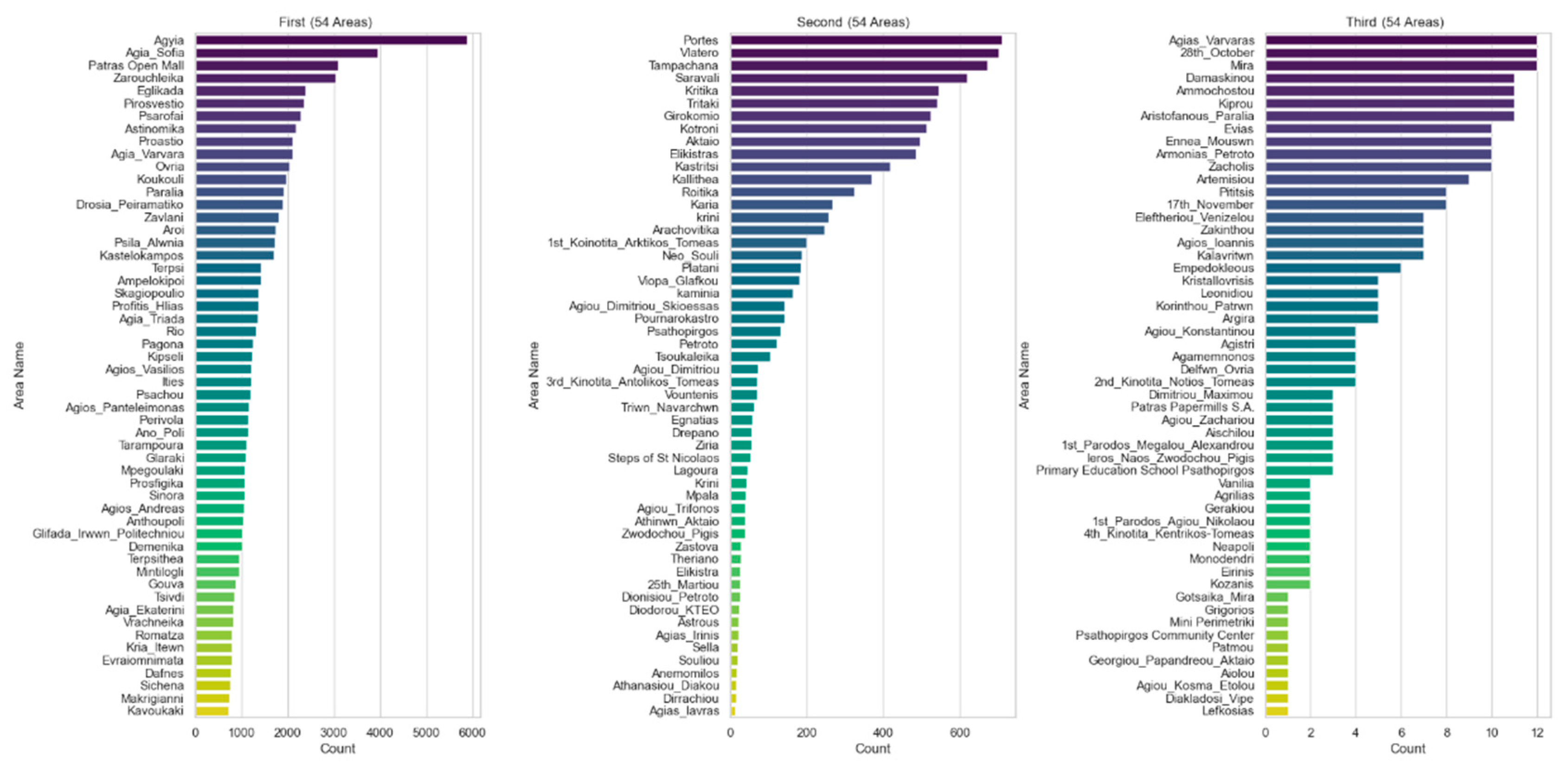
Figure 5 presents the percentage of issues by area. The visualization is divided into three horizontal bar graphs, each representing 54 different regions out of the 162 unique regions in total. Areas are sorted by number and bar graphs use different colors for a visually appealing representation.
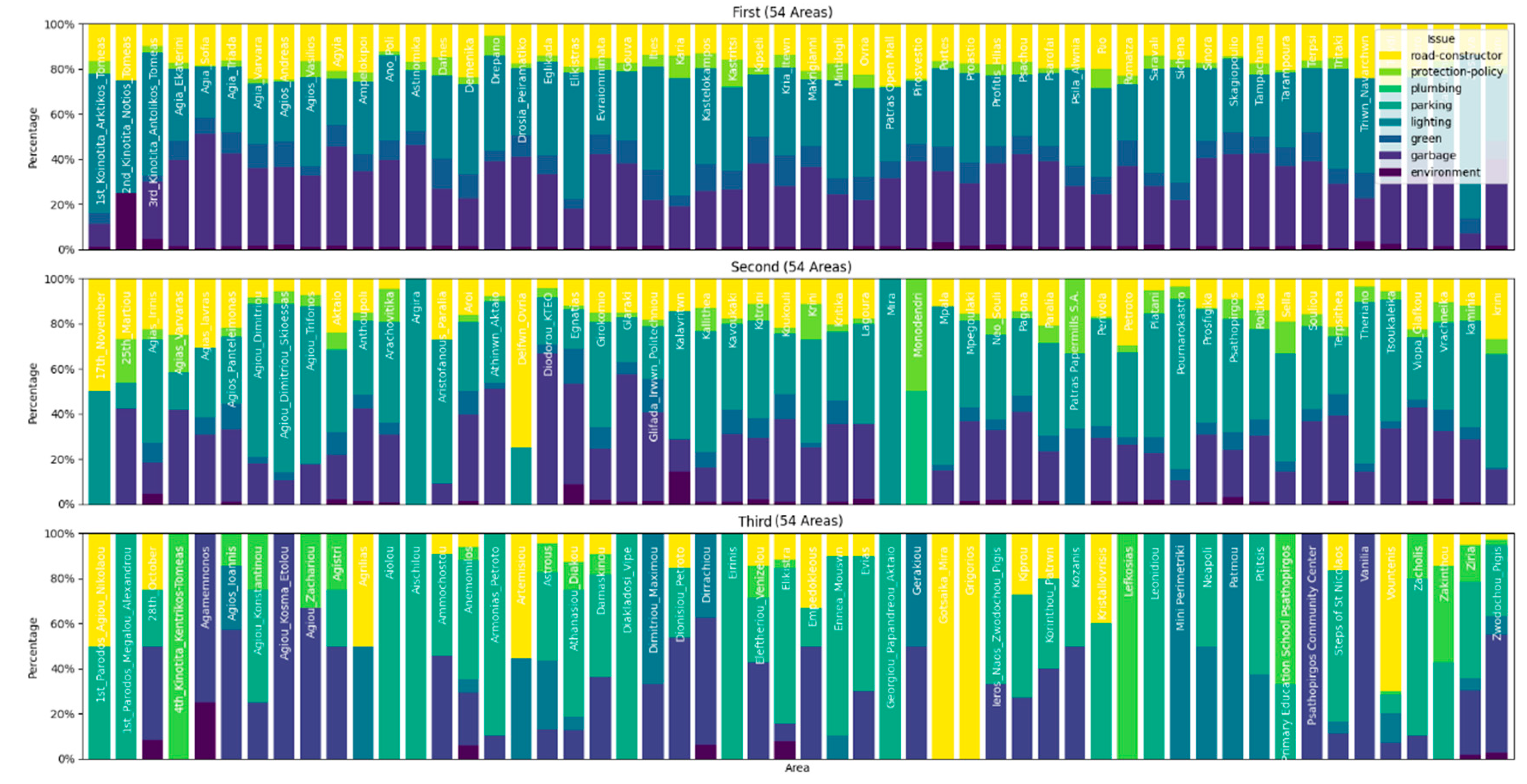
Figure 6 is the output of the Python code that creates a stacked bar chart for three different parts (First Half, Second Half, and Third Half) based on the data lake output. The image attempts to present the information in a clear and visually appealing way, taking into account the fact that there are 162 unique areas in total, and the population of regions increases the difficulty of a valuable visualization. Each segment consists of a subplot with regions represented by stacked bars, where the height of each bar segment corresponds to the percentage of a particular issue within the region, with region names appearing on each line. The legend is included in the upper right corner of the first subplot, providing information about the issues represented by different colors in the graph. The image attempts to present the information in a clear and visually appealing way, taking into account the fact that there are 162 unique areas in total, and the population of regions increases the difficulty of a valuable visualization.
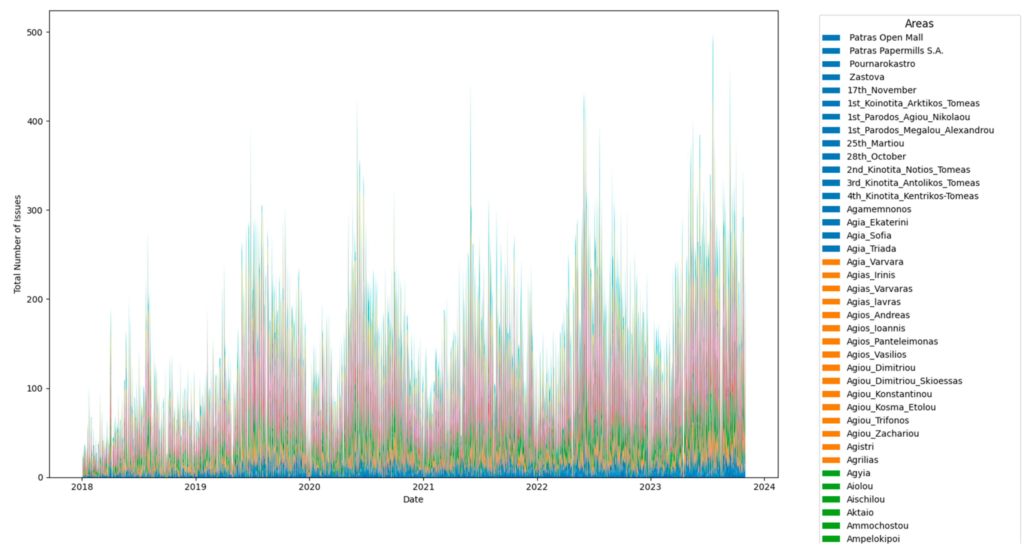
Figure 7 is an attempt to show the overall distribution of subjects in each region over time. The color dimensions categorize regions based on the total number of releases from 2018 to the date of this article's writing, and a sample of the region color groupings is shown on the right side of the chart.
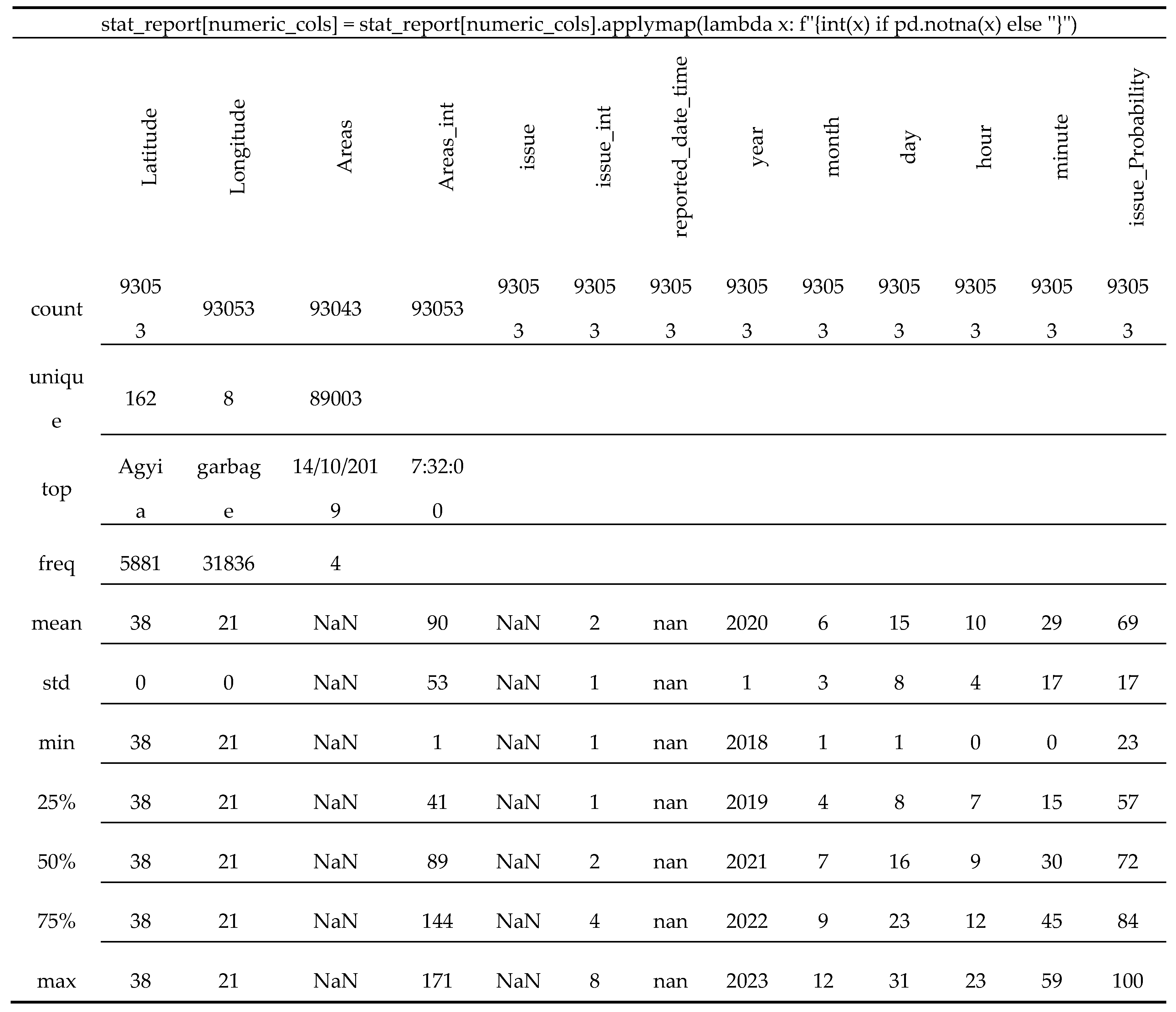
Table 1 is the statistical summary of the lake data output that provides a comprehensive overview of the entities as a whole, including distribution, central tendency, and variability of the numerical column. The terminal output provides a statistical summary of the data generated and here is a detailed explanation of each segment
Count: Latitude, Longitude, Areas, Areas_int, issue, issue_int, reported_date_time, year, month, day, hour, minute, issue_Probability: These columns represent the number of non-null entries in the dataset. For instance, there are 93053 entries for each of these columns, indicating the total number of records in the dataset.
Unique: Latitude, Longitude, Areas, Areas_int, issue, issue_int, reported_date_time, year, month, day, hour, minute, issue_Probability: This shows the number of unique values in each column. For example, there are 162 unique areas, 8 unique issue categories, and 89003 unique reported date and time entries.
Top: Areas, issue, reported_date_time: Indicates the most frequently occurring value in each column. For instance, "Agyia" is the most common area, "garbage" is the most common issue, and "2019-10-14 07:32:00" is the most common reported date and time.
Freq: Areas, issue, reported_date_time: Represents the frequency of the top value. For example, "Agyia" appears 5881 times in the "Areas" column.
Mean: Latitude, Longitude, Areas_int, issue_int, year, month, day, hour, minute, issue_Probability: Represents the mean (average) value for each numeric column.
Std: Latitude, Longitude, Areas_int, issue_int, year, month, day, hour, minute, issue_Probability: Represents the standard deviation, a measure of the amount of variation or dispersion in each numeric column.
Min: Latitude, Longitude, Areas_int, issue_int, year, month, day, hour, minute, issue_Probability: Represents the minimum value in each numeric column.
25%, 50%, 75%: Latitude, Longitude, Areas_int, issue_int, year, month, day, hour, minute, issue_Probability: These values represent the quartiles, indicating the distribution of the data. For example, 25% of the reported dates and times fall on or before the 57th minute.
Max: Latitude, Longitude, Areas_int, issue_int, year, month, day, hour, minute, issue_Probability: Represents the maximum value in each numeric column.
From this summary, somebody can identify patterns such as the common areas and issues, and can also observe the distribution and variability of numeric columns. However, identifying outliers might require additional visualization techniques, like box plots or scatter plots. The summary provides a good overview, but further exploration through data visualization and more advanced statistical techniques may be needed for a deeper understanding.
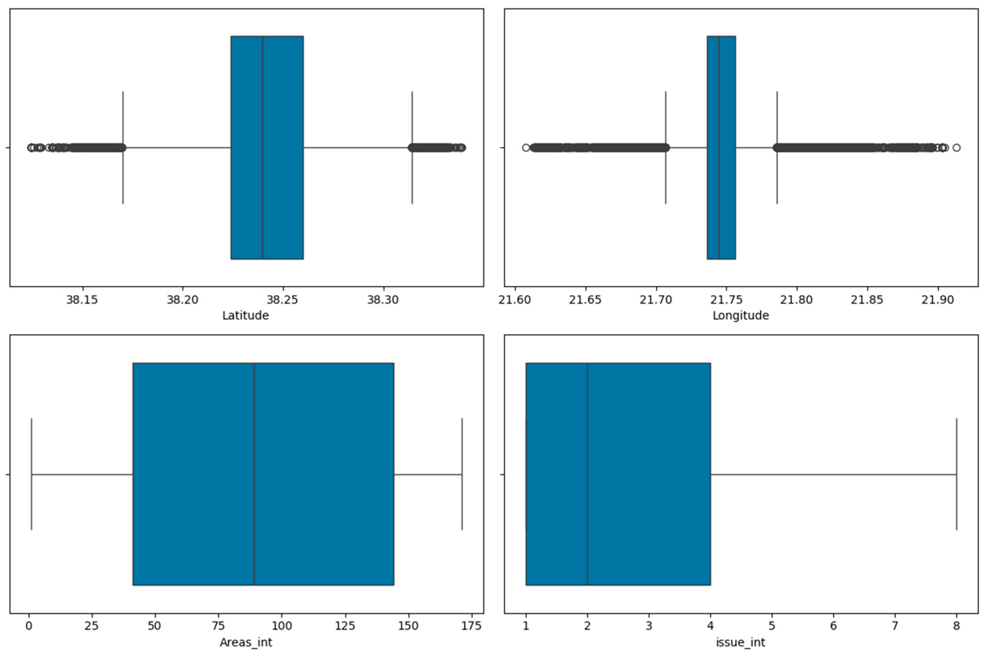
Figure 8 provides boxplots for the "Latitude", "Longitude", "Areas_int" and "issue_int" columns. According to the boxplots which show the distribution of the number of citizen reports received on each day are very useful in highlighting some observations: The boxes are relatively wide, which indicates that there is a lot of variation in the data. The medians of the boxes are all above the first quartile, which indicates that the data is positively skewed. There are a few outliers in the data, as indicated by the whiskers of the boxplots. The overall trend of the data is increasing, as indicated by the upward slope of the center lines of the boxes.
Based on these observations, somebody can conclude that the data is likely to represent a large number of citizen reports, with a significant amount of variation in the number of reports received each day. The data is also positively skewed, which means that there are more days with a high number of reports than days with a low number of reports. There are a few outliers in the data, which could be due to unusual events or data entry errors. Finally, the overall trend of the data is increasing, which suggests that the number of citizen reports is increasing over time.
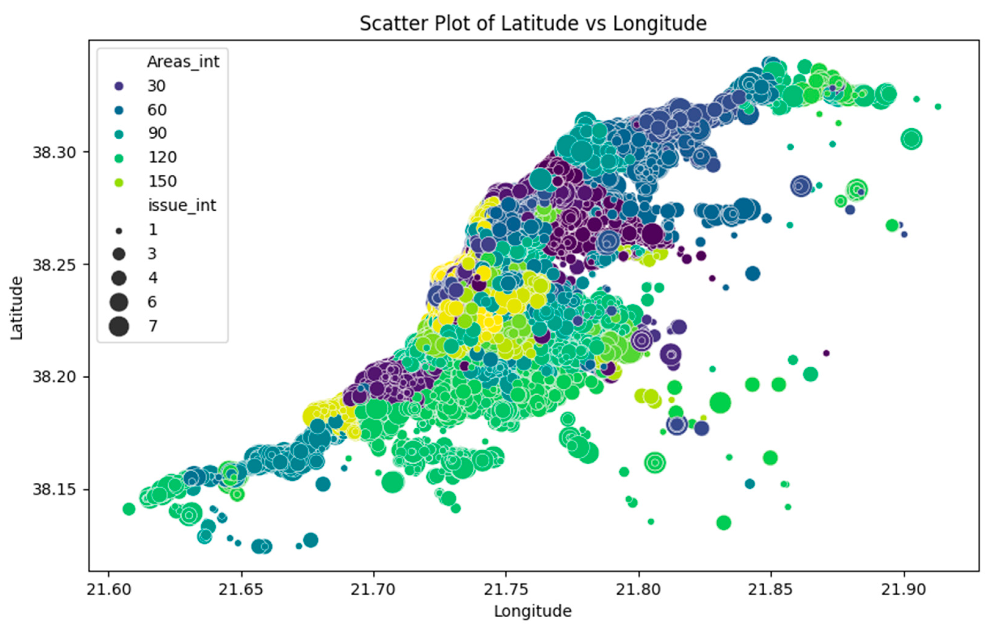
Figure 9 shows a scatterplot for "Latitude" versus "Longitude" with "Areas_int" as hue and "issue_int" as size. The points are concentrated in the city of Patras, with a few outlying suburbs scattered around the city. The largest concentrations of reports are in the city center and in the areas to the north and south of the city. The size of the points in the scatter plot suggests that there is a significant variation in the number of reports received at different locations in the city. Some areas, such as the city center and the north and south areas, receive a high number of reports, while other areas receive a relatively low number of reports. This variation in the number of reports could be due to a number of factors, such as:
Population density: Areas with a higher population density are likely to receive more citizen reports.
Land use: Areas with a mix of land uses, such as residential, commercial, and industrial land uses, are likely to receive more citizen reports than areas with a single land use.
Socioeconomic status: Areas with a lower socioeconomic status are more likely to receive more citizen reports.
Crime rates: Areas with higher crime rates are more likely to receive more citizen reports.
Based on this information, is highlighted that the citizen reports are distributed throughout the city of Patras, with a few outliers in the surrounding areas. The number of reports received on each day varies widely, with more reports being received on some days than others.
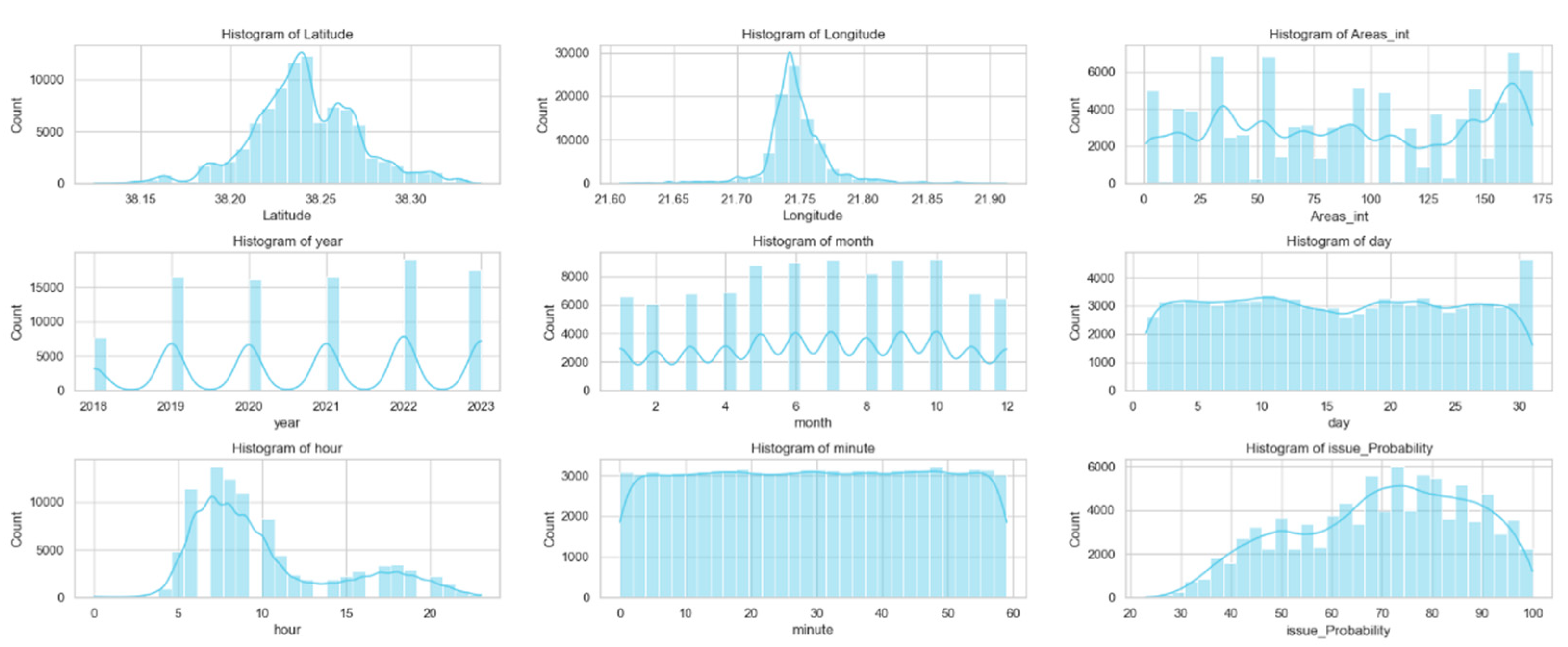
As the last figure in this section, the paper also lists the analysis of each data histogram in the figure: According to the visualizations of the
Figure 10 data histograms, an analysis follows for each of them.
Histogram 1: Latitude. The histogram of latitude shows that the majority of citizen reports are located in the central part of Patras. There is also a smaller concentration of reports in the western and northern parts of the city. The histogram is relatively symmetrical, with a slightly longer tail on the left side.
Histogram 2: Longitude. The histogram of longitude shows that the majority of citizen reports are located in the eastern part of Patras. There is also a smaller concentration of reports in the central and southern parts of the city. The histogram is relatively symmetrical, with a slightly longer tail on the right side.
Histogram 3: Areas_int. The histogram of Areas_int, which is the numerical representation of the areas, shows that the majority of citizen reports come from areas with a medium to high population density. There are also a smaller number of reports from areas with a low population density. The histogram is positively skewed, with a longer tail on the right side. This suggests that there are more citizen reports from areas with a high population density than from areas with a low population density.
Histogram 4: Year. This histogram shows that the number of citizen reports has increased steadily over time. The histogram is positively skewed, with a longer tail on the right side. This suggests that there have been more citizen reports in recent years than in previous years.
Histogram 5: Month. This histogram shows that the number of citizen reports is highest in the summer months and lowest in the winter months. The histogram is slightly skewed to the right, with a longer tail on the right side. This suggests that there are more citizen reports in the summer months than in the winter months.
Histogram 6: Day. This histogram shows that the number of citizen reports is highest on weekdays and lowest on weekends. The histogram is slightly skewed to the right, with a longer tail on the right side. This suggests that there are more citizen reports on weekdays than on weekends.
Histogram 7: Hour. This histogram shows that the number of citizen reports is highest during the day and lowest at night. The histogram is slightly skewed to the right, with a longer tail on the right side. This suggests that there are more citizen reports during the day than at night.
Histogram 8: Minute. This histogram is relatively uniform, with a slight peak at the beginning of each hour. This suggests that citizen reports are distributed evenly throughout the hour.
Histogram 9: issue Probability. This histogram shows that the majority of citizen reports have a low to medium probability of being resolved. There are also a smaller number of reports with a high probability of being resolved. The histogram is slightly skewed to the left, with a longer tail on the left side. This suggests that there are more citizen reports with a low probability of being resolved than with a high probability of being resolved. Overall, the histograms of citizen reports show that the majority of reports are located in the central part of Patras, come from areas with a medium to high population density, and are highest in the summer months and on weekdays. The histograms also show that the number of citizen reports has increased steadily over time.
In essence, this section has examined the methodological roadmap employed in this study to create a digital twin application. It encompasses various components, including features, user interactions, data interactions, rules, and predictions related to neighborhood issues based on citizen reports of problems across different city areas. A comprehensive presentation of the data's nature and distribution has been provided, facilitating the reader's exploration as they further explore the subsequent section to understand the outcomes.
