Submitted:
23 April 2024
Posted:
25 April 2024
You are already at the latest version
Abstract
Keywords:
1. Introduction
2. Methodology
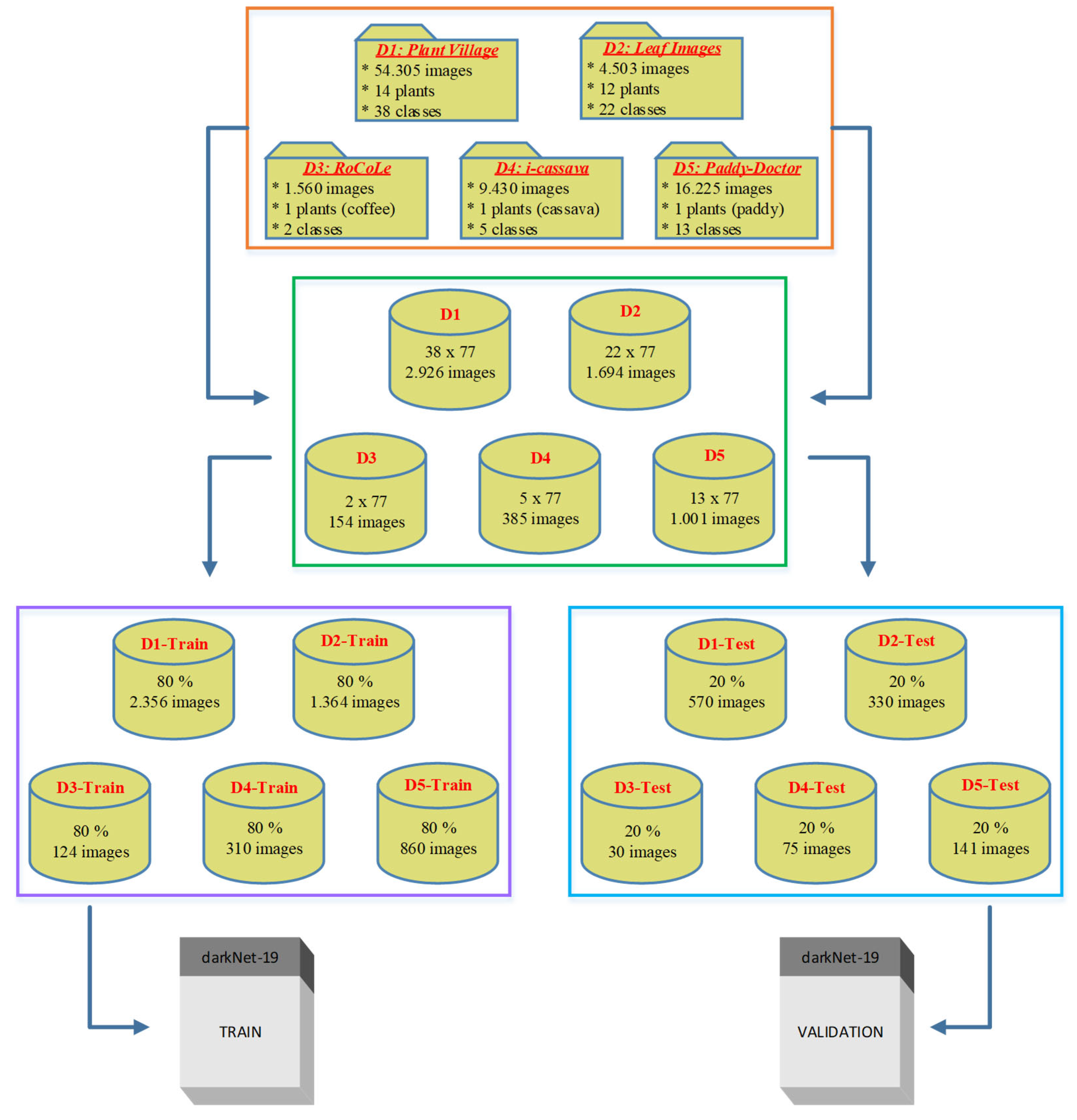
2.1. Data Collection
- "plant_village dataset" - [https://github.com/spMohanty/PlantVillage-Dataset]
- "a_database_of_leaf_images" - [https://data.mendeley.com/datasets/hb74ynkjcn/4]
- "RoCoLe dataset" - [https://data.mendeley.com/datasets/c5yvn32dzg/2]
- "FGVCx_cassava dataset" - [https://github.com/icassava/fgvcx-icassava/tree/master#fgvcx-cassava-disease-diagnosis] and
2.2. Image Preprocessing & GLCM Metrics
2.3. Statistical Analysis
2.4. Deep Learning Model Training and Evaluation
- i
- Preprocessing of the Data: To improve model performance, better feature representation and guarantee uniformity before processing, the images were resized to a uniform resolution (227x227) and pixel values.
- ii
- Model Selection: The DarkNet19 architecture was chosen as the foundational model for training since it has a track record of success in image classification challenges. DarkNet19 is a deep convolutional neural network (CNN) model.
- iii
- Hyperparameter Tuning: To maximize classification accuracy, the DarkNet19 model's hyperparameters—such as initial learning rate (0.0001), mini-batch size (128), maximum epoch (10), weight and bias learning rate factors (10) were adjusted as same values for all training trials.
3. Results and Discussions
3.1. Ideals of Image Properties and Distribution across the Datasets
3.1.1. Data Imbalance
| Annotation | Dataset name | Total Images | Image Resolutions | Setting | Disease Classes | Plants involved |
|---|---|---|---|---|---|---|
| dataset_1 | plant_village dataset | 54303 | [256x256] throughout | Lab | 38 | Apple, Cherry, Corn, grape, Peach, Pepper, Potato, Strawberry, and Tomato |
| dataset_2 | a_database_of_leaf_images | 4503 | [6000x4000] throughout | Lab | 22 | Mango, Arjun, Alstonia Scholaris, Guava, Bael, Jamun, Jatropha, Pongamia Pinnata, Basil, Pomegranate, Lemon, and Chinar |
| dataset_3 | RoCoLe dataset | 1560 | [2048x1152], 768 images, [1280x720], 479 images, [4128x2322], 313 images |
Field | 5 | Coffee |
| dataset_4 | FGVCx_cassava dataset | 537 | Variable between [213x231] to [960x540] |
Field | 5 | Cassava |
| dataset_5 | paddy_doctor dataset | 16,225 | [1080x1440], 16219 images, and [1440x1080], 6 images | Field | 13 | Paddy |
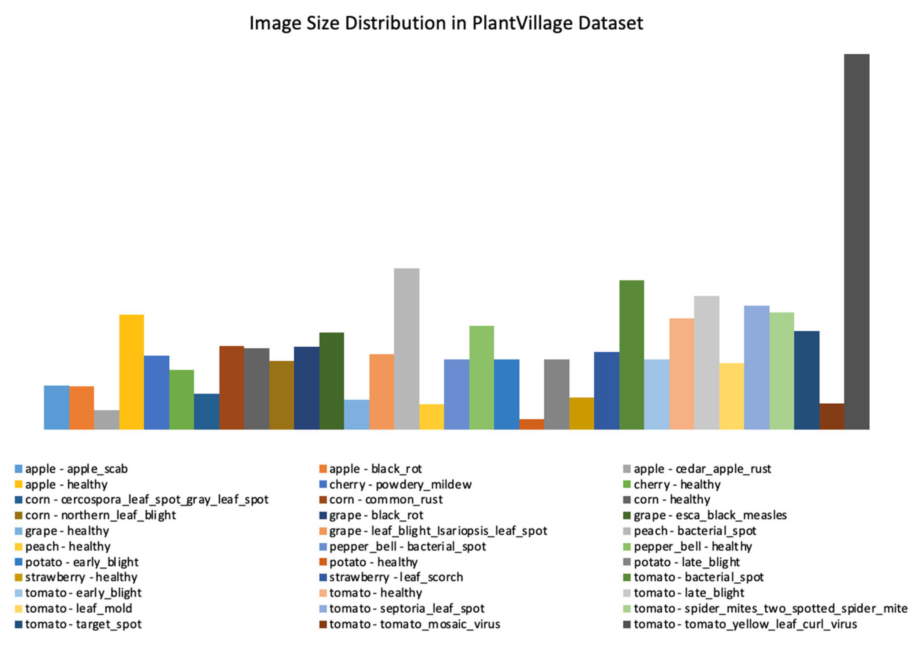

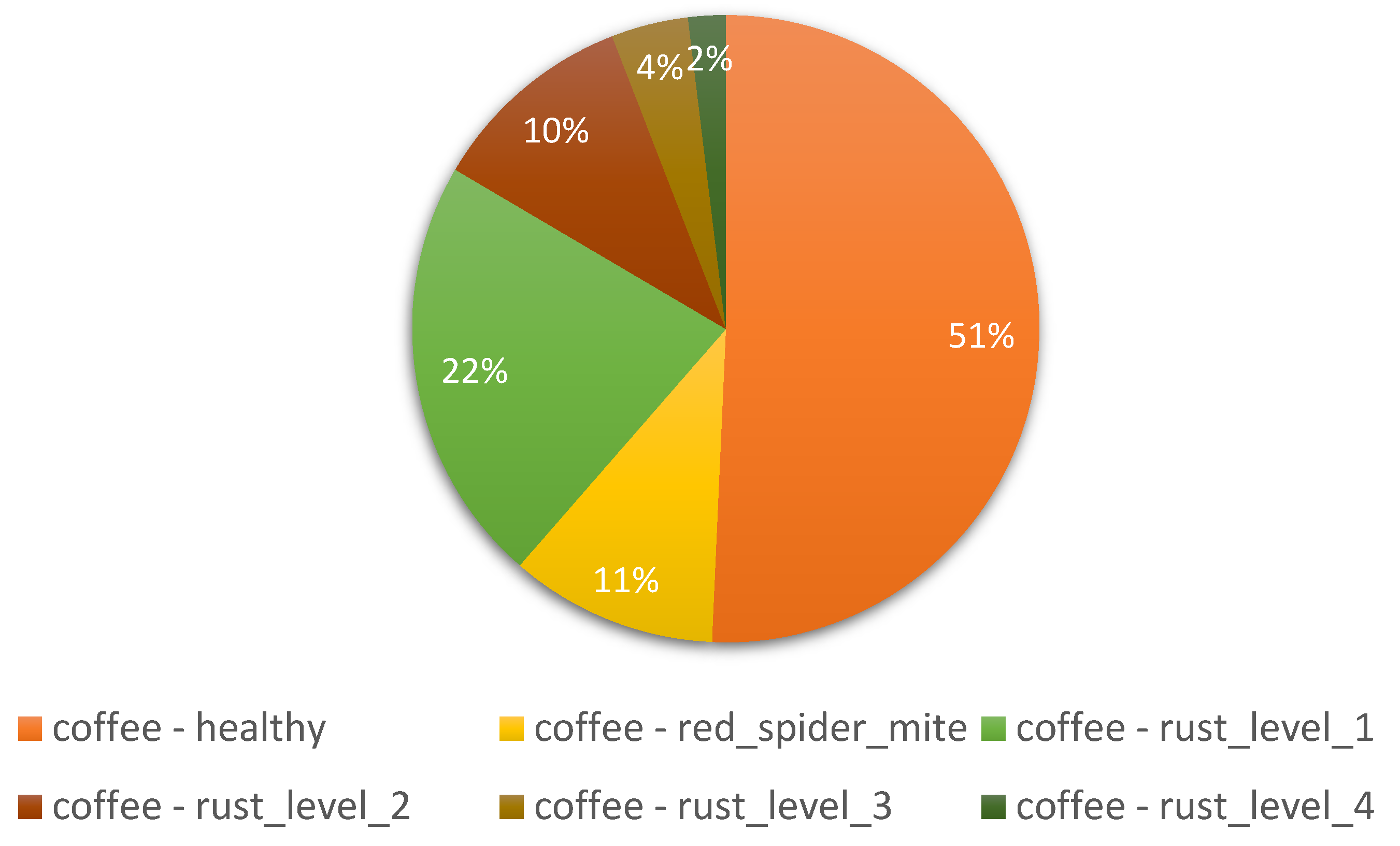
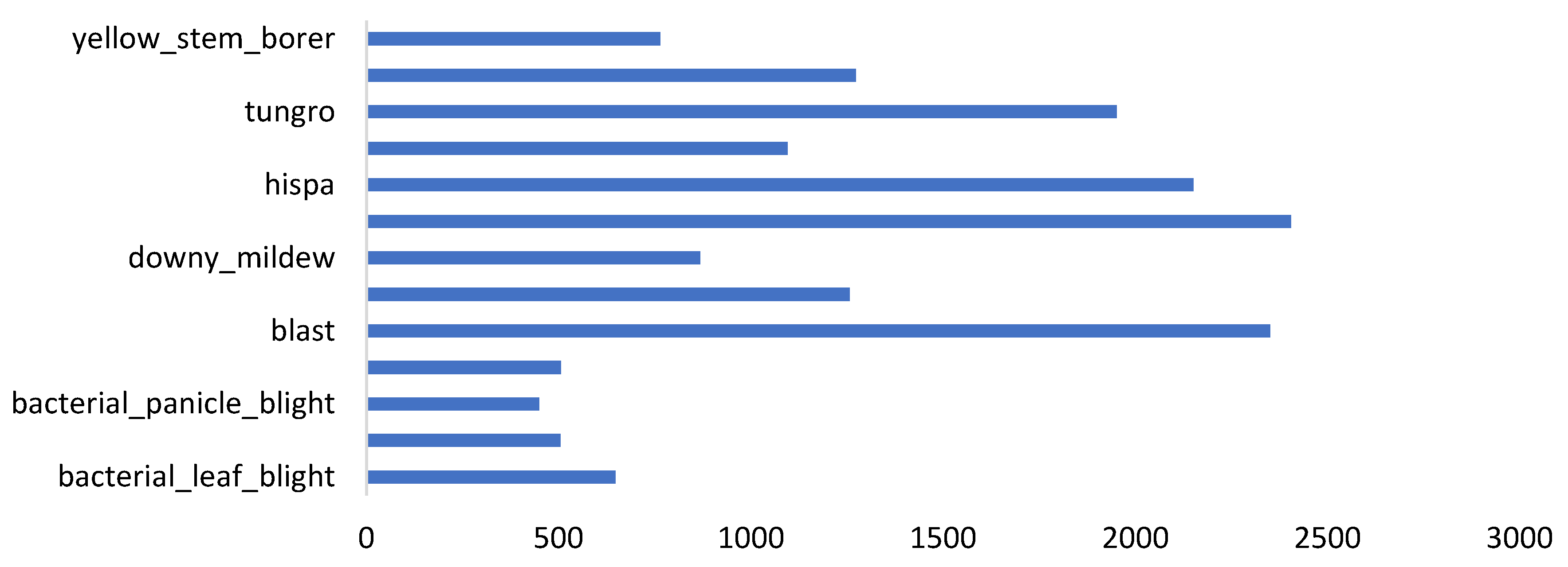
| Factors | Effects | Source |
|---|---|---|
| External factors such as uneven lighting, extensive occlusion, and fuzzy details | Variations in the visual characteristics of affected plants. | [41] |
| Variations in the presence of illness and the growth of a pest | Subtle differences in the characterization of the same diseases and pests in different regions, resulting in “intra-class distinctions”. | [42] |
| Similarities in the biological morphology and lifestyles of subclasses of diseases and pests | Problem of “inter-class resemblance” | [39] |
| Background disturbances | Makes it harder to detect plant pests and diseases In actual agricultural settings | [43] |
3.1.2. Image Resolutions
3.2. Distribution of GLCM Metrics
- Energy
- Contrast
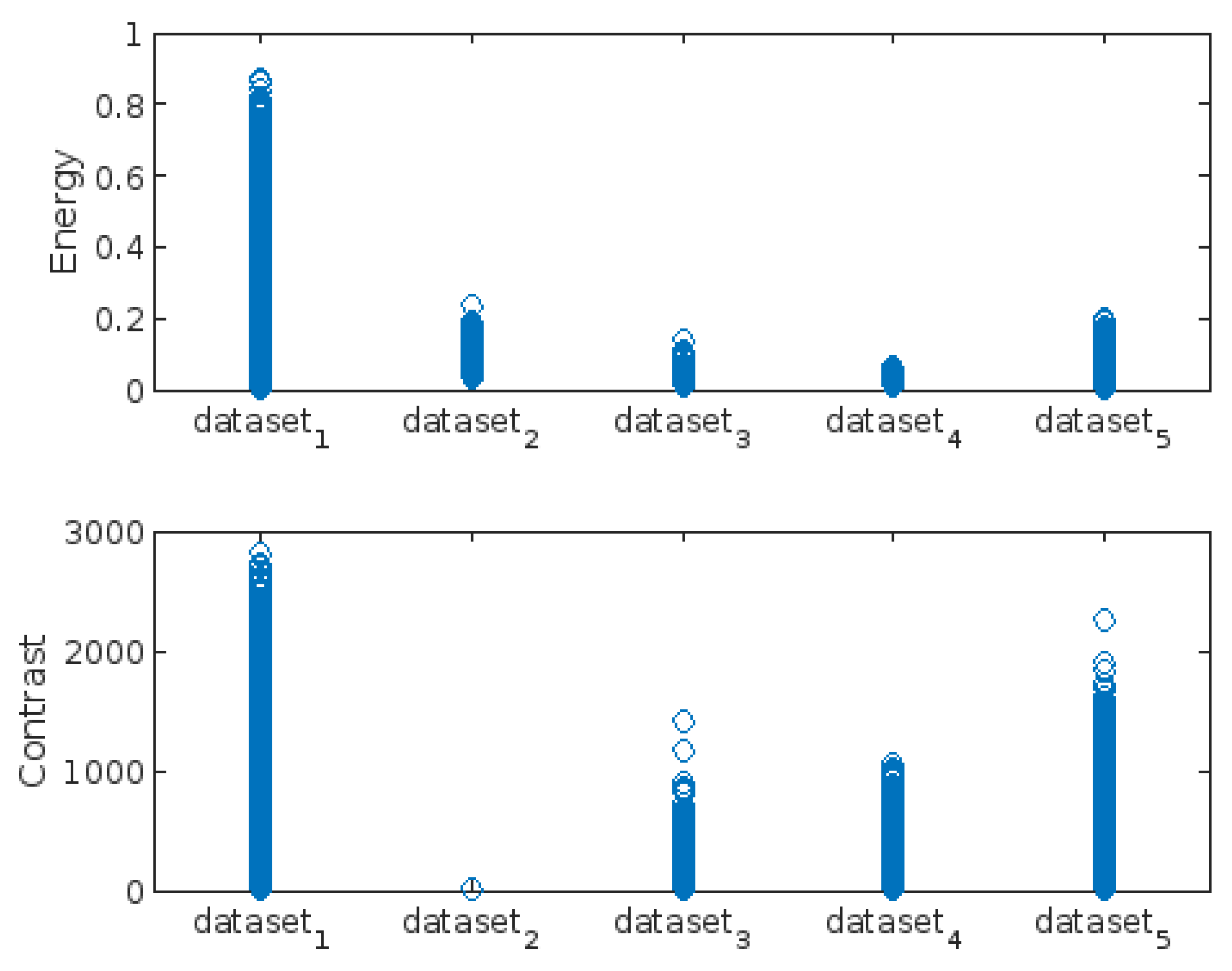
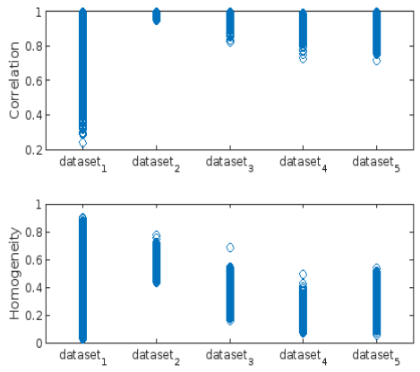
- Correlation
- Homogeneity:
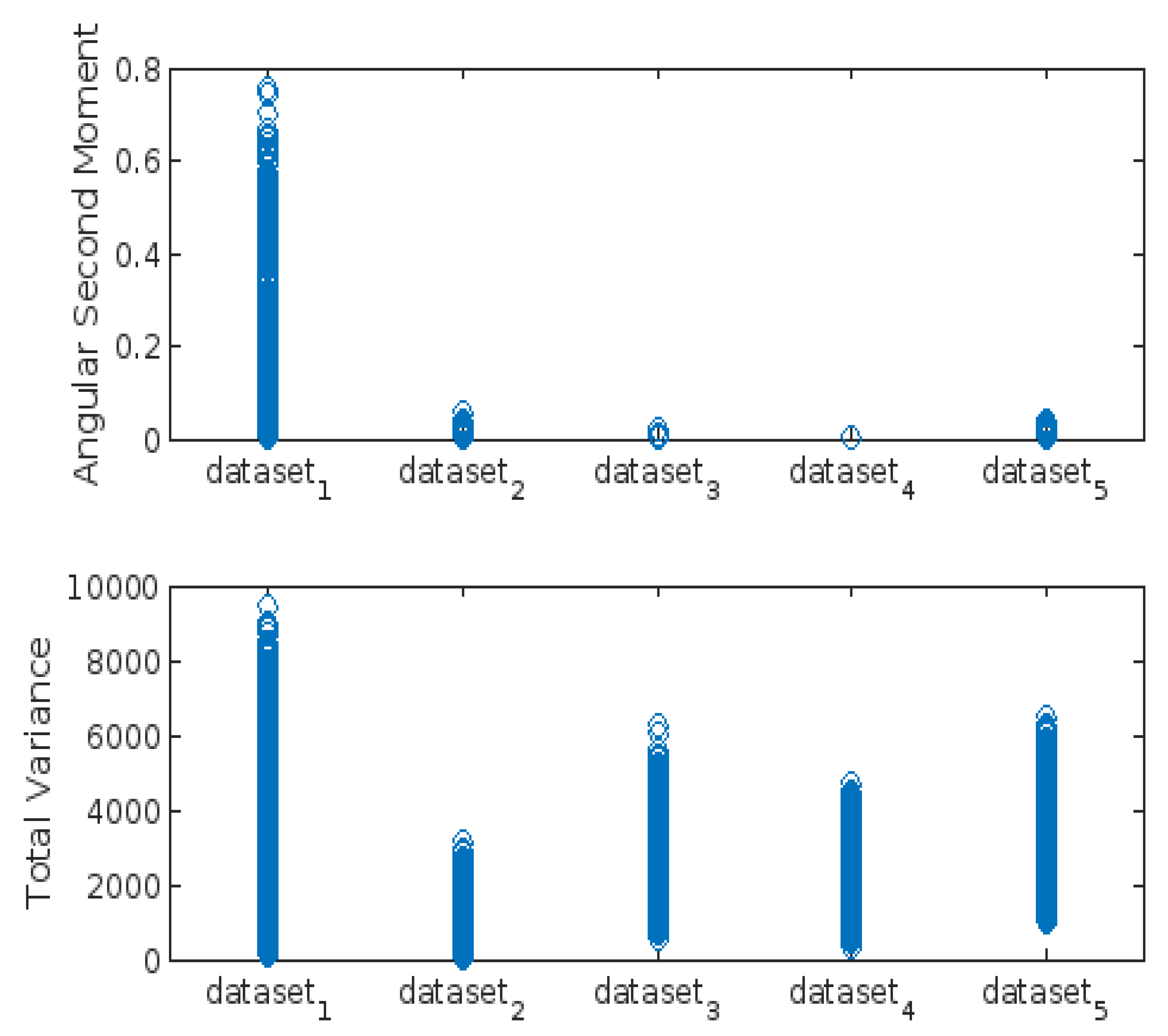
- Angular Second Moment (ASM):
- Total Variance:
3.3. Highest-Lowest GLCM Metric’s Scorecard
| GLCM Metrics | Highest in GLCM Metrics (dataset_x) | Lowest in GLCM Metrics (dataset_x) | ||||||||
| 1 | 2 | 3 | 4 | 5 | 1 | 2 | 3 | 4 | 5 | |
| Energy | X | X | ||||||||
| Contrast | X | X | X | |||||||
| Correlation | X | X | ||||||||
| Homogeneity | X | X | ||||||||
| Angular_Second_Moment | X | X | X | X | ||||||
| Total_Variance | X | X | ||||||||
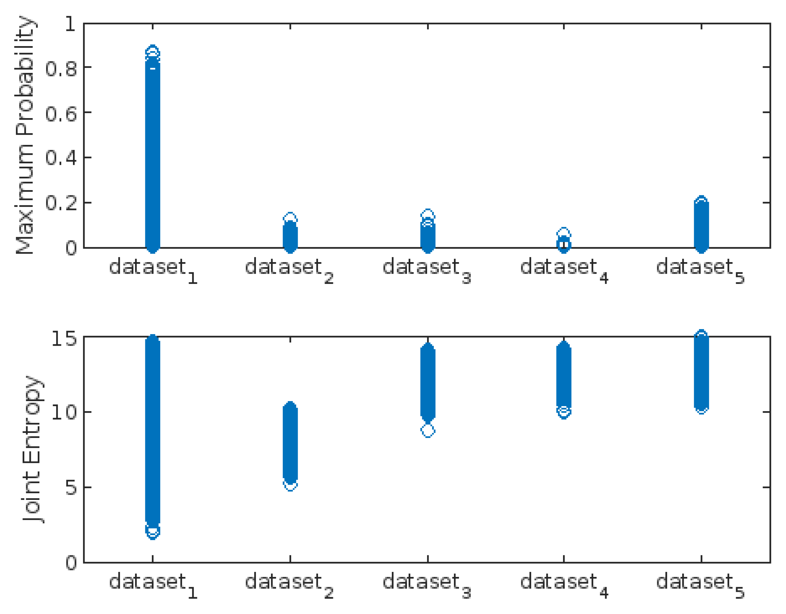
| Maximum_Probability | X | X | ||||||||
| Joint_Entropy | X | X | ||||||||
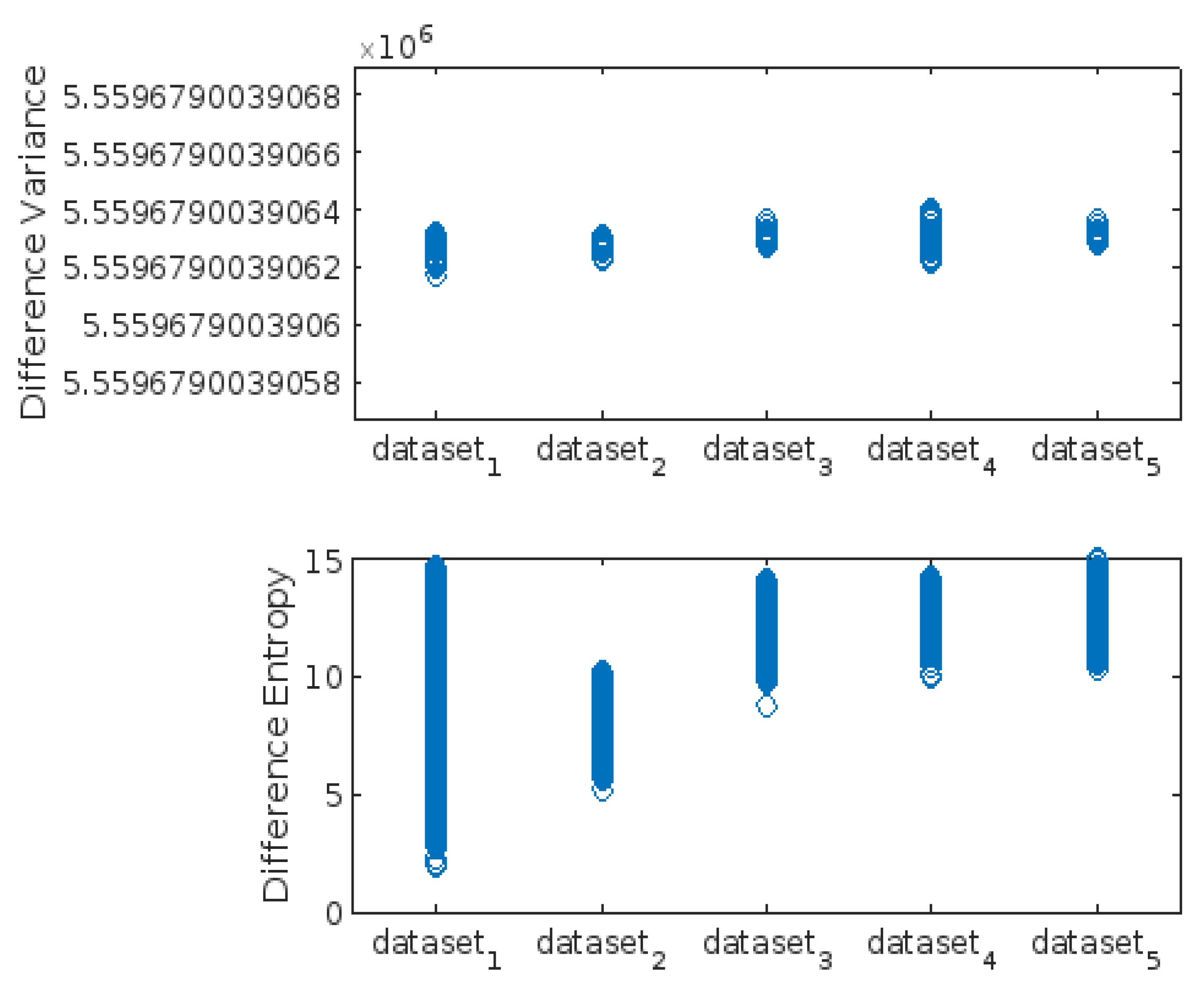
| Difference_Variance | X | X | X | |||||||
| Difference_Entropy | X | X | ||||||||
| Sum of scores | 3 | 4 | 0 | 1 | 4 | 3 | 4 | 0 | 2 | 3 |
3.4. Correlation Matrix of GLCM Metrics
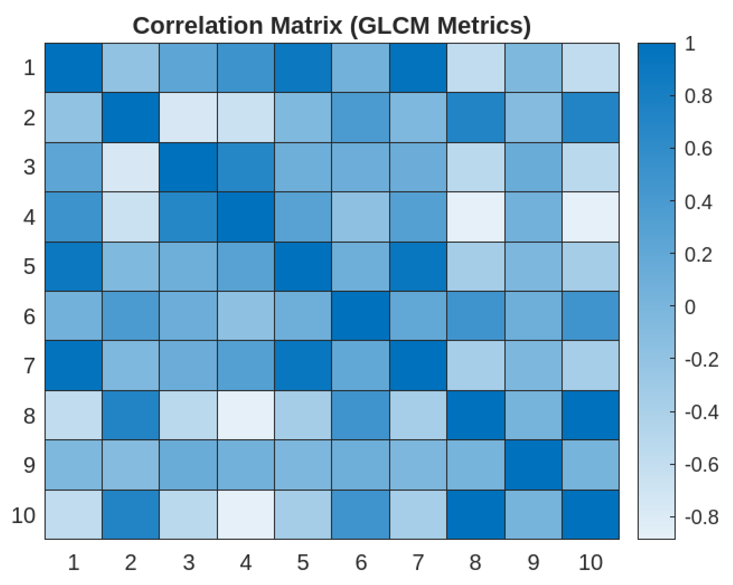
- 1)
- Strong Correlations:
- Energy and Angular Second Moment
- Energy and Maximum Probability
- Maximum Probability and Angular Second Moment
- Joint Entropy and Difference Entropy
- 2)
- Moderate Correlations:
- Contrast and Joint Entropy
- Contrast and Difference Entropy
- Correlation and Homogeneity
- 3)
- Weak Correlations
- Difference Entropy and Difference Variance
- 4)
- Inverse Correlation
- Joint Entropy and Homogeneity
- 5)
- Kruskal-Wallis test of Variance
| Table Analyzed | GLCW 10 parameters |
| Kruskal-Wallis test | |
| P value | <0.0001 |
| Exact or approximate P value? | Approximate |
| P value summary | **** |
| Do the medians vary signif. (P < 0.05)? | Yes |
| Number of groups | 10 |
| Kruskal-Wallis statistic | 619192 |
| Data summary | |
| Number of treatments (columns) | 10 |
| Number of values (total) | 637010 |
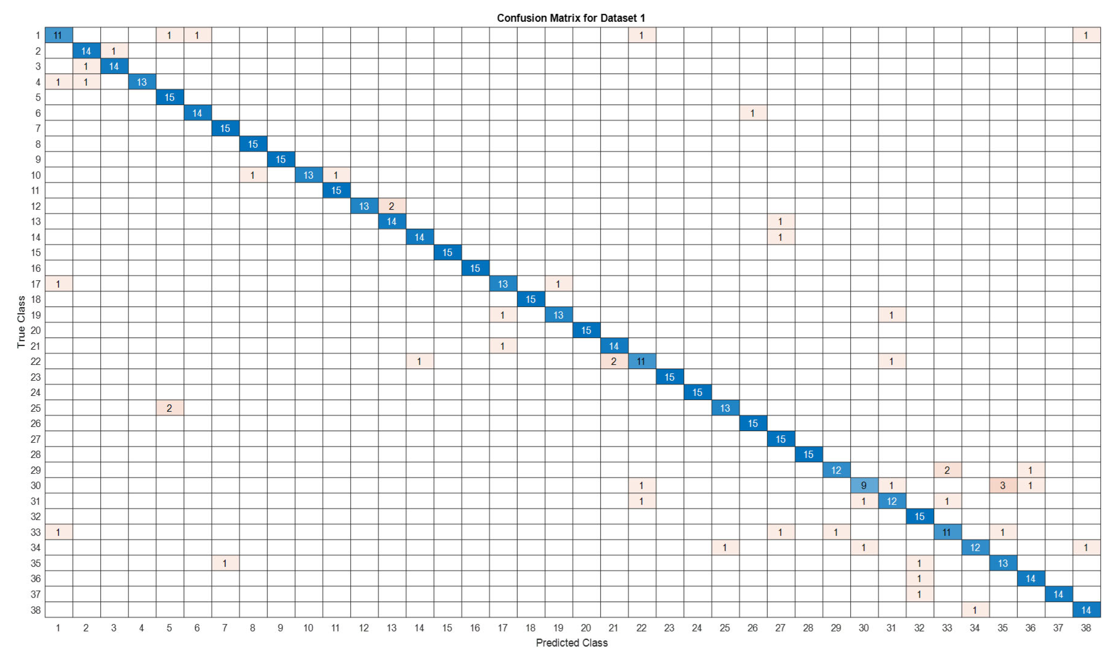
3.5. Deep Learning Model’s Development and Analysis
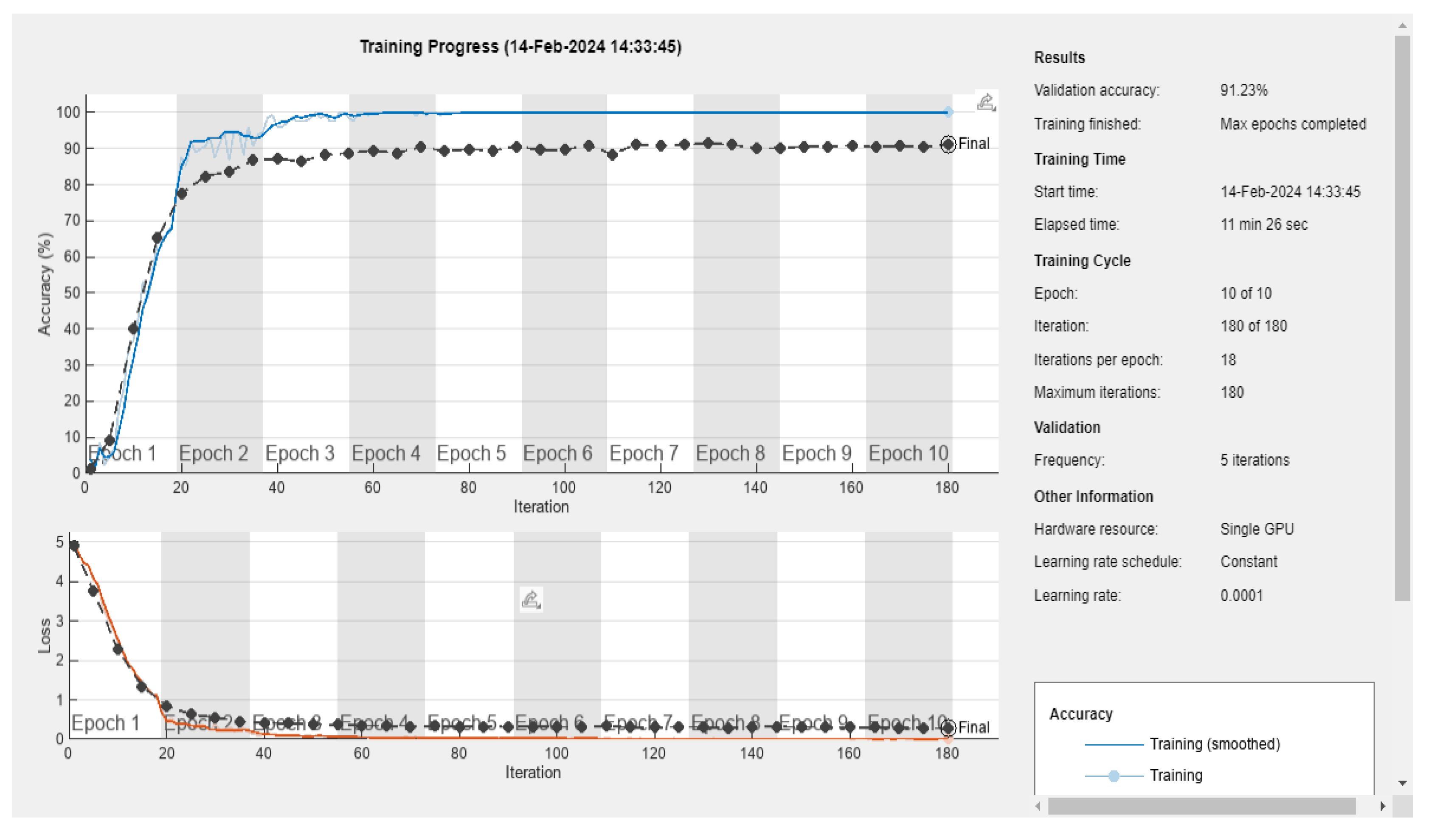
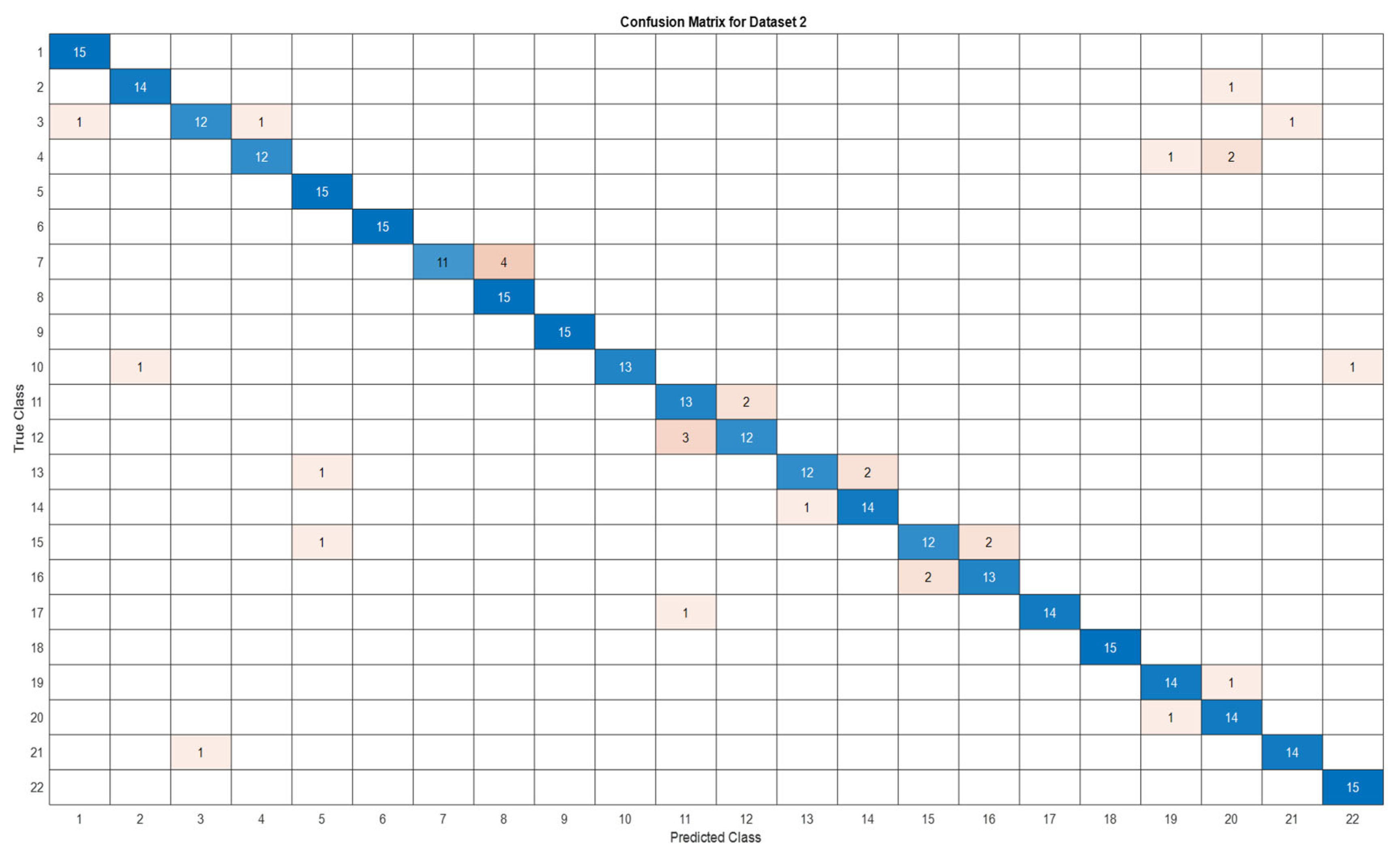
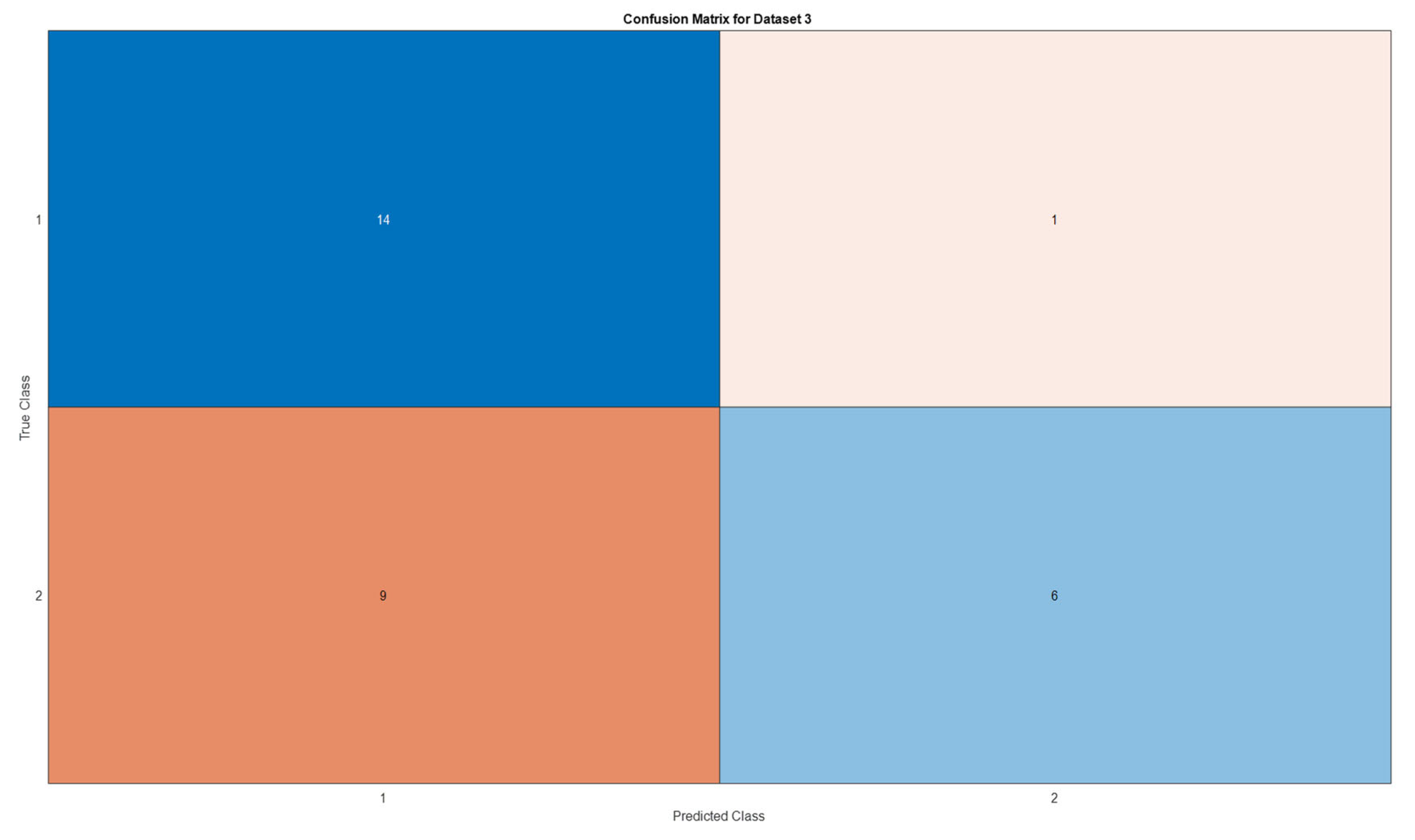
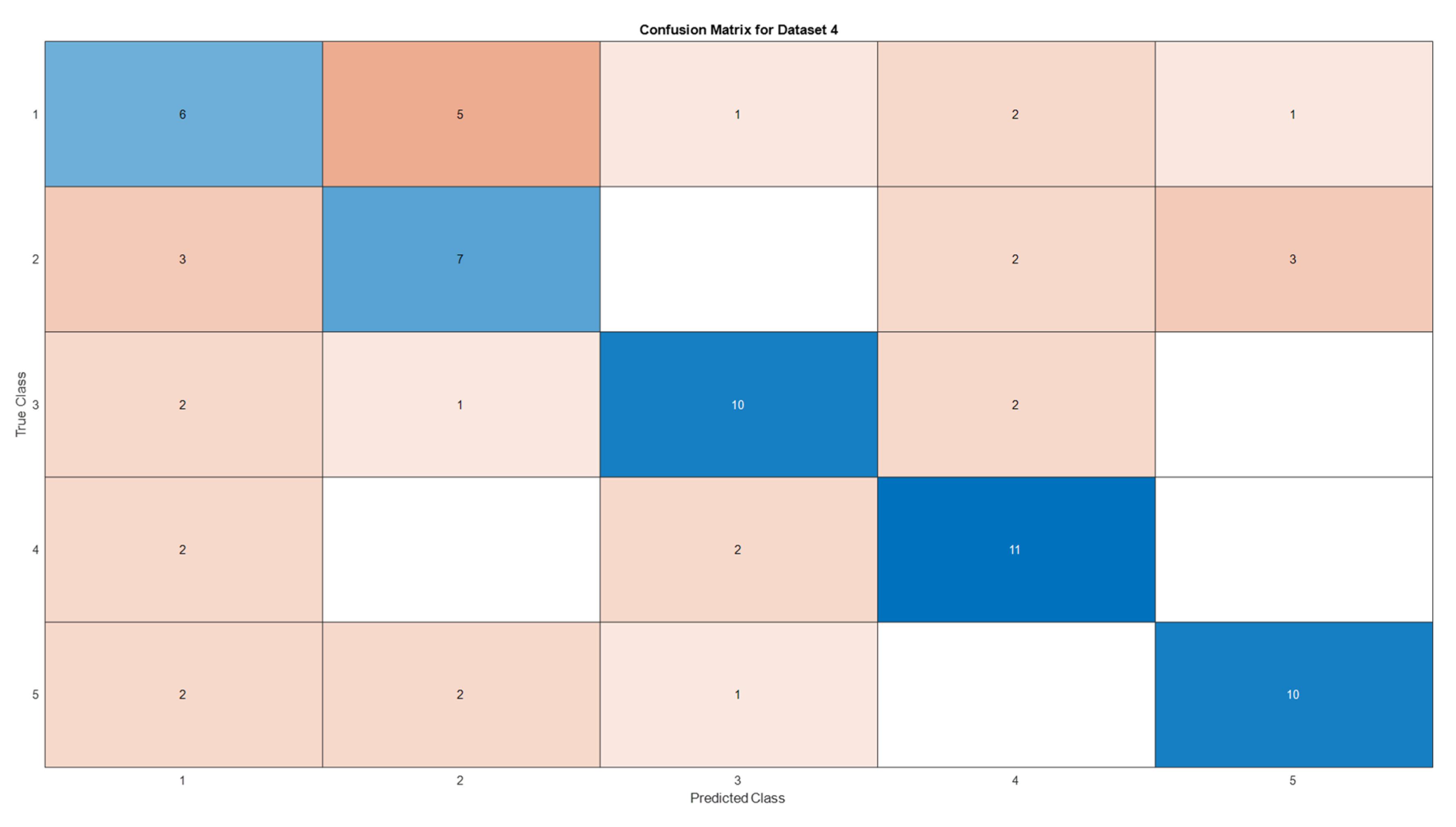
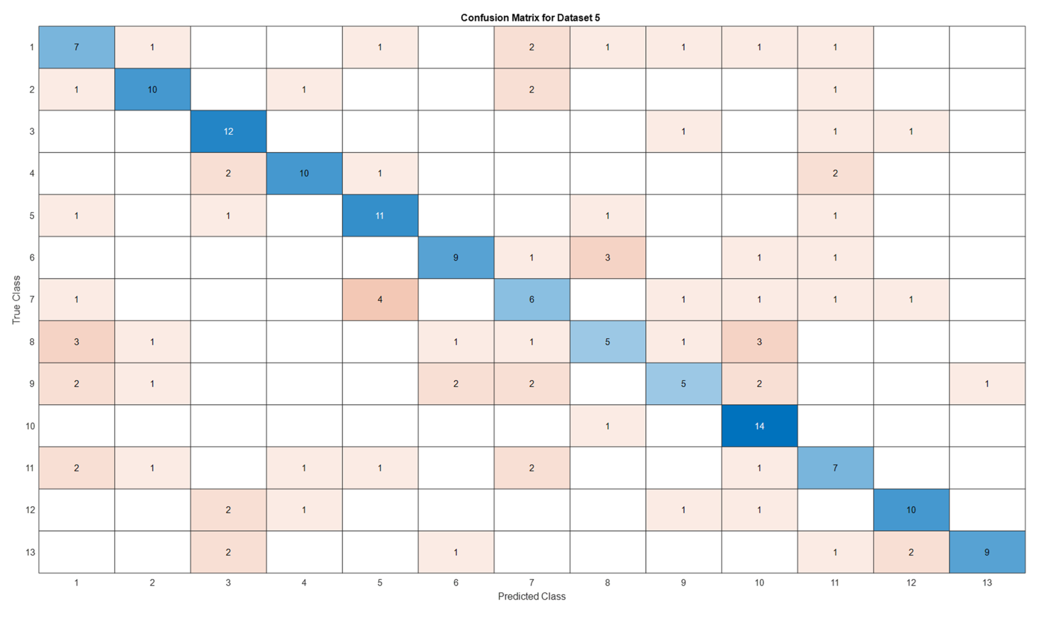
| Datasets | Av. accuracy | Av. precision | Av. recall | Av. F1-score |
|---|---|---|---|---|
| D1 | 0.9122 | 0.9141 | 0.9123 | 0.9111 |
| D2 | 0.9060 | 0.9116 | 0.9061 | 0.9056 |
| D3 | 0.6666 | 0.7329 | 0.6667 | 0.6411 |
| D4 | 0.5866 | 0.5885 | 0.5867 | 0.5867 |
| D5 | 0.5897 | 0.5996 | 0.5897 | 0.5852 |
4. Conclusion
5. Recommendations and Future Works
- Reference to the GLCM Metrics distribution across the datasets, the results emphasize how crucial it is to carry out a more thorough investigation in order to comprehend the fundamental causes of the variations in GLCM metric scores between datasets that are field- and lab-based. The possible effects of these variations on the effectiveness of deep learning or machine learning applications in the identification of plant diseases are also called into question. To improve texture analysis techniques' resilience and dependability as well as their use in practical situations, these issues might need to be resolved.
- Owing to the limitations of this study in terms of generalization, the findings may be constrained by the specific plant disease datasets and deep learning methodologies employed. Generalizing the results to broader contexts, diverse plant classes or other datasets deserves caution and further authentication.
- Deep learning models trained in this work may not be as robust or as generalizable due to the inherent biases and constraints of the chosen plant disease datasets, which include differences in image quality, disease severity, and class diversity. Acquiring datasets on plant diseases from multiple sources and repositories in order to encompass a wider range of plant species, diseases, and environmental factors will be great development. Furthermore, to maintain consistency and comparability across various datasets, standardizing the procedures for acquiring such images, annotating them, and curating the data is recommended. This entails developing standards for camera settings, illumination, image resolution, and disease severity rating.
- The incorporation of multispectral imaging techniques may allow for the acquisition of spectral information beyond the visible spectrum, thereby improving disease detection capacities and resilience to environmental variability.
- Future research could investigate the integration of other texture descriptors, such as Gabor filters or Local Binary Patterns (LBP), in addition to the GLCM metrics that were the focus of our study on texture analysis. This multi-modal method could lead to improved model performance by offering a more thorough analysis of texture features in plant disease images.
- Improving model generalizability and guaranteeing dependable performance across various imaging conditions and illness scenarios require addressing dataset biases and variability in texture features. To improve the accuracy and dependability of automated plant disease detection systems, future research should concentrate on creating strong feature extraction techniques and model architectures that can adjust to changes in textural characteristics and environmental factors.
Author Contributions
Funding
Data Availability Statement
Acknowledgments
Conflicts of Interest
References
- FAO. The State of Food and Agriculture, 1974, Lancet 1975, 306, 313–314. [CrossRef]
- FAO. FAO - News Article: New standards to curb the global spread of plant pests and diseases. Fao, (2018), 2020. https://www.fao.org/news/story/en/item/1187738/icode/ (accessed August 14, 2022).
- Horst, R.K. Plant Diseases and Their Pathogens. Westcott’s Plant Dis. Handb. 2001, 65–530. [CrossRef]
- FAO. International Year of Plant Health – Final report. FAO 2021. [CrossRef]
- Buja, I.; Sabella, E.; Monteduro, A.G.; Chiriacò, M.S.; De Bellis, L.; Luvisi, A.; Maruccio, G. Advances in plant disease detection and monitoring: From traditional assays to in-field diagnostics. Sensors 2021, 21, 1–22. [CrossRef]
- Strange, R.N.; Scott, P.R. Plant Disease: A Threat to Global Food Security. Annu. Rev. Phytopathol. 2005, 43, 83–116. [CrossRef]
- Witten, I.H.; Cunningham, S.; Holmes, G.; McQueen, R.J.; Smith, L.A. Practical Machine Learning and its Potential Application to Problems in Agriculture. In Proc New Zeal. Comput. Conf., Department of Computer Science, University of Waikato, 1993, pp. 308–325. https://researchcommons.waikato.ac.nz/handle/10289/9915 (accessed July 6, 2023).
- Shrivastava, V.K.; Pradhan, M.K. Rice plant disease classification using color features: a machine learning paradigm. J. Plant Pathol. 2021, 103, 17–26. [CrossRef]
- Lecun, Y.; Bengio, Y.; Hinton, G. Deep learning. Nature 2015, 521, 436–444. [CrossRef]
- Tibdewal, M.N.; Kulthe, Y.M.; Bharambe, A.; Farkade, A.; Dongre, A. Deep Learning Models for Classification of Cotton Crop Disease Detection. Zeichen J. 2022.
- Prakash, N.; Udayakumar, E.; Kumareshan, N. Design and development of Android based Plant disease detection using Arduino. In 2020 7th Int. Conf. Smart Struct. Syst. ICSSS 2020, Institute of Electrical and Electronics Engineers Inc., 2020. [CrossRef]
- A, P.; S, B.K.; Murugan, D. Paddy Leaf diseases identification on Infrared Images based on Convolutional Neural Networks. 2022. [CrossRef]
- Ahmad, A.; Saraswat, D.; El Gamal, A. A survey on using deep learning techniques for plant disease diagnosis and recommendations for development of appropriate tools. Smart Agric. Technol. 2023, 3, 100083. [CrossRef]
- Hughes, D.P.; Salathe, M. An open access repository of images on plant health to enable the development of mobile disease diagnostics. 2015. http://arxiv.org/abs/1511.08060 (accessed July 24, 2022). [CrossRef]
- Pardede, H.F.; Suryawati, E.; Zilvan, V.; Ramdan, A.; Kusumo, R.B.S.; Heryana, A.; Yuwana, R.S.; Krisnandi, D.; Subekti, A.; Fauziah, F.; Rahadi, V.P. Plant diseases detection with low resolution data using nested skip connections. J. Big Data. 2020. [CrossRef]
- Thakur, P.S.; Sheorey, T.; Ojha, A. VGG-ICNN: A Lightweight CNN model for crop disease identification. Multimed. Tools Appl. 2023, 82, 497–520. [CrossRef]
- Nagi, R.; Tripathy, S.S. Plant disease identification using fuzzy feature extraction and PNN. Signal, Image Video Process. 2023, 1–7. [CrossRef]
- Hanh, B.T.; Manh, H.V.; Nguyen, N.V. Enhancing the performance of transferred efficientnet models in leaf image-based plant disease classification. J. Plant Dis. Prot. 2022, 129, 623–634. [CrossRef]
- Wiesner-Hanks, T.; Stewart, E.L.; Kaczmar, N.; Dechant, C.; Wu, H.; Nelson, R.J.; Lipson, H.; Gore, M.A. Image set for deep learning: Field images of maize annotated with disease symptoms. BMC Res. Notes. 2018, 11, 1–3. [CrossRef]
- Barbedo, J.G.A.; Koenigkan, L.V.; Halfeld-Vieira, B.A.; Costa, R.V.; Nechet, K.L.; Godoy, C.V.; Junior, M.L.; Patricio, F.R.A.; Talamini, V.; Chitarra, L.G.; Oliveira, S.A.S.; Ishida, A.K.N.; Fernandes, J.M.C.; Santos, T.T.; Cavalcanti, F.R.; Terao, D.; Angelotti, F. Annotated plant pathology databases for image-based detection and recognition of diseases. 2018. [CrossRef]
- Pérez-Enciso, M.; Zingaretti, L.M. A Guide for Using Deep Learning for Complex Trait Genomic Prediction. Genes (Basel). 2019, 10, 553. [CrossRef]
- Singh, D.; Jain, N.; Jain, P.; Kayal, P.; Kumawat, S.; Batra, N. PlantDoc: A dataset for visual plant disease detection. In ACM Int. Conf. Proceeding Ser.; Association for Computing Machinery, 2020, pp. 249–253. [CrossRef]
- Oyewola, D.O.; Dada, E.G.; Misra, S.; Damaševičius, R. Detecting cassava mosaic disease using a deep residual convolutional neural network with distinct block processing. PeerJ Comput. Sci. 2021, 7, 1–15. [CrossRef]
- Parraga-Alava, J.; Cusme, K.; Loor, A.; Santander, E. RoCoLe: A robusta coffee leaf images dataset for evaluation of machine learning based methods in plant diseases recognition. Data Br. 2019, 25, 104414. [CrossRef]
- Zhang, X.; Han, L.; Dong, Y.; Shi, Y.; Huang, W.; Han, L.; González-Moreno, P.; Ma, H.; Ye, H.; Sobeih, T. A Deep Learning-Based Approach for Automated Yellow Rust Disease Detection from High-Resolution Hyperspectral UAV Images. Remote Sens. 2019, 11, 1554. [CrossRef]
- Bhakta, I.; Phadikar, S.; Majumder, K. Thermal Image Augmentation with Generative Adversarial Network for Agricultural Disease Prediction. In Lect. Notes Networks Syst.; Springer Science and Business Media Deutschland GmbH, 2022, pp. 345–354. [CrossRef]
- Mohanty, S.P.; Hughes, D.P.; Salathé, M. Using deep learning for image-based plant disease detection. Front. Plant Sci. 2016. [CrossRef]
- Chen, M.; French, A.P.; Gao, L.; Ramcharan, A.; Hughes, D.P.; Mccloskey, P.; Baranowski, K.; Mbilinyi, N.; Mrisho, L.; Ndalahwa, M.; Legg, J.; Hughes, D.P. A Mobile-Based Deep Learning Model for Cassava Disease Diagnosis. Front. Plant Sci. 2019, 10, 272. [CrossRef]
- Johannes, A.; Picon, A.; Alvarez-Gila, A.; Echazarra, J.; Rodriguez-Vaamonde, S.; Navajas, A.D.; Ortiz-Barredo, A. Automatic plant disease diagnosis using mobile capture devices, applied on a wheat use case. Comput. Electron. Agric. 2017, 138, 200–209. [CrossRef]
- Ahmad, J.; Jan, B.; Farman, H.; Ahmad, W.; Ullah, A. Disease detection in plum using convolutional neural network under true field conditions. Sensors 2020, 20, 1–18. [CrossRef]
- Petchiammal; Kiruba, B.; Murugan, P. Arjunan; Paddy Doctor: A Visual Image Dataset for Automated Paddy Disease Classification and Benchmarking. In *Proc. 6th Jt. Int. Conf. Data Sci. Manag. Data (10th ACM IKDD CODS 28th COMAD), ACM, New York, NY, USA, 2023, pp. 203–207. [CrossRef]
- Mikołajczyk, A.; Grochowski, M. Data augmentation for improving deep learning in image classification problem. In 2018 Int. Interdiscip. PhD Work. IIPhDW 2018; Institute of Electrical and Electronics Engineers Inc., 2018, pp. 117–122. [CrossRef]
- Velásquez, A.C.; Castroverde, C.D.M.; He, S.Y. Plant–Pathogen Warfare under Changing Climate Conditions. Curr. Biol. 2018, 28, R619–R634. [CrossRef]
- Wang, Q.; He, G.; Li, F.; Zhang, H. A novel database for plant diseases and pests classification. ICSPCC 2020 - IEEE Int. Conf. Signal Process. Commun. Comput. Proc. 2020. [CrossRef]
- Gadkari, D. Image Quality Analysis Using GLCM. Electron. Theses Diss. 2004, 1–120. https://stars.library.ucf.edu/etd/187.
- Hall-Beyer, M. Practical guidelines for choosing GLCM textures to use in landscape classification tasks over a range of moderate spatial scales. Int. J. Remote Sens. 2017, 38, 1312–1338. [CrossRef]
- Mall, P.K.; Singh, P.K.; Yadav, D. GLCM based feature extraction and medical X-RAY image classification using machine learning techniques. 2019 IEEE Conf. Inf. Commun. Technol. CICT 2019. 2019. [CrossRef]
- Kadir, A. A Model of Plant Identification System Using GLCM, Lacunarity And Shen Features. Publ. Res. J. Pharm. Biol. Chem. Sci. 2014, 5, 1–10. https://arxiv.org/abs/1410.0969v1.
- Shoaib, M.; Shah, B.; EI-Sappagh, S.; Ali, A.; Ullah, A.; Alenezi, F.; Gechev, T.; Hussain, T.; Ali, F. An advanced deep learning models-based plant disease detection: A review of recent research. Front. Plant Sci. 2023, 14, 1158933. [CrossRef]
- Gupta, H.P.; Chopade, S.; Dutta, T. Computational Intelligence in Agriculture. In Emerg. Comput. Paradig.; John Wiley & Sons, Ltd, 2022, pp. 125–142. [CrossRef]
- Wang, G.; Sun, Y.; Wang, J. Automatic Image-Based Plant Disease Severity Estimation Using Deep Learning. Comput. Intell. Neurosci. 2017, 2017. [CrossRef]
- Barbedo, J.G.A. Factors influencing the use of deep learning for plant disease recognition. Biosyst. Eng. 2018, 172, 84–91. [CrossRef]
- Barbedo, J.G.A. Impact of dataset size and variety on the effectiveness of deep learning and transfer learning for plant disease classification. Comput. Electron. Agric. 2018, 153, 46–53. [CrossRef]
- Theodoridis, S. Machine Learning: A Bayesian and Optimization Perspective, Second Edition, 2020. [CrossRef]
Disclaimer/Publisher’s Note: The statements, opinions and data contained in all publications are solely those of the individual author(s) and contributor(s) and not of MDPI and/or the editor(s). MDPI and/or the editor(s) disclaim responsibility for any injury to people or property resulting from any ideas, methods, instructions or products referred to in the content. |
© 2024 by the authors. Licensee MDPI, Basel, Switzerland. This article is an open access article distributed under the terms and conditions of the Creative Commons Attribution (CC BY) license (http://creativecommons.org/licenses/by/4.0/).


