Submitted:
21 May 2024
Posted:
22 May 2024
You are already at the latest version
Abstract
Keywords:
Introduction
Related Work
Dataset
| Variable | Description | Minimum | Maximum | Mean | Std. Deviation |
|---|---|---|---|---|---|
| Age | years | 20.000 | 72.000 | 47.280 | 9.662 |
| Gender | Male or female | ||||
| SBP | Systolic blood pressure | 109.000 | 166.000 | 132.763 | 13.859 |
| DBP | Diastolic blood pressure | 64.000 | 122.000 | 82.091 | 7.022 |
| BP history or Medication | blood pressure history or Medication | ||||
| Smoking habits | Smoker or non-smoker | ||||
| Excerise | Yes or no | ||||
| family history | Yes or no | ||||
| Height | Cm (height at the highest point of your head.) | 147.000 | 186.000 | 165.866 | 7.273 |
| Weight | kg | 52.500 | 146.000 | 83.708 | 16.195 |
| Body Mass Index (BMI) |
<- 18= underweight 18-24= Normal 25-29= overweight 30-34= obese >-35= morbid obese |
20.833 | 48.223 | 30.460 | 5.753 |
| Visceral fat |
1-9 = Normal 10-14= + High 15-30 Very High |
7.000 | 25.000 | 11.690 | 2.684 |
| Waist Circumference (cm) |
Men: less than 94cm (37 inches) Women: less than 80cm (31.5 inches) |
64.000 | 147.000 | 103.220 | 18.328 |
| Hip area | around the largest part of the hips — the widest part of the buttocks | 84.000 | 141.000 | 106.198 | 10.959 |
| waist to height |
Men: <-0.46-0.53= health 0.53-0.63= Overweight >0.63 = Obese For women: <-0.46-0.49= health 0.49-0.58= Overweight >0.58 = Obese |
0.403 | 0.925 | 0.623 | 0.114 |
| Waist to Hip Ratio |
Men: <-89= Good 90-95= average >95 = at Risk For women: <-79= Good 89-86= average >86 = at Risk |
0.719 | 1.441 | 0.972 | 0.143 |
| HbA1c |
<5.6 = Normal 5.6-6.4= prediabetic >6.4 diabetic |
4.500 | 11.400 | 6.282 | 1.226 |
| FBS |
<90 = Normal 91-124 = prediabetic >125 = diabetic |
76.000 | 340.000 | 127.659 | 45.781 |
| Insulin uU/ml |
< 20 = normal >20 = hyperinsulinemia |
5.300 | 37.700 | 16.593 | 8.845 |
| Homo-IR |
<1.0 = low insulin resistance 1.0-1.9 = borderline Insulin resistance >2 = high insulin resistance |
1.040 | 17.170 | 5.715 | 4.178 |
| Total Cholesterol |
<5.2 mmol/L=. Normal 5.2-6.2 mmol/L= Borderline High > 6.2 mmol/L= High |
3.160 | 11.010 | 5.484 | 1.093 |
| LDL |
Optimal: Less than 2.59 mmol/L Near optimal/above optimal: 2.59 to 3.34 mmol/L Borderline high: 3.37 to 4.12 mmol/L High: 4.15 to 4.90 mmol/L Very high: 4.91 mmol/L and above |
1.650 | 7.850 | 3.415 | 1.024 |
| HDL |
Men: >1.04 mmol/L =Normal < 1.04 mmol/L= Low Women: >1.29 mmol/l = Normal < 1.29 mmol/L= Low |
0.670 | 2.500 | 1.173 | 0.256 |
| TC/HDL Ratio |
Ideal Ratio: < 4.0 Moderate Risk Ratio: Between 4.0 and 5.0 Higher Risk Ratio: > 5.0 |
1.920 | 9.540 | 4.907 | 1.504 |
| LDL/HDL Ratio |
Men: Ideal Ratio: < 2.0 Moderate Risk Ratio: Between 2.0 and 4.0 Higher Risk Ratio: >4.0 Women: Ideal Ratio: < 1.5 Moderate Risk Ratio: Between 1.5 and 3.0 Higher Risk Ratio: >3.0 |
0.355 | 7.816 | 2.446 | 1.568 |
| Non-HDL |
Optimal: Less than 130 mg/dL Near Optimal: 130-159 mg/dL Borderline High: 160-189 mg/dL High: 190-219 mg/dL Very High: 220 mg/dL and above |
0.988 | 9.410 | 3.634 | 1.680 |
| Triglycerides |
Normal: Less than 1.7 mmol/L Borderline High: 1.7 to 2.2 mmol/L High: 2.3 to 5.6 mmol/L Very High: Greater than 5.6 mmol/L |
0.410 | 4.540 | 2.093 | 0.776 |
| Very low-density lipoprotein |
0.13 to 1.04 mmol/L= Normal > 1.04 mmol/l = High |
0.186 | 2.064 | 0.951 | 0.353 |
Methodology
- Preprocess the data: Clean and prepare the data by handling missing values, normalizing the data, and removing any irrelevant or redundant features.
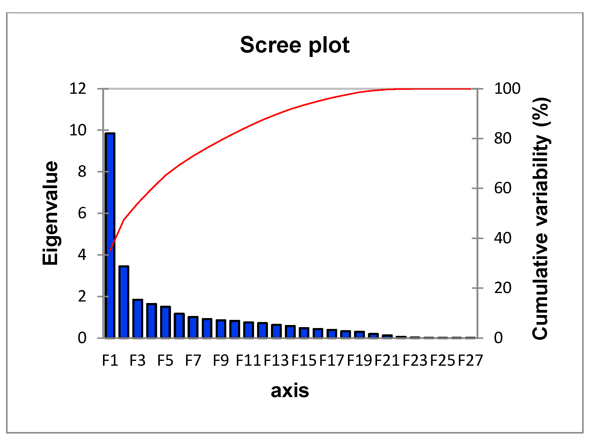
- Conduct PCA: Use a PCA algorithm to calculate the principal components of the data. This will typically involve calculating the covariance matrix of the data, performing singular value decomposition (SVD) on the matrix, and then selecting the top k principal components that explain the most variance in the data.
- Visualize the data: Use visualization techniques such as scatter plots to plot the data in the reduced-dimension space defined by the principal components. This can help to identify patterns and clusters in the data.
- Apply FCM: Use the FCM algorithm to cluster the data into a specified number of clusters. This will involve defining the number of clusters, initializing the cluster centers, and iteratively adjusting the membership of each data point to the different clusters based on the distance to the cluster centers.
- Evaluate the results: Use evaluation metrics such as the silhouette score to assess the quality of the clusters. visualize the clusters to examine their characteristics of the clusters.
Principal Component Analysis (PCA)
- Given a data matrix X with n observations and p features, we want to find a new set of p' features (p' ≤ p) that capture the most variation in the data.
- The new features are linear combinations of the original features and are represented by a matrix Y: Y = X * W, where W is a p x p' matrix called the loading matrix.
- The loading matrix is found by solving the following optimization problem:
- The loading matrix W can be found using singular value decomposition (SVD) or eigenvalue decomposition (EVD).
- The new features can be ranked by their contribution to the variation in the data. The first PC is the new feature that captures the most variation, the second PC captures the second most variation, and so on.
Fuzzy C-Means Clustering (FCM)
- Given a dataset X with n data points and m features, and the desired number of clusters k, the objective of FCM is to partition the data points into k clusters such that the sum of squared errors (SSE) is minimized.
- The SSE is calculated as:
- The membership values cij are calculated as:
Conclusion and Discussion
References
- “Cardiovascular diseases (CVDs).” https://www.who.int/news-room/fact-sheets/detail/cardiovascular-diseases-(cvds) (accessed May 19, 2024).
- S. Takeshita et al., “Novel subgroups of obesity and their association with outcomes: a data-driven cluster analysis,” BMC Public Health, vol. 24, no. 1, 2024. [CrossRef]
- R. Vijayarajan and S. Muttan, “Fuzzy C-means clustering based principal component averaging fusion,” Int. J. Fuzzy Syst., vol. 16, no. 2, 2014.
- C. Violán et al., “Soft clustering using real-world data for the identification of multimorbidity patterns in an elderly population: Cross-sectional study in a Mediterranean population,” BMJ Open, vol. 9, no. 8, 2019. [CrossRef]
- C. E. Ndumele et al., “Obesity and Subtypes of Incident Cardiovascular Disease,” J. Am. Heart Assoc., vol. 5, no. 8, 2016. [CrossRef]
- F. B. Ortega, C. J. Lavie, and S. N. Blair, “Obesity and cardiovascular disease,” Circulation Research, vol. 118, no. 11. Lippincott Williams and Wilkins, pp. 1752–1770, May 27, 2016. [CrossRef]
- L. Li, Q. Song, and X. Yang, “K-means clustering of overweight and obese population using quantile-transformed metabolic data,” Diabetes, Metab. Syndr. Obes., vol. 12, 2019. [CrossRef]
- A. Chusyairi and P. R. N. Saputra, “Fuzzy C-Means Clustering Algorithm For Grouping Health Care Centers On Diarrhea Disease,” Int. J. Artif. Intell. Res., vol. 5, no. 1, 2021. [CrossRef]
- B. R. Reddy, Y. Vijay Kumar, and M. Prabhakar, “Clustering large amounts of healthcare datasets using fuzzy c-means algorithm,” in 2019 5th International Conference on Advanced Computing and Communication Systems, ICACCS 2019, 2019. [CrossRef]
- S. Handoyo, A. Widodo, W. H. Nugroho, and I. N. Purwanto, “The implementation of a hybrid fuzzy clustering on the public health facility data,” Int. J. Adv. Trends Comput. Sci. Eng., vol. 8, no. 6, 2019. [CrossRef]
- C. E. Friesen, P. Seliske, and A. Papadopoulos, “Using Principal Component Analysis to Identify Priority Neighbourhoods for Health Services Delivery by Ranking Socioeconomic Status,” Online J. Public Health Inform., vol. 8, no. 2, 2016. [CrossRef]
- E. F. Jackson, A. Siddiqui, H. Gutierrez, A. M. Kanté, J. Austin, and J. F. Phillips, “Estimation of indices of health service readiness with a principal component analysis of the Tanzania Service Provision Assessment Survey,” BMC Health Serv. Res., vol. 15, no. 1, 2015. [CrossRef]
- G. S. M. Khamis and S. M. Alanazi, “Exploring sex disparities in cardiovascular disease risk factors using principal component analysis and latent class analysis techniques,” BMC Med. Inform. Decis. Mak., vol. 23, no. 1, 2023. [CrossRef]
- A. Chatterjee, M. W. Gerdes, and S. G. Martinez, “Identification of risk factors associated with obesity and overweight—a machine learning overview,” Sensors (Switzerland), vol. 20, no. 9, 2020. [CrossRef]
- M. Safaei, E. A. Sundararajan, M. Driss, W. Boulila, and A. Shapi’i, “A systematic literature review on obesity: Understanding the causes & consequences of obesity and reviewing various machine learning approaches used to predict obesity,” Computers in Biology and Medicine, vol. 136. 2021. [CrossRef]
- F. Ferdowsy, K. S. A. Rahi, M. I. Jabiullah, and M. T. Habib, “A machine learning approach for obesity risk prediction,” Curr. Res. Behav. Sci., vol. 2, 2021. [CrossRef]
- M. Negahbani, S. Joulazadeh, H. R. Marateb, and M. Mansourian, “Coronary Artery Disease Diagnosis Using Supervised Fuzzy C-Means with Differential Search Algorithm-based Generalized Minkowski Metrics,” Arch. Biomed. Sci. Eng., 2015. [CrossRef]
- I. J.- Technometrics and undefined 2003, “Principal component analysis,” search.proquest.comIT JolliffeTechnometrics, 2003•search.proquest.com, Accessed: Mar. 14, 2024. [Online]. Available: https://search.proquest.com/openview/759ac31230fa617356d7c8b774ba845e/1?pq-origsite=gscholar&cbl=24108.
- J. Shlens, “A Tutorial on Principal Component Analysis,” Apr. 2014, Accessed: Mar. 14, 2024. [Online]. Available: http://arxiv.org/abs/1404.1100.
- Z. Zhang and A. Castelló, “Principal components analysis in clinical studies,” Ann. Transl. Med., vol. 5, no. 17, 2017. [CrossRef]
- L. Gour et al., “Characterization of rice (Oryza sativa L.) genotypes using principal component analysis including scree plot & rotated component matrix,” ~ 975 ~ Int. J. Chem. Stud., vol. 5, no. 4, 2017.
- Y. Chen, S. Zhou, X. Zhang, D. Li, and C. Fu, “Improved fuzzy c-means clustering by varying the fuzziness parameter,” Pattern Recognit. Lett., vol. 157, 2022. [CrossRef]
- W. Xiao, Y. Zhao, X. Gao, C. Liao, S. Huang, and L. Deng, “Implementation of Fuzzy C-Means (FCM) Clustering Based Camouflage Image Generation Algorithm,” IEEE Access, vol. 9, 2021. [CrossRef]
- K. Zhou and S. Yang, “Effect of cluster size distribution on clustering: a comparative study of k-means and fuzzy c-means clustering,” Pattern Anal. Appl., vol. 23, no. 1, 2020. [CrossRef]
- H. Li, L. Dou, S. Li, Y. Kang, X. Yang, and H. Dong, “Abnormal State Detection of OLTC Based on Improved Fuzzy C-means Clustering,” Chinese J. Electr. Eng., vol. 9, no. 1, 2023. [CrossRef]
- X. Xu, H. Zhang, C. Yang, X. Zhao, and B. Li, “Fairness constraint of Fuzzy C-means Clustering improves clustering fairness,” in Proceedings of Machine Learning Research, 2021.
- C. Wang, W. Pedrycz, J. Bin Yang, M. C. Zhou, and Z. W. Li, “Wavelet Frame-Based Fuzzy C-Means Clustering for Segmenting Images on Graphs,” IEEE Trans. Cybern., vol. 50, no. 9, 2020. [CrossRef]
- E. R. Hruschka and N. F. F. Ebecken, “A genetic algorithm for cluster analysis,” Intell. Data Anal., vol. 7, no. 1, 2003. [CrossRef]
- J. C. Bezdek, Pattern Recognition with Fuzzy Objective Function Algorithms. 1981. [CrossRef]
- P. J. Rousseeuw, “Silhouettes: A graphical aid to the interpretation and validation of cluster analysis,” J. Comput. Appl. Math., vol. 20, no. C, 1987. [CrossRef]
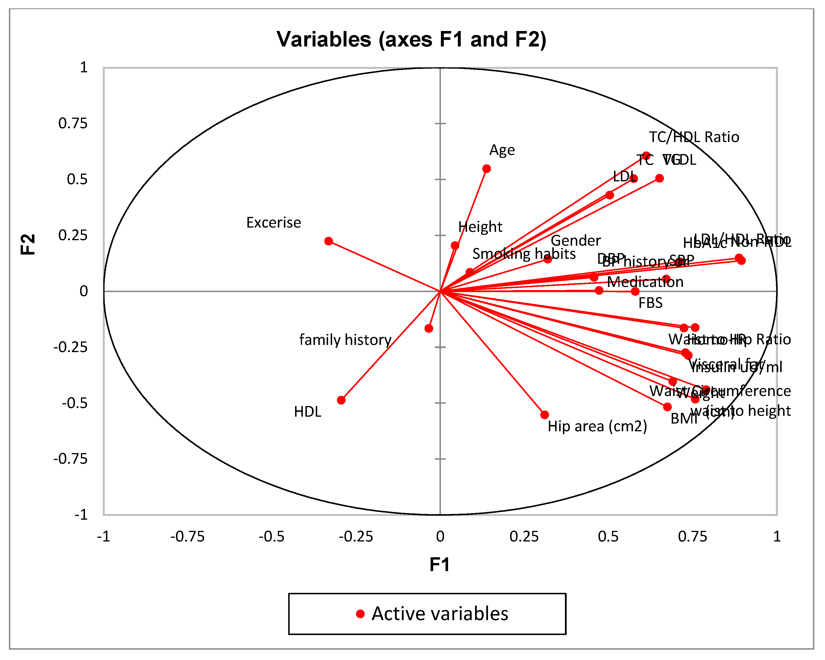
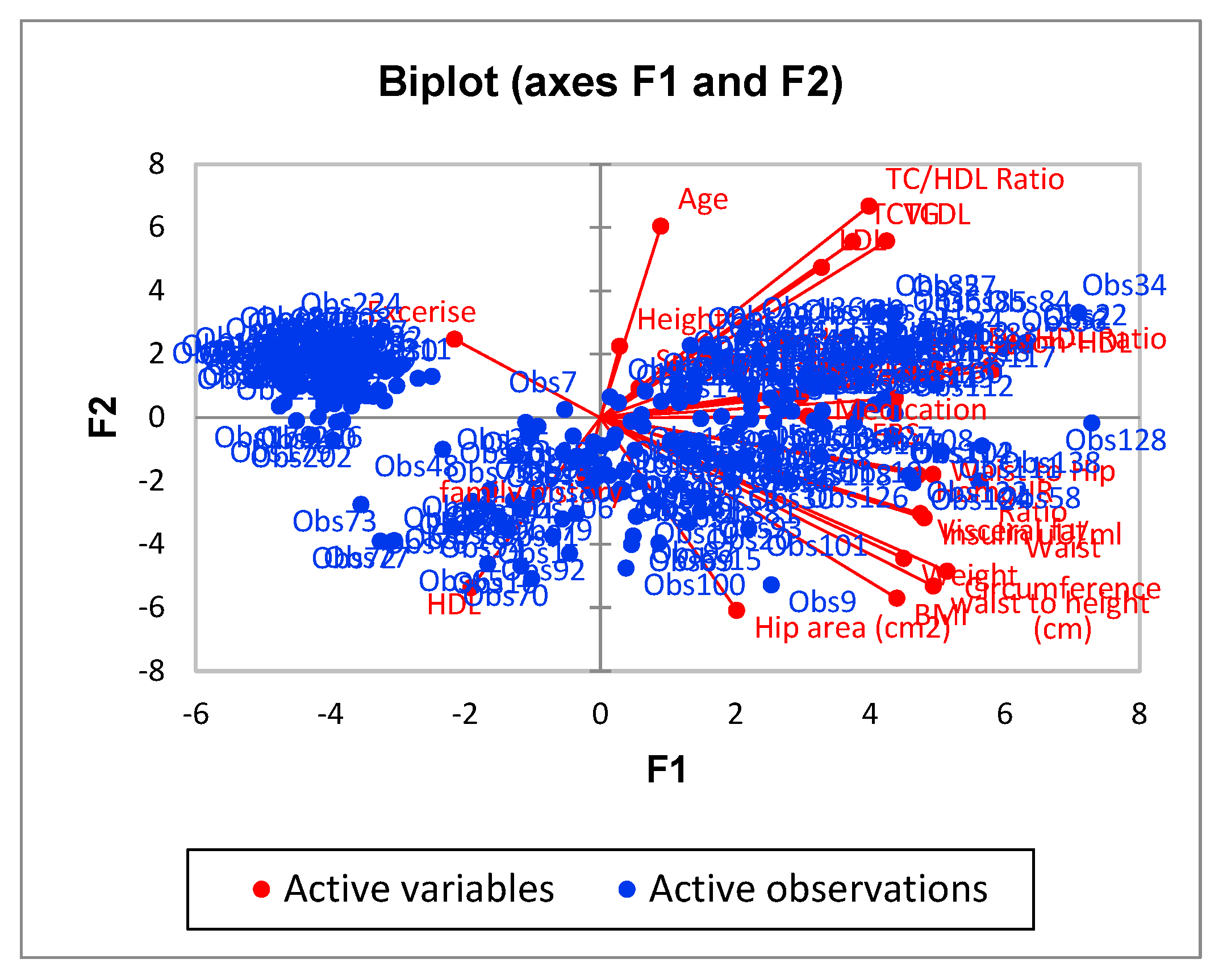
| F1 | F2 | F3 | F4 | F5 | |
|---|---|---|---|---|---|
| Age | 0.019 | 0.301 | 0.000 | 0.014 | 0.030 |
| Gender | 0.102 | 0.021 | 0.035 | 0.436 | 0.003 |
| SBP | 0.451 | 0.003 | 0.024 | 0.025 | 0.081 |
| DBP | 0.209 | 0.004 | 0.002 | 0.000 | 0.379 |
| BP history or Medication | 0.222 | 0.000 | 0.026 | 0.013 | 0.385 |
| Smoking habits | 0.008 | 0.007 | 0.040 | 0.342 | 0.055 |
| Exercise | 0.110 | 0.050 | 0.017 | 0.004 | 0.009 |
| family history | 0.001 | 0.027 | 0.012 | 0.013 | 0.301 |
| Height | 0.002 | 0.042 | 0.003 | 0.311 | 0.001 |
| Weight | 0.477 | 0.162 | 0.039 | 0.050 | 0.025 |
| BMI | 0.456 | 0.268 | 0.052 | 0.002 | 0.033 |
| Visceral fat | 0.530 | 0.075 | 0.093 | 0.021 | 0.000 |
| Waist Circumference (cm) | 0.623 | 0.194 | 0.010 | 0.030 | 0.002 |
| Hip area (cm2) | 0.096 | 0.305 | 0.006 | 0.065 | 0.065 |
| waist to height | 0.574 | 0.232 | 0.011 | 0.002 | 0.001 |
| Waist to Hip Ratio | 0.573 | 0.026 | 0.002 | 0.129 | 0.018 |
| HbA1c | 0.506 | 0.018 | 0.031 | 0.045 | 0.042 |
| FBS | 0.335 | 0.000 | 0.310 | 0.000 | 0.039 |
| Insulin uU/ml | 0.543 | 0.082 | 0.129 | 0.029 | 0.001 |
| Homo-IR | 0.524 | 0.027 | 0.335 | 0.010 | 0.011 |
| TC | 0.330 | 0.254 | 0.166 | 0.000 | 0.000 |
| LDL | 0.253 | 0.185 | 0.227 | 0.001 | 0.004 |
| HDL | 0.087 | 0.237 | 0.206 | 0.001 | 0.000 |
| TC/HDL Ratio | 0.374 | 0.367 | 0.002 | 0.006 | 0.000 |
| LDL/HDL Ratio | 0.788 | 0.022 | 0.012 | 0.002 | 0.007 |
| Non-HDL | 0.801 | 0.019 | 0.031 | 0.002 | 0.001 |
| TG | 0.424 | 0.256 | 0.008 | 0.040 | 0.007 |
| VLDL | 0.424 | 0.256 | 0.008 | 0.040 | 0.007 |
| Metrics | BCV | PC | PE | SS | |
|---|---|---|---|---|---|
| Models | |||||
| Model1 | 62.65 | 0.78 | -0.39 | 0.556 | |
| Model2 | 112.96 | 0.77 | -0.43 | 0.575 | |
| Model3 | 81.79 | 0.61 | -0.79 | 0.368 | |
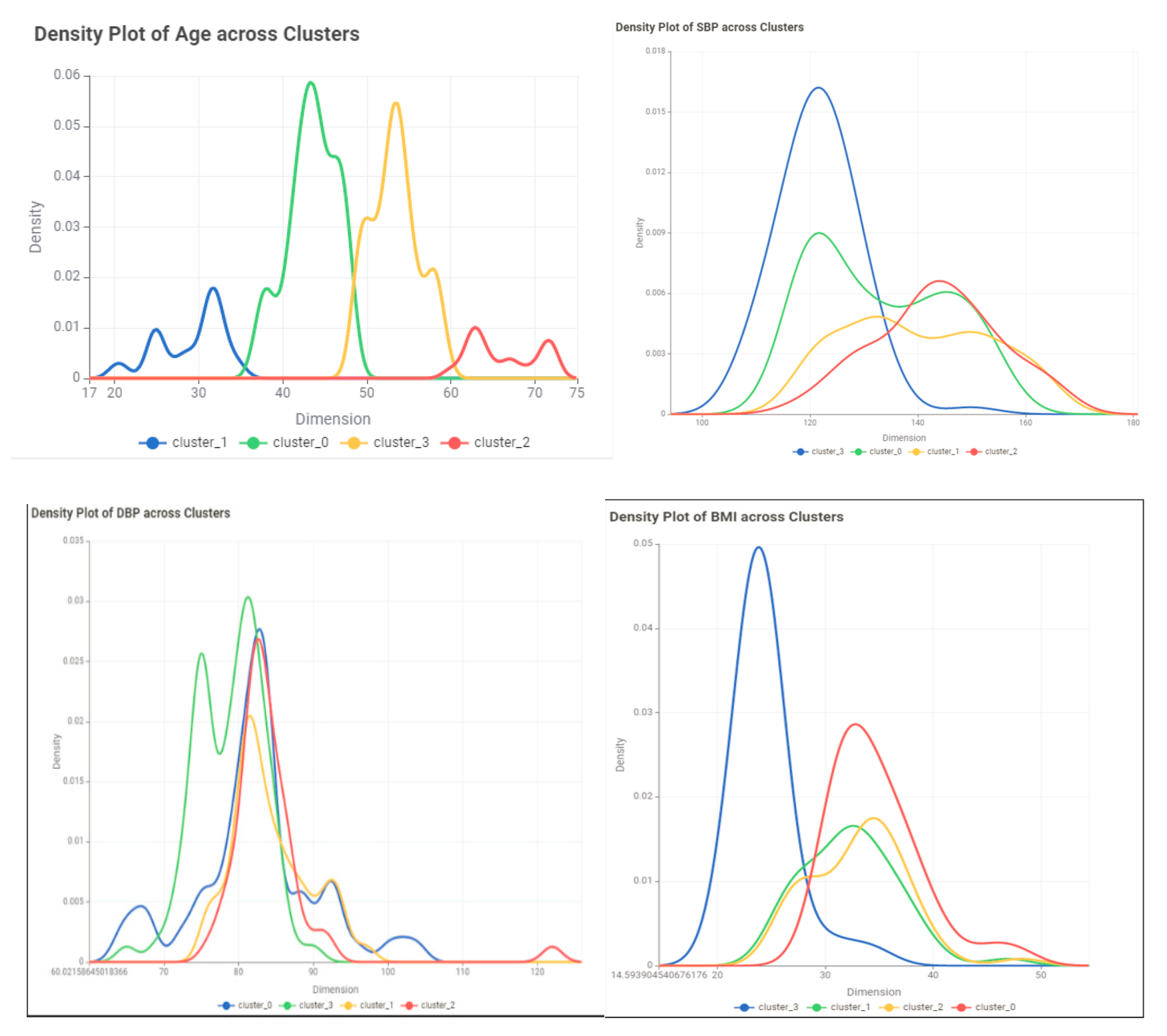
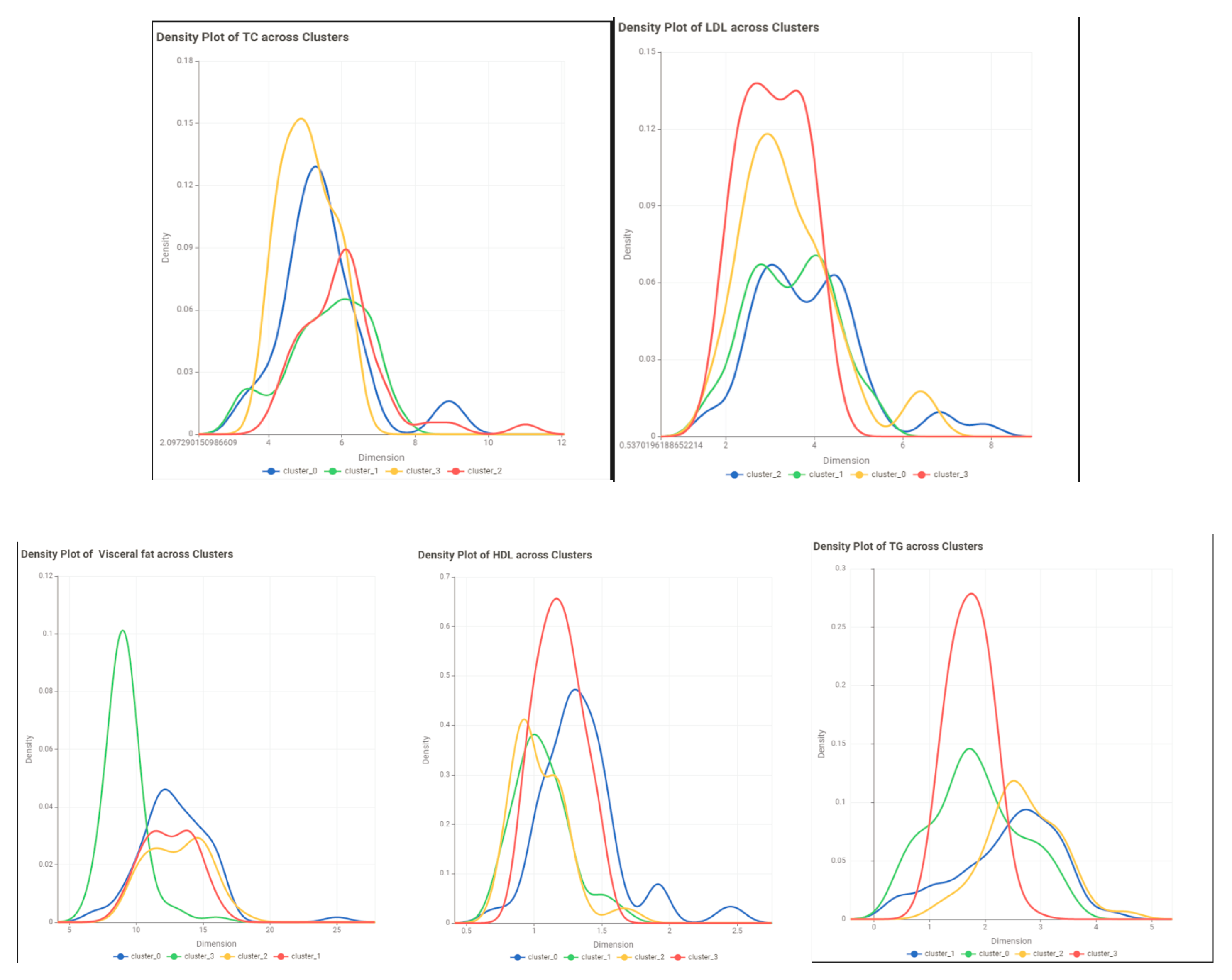
| Variable | Cluster 0 | Cluster1 | Cluster2 | Cluster3 |
| Age | ||||
| Min | 20 | 55 | 47 | 37 |
| Max | 37 | 72 | 56 | 48 |
| Mean | 29.35714 | 61.43243 | 51.49367089 | 43.11957 |
| Std | 4.227023 | 5.35693 | 2.536267284 | 2.724905 |
| Skewness | -0.54403 | 0.838738 | -0.39150176 | -0.33508 |
| Gender | M=15 F=13 | M=32 F=5 | M=46 F=33 | M=61 F=31 |
| SBP | ||||
| Min | 109 | 118 | 110 | 110 |
| Max | 155 | 166 | 163 | 164 |
| Mean | 130.1786 | 142.6757 | 127.2405 | 134.1304 |
| Std | 12.49608 | 12.8799 | 12.13515 | 13.81687 |
| Skewness | 0.395331 | -0.07564 | 1.313037 | 0.202832 |
| DBP | ||||
| Min | 64 | 77 | 72 | 65 |
| Max | 92 | 97 | 104 | 122 |
| Mean | 80.78571 | 86.18919 | 80.43038 | 82.28261 |
| Std | 7.335137 | 5.114456 | 4.637317 | 8.606573 |
| Skewness | -0.93462 | 0.355651 | 1.561946 | 2.131193 |
| BP history or Medication | Yes=3 No=25 | Yes=14 No=23 | Yes= 6 No=73 | Yes=19 No=73 |
| Smoking habits | Yes=8 No=20 | Yes=22 No=15 | Yes=39 No=40 | Yes=39 No=53 |
| Exercise | Yes=2 No=26 | Yes=1 No=36 | Yes=18 No=61 | Yes=6 No=86 |
| family history | Yes=8 No=20 | Yes=7 No=30 | Yes=16 No=63 | Yes=21 No=71 |
| Height | ||||
| Min | 147 | 156 | 149 | 148 |
| Max | 174 | 179 | 182 | 186 |
| Mean | 161.6607 | 165.4054 | 165.3987 | 167.25 |
| Std | 7.557255 | 6.495552 | 6.596123 | 7.900306 |
| Skewness | -0.25755 | 0.772235 | 0.330033 | 0.414278 |
| Weight | ||||
| Min | 67.8 | 67.5 | 52.5 | 55.5 |
| Max | 106.3 | 109.5 | 111 | 146 |
| Mean | 87.88214 | 89.56216 | 73.22532 | 89.57446 |
| Std | 10.54785 | 11.10384 | 13.75203 | 17.05227 |
| Skewness | 0.048747 | -0.22378 | 0.925506 | 0.607339 |
| BMI | ||||
| Min | 26.89232 | 25.43615992 | 20.904195 | 20.8326039 |
| Max | 45.21264 | 40.7712239 | 40.009145 | 48.2230149 |
| Mean | 33.73876 | 32.7276647 | 26.776844 | 32.0996482 |
| Std | 4.420732 | 3.622917706 | 4.9167259 | 6.07196575 |
| Skewness | 0.382043 | 0.112175598 | 1.1975546 | 0.36958127 |
| Visceral fat | ||||
| Min | 7 | 9 | 7 | 7 |
| Max | 16 | 16 | 16 | 25 |
| Mean | 12.14285714 | 13.189189 | 10.2658228 | 12.06522 |
| Std | 2.383807812 | 1.7769799 | 2.35180706 | 2.843169 |
| Skewness | -0.535412896 | -0.3651297 | 1.21897441 | 1.114398 |
| Waist Circumference | ||||
| Min | 87 | 87 | 64 | 69 |
| Max | 138 | 147 | 147 | 147 |
| Mean | 112.57143 | 112.405405 | 93.08861 | 105.6522 |
| Std | 14.325395 | 13.2171174 | 17.31769 | 17.71783 |
| Skewness | -0.0402391 | 0.46329165 | 0.992768 | 0.140572 |
| Hip area | ||||
| Min | 84 | 89 | 87 | 84 |
| Max | 134 | 135 | 128 | 141 |
| Mean | 114.178571 | 106.5135 | 102.6203 | 107.2826 |
| Std | 11.6047678 | 10.79254 | 8.557953 | 11.63863 |
| Skewness | -1.1293167 | 0.84846 | 0.701783 | 0.536408 |
| waist to height | ||||
| Min | 0.54717 | 0.486034 | 0.402516 | 0.417143 |
| Max | 0.857143 | 0.896341 | 0.924528 | 0.898649 |
| Mean | 0.695705 | 0.680444 | 0.562661 | 0.632907 |
| Std | 0.077757 | 0.082398 | 0.109548 | 0.110671 |
| Skewness | 0.312657 | 0.25963 | 1.074341 | 0.133961 |
| Waist to Hip Ratio | ||||
| Min | 0.756098 | 0.820313 | 0.719101 | 0.75 |
| Max | 1.201754 | 1.373626 | 1.441176 | 1.277228 |
| Mean | 0.990768 | 1.058794 | 0.905315 | 0.986079 |
| Std | 0.1193 | 0.107614 | 0.143132 | 0.136749 |
| Skewness | -0.56083 | 0.053912 | 1.406808 | -0.05666 |
| FBS | ||||
| Min | 72.54 | 92.16 | 76 | 76 |
| Max | 230 | 340 | 244 | 239 |
| Mean | 132.8143 | 157.7381 | 113.4273 | 124.8425 |
| Std | 47.14809 | 56.44463 | 36.83982 | 41.7015 |
| Skewness | 0.835888 | 1.146436 | 1.815943 | 1.273658 |
| Insulin uU/ml | ||||
| Min | 7 | 8.4 | 5.3 | 5.3 |
| Max | 37.37 | 37.7 | 35.07 | 35.93 |
| Mean | 20.66893 | 21.09784 | 11.52722 | 18.01489 |
| Std | 7.387154 | 7.788241 | 8.111252 | 8.284636 |
| Skewness | 0.222751 | 0.176514 | 1.211076 | -0.03373 |
| Homo-IR | ||||
| Min | 1.362667 | 2.645618 | 1.102716 | 1.04 |
| Max | 14.46667 | 15.60593 | 17.17037 | 16.74815 |
| Mean | 7.115011 | 7.972435 | 3.743428 | 6.046711 |
| Std | 3.965715 | 3.516842 | 3.843697 | 4.061748 |
| Skewness | 0.471698 | 0.556379 | 1.665274 | 0.685207 |
| TC | ||||
| Min | 3.39 | 4.44792 | 3.17 | 3.16 |
| Max | 6.8529 | 9.24 | 7.43 | 11.01 |
| Mean | 5.031471 | 6.206487 | 5.22029 | 5.516702 |
| Std | 0.954634 | 1.185539 | 0.785381 | 1.186209 |
| Skewness | 0.078733 | 1.146114 | 0.228108 | 1.234394 |
| LDL | ||||
| Min | 1.65 | 2.40498 | 1.6 | 1.68 |
| Max | 4.92 | 6.63 | 5.25 | 7.85 |
| Mean | 2.99725 | 4.268808 | 3.204681 | 3.337668 |
| Std | 0.844356 | 1.07715 | 0.740261 | 1.090519 |
| Skewness | 0.493168 | 0.408088 | 0.052199 | 1.440394 |
| TC/HDL Ratio | ||||
| Min | 1.92 | 3.265734 | 2.381503 | 2.198675 |
| Max | 7.117647 | 9.275862 | 9.137931 | 9.54023 |
| Mean | 3.956313 | 5.911426 | 4.587839 | 4.987292 |
| Std | 1.337887 | 1.330685 | 1.168956 | 1.647908 |
| Skewness | 0.834276 | -0.04545 | 1.448609 | 0.734131 |
| LDL/HDL Ratio | ||||
| Min | 1.192 | 2.067164 | 0.404765 | 0.354619 |
| Max | 4.472727 | 5.724138 | 5.133333 | 7.816092 |
| Mean | 2.347742 | 4.047246 | 1.4837 | 2.624972 |
| Std | 0.908145 | 1.049943 | 1.174594 | 1.592378 |
| Skewness | 0.79823 | -0.35873 | 1.31546 | 0.667992 |
| Non-HDL | ||||
| Min | 2.16 | 3.24 | 0.98773 | 1.242647 |
| Max | 5.76678 | 7.93 | 6.10296 | 9.41 |
| Mean | 3.680818 | 5.130117 | 2.59537 | 3.886513 |
| Std | 1.074989 | 1.176047 | 1.461076 | 1.605203 |
| Skewness | 0.393767 | 0.794324 | 0.904014 | 0.514697 |
| TG | ||||
| Min | 0.42 | 1.56 | 0.69 | 0.41 |
| Max | 3.31926 | 3.9 | 4.23 | 4.54 |
| Mean | 1.525748 | 2.586565 | 1.930973 | 2.169234 |
| Std | 0.845067 | 0.637059 | 0.600044 | 0.816264 |
| Skewness | 0.814079 | 0.127149 | 1.154205 | 0.11867 |
| VLDL | ||||
| Min | 0.190909 | 0.709091 | 0.313636 | 0.186364 |
| Max | 1.508755 | 1.772727 | 1.922727 | 2.063636 |
| Mean | 0.693522 | 1.175711 | 0.877715 | 0.986015 |
| Std | 0.384121 | 0.289572 | 0.272747 | 0.371029 |
| Skewness | 0.814079 | 0.127149 | 1.154205 | 0.11867 |
| HDL | ||||
| Min | 0.7 | 0.67 | 0.87924 | 0.63 |
| Max | 2.4 | 1.73 | 2.5 | 2.725942 |
| Mean | 1.179515 | 1.134267 | 1.359937 | 1.363539 |
| Std | 0.263488 | 0.207883 | 0.341299 | 0.03568 |
| Skewness | 1.378342 | 0.275384 | 1.63957 | 1.394629 |
Disclaimer/Publisher’s Note: The statements, opinions and data contained in all publications are solely those of the individual author(s) and contributor(s) and not of MDPI and/or the editor(s). MDPI and/or the editor(s) disclaim responsibility for any injury to people or property resulting from any ideas, methods, instructions or products referred to in the content. |
© 2024 by the authors. Licensee MDPI, Basel, Switzerland. This article is an open access article distributed under the terms and conditions of the Creative Commons Attribution (CC BY) license (http://creativecommons.org/licenses/by/4.0/).


