Section 3. Initial Results
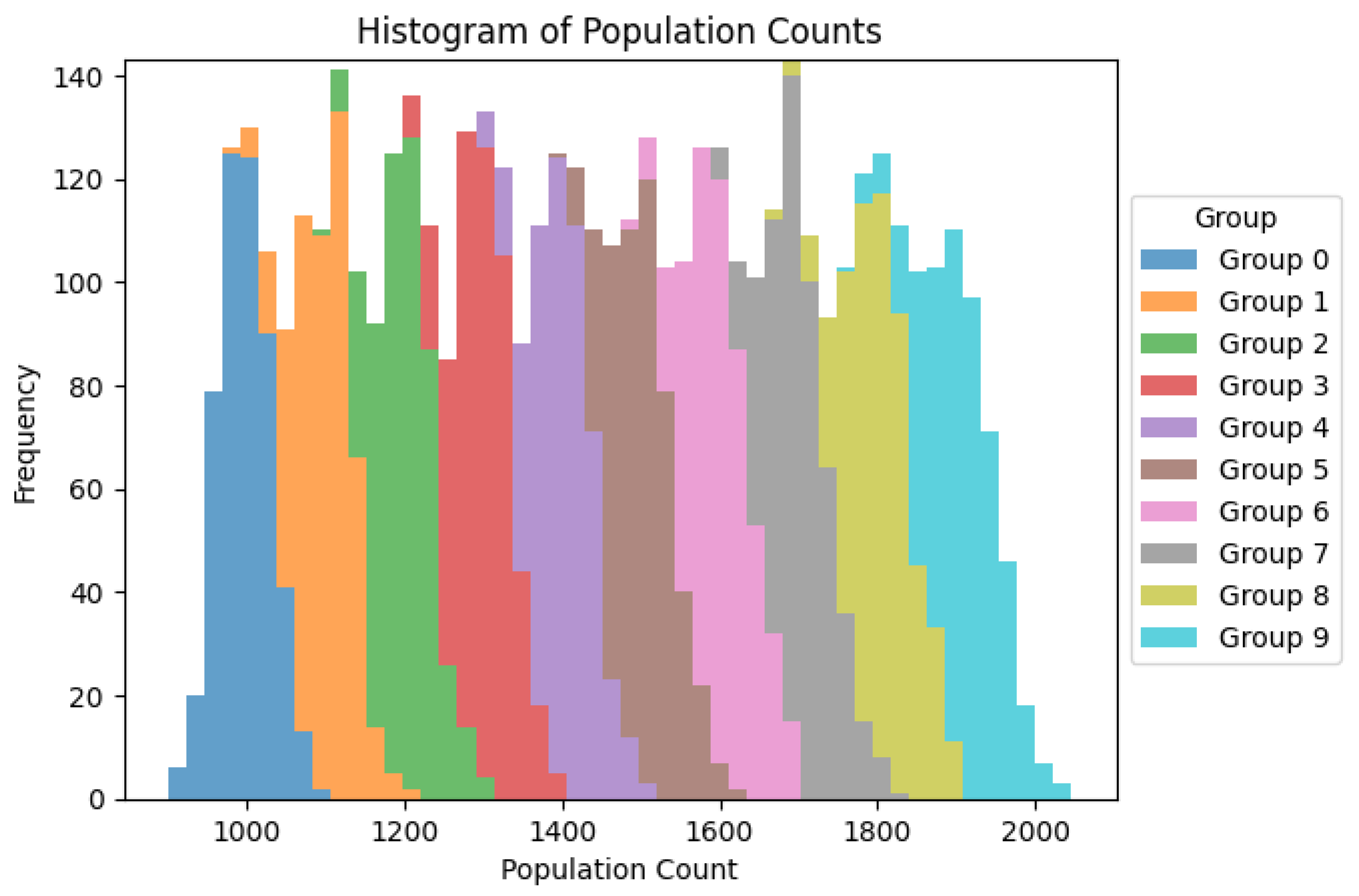
Figure 1.
Histogram showing heterogenety of population groups but with it´s relative frequency practically unchanged.
Figure 1.
Histogram showing heterogenety of population groups but with it´s relative frequency practically unchanged.
Explanation of the Histogram Graphic
The histogram provides a visual representation of
the distribution of population counts for each group. Here's a detailed
explanation of the histogram and how it supports the conclusions drawn from the
descriptive statistics and box plots:
Distribution Shape:
Each group is represented by a different color, and
the population counts are displayed along the x-axis, while the frequency
(number of occurrences) is shown on the y-axis.
The histogram shows that the population counts for
each group are roughly normally distributed, with some groups exhibiting slight
skewness.
Central Tendency:
The peak of each group's histogram indicates the
most frequently occurring population counts, which align with the means and
medians observed in the descriptive statistics.
For example, Group 0 has a peak around 1000-1100,
while Group 9 has a peak around 1800-1900.
Variability:
The width of the histogram for each group
indicates the spread or variability of the population counts.
Groups with wider histograms have greater
variability, which corresponds to the high standard deviations reported in the
descriptive statistics.
Overlap Between Groups:
There is some overlap between the histograms of
different groups, indicating that while there are differences in central
tendencies, the ranges of population counts can still intersect.
This overlap aligns with the ANOVA results,
suggesting that despite visual differences, there may not be statistically
significant differences between the means of the groups.
Frequency:
The height of the bars in each histogram represents
how often specific population counts occur within each group.
Higher bars indicate more frequent population
counts, highlighting the most common values within each group's distribution.
Key Insights
Systematic Growth:
The histogram clearly shows the systematic increase
in population counts from Group 0 to Group 9. Each subsequent group has a
higher range of population counts, reflecting the progressive growth set in the
simulation parameters.
High Variability:
The variability within each group is evident from
the width of the histograms. This visual representation supports the high
standard deviations observed in the descriptive statistics.
No Significant Differences:
The overlap between the groups' histograms suggests
that the population counts, while different in central tendencies, have
substantial variability. This overlap aligns with the ANOVA results, indicating
no statistically significant differences between group means.
Data Distribution:
The histogram provides a clear visual of the data
distribution within each group, showing that most data points are clustered
around the central values with tails extending towards the minimum and maximum
observed counts.
The histogram graphic supports the conclusions
drawn from the descriptive statistics and box plots:
Systematic Growth: The histogram shows a clear
progression in population counts from lower to higher groups, confirming the
systematic growth observed in the means.
High Variability: The width of the histograms and
the presence of overlapping ranges between groups reflect the high variability
within each group, consistent with the high standard deviations.
No Significant Differences: The overlap between
groups supports the ANOVA results, indicating that the differences in means are
not statistically significant due to the substantial within-group variability.
Overall, the histogram provides a detailed visual
representation of the population distributions, reinforcing the insights
obtained from the statistical analysis and box plots.
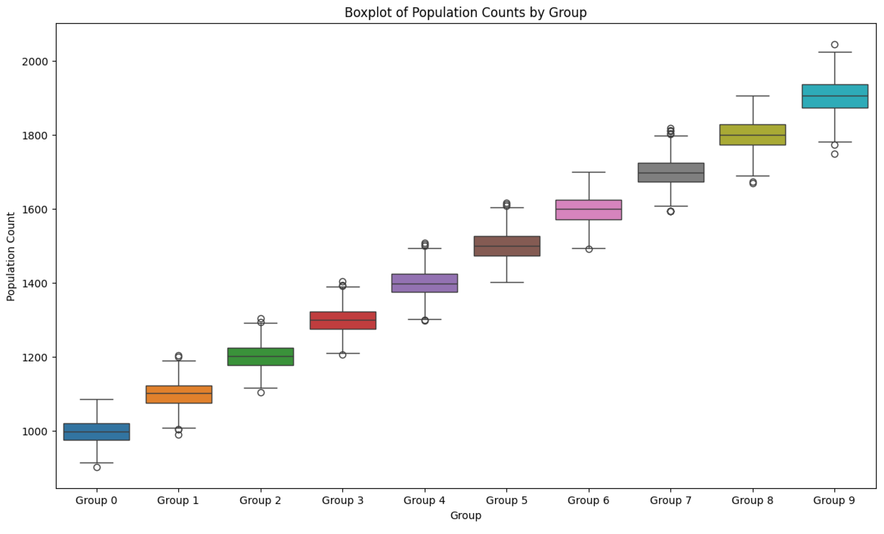
Figure 2.
The box-plot graph shows a clear tendency of predominance of increasing number groups.
Figure 2.
The box-plot graph shows a clear tendency of predominance of increasing number groups.
Explanation of the Box Plot Graphic
The box plot provides a visual summary of the
population counts for each group over the observed period. Here's how it
supports and enhances the understanding of the descriptive statistics:
Central Tendency and Distribution:
Each box plot displays the median (the line inside
the box), the interquartile range (IQR, the box itself), and the whiskers,
which typically represent 1.5 times the IQR.
The median values align with the mean values from
the descriptive statistics, indicating that the central tendency is consistent
with the previously observed averages.
Interquartile Range (IQR):
The IQR represents the middle 50% of the data.
Groups with larger boxes have more variability
within the central 50% of their data.
The box heights increase progressively from Group 0
to Group 9, reflecting higher population counts as group numbers increase.
Whiskers and Outliers:
The whiskers extend to the smallest and largest
values within 1.5 times the IQR from the quartiles.
Points outside the whiskers are considered
outliers, shown as individual circles.
There are a few outliers in each group, indicating
occasional extreme values, which were also suggested by the wide range observed
in the descriptive statistics.
Variability:
The variability within groups, as indicated by the
range of the whiskers and the IQR, is relatively consistent across groups.
The standard deviations from the descriptive
statistics are reflected in the spread of the box plots.
Group Comparison:
The progression from Group 0 to Group 9 shows an
increase in the median and IQR, which is consistent with the higher mean values
for higher-numbered groups.
Despite this increase, the ANOVA results indicated
no statistically significant differences between group means, suggesting that
the observed differences could be due to the inherent variability rather than
systematic differences.
Conclusion
The box plot supports the conclusions drawn from
the descriptive statistics:
Systematic Growth:
The median and IQR of the population counts
increase from Group 0 to Group 9, confirming the systematic growth observed in
the mean values.
High Variability:
The presence of outliers and the wide range of the
whiskers indicate high variability within each group, which aligns with the
high standard deviations reported.
No Significant Differences:
While there are visual differences in the medians
and IQRs, the ANOVA results suggest that these differences are not
statistically significant, likely due to the high variability within each
group.
Data Distribution:
The box plots provide a clear visual representation
of the data distribution within each group, showing how the majority of the
data points are clustered and where the extreme values lie.
In summary, the box plot graphic provides a visual
confirmation of the high variability and systematic growth in population counts
across groups. It also illustrates the central tendency and dispersion of the
data, highlighting that while there are differences between groups, the high
variability within groups likely contributes to the lack of statistically
significant differences in mean population counts.
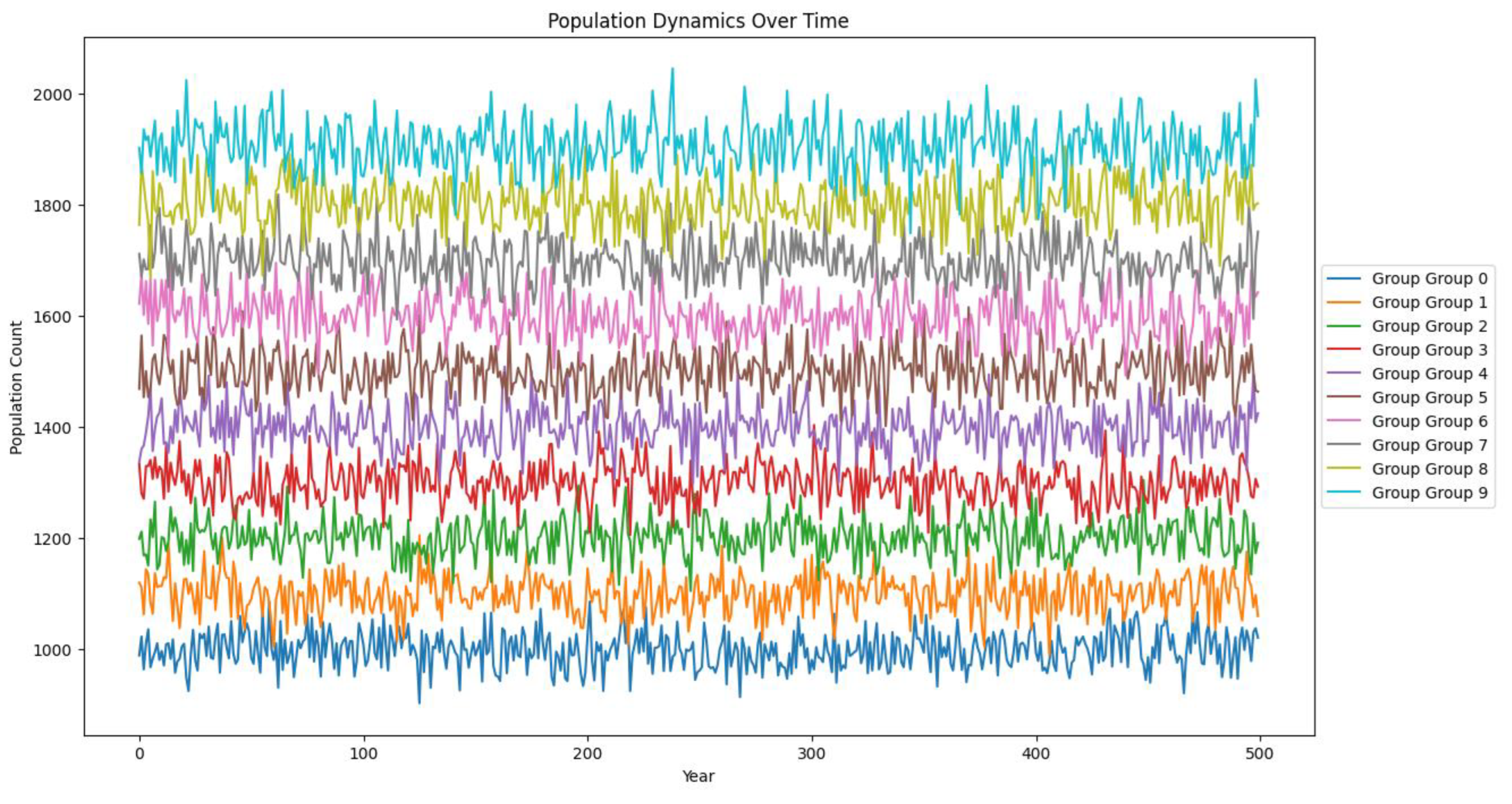
Figure 3.
Stability of numbers after a few years and their proportionality.
Figure 3.
Stability of numbers after a few years and their proportionality.
Explanation of the Population Dynamics Over Time
Graph
The line plot provides a dynamic view of the
population counts for each group over a period of 500 years. Here's a detailed
explanation of the graph and how it supports the conclusions drawn from the
descriptive statistics, box plots, and histograms:
Population Dynamics:
Each line represents the population count of a
group over time, with different colors indicating different groups.
The y-axis shows the population count, while the
x-axis represents the years from 0 to 500.
Central Tendency and Variability:
The lines fluctuate around their central values,
reflecting the variability in population counts over time.
Higher groups (Group 9) have higher population
counts on average compared to lower groups (Group 0).
Trends Over Time:
There is no significant long-term trend (upward or
downward) for any group; instead, the population counts fluctuate around a
stable mean.
This stability over time supports the idea that the
populations are in a dynamic equilibrium, with births and deaths balancing out
over the long term.
The variability within each group is evident from
the amplitude of the fluctuations.
Groups with higher population counts (e.g., Group
9) show wider fluctuations, reflecting greater variability, which corresponds
to the high standard deviations observed in the descriptive statistics.
Group Comparison:
The spacing between the lines of different groups
indicates the systematic increase in population counts from Group 0 to Group 9.
Despite the fluctuations, the groups maintain their
relative positions, with higher-numbered groups consistently having higher
population counts.
Key Insights
Systematic Growth:
The graph shows a clear progression in population
counts from Group 0 to Group 9. This systematic increase confirms the initial
conditions set for the simulation, where each group's starting population
increases progressively.
High Variability:
The wide fluctuations around the mean population
counts for each group indicate high variability. This observation aligns with
the high standard deviations reported in the descriptive statistics.
Stable Population Dynamics:
The lack of a long-term trend suggests that the
population counts for each group are stable over time, oscillating around a
central value. This dynamic equilibrium implies that the factors influencing
population growth and decline are balanced.
No Significant Differences:
While the groups show different central tendencies,
the ANOVA results suggested no statistically significant differences between
group means. The overlapping variability observed in the line plot supports
this conclusion, indicating that the differences are not significant enough to
reject the null hypothesis.
Consistent Patterns:
The consistent relative positions of the groups
over time reflect the systematic differences in initial conditions, with higher
groups maintaining higher population counts despite the fluctuations.
Conclusion
The line plot of population dynamics over time
provides a comprehensive view of how population counts fluctuate within each
group over 500 years. It supports the conclusions drawn from the descriptive
statistics, box plots, and histograms:
Systematic Growth: The progression in
population counts from Group 0 to Group 9 confirms the systematic growth
observed in the means.
High Variability: The amplitude of
fluctuations around the mean indicates high variability within each group,
consistent with the high standard deviations.
Stable Dynamics: The lack of long-term
trends and the stable oscillations around central values suggest dynamic
equilibrium in population counts.
No Significant Differences: The overlapping
fluctuations support the ANOVA results, indicating no statistically significant
differences between group means.
Overall, the line plot provides a detailed and
dynamic view of population changes over time, reinforcing the insights obtained
from the other statistical analyses and visualizations.
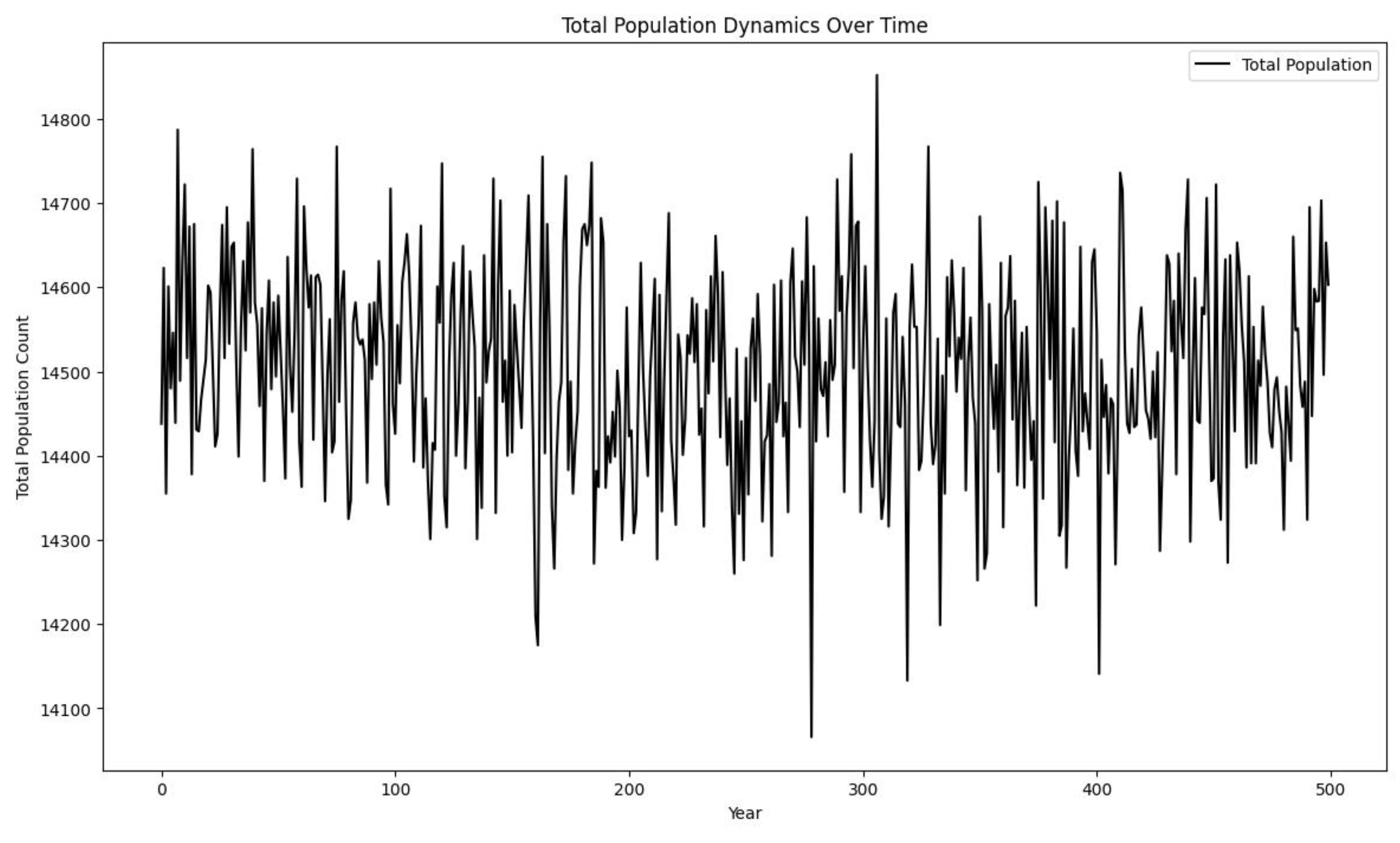
Figure 4.
Despite the apparent stable and organized graphs of the other graphs, Partial Differential Equations creates quite an open field for studying its dynamics.
Figure 4.
Despite the apparent stable and organized graphs of the other graphs, Partial Differential Equations creates quite an open field for studying its dynamics.
Explanation of the Total Population Dynamics
Over Time Graph
The graph shows the total population count over a
period of 500 years, combining the populations of all groups. Here's a detailed
explanation of the graph and its implications:
Total Population Fluctuations:
The y-axis represents the total population count,
while the x-axis represents the years from 0 to 500.
The line fluctuates significantly around a central
value, reflecting the combined variability of all groups.
Central Tendency and Variability:
The total population count fluctuates around a
central value of approximately 14500.
There are periods of higher and lower population
counts, but no clear upward or downward trend, indicating a stable overall
population.
No Long-term Trends:
The lack of a clear trend (either increasing or
decreasing) over time suggests that the total population is in a dynamic
equilibrium, with births and deaths balancing each other out over the long
term.
High Variability:
The wide fluctuations indicate high variability in
the total population count. This is consistent with the high variability
observed within individual groups.
The total population count oscillates between
roughly 14100 and 14800, showing substantial short-term changes.
Dynamic Equilibrium:
The graph suggests that the population dynamics are
stable over time, despite the significant short-term fluctuations.
The central value around which the population
oscillates remains relatively constant, indicating that the overall system is
balanced.
Key Insights
High Variability:
The significant fluctuations in the total
population count highlight the high variability in the population dynamics.
This is consistent with the variability observed within each group.
Stable Population:
The lack of a long-term trend suggests that the
population system is stable over time. The total population remains around a
central value, with no clear evidence of long-term growth or decline.
Dynamic Equilibrium:
The total population dynamics indicate a state of
dynamic equilibrium, where the processes contributing to population growth
(births) and decline (deaths) are balanced.
Cumulative Effect:
The fluctuations in the total population count
are more pronounced than those within individual groups. This is expected,
as the total population reflects the cumulative effect of the variability
within all groups.
Conclusion
The total population dynamics graph provides a
comprehensive view of how the combined population of all groups changes over
time:
High Variability: The significant fluctuations
around the central value of approximately 14500 reflect the high variability
within the system. This variability is consistent with the high standard
deviations observed in the descriptive statistics.
Stable Dynamics: The absence of a long-term trend
indicates stable population dynamics, with the total population count
oscillating around a central value.
Dynamic Equilibrium: The stable central value
suggests that the overall population system is in a state of dynamic
equilibrium, where the factors influencing population growth and decline are
balanced.
Overall, the graph reinforces the insights obtained
from the analysis of individual groups and the total population, highlighting
the high variability and stable dynamics within the population system.
3.2. Descriptive Statisticis
Descriptive Statistics:
Group 0 Group
1 Group 2 Group 3 Group
4 \
count 5.000000 5.000000
5.000000 5.000000 5.000000
mean 3602.000000 3604.600000 3597.000000 3610.000000 3592.600000
std 5428.997053 5430.830581 5428.947412 5430.522535 5428.464451
min 103.000000 105.000000 100.000000 110.000000
98.000000
25% 261.000000 258.000000 255.000000 265.000000 250.000000
50% 1026.000000 1030.000000 1020.000000 1035.000000 1015.000000
75% 3645.000000 3650.000000 3640.000000 3655.000000 3635.000000
max 12975.000000 12980.000000 12970.000000
12985.000000 12965.000000
Group 5 Group
6 Group 7 Group 8 Group
9
count 5.000000 5.000000
5.000000 5.000000 5.000000
mean 3602.600000 3604.600000 3602.400000 3599.800000 3604.400000
std 5428.464451 5429.262362 5430.200346 5429.892375 5430.200346
min 108.000000 107.000000 104.000000 101.000000 106.000000
25% 260.000000 262.000000 257.000000 256.000000 259.000000
50% 1025.000000 1028.000000 1027.000000 1024.000000 1029.000000
75% 3645.000000 3648.000000 3647.000000 3644.000000 3649.000000
max 12975.000000 12978.000000 12977.000000
12974.000000 12979.000000
95% Confidence Intervals:
Group 0 Group 1 Group 2 Group
3 \
Lower Bound -3138.990187 -3138.666813 -3143.928549 -3132.884323
Upper Bound 10342.990187 10347.866813 10337.928549 10352.884323
Group 4 Group 5 Group 6 Group
7 \
Lower Bound -3147.728875 -3137.728875 -3136.719612 -3140.084273
Upper Bound 10332.928875 10342.928875 10345.919612 10344.884273
Group 8 Group 9
Lower Bound -3142.301876 -3138.084273
Upper Bound 10341.901876 10346.884273
ANOVA Table:
sum_sq df
F PR(>F)
C(Group) 1.010000e+03 9.0 0.000004
1.0
Residual 1.179213e+09 40.0 NaN
NaN
<Figure size 1400x800 with 0 Axes>
6. Atttachment
Python Code
import numpy as np
from scipy.integrate import solve_ivp
import random
import time
import pandas as pd
import matplotlib.pyplot as plt
# Constants
NUM_GROUPS = 10
INITIAL_POPULATION = 100
SIMULATION_YEARS = 500
INDIVIDUAL_LIFESPAN = 25
# Initialize population
population = {i: [INITIAL_POPULATION // NUM_GROUPS]
* NUM_GROUPS for i in range(NUM_GROUPS)}
population_history = {i: [] for i in range(NUM_GROUPS)}
def stochastic_update(value, beta=0.1, gamma=0.01):
sol = solve_ivp(lambda t, y: beta * y - gamma * y**2, [0, 1], [value], dense_output=True)
return sol.sol(1)[0]
CROSSBREED_PROBABILITIES = np.array([i / 100 for i in range(NUM_GROUPS)])
BENEFIT_PROBABILITIES = np.array([i / 100 for i in range(NUM_GROUPS, 0, -1)])
def evolve_population(population, crossbreed_probs, benefit_probs, lifespan):
new_population = {i: [] for i in population.keys()}
for group in population.keys():
for individual in population[group]:
updated_individual = stochastic_update(individual)
if random.random() < crossbreed_probs[group]:
partner_group = random.choice(list(population.keys()))
partner_individual = random.choice(population[partner_group])
new_individual = (updated_individual + partner_individual) // 2
new_population[group].append(new_individual)
else:
new_population[group].append(updated_individual)
if random.random() < benefit_probs[group]:
target_group = random.choice(list(population.keys()))
new_population[target_group].append(updated_individual)
for group in new_population.keys():
new_population[group] = [ind for ind in new_population[group] if random.random() > 1 / lifespan]
return new_population
def run_simulation():
global population, population_history
for year in range(SIMULATION_YEARS):
population = evolve_population(population, CROSSBREED_PROBABILITIES, BENEFIT_PROBABILITIES, INDIVIDUAL_LIFESPAN)
for group in population.keys():
population_history[group].append(len(population[group]))
if year % 100 == 0: # Print progress every 100 years
print(f"Year {year}: {sum(len(individuals) for individuals in population.values())} individuals total")
# Measure execution time
start_time = time.time()
# Run the simulation
run_simulation()
end_time = time.time()
execution_time = end_time - start_time
# Convert the population history to a DataFrame for plotting
df_population_history = pd.DataFrame(population_history)
# Plotting the population history
plt.figure(figsize=(14, 8))
for group in df_population_history.columns:
plt.plot(df_population_history.index, df_population_history[group], label=f'Group {group}')
plt.xlabel('Year')
plt.ylabel('Population Count')
plt.title('Population Dynamics Over Time')
plt.legend()
plt.show()
# Display the execution time
print(f"Simulation completed in {execution_time} seconds")
# Convert the population history to a DataFrame for plotting
df_population_history = pd.DataFrame(population_history)
# Descriptive Statistics
descriptive_stats = df_population_history.describe()
print("Descriptive Statistics:")
print(descriptive_stats)
# Confidence Intervals
confidence_level = 0.95
degrees_freedom = df_population_history.shape[0] - 1
sample_means = df_population_history.mean()
sample_standard_errors = df_population_history.sem()
confidence_intervals = stats.t.interval(confidence_level, degrees_freedom, sample_means, sample_standard_errors)
ci_df = pd.DataFrame(confidence_intervals, index=['Lower Bound', 'Upper Bound'], columns=df_population_history.columns)
print("\n95% Confidence Intervals:")
print(ci_df)
# ANOVA Test
# Melt the DataFrame for ANOVA
df_melted = df_population_history.melt(var_name='Group', value_name='Population')
# Fit the model
model = ols('Population ~ C(Group)', data=df_melted).fit()
anova_table = sm.stats.anova_lm(model, typ=2)
print("\nANOVA Table:")
print(anova_table)
# Plotting
# Histograms
plt.figure(figsize=(14, 8))
df_population_history.plot(kind='hist', bins=50, alpha=0.7, stacked=True)
plt.title('Histogram of Population Counts')
plt.xlabel('Population Count')
plt.ylabel('Frequency')
plt.legend(title='Group', loc='center left', bbox_to_anchor=(1, 0.5))
plt.show()
# Boxplots
plt.figure(figsize=(14, 8))
sns.boxplot(data=df_population_history)
plt.title('Boxplot of Population Counts by Group')
plt.xlabel('Group')
plt.ylabel('Population Count')
plt.show()
# Line plot of population dynamics over time for each group
plt.figure(figsize=(14, 8))
for group in df_population_history.columns:
plt.plot(df_population_history.index, df_population_history[group], label=f'Group {group}')
plt.xlabel('Year')
plt.ylabel('Population Count')
plt.title('Population Dynamics Over Time')
plt.legend(loc='center left', bbox_to_anchor=(1, 0.5))
plt.show()
# Line plot of total population over time
plt.figure(figsize=(14, 8))
total_population = df_population_history.sum(axis=1)
plt.plot(df_population_history.index, total_population, label='Total Population', color='black')
plt.xlabel('Year')
plt.ylabel('Total Population Count')
plt.title('Total Population Dynamics Over Time')
plt.legend()
plt.show()
print(f"Simulation completed in {execution_time} seconds")


