4.1. Economic Indicator Forecasting Results
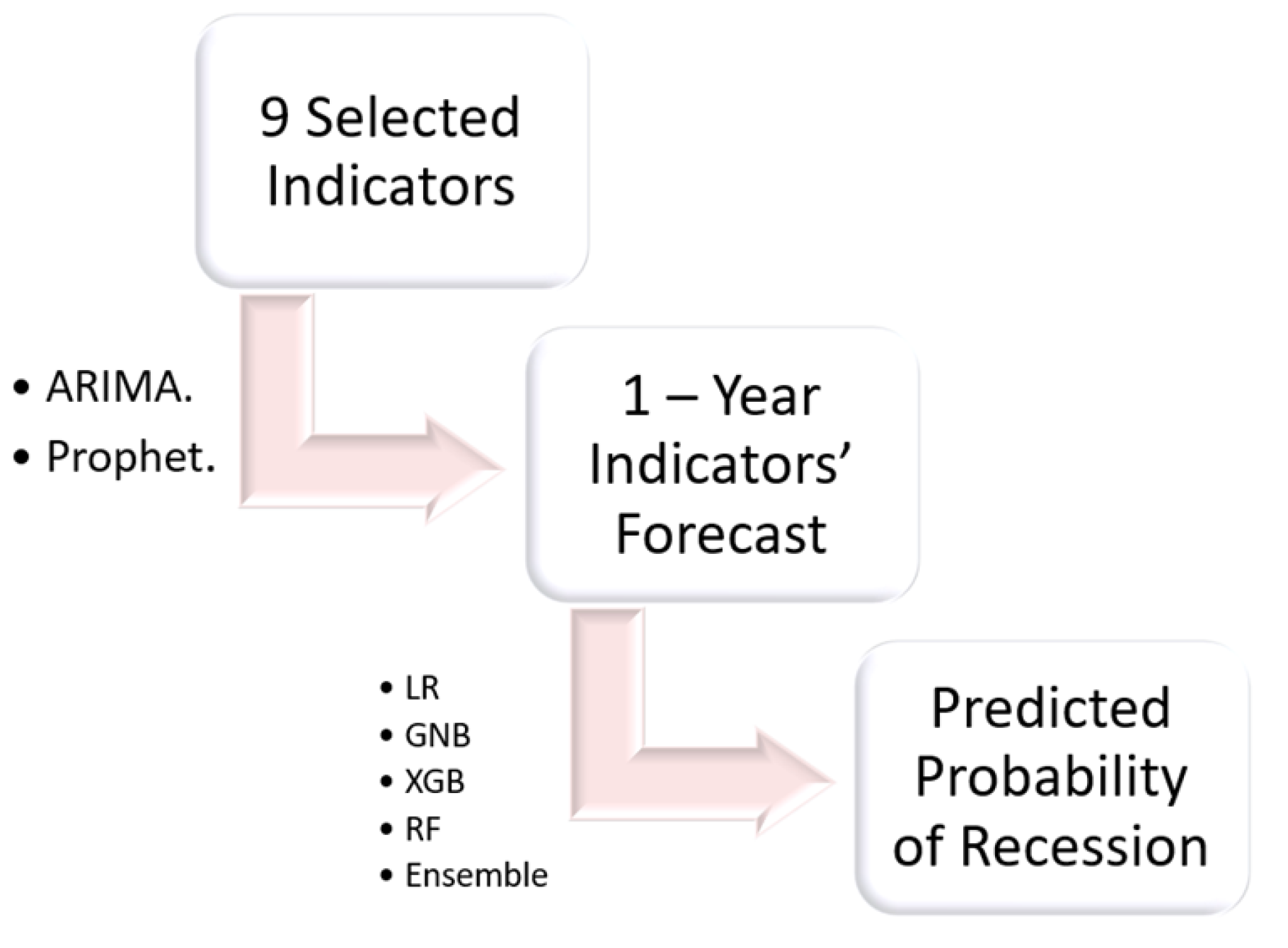
After applying the two models (prophet() and ARIMA()) on the individual economic indicators, forecast data frame was created as shown below.
Table 3.
Forecasts from the raw data (cropped).
Table 3.
Forecasts from the raw data (cropped).
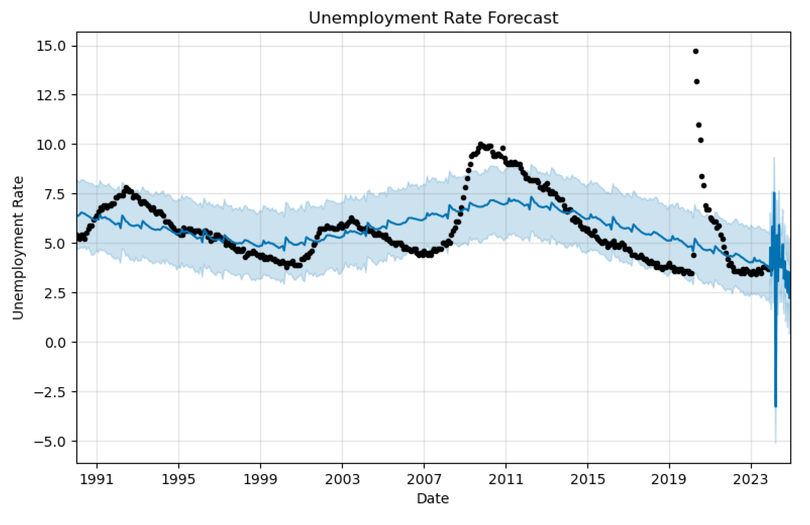
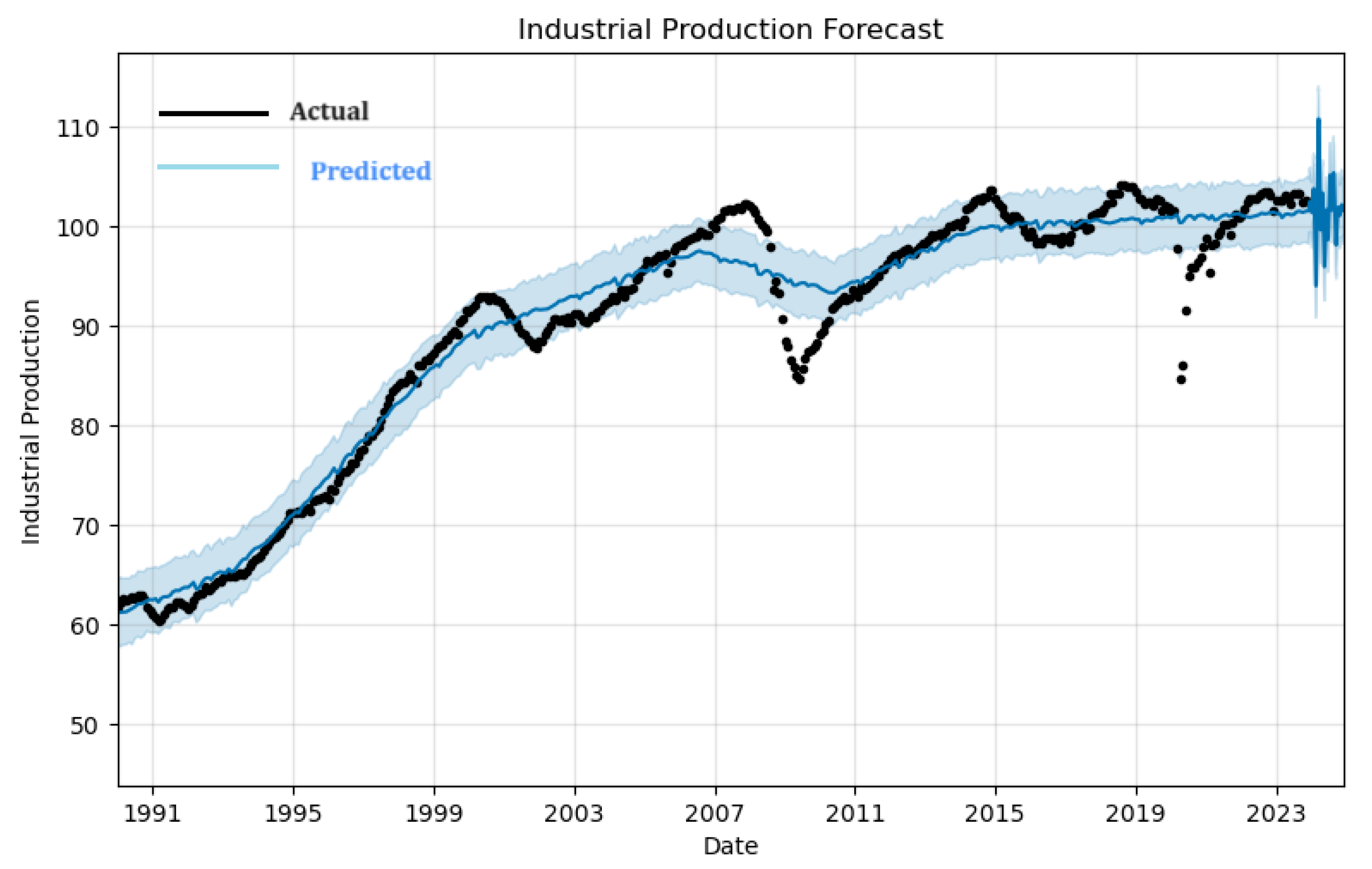
The entire data set was used to train the forecasting models model and plots for each indicator generated. The figures below shows the forecasting plots for two of the macroeconomic indicators. The rest of the plots are included in the appendix.
Figure 10.
Unemployment Rate Forecasts as generated by the prophet()
Figure 10.
Unemployment Rate Forecasts as generated by the prophet()
Figure 11.
Industrial Production Forecasts as generated by the prophet()
Figure 11.
Industrial Production Forecasts as generated by the prophet()
Industrial production forecast shows a general increasing trend from 1991 until the early 2020’s, with a sharp uptick followed by significant volatility in the forecast period post-2023. The shaded area represents confidence intervals, and it widens substantially towards the end of the forecast period, indicating higher uncertainty or variability in the industrial production projections. Unemployment rate forecast, indicates a fluctuating trend around a stable mean until the early 2020s. However, in the forecast period, there is a pronounced spike in unemployment rates, which sharply reverses into a steep decline towards the end of the period. The confidence interval also widens dramatically, reflecting considerable uncertainty in future unemployment rates.
The two plots suggest that a significant economic event or change in policy might be anticipated around 2024, affecting both industrial production and unemployment rates with a more pronounced immediate impact on unemployment.
Before using the forecasts, a normalization process was necessary since the model had been built on a normalized data set. To ensure the conformity, the forecasts were transformed through a process to produce a new dataset that could now be applied in the model.
Table 4.
Transformed Forecasts (first six months).
Table 4.
Transformed Forecasts (first six months).
4.3. Linear Model - Logistic Regression(LR)
A linear model was applied, the indicators’ signal were normalized and lag added to the recession dates to enhance early detection of the recession. Upon comparing the confusion matrices before and after a transformation, we observe a substantial improvement in the model’s classification ability. In the pre-transformation matrix, the model correctly predicted 114 instances of Class 0 (true negatives) and 9 instances of Class 1 (true positives), while incorrectly predicting 22 instances as Class 0 that were actually Class 1 (false negatives) and 3 instances as Class 1 that were actually Class 0 (false positives). Following the transformation, the true negatives increased to 126 and true positives to 11, indicating better accuracy in classifying both negative and positive cases. The false negatives decreased to 10, showing that fewer actual Class 1 instances were misclassified as Class 0. The false positives were reduced to just 1, significantly minimizing instances where Class 0 was incorrectly identified as Class 1. These changes demonstrate a marked increase in the model’s predictive precision and recall, reflecting a significant enhancement in overall performance, particularly in reducing the mis-classification of Class 1, which is often the more critical metric in imbalanced datasets.
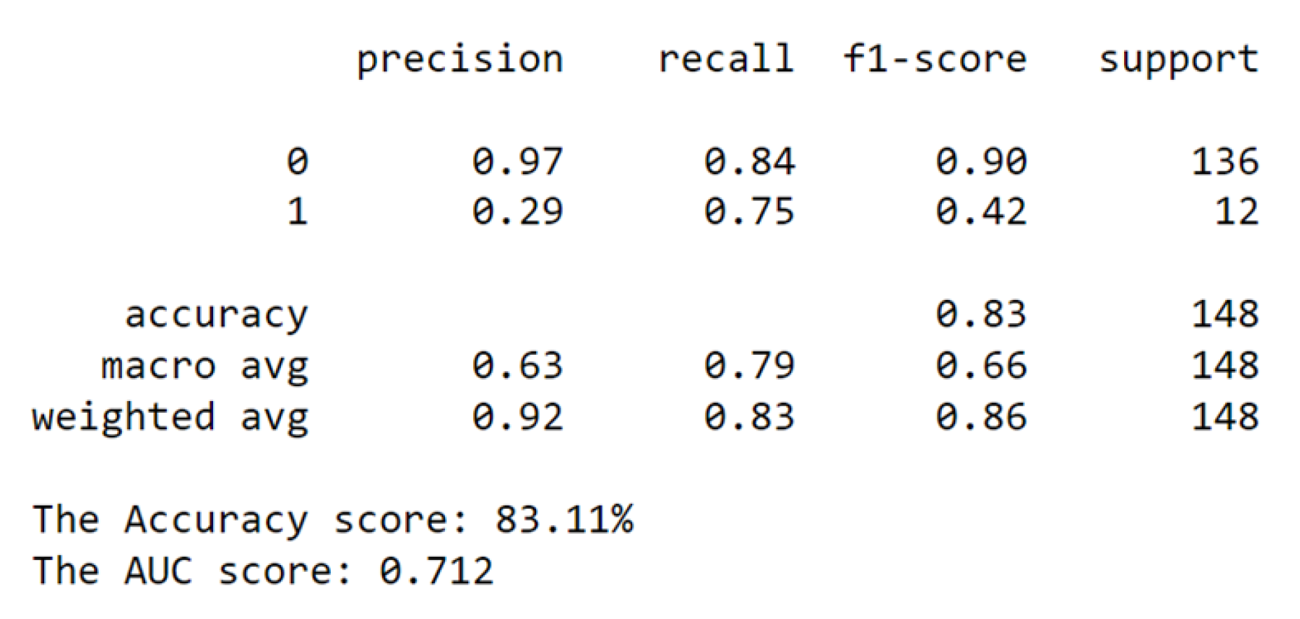
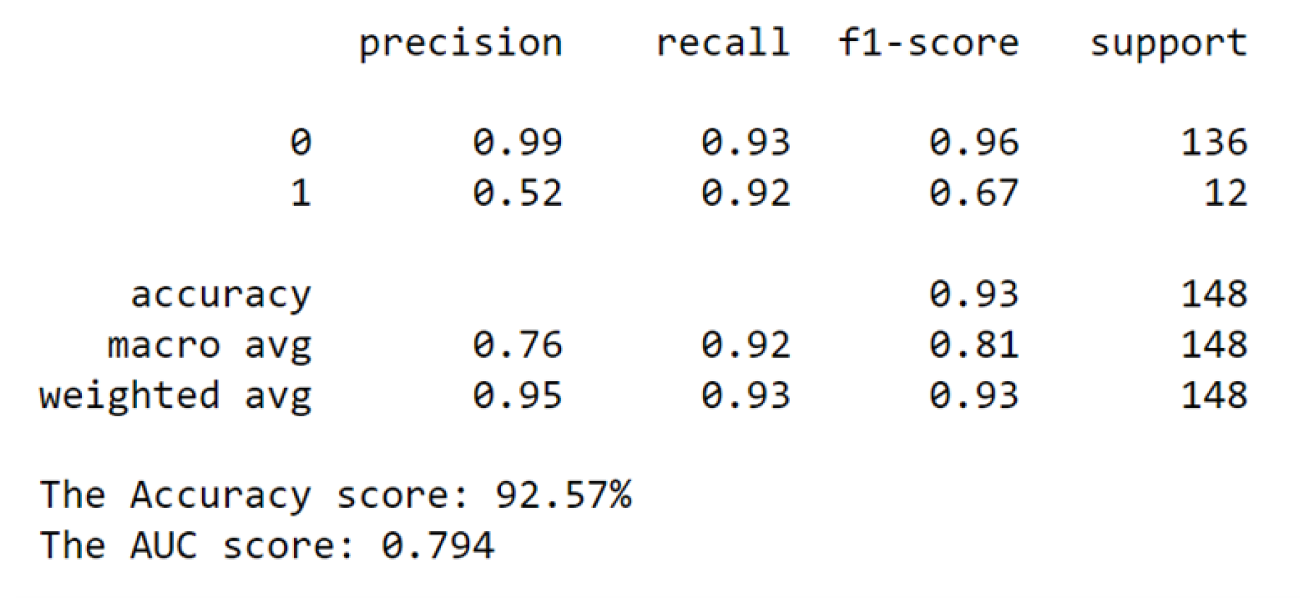
We also compared the classification reports for the two instances of classification and achieved the following outcomes.
Figure 12.
Before Transformation.
Figure 12.
Before Transformation.
Figure 13.
After Transformation.
Figure 13.
After Transformation.
From the classification report, the accuracy rose from 0.83 to 0.93. The increase signifies a substantial enhancement in the model’s general predictive abilities. Additionally, both the macro and weighted averages for precision, recall, and f1-score exhibited significant improvements. The macro average, which treats both classes equally, showed increases across all metrics: precision (0.63 to 0.76), recall (0.79 to 0.92), and f1-score (0.66 to 0.81). These improvements underscore a balanced boost in model performance for both classes.
Similarly, the weighted average, also showed increases: precision (0.92 to 0.95), recall (0.83 to 0.93), and f1-score (0.86 to 0.93). This comprehensive improvement indicates that the transformation’s benefits extend to the model’s ability to handle imbalanced data.
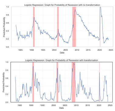
Next, we provide a graphical visualization of the probability happening. This was done and compared for the cases of with and without transformation.
Before transformation, Figure ?? displays a smoother curve with more gradual increases in predicted probabilities preceding the recession periods, highlighted by vertical red lines. After transformation, Figure ?? exhibits sharper and more significant spikes in predicted probabilities, particularly during known recession periods like the early 1990s and the 2008-2009 financial crisis. These heightened peaks suggest that the transformed model may have a heightened sensitivity to the indicators of a recession, providing a more pronounced warning in advance. Overall, the transformation seems to have enhanced the model’s ability to detect the likelihood of a recession.
4.3.1. Probabilistic Model - Gaussian Naive Bayes(GNB)
Here, a probabilistic model was applied, the signals were normalized and a lag added to the recession dates, just as was the case with the linear model. Ros resampling technique was applied on the imbalanced recession data with lag. The following results were obtained, and observations reported.
Figure 14.
Before Transformation.
Figure 14.
Before Transformation.
Figure 15.
After Transformation.
Figure 15.
After Transformation.
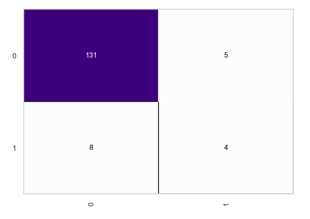
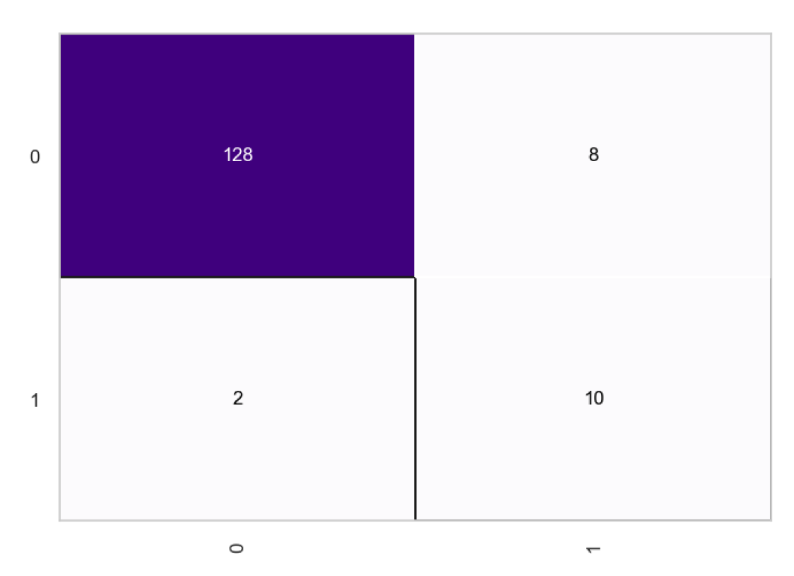
From the confusion matrices, we observe a total of 131 true positives and 4 true negatives, with the number of false negatives being higher at 8 compared to the 5 false positives. After the transformation, the true negatives increase to 10, indicating an enhanced ability to correctly identify negative cases. The true positives slightly decrease to 128, which is a minimal change. However, there’s a noteworthy reduction in false negatives to 2, showing the model’s improved sensitivity in correctly predicting positive cases. Meanwhile, the false positives have risen to 8, suggesting a trade-off where the model is now mistaking some negatives for positives more often than before. Overall, the transformation seems to have favorably impacted the model’s predictive accuracy, particularly by reducing false negatives, which is often crucial in scenarios where missing out on a positive prediction could have significant consequences.
The classification report of the Gaussian Naive Bayes model shows a marked improvement from the first outcome (no transformation) to the second (after transformation). Initially, the model struggled with the minority class, indicating a potential issue with class imbalance, as evidenced by the lower performance metrics for that class. However, after transformation, there is a significant enhancement in the model’s ability to correctly identify the minority class, which is reflected in the improved recall and F1-score for that class. This suggests that an adjustment resampling has been successfully applied to address the imbalance and improve the overall performance of the model. Consequently, the macro average and weighted average scores across all metrics also show substantial improvement, confirming that the model’s predictive power has become more balanced and effective across both classes.
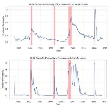
The graphical representation for the recession probabilities as given by the model is as shown below.

From the graphs, we observe a relatively smoother curve with fewer and less pronounced peaks in the pre-transformation plot. The observation suggests that the model is conservative in predicting the likelihood of a recession. Conversely, the post-transformation graph displays a more volatile behavior with numerous sharp peaks, indicating a model that is more sensitive to the underlying factors that may signal a recession. Particularly, the period around 2005 shows a significant change where the post-transformation model predicts several high-probability peaks that are absent in the pre-transformation model. This increased sensitivity could be beneficial if the model is capturing true positives (actual recessions) more effectively, but it also runs the risk of producing more false positives (predicting a recession when there isn’t one). The model provides a trade-off between the cost of missing a recession versus the cost of a false alarm.
4.3.2. Non-Linear Models: Random Forests (RF) and eXtreme Gradient Boosting (Xgboost)
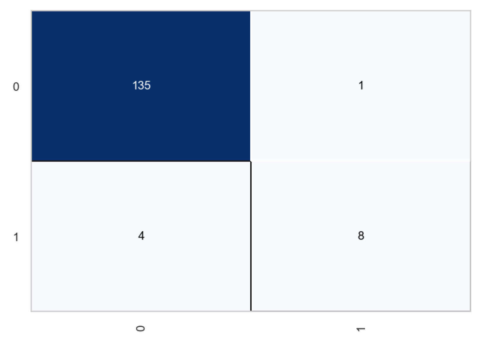
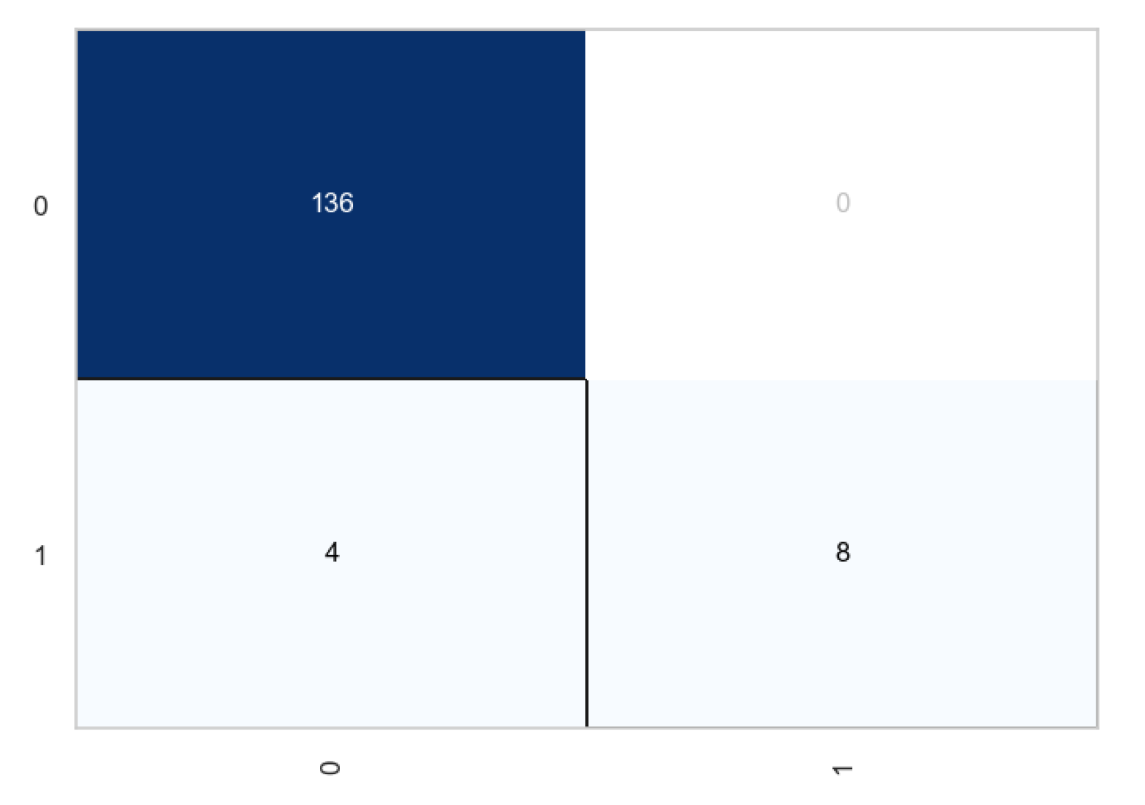
The non-linear models includes random forests and Xgboost. Similar formulations were used to set the models, and results recorded and reported. One of the most significant observations was that the two models did not rely so much on transformations of the indicators, however, addition of lag was still necessary at it served the purpose of early recession detection. The following confusion matrix shows the outcome for the random forests before and after transformation.
Figure 16.
Classification matrix of the random forests before transformation.
Figure 16.
Classification matrix of the random forests before transformation.
Figure 17.
Classification matrix of the random forests after transformation.
Figure 17.
Classification matrix of the random forests after transformation.
From the above plots, we observe that transformation had very little impact in the classification process. The number of true negatives increased by 1, while the number of true positives remained the same for each case. From the classification report, the accuracy improved from 96.62 to 97.30 which is not a significant increase. Similar observations were noted in the case of Xgboost.
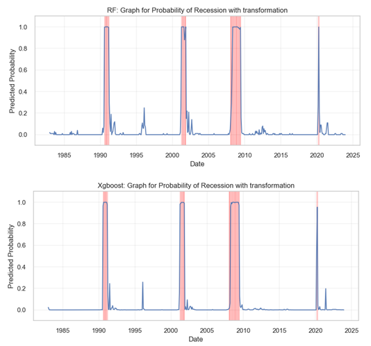
Next we plotted the probabilities and compared the results for the two non-linear models.

Comparing above probability plots for recession, we observe contrasting predictive behaviors. The RF model generates a graph with numerous peaks, some aligning well with the historical recessions as marked by the red vertical line, indicating a certain level of sensitivity to the conditions leading to a recession. The XGBoost model’s plot is markedly smoother with fewer peaks, suggesting a more conservative approach to predicting recessions. Notably, the XGBoost plot shows fewer false positive peaks, but it also seems to miss some known recession periods. Overall, the RF model appears more sensitive, potentially at the cost of false alarms, while the XGBoost model seems to prioritize minimizing false positives, even if it risks missing some true positives. The two models were applied in the ensemble model because the bagging (for RF) and boosting (xgboost) techniques embeded in the algorithms an yield diverse perspectives on the data.
4.3.3. Feature Importance for the Non-linear Models
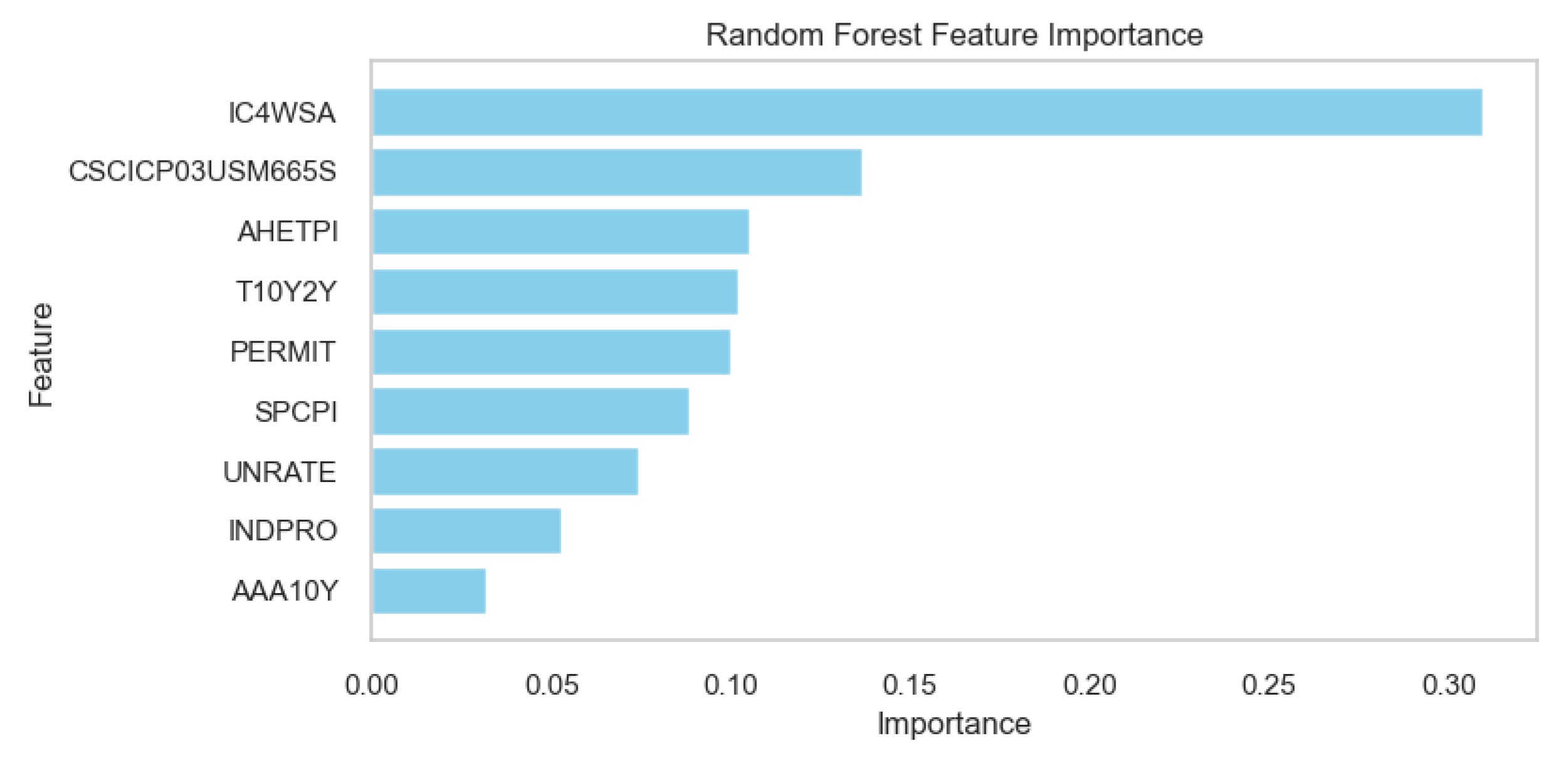
The non-linear models have a attribute which is not available in the other algorithms. We present these plots to demonstrate the contribution of each non-linear model towards the prediction of recession probabilities.
Figure 18.
Random Forests Feature Importance Scores.
Figure 18.
Random Forests Feature Importance Scores.
Figure 19.
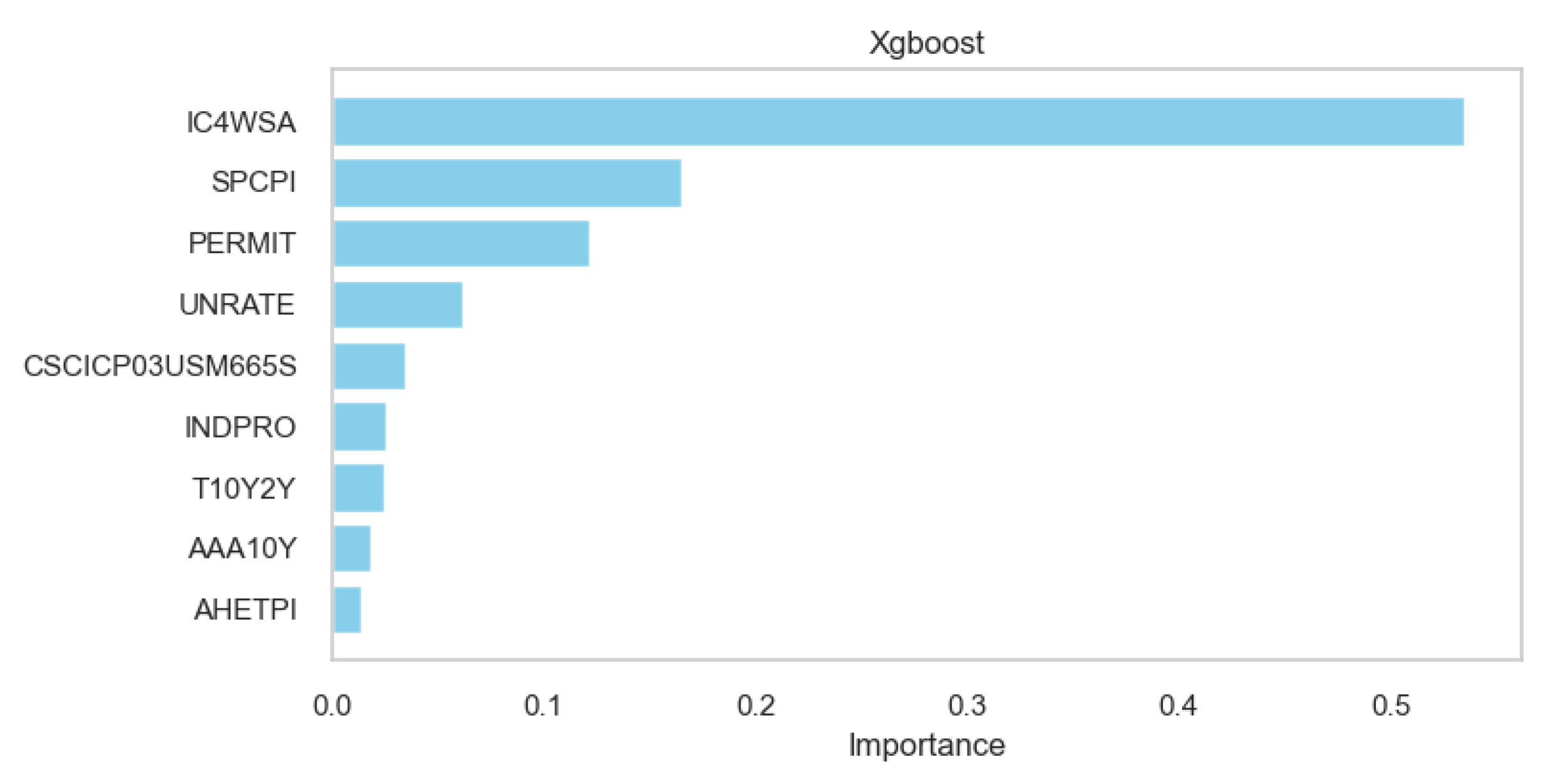
Xgboost Feature Importance Scores.
Figure 19.
Xgboost Feature Importance Scores.
In the Random Forest model, the feature ‘IC4WSA’ stands out with the highest importance score, significantly more influential than the others. The features ‘CSCICP03USM665S’ and ‘AHETPI’ also show notable importance, though less than ‘IC4WSA’. On the other hand, the XGBoost model assigns the greatest importance to ‘IC4WSA’ as well, but with an even more dominant weight compared to the other features. Features like ‘SPCPI’, ‘PERMIT’, and ‘UNRATE’ appear more prominent in the XGBoost model than in the Random Forest model. The XGBoost model also assigns substantial importance to ‘AHETPI’ and ‘AAA10Y’, whereas these features are less significant in the Random Forest model. These discrepancies underscore the differences in how each model processes.
4.4. Model Ensembling - Averaging Approach
The last stage of model configuration was the most different one as it did not rely on one algorithm but a combination of the four discussed above. Average was applied as an ensembling technique, to build a robust model that utilizes the strengths of the linear, probabilistic and non-linear approaches, to compensate for the weaknesses of each algorithm.
The outcomes for the predicted probabilities were obtained for the averaged model and plotted as shown in the following graph.
Figure 20.
Training plots for the predicted probabilities of the US recession for the Ensembled Model.
Figure 20.
Training plots for the predicted probabilities of the US recession for the Ensembled Model.
4.4.1. Confusion Matrix and Classification Report
Results from the previous models were used to configure the algorithm, and generate the results. Consequentially, the following classification report was generated.
Figure 21.
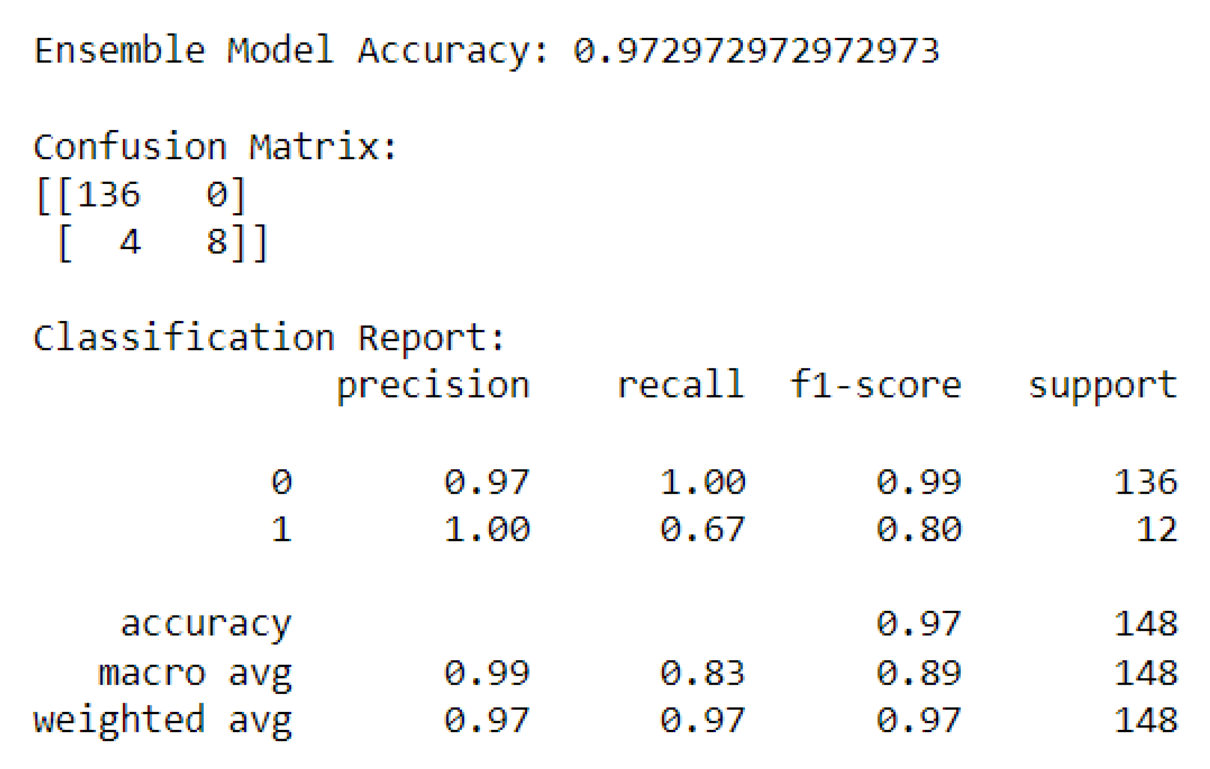
Classification report for the models’ average.
Figure 21.
Classification report for the models’ average.
The report provides an outline of the results in the form of a confusion matrix and classification report.
From the confusion matrix, we observe that the model achieved 136 true positives and 8 true negatives. This result indicates that the model is particularly adept at identifying the majority class (class 0) with a perfect recall rate. However, there are 4 instances where the model incorrectly predicted the minority class (class 1), signifying false negatives.
From the classification report, the precision for class 0 is 0.97, which is very high, and perfect for class 1, suggesting no false positives for the minority class. The recall rate is perfect for class 0 but stands at 0.67 for class 1, indicating that while the model captures all instances of class 0, it misses about a third of the instances of class 1. The f1-score, which combines precision and recall into a single measure, is excellent for class 0 at 0.99 and quite good for class 1 at 0.80, indicating a reasonably well-balanced model for both classes.
The model’s overall accuracy is mirrored in the weighted average scores for precision, recall, and the f1-score, each standing at 0.97, aligning closely with the model’s accuracy which stands at 0.973. The macro average scores, which treat both classes equally, are also high, with precision at 0.99, recall at 0.83, and the f1-score at 0.89.
4.4.2. ROC Curve and AUC
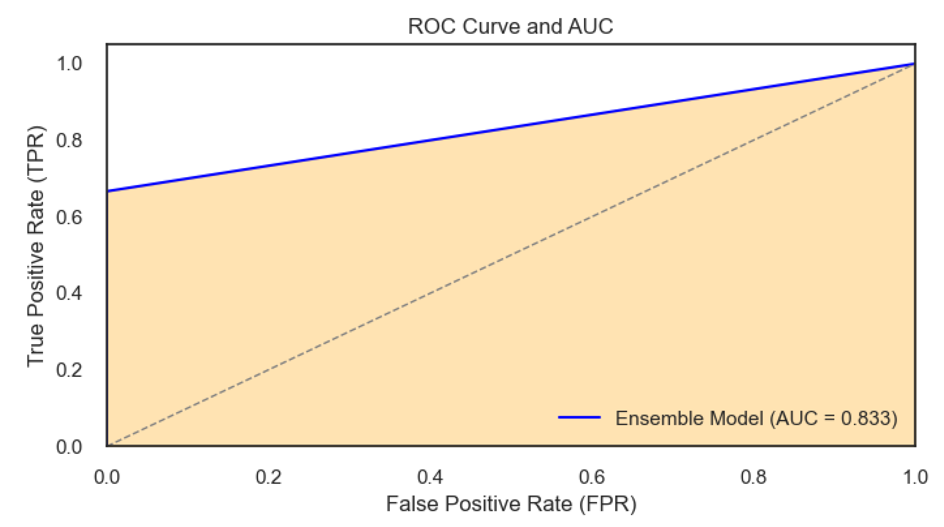
The ROC curve and AUC were used to illustrate the power of the ensembled model in predicting recession probabilities at different rates of TP and FP. The AUC – Area Under the ROC Curve – is a measure of the model’s ability to distinguish between the two classes and is inherently tied to the ROC curve. The figure below shows the outcome:
Figure 22.
ROC curve with the AUC for the Ensembled Model.
Figure 22.
ROC curve with the AUC for the Ensembled Model.
The ROC curve for the ensemble model exhibits a good performance with an AUC of 0.83. An AUC value closer to 1 than to 0.5 indicates that the model has a strong capacity to measure of separability. Specifically, the AUC of 0.83 suggests that the model can almost correctly distinguish between the positive class and the negative class.
The ROC curve and AUC indicate that the ensemble model is effective for the task at hand, providing a good tool for decision-making processes where accurate classification is necessary. Further evaluation in a real-world setting or across multiple data sets would be beneficial to confirm the model’s robustness and to fine-tune its threshold to maximize both precision and recall according to domain-specific requirements.
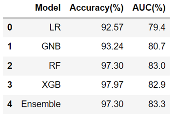
The table below shows the performance summary for the five models used in this project.
Table 5.
Performance summary in terms of accuracy of the models.
Table 5.
Performance summary in terms of accuracy of the models.
From the summary, we observe that logistic Regression (LR) shows relatively lower accuracy and AUC compared to other models, suggesting less predictive strength. The Gaussian Naive Bayes (GNB) has slightly better performance, with small increases in both accuracy and AUC. The Random Forest (RF) and Extreme Gradient Boosting (XGB) models achieve much higher accuracy (above 97%), with RF also having the highest AUC, indicating a strong ability to distinguish between classes. The Ensemble model, matches the RF’s accuracy but with a slightly higher AUC, which might suggest better generalization. Interestingly, despite XGB having the highest accuracy, its AUC is lower than that of the RF and Ensemble models, indicating that while it may predict correctly most of the time, it may not rank the positive cases as consistently higher than the negative cases as the RF and Ensemble models do. The observations justify the choice of the ensemble model for performing the out-of-sample predictions in this paper.
4.5. Forecast Results for the Probability of Economic Recession
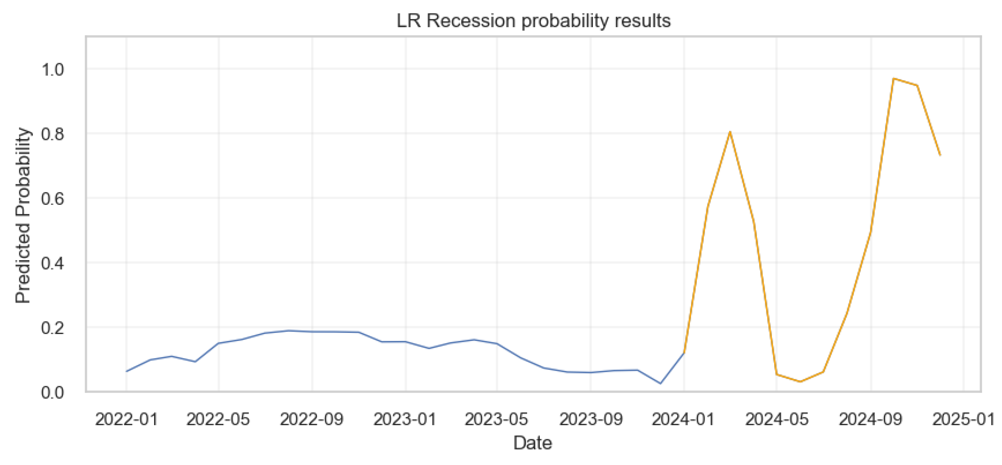
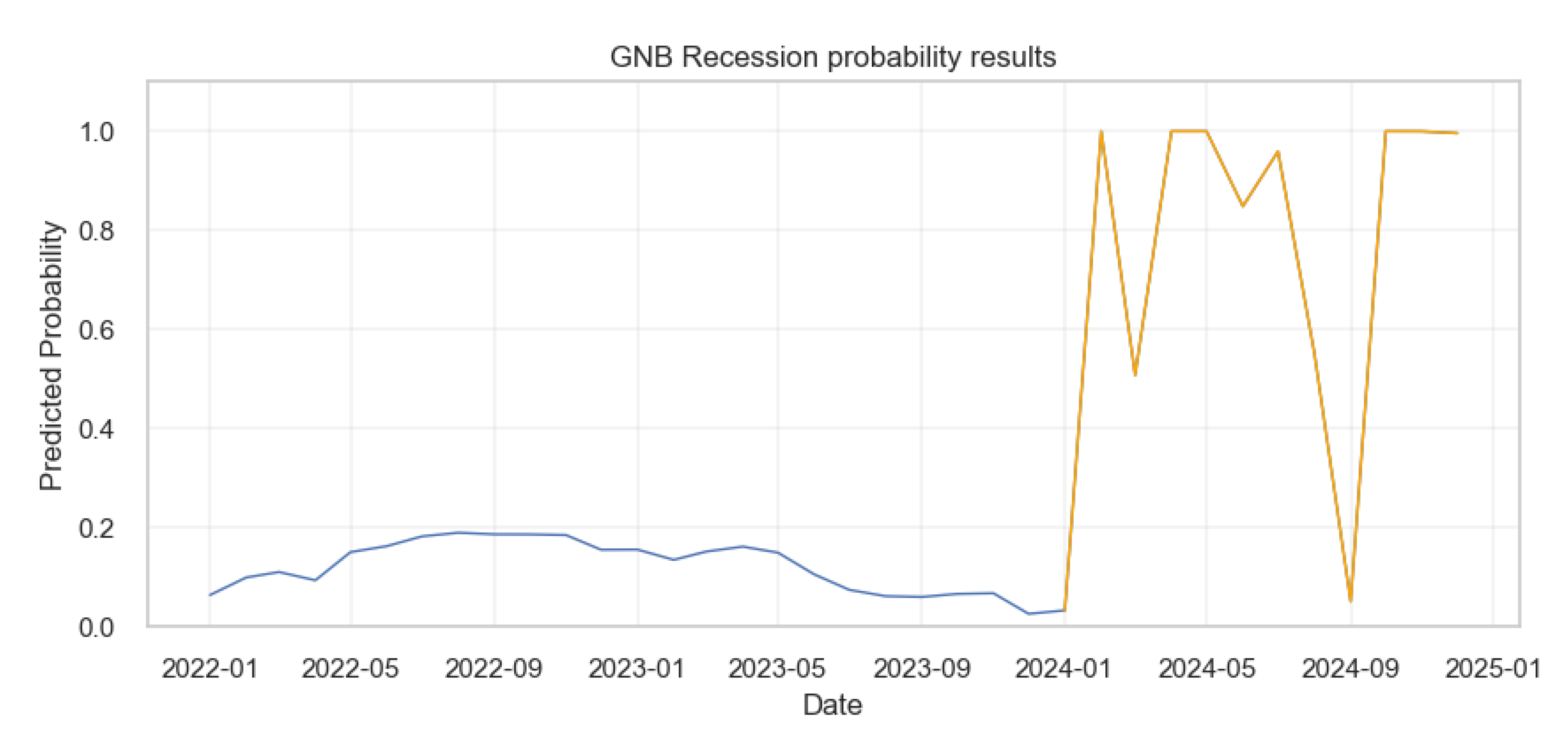
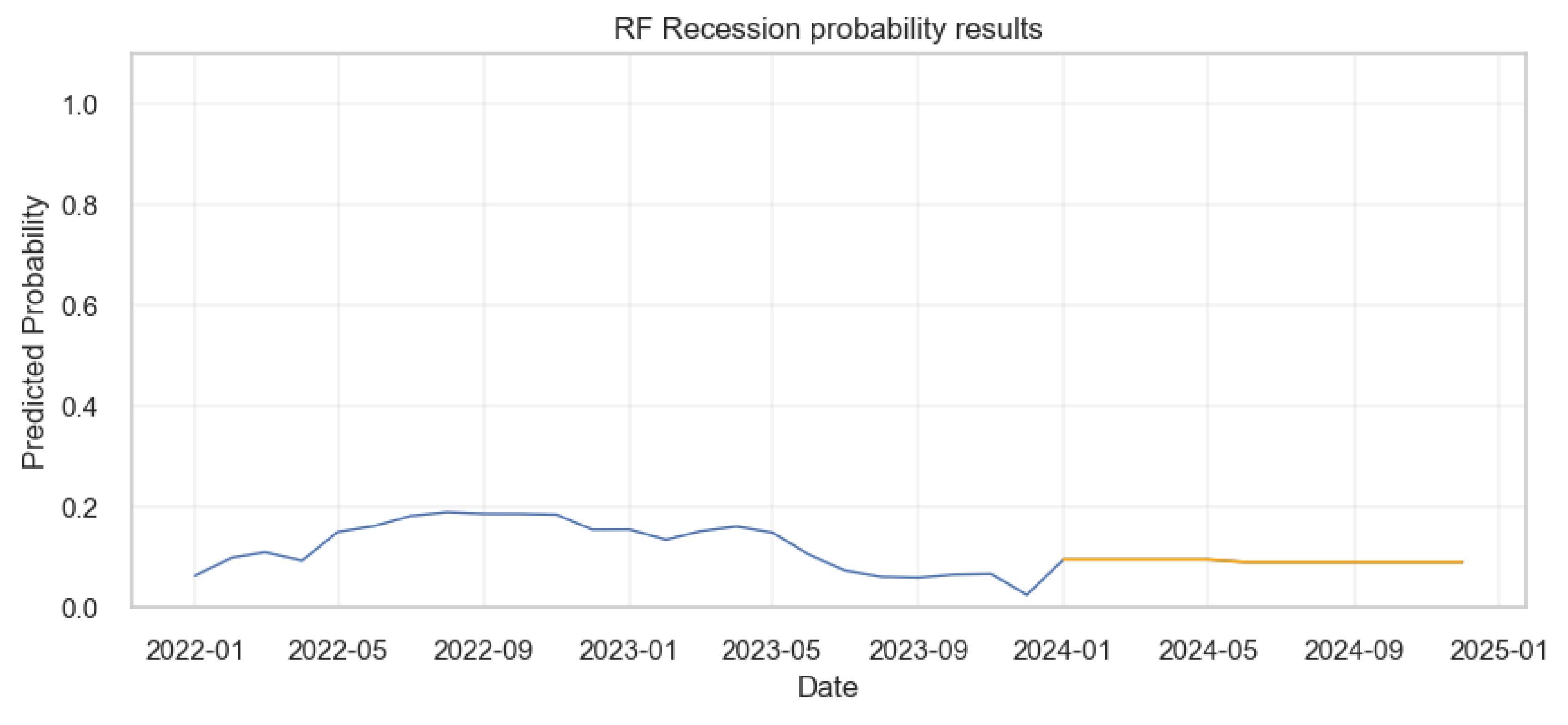
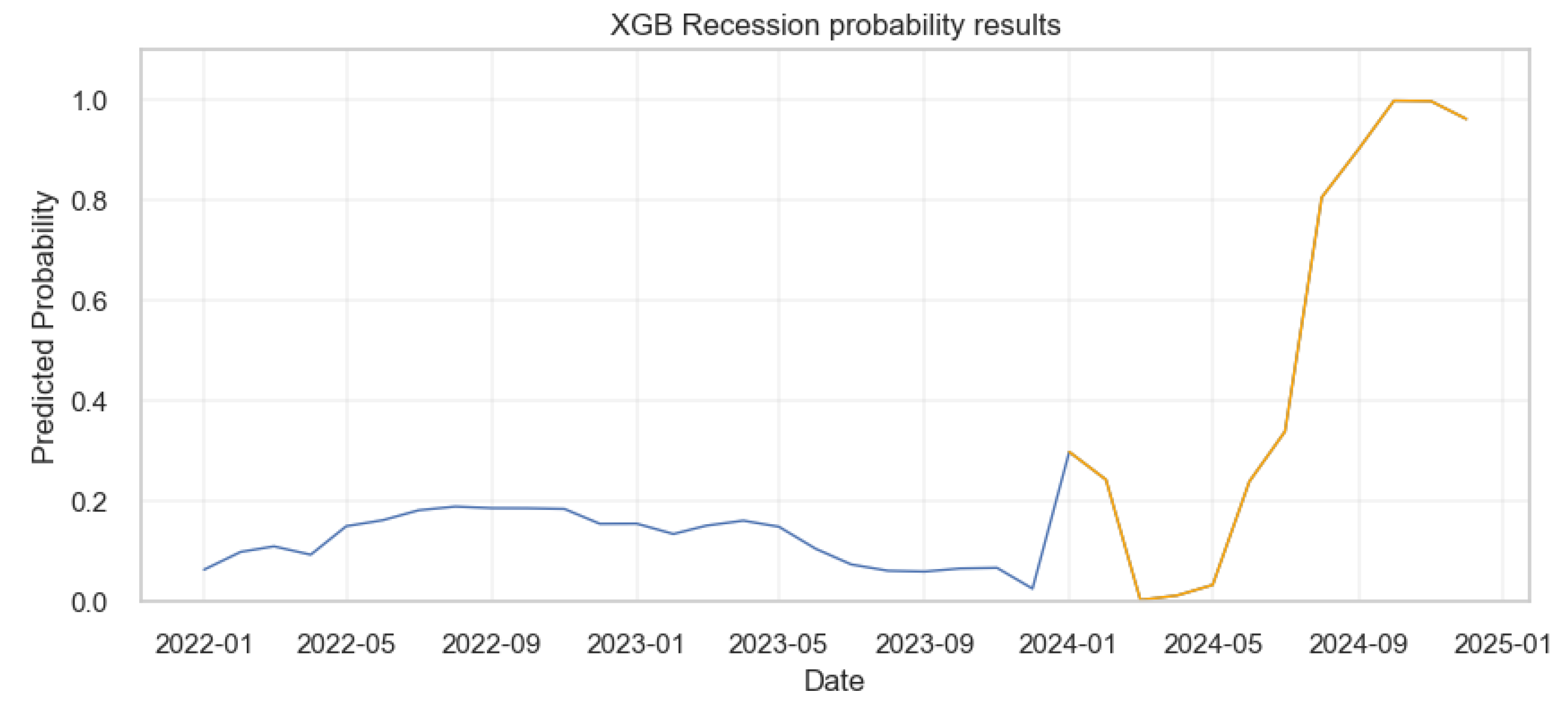
This section provides a detailed analysis of the potential likelihood of economic downturns in the forthcoming one year period using five machine learning models. First, we will present reports of the economic crisis prediction results for the four individual models. Then we present the results of using all of the four models called the ensemble model to predict economic crisis. We plot the predicted probability of the U.S. economic crisis for 2024 for each model in yellow line along with the real probability of economic crisis of 2022-2023 in blue line.
4.5.1. Logistic Regression
The results from the logistic regression were shown below.
Figure 23.
Probability of Economic crisis according to logistic regression.
Figure 23.
Probability of Economic crisis according to logistic regression.
The Figure 29 shows that from early 2022 to the end of 2023, the probability of a recession is consistently low, mostly under 0.2 as shown by the blue line. However, there are two prominent spikes in the model’s predictions based on the one year forecast data as indicated by the orange line: one around March 2024 and another around October, 2024, with probabilities surging to above 0.8 and then dropping back down. This suggests that, according to the model, the risk of recession was significantly higher during these two periods.
Gaussian Naive Bayes
The results from the Gaussian Naive Bayes were as shown below.
Figure 24.
Probability of Economic crisis according to Gaussian Naive Bayes Model.
Figure 24.
Probability of Economic crisis according to Gaussian Naive Bayes Model.
In Figure 29, the blue line shows the probabilities of recession from the actual data. In contrast to the logistic regression model, from early 2024 onward, the Gaussian Naive Bayes model displays a more volatile prediction pattern as shown by the orange line, with several sharp peaks and troughs indicating fluctuating probabilities of a recession. These probabilities reach as high as 1.0 at times, suggesting periods of very high predicted recession risk according to this model, but these spikes are brief with some predictions lasting less than a month.
III. Random Forests
The results from the Random Forests were as shown below.
Figure 25.
Probability of Economic crisis according to Random Forests Model.
Figure 25.
Probability of Economic crisis according to Random Forests Model.
The prediction results from the Random Forest (RF) model indicate a consistently low probability of recession from the beginning of 2022 through to early 2024, with the probability largely hovering under 0.2 as shown by the blue and orange lines. There’s a slight increase observed around mid-2023, but it remains below 0.25. From early 2024 onward, the model shows a remarkably flat prediction, with the probability of recession being constant and minimal, close to zero. This suggests a stable outlook according to the Random Forest model, with no significant risk of recession predicted beyond early 2024.
IV. eXtreme Gradient Boosting
The results from the XGBoost were as shown below.
Figure 26.
Probability of Economic crisis according to XGBoost Model.
Figure 26.
Probability of Economic crisis according to XGBoost Model.
According to the XGboost model’s prediction results, the probability of a recession remains low and relatively stable from the beginning of 2022 up to early 2024, with a slight uptick around mid-2023 (blue line). From early 2024, the model predicts (as shown by the orange line), a sharp increase in the probability of a recession, reaching a peak just below 1.0 around October 2024. Following this peak, the model suggests a slight decrease but then maintains a high probability of a recession towards the end of 2024, indicating a period of high recession risk.
4.6. Applying the Ensemble Model to Predict U.S. Economic Recession
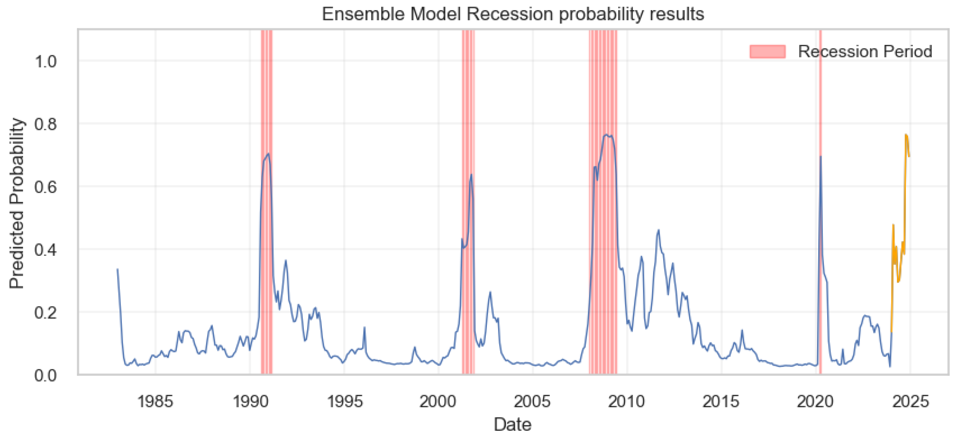
After building, training, testing and evaluating the ensemble model, the next step was to apply it on a real life situation. The forecasts from section 3, subsection 3.2.5 were used to generate the predictions in terms of probabilities. First, we plotted the general results for the entire data set including the historical data and one year forecast for the indicators . The results were as shown below:
Figure 27.
Prediction Results for the entire Data set.
Figure 27.
Prediction Results for the entire Data set.
The blue line represents the predicted likelihood of a recession occurring at different points in time, with several notable peaks corresponding to past recessions, as highlighted by the vertical red bands. The periods covered by these bands indicate times of economic downturn, as recognized by the model’s historical data. Moving into the future, the forecast period is marked in orange, starting early 2024, and shows a significant spike in the recession probability at different months. This suggests that, based on the model’s indicators, there is a considerable risk of a recession occurring in 2024 at specific months.
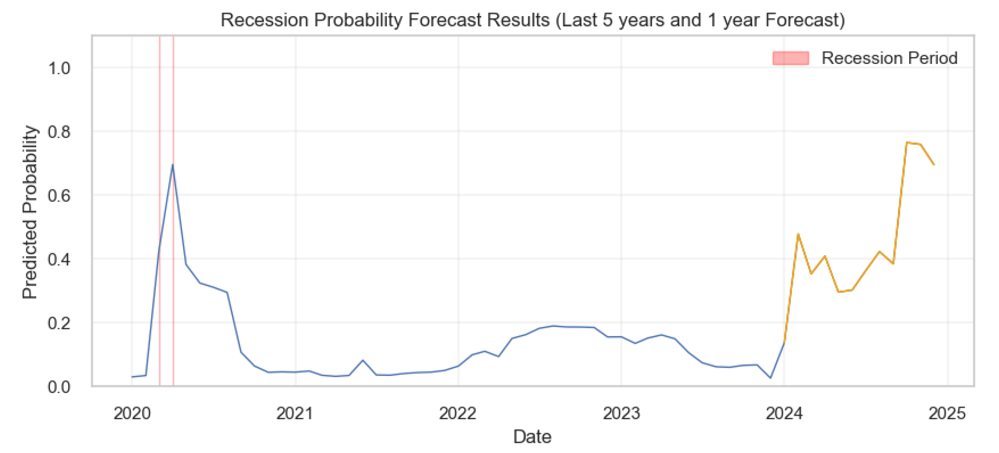
To get a clear understanding of when the recessions were likely to happen according to the model, we plotted the prediction probabilities based on the last five years of the historical data and concatenated this with the 1-year out of sample forecasts. The outcome was as shown.
Figure 28.
Results for the Past 5 years and 1-year Economic Recession Probability Prediction .
Figure 28.
Results for the Past 5 years and 1-year Economic Recession Probability Prediction .
The graph shows the recession probabilities over the last five years, along with a 1-year forecast into the future, according to the ensemble predictive model. The historical data, represented by the blue line, shows a peak around 2020, likely indicating the economic impact of COVID-19. Following this, the recession probability declines and remains relatively low until the beginning of the forecast period, which is depicted in orange. The forecast predicts a volatile period with two pronounced peaks suggesting a heightened probability of recession occurring around January/February and October/November, 2024. The red bands highlight the actual recession periods, aligning with the peaks in predicted probabilities, thereby validating the model’s effectiveness in historical data.
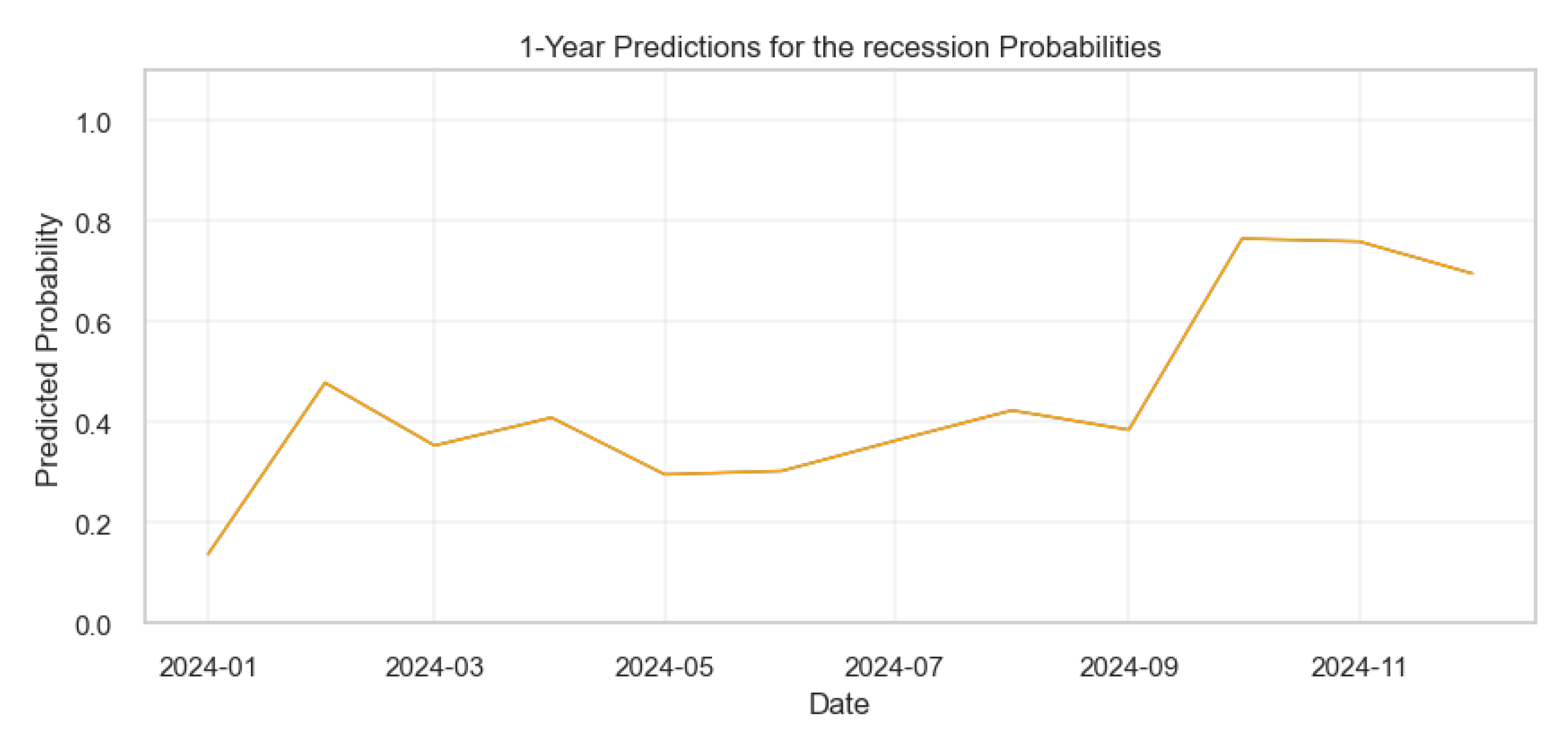
The figure below shows the specific months for the predicted recession dates for the year 2024.
Figure 29.
Results for the 1-year Economic Recession Probability Prediction.
Figure 29.
Results for the 1-year Economic Recession Probability Prediction.
