Submitted:
19 October 2024
Posted:
21 October 2024
You are already at the latest version
Abstract
Keywords:
1. Introduction
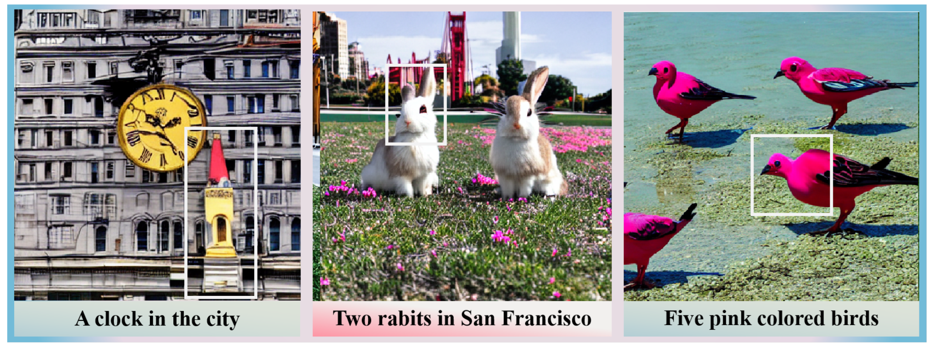
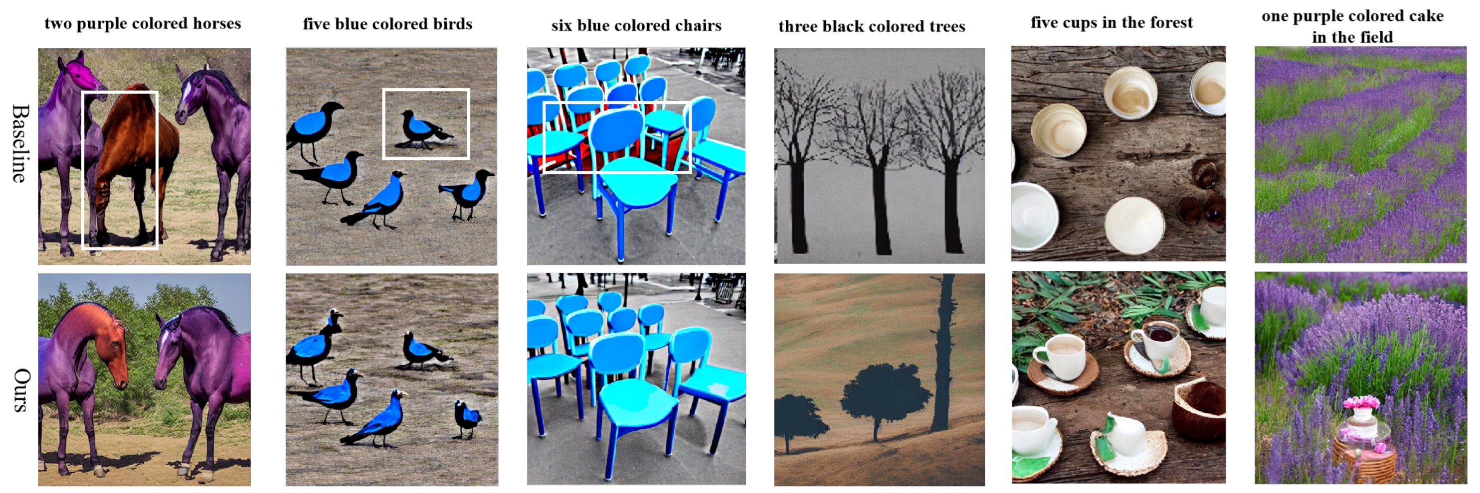
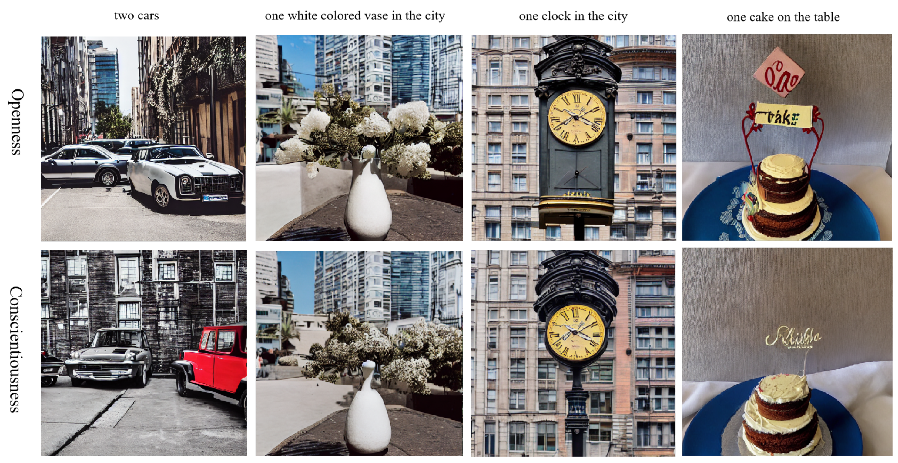
- Use HITL to generate personalized images: To our best knowledge, this paper is the first to exploit an aesthetic assessment model to finetune the image generation model to get results more in line with human aesthetic preference.
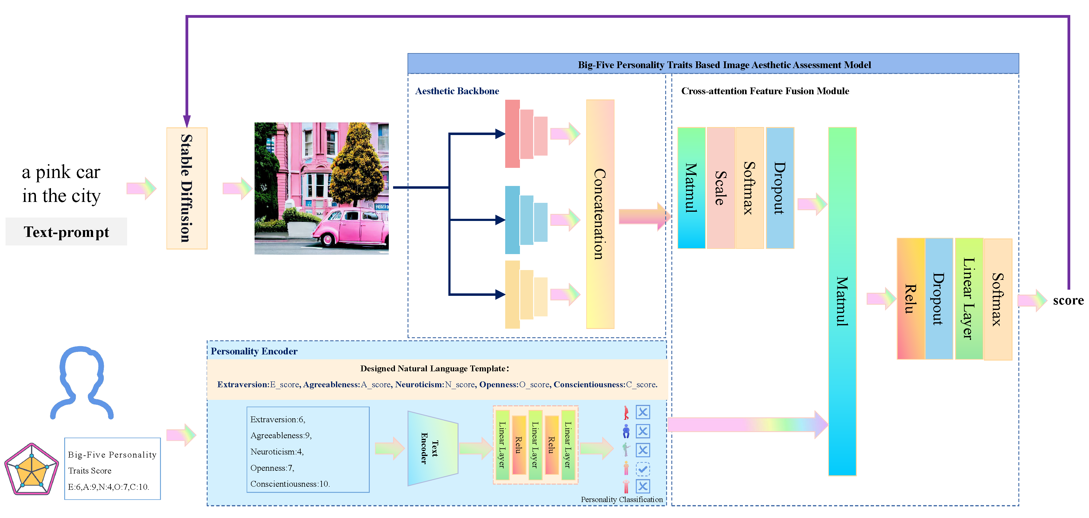
- Build the Personality Encoder: We embed the personality traits score distributions into the natural language to get sentences, exploiting them to pre-train a transformer-based model on the text classification task, making the model output the correct personality category. The model will be utilized in the latter training of personalized image aesthetic assessment.
- Develop Big-Five personality traits based Image Aesthetic Assessment model: We concurrently input personality traits and image features into the pre-trained PE and the backbone of the aesthetic model, and we introduce the cross-attention fusion module to amalgamate features from different modalities. Subsequently, these features are utilized for mapping, ultimately yielding aesthetic scores.
2. Related Work
2.1. Text-to-Image Generation Models
2.2. Image Aesthetic Assessment Task
2.3. Connections between Big-Five Personality Traits and Human Aesthetic Preference
3. Methods
3.1. Personality Encoder
3.1.1. Overall Architecture
3.1.2. Data Preparation
3.1.3. Experiment of the Pretraining Task
3.2. Big-Five Personality Traits Based Image Aesthetic Assessment Model
3.2.1. Overall Architecture
3.2.2. Data Preparation
3.2.3. Experiment on Prepared Data
3.3. Personalized Image Generation Model
3.3.1. General Architecture
3.3.2. Data Preparation
3.3.3. Adapt Stable Diffusion with BFIAA Model via LoRA
4. Experiments and Analysis
4.1. Results of the Personality Encoder
4.2. Results of Our BFIAA Model
4.3. Results of the Personalized Image Generation Model
5. Future Discussion
6. Conclusions
Author Contributions
Funding
Informed Consent Statement
Acknowledgments
Conflicts of Interest
References
- Salimans, T.; Goodfellow, I.; Zaremba, W.; Cheung, V.; Radford, A.; Chen, X. Improved techniques for training gans. Advances in Neural Information Processing Systems (NeurIPS) 2016, 29. [Google Scholar]
- Heusel, M.; Ramsauer, H.; Unterthiner, T.; Nessler, B.; Hochreiter, S. Gans trained by a two time-scale update rule converge to a local nash equilibrium. Advances in Neural Information Processing Systems (NeurIPS) 2017, 30. [Google Scholar]
- Wu, X.; Sun, K.; Zhu, F.; Zhao, R.; Li, H. Better aligning text-to-image models with human preference. International Conference on Computer Vision (ICCV), 2023.
- Lee, K.; Liu, H.; Ryu, M.; Watkins, O.; Du, Y.; Boutilier, C.; Abbeel, P.; Ghavamzadeh, M.; Gu, S.S. Aligning text-to-image models using human feedback. arXiv 2023. [Google Scholar]
- Wu, X.; Xiao, L.; Sun, Y.; Zhang, J.; Ma, T.; He, L. A survey of human-in-the-loop for machine learning. Future Generation Computer Systems 2022, 135, 364–381. [Google Scholar] [CrossRef]
- Radford, A.; Kim, J.W.; Hallacy, C.; Ramesh, A.; Goh, G.; Agarwal, S.; Sastry, G.; Askell, A.; Mishkin, P.; Clark, J. ; others. Learning transferable visual models from natural language supervision. Proceedings of International Conference on Machine Learning (ICML), 2021, pp. 8748–8763.
- Yang, Y.; Xu, L.; Li, L.; Qie, N.; Li, Y.; Zhang, P.; Guo, Y. Personalized image aesthetics assessment with rich attributes. Conference on Computer Vision and Pattern Recognition (CVPR), 2022, pp. 19861–19869.
- He, S.; Zhang, Y.; Xie, R.; Jiang, D.; Ming, A. Rethinking image aesthetics assessment: Models, datasets and benchmarks. International Joint Conference on Artificial Intelligence (IJCAI), 2022, pp. 942–948.
- Qiao, N.; Sun, Y.; Liu, C.; Xia, L.; Luo, J.; Zhang, K.; Kuo, C.H. Human-in-the-loop video semantic segmentation auto-annotation. IEEE Winter Conference on Applications of Computer Vision (WACV), 2023, pp. 5881–5891.
- Li, J.; Li, D.; Xiong, C.; Hoi, S. Blip: Bootstrapping language-image pre-training for unified vision-language understanding and generation. Proceedings of International Conference on Machine Learning (ICML). PMLR, 2022, pp. 12888–12900.
- Rombach, R.; Blattmann, A.; Lorenz, D.; Esser, P.; Ommer, B. High-resolution image synthesis with latent diffusion models. Conference on Computer Vision and Pattern Recognition (CVPR), 2022, pp. 10684–10695.
- Hu, E.J.; Wallis, P.; Allen-Zhu, Z.; Li, Y.; Wang, S.; Wang, L.; Chen, W. ; others. LoRA: Low-Rank Adaptation of Large Language Models. International Conference on Learning Representations (ICLR), 2021.
- Goodfellow, I.; Pouget-Abadie, J.; Mirza, M.; Xu, B.; Warde-Farley, D.; Ozair, S.; Courville, A.; Bengio, Y. Generative adversarial nets. Advances in Neural Information Processing Systems (NeurIPS) 2014, 27. [Google Scholar]
- Reed, S.; Akata, Z.; Yan, X.; Logeswaran, L.; Schiele, B.; Lee, H. Generative Adversarial Text to Image Synthesis. Proceedings of International Conference on Machine Learning (ICML), 2016, Vol. 48, pp. 1060–1069.
- Vaswani, A.; Shazeer, N.; Parmar, N.; Uszkoreit, J.; Jones, L.; Gomez, A.N.; Kaiser, Ł. ; Polosukhin, I. Attention is all you need. Advances in Neural Information Processing Systems (NeurIPS) 2017, 30. [Google Scholar]
- Ramesh, A.; Pavlov, M.; Goh, G.; Gray, S.; Voss, C.; Radford, A.; Chen, M.; Sutskever, I. Zero-shot text-to-image generation. Proceedings of International Conference on Machine Learning (ICML), 2021, pp. 8821–8831.
- Ramesh, A.; Dhariwal, P.; Nichol, A.; Chu, C.; Chen, M. Hierarchical text-conditional image generation with clip latents. arXiv 2022. [Google Scholar]
- Chang, H.; Zhang, H.; Barber, J.; Maschinot, A.; Lezama, J.; Jiang, L.; Yang, M.H.; Murphy, K.; Freeman, W.T.; Rubinstein, M. ; others. Muse: Text-to-image generation via masked generative transformers. Proceedings of International Conference on Machine Learning (ICML), 2023.
- Ho, J.; Jain, A.; Abbeel, P. Denoising diffusion probabilistic models. Advances in Neural Information Processing Systems (NeurIPS) 2020, 33, 6840–6851. [Google Scholar]
- Nichol, A.; Dhariwal, P.; Ramesh, A.; Shyam, P.; Mishkin, P.; McGrew, B.; Sutskever, I.; Chen, M. Glide: Towards photorealistic image generation and editing with text-guided diffusion models. Proceedings of International Conference on Machine Learning (ICML), 2022.
- Dhariwal, P.; Nichol, A. Diffusion models beat gans on image synthesis. Advances in Neural Information Processing Systems (NeurIPS) 2021, 34, 8780–8794. [Google Scholar]
- Do, C.B. The multivariate Gaussian distribution. Section Notes, Lecture on Machine Learning, CS 2008, 229. [Google Scholar]
- Kenton, J.D.M.W.C.; Toutanova, L.K. BERT: Pre-training of Deep Bidirectional Transformers for Language Understanding. Proceedings of NAACL-HLT, 2019, pp. 4171–4186.
- Xu, J.; Liu, X.; Wu, Y.; Tong, Y.; Li, Q.; Ding, M.; Tang, J.; Dong, Y. Imagereward: Learning and evaluating human preferences for text-to-image generation. arXiv 2023. [Google Scholar]
- Celona, L.; Leonardi, M.; Napoletano, P.; Rozza, A. Composition and style attributes guided image aesthetic assessment. IEEE Transaction on Image Processing 2022, 31, 5009–5024. [Google Scholar] [CrossRef] [PubMed]
- Niu, Y.; Chen, S.; Song, B.; Chen, Z.; Liu, W. Comment-guided semantics-aware image aesthetics assessment. IEEE Transaction on Circuits and Systems for Video Technology 2022, 33, 1487–1492. [Google Scholar] [CrossRef]
- Goldberg, L.R. An alternative “description of personality”: The Big-Five factor structure. In Personality and Personality Disorders; 2013; pp. 34–47.
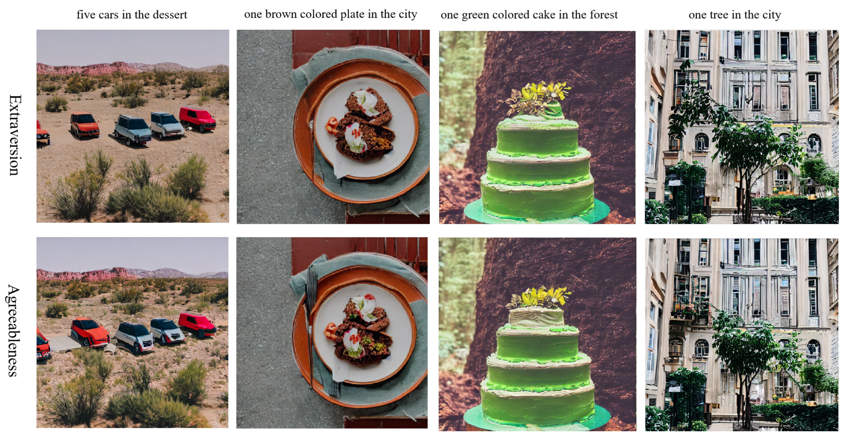
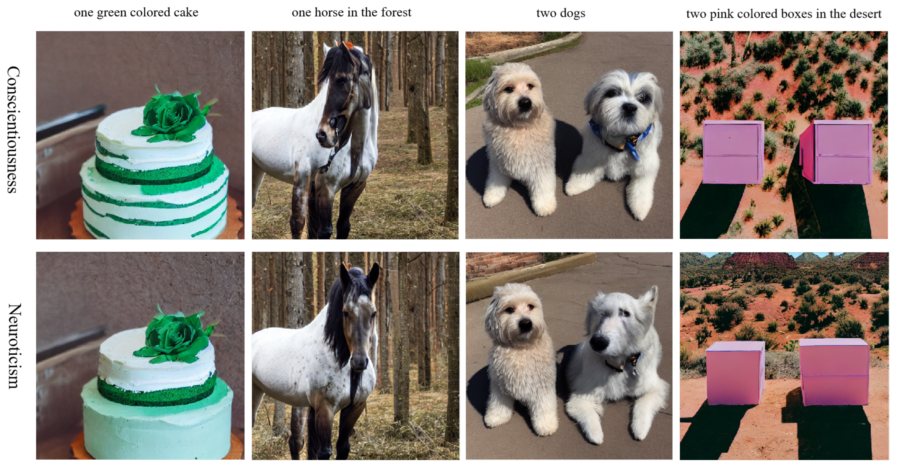
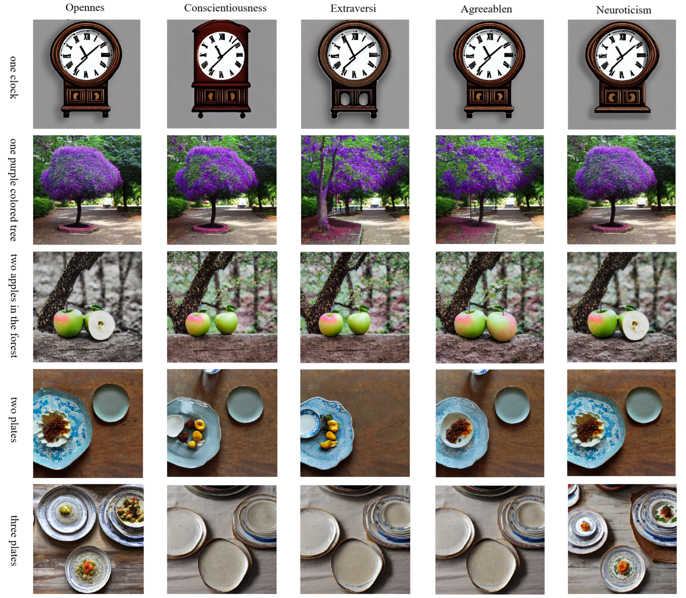
| PM | AL | ED | LR | Accuracy |
| CLIP_ViT_H_14 | ConvNet | 100 | 0.0005 | 54.3% |
| CLIP_ViT_H_14 | MLP | 100 | 0.0005 | 76.8% |
| all-mpnet-base-v2 | MLP | 100 | 0.0005 | 86.4% |
| all-mpnet-base-v2 | MLP | 100 | 0.001 | 94.6% |
| all-mpnet-base-v2 | MLP | 30 | 0.001 | 98.1% |
| Evaluation Metrics | Baseline in PARA[7] | TANet | BFIAA (Ours) |
| SRCC | 0.705 | 0.752 | 0.718 |
| PLCC | 0.751 | 0.711 | 0.761 |
| Model | Personality Traits | SRCC | PLCC | Accuracy |
| w/o PE, CA | O | 0.752 | 0.801 | 98.9% |
| C | 0.784 | 0.842 | 98.4% | |
| E | 0.516 | 0.582 | 98.0% | |
| A | 0.693 | 0.761 | 99.4% | |
| N | 0.516 | 0.571 | 98.6% | |
| w/o CA | O | 0.756 | 0.815 | 99.0% |
| C | 0.803 | 0.862 | 98.9% | |
| E | 0.522 | 0.585 | 98.5% | |
| A | 0.743 | 0.787 | 99.4% | |
| N | 0.598 | 0.629 | 98.2% | |
| BFIAA | O | 0.780 | 0.821 | 99.0% |
| C | 0.816 | 0.862 | 98.2% | |
| E | 0.628 | 0.670 | 98.2% | |
| A | 0.755 | 0.796 | 99.3% | |
| N | 0.613 | 0.656 | 98.4% |
| Model | CLIP score | MSE loss |
| Baseline | 0.383 | 0.132 |
| O | 0.383 | 0.0868 |
| C | 0.385 | 0.0868 |
| E | 0.383 | 0.0868 |
| A | 0.383 | 0.0868 |
| N | 0.384 | 0.0868 |
Disclaimer/Publisher’s Note: The statements, opinions and data contained in all publications are solely those of the individual author(s) and contributor(s) and not of MDPI and/or the editor(s). MDPI and/or the editor(s) disclaim responsibility for any injury to people or property resulting from any ideas, methods, instructions or products referred to in the content. |
© 2024 by the authors. Licensee MDPI, Basel, Switzerland. This article is an open access article distributed under the terms and conditions of the Creative Commons Attribution (CC BY) license (http://creativecommons.org/licenses/by/4.0/).


