
Submitted:
27 December 2024
Posted:
30 December 2024
You are already at the latest version
Preprints on COVID-19 and SARS-CoV-2
Abstract
This file describes a model called the SEQIRP model [8] which is a modified SIR model and it has been proposed by Dr Pabel Shahrear, S. M. Saydur Rahman, Md Mahadi Hasan Nahid from Shahjalal University of Science and Technology, Bangladesh which uses some basic parameters of Covid – 19 to predict the future of Covid 19 situation. We have used the data from 01 December 2021 to January 05, 2022, to predict the next peak point of COVID-19 in the next 250 days from December 01, 2021. Here we calculated the Basic Reproduction Number R0 by using Next-generation matrix, and to state the result from the model, we have used MATLAB to simulate our analysis by using the fourth-order Runge-Kutta (RK4) method and validate the results using fourth-order polynomial regression. Finally, we have got our prediction for Covid – 19. After getting the result we have taken the data from April 1, 2021, to February 28, 2022, and do a statistical analysis by using descriptive statistics and a histogram by using Microsoft Excel, which will validate the accuracy of our model. We have analyzed the SEQIRP model [8] with newly available data and tried to predict the next wave of COVID-19 in Bangladesh, and then we tried to validate the result with statistical analysis to achieve the model’s accuracy. Finally, we can claim the usefulness of the model in Bangladesh that, in the future, should we use the model to determine the wave of COVID-19 or not. This result of our model represents the effect of Covid 19 in Bangladesh.
Keywords:
SEQIRP
; SIR
; Covid
; RK4
; MATLAB
; Excel
; Descriptive Statistics
; Histogram
; Next-Generation Matrix
; Polynomial Regression
1. Introduction
1.1. Overview
Here, we take a closer look at the history of COVID-19 from the first recorded case to the current efforts to curb the spread of the disease through global vaccination programs. The first official cases of COVID-19 were recorded on the 31st of December 2019, when the World Health Organization (WHO) was informed of cases of pneumonia in Wuhan, China, with no known cause [1]. On the 7th of January, the Chinese authorities identified a novel coronavirus, temporally named 2019-nCoV, as the cause of these cases [1]. In the early months of COVID-19, health officials around the world, government agencies, and the public were uncertain about how the disease would spread and how it would affect daily life. On March 1, 2020, the United Nations released $ 15 billion to support the global response to COVID-19. One week later, on March 7, the cases of COVID-19 reached 100,000. A few days later, on March 11, COVID-19 was declared a pandemic by the WHO. COVID-19 was quickly transformed into a seemingly universal problem in China, becoming a global health emergency for almost one night [1].
In recent times, with the aspect of Bangladesh at the end of 2021, we have seen the rise of covid 19 significantly [2,3,4,5,6,7]. In Starting of February 2021 an article was published by Shahrear, Pabel, et al. developed a modified version of SIR model based on the scenario of Bangladesh [8]. In this paper a model named “SEQIRP” stands for Susceptible–Exposed–Quarantine–Infected–Recovered–Death model has been proposed to determine the behaviour of Covid 19 in Bangladesh based on available information of the Covid 19. Now in our aspect, we will take the model for granted and will be analyzing the model based on current data and try to find the situation of Covid 19 in Bangladesh in the next 300 days. We will also find the approximate date of Covid 19 to go on its peak point in the next 300 days to predict its aspect. We will also have to find the basic reproduction number for the model formulation, and we used the method of the next-generation matrix to calculate the basic reproduction number. In the next section, we will find all this information and calculations in detail.
1.2. Scope of the Work
In this paper, we describe the SEQIRP model [8] with the latest data of Covid 19 in Bangladesh to predict the future of Covid 19 in Bangladesh. As we know the situation of Bangladesh regarding Covid 19 is getting worse day by day as of January 2022, we take the data from November 01, 2021, to January 5, 2022, to get our parameters to find the peak of the situation by using the SEQIRP model.
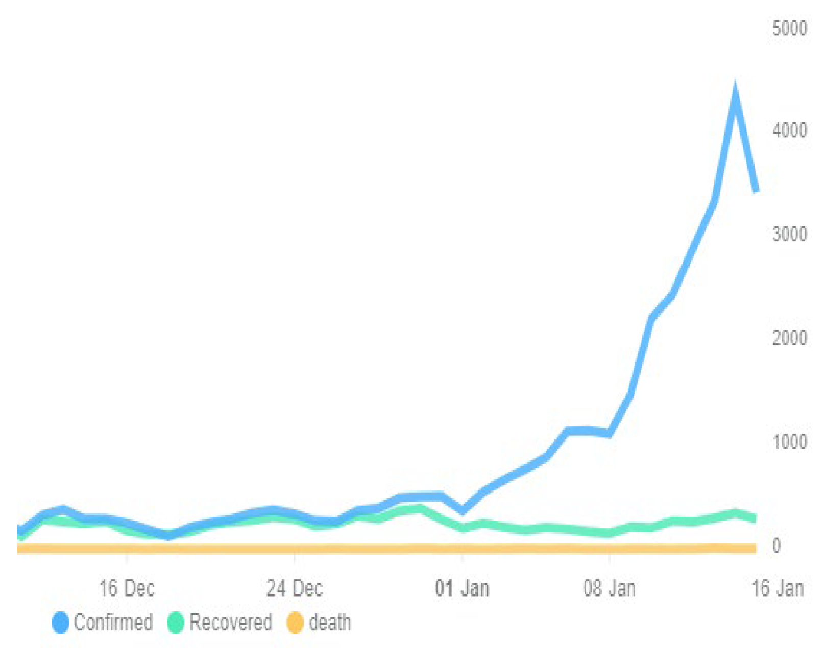
If we see the last stat of new cases of covid in the last two weeks from January 13, 2022, we can get that,
Figure 1.
Covid 19 New Cases stat Bangladesh in last two weeks from 13 Jan 2022.
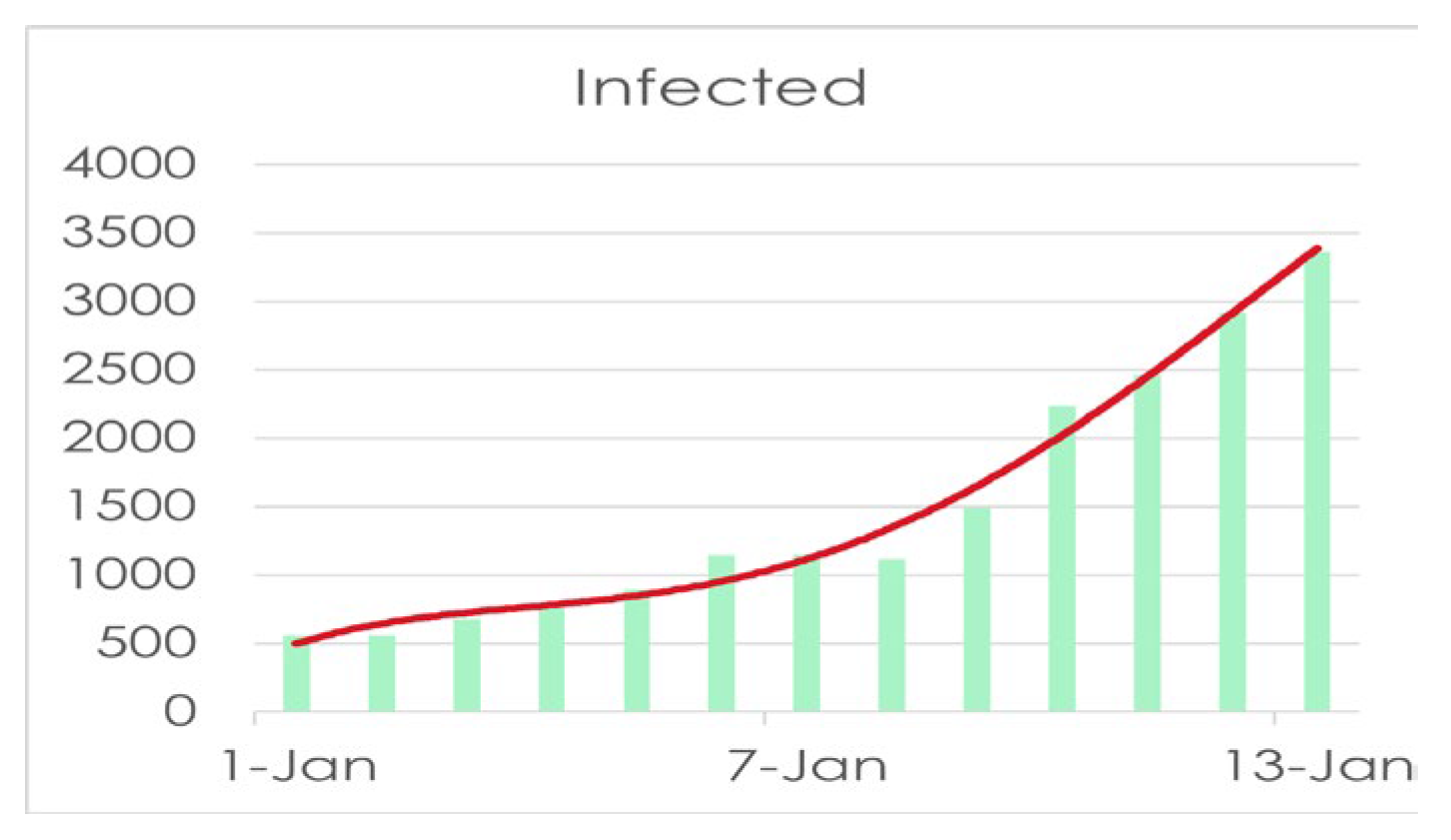
So, if take a look at the stat above we can easily get the current scenario of Bangladesh that from the beginning of this year there is a significant increase in daily new cases in Bangladesh which makes us a little worried that there might be some worse scenario in next few months and with analyzing the current situation we can estimate our required parameters to obtain the result from the newly proposed SEQIRP model to predict the future of Covid 19 situation here in Bangladesh. Now if we look at the recovery of Covid 19 infected people we can have,
In Figure 2 we can get that the daily recovery rate is somehow stable at this moment but with the increase of daily new cases, the number of recoveries will be set to increase a lot with time. Now we will analyze the current stat with our data to predict the upcoming situation of Covid 19 in Bangladesh. We have used many data sources to collect the data about Covid 19 in Bangladesh and calculated using Microsoft excel and we also tried to analyze the model’s sensitivity with MATLAB. Now here we will discuss the formation of the model and our work and its implementation and how we calculated the parameters and assumed from which sources and why we assumed that.
1.3. Objectives
In our project, we tried to predict the situation of Covid 19 in Bangladesh by using available data from many open-source websites that provide authentic data provided by the Government of the People’s Republic of Bangladesh [10]. Our primary objectives in this project are,
- Deciding parameters
- Formulate model
- Estimating Parameters
- Using the parameters in MATLAB to generate the final graph by using the fourth order Runge–Kutta (RK4) method
- Sensitivity analysis and validate the results using fourth-order polynomial regression.
1.4. Challenges
On the time of ongoing development of the project, we find some challenges which were partially solved or somewhere need to obtain alternative approach and some of those are, Lack of data. Recovery data was missing in Worldometer [11] and John Hopkins [12], We solved the problem by using AMBASSADE DE FRANCE AU BANGLADESH [9] daily news data and CoronaTracker [13] website. We used Covid 19 Dataset [14] available online to get the available data. After solving these challenges, we move forward with the actual development of the project and start assuming and estimating the needed parameters.
1.5. Related Works
We have found many other models other than the SEQIRP model [8] and found those amazing. A paper entitled “Mathematical Modeling Based Study and Prediction of COVID-19 Epidemic Dissemination Under the Impact of Lockdown in India” by Vipin Tiwari, Namrata Deyal and Nandan S. Bisht [22] has proposed a model called “SEIRD model” which stands for Susceptible (S)-Exposed (E)-Infected (I)-Recovered (R)-Death (D) model which is used to investigate the progression of COVID-19 and predict the epidemic peak under the impact of lockdown in India.
The aim of this study [22] is to provide a more precise prediction of epidemic peaks and to evaluate the impact of lockdown on epidemic peak shifts in India. Another study entitled “Mathematical modelling and the transmission dynamics in predicting the Covid-19 - What next in combating the pandemic” [24] we have used to get a description about the outcome and the challenges of SIR, SEIR, SEIRU, SIRD, SLIAR, ARIMA, SIDARTHE, etc. models used in prediction of spread, peak, and reduction of Covid-19 cases. With the same approach “Prediction of COVID-19 transmission dynamics using a mathematical model considering behavior changes in Korea” by Soyoung Kim, Yu Bin Seo and Eunok Jung [25] modelled the COVID-19 outbreak in Korea by applying a mathematical model of transmission that factors in behavioral changes.
So, If we go through the papers based on the same concept of ours we will see most of them has been used the “SEIR” model [22,23,24,29,33] and in our case we also used a modified “SIR” model which very identical to the above SEIR model wherein definition of SEIR model we can say, one of the most commonly used statistical methods to describe the spread of an epidemic is the SEIR model, which we have used to calculate the number of people infected with the virus, recovering, and dying based on the number of people infected, the chances of transmission. , inflammation and infection. In some respects [30] they were also talked about “NPIs” where Nonpharmaceutical Interventions (NPIs) are actions, in addition to vaccination and medication, that individuals and communities can take to help reduce the spread of diseases such as influenza (influenza). NPIs are also known as community reduction strategies. When a new flu virus spreads among people, it causes illness all over the world, called the flu virus [31]. We have also gone through some research that shows the difficulties and challenges in the making of our model on Covid 19 prediction [32].
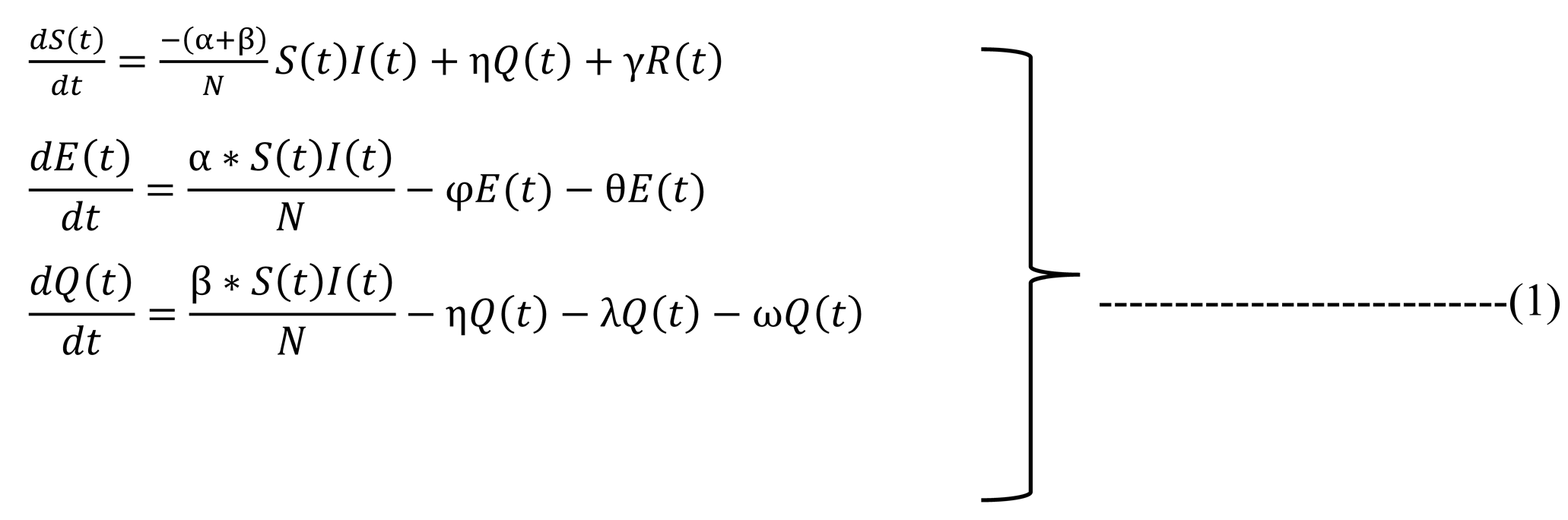
2. Model Description
2.1. Model Formation
In this part, we will talk about the model that was proposed called the SEQIRP model [8] and analyze the model with current data. Now, as we get the current data from different sources as we have the data, we can estimate the data and assume them based on the current scenario. In our model, t is representative of the time in our case, so the SEQIRP model is, Here, S(t) represents the susceptible class that is uninfected, E (t) represents infected people but not infectious, Q(t) represents the quarantine that may involve uninfected, infected, and death. I(t) represent the number of infected people that have to be cured or dead, and R(t) represents the recovered individuals having a cure from the disease. Finally, P(t) represents the disease that dies the people: N(t), the total number of populations at time t.
In this system, we have six individual classes, and those classes are,
Here, S(t) represents the susceptible class that is uninfected, E (t) represents infected people but not infectious, Q(t) represents the quarantine which may involve in uninfected, infected, and death. I(t) represent the number of infected people that have to be cured or dead, and R(t) represents the recovered individuals having a cure from the disease. Finally, P(t) represents the disease dies the people: N(t), the total number of populations at time t. In this system, we have six individual classes, and those classes are,
Susceptible (S), ii. Exposed (E), iii. Quarantine (Q), iv Infected (I), v. Recovered (R)
Death (P)
Now let’s we see how these classes are interconnected with each other by the diagram below,
Here is the description of these rates from the diagram,

Table 1.
Parameter’s Description (1/Day).
| Parameter | Description | Parameter | Description |
| α | Contact rate of susceptible class to exposed class. | ω | The death rate of quarantine class to death class. |
| β | Contact rate of susceptible class to quarantine class. | ρ | The rate of recovery. |
| φ | Transmission coefficient of exposed class to infectious class. | ψ | The rate of death. |
| θ | The death rate of exposed class to death class. | γ | The rate of susceptibility. |
| η | Transferred rate of quarantine class to susceptible class. | λ | Transferred rate of quarantine class to infectious class. |
The model maintains the following properties:
- Susceptible people are transmitted into exposed class and quarantine class at rate of α and β respectively.
- Exposed class people become infectious at a rate φ and exposed class people are dying at a rate θ.
- Quarantine people are moved into susceptible class at η transferred rate because the people are uninfected due to COVID-19, also, the people are infectious and death class transmitted at a certain rate λ and ω.
- Infected people are removed from the disease at a rate ρ.
- The disease dies infected people at rate ψ.
- Recovered people become susceptible again at a rate γ.
- We have assumed that the disease of COVID-19 spreads mainly from infected and the rate of incidence is of the from
2.2. Model Accuracy
This paper was published in February 2021 and this paper on the result section It was mentioned that in mid-July 2020 the Covid 19 in Bangladesh will be at its peak point and the Covid cases in July 2020 were highest in a real scenario. Here is the graph of Covid 19 in Bangladesh in 2020.
Figure 4.
Covid 19 situation in Bangladesh in 2020.
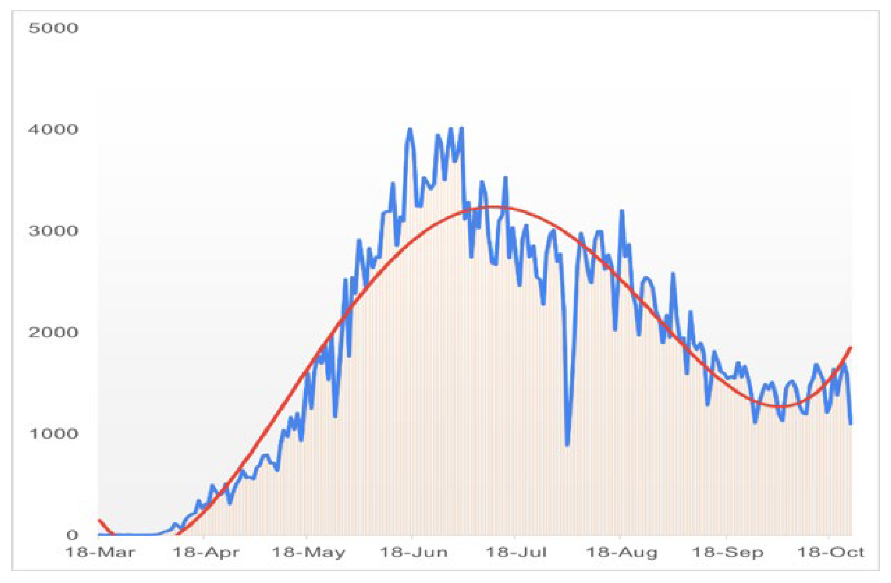
So, from the figure, we can conclude that the proposed SEQIRP model is nearly perfect and provide more than 90% accurate result. We got better accuracy in 2020, we will now try to reuse the method to predict the covid situation in Bangladesh in early 2022.
2.1. Model Structure
Based on these assumptions, the compartmental structure and flow directions of the model can be described using a directed flow chart as illustrated below,
In these equations birth rate and natural death rates are being considered as constant. Now from Table 1, knowing that S (t) , E (t) , Q (t) , I (t) , R(t) and P(t) are fractions of the population, We can say that,
here,
s (t) + e (t) + q (t) + i (t) + r (t) + p(t) = 1
From this assumption we can rewrite (1) as,
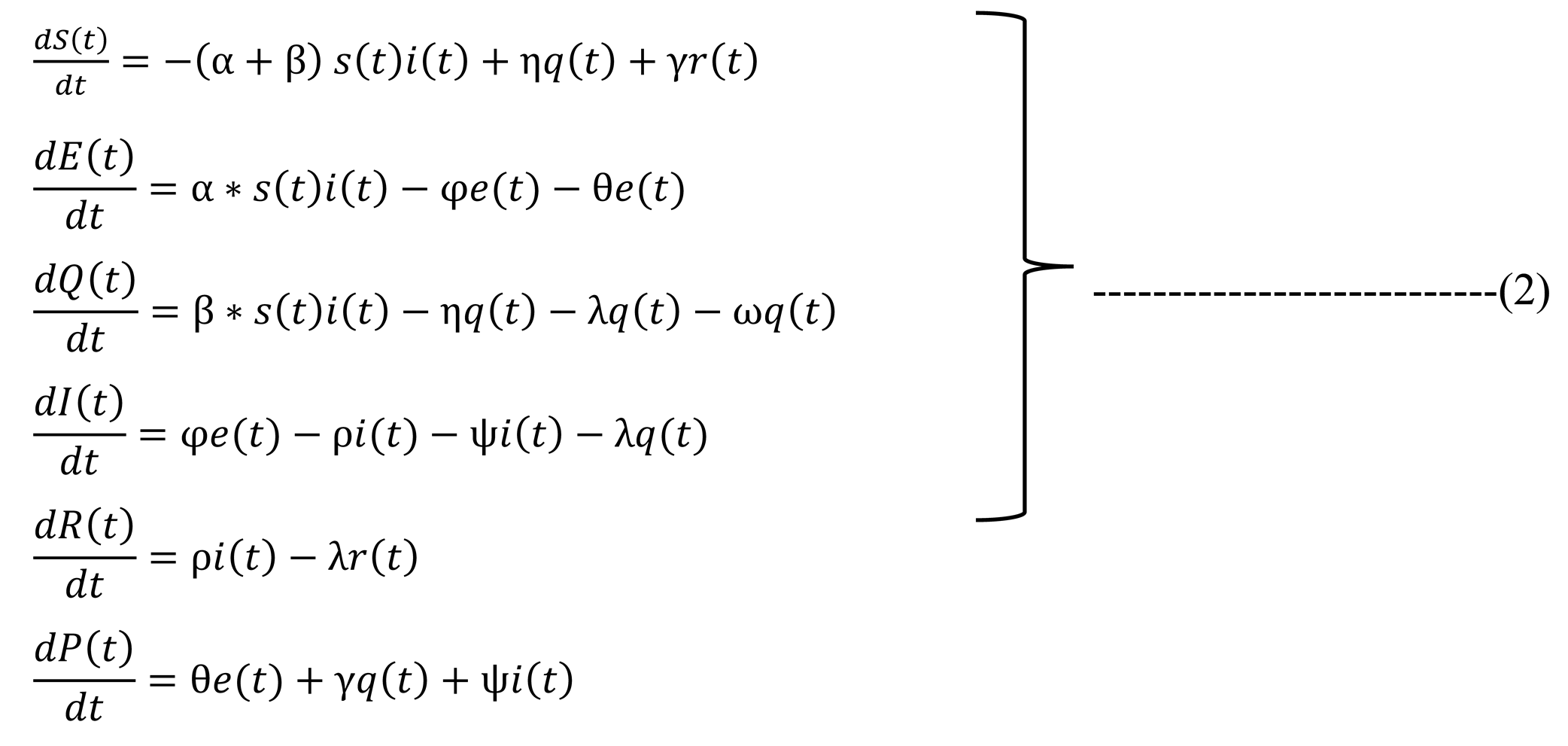
2.1. Mathematical Analysis of the Model
We have studied the paper which proposed the SEQIRP model [8] and here we find some basic principle for the model to be validated. Here we will discuss the terms in short below,
2.4.1. Equilibria
This term Equilibria refers to the state of the epidemic or pandemic to define its stability. At Equilibria the values of the left side of (2) will be zero as follow,
So the endemic equilibrium point from the system (2) is,
So, here, E∗ = (S∗, E∗, Q∗, I∗, R∗) is the unique endemic equilibrium of the system (2).
2.4.2. Basic Reproduction Number
In our scenario the Basic reproduction number can be calculated in the model [8] with the formula below,
We have used this formula to calculate the Basic reproduction number in Table 4. Now it is proved in the paper [8] that, When R0 < 1, the disease-free equilibrium E0 is locally asymptotically stable. If R0 = 1, E0 is locally stable. When R0 > 1, the infection-free equilibrium E0 is an unstable saddle point. When R0 > 1, the endemic equilibrium is E∗ locally asymptotically stable.
3. Data Collection and Methodologies
3.1. Data Source
We have collected data from many sources like Worldometer, JHU CSSE etc. [9,10,11,12,13,14] and We have calculated data from many sources and used Microsoft Excel to calculate parameters. Below here is a table showing the data we have collected From December 1, 2021, to January 5,2022. Now we have the data, and we will now take the numbers start from 0 (on Dec 1, 2021) at the beginning and get the data of different classes as shown below in the table which is showing the initial values of different variables.
3.2. Data Estimation and Assumption
Now here we consider where and are the representative of the exposed people who are infected by COVID-19 in today and yesterday respectively. Similarly, and infectious people who are recovered from COVID-19 in today and yesterday respectively. Finally, and are the infectious people who are death due to COVID-19 in today and yesterday respectively. All these ξ1, ξ2, ξ3 are entitled as α, ρ, ψ respectively. Using these equations, we calculated α, ρ and ψ, some for-example infectiousness rate φ, θ, and λ, etc. were taken from WHO or other credible sources.
Table 2.
Parameter estimation and Assumption.
| Parameters | Values | Data source |
| α | 0.0296 | Estimated |
| β | 0.4500 | Assumed |
| η | 0.3000 | Assumed |
| φ | 0.0300 | Assumed |
| θ | 0.0015 | Assumed |
| λ | 0.3000 | Assumed |
| ω | 0.1200 | Assumed |
| ρ | 0.0240 | Estimated |
| ψ | 0.0003 | Estimated |
| γ | 0.0000 | Assumed |
By using these values, we can now start the system to generate a prediction of Covid situation in Bangladesh.
3.3. Sensitivity Analysis
In proposed SEQIRP model we can gain our basic reproduction number by using the formula below,
By using this formula above we achieve,
Table 3.
Data for sensitivity analysis.
| Term | Value |
|---|---|
| R0 | 8.89 |
| 0.13 | |
| -0.99 | |
| -0.01 |
We observe the following results from the analysis of the indices:
- From, we can say that if increasing α by 10% increases by 10% |0.13| = 0.013 of R0, which can carry an outbreak and if α decreases 10% so R0 decreases by 10% |0.13| = 0.013 i.e., the value of α plays a major role in reducing the value of R0. Hence, it is required to make the rate of α reduced to restrain the disease. Therefore measures such as social distance and quarantine are being promoted by the WHO and the government to control the pandemic.
- is negative and from the value, we can say increasing (decreasing) ρ by 10% decreases (increases) R0 by 10% × ω|−0.99| = 0.099. Therefore, COVID patients need to be isolated to restrict the spread of the disease.
- Similarly, from is negative and from the value, we can say increasing (decreasing) ψ by 10% decreases (increases) R0 by 10% × |−0.01| = 0.001 Therefore, the COVID patients need to be isolated to restrict the spread of the disease.
In Figure 5, the actual infection rate will be at its peak at 72nd days (February 2022) and the peak value will be around 0.415. On the other hand, if we change the initial value such as adding 0.002 then we see the perturb line gives the peak situation in 59th days (January 2022). According to the deviation results, on the 72nd day (February 2022) the deviation of the actual value and the perturb value is 0.417 and the actual line surplus the perturb line. From Figure 5, we can see that after the 142nd day (April 2022) the infection rate is heading below 0.1 which implies the disease will be stable in Bangladesh.
From Figure 6, the actual recovery rate is upward after 250th days (August 2022) and the value is around 0.714 and the perturb line shows that the recovery rate is also upward, and the value is around 0.720. That means if we change the initial value adding 0.001 along with the initial value, the recovery rate is increasing, and the deviation is 0.006 on the 250th day (August 2022).
Figure 7 shows the death rate is upward. The perturb graph of the death rate and the actual graph is very close after the 100th day (March 2022). The deviation result for two different initial values is approximately 0 on around 250th days (August 2022). From Figure 8, we can see that the susceptible people get recovered from the disease day by day, so the infectious people are back to the original compartment. Adding 0.001 to the initial value then the recovery rate goes upward more quickly. Eventually, the people are back to their original position. The actual line of the rate of susceptible people and the perturb line is very close after the 100th day. Finally, on the 250th day (August 2022) the deviation value is very negligible.
3.4. Methodologies
This section will describe two of the methods we used in the projects with the instruments or softwires we used in our project.
-
Next-generation matrixIn epidemiology, the next generation matrix is used to find the basic reproduction number, the compartment model for the spread of infectious diseases. Population variables are used to calculate the basic reproduction number of formal human models. It is also used in branching models of many types to have the same numbers. [15]
-
MATLAB OnlineWe have used MATLAB to simulate this model with the help of the fourth-order Runge–Kutta (RK4) method and validate the results using fourth-order polynomial regression (John Hopkins Hospital (JHH), 2020). MATLAB is a software package for efficient math, visualization, and editing space [16,17,18,19,20,21]. Provides an interactive space with hundreds of built-in computer programming, graphics, and animation functions. MATLAB stands for Matrix Laboratory.
4. Numerical Simulations
We used MATLAB to solve the system with fourth order Runge–Kutta method based on the data achieved in Table 3 & 4. Here is the MATLAB output for the figures of Sensitivity analysis of the proposed SEQIRP model,
And now here is the rate of recovery for the SEQIRP model based on present data.
Now if we look on the rate of death,
And the rate of suscceptibility is,
And the rate of quarantine is,
Now let’s find the solution of the system done in MATLAB. We used the data from Table 2 & 3 to solve the proposed SEQIRP model to predict the covid 19 situation in upcoming month from January 2022 in Bangladesh. Here is the solution from MATLAB for the proposed SEQIRP model [8],
Now here, we utilize Table 2 & 3 with fourth order RK method and fourth order polynomial regression. Here we have generated fourth order polynomial regression using Microsoft Excel, below we will see the regression,
Utilizing values of (Table 2 and Table 3) along with fourth-order RK method and fourth-order polynomial regression, we found the following Figure 9, Figure 10, Figure 11 and Figure 12:
Figure 10 shows that the effect of the infection rate is certainly upward. On the other hand, after a certain period, the rate of infection came downward. We can see that from the figure and predict that during 1st week of February 2022, the rate of the infection was going to be peak position then slowly reduce after 68 days i.e., the 1st week of February 2022 (counting from December 1, 2021). The infection rate of the disease is slowly reduced after 250 days i.e., August 2022.
Finally, in Figure 11, Figure 12 and Figure 13, The red line represents the current trends in the number of infections, recovered, and death cases. We used fourth-order polynomial regression to find the trendline and shows that the rate of death is almost constant [36,37,38,39,40]. So, if we undertake prudent steps, we can fight against COVID-19. Otherwise, infected people will improve day by day, and people will die. Also, the Figure 10 manifests, the rate of death is going to rises to around 0.27 on the 250th day (August 2022).
5. Statistical Analysis
5.1. Overview
Statistical analysis is called the science of collecting, exploring, and presenting large amounts of data to discover underlying patterns and trends. In our work, we have used the data of Covid 19 provided by the government of Bangladesh now we need to validate the data to understand the validity of Figure 10. We will now analyze the data from Table 2. Now we will use Microsoft Excel to find the required data tables and figures from the data of Table 2 using these methods,
- Descriptive statistics
- Histogram
Here in the following section, we will describe our works with these two above mention methods using excel.
5.2. Descriptive Statistics
According to sources [34], Descriptive statistics are short descriptive coefficient that summarizes a given set of data, which may be a representation of the total population or a sample of the population. As we know Descriptive Statistics describes the characteristics of the given data, and it provides very important data to understand the basic behavior of the data, it consists of two basic categories of measures: measures of central tendency and measures of variability (or spread). As we already described Descriptive statistics are used to describe or summarize aspects of a sample or set of data, such as the definition of variance, standard deviation, or frequency. Inferential statistics can help us understand the collected features of sample data elements. Knowing sample meanings, variations, and distribution of variables can help us understand data very clearly to find the validity of our work in this paper. Descriptive statistics can be useful for two purposes:
- 1)
- To provide basic information about variables in a dataset and
- 2)
- To highlight potential relationships between variables.
The three most common descriptive statistics can be displayed graphically or pictorially and are measures of:
- Graphical/Pictorial Methods
- Measures of Central Tendency
- Measures of Dispersion
- Measures of Association
Now here we have taken the data from December 1, 2021, to January 05, 2022, to continue our work on Covid 19 in Bangladesh so we, here, apply Descriptive Statistics on the data dated above in Table 2 and find all the necessary fields in Excel below,
Table 4.
Descriptive statistics on Data from 01/12/21 to 05/01/22.
| Statistical analysis (Descriptive statistics) | |||
| Dead | Infected | ||
| Mean | 3.06 | Mean | 349.74 |
| Standard Error | 0.33 | Standard Error | 28.51 |
| Median | 3.00 | Median | 291.00 |
| Mode | 1.00 | Mode | 277.00 |
| Standard Deviation | 1.94 | Standard Deviation | 168.65 |
| Sample Variance | 3.76 | Sample Variance | 28443.67 |
| Kurtosis | -1.00 | Kurtosis | 2.81 |
| Skewness | 0.38 | Skewness | 1.63 |
| Range | 7.00 | Range | 770.00 |
| Minimum | 0.00 | Minimum | 122.00 |
| Maximum | 7.00 | Maximum | 892.00 |
| Sum | 107.00 | Sum | 12241.00 |
| Count | 35.00 | Count | 35.00 |
As we see in Table 6 all statistical properties are normal for the death column but recovered and infected columns are showing significantly high magnitude where the number of recovered is good for us but at the same time, the number of infected people is the problem here which shows the number of infected people is increasing which is quite like our result in Figure 10. Now here, the mode of Infected people is 277 and mean and median are respectively 349.77 and 291 so we can say that Mean > Median > Mode which shows that the graph will be positively skewed on the other hand in Death column as it is showing Mean > Median > Mode so this graph will also Positively Skewed.
So, in terms of our figure, we find similar patterns with our statistical analysis. Now we will discuss these in brief. Here, another property called skewness is also matters. As we know few conditions exist in statistics for Skewness which are [35],
- If skewness is less than -1 or greater than 1, the distribution is highly skewed.
- If skewness is between -1 and -0.5 or between 0.5 and 1, the distribution is moderately skewed.
- If skewness is between -0.5 and 0.5, the distribution is approximately symmetric.
Now in our case, the skewness for Death and Infected are respectively 0.38 and 1.63 so with satisfying the above conditions we can say that the curve of death is approximately symmetric and for infected one it is highly skewed. And from the relation of Mean and Median, The data skewed right.
Now lets the data from October 01, 2021, to January 05, 2022, and we find,
Table 5.
Descriptive statistics on Data from 01/10/21 to 05/01/22.
| October 01, 2021 to January 05, 2022 | |||
| Death | Infected | ||
| Mean | 5.82 | Mean | 333.84 |
| Standard Error | 0.53 | Standard Error | 16.56 |
| Median | 4.50 | Median | 276.50 |
| Mode | 6.00 | Mode | 243.00 |
| Standard Deviation | 5.20 | Standard Deviation | 162.28 |
| Sample Variance | 26.99 | Sample Variance | 26333.71 |
| Kurtosis | 2.85 | Kurtosis | 1.56 |
| Skewness | 1.70 | Skewness | 1.45 |
| Range | 24.00 | Range | 770.00 |
| Minimum | 0.00 | Minimum | 122.00 |
| Maximum | 24.00 | Maximum | 892.00 |
| Sum | 559.00 | Sum | 32049.00 |
| Count | 96.00 | Count | 96.00 |
Now if we compare Table 6 and 7 with the condition, we can see that the skewness for the death curve has decreased from 1.70 to 0.38 which denotes it is shifting from highly skewed to approximate symmetrically and on the other hand skewness of Infected has increased from 1.45 to 1.63 which is showing that with time the curve of Infected is skewed highly rapidly and remain left-skewed. For more validity we take data from April 01, 2021, to January 05, 2022, to get a clear view.
Table 6.
Descriptive statistics on Data from 01/04/21 to 05/01/22.
| April 01, 2021 to January 05, 2022 | |||
| Death | Infected | ||
| Mean | 68.05 | Mean | 3480.44 |
| Standard Error | 4.44 | Standard Error | 241.77 |
| Median | 39.00 | Median | 1682.00 |
| Mode | 6.00 | Mode | 261.00 |
| Standard Deviation | 74.23 | Standard Deviation | 4038.40 |
| Sample Variance | 5509.63 | Sample Variance | 16308645.90 |
| Kurtosis | 0.28 | Kurtosis | 1.08 |
| Skewness | 1.20 | Skewness | 1.41 |
| Range | 264.00 | Range | 16108.00 |
| Minimum | 0.00 | Minimum | 122.00 |
| Maximum | 264.00 | Maximum | 16230.00 |
| Sum | 18985.00 | Sum | 971043.00 |
| Count | 279.00 | Count | 279.00 |
Now if we compare tables 6, 7, and 8 with the condition we can see that the skewness for the death curve has Increased from 1.20 to 1.70 which denotes it is shifting upward, and then after October 01, 2021, it changes from highly skewed to approximate symmetrically and on the other hand skewness of Infected has increased from 1.41 to 1.45 which is showing that with time the curve of Infected is skewed highly rapidly and remain left-skewed. Now we analyze Table 6 with our work and find with passing time death curve has been come to asymmetry form so we can say the death curve became and remain stable but for the curve of infected people the curve is being skewed and if we take the month February 2022, we will see the curve of infected will be skewed higher which will be a sign of the next wave of Covid 19 is coming.
Now we will take data from December 01, 2021, to February 28, 2022, and apply statistical analysis on that data where we will find the validity to our result of the work.
Table 7.
Descriptive statistics on Data from 01/12/21 to 28/02/22.
| December 01, 2021 - February 28, 2022 | |||
| Death | Infected | ||
| Mean | 11.84 | Mean | 4123.72 |
| Standard Error | 1.23 | Standard Error | 508.94 |
| Median | 7.00 | Median | 1516.00 |
| Mode | 1.00 | Mode | 277.00 |
| Standard Deviation | 11.58 | Standard Deviation | 4801.29 |
| Sample Variance | 134.04 | Sample Variance | 23052357.75 |
| Kurtosis | 0.06 | Kurtosis | -0.07 |
| Skewness | 1.10 | Skewness | 1.10 |
| Range | 43.00 | Range | 15911.00 |
| Minimum | 0.00 | Minimum | 122.00 |
| Maximum | 43.00 | Maximum | 16033.00 |
| Sum | 1054.00 | Sum | 367011.00 |
| Count | 89.00 | Count | 89.00 |
Here we can see the skewness for the Death curve has risen compared to the Table 6 and converted to highly skewed on the other hand the skewness for the infected curve has decreased from 1.63 to 1.10 which is showing the deflection of our curve within the month of February which means our result from Figure 10 is accurate because comparing Table 6, Table 7, Table 8 and Table 9 we can say that the curve of infection raised till February 2022 and then it started decreasing which states our result to be accurate. Now if we take a look at Figure 10 we will find that our curve is also showing the same behavior, as we find with the passing of time the curve of infected is skewing high so in our Figure 10, we see that the curve is highly skewed with being left-skewed. If we take any random example of a curve being highly skewed, we can see some similarity with Figure 10 as here is a basic example of a highly right-skewed graph.
Generally, A histogram is a graphical representation that organizes a group of data points into user-specified ranges. In our paper we have focused on the infection rates so we have used Histogram because we know, In trading, the MACD histogram is used by technical analysts to indicate changes in momentum and we are here to find these changes in Infection rates in our data from the Table 2 by using this feature of the histogram.
5.2. Histogram
Now here we tried to find the number of infected people in different ranges, and we find,
As we get the data, we have also constructed the histogram which is,
In Figure 15, As we can see in the Histogram, till 05 January 2022 almost 50% of daily infected people are between the number of 200 and 300, and no daily infection under 100. But if we look at the histogram from December 01, 2021, to February 06, 2022, we get,
ere we find a completely different histogram which containing 32 daily infected people’s number is greater than 1000 as below,
Here we can see for the month of January the curve goes higher for the number of daily infected people of 1000+ infect highest. So, histogram is also showing the increase of the infection rate in one month from January 05, 2022, which makes our model more valid.
5.4. Polynomial Regression for Validation
Here we will now observe the real scenario constructed with polynomial regression to get our data more validated. Here we have taken the data from December 01, 2021 to February 28, 2022 and will be trying to find the peak point of covid 19 infection and if the point found at the starting of February 2022 our model will be validated.
Figure 17.
Regression from 01/12/21 to 28/02/22
Here we can see that the covid 19 daily infected graph has been risen a lot after mid-January 2022 and was at pick-point in starting of February 2022 which makes our model more accurate as we have seen our model provides result as we are getting covid 19 peak point at the starting of February 2022. Now as the real scenario showing the actual reflection of our result and getting the exact same result in our model formulation. So, we can say that our model is providing approximately accurate result.
6. Discussion and Conclusions
6.1. Result and Accuracy
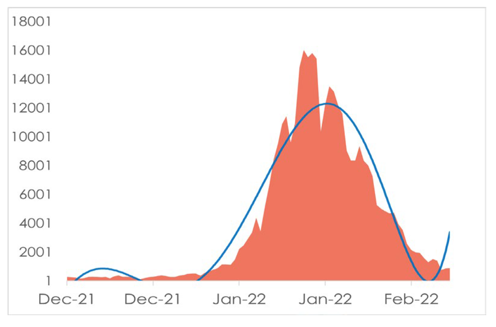
We have found from Figure 10 the number of infected people will increase and the disease is spreading over Bangladesh so rapidly. The outbreak will be at its peak point in the month of February 2022. In previous section, we have already shown the model’s accuracy (2.2) Now we talk about the accuracy of the prediction we have achieved from our data in Figure 10.
Figure 18.
Covid 19 Stat Bangladesh from 16 Dec 2021 to 15 January 2022 [13]
Figure 18.
Covid 19 Stat Bangladesh from 16 Dec 2021 to 15 January 2022 [13]
If we look at Figure 18, we will see the blue line’s behavior which is showing the daily cases and it is upward suddenly after January 01, 2022, which is giving us a vibe that something serious is coming and at the same time in Figure 10 our model is also giving the prediction of Covid situation in Bangladesh will be at its peak point in March 2022. Although in Figure 10 The Green curve which is the curve of recovery is climbing which is good news for us but also in some respects the red curve defining death in Bangladesh will be rising slightly and will be likely stable after the milestone of 200 days or Mid-June 2022. Now here we can find some sort of similarity in Figure 10 and Figure 18 and if our prediction is right then we have very little time to be aware of the situation.
After comparing our result with the real scenario available to us till now we find the same behavior in both cases so we can conclude that our prediction is likely accurate in the determination of the situation. Although the time (February 2022) has not arrived yet that’s why we cannot say any number or percentage to define the accuracy of our prediction but comparing Figure 10 and Figure 18 we can assume our prediction might be accurate.
6.2. Limitations
Now many of the basic parameters in the model are assumed from many authentic sources like Worldometer [11], JHU CSSE [12] etc. But in some cases, we have to assume the parameters based on other relevant fields or data which I think is a limitation because for this assumption we can get a little negative accuracy in the prediction [41,42]. If the required information can be given accurately or the required information will be present in the sources provided by the government then the proposed SEQIRP model will provide a more accurate prediction. For example, in our project, we have assumed “90,000” people are in quarantine as of now, but if the government provides the actual number, then there will be no need for this assumption which will help us to find more accurate predictions in our case. By this, we will have more accurate results to get prepared for facing the situation.
6.3. Conclusions
As we know, there are 10 vaccines available as of the end of 2021 approved by the World Health Organization [16] but none of them can assure us 100% that they will cure Covid 19 in every situation, therefore the Government of the People’s republic Bangladesh should increase public awareness, exclusion, and social exclusion. Also, prudent measures such as closure policies are important in reducing the rate of infection. Bangladesh is a developing country, and many people live in poverty or poverty line, so a long-term closure policy does not bear fruit in the economy and the people.
Now as we have developed this model and generates the result on January 05, 2022, we have predicted that Covid 19 will be at its peak point at the starting of February 2022. Now after passing the month of February 2022, we have observed the scenario and after passing the month we have conduct a statistical analysis and found the similar result with our model. We have found the curve going up and then on starting-February the curve became going down as we have achieved the result on completing the statistical analysis and we have achieved the same result by our model.
We have also shown the real scenario in Figure 17 that the peak point of Covid 19 was on February 2022 and our model also provided the same result [43]. Now we also test the validity and nature of our result we found in 5.2 that the curve is positively skewed and after we also calculate the skewness on different date range and we found the skewness of daily infected has decreased after February 2022 and this state the result of our model. As we find the same nature and behavior of curve of infected one from both of our model and statistical analysis, we can claim our model as valid with the current scenario of Bangladesh with more than 90% accuracy.
In Figure 10, these simulations show differences in infection rate, recovery rate, and mortality rate at different times.
The number of people infected with the virus depends largely on the level of infection. The infection rate will continue despite rising rates of recovery and death as the target has not yet been reached. Therefore, through a system of monitoring and segregation, public awareness is responsible for controlling the rate of infection which means controlling the spread of the disease. We would like to separate the last line of this work. The SEQIRP model predicts an infection rate in Bangladesh that has released the highest rate since February 2022, and the recovery rate is also rising. This time we have a possibly accurate model so, we can easily use the model to predict next wave of Covid 19 and if we found any next wave, we will have enough time to take many steps to fight the wave and make our people safer than ever, we know how to handle the situation in last two years, we must learn from it to be more careful this time.
Appendix
- 1. JHU CSSE- Center for Systems Science and Engineering (CSSE) at Johns Hopkins University (JHU)
- 2. SEQIRP- Susceptible–Exposed–Quarantine–Infected–Recovered–Death
- 3. MATLAB- MATrix LABoratory
- 4. RK4- fourth order Runge-Kutta method
- 5. Multi-paradigm- Using or conforming to more than one paradigm
- 6. LINPACK- Linear system package
- 7. Perturb graph- compare the effects of all the factors at a particular point in the design space
- 8. Schematic diagram- Representation of the elements of a system using abstract, graphic symbols rather than realistic pictures.
- 9. Matrix- A matrix is a grid used to store or display data in a structured format.
- 10. 2019-nCoV- Coronavirus disease
- 11. DGHS- Directorate General of Health Services
References
- Moore, S. (2021). History of COVID-19. Retrieved 14 January 2022, from https://www.news-medical.net/health/History-of-COVID-19.aspx.
- Das, A.; Srinivas, M.N.; Shahrear, P.; Rahman, S.M.S.; Nahid, M.; Murthy, B.S.N. Transmission Dynamics and Control of COVID-19: A Mathematical Modelling Study. J. Appl. Nonlinear Dyn. 2023, 12, 405–425. [Google Scholar] [CrossRef]
- Islam, S.; Shahrear, P.; Saha, G.; Ataullha; Rahman, M. S. Mathematical analysis and prediction of future outbreak of dengue on time-varying contact rate using machine learning approach. Comput. Biol. Med. 2024, 178, 108707. [Google Scholar] [CrossRef] [PubMed]
- Shahrear, Pabel, Amit Kumar Chakraborty, Md Anowarul Islam, and Ummey Habiba. Analysis of computer virus propagation based on compartmental model. Applied and Computational Mathematics 2018, 7, 12–21. [Google Scholar]
- A Islam, M.; A Sakib, M.; Shahrear, P.; Rahman, S.M.S. The Dynamics of Poverty, Drug Addiction and Snatching In Sylhet, Bangladesh. IOSR J. Math. 2017, 13, 78–89. [Google Scholar] [CrossRef]
- Sakib, M., M. Islam, P. Shahrear, and U. Habiba. Dynamics of poverty and drug addiction in sylhet, bangladesh. Journal of Multidisciplinary Engineering Science and Technology 2017, 4, 6562–6569. [Google Scholar]
- Chakraborty, Amit Kumar, Pabel Shahrear, and Md Anowarul Islam. Analysis of epidemic model by differential transform method. Journal of Multidisciplinary Engineering Science and Technology 2017, 4, 6574–65. [Google Scholar]
- Pabel Shahrear, S.M.; Rahman, S.; Nahid, M.M.H. Prediction and mathematical analysis of the outbreak of coronavirus (COVID-19) in Bangladesh. Results Appl. Math. 2021, 10, 100145. [Google Scholar] [CrossRef] [PubMed]
- COVID 19 - La France au Bangladesh - Ambassade de France à Dacca. (2022). Retrieved 14 January 2022, from https://bd.ambafrance.org/-COVID-19-376.
- কোভিড-১৯ ট্র্যাকার | বাংলাদেশ কম্পিউটার কাউন্সিল (বিসিসি). (2022). Retrieved 14 January 2022, from http://covid19tracker.gov.bd/.
- Bangladesh COVID - Coronavirus Statistics - Worldometer. (2022). Retrieved 14 January 2022, from https://www.worldometers.info/coronavirus/country/bangladesh/.
- Bangladesh - COVID-19 Overview - Johns Hopkins. (2022). Retrieved 14 January 2022, from https://coronavirus.jhu.edu/region/bangladesh.
- Bangladesh COVID-19 Corona Tracker. (2022). Retrieved 14 January 2022, from https://www.coronatracker.com/country/bangladesh/.
- Covid 19 Data Set. from https://raw.githubusercontent.com/datasets/covid-19/master/data/time-series-19-covid-combined.
- Kassa, S.M.; Njagarah, J.B.; Terefe, Y.A. Analysis of the mitigation strategies for COVID-19: From mathematical modelling perspective. Chaos, Solitons Fractals 2020, 138, 109968–109968. [Google Scholar] [CrossRef] [PubMed]
- WHO – COVID19 Vaccine Tracker. (2022). Retrieved 15 January 2022, from https://covid19.trackvaccines.org/agency/who/.
- Chakraborty, Amit Kumar, Pabel Shahrear, and Md Anowarul Islam. Analysis of epidemic model by differential transform method. Journal of Multidisciplinary Engineering Science and Technology 2017, 4, 6574–6581. [Google Scholar]
- Rahman, S. M. S., M. A. Islam, P. Shahrear, and M. S. Islam. Mathematical model on branch canker disease in Sylhet, Bangladesh. Journal of Mathematics 2017, 13, 80–87. [Google Scholar]
- Saha, Amit Kumar, Goutam Saha, and Pabel Shahrear. Dynamics of SEPAIVRD model for COVID-19 in Bangladesh. (2024). [CrossRef]
- Shahrear, P.; Habiba, U.; Karim, S.; Shahrear, R. s Generalization of Gene Network Representation on the Hypercube. Eng. Sci. 2024, ume 29 (Ju, 1152. [Google Scholar] [CrossRef]
- Shahrear, Pabel, Habiba, Ummey, Rezwan, Shahrear, ‘‘ The Role of the Poincaré Map is Indicating a New Direction in the Analysis of the Genetic Network’’. International Review on Modelling and Simulations (I.RE.MO.S.) 2022, 15, 351–358.
- Tiwari, V.; Deyal, N.; Bisht, N.S. Mathematical Modeling Based Study and Prediction of COVID-19 Epidemic Dissemination Under the Impact of Lockdown in India. Front. Phys. 2020, 8. [Google Scholar] [CrossRef]
- Anirudh, A. Mathematical modeling and the transmission dynamics in predicting the Covid-19 - What next in combating the pandemic. Infect. Dis. Model. 2020, 5, 366–374. [Google Scholar] [CrossRef] [PubMed]
- Santosh, K.C. COVID-19 Prediction Models and Unexploited Data. J. Med Syst. 2020, 44, 1–4. [Google Scholar] [CrossRef] [PubMed]
- Kim, S. , Seo, Y. B., & Jung, E. (2020). Prediction of COVID-19 transmission dynamics using a mathematical model considering behavior changes in Korea. Epidemiology and health.
- Shahrear P, Glass L, Edwards R. Chaotic dynamics, and diffusion in a piecewise linear equation. Chaos: An Interdisciplinary Journal of Nonlinear Science, 2015, 25, 033103. [Google Scholar] [CrossRef]
- Shahrear, Pabel, Leon Glass, and Roderick Edwards. Collapsing chaos. Collapsing chaos. Texts in biomathematics 2018, 35–43. [Google Scholar]
- Shahrear, Pabel, Leon Glass, and D. B. Nicoletta. Analysis of piecewise linear equations with bizarre dynamics. PhD diss., Ph. D. Thesis, Universita Degli Studio di Bari ALDO MORO, Italy, 2015.
- Alsheri, A.S.; Alraeza, A.A.; Afia, M.R. Mathematical modeling of the effect of quarantine rate on controlling the infection of COVID19 in the population of Saudi Arabia. Alex. Eng. J. 2021, 61, 6843–6850. [Google Scholar] [CrossRef]
- Nonpharmaceutical Interventions (NPIs) | CDC. (2022). Retrieved 16 January 2022, from https://www.cdc.gov/nonpharmaceutical-interventions/index.html.
- Roda, W. C. , Varughese, M. B., Han, D., & Li, M. Y. Why is it difficult to accurately predict the COVID-19 epidemic? Infectious Disease Modelling 2020, 5, 271–281. [Google Scholar]
- Wang, J. (2020). Mathematical models for COVID-19: applications, limitations, and potentials. Journal of public health and emergency, 4.
- Bani Younes, A. , & Hasan, Z. COVID-19: Modeling, prediction, and control. Applied Sciences 2020, 10, 3666. [Google Scholar]
- Shahrear, P.; Glass, L.; Wilds, R.; Edwards, R. Dynamics in piecewise linear and continuous models of complex switching networks. Math. Comput. Simul. 2015, 110, 33–39. [Google Scholar] [CrossRef]
- Junaid, Mohammad, Goutam Saha, Pabel Shahrear, and Suvash C. Saha. Phase change material performance in chamfered dual enclosures: Exploring the roles of geometry, inclination angles and heat flux. International Journal of Thermo fluids 2024, 24, 100919. [Google Scholar]
- Faiyaz, C.A.; Shahrear, P.; Alam Shamim, R.; Strauss, T.; Khan, T. Comparison of Different Radial Basis Function Networks for the Electrical Impedance Tomography (EIT) Inverse Problem. Algorithms 2023, 16, 461. [Google Scholar] [CrossRef]
- Ahamad, Razwan, M. S. Karim, M. M. Rahman, and P. Shahrear. Finite element formulation employing higher order elements and software for one dimensional engineering problems. space 2019, 1, 1. [Google Scholar]
- Hussain, Farzana, Razwan Ahamad, M. S. Karim, P. Shahrear, and M. M. Rahman. Evaluation of Triangular Domain Integrals by use of Gaussian Quadrature for Square Domain Integrals. Sust Studies 2010, 12, 15–20. [Google Scholar]
- Karim, Md Shajedul, Pabel Shahrear, MDM Rahman, and Razwan Ahamad. Generating formulae for the existing and non-existing numerical integration schemes. Journal of Mathematics and Mathematical Sciences 2005, 21, 91–104.
- Faruque, S. B. , and Pabel Shahrear. On the gravitomagnetic clock effect. Fizika B: a journal of experimental and theoretical physics 2008, 17, 429–434. [Google Scholar]
- Shahrear, P.; Faruque, S.B. SHIFT OF THE ISCO AND GRAVITOMAGNETIC CLOCK EFFECT DUE TO GRAVITATIONAL SPIN–ORBIT COUPLING. Int. J. Mod. Phys. D 2007, 16, 1863–1869. [Google Scholar] [CrossRef]
- Shahrear, Pabel, Md Fahim Hossain Saiki, and Md Tarequn Nabi Tareq. Analysis of the Covid-19 Mathematical Model Based on Vaccine Data: A Descriptive Approach to Eradicate the Outbreak. 2024. [CrossRef]
Figure 2.
Covid 19 daily recovered cases stat Bangladesh in last two weeks from 13 Jan 2022.
Figure 3.
situation in Bangladesh in the next 300 days.
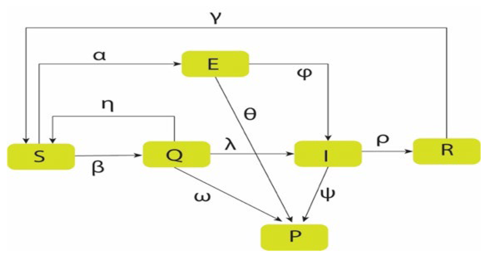
Figure 5.
Rate of Infection.
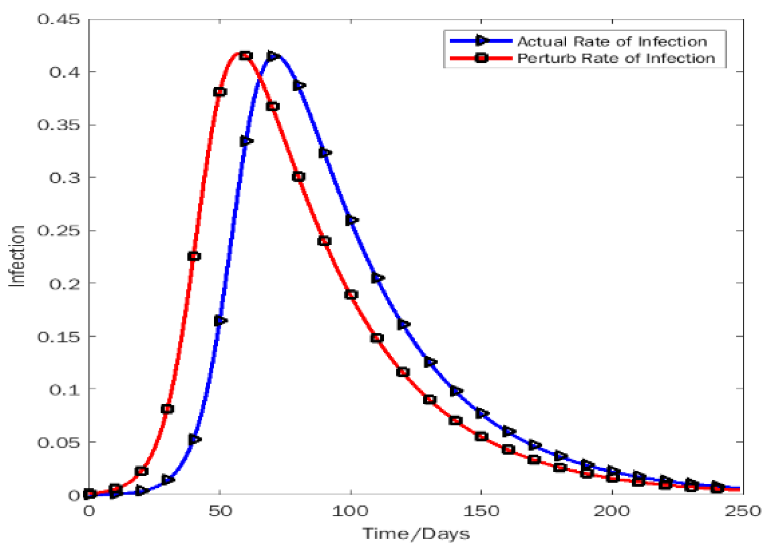
Figure 6.
Rate of recovery.

Figure 7.
Rate of death.
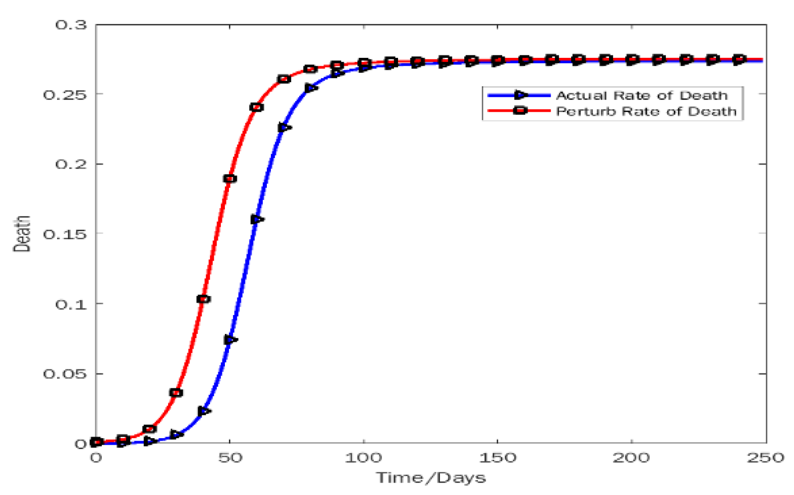
Figure 8.
Rate of susceptibility.
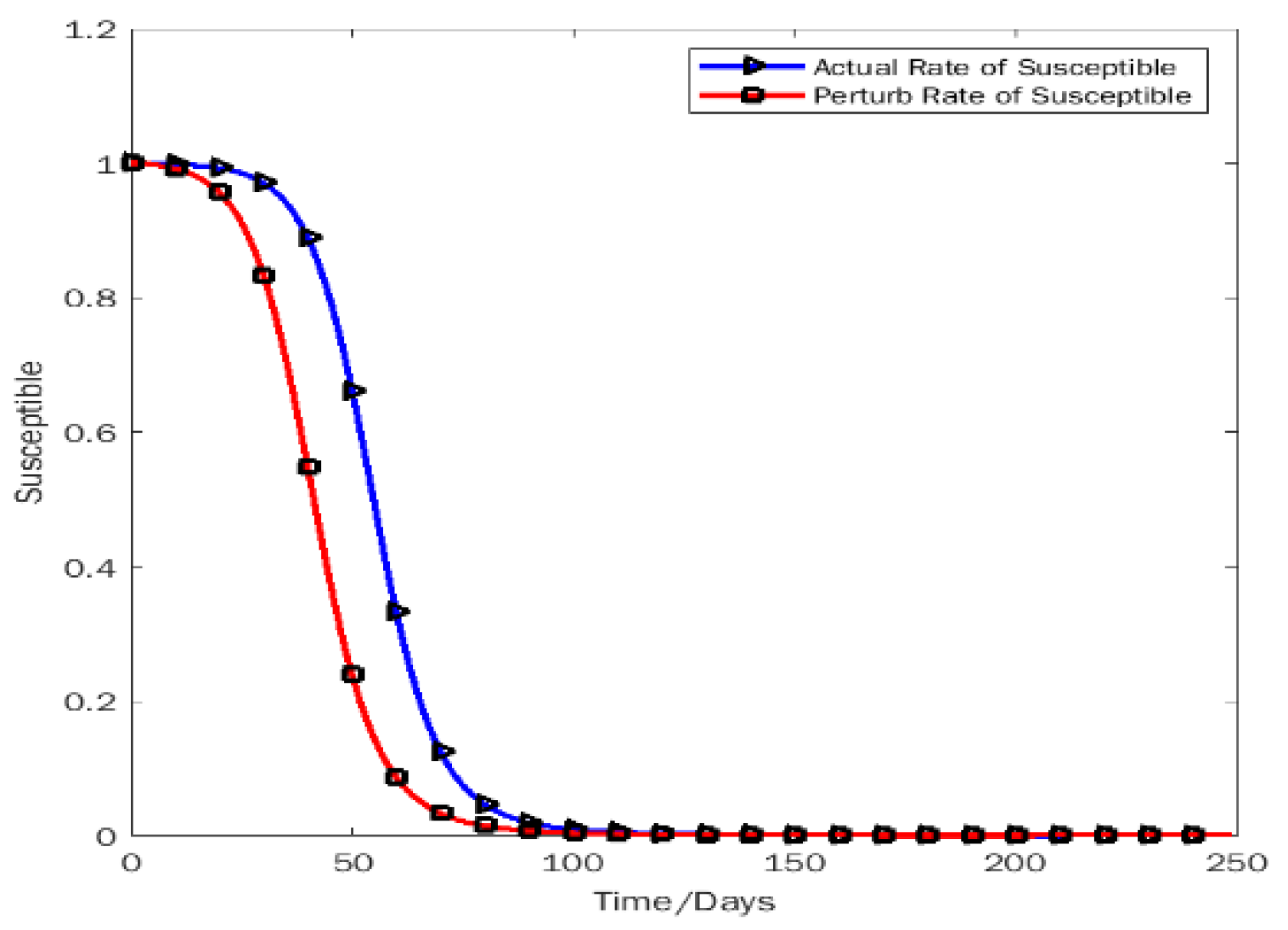
Figure 9.
Rate of quarantine.
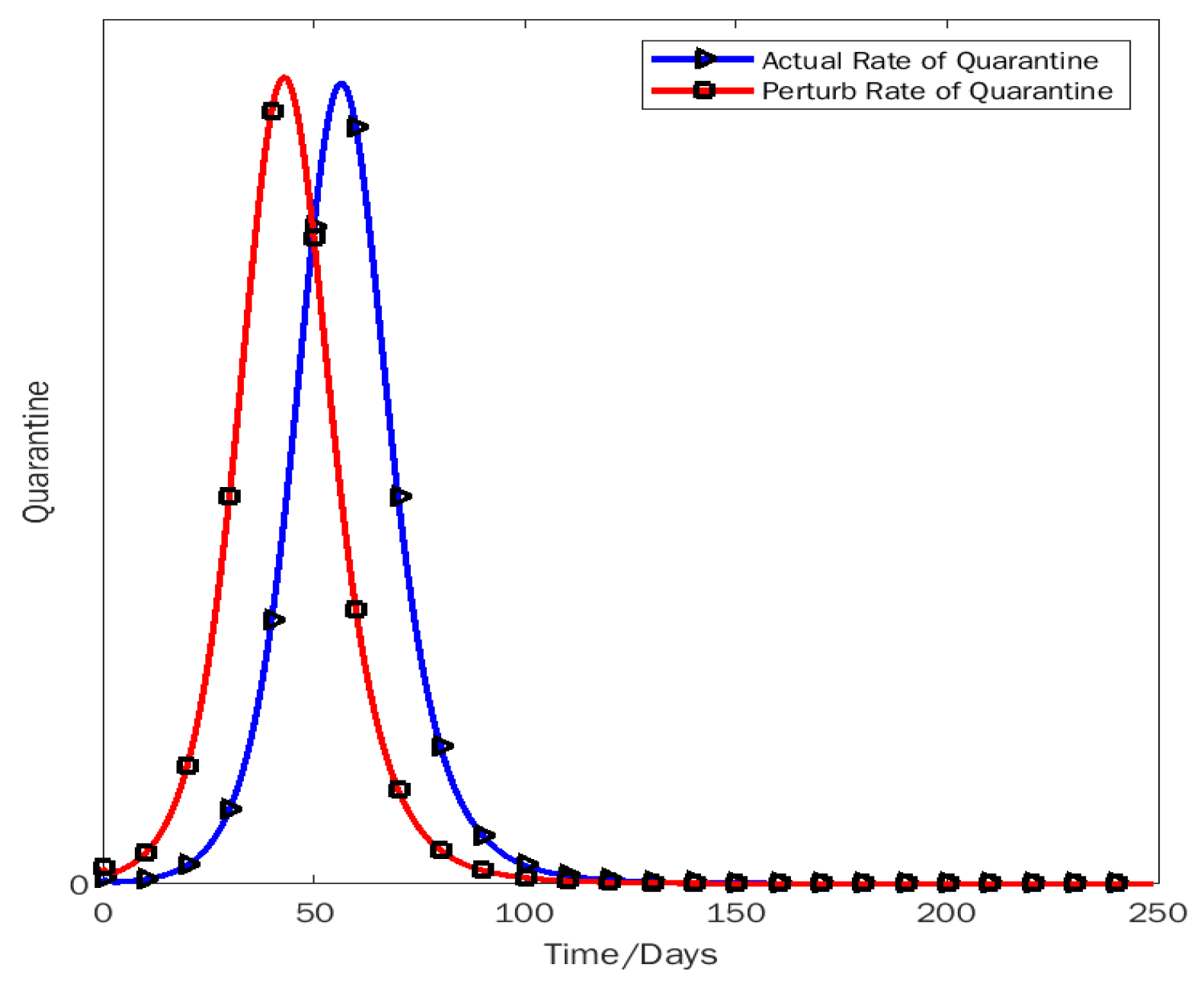
Figure 10.
Solution of the model by MATLAB
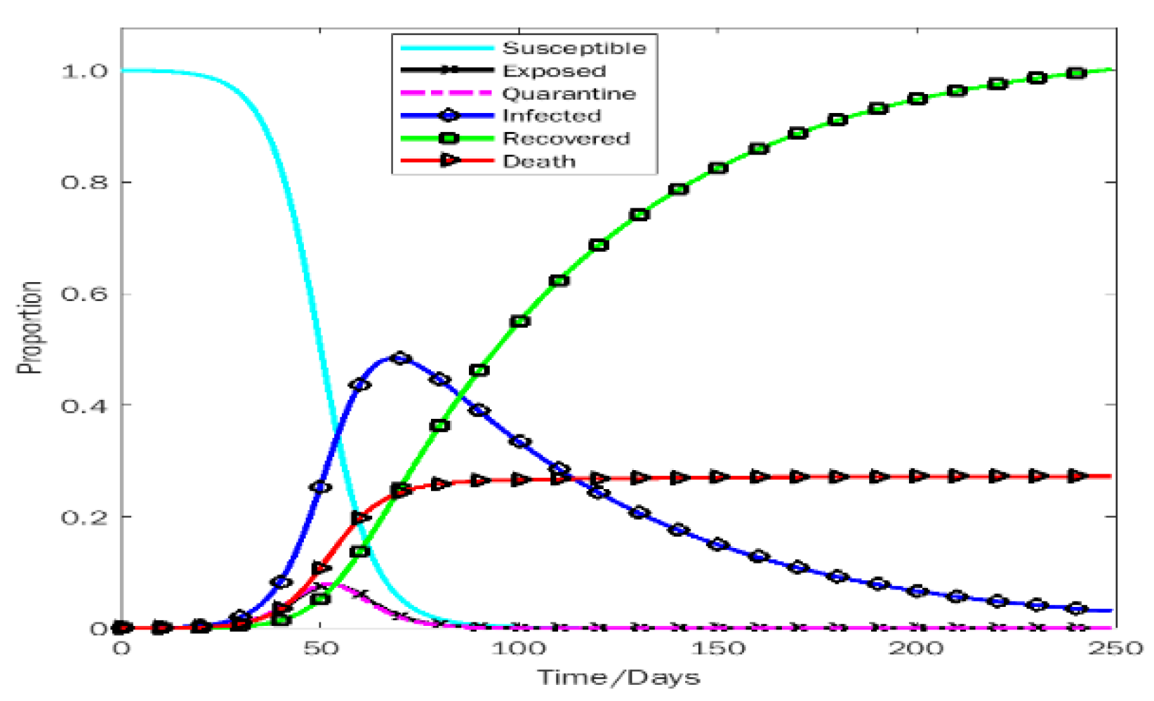
Figure 11.
Polynomial regression for Infected vs date
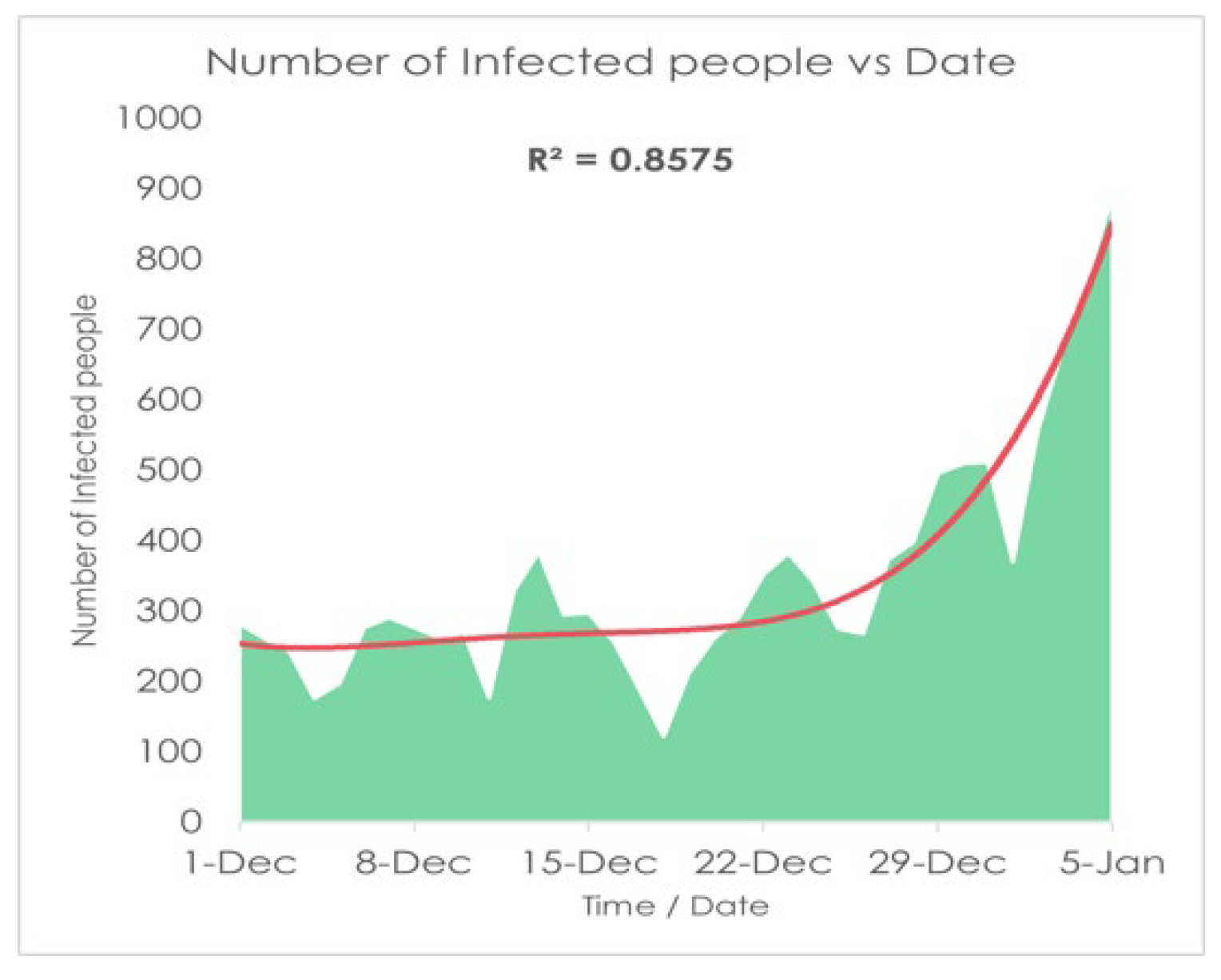
Figure 12.
Polynomial regression for Recovered vs date
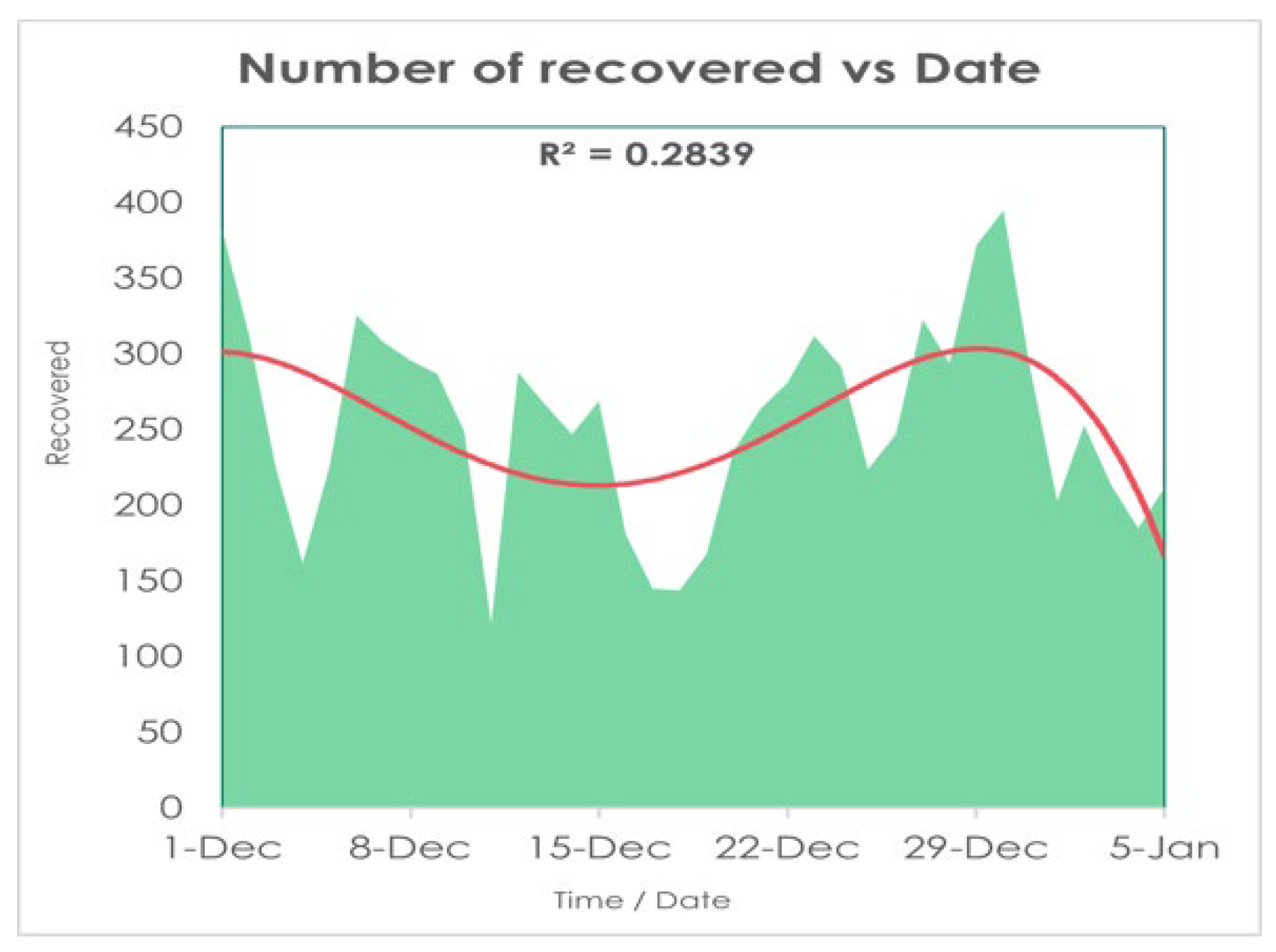
Figure 13.
Polynomial regression for Dead vs date
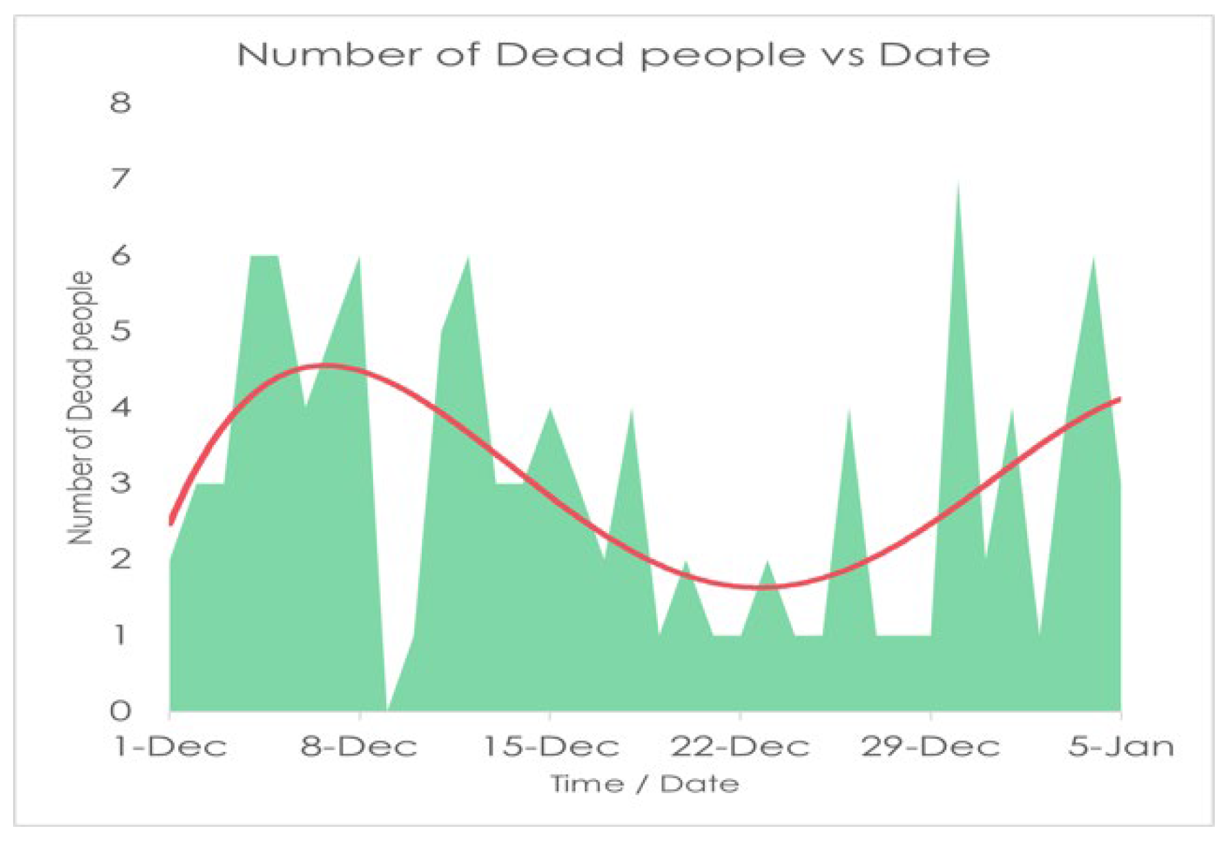
Figure 14.
Highly Skewed graph skewed right.
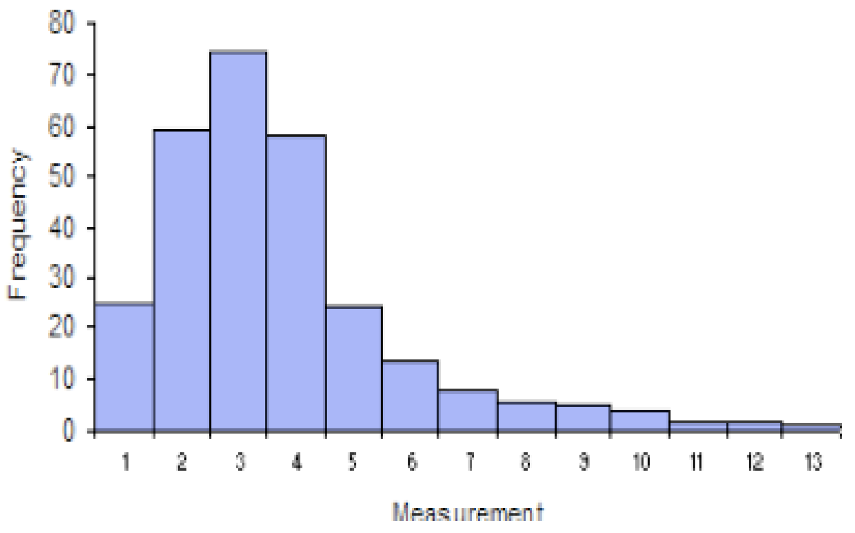
Figure 15.
Histogram based on Infected people from 01/12/21 to 05/01/22
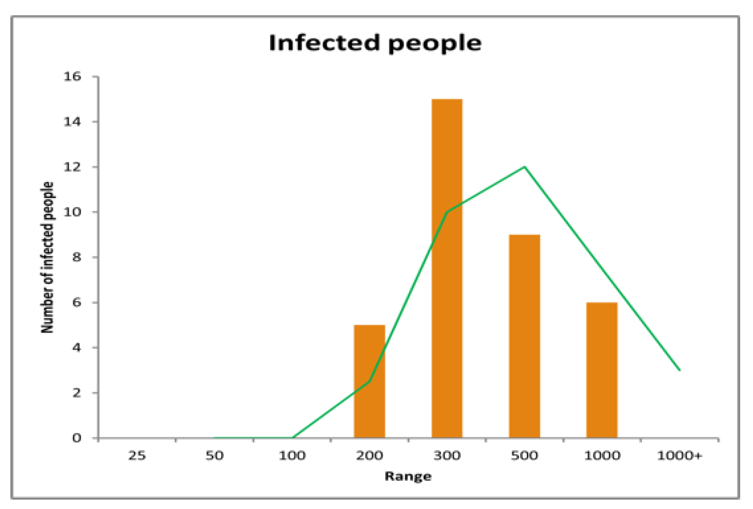
Figure 16.
Histogram based on Infected people from 01/12/21 to 06/02/22
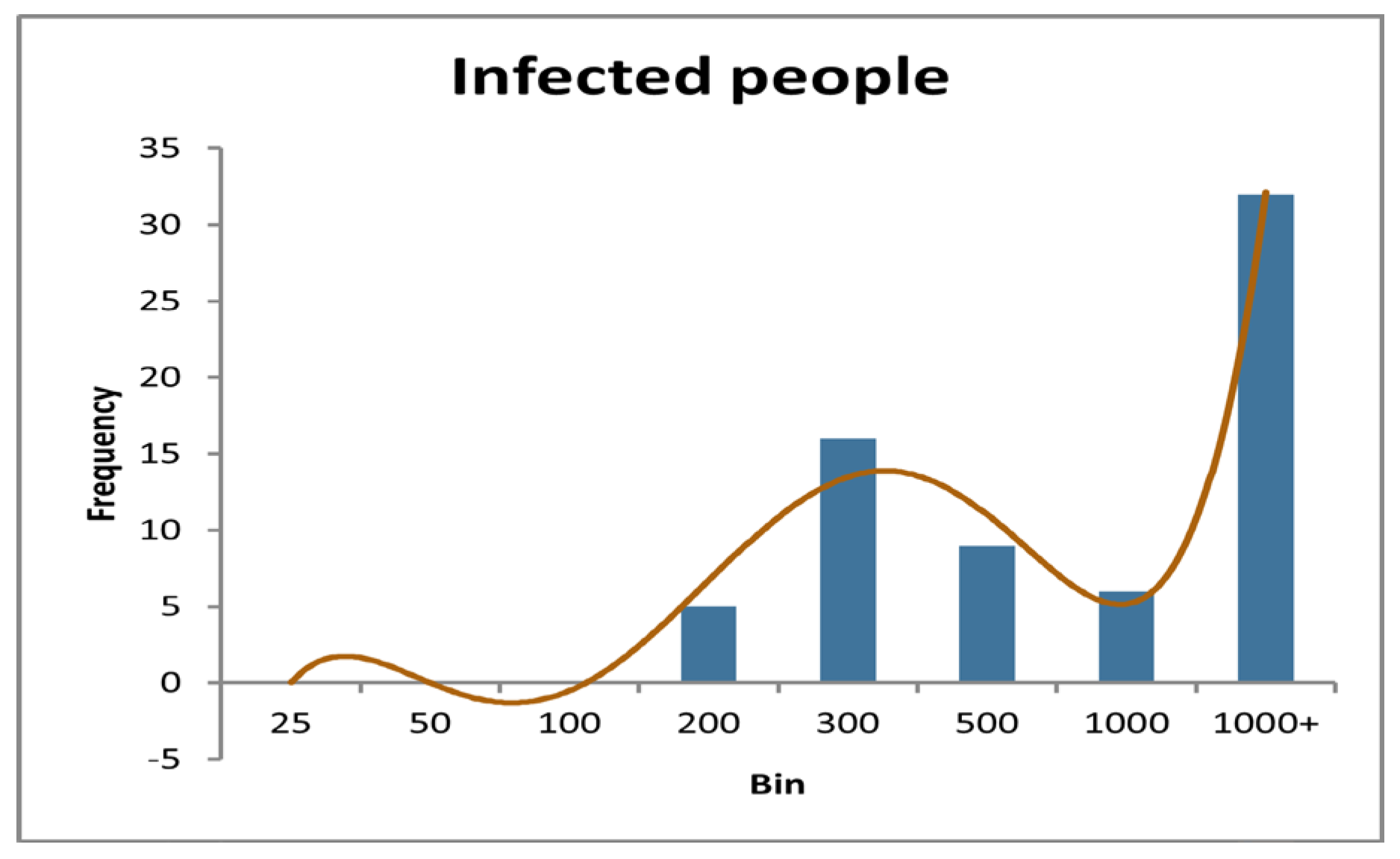
Table 1.
Initial values of variables.
| Parameters | Values | Data source |
| N | 167214474 | World meter |
| S | 167192639 | N − Q − I − R − P |
| Q | 90000 | Assumed |
| E | 12523 | JHU CSSE |
| I | 12523 | JHU CSSE |
| R | 9203 | JHU CSSE |
| P | 109 | JHU CSSE |
Table 8.
Figure 01. to 05/01/22
| Range | Number of people | Range | Number of people |
| 25 | 0 | 300 | 15 |
| 50 | 0 | 500 | 9 |
| 100 | 0 | 1000 | 6 |
| 200 | 5 | 1000+ | 0 |
Table 9.
Frequency table from 01/12/21 to 06/02/22
| Range | Number of people |
| 25 | 0 |
| 50 | 0 |
| 100 | 0 |
| 200 | 5 |
| 300 | 16 |
| 500 | 9 |
| 1000 | 6 |
| 1000+ | 32 |
Disclaimer/Publisher’s Note: The statements, opinions and data contained in all publications are solely those of the individual author(s) and contributor(s) and not of MDPI and/or the editor(s). MDPI and/or the editor(s) disclaim responsibility for any injury to people or property resulting from any ideas, methods, instructions or products referred to in the content. |
© 2024 by the authors. Licensee MDPI, Basel, Switzerland. This article is an open access article distributed under the terms and conditions of the Creative Commons Attribution (CC BY) license (http://creativecommons.org/licenses/by/4.0/).
Copyright: This open access article is published under a Creative Commons CC BY 4.0 license, which permit the free download, distribution, and reuse, provided that the author and preprint are cited in any reuse.


